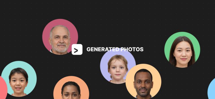
This is how we turned AI-generated abstract pencil holders and magic cubes into an icon that piques users’ curiosity.
Why change things up?
In an endless library of Figma plugins, the competition for users’ attention is tough. They scroll past the ones that don’t look appealing in a matter of milliseconds without even reading the description. Naturally, the first thing that catches any user’s eye is a vibrant image — it’s quicker to scan and interpret than any text. That said, it’s the 64 × 64 px square that carries the responsibility of making an impeccable first impression. The icon is what can make or break your plugin’s visibility.
We needed to make sure our icons stood out from the long list of Figma plugins. Our first step was to look through other plugin icons and see how we could improve ours and turn them into attention grabbers. After all, most of the time users scroll through the plugin library instead of googling a particular plugin and clicking on its page. This is why it’s crucial to take the environment into account when designing an icon — it never exists on its own.
Brief competitor analysis
We noticed that most icons were minimalistic flat 2D designs with company logos or pictograms in the middle. While flat icons might be all the rage now, see how even a tiny bit of volume makes your icon stick out instantly.
What we also noticed is that with a logo or a single letter used as the main design element, it’s unclear what the plugin can do in the first place. Take our own old icon, for instance: can you tell Icons8 is a massive asset library for graphic designers? Nope, not unless you already know who we are and what we do.
Single letters as the primary icon design elements only work for companies with high brand awareness: think Vimeo or Unsplash.
With all that in mind, we determined our two main tasks:
- Add depth to the icon.
- Make sure it reflects the function of the product better than the old one.
First redesign: Background Remover plugin
Approaching the Icons8 plugin icon from the get-go seemed a bit too ambitious since Icons8 is essentially an all-in-one asset library that has icons, photos, and illustrations. Packing all of this into a single icon is a challenge that required a good creative warmup. This is why we started with remaking the icon for a more straightforward plugin — Background Remover.

The old icon had sparkling stars to show that the plugin can magically remove backgrounds with AI. However, now there are a little too many apps and tools that use the same sparkling stars for all sorts of AI magic.
To make our icon pop, we decided to step away from the magic stars and focus on the functionality of our plugin. The redesign process was a breeze: since the plugin only has one job, the new icon had to be clean and simple.
We came up with an icon that has a woman’s portrait picture against a half-transparent background to show that our plugin can:
- Deal with fine details like curly hair
- Remove backdrops quickly and meticulously
Once we finished reworking the icon for Background Remover, it was time to tackle a bigger design challenge — remaking the icon for our main plugin, Icons8.
Redesigning the main plugin
Icons8 is our core Figma plugin since it has all of our graphic design assets in one place. With this plugin, users can add free icons, photos, and illustrations to their Figma projects. The assets are sorted by style and category making it easy to create clean, cohesive designs.
Which sure sounds magnificent, except it only turns the icon redesign process into an even bigger challenge.

All of this is quite a lot to wrap into a single 64 × 64 px icon. After numerous brainstorming sessions, we decided that Icons8 is like a treasure box that has an abundance of priceless design assets inside.
Hunting for references
With treasure box as our keyword, it was time to search for the right reference. Dribbble and Pinterest were our first destination points, and we found some awesome design ideas there. Sadly, most of them didn’t seem to resonate with our concept as much as we expected.

There were, however, a couple of designs that were close to our key ideas:

Technically, these two icons merged together would give us roughly what we needed — a box with pictures peeking out of it.
Brainstorming with Midjourney
After that, we decided to experiment with AI image generation and bring Midjourney on board as our concept artist.
First, we wanted to see what designs Midjourney would suggest if you just typed in “3d icon for app”. With no further clarifications, Midjourney’s icons looked like this:

That was, as expected, not even close to our concept, but the box shape was a major source of inspiration for further designs.
Then, we tried to create images that featured Icons8’s signature green color. Because the Icons8 plugin is basically an asset organizer, we built our next prompts around this keyword. Since icons, photos, and illustrations are instruments for art and design, we went for “icon 3d skeumorphism green stationery organizer”.
What we got was essentially a bunch of pencil holders. That was too far of a stretch concept-wise: an icon like this would be a better fit for a graphics editor rather than an asset library. Plus, the green was too overwhelming.

Here are the results of our most successful runs: we have cube boxes with pictures and art tools. To get these, we typed in “app icon 3d stationery organizer”.


These images generated by Midjourney are vibrant and eye-catching but overloaded with details. This is a big no-no for product icons because the more you have going on, the less readable they end up looking.
Finally, we decided to step away from the word ‘stationery’ and tried “app icon 3d illustrations and photos organizer”. In this query, we finally got a design that looked promising, and we started working with it.

Turning ideas into icons
We did a couple of quick sketches, but something felt off. It almost looked like an office file folder or a box where you pack your coffee-stained mug and family pictures when you leave the company.

The resemblance is terrifying.

Reshaping the box
Because everyone on the team liked the look of a 3D box, we started adding various elements to it to figure out what worked best. We used Figma and Blender to model, texture, and color the icon.
Here is what we had after numerous iterations:

We eliminated box number 1 right away because if you think about it, the design goes against the core concept. Once you open the lid, you can no longer see our logo. And if you don’t, you will not see what’s inside, which makes no sense, since all the assets are what the user came for in the first place.
Design number 2 was a bit too wide and bulky, and the logo looked awkward squeezed into the small area at the bottom of the box.
The third box was not bad overall. We liked the half-open lid and the positioning of the logo, but the design looked a little too familiar. AirPods case familiar.

The fourth design was the closest to our ultimate goal: we had a box filled with our signature assets. The logo placement felt organic and overall the shape looked harmonious and easily readable. We proceeded with this design and started by modeling two versions of the box in Blender: one without a lid, and the other one with a half-open lid.


We were happy with everything except for the positioning of the box. It almost looked like we were hiding the assets and trying to keep them all to ourselves by turning the box away from the viewer. That said, we decided that a front-facing design works best.
We then adjusted the lighting and were ready to start placing additional elements in and around the box.

Placing the assets
To make the process faster, we threw in a bunch of elements without spending too much time repositioning, recoloring, and resizing them. At that point, we needed to see how all these finer details worked with the box itself and whether we needed the lid after all. Here are the three final versions:

Our winner was design number 3. The composition seemed the most fitting: we had a treasure box with our logo on it and all of our signature assets inside it. We just needed to make it a little less messy and give more definition to each element because the initial sketch was the opposite of readable. Now imagine that in a 64 × 64 px resolution — yeah, that had to be fixed.
Final touches
First, we tidied up the composition and then tweaked the box material to make it shinier.

After that, we began working on finer details. The trick is that every icon in the Figma Community is only 64 × 64 px big. We had to avoid blurry pixels at the edges to make every element look nice and crisp when resized.
If you take a closer look at the circled lines, you’ll see what we mean. It’s those clusters of pale pixels that we were after. Notice how sloppy the icon becomes once you zoom in.


Once the cleanup was complete, the brand new plugin icon was ready to go.

The only thing left to do was to upload it to Figma and check how it looked in the plugin library. It turned out to be exactly what we were going for. See how it pops now?

Key takeaways
The plugin icon that made it to Figma Community came a long way. It took us several attempts at AI image generation with Midjourney, multiple iterations in Blender, and a fair amount of adjustments in Figma. Here are the key points we’ve defined after finishing the redesign:
1. Context and environment matter a lot and should be the first point to consider.
Where is your icon going to go? Will it get cropped, resized, or altered in any other way once uploaded? How does it compare to the rest of the icons on that platform? If you start designing your icon without having clear answers to these questions, you might end up with an unusable image.
2. The design shouldn’t harm the representation of your brand.
Some of our designs were good at first glance, but the logo placement was not too flattering. Because Icons8 is our main plugin that carries the same name as the entire company, the logo had to be perfectly readable.
3. AI image generation is a great starting point that saves plenty of time.
Even the most creative tasks can get repetitive at some point and even the most inventive designers can feel drained and uninspired at times. Though we did have a general idea of what we wanted to see in the end, Midjourney was a time-saver. The variety of designs you never even thought of is insane with AI, which makes it easier to turn your ideas into a sketch. Don’t we all know how painfully pressuring a blank canvas is?