See all the guidelines and recommendations of the most suitable icon formats for each OS in one place.
It might seem overwhelming to consider all the requirements that mobile, desktop, and wearable device operation systems have for the icon formats and sizes. We gathered all popular OS guides in one article to ensure your interface meets the official guidelines. Pin this tab and use it as a reminder.
List of OS platforms
Mobile
iOS
See the full guidelines on the Apple official website.
Interface icons
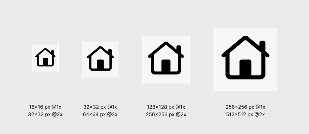
Basically, there are no strict regulations about the size of the interface icon in iOS. You just need to adjust it to your app interface hierarchy and keep it consistent throughout the entire app. Here is a list of common sizes:
- 256px x 256px @1x, 512px x 512px @2x
- 128px x 128px @1x, 256px x 256px @2x
- 32px x 32px @1x, 64px x 64px @2x
- 16px x 16px @1x, 32px x 32px @2x
You can find all the basics about interface icons for iOS at the SF Symbols page.
Couldn’t find the icon you need in the main catalog from Apple? Here are custom-made:
- SF symbols by Icons8
- iOS icons by Icons8
| @2x (pixels) | @3x (pixels) iPhone only | Usage |
|---|---|---|
| 120×120 | 180×180 | Home Screen |
| 80×80 | 120×120 | Spotlight |
| 58×58 | 87×87 | Settings |
| 76×76 | 114×114 | Notifications |
App icon
Note: don’t put any additional border or overlay on your Settings icon. iOS automatically adds a 1-pixel stroke to all icons to look good on Settings’ white background.
iPadOS
iPadOS has similar requirements to iOS. See general Apple guidelines here.
Interface icons
Interface icon sizes used in iPadOS are also similar to iOS ones. To make sure, keep this list in mind:
- 256px x 256px @1x, 512px x 512px @2x
- 128px x 128px @1x, 256px x 256px @2x
- 32px x 32px @1x, 64px x 64px @2x
- 16px x 16px @1x, 32×32 px @2x
Before creating your own icons, check this 10K+ icons catalog from Icons8 made by Apple guidelines.
App icon
Like iOS, here is the general tip: don’t add any border or overlay to the Settings icon cause the system will automatically add a stroke 1-pixel thickness around it. Use a standardized one from the SF Symbols list, or design yours with these sizes in mind:
| @2x (pixels) | Usage |
|---|---|
| 167×167 | Home Screen on iPad Pro |
| 152×152 | Home Screen on iPad, iPad mini |
| 80×80 | Spotlight on iPad Pro, iPad, iPad mini |
| 58×58 | Settings on iPad Pro, iPad, iPad mini |
| 76×76 | Notifications on iPad Pro, iPad, iPad mini |
Android
Android is a mobile OS made by Google. The UI design is based on the Material Design System. Here, you can check the full guidelines for the latest version, Material 3. The following works with both smartphones and tablets operating on Android.
Interface icons
Google uses dp to measure the size of icons. 1dp is basically equal to 1px on the 160dpi screen. If, for example, your interface is viewed on a 320dpi screen, 1px will be equal here to 2dp, and so on.
| Icon size | Purpose |
|---|---|
| 24dp | Pixel-perfect standard (Baseline) icon size |
| 20dp | Additional small-scale visuals |
| 40dp and 48dp | For display or headline type and larger screen sizes |
Here are some handy sources to check:
- Material icons by Icons8
- Material icons catalog on Google Fonts
- Material icons Figma plugin from Google
- Design principles for icons in Material design
App icons
Quick format check to follow in your Android app icon design:
- Final artwork size: 512px x 512px
- Format: 32-bit PNG
- Color space: sRGB
- Max file size: 1024KB
Google Play automatically applies a 20% squared corner radius to your app icon. Ensure that all important parts of your design fit 384px x 384px, and nothing will be cut. A shadow mask will also be applied automatically, so upload your artwork without it.
Other than that, Google doesn’t allow you to use additional text or graphic elements on your app icon that:
- indicate your app ranking
- promote deals or incentivize installs
- indicate participation in a Play program
- can mislead users.
For more information, check Google Play icon design specifications.
HarmonyOS
HarmonyOS is the operating system developed by Huawei. The main idea is based on full adaptivity. This means that using the same system capabilities, you can apply it to all kinds of devices, including mobile phones, tablets, PCs, smart TVs, wearables, smart speakers, head units, earphones, and AR/VR glasses. This makes a bit of a difference in the interface design. All elements are measured not in pixels but in vp (virtual pixels) to ensure that all interface elements have a consistent visual volume on devices with different densities. But keep in mind that you need specific icon maker software to produce elements of this type.
Interface icons
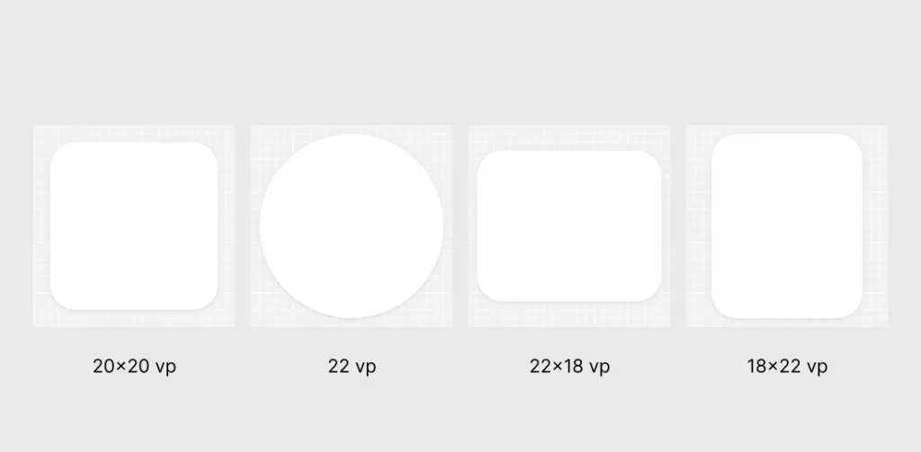
The final size of the system icon in HarmonyOS is 24vp with 1vp of space reserved around the drawing area. The drawing area depends on the shape of your graphics, which is:
| Shape | Sizing |
|---|---|
| Square | 20vp x 20vp |
| Circle | ⌀ 22vp |
| Horizontal rectangle | 22vp x 18vp |
| Vertical rectangle | 18vp x 22vp |
See the full guide for the interface icons on the official HarmonyOS portal.
App icon
HarmonyOS app icons adopt the neumorphism design approach, so using a semi-transparent blur effect and layered design techniques is preferable. The system automatically applies an adaptive mask to unify icons.
The final artwork should be uploaded in *.png. Here is the sizing:
| Icon size | Usage scenario |
|---|---|
| 512px x 512px | App main page preview in AppGallery |
| 216px x 216px | App preview in the list in AppGallery |
| 40vp x 40vp (120px x 120px, @3x) | Settings screen |
| 16vp x 16vp (48px x 48px, @3x) | Notification |
Check out the comprehensive app icon official guide here.
Desktop
MacOS
Here is Apple’s guide for designing macOS apps.
Interface icons
Standard sizes for all system icons in the Apple ecosystem are the following:
- 256px x 256px @1x, 512×512 px @2x
- 128×128 px @1x, 256×256 px @2x
- 32×32 px @1x, 64×64 px @2x
- 16×16 px @1x, 32×32 px @2x
You can find all the basics about interface icons for macOS at the SF Symbols page.
Couldn’t find the icon you need in the main catalog from Apple? Here are custom-made:
- SF symbols by Icons8
- iOS icons by Icons8
App icon
Use the drop shadow in the icon-design template. The app-icon template includes the system-defined drop shadow that helps your app icon coordinate with other macOS icons.
Create a 1024px x 1024px version of your macOS app icon for the App Store. In addition, you also need to supply the icon in the following sizes.
| @1x (pixels) | @2x (pixels) |
|---|---|
| 512×512 | 1024×1024 |
| 256×256 | 512×512 |
| 128×128 | 256×256 |
| 32×32 | 64×64 |
| 16×16 | 32×32 |
Learn more about the design guide for macOS app icons here.
Document icons
If your macOS app can use a custom document type, you can create a document icon to represent it. It looks like a piece of paper with its top-right corner folded down. This helps people distinguish documents from apps and other content, even when icon sizes are small.
You can supply a combination of background fill, center image, and text to create a custom document icon.
Sizes for the background fill image:
- 512px x 512px @1x, 1024px x 1024px @2x
- 256px x 256px @1x, 512px x 512px @2x
- 128px x 128px @1x, 256px x 256px @2x
- 32px x 32px @1x, 64px x 64px @2x
- 16px x 16px @1x, 32px x 32px @2x
Center images (pictogram) sizes:
- 256px x 256px @1x, 512px x 512px @2x
- 128px x 128px @1x, 256px x 256px @2x
- 32px x 32px @1x, 64px x 64px @2x
- 16px x 16px @1x, 32px x 32px @2x
Define a margin that measures about 10% of the image canvas and keep most of the image within it. Although parts of the image can extend into this margin for optical alignment, it’s best when the image occupies about 80% of the image canvas. For example, most of the center image in a 256px x 256px canvas would fit in an area that measures 205px x 205px.
You can use minimalistic icons from the Icons8 pack designed by Apple’s guidelines for your center image. The complete guide for macOS custom document icon design is here.
Windows
The complete info about icons used in Windows OS apps is on the official Microsoft page.
Interface icons
Windows 11 introduces a new system icon font, Segoe Fluent Icons. All glyphs in Segoe Fluent Icons are drawn in a monoline style. That means they’re created through a single stroke of 1epx.
For easier usage, the size of the icon complements the font size around it. For example, if you use 16pt font, put a 16epx *.svg icon next to it.
You can check these colored Windows 11 icons that fit with Microsoft guidelines.
App icon
When Windows displays your app’s icon, it will first look for an exact size match. If there is no match, it will look for the next size above and scale down. Including more icon sizes with your app means Windows will more often have a pixel-perfect match and reduce the amount of scaling applied to scaled icons.
| Windows 11 scale factor | 100% | 125% | 150% | 200% | 250% | 300% | 400% |
|---|---|---|---|---|---|---|---|
| Context menu, title bar, system tray | 16px | 20px | 24px | 32px | 40px | 48px | 64px |
| Taskbar, search results, Start all apps list | 24px | 30px | 36px | 48px | 60px | 72px | 96px |
| Start pins | 32px | 40px | 48px | 64px | 80px | 96px | 256px |
Here is the complete list of icons and variations for Windows OS.
Linux
Being an open-source OS made by developers, Linux doesn’t have its own human interface. Several significant contributors provide Linux users with an interface. In this article, we will cover the most popular.
GNOME
The largest human interface contributor to Linux. You can find GNOME Human Interface Guidelines here.
Interface icons
GNOME UI icons use the “symbolic” style. This is simple and monochrome and is designed to work well in smaller sizes. As an example of such minimalistic icons, you can use this pack by Icons8, which is designed for small interfaces and is not overloaded by too many details.
This is a list of all preferable sizes of symbolics:
- 16px x 16px
- 32px x 32px
- 64px x 64px
- 128px x 128px
The GNOME team strongly recommends using these sizes only and *.svg format to prevent fuzzy rendering.
See the main UI icons guide on the GNOME website.
App icons
GNOME’s app icon’s standard size is 128px × 128px. But the icon itself shouldn’t fill this space entirely. Follow the guides in the app icon template, and ensure your icon has a similar visual weight to other app icons.
App icons are defined at 128px × 128px but are typically viewed at 64px × 64px and can be scaled down to 32px × 32px. Therefore, avoid adding too much detail, as this will be lost at small sizes.
The official guideline is here.
KDE
Unlike any other guidelines in this article, the KDE design system divides icons into colorful and monochromatic types. Each has a separate design guide.
Interface icons
The size of the icon depends on the purpose:
| Icons type | Size in pixels | Purpose |
|---|---|---|
| Monochromatic | 16×16 | Menu items Tabs Buttons |
| 22×22 | ToolButtons | |
| Colorful | 32×32 | Category Preferences Places icons |
| 64×64 | MIME-type Devices Status icons |
Application icons
Application icons always use the colorful icon style. Their baseline size is 48 pixels.
Learn more about app icon design guidelines on the KDE website.
Elementary OS
Probably, the Linux contributor with the richest design environment.
Interface icons
Design each icon for the size it’s meant to be viewed at. So the Elementary team recommends you design icons in each size individually. Here is Dustin Curtis’ article, Pixel-fitting, that can help you with that.
The main system sizes for icons in Elementary OS are:
- 16px x 16px
- 24px x 24px
- 32px x 32px
- 48px x 48px
- 64px x 64px
- 128px x 128px
This sizing is also applied to the app icons. Note: only the colored icon can be used as the application pic. For more information, check the complete guide here.
Wearable gadgets
Watch OS
Apple doesn’t have any additional considerations for the watchOS since it uses iOS icon guidelines.
Interface icons
Here is a list of standard sizes:
- 256px x 256px @1x, 512px x 512px @2x
- 128px x 128px @1x, 256px x 256px @2x
- 32px x 32px @1x, 64px x 64px @2x
- 16px x 16px @1x, 32ps x 32px @2x
You can find all the basics about interface icons for iOS at the SF Symbols page.
Couldn’t find the icon you need in the main catalog from Apple? Here are custom-made:
- SF symbols by Icons8
- iOS icons by Icons8
- Simple small icons made perfect for tiny interfaces.
App icons
A watchOS app icon is circular and displays no accompanying text. Sizes in pixels:
| 38mm | 40mm | 41mm | 42mm | 44mm | 45mm | 49mm | Usage |
|---|---|---|---|---|---|---|---|
| 80×80 | 88×88 | 92×92 | 80×80 | 100×100 | 102×102 | 108×108 | Home Screen |
| 48×48 | 55×55 | 58×58 | 55×55 | 58×58 | 66×66 | 66×66 | Notification Center |
| 172×172 | 196×196 | 196×196 | 196×196 | 216×216 | 234×234 | 258×258 | Short look |
If you have a companion iPhone app, you must also supply your watchOS app icon in the following sizes.
| @2x (pixels) | @3x (pixels) |
|---|---|
| 58×58 | 87×87 |
You can find the official guidelines here.
Wear OS
Wear OS follows Material Design principles for iconography.
Interface icons
Interface icons for Wear OS are the same size as the main Android UI icons.
| Icon size | Purpose |
|---|---|
| 24dp | Pixel-perfect standard (Baseline) icon size |
| 20dp | Additional small-scale visuals |
| 40d and 48dp | For display or headline type and larger screen sizes |
Here are some handy sources to check:
- Material icons by Icons8
- Material icons catalog on Google Fonts
- Material icons Figma plugin from Google
- Design principles for icons in Material design
App icons
Since applications for Wear OS are available at the main Google Play app store, the sizing and format for the app icons here are the same as for Android.
- Final artwork size: 512px x 512px
- Format: 32-bit PNG
- Color space: sRGB
- Max file size: 1024KB
Google Play automatically applies a 20% squared corner radius to your app icon. Ensure that all important parts of your design fit 384px x 384px, and nothing will be cut. A shadow mask will also be applied automatically, so upload your artwork without it.
For more, check Google Play icon design specifications.
HarmonyOS for watch
Since the most important feature of this OS is about full adaptivity of the interface, HarmonyOS for watch icons guidelines is no different from HarmonyOS for other devices.
Interface icons
The final size of the system icon in HarmonyOS is 24vp with 1vp of space reserved around the drawing area. The drawing area depends on the shape of your graphics, which is:
| Shape | Sizing |
|---|---|
| Square | 20vp x 20vp |
| Circle | ⌀ 22vp |
| Horizontal rectangle | 22vp x 18vp |
| Vertical rectangle | 18vp x 22vp |
| Basic line width | 1.5vp |
See the full guide for the interface icons on the official HarmonyOS portal.
App icon
This icon type is consistent with that on the mobile phone home screen. Use round backdrops.
- Backdrop (slice) size: 76vp (transparent blank area around the backdrop)
- Icon size: 60vp.
The final artwork should be uploaded in *.png. Here is the sizing:
| Icon size | Usage scenario |
|---|---|
| 512px x 512px | Message notification on the locked screen |
| 104px x 104px | Launcher icon |
| 92px x 92px | Message notification details |
| 56px x 56px | Message notification level-2 list |
| 40px x 40px | Message notification level-1 list |
Check out the comprehensive app icon official guide here.
visionOS
Apple Vision Pro is all about new, multi-dimensional experiences, so its apps should also fit this new concept of “Spatial user interface.” Check Apple’s introduction video to learn the basics about this concept.
Interface icons
For the UI icons in visionOS use the standard list of sizing requirements that is general for all OS’s in the Apple ecosystem:
@2x (pixels) | Usage |
|---|---|
| 120×120 | Home Screen |
| 80×80 | Spotlight |
| 58×58 | Settings |
| 76×76 | Notifications |
More about it here.
App icons
A visionOS app icon is circular. It includes up to three layers:
- background layer
- one or two layers on top
Altogether, it produces the 3D effect. All layers should be provided separately as flat, squared images. Apple recommends designing mostly center-oriented layers for the best volume effect. More about this on Apple’s website.
Create an app icon that measures 1024px x 1024px for display in the Home View.
TV
tvOS
Here are the main guidelines from Apple about designing for tvOS.
Interface icons
TvOS uses the list of sizing requirements that are standard for most OS’s in the Apple ecosystem:
@2x (pixels) | Usage |
|---|---|
| 120×120 | Home Screen |
| 80×80 | Spotlight |
| 58×58 | Settings |
| 76×76 | Notifications |
More about it here.
App icons
App icons use the PNG format and support the following color spaces:
- sRGB (color)
- Gray Gamma 2.2 (grayscale)
In addition, app icons in tvOS support Display P3 (wide-gamut color).
The sizing is the following:
| @1x (pixels) | @2x (pixels) | Usage |
|---|---|---|
| 400×240 | 800×480 | Home Screen |
Android TV
Like for Android for smartphones, for Android TV, Google uses Material 3 as the main guidelines.
Interface icons
System icons are measured in dp. 1dp is basically equal to 1px on the 160dpi screen. If, for example, your interface is viewed on a 320dpi screen, 1px will be equal here to 2dp, and so on.
| Icon size | Purpose |
|---|---|
| 24dp | Pixel-perfect standard (Baseline) icon size |
| 20dp | Additional small-scale visuals |
| 40d and 48dp | For display or headline type and larger screen sizes |
Here are some handy sources to check:
- Material icons by Icons8
- Material icons catalog on Google Fonts
- Material icons Figma plugin from Google
- Design principles for icons in Material design
App icons
There are two formats to consider: banners and launcher icons for Android TV.
Banner
The Banner logo is a 16×9 aspect ratio logo used in Android TV OS to show your app launcher. You can also provide xhdpi resources with the size of 320px x 180px when using API level 25 or lower.
| Density | Min Size | Pixel Ratio |
|---|---|---|
| mdpi | 160px x 90px | 1 |
| hdpi | 240px x 135px | 1.5 |
| xhdpi | 320px x 180px | 2 |
| xxhdpi | 480px x 270px | 3 |
| xxxhdpi | 640px x 360px | 4 |
Launcher icon
The Launcher icon is a 1×1 aspect ratio resource used in multiple places, such as Settings and Media session integrations (Now playing card) on Android TV. The launcher icon can also be used in the Your Apps row on Google TV.
| Density | Min Size | Pixel Ratio |
|---|---|---|
| mdpi | 80×80 px | 1 |
| hdpi | 120×120 px | 1.5 |
| xhdpi | 160×160 px | 2 |
| xxhdpi | 240×240 px | 3 |
| xxxhdpi | 320×320 px | 4 |
A full guide on creating app icons for Android TV is here.
Tizen OS
Most of the Samsung Smaty TVs use Tizen OS. This open-source operational system allows you to customize your app for it freely.
Interface icons
There are no strict rules about interface icon sizing in Tizen Os for smart TVs. Here is the list of the most common sizes used depending on the screen type:
| Resolution | Icon asset size (pixels) |
|---|---|
| HD | 118 x 118 |
| WQHD | 236×236 |
| WVGA | 81×81 |
Check full guides on the main developer’s website.
App icons
The main icon should have the following properties:
- File format: PNG file with a transparent background
- Size for a WVGA-screen device: 82px x 82px
- Size for the Tizen Store: 512px x 512px
NOTE: Always surround each icon with 2 pixels of transparent free space.
An application icon for Samsung Smart TV for 2016 model groups and later has two images. To correctly display your application icon on 2016 Samsung Smart TVs and later, you must comply with the conditions:
| Required File | Image Size (px) | Image Format |
|---|---|---|
| Logo Image | 1920×1080 | 32-bit PNG (RGBA) |
| Background Image | 1920×1080 | 24-bit PNG (RGB) |
Summary
When designing the app, always check the requirements of each OS since they sometimes can be tricky.
For an easier way, you can always choose icons from the main OS’s catalog:
- SF Symbols 5 by Apple
- Material symbols on Google fonts
- WinUI Gallery sources by Microsoft
You also can use these custom-made icons: