The year 2019 sees some established trends go in full force and some new patterns emerge. As a web design expert, you have to keep your hand on the pulse of the industry. Here are the trends for ecommerce that we believe are worth your attention this year.
Minimalism
The days of mind-blowing designs seem to be over. Wow-effect complex graphics used to be a big thing, but it’s not as popular now. People value well-made minimalistic projects these days.
It’s not just about being trendy either. While intricate UI looks great, ultimately, it’s not what people are looking for on an e-commerce website.
Sure, good looks are essential for the website to appeal to users. However, good navigation, secure authentication, and good content are much more critical.
By creating a good looking minimalistic design, you save your time and budget to work on more important things.
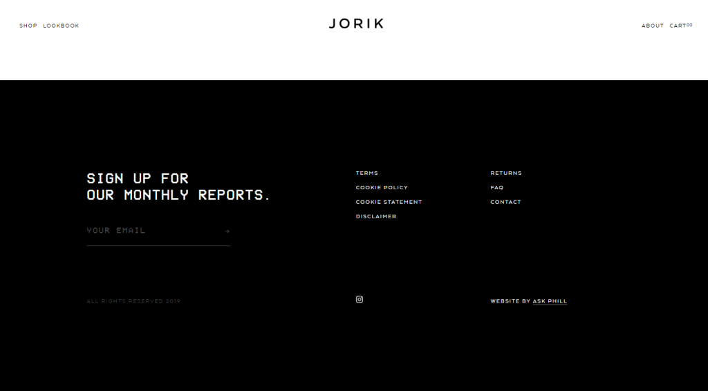
Here’s how Jorik does a great job with minimalism on their footer.
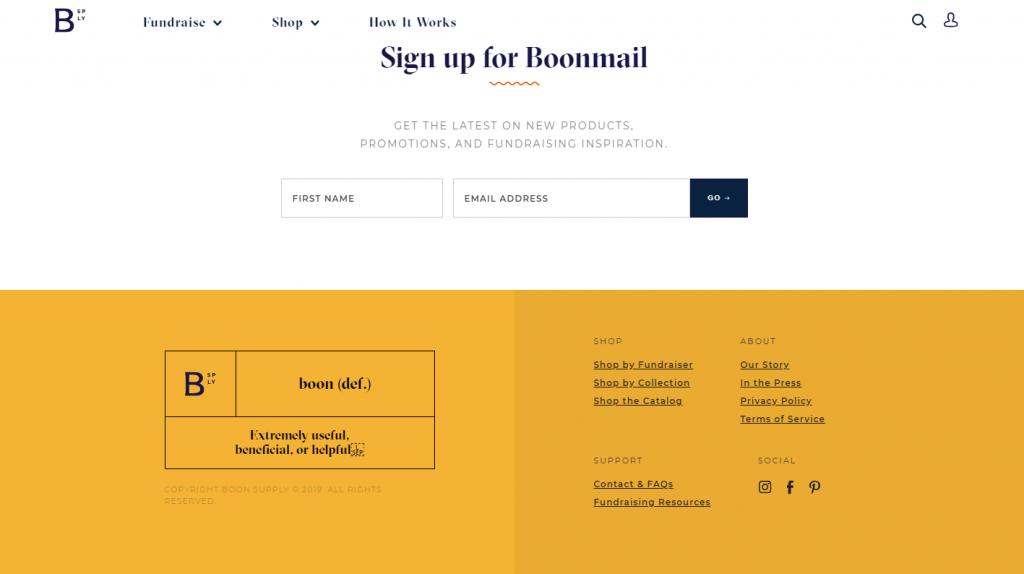
Boonsupply, an all-purpose e-commerce website and a fundraiser, makes their footer rather minimalistic in terms of colors.
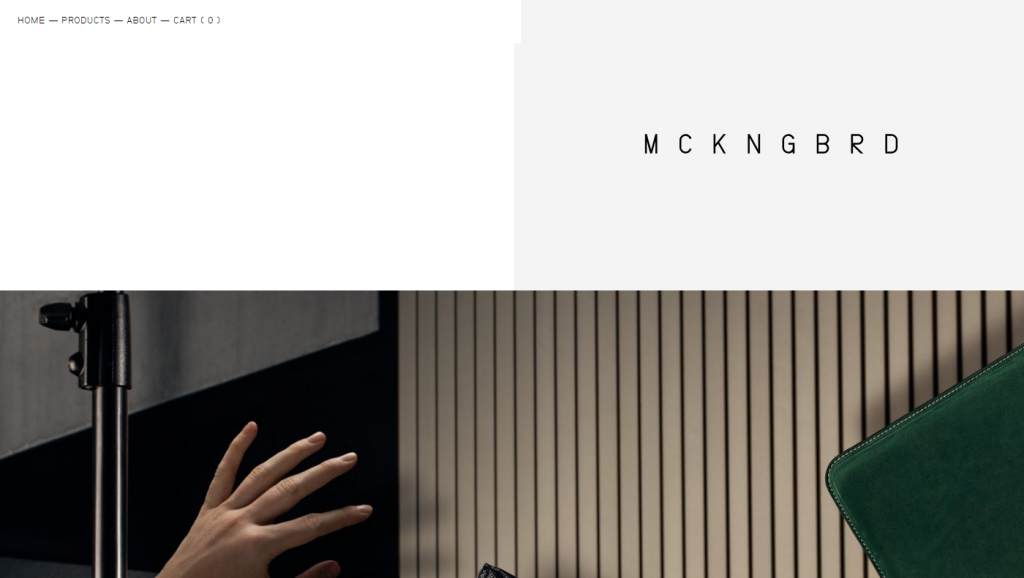
Fashion brand MCNBRD makes their whole website purely minimal.
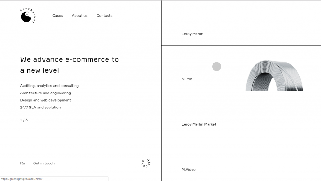
An e-commerce consulting agency Greensight steps even further into minimalism.
Bold Headlines
There’s a massive competition for attention on the web. How do you get people to stay on your site? One of the possible answers to this question is to make your headline bold and huge.
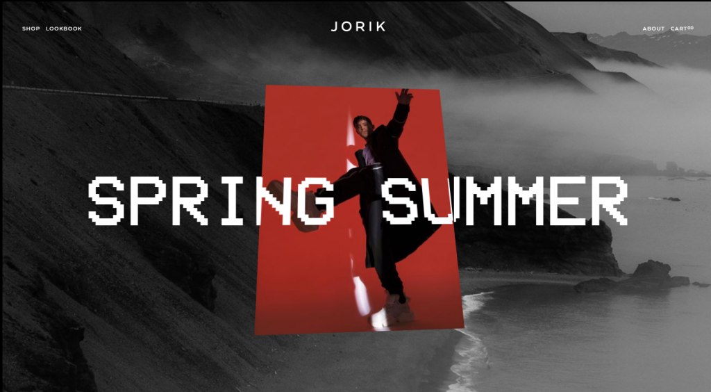
Take a look at how Jorik fashion brand managed to do this.
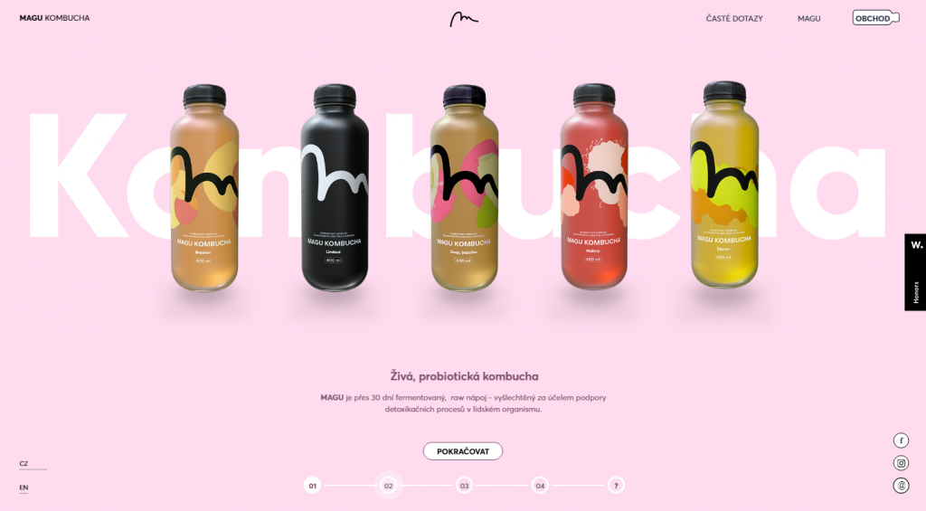
Here’s how Magu Kombucha creates a bold headline. The design is quite minimalistic as well.
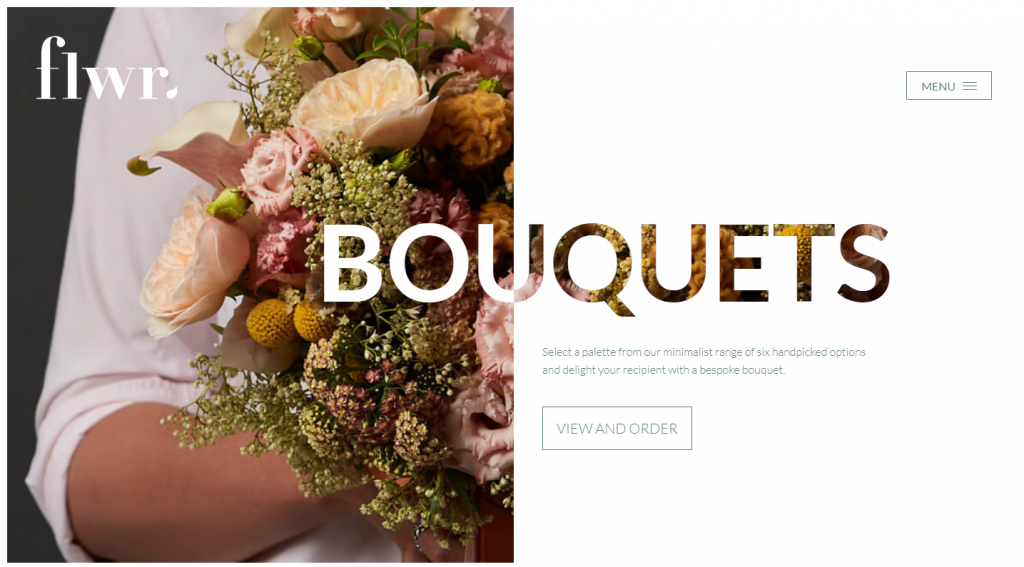
Flwr, a company that sells floral decorations, makes a bold statement with their headline like this.
Focus on Content
By this time, you all know full well that content is king. Its importance is not going to decrease any time soon. Good content is and will be one of the core components of a good UX design.
Creating content that matches the expectations of the reader is not the only thing you can do to make your website better.
Make your content engaging and readable both on the textual and the visual level. Here’s what you can do to make your text easier to read:
- Short sentences
- Small paragraphs
- Bullet point lists
- Headlines to split up content
- Use informal style
When you end up with a great piece of content, here’s how you make it even more readable from the visual standpoint:
- Don’t overdo the fonts
- Work on line spacing
- Give the text some white space
- Support it with images
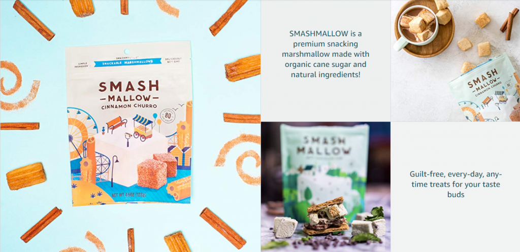
Here’s how SmashMallow presents their products on Amazon.
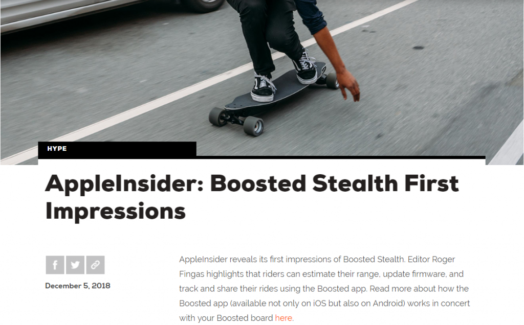
A good example of typography is the blog of Boosted, the leading company in electric skateboards sales. It’s simple and readable, with few fonts.
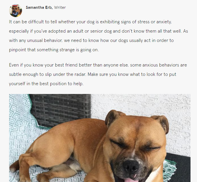
Here’s an example from an ordinary e-commerce website, BarkBox. This blog post is informative to the target audience of this shop and uses basic but efficient typography.
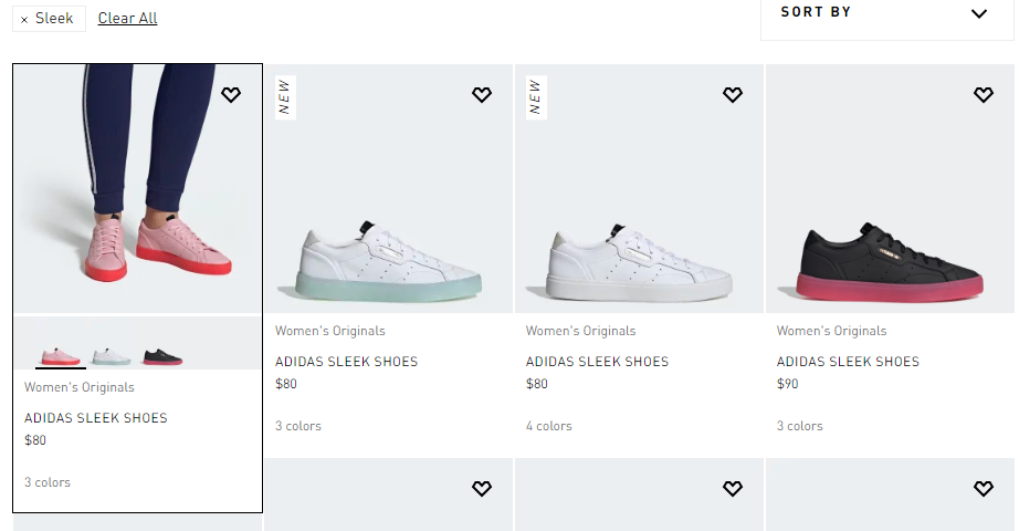
If your products look great on photos, focus on imagery as a content strategy. This is how Adidas does it.
Visual Storytelling
People do not have the time to read through a thousand words to get the general idea of how great your product is. This is why in addition to making the text readable, you should consider conveying your message without words.
As creatures that consume most of the information about the world visually, we can interpret pictures way faster than words.
Using visual storytelling on your website makes it easier for visitors to get the main idea. Here’s how can you leverage the power of visuals to tell your story to the customers:
- Show a video
- Use motion pictures
- Support text with images
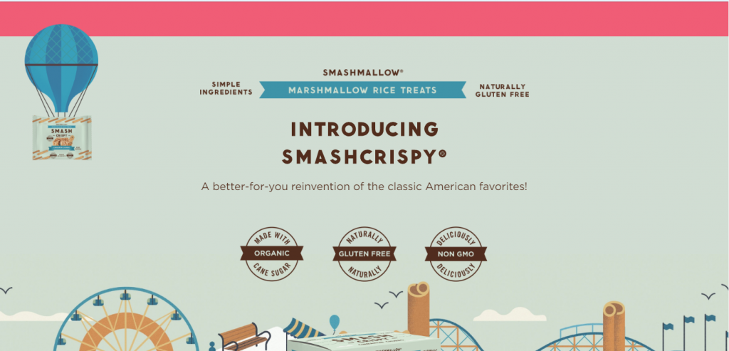
Here’s how SmashMellow tells their story with the help of the visuals.
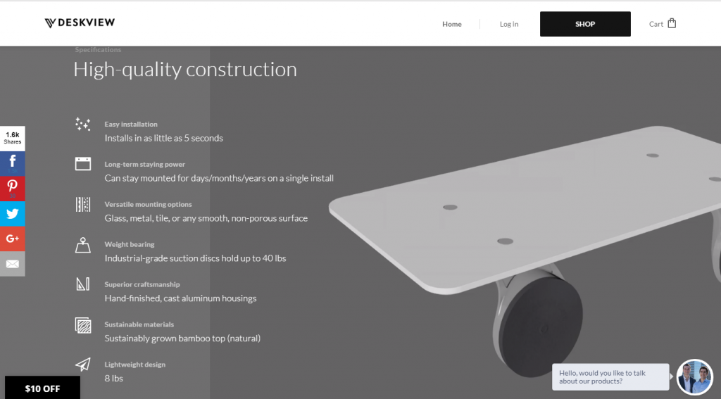
Here’s how Deskview shows the benefits of their products with visual storytelling.
Personalized Experience
The web is getting more and more personal. Google knows what you were searching and offers you ads on the basis of that. But that’s not all there is to personalization. Services like Netflix, Airbnb, and Spotify track your personal preferences and give you a list of products you may like. Their algorithms are able to make each user’s page unique and appealing to them.
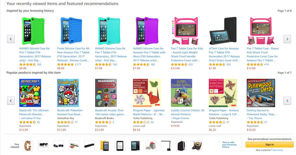
If you’ve ever used Amazon, you know that at the bottom of the page you can see recommendations. If you have an Amazon account, you can receive personalized tips on what to buy. The AI will study your browsing history to learn what do you like.
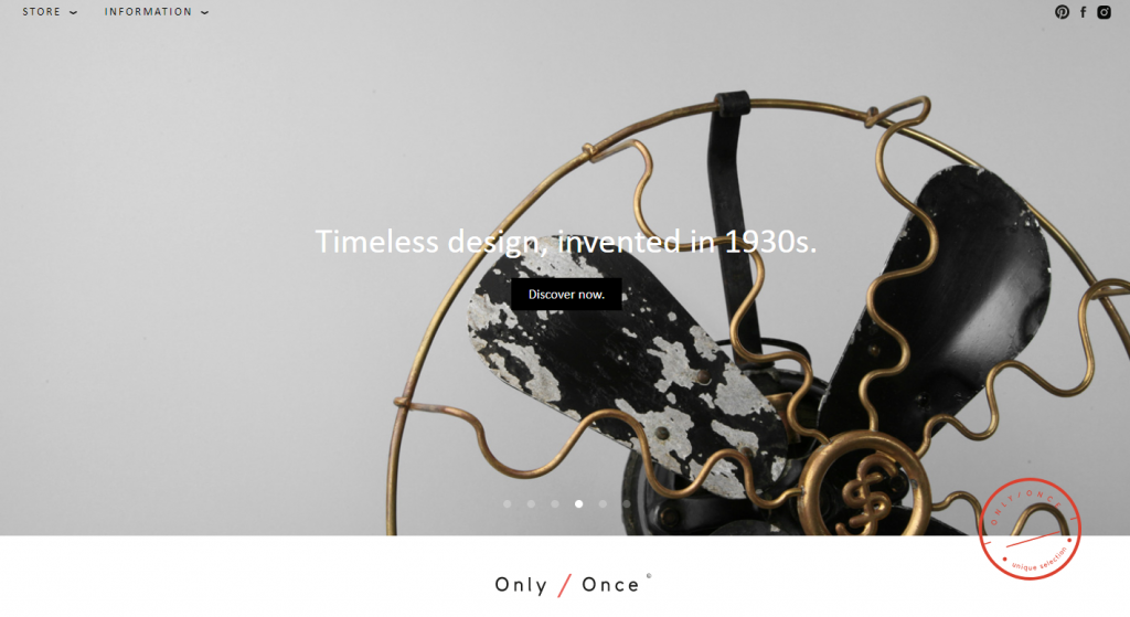
The premise of Onlyonce store is that all products are unique and you will be one of the few to own them. This creates a sense of personalization.
If your business is not like these platforms, there’s still space for personalization.
People love it when they are offered something unique. The sense of getting a bargain increases sales. This is why offering discounts and hot deals always work. Here’s how Avira in cooperation with CouponBuffer.com did this.
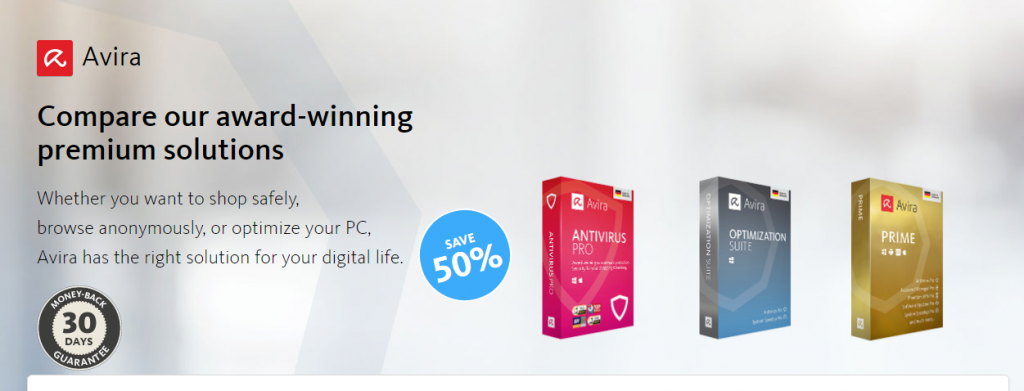
They offer a unique discount to visitors to kick start sales. Note that the page mentions a money-back guarantee to help to make the decision easier.
Create customized photos to make your website stand out among thousands of others that use stock photos.
Device-Independence
Mobile-first has been the focus of UX design for a long time. This is not going to change either.
Most people in the world use their smartphones to browse the web. With more and more affordable phones entering the market, you can’t but reflect this in your design.
Consider accessibility of the design for all devices and people that might use it. This includes making it scalable for mobile as well as reading programs friendly to help visually impaired clients.
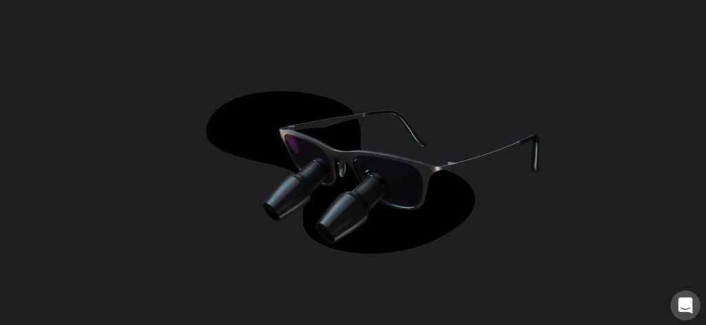
Compare how Bryant Dental website displays from desktop and mobile.
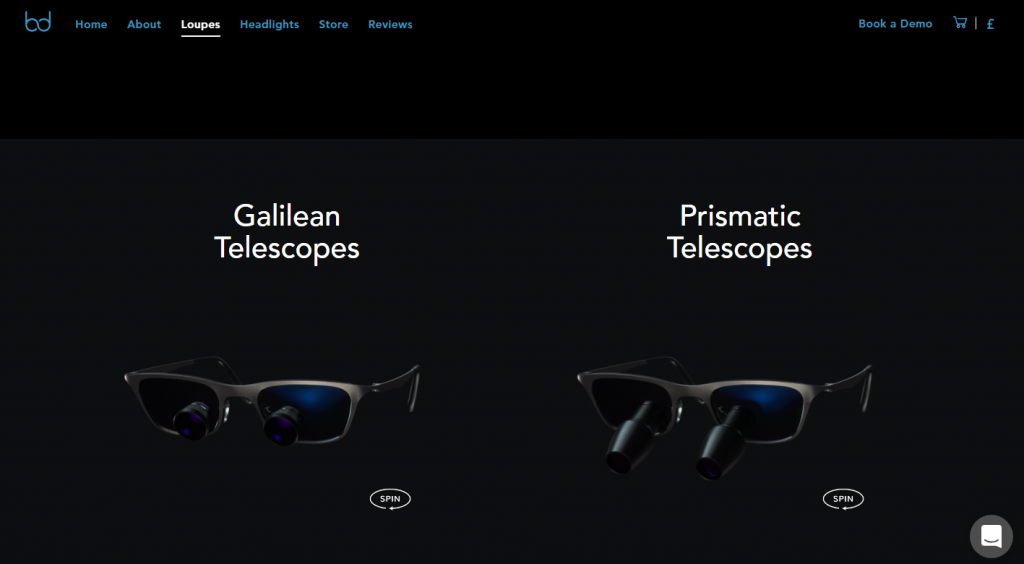
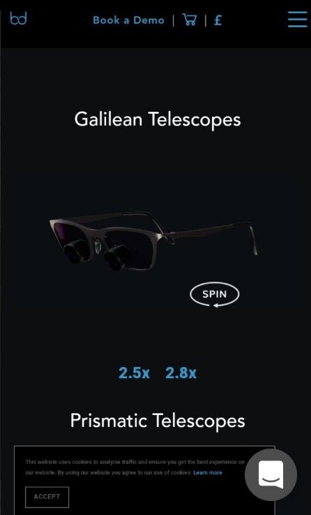
The website presents the same message and imagery but treats mobile and desktop users differently. You can also rotate the glasses on this screen with touching it.
Fast Loading Speed
One of the reasons large scale animations are out of the picture is because of the loading speed.
Mobile users tend not to wait around for your website to load fully. While many PCs are good enough to load average sites quite well, smartphones may take about five seconds to do that.
This may not look that big, but you must know the frustration of having to wait on the internet.
Here’s what you can do to improve this part of user experience:
- Compress images
- Use cache & cookies
- Optimize JavaScript
Creative Illustration
One of the biggest UI trends that emerged in the recent year is using original illustration instead of stock photos. A light an upbeat style of illustration that many digital artists now use help establish a brand image that appeals to young people.
Bold artistic styles catch attention. You don’t have to spend tons of money on creating eye-catching imagery. Use humor and cuteness instead to appeal to your visitors.
Here’s how SmashMellow, a website that sells marshmallows, leverages the power of creative illustration.
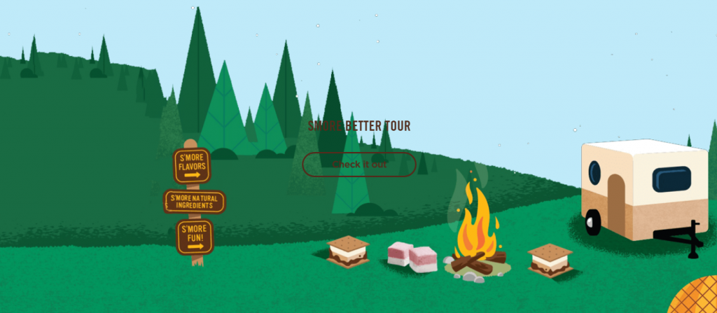
Google Store also makes use of custom imagery.

Take a look at what one of the Ouch artists did with this Fatal Error illustration.
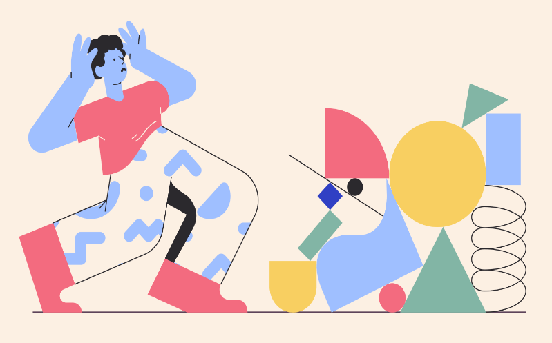
This Message Sent illustration in Flamenco style is not what you typically see on websites.

And this vector illustration in Fogg style would make for a great 404 page.

You can also commission an artist to create a brand style that can make you stand out among the competition.
Surreal and Abstract Imagery
Whether it is the web punk slowly making it into the mainstream, or the influence of the last season of Twin Peaks, some websites go bizarrely abstract. There’s no reason from the perspective of UX to do this. Well, perhaps the only one is that it definitely attracts attention.
Here’s a bit of abstract animation that Bryant Dental brought to life.
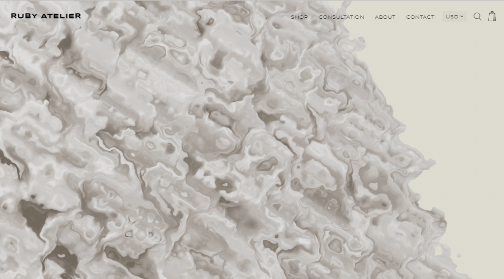
Ruby Atelier, a furniture and decor store, make the transition between products on the landing page completely surreal.
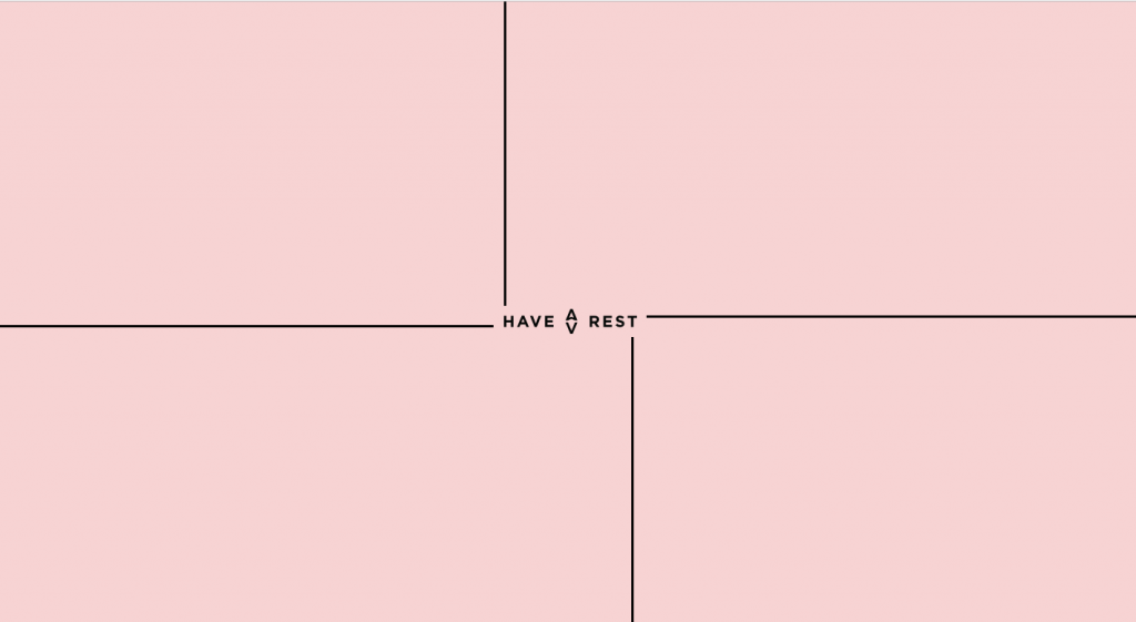
This is how the loading screen of Have a Rest brand looks like.
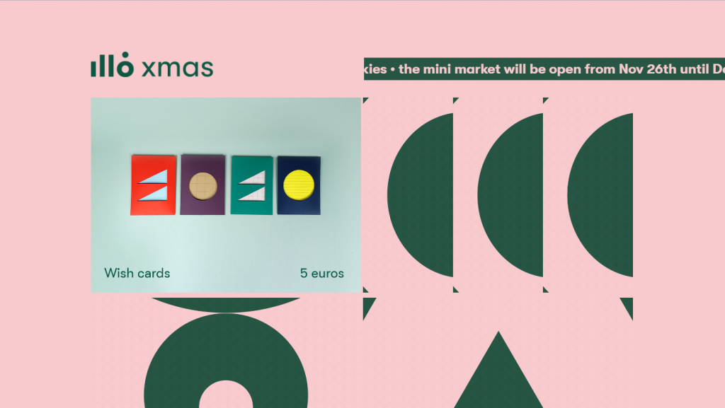
The illo Xmas mini market looks as abstract as it gets. It also uses upbeat music to match the atmosphere.
Closing Words
Some people see a trend and follow it blindly assuming it’s the way to go to success. But that may lead you down the wrong path.
There are two types of trends on the web. The ones that actually help your UX because they’re based on human psychology and A/B testing, and the ones that make your website look hip.
The first type is the ones to incorporate into your website no matter what. The trends from the second type are harder to deal with. On the one hand, they make your site look fresh, and distinguish it from the others. The choice of whether to redesign your website every so often is yours, but the ultimate advice goes as follows.
Implement what works better, but always keep your style consistent.
About the author: James Riddle is a freelance writer with a passion for new technologies, marketing trends, and branding strategies.
Title image from Ouch, the big collection of free vector illustrations
Check the lists of top logo design trends, read how to cope with banner blindness, review the set of design strategies for e-commerce, and explore how to design a website footer.