Every user wants fewer ads, every businessman wants ads to work effectively and bring more customers. Banner blindness is the phenomenon of having an impact on both sides. Today’s article shares the set of recommendations on dealing with banner blindness from Dmitriy Tkach, a marketing specialist from Plerdy.
It was in 1994 when the first banner advertisement in the world was launched. Its click-through rate (CTR) was 44%. However, there were only around 30 million active internet users at that time. Today, the effect of this kind of advertising has reduced by a hundred times. The main reason for this trend is banner blindness.

What is banner blindness?
Banner blindness is a behavior feature of modern internet users. It’s based on the fact that people ignore the elements of the page similar to advertising. Regardless of how bright and thoughtful the ad will be, 99.9% of users will not click on it.
The cause of banner blindness uprise lies in advertising abundance. Every day we see thousands of ads in the streets, around the internet, and on TV. Not to get overwhelmed with too much unnecessary information, our brain has learned not to pay attention to advertising. It “captures” out of context only the information and elements we need.
Statistics of banner blindness:
- 54% of people do not trust banner advertising.
- According to 33% of users, banner advertising is inappropriate.
- An average click-through rate for banner advertising is 0.01%.
- Up to 50% of clicks on banners made via smartphones occur by accident.
Why Is Banner Blindness a Problem for E-commerce Websites?
It may seem that the problem of banner blindness is a concern of only those who run an advertisement. However, it’s not exactly this way. The issue is relevant also for e-commerce platforms.
Human brain does not function perfectly. That’s why it often takes for advertisement the elements of a page which are only visually similar to but don’t present advertising. This factor should be considered when the design for e-commerce websites is created.
Moreover, if you run a banner ad on your website, visitors will pay much less attention to elements placed next to it. In the case of monetization of an online resource with the help of banners, do not put them close to the elements of the page which are important to the user.
How to identify “blind zones” on the website page?
“Blind zones” are the elements of the page that get much less user’s attention. Let’s consider 2 most efficient ways to identify the “blind zones.”
- Google Analytics tools. With these tools, you’ll discover which links on the website are clicked most frequently. To identify “blind zones,” it is necessary to master Google Analytics services quite well. Also, you have to spend a lot of time to collect statistics and analyze all the clicks on your website.
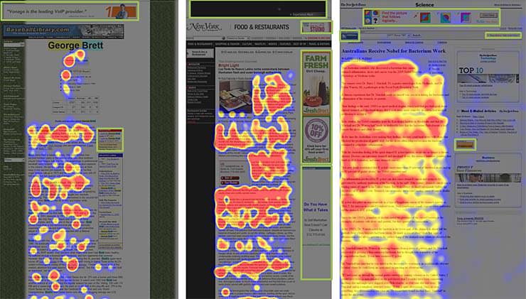
- Click-maps. They will pointedly demonstrate to you how many clicks were made in particular zones of the page within a selected timeframe. For example, using Plerdy service, you can see which elements of the page attract attention, and which form the “blind zones.”
Top 7 tips on how to overcome banner blindness
Banner blindness significantly decreases the website performance. Fortunately, there are ways to minimize banner blindness and make banners more effective.
Take A/B testing
Split tests (A/B testing) is a technique to identify a more efficient option to use a particular tool. In the case of banners, A/B testing will look like this: you create 2 banners with various designs. You show one option to half of the website visitors. The second half of the visitors see a different design. A couple of days later you analyze which banner has demonstrated a higher efficiency, and after that keep it on your website.
Split tests can also be carried out to find out a more advantageous location of the banner on the website.
Change the location of a banner
The majority of websites advertise in the same places. Users get used to that and stop paying any attention to banners.
Try to put promo materials and banners possessing important information in the following places:
- In the text or right after it. If a user reads your article carefully, he or she can’t fail to notice a banner in the text. As you can see from the images, banners integrated into text attract more user’s attention.
- At the very top of the page. Users look at the upper elements of the page because there can be a place of a navigation menu and essential information.
Important! Always give close attention to the banner design and track the CTR (click-through rate) for each. - Play around with adding icons of social networks, animations, and video to advertising materials.
Optimize a website and banners for mobile devices
Year by year more and more people are using the internet via smartphones. Take this factor into consideration developing a website and banner design. To find out whether your website is optimized for mobile devices, use a free service from Google.
Working on a design for mobile devices, keep in mind that websites should not lose a logical structure, and advertising banners should not overlap important information.
Use relevant content
You should understand the needs of your audience. While creating a banner, consider how it will help to solve a user’s problem.
How to create an effective banner:
- Before creating a banner, clear up what the users want
- Use relevant content. Including keywords that meet the needs of the target audience
- Use cookie files when placing advertising banners on someone else’s websites. This way, you’ll show an advertisement only to those people who have already visited your website
Be unconventional
Every day Internet users see hundreds of advertisements of standard sizes, colors, and calls to action, so they are getting used to them and stop responding.
Select a nonstandard shape of a banner and check out the result. Banner in the shape of a triangle, diamond or oval may be more fruitful than standard boring rectangular banners. Make banner a part of a page, so it would naturally match other elements not looking like a separate alien structure. Use unordinary colors, 3D-graphics, and motion effects. You’ll be surprised to see how the banner’s performance increases.
Be on the same page with a user
It’s great if you know what the target audience wants. Ideally, if you want the same thing and completely mind around the client’s issue. In this case, you’ll always get a better result both out of banners and a website in general.
Always improve yourself
If you have identified “blind zones” of website pages and managed to eliminate them, keep working on increasing the performance of the website. Always test new options for interaction with users. The thing that works well today may become inefficient tomorrow.
Conclusion
Today banners do not demonstrate the same high-efficiency rates as they did several years ago. However, they still remain to be a reliable and effective tool for advertising and attracting users’ attention.
To overcome banner blindness, always do your best to think on behalf of your target audience. That will help to produce more relevant content. Doing so, don’t forget to analyze the results and continuously improve the website.
About the author: Dmitriy Tkach, a marketing specialist from Plerdy
The original article was published on Telegraf Design
Title image from Abstract illustrations on Ouch
Check Ouch, the collection of free vector illustrations for design and marketing projects, read how mood boards improve design process and what’s accessibility of mobile applications