One of the core elements of effective design is typography. Our today’s post shares insights into typography for beginners: here you’ll check core terminology and handy infographics.
Definition
Typography is known as the art and skill that is related to arranging and making the language readable and appealing when it is displayed. The arrangement includes the typefaces, lengths of line, spacing the letters, etc.
Typography as a term also is applied to the style and arrangement of the letters, symbols, and numbers that are created by the process.
History of Typography
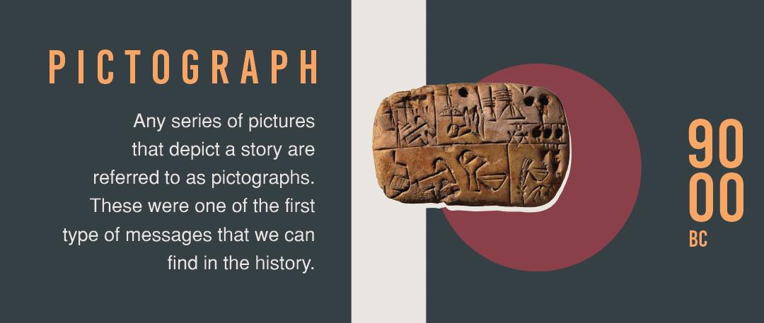
Pictographs: These are the stories that are told in earlier ancient times in single pictures. They were initially found in 900 BC.
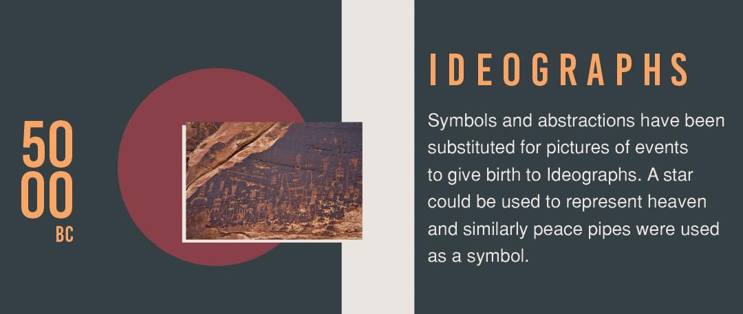
Ideographs: They came in place of symbols and abstractions instead of pictures of events. These were used in 500 BC.
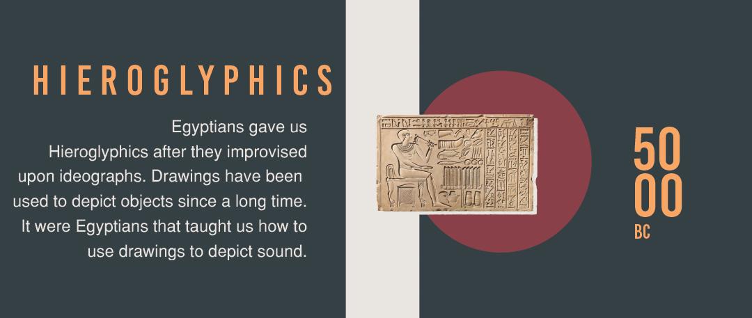
Hieroglyphics: These were invented by the Egyptians in 500 BC. They worked on the ideographs and made drawings that in a way depicted drawings.
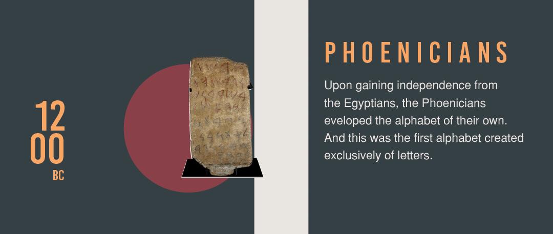
Phoenicians: They invented their own alphabets after they got freed from the Egyptians. Those were the very first alphabets that involved letters too in 1200 BC.
The history of typography also includes the adoption of language by Greeks and Romans, Croline Miniscule, etc.
Classification of Typefaces
There are 4 basic types of typefaces.
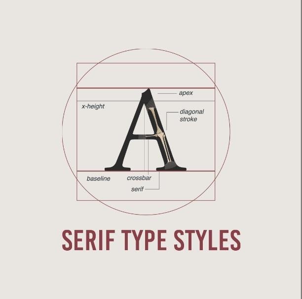
Serif
These typefaces are also known as Serifs with respect to small lines which are linked with the main strokes of characters in the face. The typefaces are used as the copy of print documents and also for the body texts and online headlines.
Types of Serifs include:
- Old Serif like ITC Berkley Old style, Goudy Old style, etc.
- Transactional like Times New Roman
- New Classical like Didot and Bodoni
- Slab Serifs Like American Typewriter
- Clarendon Serifs like Bookman
- Glyphic Serifs like Cartier Book and Friz Quadrata etc.
Sans Serif Styles
Square: These are based on the behaviors of grotesque. They have a very specific squaring of curved strokes.
Grotesque: These come in the very first famous sans serif fonts. The dissimilarity in the weights of strokes is the most obvious thing in such typefaces, whereas the curves are a little squared.
Geometric: The strokes in such typefaces fonts are strictly monoline, whereas the shape of the characters is in the form of geometry.
Humanistic: The characteristics of this one is based on the Roman Letters inscription. The humanistic sans serif comes in the most readable fonts.
Script Styles
Calligraphic: These are exactly like calligraphy. These are lined or non-linked in designs. Works both ways.
Casual: They are not formal just as they are written very quickly. The strokes in the characters are the ones which connect the letters.
Formal: These were found in the 17th Century in the writing scripts. The strokes in the letters are linked with the other letters like Blackletter and Lombardic. The fronts are based on the manuscripts letters that are dominant before the creation of the movable types.
Decorative Styles
The decorative styles come in very different and huge categories. They are used in the signage and headlines. These actually represent the culture of today that is tattoos and graffiti.
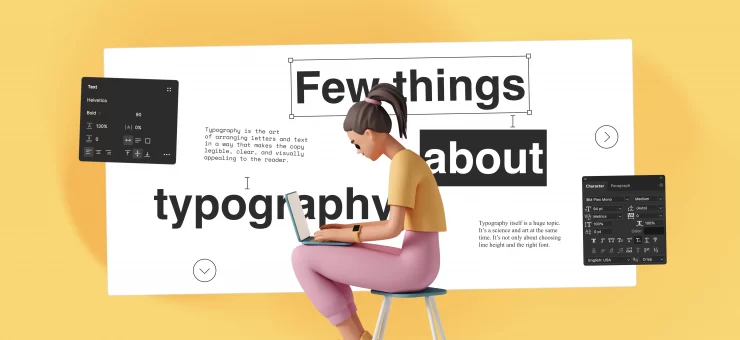
Below you can check the full version of the infographic on typography basics.
About the author: the post and infographic were prepared by Vowels Advertising who know much how to empower visuals and typography for effective adds.
Title illustration from Pablo pack on Ouch, free vector library
Read about the basic principles of creating vector illustration, check best free vector software, learn how typography logos work and how to create viral content