What is the difference between typography and typeface, what are the attributes of a font, and how great should a line height be? Let’s take a look.
This article is written by Victor, who has been working as a frontend and backend developer for more than 10 years and has 3+ years of experience in UX design.
First of all, let me cite a definition of typography that I’ve just googled: “Typography is the art of arranging letters and text in a way that makes the copy legible, clear, and visually appealing to the reader.”
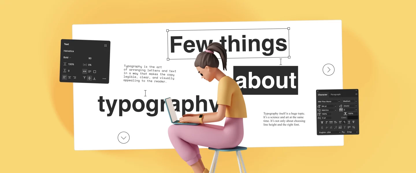
Typography itself is a huge topic. It’s a science and art at the same time. It’s not only about choosing line height and the right font. Have you heard about such terms as:
— Ascender
— Descender
— Counter
— Loop
— Bowl
— Shoulder
— Bar
— Swash
— Minuscule
— Baseline
— Cap height
And many many other things? If yes, then you’re probably already good at it.
However, the aim of this article is not to cover everything about typography, as that might require a dedicated book.
In this article, we’ll go through the most common things to consider when you develop or design a web application. These are the basics. Most of these things are not strict rules. Keep in mind that every case is unique, and every rule has an exception.
What is typeface and what is font?
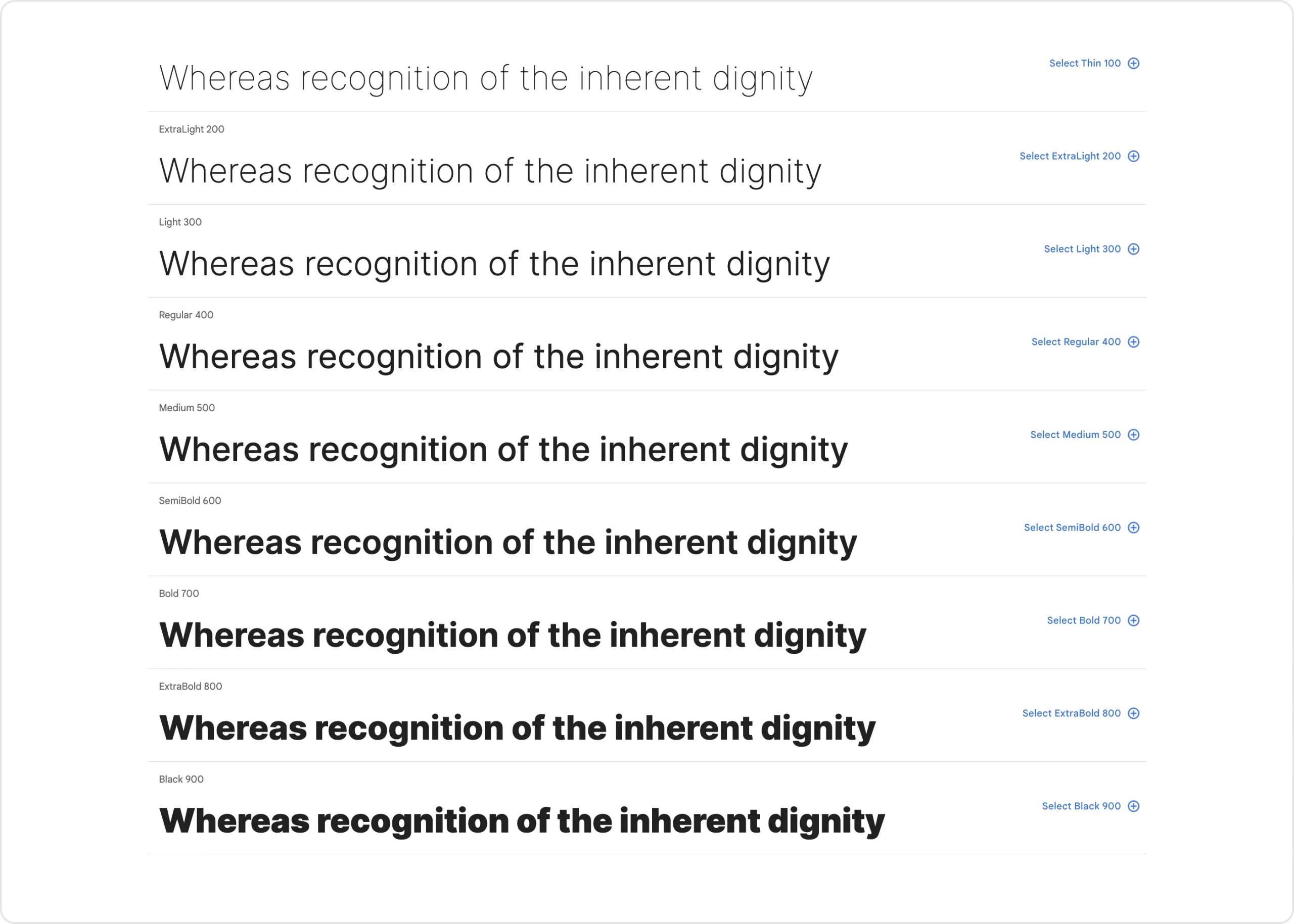
Typeface: Think of this as the “family name” for a group of related fonts. It’s the overall look or style of the letters and characters.
Font: This is like a specific member of that family. It includes a certain size, weight (like bold or regular), and style (like italic) of the typeface.
If you go to Google Fonts and choose a typeface (Inter in this case), you’ll see different variations of it. These variations are referred to as fonts. Basically, these fonts are just files with different formats such as OTF, TTF, WOFF, etc.
This is important to know, but nowadays, people quite often use the term ‘font’ instead of ‘typeface.
Which typeface should I choose?
That’s another huge topic, but there are a few things to consider:
- Limit the number of typefaces. One or two is usually sufficient.
- Serif typefaces are easier to read for lengthy text. For blog posts or extensive texts, serif typefaces might be a good choice, even though it’s not a strict rule.
- There is a thing called “web-safe” fonts. These are fonts installed on the vast majority of devices, so you don’t need to include them on your site
- If you use TailwindCSS, the default font will be system-ui. The specific font will depend on the users’ operating system: Segoe for Windows, San Francisco for macOS, and Roboto for Android.
In a nutshell, you can choose one of the popular typefaces, stick to it, and then use different fonts (weights and sizes), and that’s all there is to it.
Personally, I would recommend going with the Tailwind approach since the font will look familiar to users, and you won’t have to worry too much about it.
Should I justify the text?
No.
The reason is that it might lead to what is called “rivers.” Wikipedia’s definition explains: “In typography, rivers (or rivers of white) are gaps in typesetting, which appear to run through a paragraph of text due to a coincidental alignment of spaces.”
Visually they look like this.
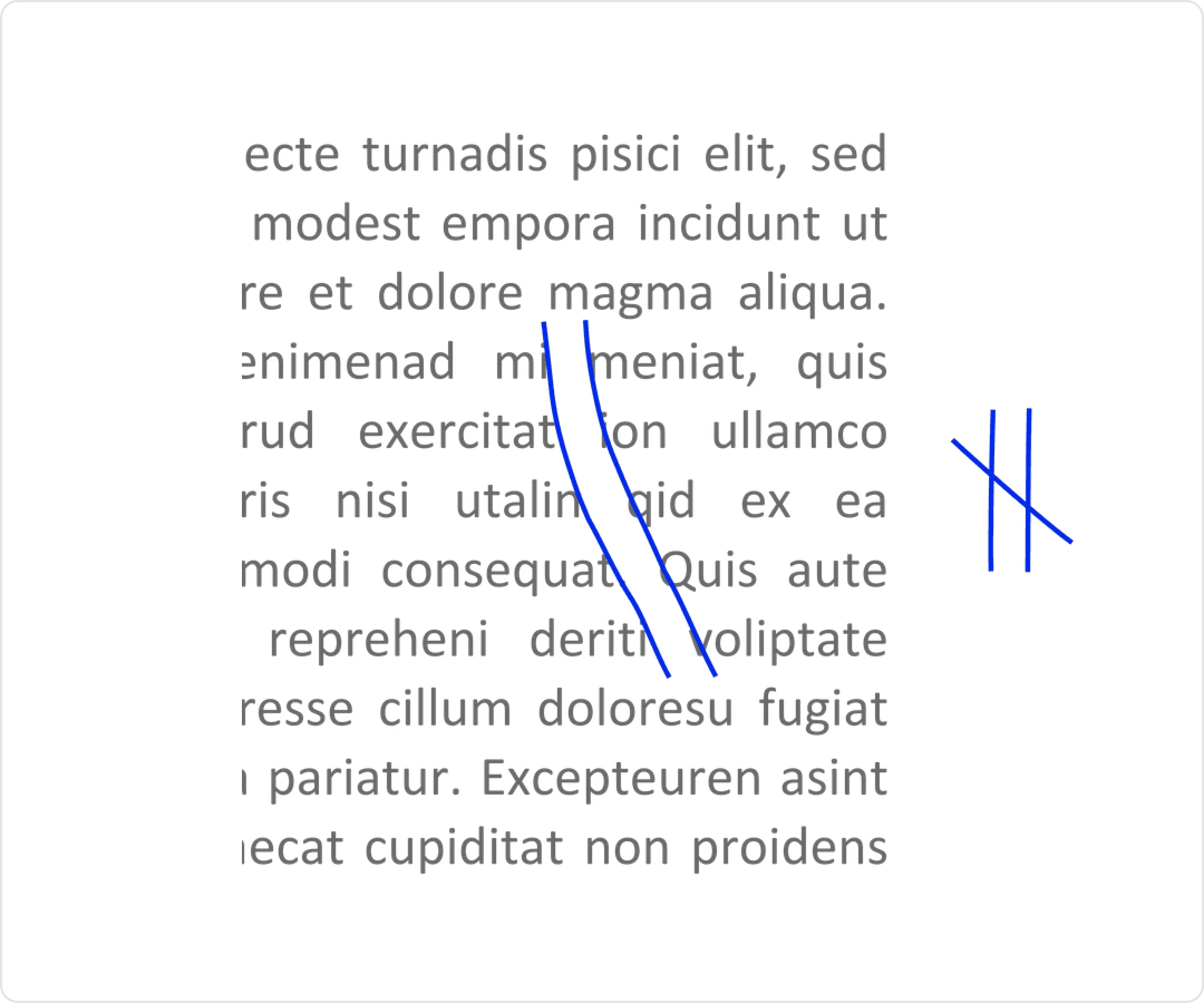
This is especially noticeable when you have narrow columns of text.
Even if you don’t encounter a river, you might still end up with gaps between words that don’t look good.
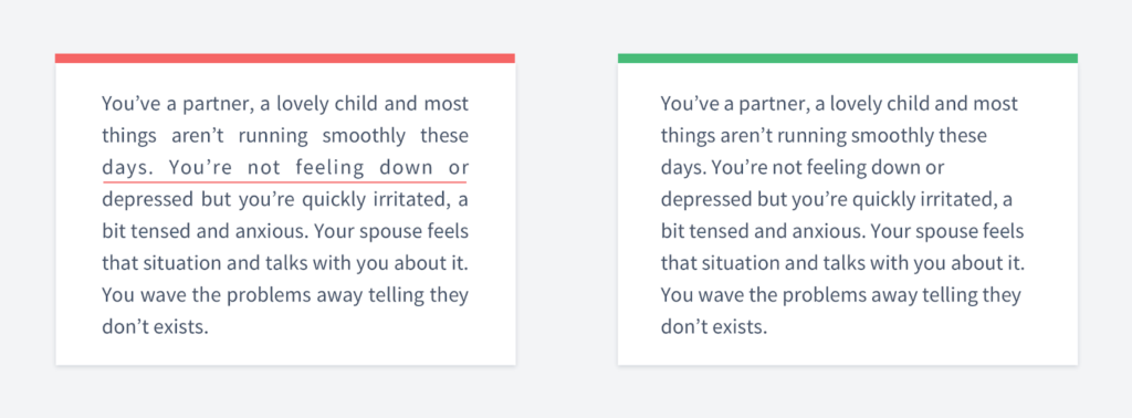
Should I center the text?
Only if it consists of a couple of sentences, such as in the hero section of your landing page.
Otherwise, you may encounter a problem where your eyes will move in a Z-pattern.
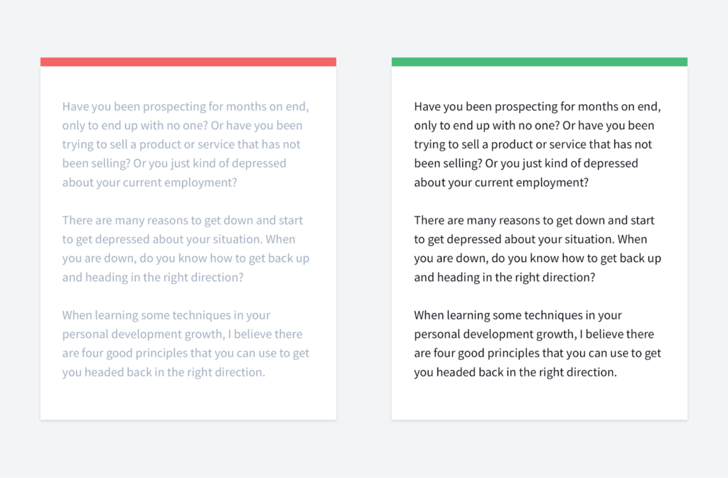
What about line height?
There is an interesting rule to know: The smaller the font size, the greater the line height should be, and conversely, the larger the font size, the smaller the line height should be.
The reason for this is that large fonts are already easy to read, so the lines can be close to each other. Meanwhile, for small font sizes, it will be much harder to read if the line height is small.
Again, this is not a strict rule.
Usually, when you have typical text with a font size of, say, 16-18px, you might want to choose a line height between 1.3 and 1.5.
In Tailwind, the maximum value they have is 2, which can sometimes make sense.
For example, imagine you have a landing page that is almost empty but features nice-looking, slightly bold text in the center of the page with a fancy typeface.
You may want to add more space to let the typography breathe and focus on it.
In any case, use common sense and always take an overall look.
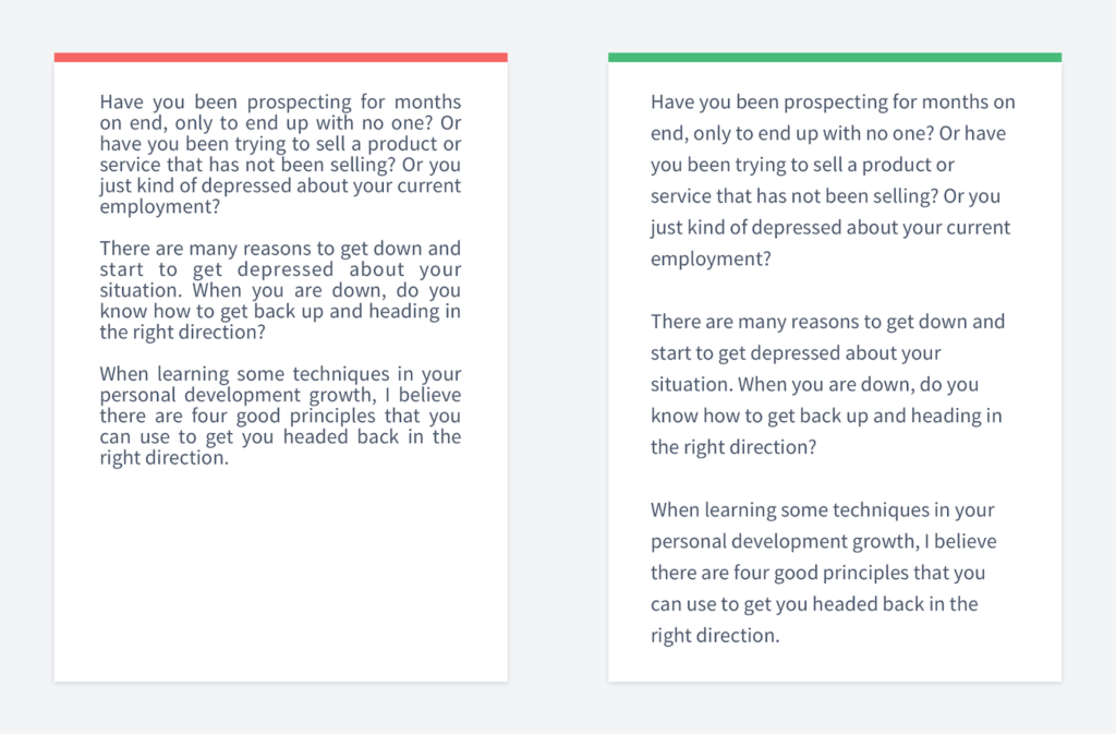
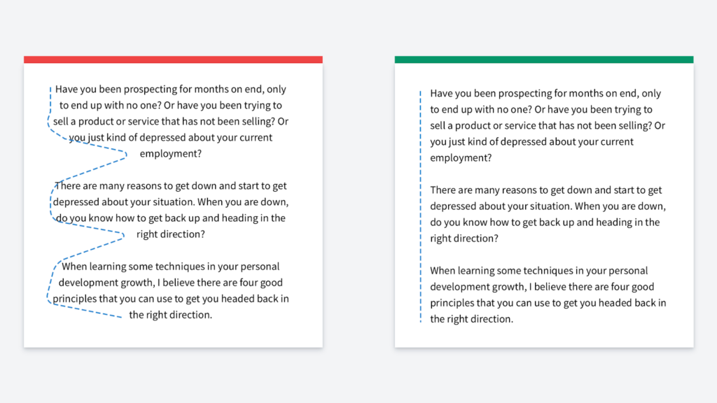
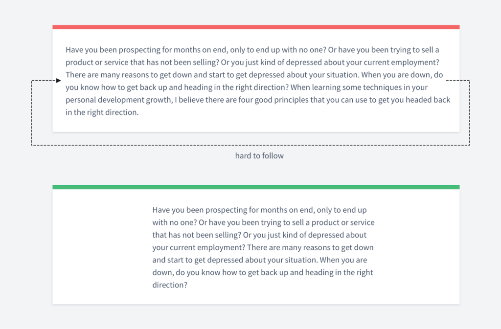
What about line length?
If you do not limit the width of the text container, or if your text container is too wide, it can become hard to read.
The reason for this is that after you read one line of text and then switch to the next one, you might become lost, unsure of which line to read next.
There is no golden standard, but try to limit the container so that it’s neither too narrow nor too wide.
If it’s too narrow, your eyes will jump from one line to another too frequently. If it’s too wide, it will be hard to follow the next line.
Which color should I choose?
First of all, it might not be recommended to choose a pure black color on a white background. Because it is too bright, it might make your eyes tired when reading a long text.
What’s more important is the contrast ratio. There are contrast checkers that allow you to check if your text is easy to read or not. This is especially important for accessibility reasons.
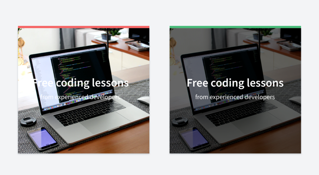
Pay special attention when you put text on images, as very often, it can be hard to read. There are many tricks to make it easier to read, but they all revolve around the same idea: applying some kind of background to the image (or part of the image) to ensure that the text will be easy to read.
If you are interested in typography and other usability topics, you might want to check out a project I’m working on.
The first module will be dedicated to typography, and it will be available for free.
In it, you’ll find insights that you probably won’t find anywhere else, as I’m collaborating with top designers who know typography much better than I do.