Creating a logo is more than creating a visual brand identification of a company. And it’s far from the company’s name arranged in a rectangular box. Clever entrepreneurs and designers never separate the visual aspect from the substantial one. A logo is often the first impression of the company, and it alone can affect the customer’s perception of the brand.
A well-designed logo is a unique combination of business and art which is extremely difficult to achieve. Typography in logos if utilized wisely can bring the desired balance between the two. Typographic logos seem to be the simplest logo designs and the least creative. However, they are not. Professional and creative approaches can make your brand not only memorable but also trusted and loved. This article is for those who are looking for the ideas and inspiration in creating text logos.
5 Essential Typography Logo Design Tips
Know your brand
It’s not the best idea to get down to design before you immerse yourself into your business essence. Knowing your own brand and the value it drives to the customers is even more important than knowing your competition. What message are you trying to deliver? Does the brand encourage action or is it more focused on triggering emotions? What will make customers turn to your service once again? After you understand your brand enough, you will be able to deliver the right message through your logo.
Secondly, the typographic logo will impact the brand name of your company. So make sure the name is self-explanatory enough not to confuse your potential customers.
Know your audience
The next step is to get to know your audience. There’s a great difference in what you are trying to drive through your brand and what your audience is expecting to receive. Think of the answers to these questions:
- Who are they? Their age, gender, and nationality are just as important as knowing your customers’ occupation, hobbies, and interests.
- Where would they see your logo? It can be a website, ad banner, billboard or their neighbor’s t-shirt. Try to consider any situation.
- Will they understand your message? Try to think of all the associations that can come to mind when they see your logo. It’s a good idea to interview objective outsiders for their opinion.
Make sure you know the visual basics
Based on the research results and your deep understanding of your brand, you will have to make a few choices related to your logo look.
First of all, be prepared to discuss the fonts. Thousands of fonts are available nowadays, which makes it even more difficult for designers to choose a suitable one. All the basic fonts can be divided into a few types and each of them can have its emotional tone:
- Serif (with serifs): respectable, traditional, reliable, comforting.
- Sans Serif (without serifs): modern, objective, clean.
- Script type (looks like handwriting): elegant, creative, affectionate.
- Decorative: expressive, unique.
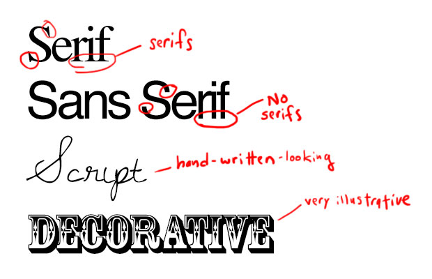
You see that each font has its own mood and personality which it transfers to your brand. It can be serious, careless, playful or refined. You need to determine what exactly you want to say using a font and whether it fits your design. Choose a font that is not based on personal preferences but keep in mind the spirit and features of your business instead.
Colors also play an important role. Each color has its own subtext and can add some nuances to your message. So don’t send incorrect messages to your customers.
Here are a few tips to help you choose the right font and color for your logo:
- Check out your competitors. Your goal is not to imitate their logo but to analyze it carefully. If their solution is smart, you can learn from their experience.
- Keep it simple. The clean font will let you reproduce your logo across various products and in all sizes, be it a large banner or a pen.
- Ensure readability. Your logotype should be readable within a few seconds.
Ensure versatility of your logo
- Design logos in vector applications, such as Adobe Illustrator. Photoshop is not the best choice for that purpose because a logo needs to be scalable without losing quality.
- Specify logotype colors with CMYK or Pantone references to make sure the colors will be reproduced correctly once the logo is printed.
- You should be able to reproduce your logo in a single color (black or white) and still recognize it.
Beware of common design mistakes
- Using too many fonts and colors. Top companies tend to use one font and one color only for a good reason – the more fonts that are used, the messier the logotype looks. The use of two fonts is acceptable if they are different for a company name and a slogan.
- Using trendy fonts. Most trends are short-lived: what is popular today may be outdated and seem ridiculous tomorrow.
- Copying others. Imitating is a lazy way to solve the creative problem. A logo is a reflection of your business: if it looks like someone else’s, your business fails to be unique and loses credibility in customers’ eyes.
Typography Logo Design Examples
There are certain types of logos that you should be aware of before you start designing your own logo and make sure that the chosen type matches the needs of your business:
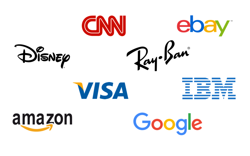
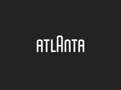
Lettered and word logos
There are lots of world-famous companies that rely solely on typographic logos. Here are just a few for you to feel the power in text based logos. Of course, IBM, CNN, Google, Facebook, etc. are the most prominent representatives of lettered logo design.
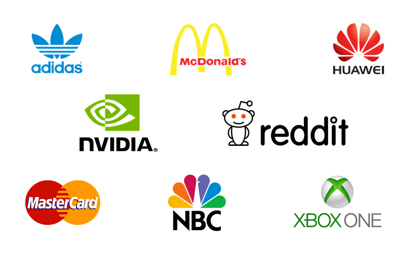
Icon logos
Apple, Nike, Shell, and lots of other companies have just an icon as their logo.
Combined logos
It’s the most common type that contains both: an icon and a company name (sometimes a slogan). This kind of typographic logo is the most popular one and gives more space for creativity.
Typography Logo Design Ideas
The key to a perfect logo is a combination of simplicity and memorability. Here are a few ideas that can help you create the right logo.
Clever use of color
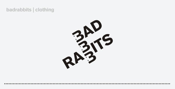
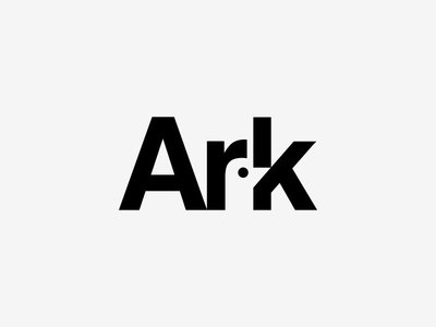
Rearrange letters
Interlink
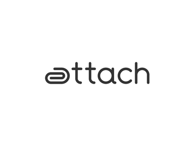
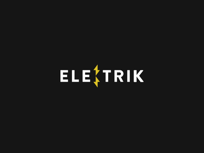
Include icons

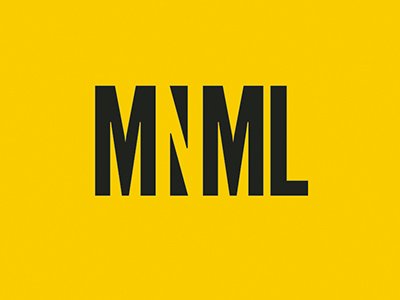
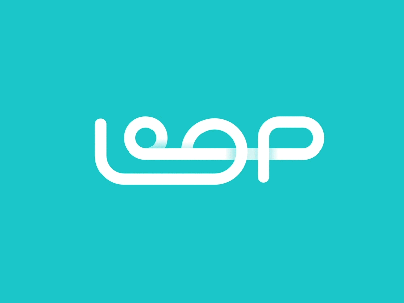
The use of negative space
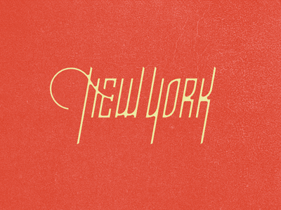
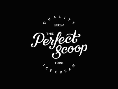
Vintage typography
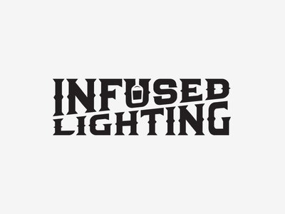
Creative typography
Conclusion
When creating a logotype, it’s a good idea to aim at long-lasting relationships. Once you understand the identity of your brand, positioning, and basic messages, it will be easier for you to choose the type of logo that will best represent your brand. Following the generally accepted tricks of the trade, you may lose your brand identity. On the other hand, logo designs that employ the “off-the-shelf” typographic tricks run the risk of being rejected.
Another thing to keep in mind is that your logo should fit in beautifully on all of your online channels. You should be especially careful when choosing the right font for your website and do everything you can to make sure it properly communicates your entire brand identity and correlates with your logo typography.
Finally, remember that no business has become successful because of its logo. The purpose of the logo is to increase the company’s visibility. The quality of services you offer should do the rest.
About the Author: Nataliia Kharchenko is a content manager, writer, and researcher at Cleveroad.
Looking for a simple tool for non-designers to make your logo? Check online logo maker Logaster – it may be helpful.
Check the collection of logos with visual metaphors, and read how to remove background from logo. Have an interesting article to share with our readers? Let’s get it published.