Rectangles are safe and circles are too, triangles are bold and so are you. Dive in to see how you can benefit from using abstract shapes and why spirals are mysterious.
Main types of shapes
Even something as straightforward as graphic shapes can fall into multiple categories based on different characteristics. Every figure can be organic or geometric, abstract or non-abstract, simple or compound, and 2D or 3D. Each of them has a different effect on how a composition looks and feels.
1. Organic & geometric
Organic
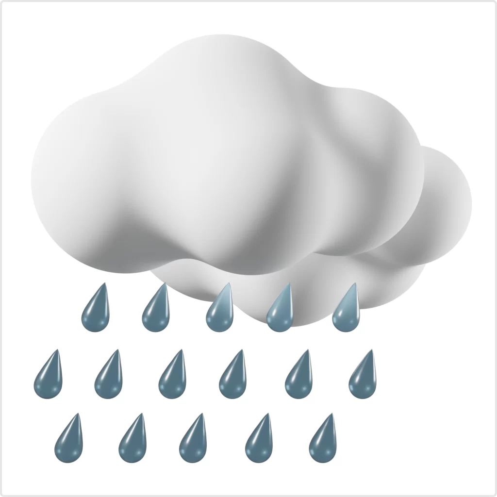
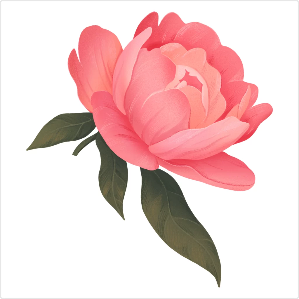
To put it simply, organic shapes are all the imperfect silhouettes you find in nature. Examples of organic forms include tree trunks and branches, flower petals, clouds, paw prints, and many more. They are never perfectly symmetrical, even when they appear so. Organic shapes are usually associated with nature, peace, comfort, and creativity. Most of the time, organic figures are curvy and flowy, unlike geometric ones which tend to be sharp and weighty.

Geometric
Calculated to the last pixel, stiff and plain, geometric shapes look and feel artificial compared to organic figures. These include both two- and three-dimensional forms: squares and cubes, circles and spheres, triangles and pyramids, etc. Geometric shapes make a design look more strict, professional, and direct. Though most of the time, geometry in graphic design is symmetrical, artists frequently use uneven compound figures to make the composition more dynamic.


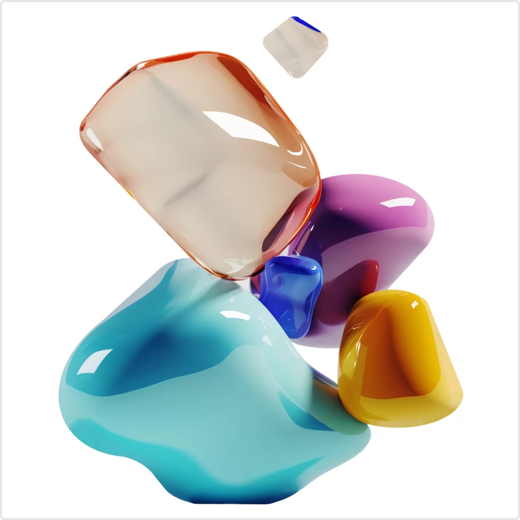
Abstract
Abstract shapes almost always leave room for interpretation, since they only hint at what they might represent. The viewers often see something more in them than what the designer intended to show. While some abstract images are easily readable and represent a known real-life object (e.g. star symbol), others might be crazy blobs of color with textures and patterns on top. Abstract figures are perfect for conveying complex ideas that are nearly impossible to represent with a simple shape.


Non-abstract
Non-abstract shapes are more clear and straightforward than abstract ones. You don’t need to think twice about what you see when you look at a non-abstract shape. Thanks to this, non-abstract figures are universally readable and easy to interpret. This is especially useful when communicating with a wide multicultural audience.

3. Simple & compound
Simple
A simple form is the one that is made from just one shape. Most geometric forms are simple: circles, octagons, and triangles are all one shape. Simple figures are incredibly easy to incorporate into any design: a plain shape lets you fill an empty space without overloading the composition. Plus, uncomplicated forms will never steal the spotlight from the main elements in a design, making them perfect for backgrounds or adding subtle accent elements.


Compound
Unlike a simple shape that only features one form, a compound shape is one that is built using several figures. Just like simple shapes, they can be composition-friendly and non-bulky depending on how much texturing and color variation they have. Complex shapes are more eye-catching and bold, which is why they often act as the central element of the composition.


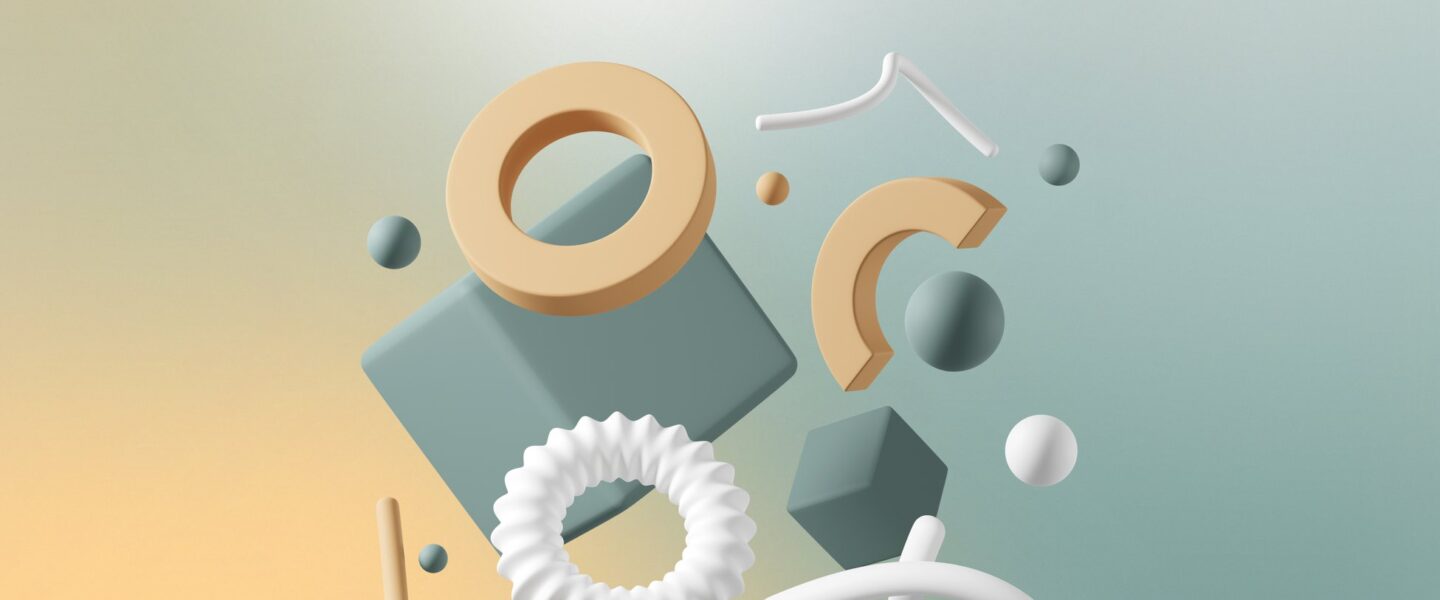
4. 2D &3D
2D
Flat, two-dimensional shapes are a go-to choice for minimalist designs. They make the composition look clean and uncluttered and are easy to combine with other elements like texts and photos. 2D shapes are irreplaceable in UI/UX design, where the main goal is to make the layout painless to navigate.


3D
Striking three-dimensional shapes instantly make a design feel more lively and spacious. Adding extra volume with 3D figures can make any composition pop and turn it into an attention grabber. By experimenting with the placement of 3D forms, designers often play with the viewers’ perception of space, creating puzzling optical illusions.

Psychology of shapes in graphic design
Every single shape has a specific effect on how a viewer perceives the entire composition. If it consists mostly of flowy, funky, asymmetric shapes, it’s more likely to be viewed as quirky, playful, and creative than, say, the one that is made up of triangles and squares. By picking the right shapes, designers can set the mood and evoke some very specific emotions in their viewers.
1. Squares and rectangles
These shapes are the most common ones in our daily lives. Boxes, windows, doors, tables, laptop screens and pretty much everything in between is either square or rectangular. Because this shape is associated with a wide variety of everyday comfort objects, it evokes a sense of security and peace. Rectangles and squares are perceived as strong, dependable, and predictable.

Squares and rectangles might carry a slightly negative connotation, too: they might be viewed as conservative, unoriginal, conformist, and bland. If these characteristics are not what you are going for, try adding more textures, colors, or other shapes.
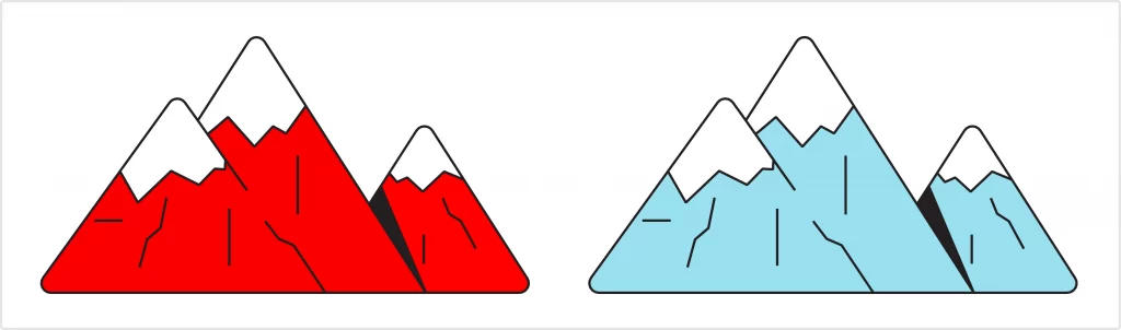
2. Triangles
Having at least 2 acute angles out of 3, triangles appear way sharper than rectangles and squares. Because of this, triangles are often associated with aggression, danger, and intensity. It’s not all black and white with triangles, however, because depending on their shape and positioning, they can mean something drastically different.

An equilateral triangle pointing upwards symbolizes harmony, balance, and stability. That same triangle turned upside down would represent instability, conflict, and risk.
Ultimately, a lot depends on the general message of a composition that has triangles in it. The choice of color is vital, too:
3. Circles and ovals
Also known as ellipses, these shapes are the only 2D figures that don’t have angles. They are the most calming, inviting, and non-intimidating forms of all. Because they don’t have a starting point or an end, ellipses are typically associated with wholeness, continuity, and recurrence. Curvy by nature, circles and ovals evoke a sense of tranquility, safety, and warmth.


Circles are also seen as dynamic shapes since some of the most common associations with circles include wheels and planets – the ever-moving objects.
4. Zigzags, wavy lines, and spirals
Though visually totally distinct, zigzags, wavy lines, and spirals all represent creativity. By using these elements in a design, brands often imply they think differently compared to their competitors. Because these shapes are not enclosed, unlike the rest, they can also be linked to spontaneity, boldness, and non-conformity. These elements can be tricky to blend into a design, but they are powerful attention grabbers.


Funky shapes like these elicit a sense of excitement and evoke curiosity. Of all three, zigzags are the most in-your-face, daring ones because of their sharpness. They can either appear fun and energetic or aggressive and dangerous.
Spirals are the most mysterious of the bunch: they are associated with the shape of the Milky Way, the eye of a hurricane, and hypnosis. Twirls can instantly add an aura of obscurity and exclusiveness to a design.

Wavy lines, for the most part, are comforting, friendly, and cozy. Depending on the regularity of the line and the size of the bumps, they can be quirky and playful, calming and delicate, or intimidating and alarming.