The design of your product packaging can make or break its success and has a direct influence on the number of sales you make, and the rate at which your product(s) gain popularity, so it’s vital you get it right. Packaging design is a complex process, requiring the designer to balance a multitude of very specific requirements, fusing them together to create the finished piece. It might take a lot of trial and error, but to help you get things right the first time around, we’ve created a list with our top tips on effective packaging design. From ways to target your audience, to choosing the correct color scheme, read on to find out just what it takes to make your products fly off the shelves and bring joy to your customers.
Here are our top tips for getting that packaging just right.
Target Your Customer
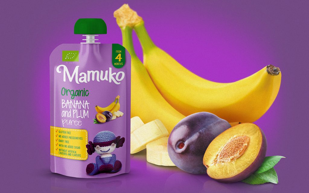
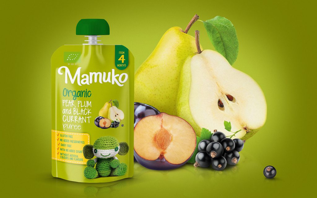
This is perhaps the most crucial point you need to keep in mind, especially when working with all other aspects of the design listed below. Whatever the demographics of your audience, always check back to see whether your image choices, color combinations, and wording are relevant to your target market. If you’re selling baby food, make sure your packaging targets parents – and their kids! Make it bright and colorful, add a soft bubble writing font to make it more child-orientated. To get a clearer understanding, take a look at the Mamuko baby food range.
 Design by Zanas Karenauskas
If we take a moment to analyze their strategy, the products tick all of the boxes in terms of effective packaging design: it is simple and contains all the parent needs to know regarding the ingredients. Not only are these vividly and colorfully visualized on the packaging, but they are also listed in writing using a large font, making them impossible to miss.
In terms of textual information, there is a quick checklist to reassure the parent regarding the safety of the contents, as well as a clear age indicator, making it easy for busy carers to grab the product and go, without having to go to the ingredients section and having to figure it all out for themselves. Convenience is critical for parents, and this is something that Mamuko certainly provides.
The font resembles child-like, but very easy-to-read handwriting, which further adds an element of trust, leaving no doubt in our minds that this is a product with kids in mind. A final finishing touch is the little, soft, smiling toy, which is always in line with the overall color scheme of the package, whatever the flavor. It not only attracts the parents’ attention but is also very appealing for the baby, tempting many little ones to reach out of their seats and grab the item when shopping with mom and dad.
Lastly, the packaging itself is highly functional and convenient – parents know their baby can go from hungry to happy in a matter of minutes, as soon as they leave the checkout. Seeing product packaging like this leaves no doubt in our minds as to whom the target market is, and Mamuko provides fantastic examples of packaging done right. From A-Z, they show their product to be baby-focused, with nothing but the health and joy of the little one in mind.
Keep It Simple. And Give It Some Personality
Don’t overdo it on any of the design aspects – don’t use too many colors, too many clashing fonts, and don’t oversaturate your packaging with text. In this case, less is most certainly more. In short, ensure the design is not visually confusing. If you make your packaging too complicated, your target customer will have trouble understanding what the product is and what it’s for. When passing your product, a potential customer should, ideally, be able to intuitively understand what is hidden within the package, without having to pick it up and thoroughly scrutinize its entire surface for clarity. And with such an abundance of consumer goods out there, unless you have a really niche item, you’ll need to make your packaging easy to recognize and comprehend.
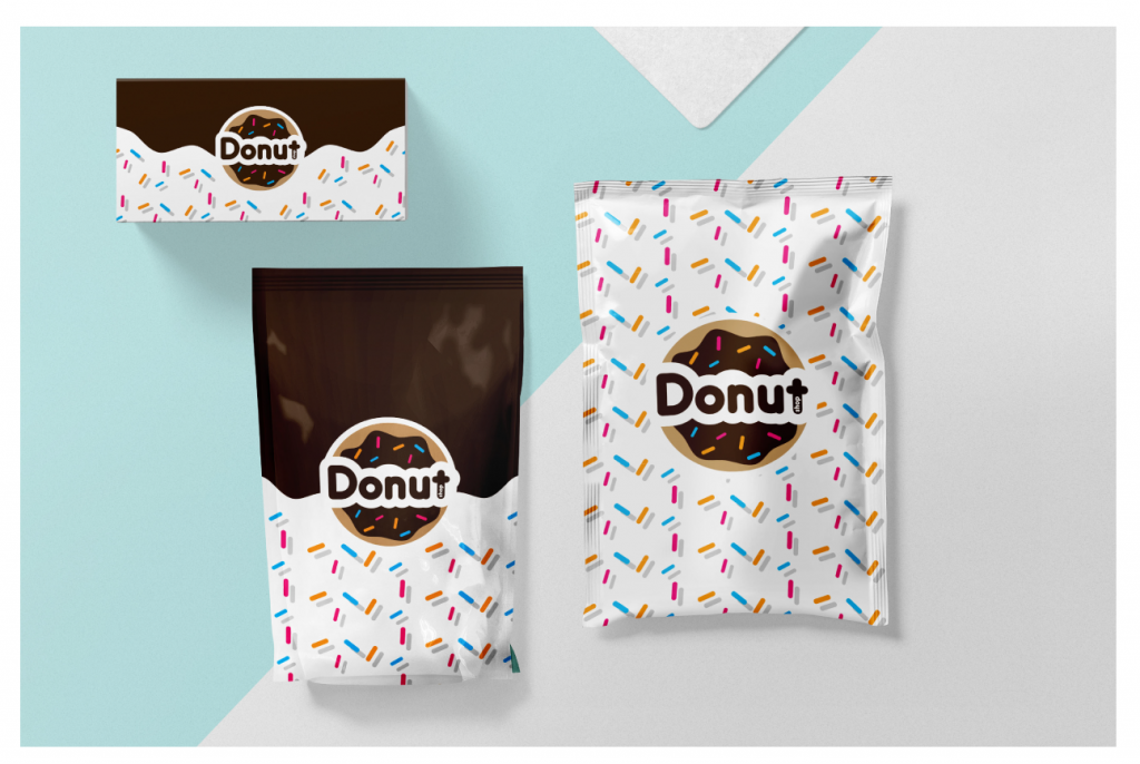
However, keeping things straightforward shouldn’t equate to bland packaging – do make it memorable, unique, and make it stand out. Check out Donut Shop’s incredibly simple and to the point – yet bright and eye-catching – packaging design.
 Design by Alexandar Nofitosky
Choose Your Colors
When it comes to the colors on your packaging, there are a few key points you should try to adhere to:
- Stick to your color palette. Make sure your packaging colors are consistent with your brand’s primary colors, to make your product instantly recognizable. As mentioned in the point above, keep things simple and try to avoid using too many colors that don’t work together. Use contrasting colors in moderation.
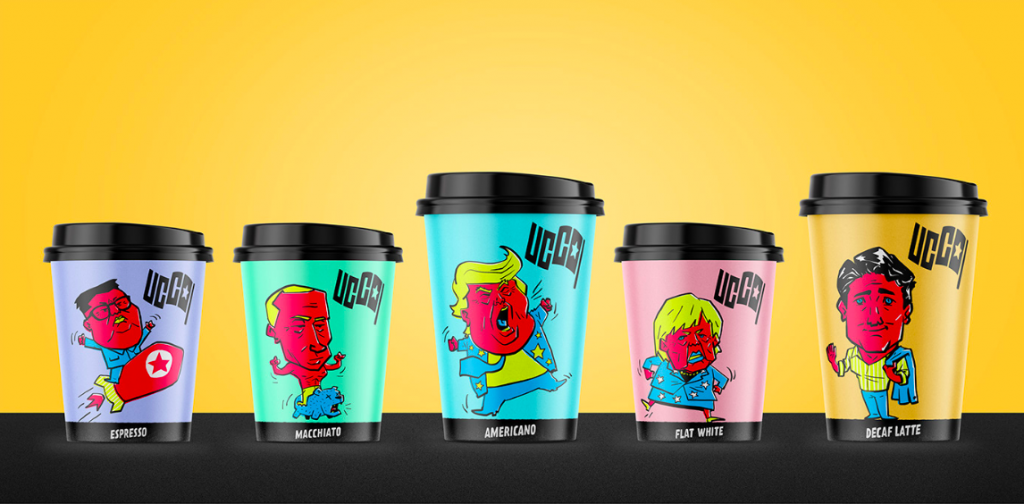
- Your colors should grab attention – do some research on the most popular color choices in your product’s category. You can see what has already been done and how you can make your packaging different from what is already on the shelves. The same goes for when you’re designing functional packaging such as a coffee cup. Yes, there are hundreds of thousands of designs out there, ranging from a simple brown cardboard color to funky prints and patterns – the key here is to make yours unique and appealing. Ucco coffee has chosen a pop art color scheme for their cups:
 Design by Gokce Sen and Berat Pekmezci
It’s worth noting here that not only does the design perfectly balance vibrance and simplicity, but Ucco have also made what is essentially a disposable piece of packaging quirky, memorable and engaging. This definitely establishes a connection with many consumers, particularly those who are into politics or have ever come across any kind of stories about famous politicians. It’s extra touches like this that truly make a product stand out from the rest.
- When selecting your colors, remember the basic principles of color theory and the different connotations various colors evoke. Focus not only on the way certain colors combine or contrast together but also the emotional effects they have. A basic example is the color red, which is most commonly associated with energy, confidence, and assertion.
Materials Matter
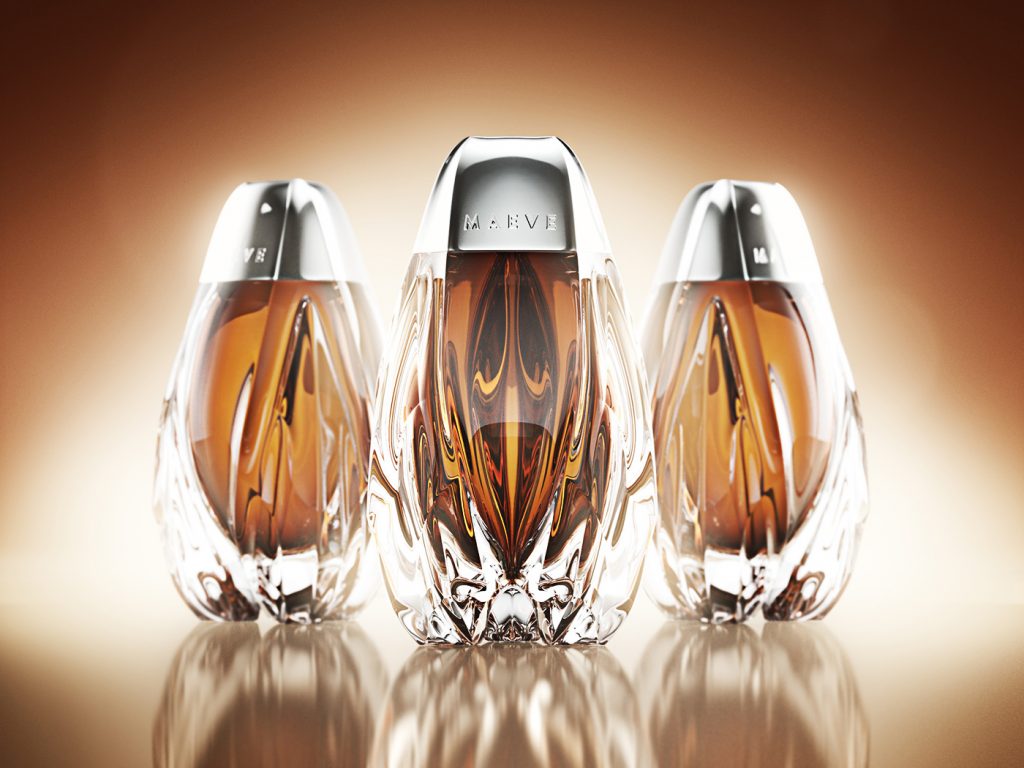 Design by Ivan Venkov
This point highly depends on budget, your target market and, of course, the product at hand. More luxurious items require a much more luxurious feel. So if you’re going for paper packaging, make sure it’s dense and free from that flimsy feel. Instead of a plastic bottle, if possible, go for glass, as exemplified by the Maeve honey packaging above. This is all pretty straightforward, but it is vital you stay consistent: even if you market your product as a high-end item and create an expensive-looking visual design for the packaging when your customer picks up this item and the packaging feels subpar, they probably won’t be going home with it. Textures are essential too, and you can try experimenting with these – from polished to matte – the tactile impression your packaging creates plays a huge role in how your product will be perceived.
Also, consider the environmental impact of your packaging choices. Try to use recycled materials, if possible, and make the packaging biodegradable or eco-friendly if this is something that can work for your product. Not only will many customers appreciate your company’s ethics (often, this can be a dealbreaker!), but you’ll also do the entire planet a favor.
Final Thoughts
Packaging creation is perhaps one of the more nuanced types of design. It requires the designer to orchestrate a multitude of components, from the way it looks with the choice of colors and fonts, to the way it feels with the option of finish and texture style. Most important in all of this is always to make your packaging attractive, interesting, fun, and understandable, while staying true to your brand identity and values. Try to strike the right balance of aesthetics and functionality, and you’ll definitely be on your way to a highly effective packaging design!
About the author: Diana Raz, content writer on technology and design issues
Title image by Backbone Branding
Learn what’s a brand book and why you need it, check the top trends in logo design and read how to integrate identity into digital products