


Identity cannot be assigned to one author, follow the solidly established rules or fully fit into a certain framework. It always develops and never ends, because this process has no limits. Designer Marco Ivanik from Petcube gave a lecture on the main components of the identity design, and here we’ve made notes on the key points.
Identity exists to guide people’s attention. It forms the brand and its visual part. I perceive it as follows: I was given the tools through which different things have to be conveyed. With them, I can show what to read, where to click, what to look for. In general, besides consistency in digital products, identity creates a focus on content.
Logo
When you think about the logo, you free your fantasy, try different compositional techniques, dynamic versions, etc. In reality, the digital world is more likely to have your logo on the website appearing in the upper left part and it will be allocated a maximum of 60-70 pixels.
The logo has to be horizontal.
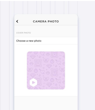
The logo or a part of it must work as the icon of the future mobile app.
Color
Identity must be colorful and should attract attention to the picture. The brand book usually has one or two corporate colors. Clickable elements are usually presented with one of them.
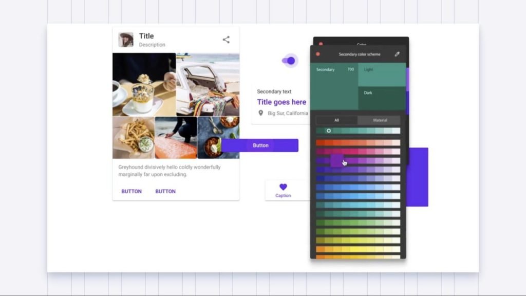
Graphic designers, creating an identity, as a rule, do not think that the interface or the website will make errors states, so the red color will have to be used. As well as the color of success – for example, green. Therefore, most likely, the colors, which are fixed in the identity, will be supplemented. It is better to think about their combination with the main colors in advance so that this work wasn’t passed on to UI designers.
The same story happens with color grading on the web. If you want to show the main and secondary buttons, you take the main color, reduce the saturation and thus show a secondary. Keep in mind that it is likely that you will need to make the gradation from the main color.
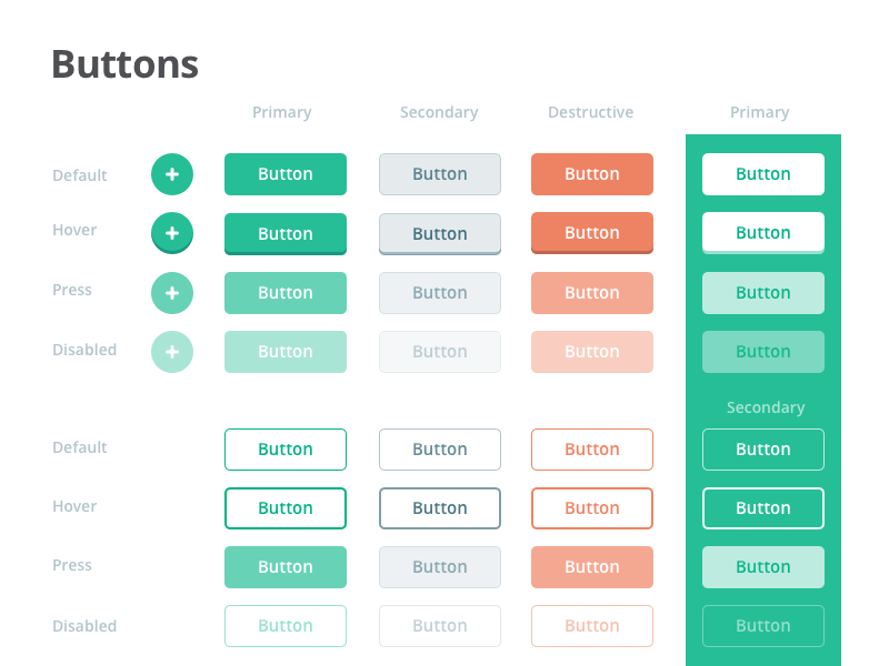
UI Kit by Paul Hatch showing color solutions for different types and states of buttons.
Google recently released a useful plugin for Sketch. It allows you to select color palettes and immediately generates color gradations on both sides.
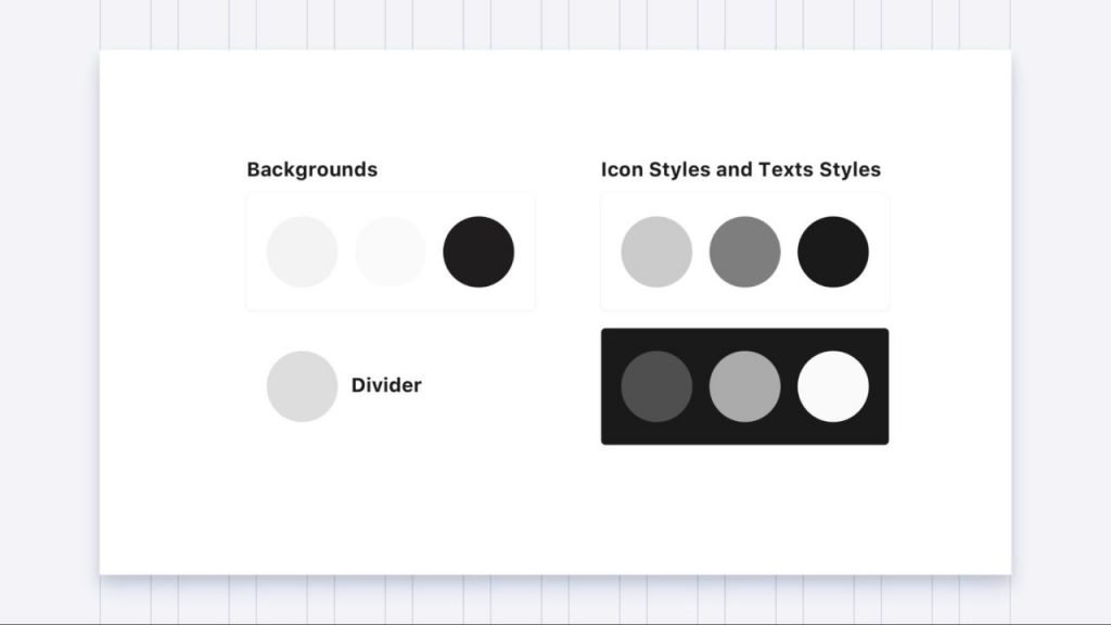
If we use black on 80-90%, we get the so-called “designer’s color”. The web gives much more opportunities. We, for example, often add blue shades into black: this way it looks noble, more expensive, more design-like. Then we multiply gray ones from the received shade. If you create an identity that will be used in digital, it is worth making black for print and black for a screen.
Graphic patterns that are often found in identity design can be perceived as décor for tabs and colors. That is all about brand image. When I develop an interface, I do not think about the patterns at all, leaving them for later. Patterns in interfaces are decorative solutions that have almost no impact.
Font
Fonts are a similar story: they work one way in print but they are different in digital. Anyway, the font is crucially important. Each font has a character, so it’s important to consider the context. For example, all studies say that the Baskerville font feels more trustworthy than Helvetica. But under certain circumstances, perception may change.
I recommend reading “Why fonts matter” by Sara Hidman. It describes the study of fonts perception.
Fonts are perceived at the micro level. Even when you think you do not notice the difference, you notice it.
Google Fonts (and not only) have great free fonts. But you need to carefully check if the chosen option corresponds to the goals. For example, there may not be enough individual characters or a whole language. While the font is 90% of the entire identity.
Another problem is the font render on the screen. There are various render mechanisms and the process is different in different browsers, but there are obvious things that work everywhere.
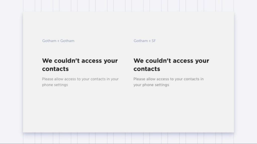
For example, in the left part of the picture below the title and the text are typed in the Gotham font, and in the right part features the font San Francisco. Gotham works in the size of 16-18, but as soon as it is reduced to at least 14 it seems to disappear. That does not happen with San Francisco.
In addition, there is a font form. Depending on the font size, it will either be stretched or flattened. You have to rack your brain to understand how designer saw the font creating it. It will look different in different sizes.
Layout
Here in Petcube, we use one of the typical schemes: heading, title, and text. But the problem arises when you start making mobile versions. In a small size, everything merges into a gray spot. There are fewer tools to control human focus.
Therefore, here we did not use the principles laid down from the beginning. After all, the text will only be easier to read with a saturation change in the header. If the header is typed in bold, it immediately begins to dominate in the gray text bulk.
Remember Erik Spiekermann? When the IOS7 came out, except gradient icons, thin Helvetica appeared there. Super sexy! But Spiekermann said: it looks good but it will not work. Over time, the version was tested and Apple turned back to a thick headline and regular text.
Visuals
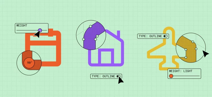
Everything related to graphics is defined as visuals: illustrations, photos, or any images used to form a brand. In interfaces, it is mostly icons, but they can’t be made bigger. They are usually 24*24 pixels. When there is a need to draw 48*48, you need to create a piece of graphics.
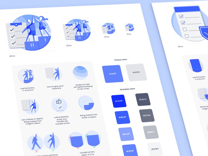
Identity is a process. You are constantly improving, polishing, and changing. It is impossible to use only the tools that were decided upon at the beginning. There are always two options: either to change something or stick to a fixed guideline, even if it is not suitable for all tasks. It is better to consider the changes that can improve brand image and only partly rely on the guideline. For designer-perfectionist, it’s a pain, but each style serves a specific goal, and unification, in this case, is not a smart decision.
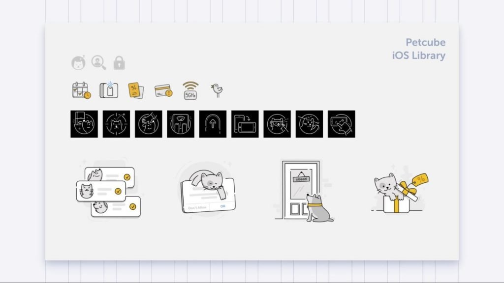
For example, in Petcube, three illustration styles and two sizes of outline icons appeared in the creative process.
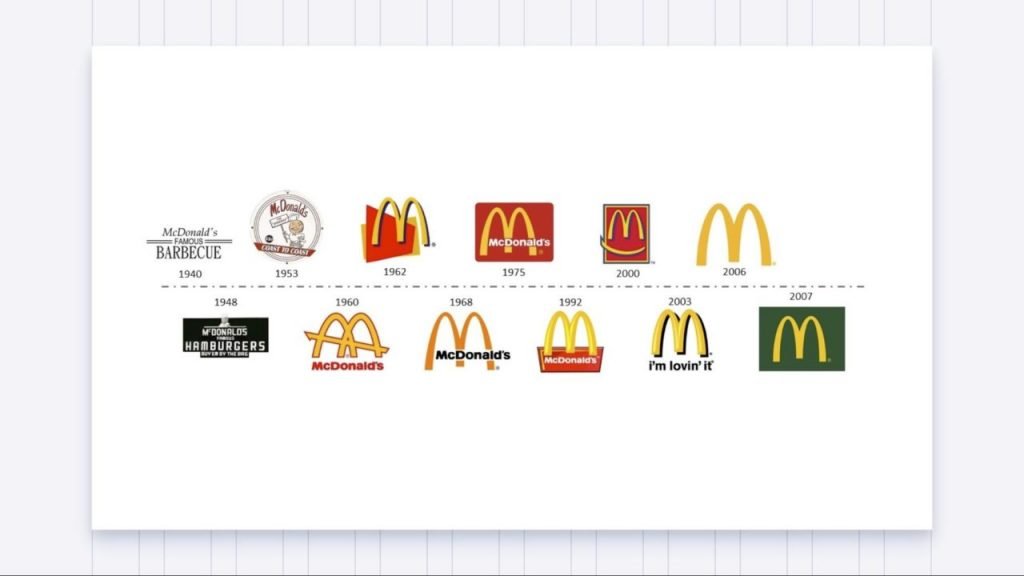
I really enjoy the progress of McDonald’s. They chose the golden arch as the main element, but the identity and stylistics are constantly changing. Previously, the main color was red – it’s about speed, and now the green is about the environment. And this is normal, everything is changing.
If you love it, let it go
At the current pace, the essence of the guidelines is quite blurred. It is necessary to set a foundation, and then let everything go and watch out for the development in the right direction.
About the author: Marco Ivanik, designer for Petcube
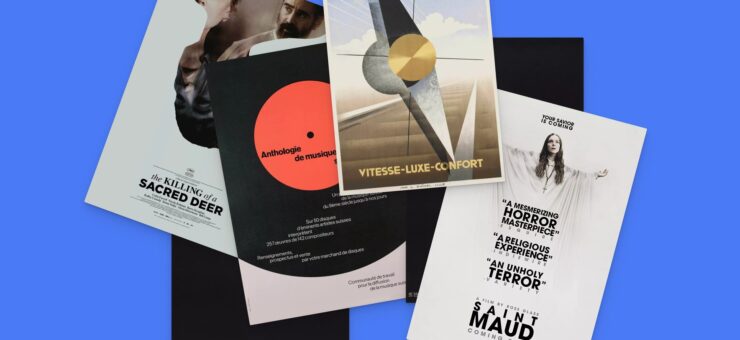
Title image by Ramotion
The original article was published in Telegraf Design
Check the practical case study comparing cheap and expensive logos, read the ultimate guide to font kerning and review the list of top logo design trends this year.
