Color is one of the most powerful tools in the designer’s toolkit. Color can draw attention, set a mood, influence users’ emotions, perceptions, and actions. When it comes to web & mobile app design, this is definitely the time of vibrant colors. Designers use vibrant colors to make people focus their attention on important elements and make their design memorable.
Below you’ll find some practical techniques on using vibrant colors in your design.
Monotone
One of the most popular ways to use vibrant colors is the monotone color palette. The monotone palette includes a single color with a mixture of tints and tones. Such color palettes are visually stimulating — paired with attention-grabbing typography, monotone color schemes are able to create really memorable experience.
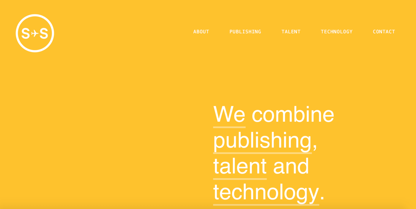
Sydneystockhom uses bold color to create a memorable look in a very simple way.
Tip: Use of a single color with black and white accents is a great way to create visual interest on a small screen.
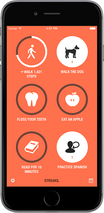
The color, iconography and simple type in Streaks app creates a striking combination that are easy to read and engage with.
Duotone
Duotone is a halftone reproduction of an image that brings out its middle tones and highlights. The technique that was once a print staple has found new life online. Duotones are visually interesting and fairly easy to create. You can create the effect using Adobe Photoshop and a two-color gradient.

Soft duotone effect set a businesslike atmosphere. Credits: Holm Marcher & Co
While duotone effects lend themselves to large desktop images, they can work in smaller mobile screens as well.
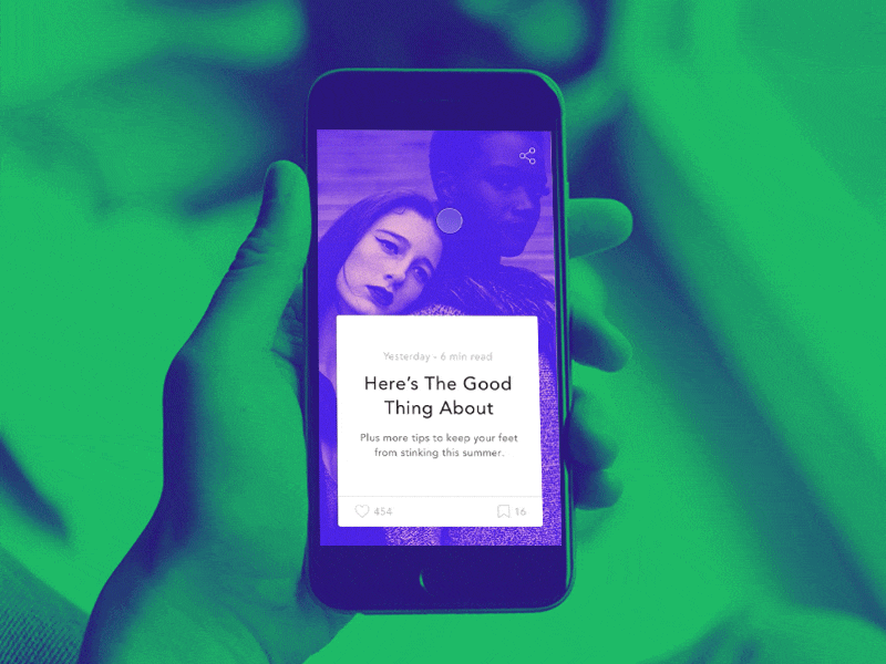
Credits: Ognjen Divljak
Tips:
-
- Use duotone to create a dominant image. Select simple high-quailty photos with a single, clear subject. Busy photographs with a lot of details may be obscured.
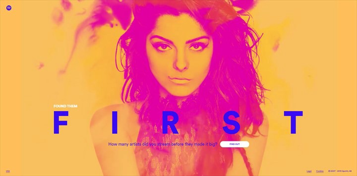
One highly intensive images that are worth a thousand words. Credits: Spotify
- Pick colors that reflect the mood of the photo. Remeber, that different colors evoke different emotions.
- You design a website and want to create a duotone effect for your image you can do it without any modifications of existing image. Simply use Colofilter.css to apply the effect in CSS code.
Overlay
One way to use color to make a statement is with a design that incorporates a color overlay. You simpy cover an image or video with a semi-transparent colored box. By using one of the bright, saturated colors associated with Material Design, you can evoke feelings of modernism.
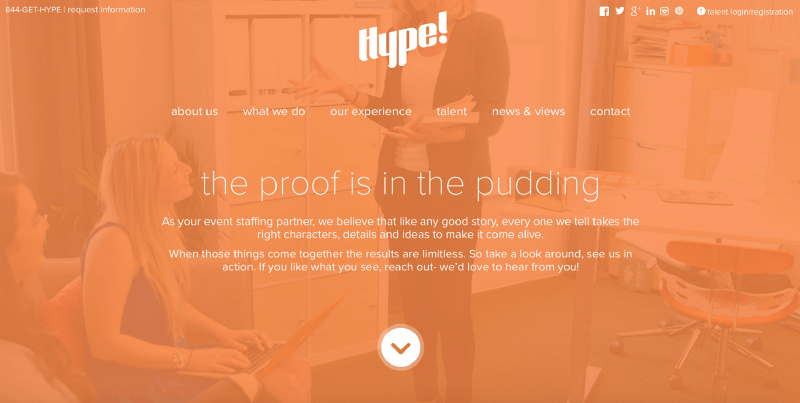
Color overlays enhance the impact of a photograph, and allow designers to modify the tone the interpretation. Credits: Hype
Consider using image overlay for card-style elements, for video content or to emphasize calls to action.
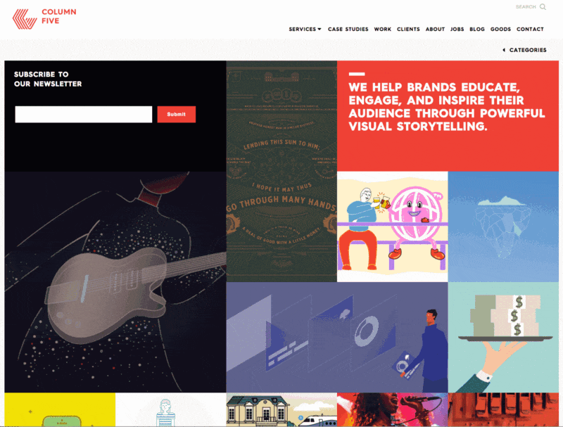
Apply hover animations to the cards. Credits: Column Five
Tip: When using a single color as an overlay, think about the degree of saturation and transparency of the color:
- Heavier color combinations (less transparency and more saturation) put more focus on the color itself than the image behind it.
- Lighter color combinations put more focus on the image.
Conclusion
It’s hard to find a design technique that’s more fun to play with than color. Color effects can be dramatic, impressive and even serene. You the designer really get to experiment when using color effects. Whether you are a fan of bright, bold hues or prefer a more minimalist black and white, the one thing you need to remember:
There are no wrong colors. What matters most is how to use them.
About the Author
Nick Babich is a software developer and author of a blog dedicated to usability
Main image credit: Venngage