Discover seven time-saving hacks for modern article design to stand out and captivate your target audience easily.
An astonishing seven and a half million blogs are published every single day of the year.
Modern-day writing isn’t just about the quality of the written content. Your article’s design and presentation must captivate your reader while being neat, presentable, and easy to digest.
There’s also the pressure to produce content daily to keep up with competition and the fear of losing your audience, which sometimes compromises article design.
So, how do you produce content without sacrificing its aesthetic appeal?
In this article, we’ll present seven methods.
- Prioritize the strategic use of imagery
- Leverage pre-made templates
- Use vector design software
- Ask AI for help
- Try drag-and-drop design tools
- Employ color theory
- Use data to make informed design decisions
Prioritize the strategic use of imagery
Well-chosen images can break up long stretches of text, making the content more digestible and less intimidating for readers.
For example, Adham Dannaway does an excellent job adding an explaining custom graphic of the design tips in his Medium blog.
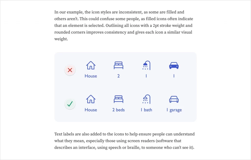
Nonetheless, images aren’t just for decorations. They also add context to the written content, illustrating points and ideas in a way that words alone might not fully capture.
This is particularly true for complex or abstract concepts, where a relevant image can immediately clarify and convey the intended message.
Images can also evoke emotions, set the tone, and connect with the audience more personally. They can draw readers in and make the content more memorable.
Take this article on Dribbble, for instance, where they covered recent concepts for VisionOS. The Dribbble shots that they handpicked there are made to immerse you into this true VR atmosphere like you are wearing Apple Vision Pro yourself.

You don’t need an expensive Shutterstock account to acquire good-quality images. Several websites are offering high-quality, free images, such as:
Use these resources to add visual depth and appeal to your content, making it more engaging and effective in communicating your message.
Leverage pre-made templates
Creating an appealing article can seem daunting for beginners not well-versed in design.
To circumvent this, you can use content management systems (CMS) like WordPress, which offer a plethora of article-friendly, templated themes.
These platforms provide beautifully pre-designed templates — many of which are free and offer a responsive design — that instantly enhance the visual appeal of your content.
WordPress, for instance, is renowned for its user-friendly interface and a vast repository of themes specifically tailored for article writing and blogging. Plus, it comes with plugins designed to enhance your website’s design.
These themes include various layout options that already boast effective white space use, a clean design, and mobile-friendliness for a pleasant user experience.
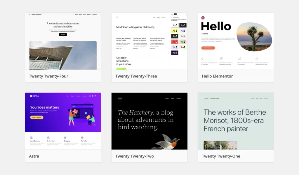
These templates also come ready with pre-selected font choices and color schemes, which are meticulously designed to make your articles visually engaging and professional-looking.
But you don’t have to settle for what the templates give you.
Though pre-figured, the templates offer a level of customization that’s simple yet impactful. You can easily toggle design elements, like changing a color palette or adjusting font sizes.
The best part? It doesn’t require complex design software or coding knowledge.
Whether you prefer a minimalist design or a vibrant, image-rich article full of bold colors, WordPress and other CMSs give you all the tools you need to create a visually stunning blog.
Say hello to a streamlined production of attractive and professional-grade content—every time.
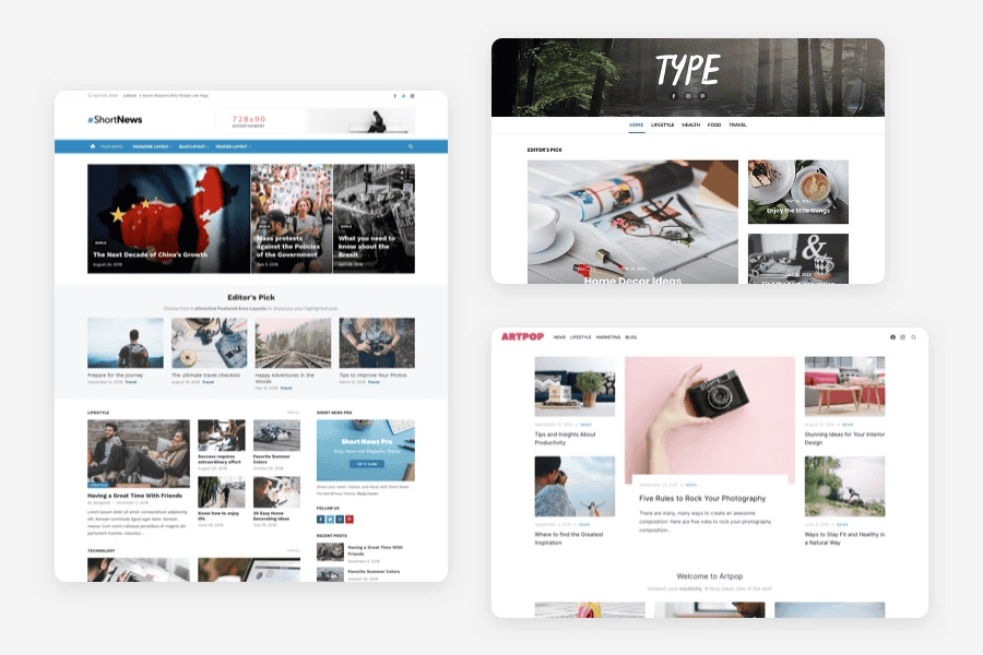
One more great place to find pre-made templates is Design Lab. With the Design Lab WordPress Themes, you can build pixel-perfect articles and pages in no time! Building your blog, magazine, or shop is now easier than ever, without installing any extra plugins. And the best part? Upload your logo, change layouts, adjust colors and fonts to match your tastes and branding in a flash, all with a live preview!
Use vector design software
Vector design software, opens up possibilities for enhancing articles’ visual appeal and is excellent for the design-minded individual.
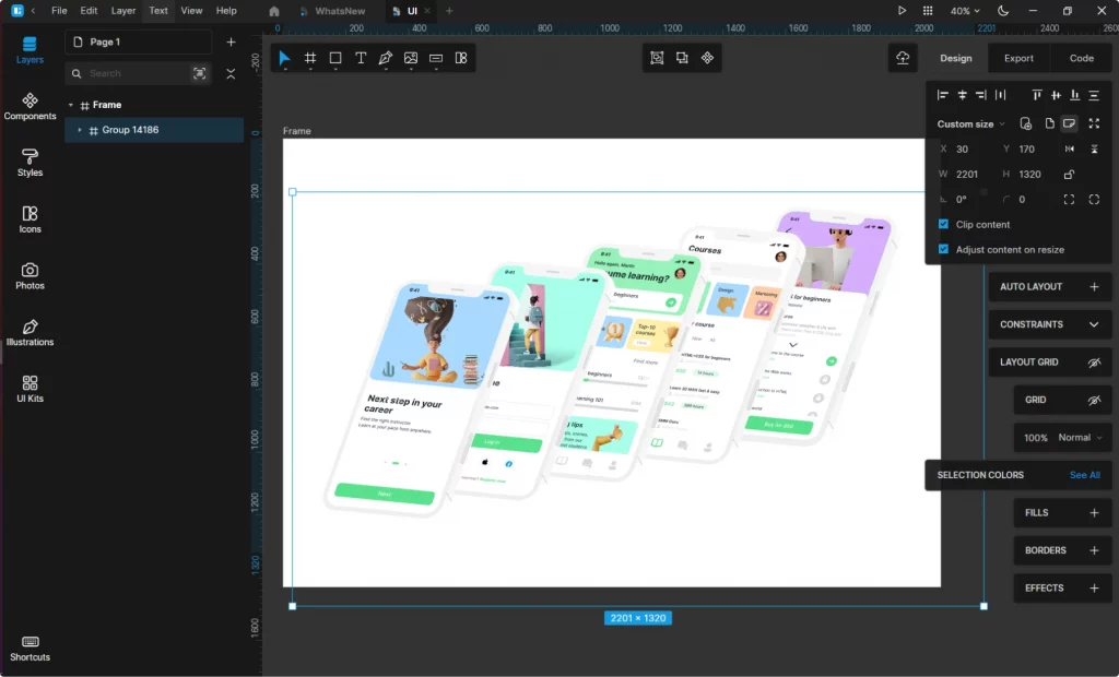
Practical uses of vector elements include:
Create custom infographics
When dealing with statistics or data-heavy content, incorporating an infographic transforms an overwhelming set of numbers into an engaging, easy-to-understand visual narrative.
Think of colorful bar graphs, pie charts, or flow diagrams that can quickly illustrate statistics or processes related to your article’s topic.
Designing unique icons and symbols
Instead of generic icons, create custom vector icons to match the theme and tone of your article, providing a cohesive visual experience. These can highlight key points, signify different sections, or guide the reader’s journey through the article.
Additionally, vector-based illustrations can be particularly effective in storytelling, allowing for creating bespoke images that reflect the content’s theme, whether for a technical how-to guide or a narrative-driven feature.
As a time-saving feature, they allow readers who prefer to skim the content to skip to the most relevant or related sections (marked by specific icons).
Ask AI for help
AI changes the way content creators approach visual elements in their work. AI image and graphic generators have opened new frontiers in creating unique and compelling visuals.
These can generate high-quality images, graphics, and even art — provided you give them accurate prompts.

Popular image and graphic generators include Dall-E and Midjourney, but plenty of alternatives exist.
Try drag-and-drop design tools
If you find design challenging or lack the time to learn complex software, drag-and-drop tools like Canva are a great alternative to apps like Figma.
Canva simplifies the design process by providing a user-friendly interface where you can easily select, place, and customize various design elements with a simple click and drag.
This approach significantly lowers the barrier to adding visual appeal to articles, making it possible for anyone, regardless of their design expertise.
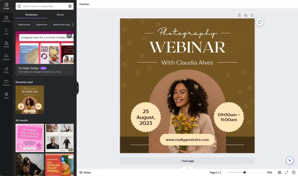
Canva has almost unlimited design options, especially when considering the highly customizable nature of any template.
While customization might be more limited than vector design software, Canva offers many options to make your designs feel bespoke.
For instance, Canva provides an extensive library of pre-designed templates that can be tailored to your needs, including infographics, icons, and illustrations.
These templates can be easily modified to match your article’s theme. You can change colors, fonts, and layout with a few clicks.
And if you subscribe to the relatively low-priced Canva Pro, your options become much broader.
Employ color theory
The color palette chosen for an article influences how readers perceive and interact with the content.
If you’re writing an article about sustainability and the environment, a palette of earth tones such as greens, browns, and blues can immediately set a tone of nature and eco-friendliness. These colors resonate with the topic and subtly reinforce the article’s message.
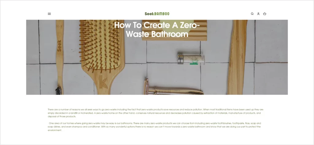
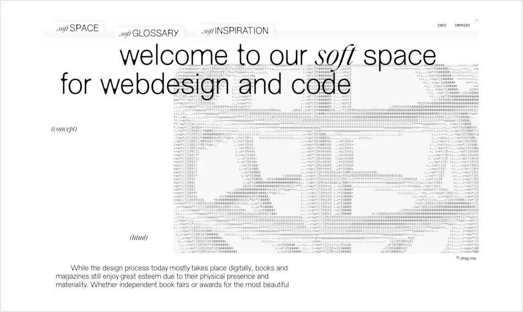
Another example is this code glossary wiki base from SoftGlossary. Their choice of a minimalistic white palette looks calming and helps you focus while learning about terms and trends in coding.
For more emotionally driven content, such as an article on mindfulness and well-being, softer, pastel colors like lavender, pale blue, or gentle pink can create a sense of calmness and tranquility.
The use of color theory extends beyond just the body of the article. It encompasses everything from the background color to the color of headings, hyperlinks, and even the call-to-action buttons.
Using a contrasting color for calls-to-action, like a warm orange in a predominantly blue palette, can make them stand out and increase reader engagement.
Colors also have a psychological effect:
- Blue and light greens are great for evoking calmness and tranquility.
- Red can evoke a sense of urgency or importance.
- Yellow is associated with happiness and energy.
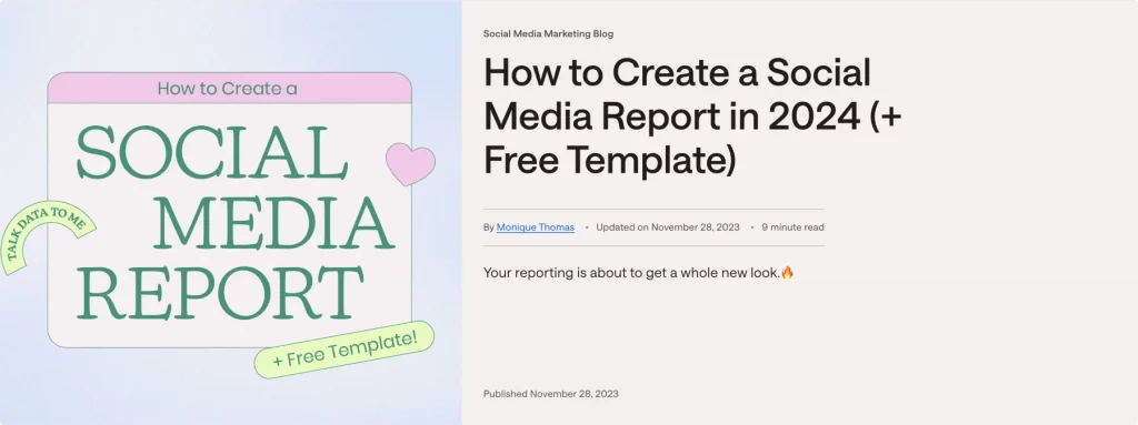
Your brand colors must be consistently reflected in all articles. A great example of this is Later’s insightful guide on creating a social media report. The seamless integration of their brand colors enhances the visual appeal and reinforces brand familiarity.
Use data to make informed design decisions
Why guess what your users want from your design when you can learn from past interactions?
That’s where session replay tools come in handy. They are a great way to save time while using modern designs in your articles.
How? These tools capture and analyze website user interactions, providing valuable insights into user behavior and preferences.
Any content creator or team member can unlock a deeper understanding of how users engage with your article’s design elements, identifying areas for enhancement or optimization.
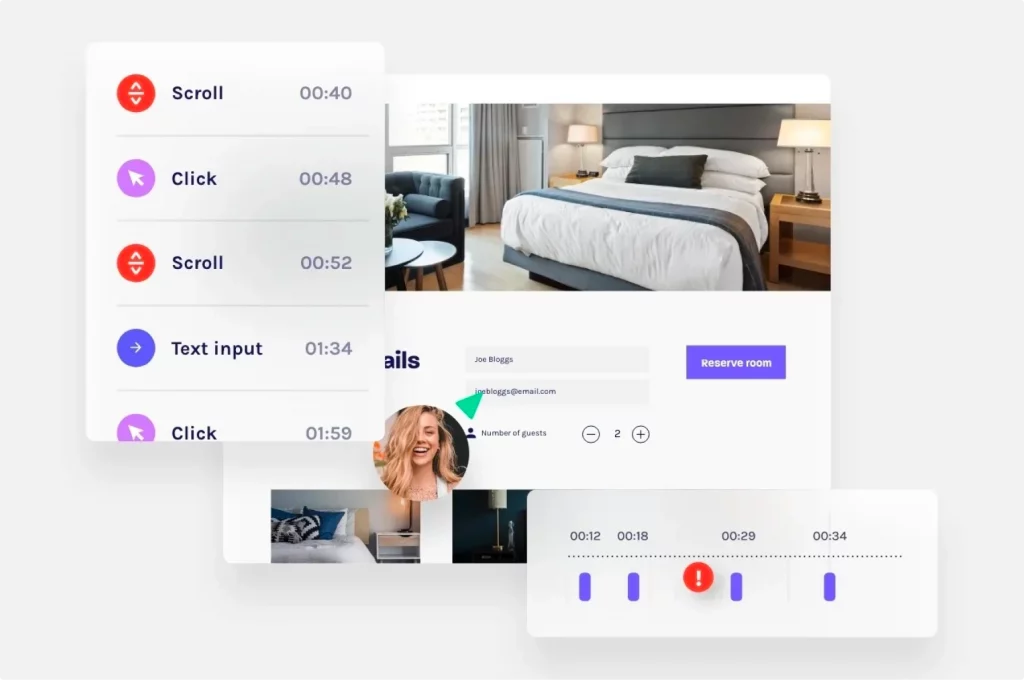
This data lets you know precisely which modern design elements resonate better with your audience. It’s the secret recipe for improving readability, visual appeal, and user experience.
Level up your content marketing with modern article design
Effective article design is a game-changer for standing out in the Internet abyss. Investing in article design is a surefire way to capture and retain your audience’s attention.
We hope this blog has equipped you with practical tips and resources to elevate your design article game, ensuring that your content looks professional and resonates deeply with your readers.
About the author
Jeremy is co-founder and CEO at uSERP, a digital PR and SEO agency working with brands like Monday, ActiveCampaign, Hotjar, and more. He also buys and builds SaaS companies like Wordable.io and writes for publications like Entrepreneur and Search Engine Journal.