Why is my printed logo not as vibrant as the digital one? Why do I need to care about CMYK? Here are the answers to all your color-related questions.
If you’re used to designing for screens, your first print project might come with a shock: those vivid on-screen colors look dull on paper. Here are some examples:
You’ll probably start questioning the printer or ink quality, but the real culprit? Different color modes.
Simply put, printers and screens have different ways of building hues (to learn more, check out our in-depth guide on color palettes). Screens use light to build hues, while printers rely on ink. Because of this, the color range on screens is much wider than on printed paper.
Here’s a deep dive into color modes to get perfect results every time.
Color modes are like “recipes” for creating hues. They tell you how to mix colors, and the most common ones are RGB (and HEX) for digital and CMYK and PMS for print.
RGB is the go-to color mode for anything digital, from phone screens to billboards. It’s an additive color model that creates colors by adding light.
Each RGB value ranges from 0 to 255, with 0 being black and 255 being the most intense. For example, R 255, G 0, B 0 give you pure red, and R 255, G 255, and B 255 create white. With 256 levels per channel, RGB can produce over 16.7 million colors.
HEX is essentially the same as RGB but expressed differently. It uses a 6-character code to represent red, green, and blue values. The codes range from 00 (no color) to ff (maximum intensity). For example, #aa00ff gives you a bright purple—no green, lots of red, and maxed-out blue.
HEX is popular in web design because it’s easy to copy as it’s just one number.
CMYK is the standard color mode for printing. It stands for cyan, magenta, yellow, and black (key). Unlike RGB, which adds light to create color, CMYK is subtractive—the more ink you add, the darker the color gets. White in CMYK is simply the absence of ink (0, 0, 0, 0).
Printers use tiny dots of these four inks to build colors. If you look closely at printed material, especially lower quality, you might notice the dot pattern. Since paper doesn’t emit light like screens, CMYK’s color range is much smaller—only about 16,000 colors compared to RGB’s 16.7 million.
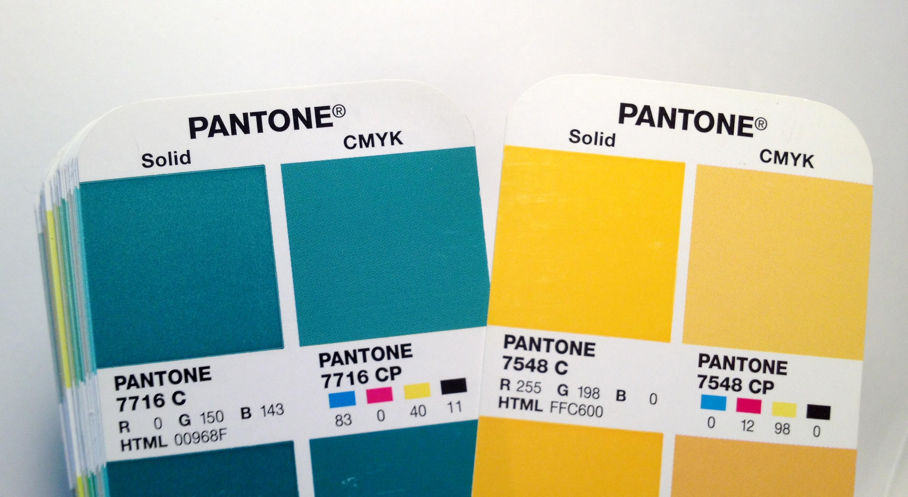
PMS (Pantone Matching System) is a color mode best for precise, solid colors. Each PMS hue is made from a unique, pre-mixed pigment, offering more consistency than CMYK. The PMS palette has over 3,000 colors, many of which can’t be accurately reproduced with CMYK.
Printing full-color images with PMS is impractical and expensive since each color would require its own ink. That’s why PMS is mainly used for spot printing, like logos or branding, where color accuracy is crucial. However, you don’t need to use Pantone for every color—simple shades can still be printed in CMYK. Pantone inks act as additional buckets of pre-mixed colors that work alongside the 4 base CMYK inks.
For easier transfer between color modes, there are palettes with the closest CMYK and RGB equivalents to Pantone colors.
Color matching is a common issue when transferring designs from RGB to print (CMYK). Unfortunately, there’s no way to get a perfect match between screen and paper. But there are ways to get close. Here’s how to minimize color distortion in the print process.
If your design is meant for print, start in CMYK mode. This way, you’ll only see colors within the CMYK range, helping you avoid hues that won’t translate well to print. Colors closer to the upper right of the palette (the most luminous) won’t be available, as CMYK can’t reproduce them.
If you work in RGB, tools like Adobe Photoshop will show a warning icon when a color is out of the CMYK range. Clicking it will give you the closest printable alternative. You can also use the Gamut warning feature, which highlights areas where colors fall outside the printable range, making it easier to spot and adjust problem zones.
Many design apps have a proofing mode showing your design’s appearance in print. This helps you spot colors that might turn dull or shift when converted to CMYK. The closest printable match replaces out-of-gamut colors, but the result isn’t always perfect. Proof mode lets you tweak colors manually to get as close as possible to the original.
In Adobe Photoshop, go to View > Proof Colors (or press Ctrl+Y/Cmd+Y). You can also use online tools to convert colors:
Although printing uses CMYK, don’t convert your RGB files to CMYK yourself. Most printers handle the conversion automatically, adjusting their specific settings (like print method and speed) to get the best match.
The biggest issues happen with colors in the blue and green areas. These colors tend to lose a lot of their vibrancy during the conversion process. Meanwhile, red and yellow stay almost as bright as they are in RGB.
Even with automatic conversion, it’s crucial to manually check each color. even when the printer does the conversion, manually check every color after converting to CMYK. For instance, when converting a bright yellow from RGB to CMYK, 9% of cyan might be added, potentially giving yellow objects, like pants, a greenish tint.
To avoid this, make sure no cyan appears in red and yellow shades, and that blue shades don’t contain a mix of yellow and red.
A simple fix is to reduce the number of inks being mixed—try to keep it to no more than three colors per hue. For example, in yellow, remove any cyan; for green, eliminate red. This prevents unwanted color shifts, like a greenish tint in yellow or muddy tones in blue.
To ensure color consistency, only manually convert to CMYK if you’re using multiple printers for the same project. Otherwise, let the printer handle it. Pre-print conversions can cause more problems unless you know the specifics of CMYK profiles and paper types.
If you convert to CMYK manually, check your Total Ink Coverage (TIC). TIC indicates how much ink (cyan, magenta, yellow, and black) will be used for each color. If it’s too high (like 400%), the paper won’t absorb it properly, resulting in poor-quality prints.
TIC limits vary depending on the paper and print method. As a rule of thumb:
For a rich black that prints well, aim for a mix of 50% cyan, 50% magenta, 50% yellow, and 100% black (C50, M50, Y50, K100). Maxing out the TIC won’t improve your colors; instead, keep it balanced to ensure smooth printing.
Switching from screen to print doesn’t have to be a color disaster. You’ll be way ahead of the game by understanding how RGB, CMYK, and PMS work. Start your projects in the right color mode, use proof tools to check how things will look in print, and let your printer handle the conversions. Nail these tips, and your designs will pop as much on paper as on screen.
Sometimes, you don’t need to worry about manually fixing colors. For example, most home color printers automatically convert RGB to CMYK using an intermediate color model, LAB. Just keep in mind that the printed colors won’t be as vibrant as what you see on screen.
Check out this gallery of Ouch illustrations, where we’ve got a side-by-side showdown of how they look in RGB vs. CMYK.
Monochromatic color = one hue, many values. Learn what it is, why it works, examples,…
A blunt look at why “three clicks” isn’t a usability law, what actually drives task…
Your cover may hook them, but the contents page keeps them. Learn how to design…
Because your feed shouldn't look like it was generated by the same three people. (more…)
From bold typography to organic abstracts, explore creative poster layouts with pro tips to adapt…
Everyone's out here saying "don't use Garamond" like it's 2015. Spoiler alert: it's not.
This website uses cookies.