Call to action is amongst the crucial design features of any website. These small buttons pack a punch in terms of conversion rates, and they can be hugely influential in a buyers’ decision-making process. The buttons can be used in a variety of different ways, to encourage a user to complete a particular action. This action might be making a purchase, signing up to a newsletter, signing up for product updates or even not leaving a website.
Call-to-action elements can be used on almost any form of online communication, whether that be a website, mobile app, newsletter, landing page, social post or advert. No matter how they are used, and where it appears, the design is of fundamental importance. When it comes to evaluating the effectiveness of a CTA, looks really do matter. So, let’s take a closer look at how to design a standout CTA that gets results, and what to avoid if you want to steer clear of disappointing results.
Why Are Call to Action Buttons So Important?
Before we think about how to design the best CTAs for any website, it’s worth taking a step back to consider what makes these buttons so important. The call-to-action is an essential step in the buyer’s journey, and in many cases, they are just the nudge a user needs to get them to the checkout page. They are a vital part of the sales funnel and enable businesses to make the most of engagement and capitalize on traffic.
Call-to-action buttons aren’t just great for businesses, though. They’re also hugely helpful for consumers themselves. That’s because today’s time-poor consumers don’t have the patience to search through a website to find the link they need to sign up or make a purchase. They much prefer to find what they’re looking for immediately, as soon as their eyes land on a new site. Interactive elements like CTAs enable companies to give consumers exactly what they want, as soon as they start looking for it. It’s a win-win situation.
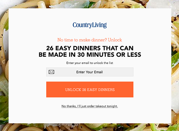
When we think about call-to-action buttons, the examples that immediately spring to mind are those that pop up encouraging us to make a purchase, but these aren’t the only ones out there. One of the most useful versions is exit-intent CTA. With an average conversion rate of 19%, these pop-ups can be massively beneficial if done well. Take a look at these tips on how to use exit-intent pop-ups and start designing your own exit-intent CTAs.
What Makes a Great CTA?
We’ve mentioned that the design of CTA button matters, but now it’s time to really narrow down the design features that can make or break them. When designing a website, it’s easy to get carried away with the overall visual effect of some of its all-singing, all-dancing features, and forget what the page is designed to do. With call-to-actions, the user experience is everything.
Make It Look Clickable
Call-to-action buttons should be designed with the average user clearly in mind, and they should be as obvious as they possibly can be. Buttons should look interactive, and their function should be as clear as possible.
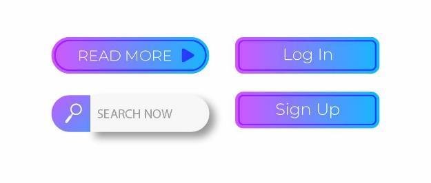
If a user needs to click something, make it look clickable. How you choose to do this is up to you, but typical choices include adding rounded corners or making a button appear to stand out from the rest of the page.
Edit the Size of a CTA
The size of call-to-action buttons is another aspect that should be considered during the design stage. Buttons need to be big enough to demand attention, but if they’re too big you risk irritating a user to the point that they actually leave the website.
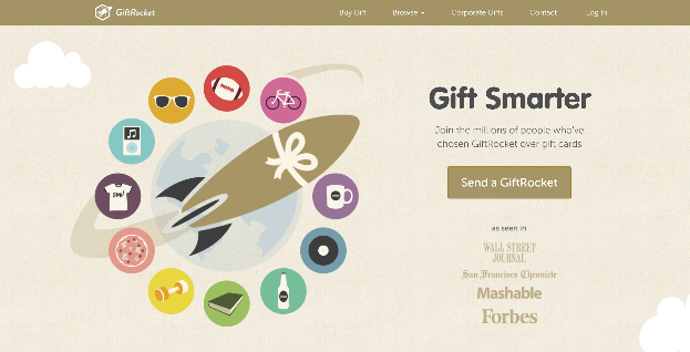
Overly large CTAs can appear too in-your-face and have a negative effect on the visual impact of the website as a whole. There’s a degree of trial and error to finding the perfect size, but as a guide, we recommend making a button approximately 20% larger than your company logo.
Adjust All The Buttons
Often, brands will want users to complete several different actions while on a website and include a variety of call-to-action buttons to reflect this. This is a dangerous tactic and risks alienating a user entirely. It’s best to give a user no more than two main options.
These buttons don’t have to be completely identical, but they should be similar from a design point of view. Using too many contrasting designs can make a website appear confused.
Create Focus With Contrast
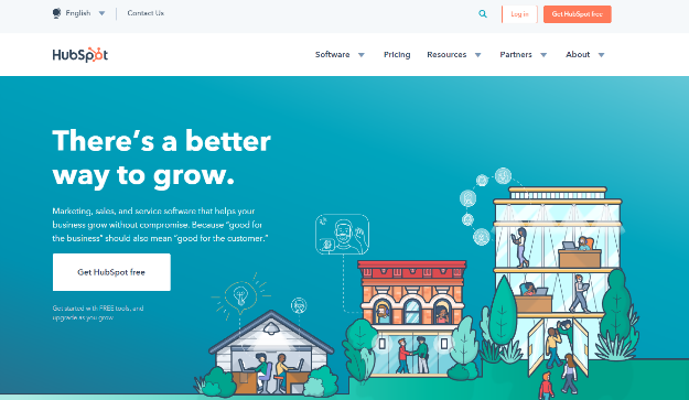
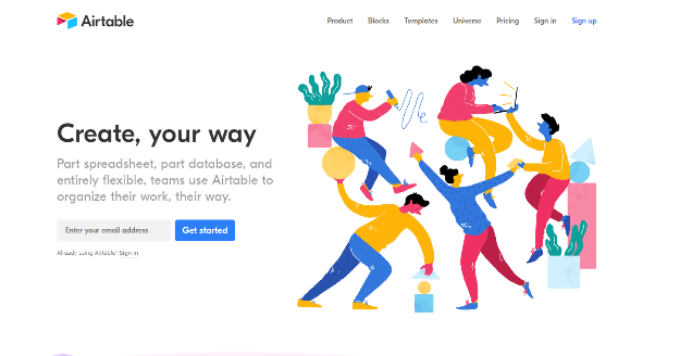
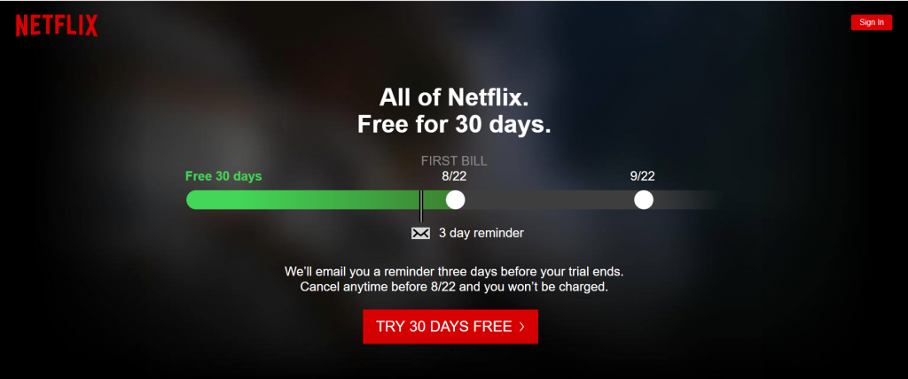
Colour is a great tool to use when designing, and contrasting hues can really help to create buttons that stand out from any webpage. Great color contrasts are seen on many top-performing company websites, just take a look at Netflix and Airtable, for example. In both cases, the button directly contrasts with the color of the rest of the page, and that’s what makes it so effective.
When considering the colors to choose, it’s worth taking the time to read up on the psychology of color, particularly in a marketing context. Different shades can trigger vastly different emotional responses, and can even have implications in terms of pricing, trustworthiness, and security.
Speak to the Right Audience
Responses to different color palettes vary according to the audience in question, so consider your target demographic first and foremost. The target audience of a meditation retreat would be far more responsive to a neutral, pastel-colored call-to-action, whereas a marathon race audience might be more likely to click a bolder, stronger alternative. Take the time to analyze your target audience in as much detail as you can, to ensure that the decisions you make regarding color are as informed as they possibly can be.
Create Copy That Matters
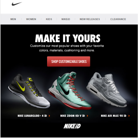
The copy chosen for call-to-action buttons needs to work hard, grabbing a users’ attention and encouraging them to complete the steps required. Choose compelling headings and subheadings, and ensure that they are written in your brand’s recognizable tone of voice.
Use a Legible Font
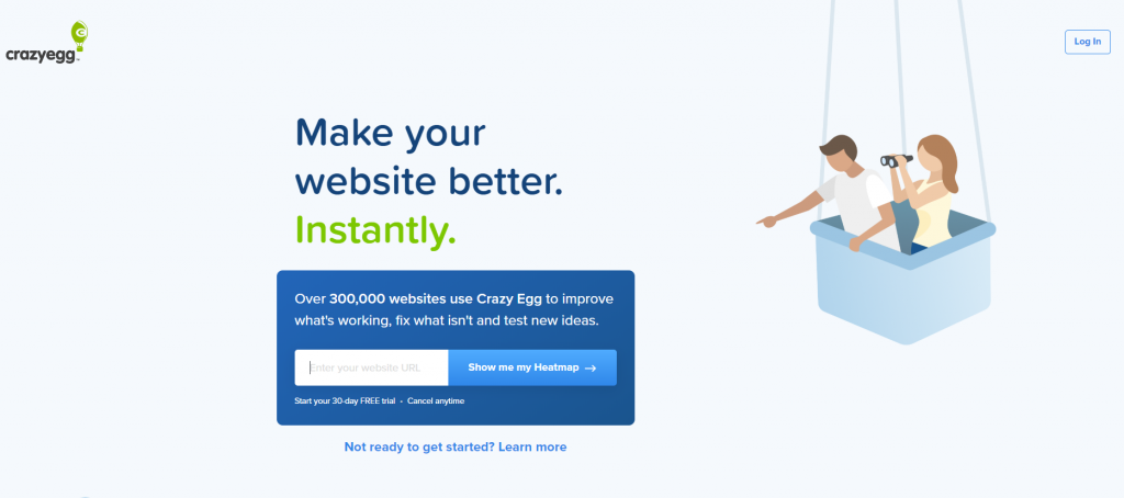
Don’t overlook typography at this stage, either. Many brands choose two or three fonts as part of their brand guidelines, so consider a contrasting font to make sure that call-to-action can’t be missed.
Common CTA Mistakes
When they’re designed well, call-to-action buttons are a thing of beauty. But all too often brands forget about the design of this all-important element and throw something together at the last minute. That often results in one of the most common call-to-action mistakes.
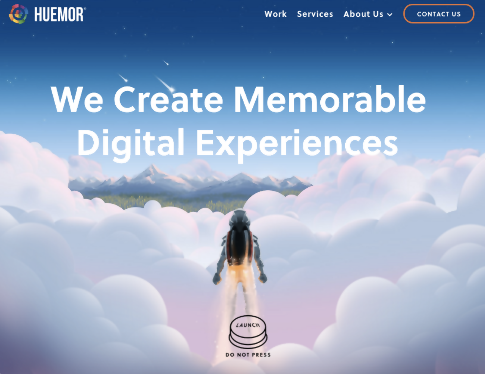
There are many pitfalls when it comes to call-to-action design, but one of the ones we see most often is a lack of clarity. Sometimes, brands don’t fully appreciate the importance of making a button that will stand out. So, CTAs flounder in the shadows as users peruse the rest of the page trying to find what they’re looking for. Avoid this by using contrasting colors, making sure the button looks like a button and ensuring all interactive elements are crystal clear. The below example shows an unusual design, which isn’t quite clear enough to immediately attract users’ attention.
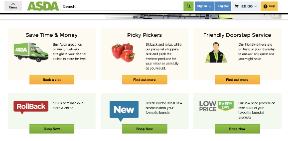
In an attempt to ensure a button gets noticed, it’s easy to fall into the trap of another common mistake. Making a button too big can get on users’ nerves, and negatively affect the conversion rate of a landing page. Using too many different designs is another common issue that can make a page appear cluttered and really detract from the overall user experience. In the below example, far too many different buttons are used, making the page appear cluttered and confusing.
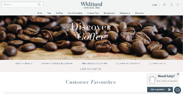
The location of call-to-action buttons is another factor that must be considered throughout the planning process. If they aren’t placed where users expect them to be – well, that can have disappointing results, no matter how well designed they are. So, make sure they are clearly located beneath a captivating tagline that users see as soon as they visit your page. In the below example, the button is placed at the bottom corner of the page, where users might miss it. Not only that, the color blends in far too much with the rest of the page.
A call to action button that performs well is worth its weight in gold. Before adding buttons to your site, or using them on your app, newsletter and social posts, make sure you think about the design elements that can make or break them. Consider your target audience, think about your existing branding and work on a contrasting button that stands out for all the right reasons. You won’t believe the impact it’ll have.
About the author: this is the guest post by Antonija Bozickovic, an internet marketing specialist at Point Visible, a marketing agency providing custom outreach and link building service. She has a great interest in digital marketing and a soft spot for graphic design.
Title image: free vectors from Pale pack on Ouch, the big library of illustrations
Read how to design effective billing forms, check the tips on improving website search and learn how illustrations improve user experience