The search form is arguably one of the most important UI elements and for many different reasons. First, search helps to expand the depth of your content. Whether it’s an ecommerce platform or a news site, the search form is where users’ will navigate to get the information they need. And second, your site search provides plenty of valuable feedback. Which content is being searched the most? Which pages do users use the search form for the most often and why? The goal is not to separate these two use cases but to combine them together with UX design.
As such, this article is to help you understand the best way of approaching search forms in any kind of website or mobile design. We’ll also take a look at some nifty tricks to further improve the search experience for your users. Keep reading to learn more!
Search affects your bottom line
The website search feature is a universal thing. It’s on 99% of website designs today, and in many cases, site search will directly affect your bottom line.
This includes sales, conversions, leads, and anything that makes a user perform a business-beneficial action.
Here are a few facts:
- Up to 80% of users will leave the site if the search experience isn’t up to par.
- Successful searches result in up 2x better conversion rates.
- On average, users give up after 8 seconds of trying to find something.
It’s clear that search needs to become an integral part of your design rather than an external feature. So, let’s try and focus on that.
What is the best placement for a search form?
Although it’s tempting to place the search form where you feel like putting it, it’s generally a much better idea to position it for your users.
As an unwritten rule, designers agree that Top Center and Top Right are the best areas for placing a search box. That said, you have to review your site at an individual perspective.
Let’s take a look at some examples.
1. Verywell
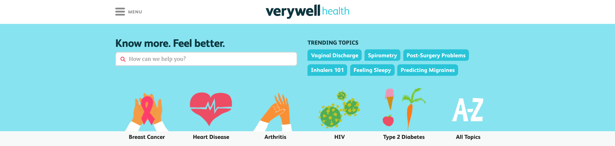
Verywell is a platform dedicated to all kinds of health news. The site is operated as a blogging platform; however, the very first thing users see when landing on the homepage is a massive search box.
This is for two reasons:
- It’s a site focused on information and its accessibility.
- Verywell uses Search and Categories as an actual site navigation feature.
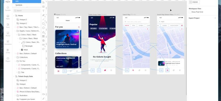
On individual blog posts, Verywell is using a traditional icon approach to let users know where the search form is located.

But, when users click the icon, they won’t see just an input form alone. Instead, Verywell is further adding to their efforts to make the site as searchable as possible.
Like so:
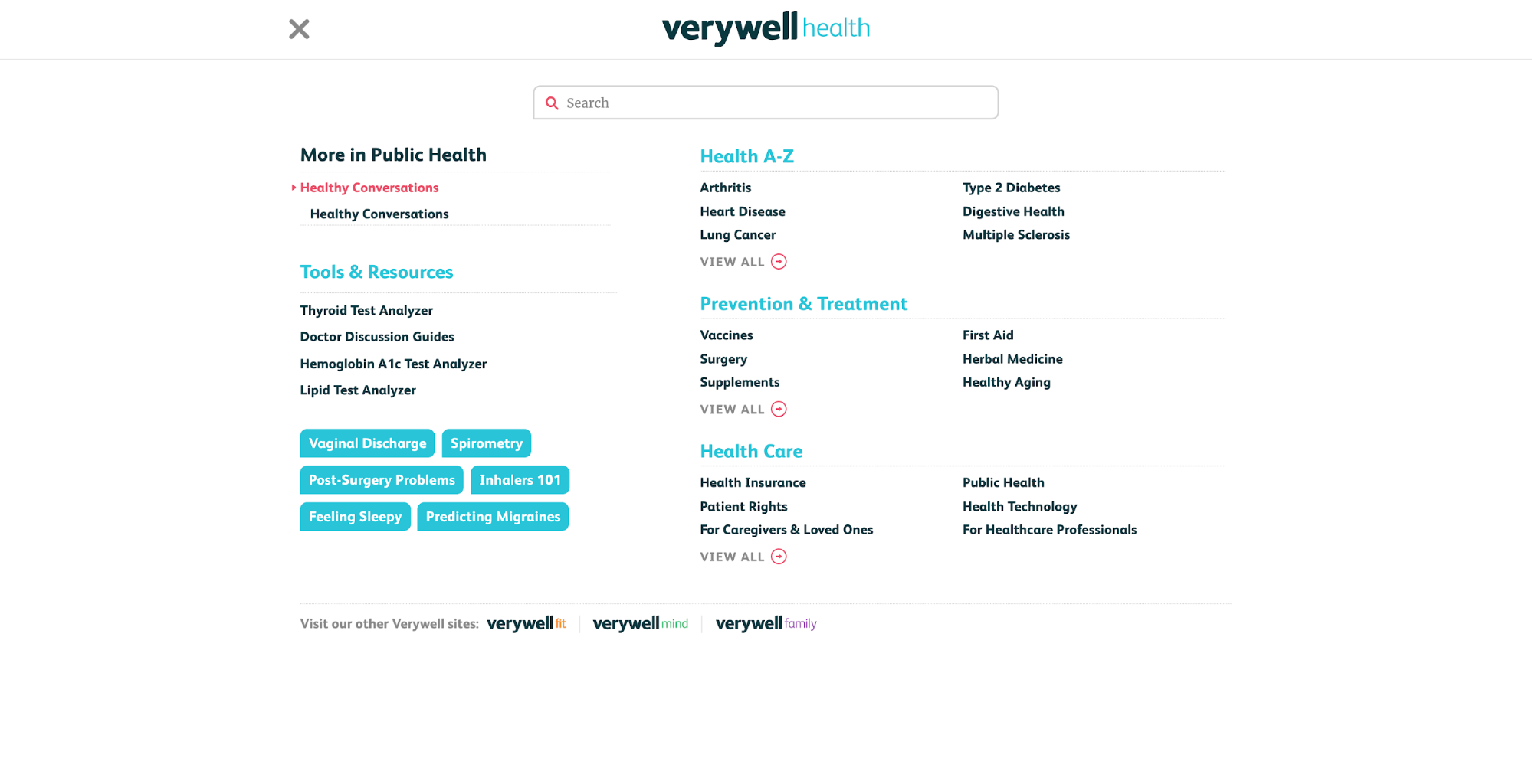
An overlay opens up which showcases related topics and other navigation links, and of course, a hefty search form the dead center of the page.
It just goes to show how a seemingly boring form can be turned into something great.
2. Quora
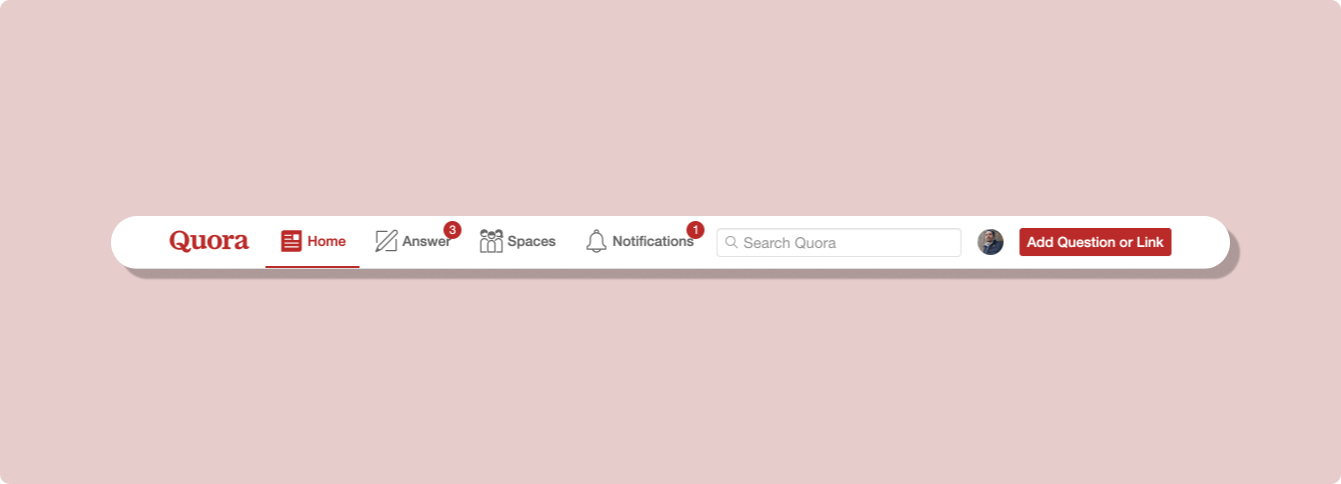
Quora lives and breathes searchable content, so it has been fairly critical for the design team to get the search feature just right.
This is the first example of placement that’s a part of a bigger design ideology. In this example, Quora is using their navigation bar to emphasize only the most important site features, search being among them.
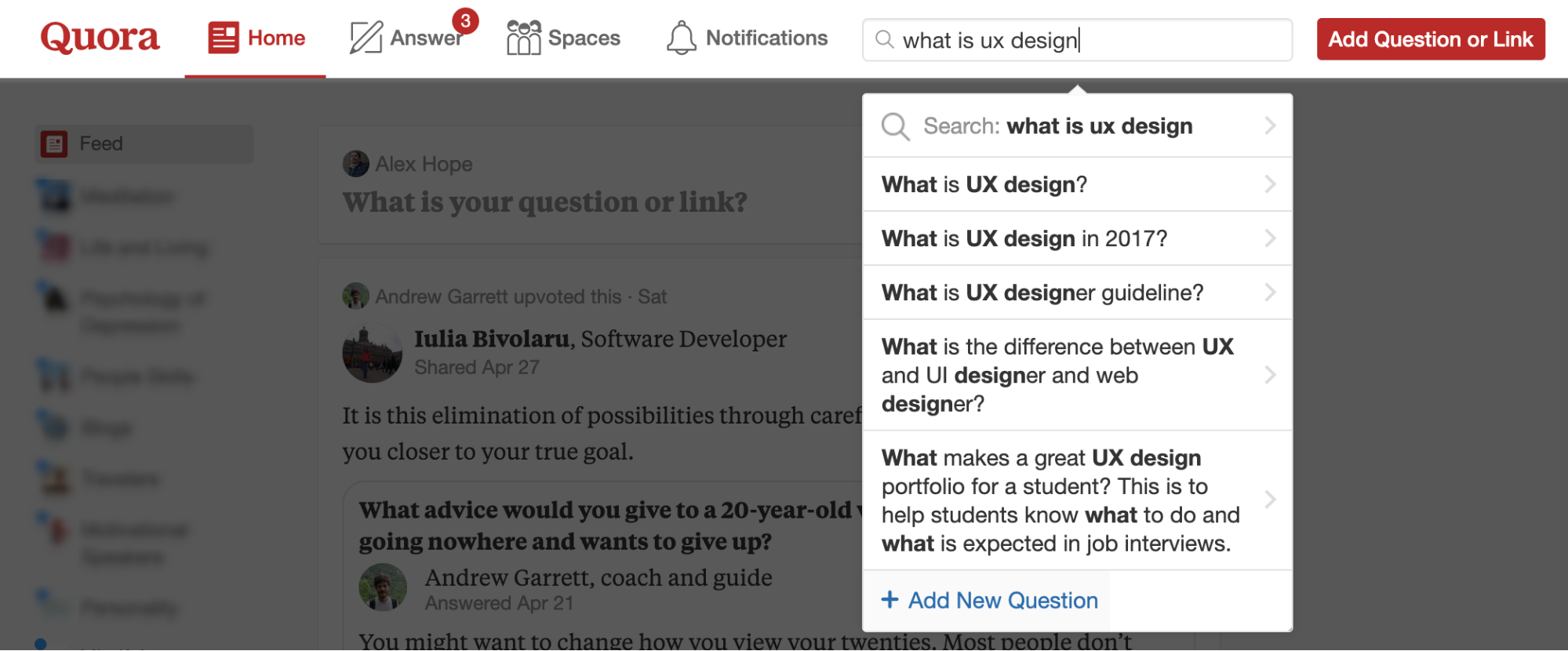
If you look things up, you’ll see a nice autofill feature:
And if autofill isn’t enough, you can follow through to the actual search page.
It looks like this:
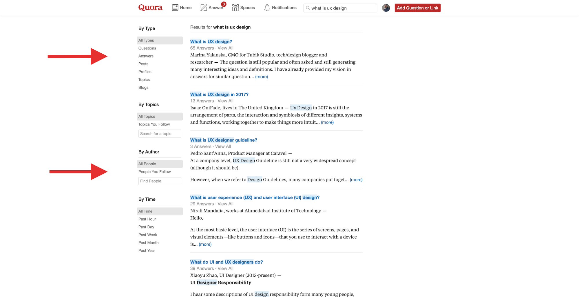
Take note of the extensive features provided on this page. Users can even look up content from other people!
Search is not just how it looks to the eye, it’s also what happens after users hit the enter key!
If you’re overly unsure, then checking out the most popular websites in your niche will quickly reveal common patterns.
What about mobile UI?
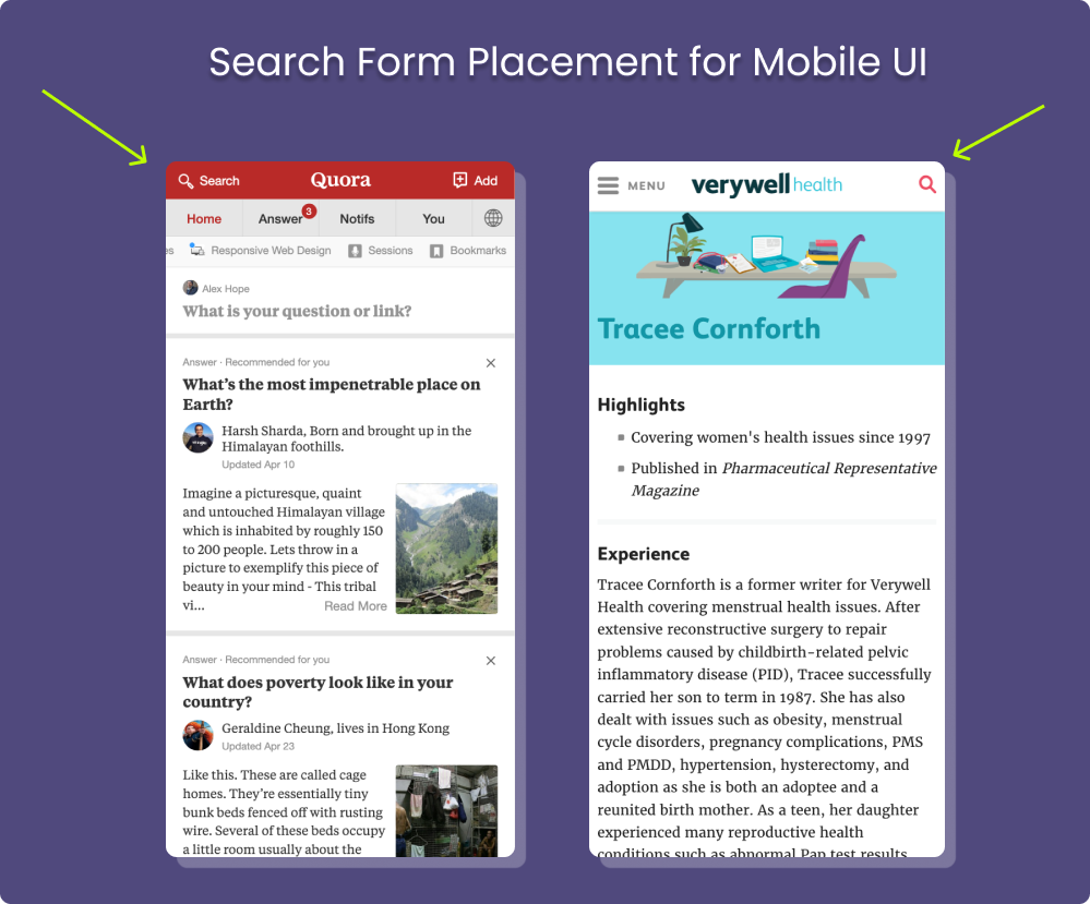
For mobile designs, you’re going to want to place the search bar at the top of the page almost exclusively.
Top Left or Top Right placement depends entirely on other website features that you have.
Symbolism and buttons
There are two commonly used types of search forms, one is plain and the other uses an additional icon as a “submit” button.

The idea here is that users can choose to hit their “Enter” button or instead click the magnifying glass to submit the search request that way.
And even though you see this magnifying glass everywhere, not all designs make it possible to submit a request without having to use “enter”.
It’s definitely nice to have the ability to tap the icon on mobile devices. And if you do incorporate it for mobile, make sure the icon has an appropriate size and users won’t accidentally click other page elements.
Make search available on every page
Design has to be consistent.
If your main navigation includes links to different pages, why would those other pages not have the same menu availability? A lot of sites use their menu to point to the Blog, but once you land there, the Search form is either non-existent or buried somewhere on a sidebar.
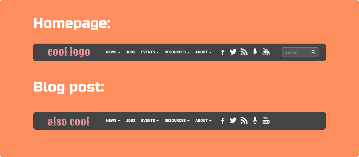
So, one of the things you can do is simply use a consistent navigation menu for all your pages. Granted, the menu provides a search box.
Also, 404 pages are another area where designers usually forget to place a search form. If the user landed on a 404 page, it means that they could not find what they were looking for. It only makes sense that the next step would be to look up the site to find a working page.
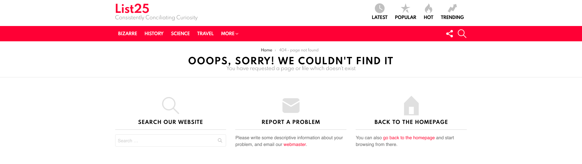
404 page on List25
Consider advanced search options
If your platform has content that’s based on multiple choices, you’ll need to ensure that users can narrow down their search based on a select few filters.
Here’s an example of the Stack Overflow search feature:
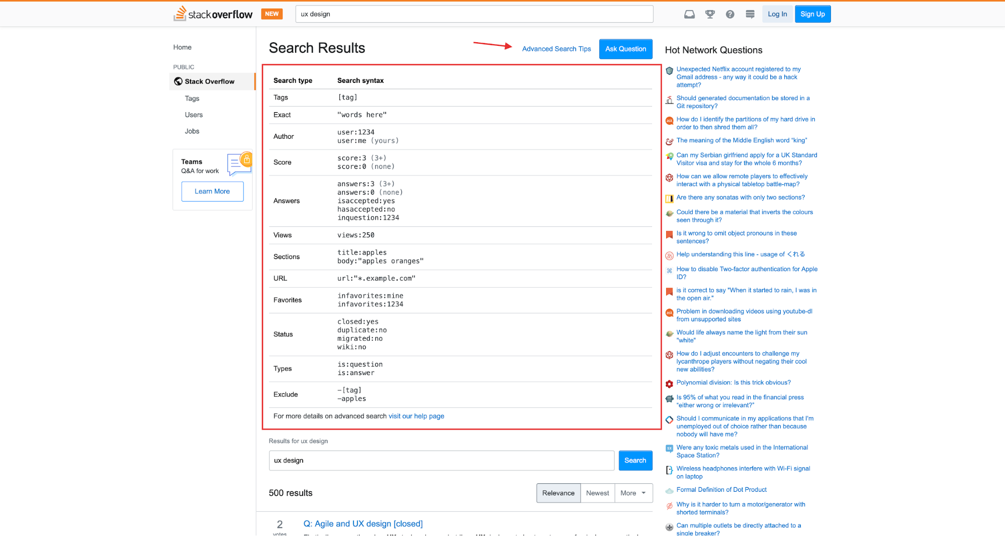
Since each “answer” works as a dedicated entry, users can use advanced search syntax to narrow their search down to a user, or even specific URLs used within the answer.
The greater the depth, the easier it is for users to find the exact piece of content that they require.
And here’s an example from Airbnb:

Being able to look for homes that have a “gym” or are “workspace friendly” improve the user experience immensely.
Design search accessible for mobile users
Mobile screens come in hundreds of different sizes and resolutions. In order to make it accessible to everyone, implement a search form that’s easily accessible, both in width and in font size.
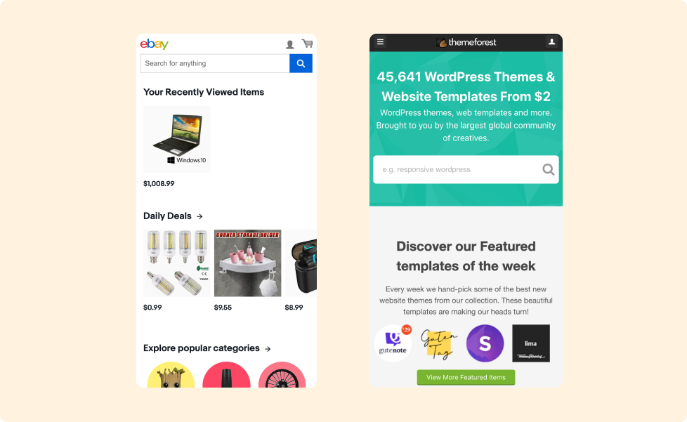
Everyone can attest to the fact that small input forms and buttons often lead to tapping the wrong site element. And many users simply won’t deal with such frustration.
Autofill is a must-have for large sites
Predictive search forms have been around for ages, but you might be overlooking the benefit of them in your own projects. First and foremost, autofill saves time. If users can avoid having to go through multiple steps to get to a page, that’s a huge plus in the user experience department.
Google is well-known for its autocomplete feature, but it’s not the only way to introduce autofill in your project. If you operate an eCommerce store, autofill can greatly improve user experience by auto-suggesting different types of products you have in your catalog.
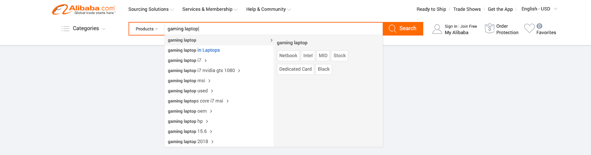
This example from Alibaba is just one of many that you’ll find amongst the most popular e-commerce platforms.
And if you’d like to implement autofill for mobile users, I highly recommend checking out this article from Algolia.
A/B test several variations
Just like any other design element, search forms are not conclusive or tied to a specific style. While the examples shown in this article showcase the accessibility, they do not showcase individual design choices.
So, to get the best results, it’s highly recommended that you test your search for style and placement using A/B testing.
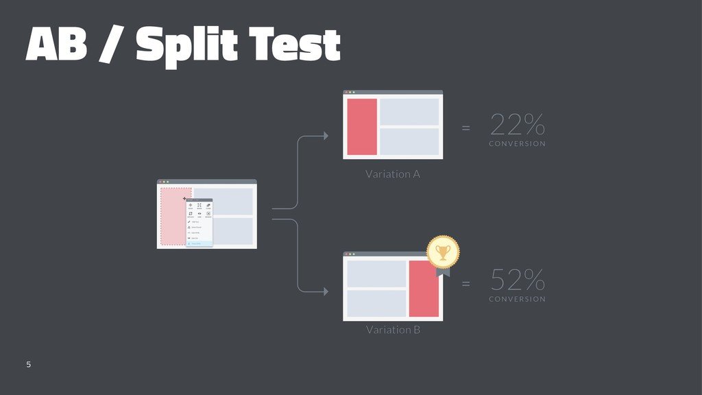
Image by BoldMinded
The tools for the job include Optimizely, AB Tasty, and if you have the resources then you can do it all in-house. Different sites have varying audience types, so A/B testing different placements will give you a clear oversight of what works and what doesn’t.
Conclusion
Search is an important enough design feature that users will almost always remember a bad experience. Whereas a properly implemented search form will guarantee satisfactory results for you and your users.
Here is a recap of all that we’ve learned in this article:
- Search affects the bottom line of your business. The effortless search leads to effortless conversions.
- It’s widely recognized that the Top Header placement for a search form provides the best user experience.
- Using buttons like a magnifying glass gives the user a necessary trigger and a choice to submit their search query in different ways.
- Expect users to land on non-existent pages. To get them out of those pages, make search accessible sitewide.
- Advanced Search Options let users narrow down their search to the exact page/segment they need.
- Mobile forms should be clearly visible and catered to varying screen sizes.
- Autofill reduces the time required to find a specific page or product.
- A/B testing shows you how different placements affect your conversion rates and ultimately the user experience.
Do you know other ways to make the search in user interfaces accessible to everyone? Let us know in the comments down below!
About the author: Alex Ivanovs is a digital marketing specialist with a knack for writing, UX design, and all-things success. Visit his website Stack Diary.
Title image from Pablo pack on Ouch, the library of free vectors
Read about the grey areas of user testing, check the set of effective strategies for educational website design and review how UX and AI work together