Discover how burgundy’s rich history, cultural significance, and design tips can elevate your projects with timeless elegance.
Welcome to “Hues unraveled,” where we explore the nuances of different colors and how they can elevate your designs. We’ve already explored the incredible depths of indigo and the soft elegance of lavender. Today, we turn our attention to burgundy’s rich, sophisticated hue.
In this guide, we’ll explore the historical and cultural significance of burgundy and its emotional impact, provide practical advice on using burgundy in your designs, and showcase stunning graphics to inspire your next project.
In this article
- History of burgundy color
- What color is burgundy?
- Using burgundy in design
- Tips for designing with burgundy
History of burgundy color
Burgundy derives its name from the famous Burgundy wine produced in the Burgundy region of France. This wine is known for its deep, rich red color, which mirrors its hue.
Historically, burgundy has been associated with nobility and high status. During the Middle Ages, it was a color worn by the wealthy and the aristocracy, symbolizing power and luxury. Its enduring association with sophistication and elegance has made it a timeless design and fashion choice, evoking prestige and refinement.
Psychologically, burgundy can evoke warmth and comfort while suggesting strength and confidence. It is a color that balances the intensity of red with the grounded stability of brown, making it ideal for creating a sense of authority and elegance in design. Burgundy’s associations with ambition and wealth make it a popular choice for brands seeking to convey a message of prestige and quality.
What color is burgundy?
Burgundy is a rich, deep hue that varies slightly across the platforms. This color sits at the intersection of red and brown, encapsulating burgundy’s luxurious and sophisticated essence.
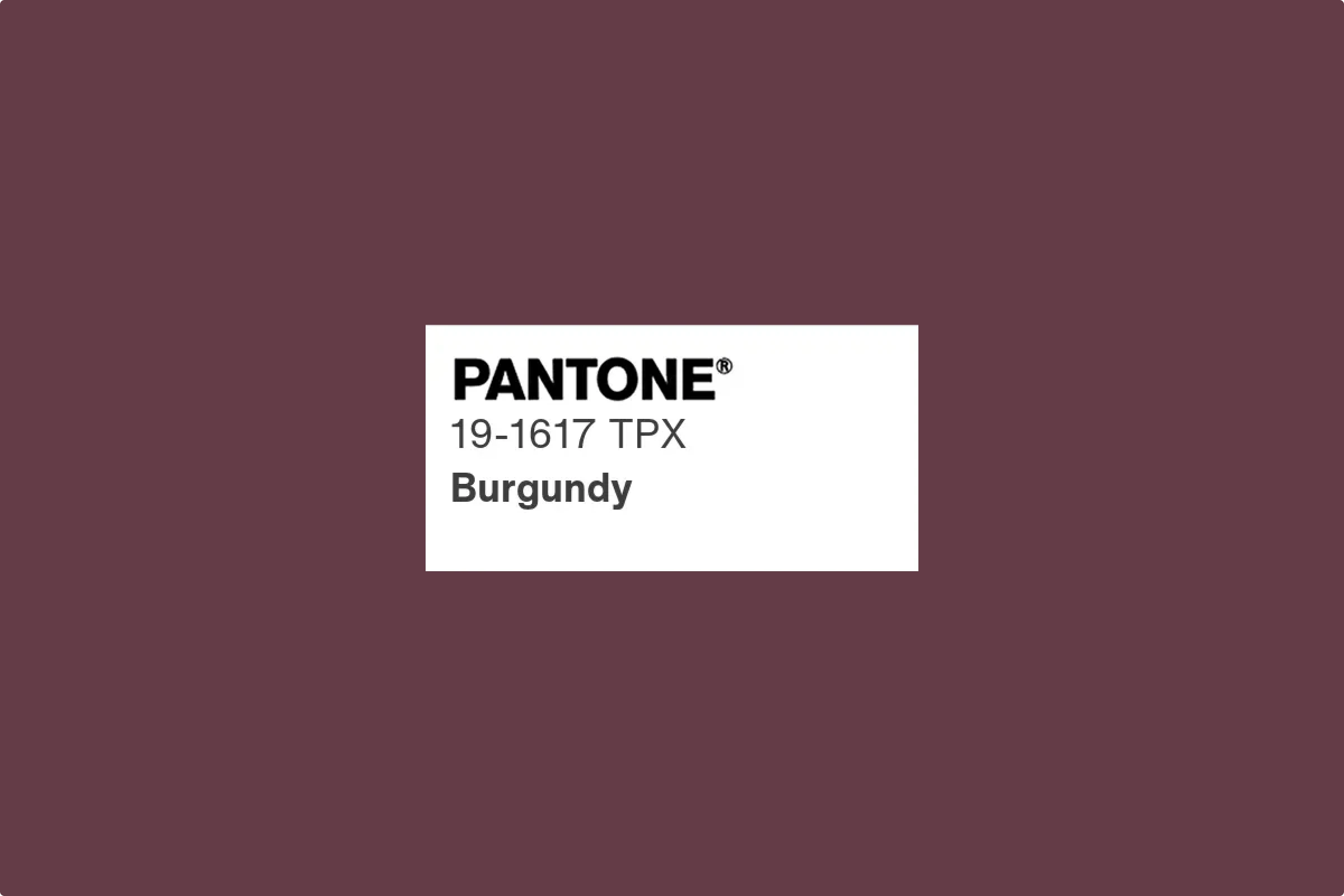
Pantone
Pantone defines “Burgundy” as Pantone 19-1617 TPG, a rich, deep red hue associated with sophistication and frequently used in textiles and interior design.
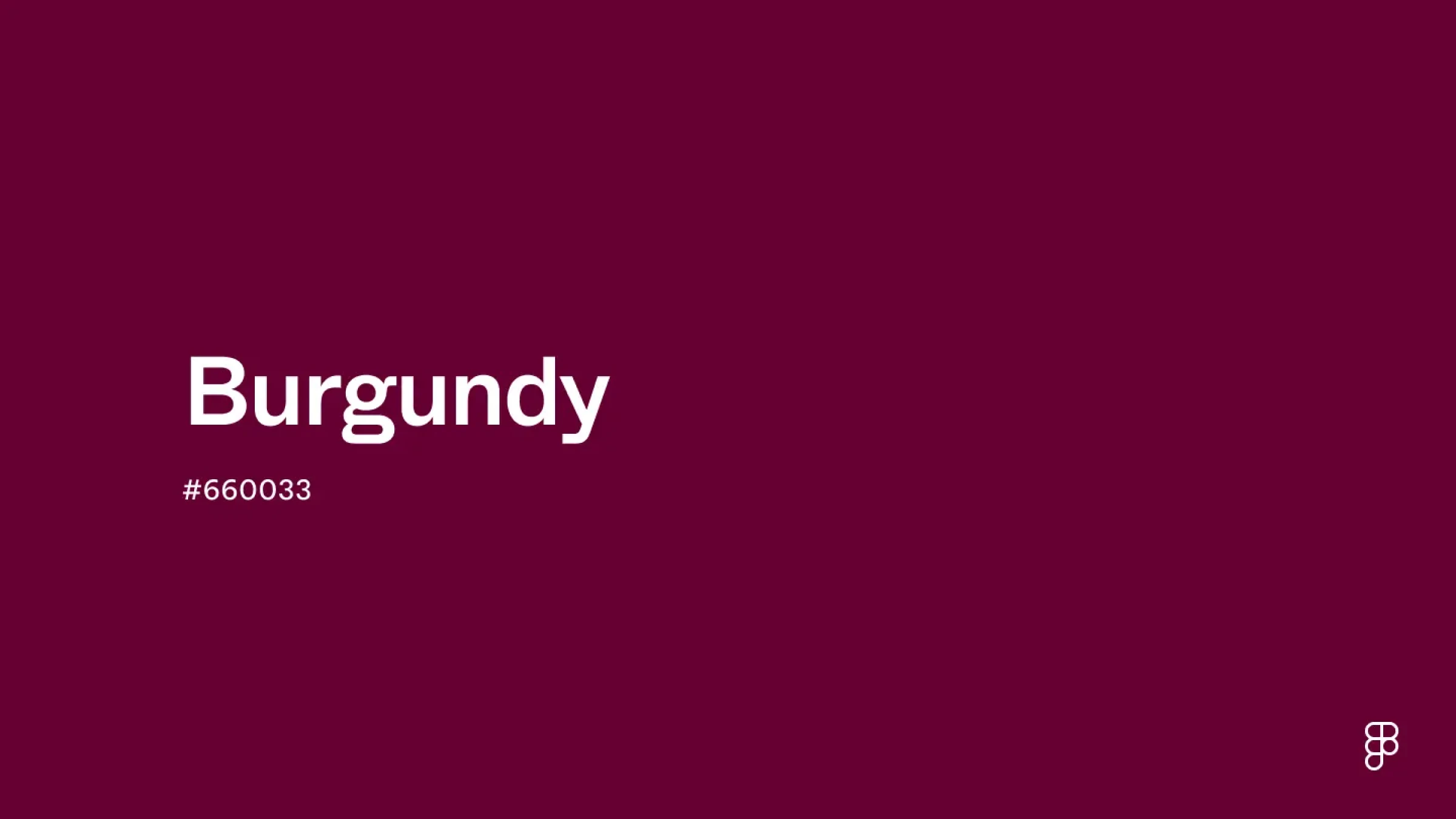
Figma
Figma specifies burgundy using the following color codes:
- HEX code: #660033
- RGB value: 40% red, 0% green, 20% blue
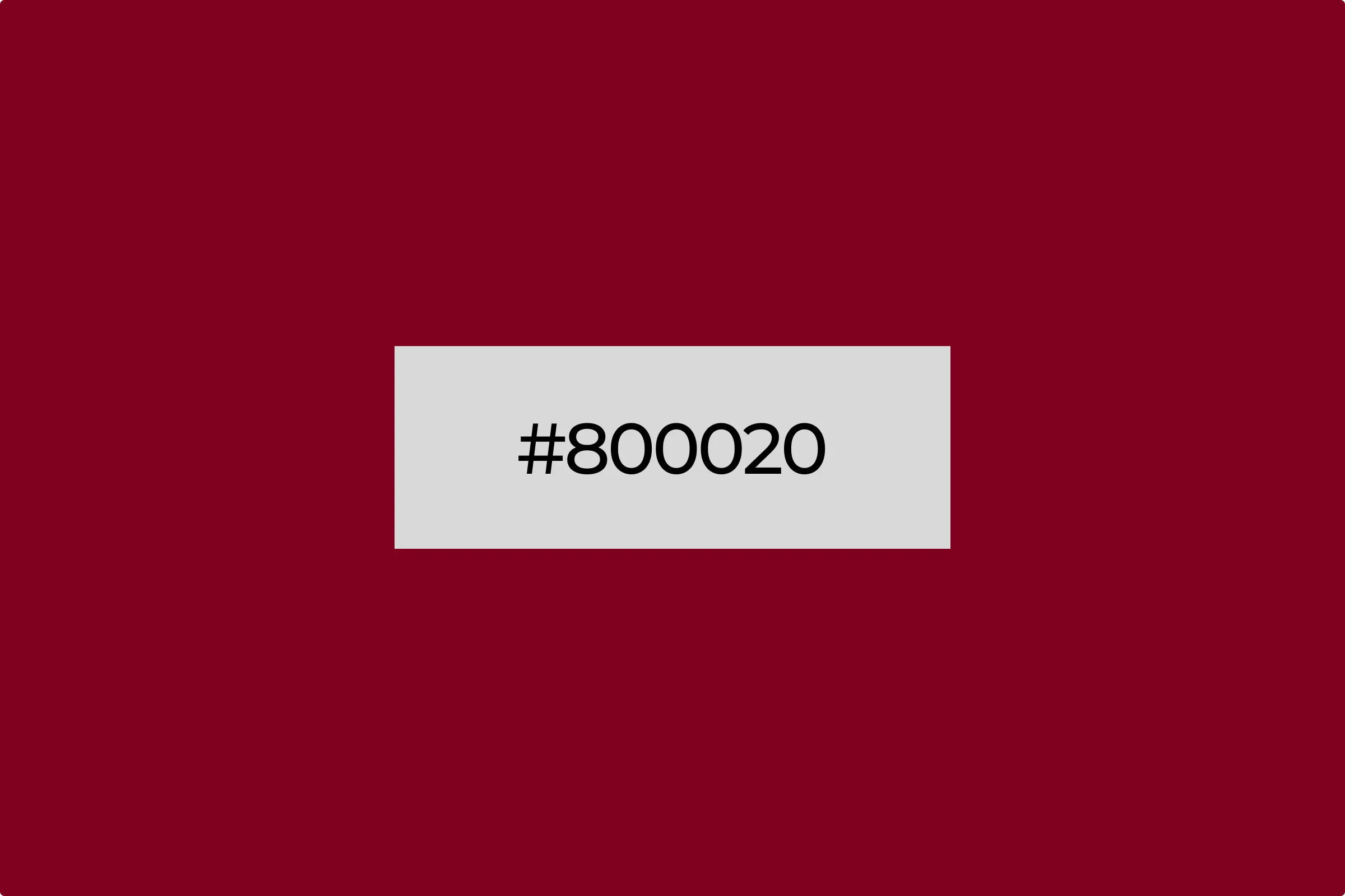
Canva and Adobe
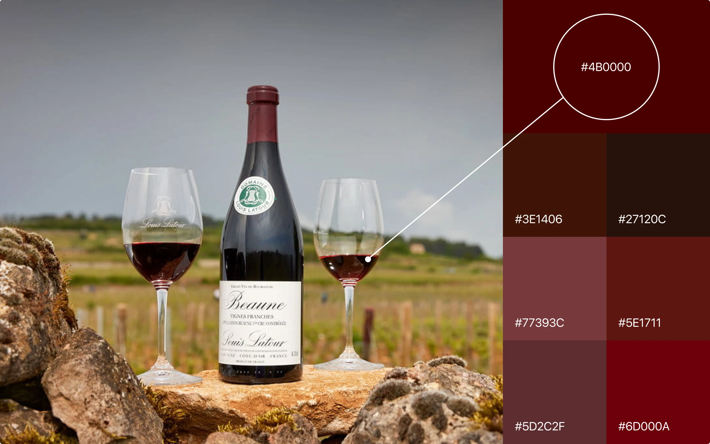
Both Canva and Adobe identify the hex code for burgundy as #800020. For this article, we will adhere to Adobe’s definition, using #800020 as the standard representation of burgundy.
In the RGB (Red, Green, Blue) color model, burgundy is defined as RGB(128, 0, 32). This combination of red, green, and blue highlights its dominant red and brown tones. For print designs, the CMYK (Cyan, Magenta, Yellow, Key/Black) values for burgundy are approximately C=0, M=100, Y=75, K=50, ensuring the color’s depth and richness in physical media.
| HEX | 800020 |
| RGB Decimal | 128, 0, 32 |
| CMYK | 0, 100, 75, 50 |
| HSL | 345°, 100, 25.1 |
| RgbaColor | rgba(128,0,32,1.00) |
| lab XyzColor | 9.163, 4.693, 1.789 |
| HsvColor | 345° , 100% , 50% |
| CIE L*a*b* | 25.84, 48.9, 21.29 |
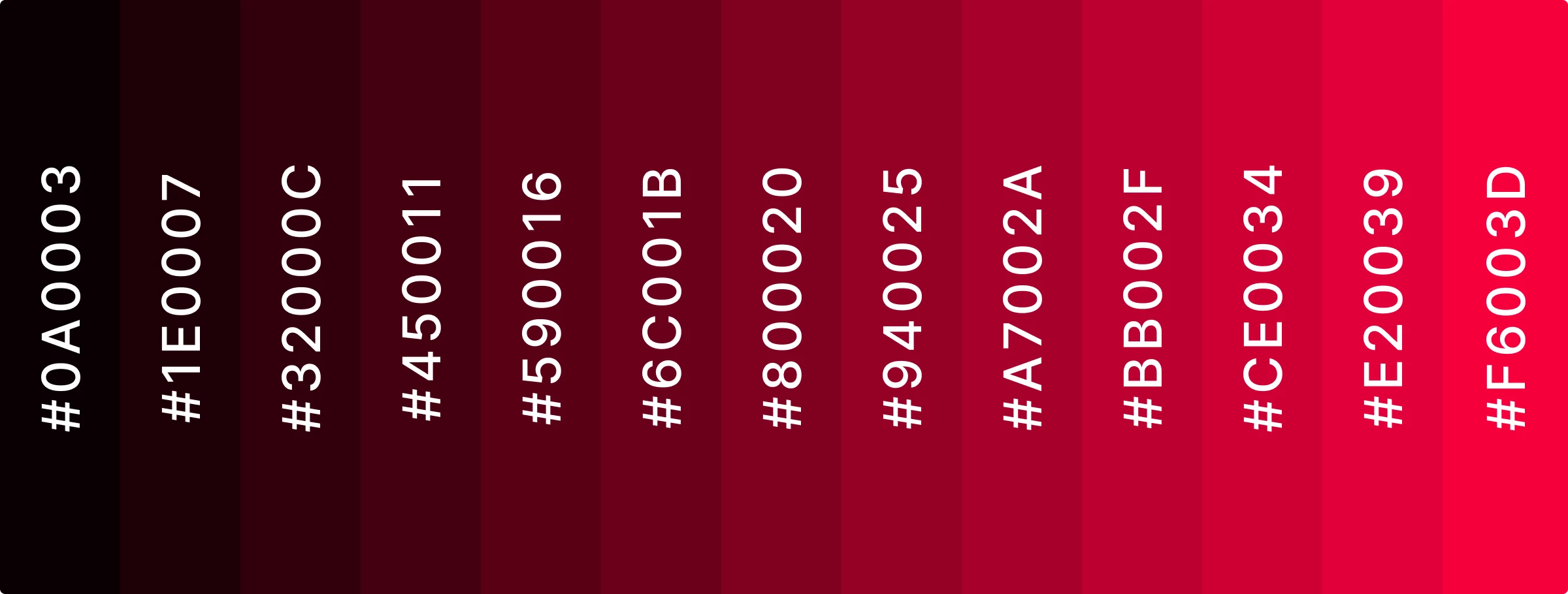
Shades of burgundy
While #800020 is a standard representation of burgundy, the color ranges from lighter to darker. Exploring these variations allows you to tailor the mood and style of your design, from deep, contemplative shades to lighter, more vibrant tones.
Using burgundy in design
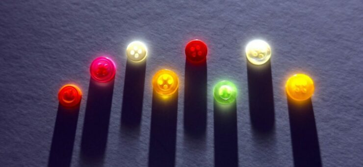
Icons
Burgundy can add a touch of elegance and sophistication to icons. Use it sparingly to avoid overwhelming the design, and balance it with neutral tones to maintain clarity.
Here’s how to recolor any icon straight in a Icons8’s web app:
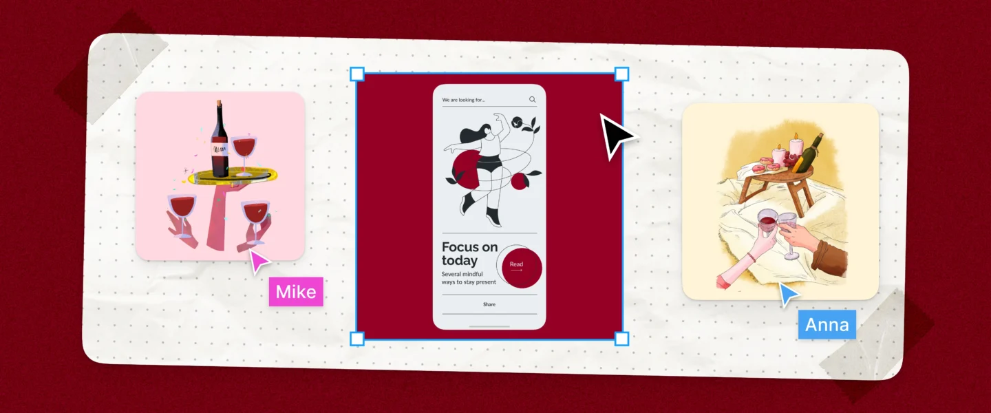
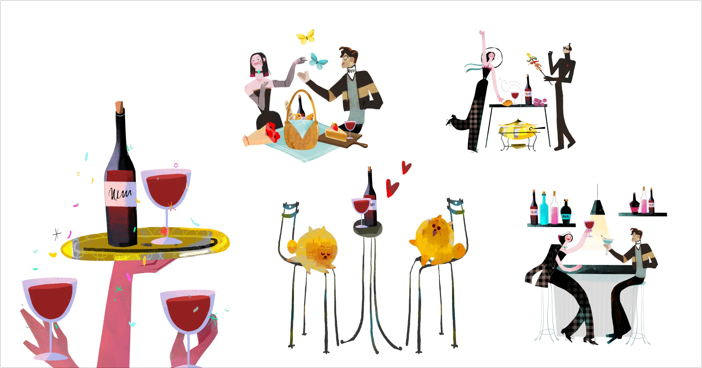
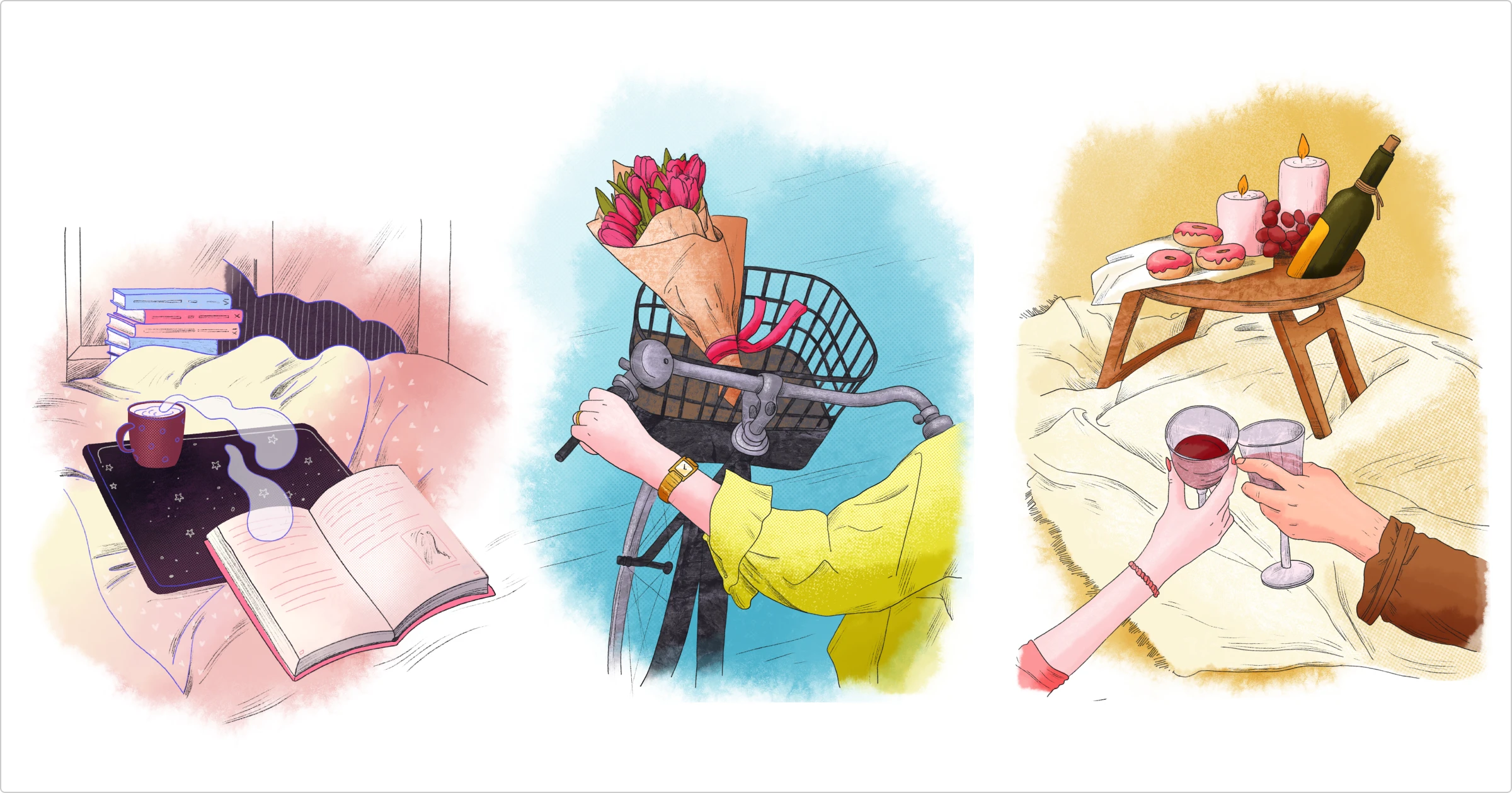
Illustrations
Incorporate burgundy to add depth and richness to illustrations. It works well with lighter colors and can highlight important elements without overpowering the entire image.
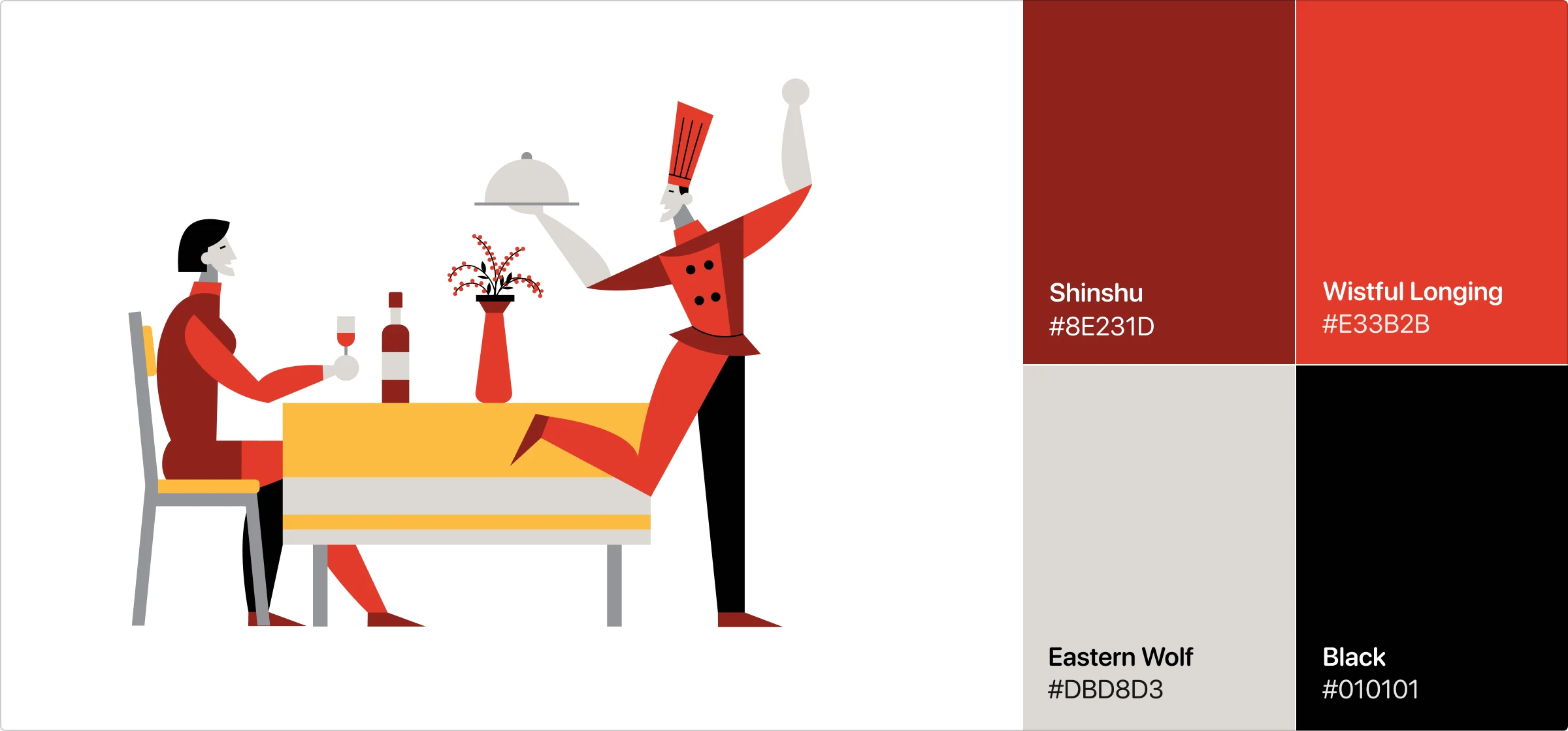

Burgundy is perfect for little details:

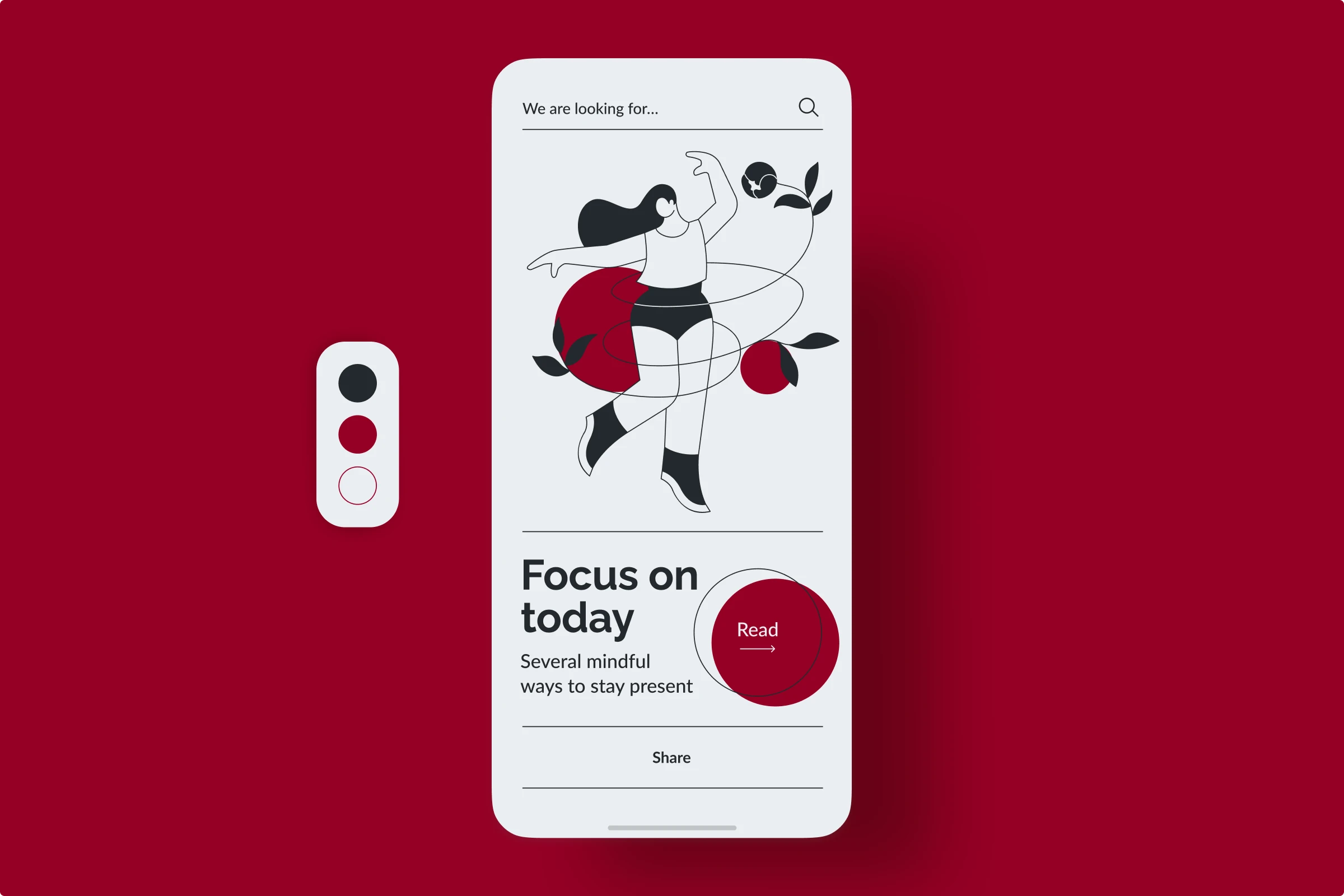
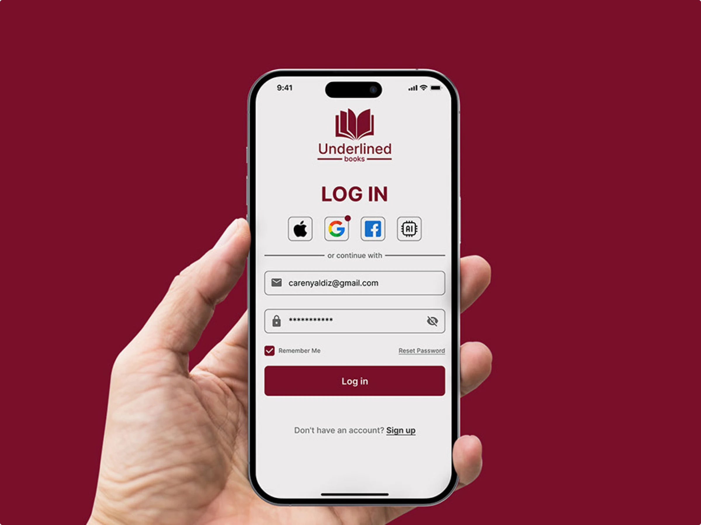
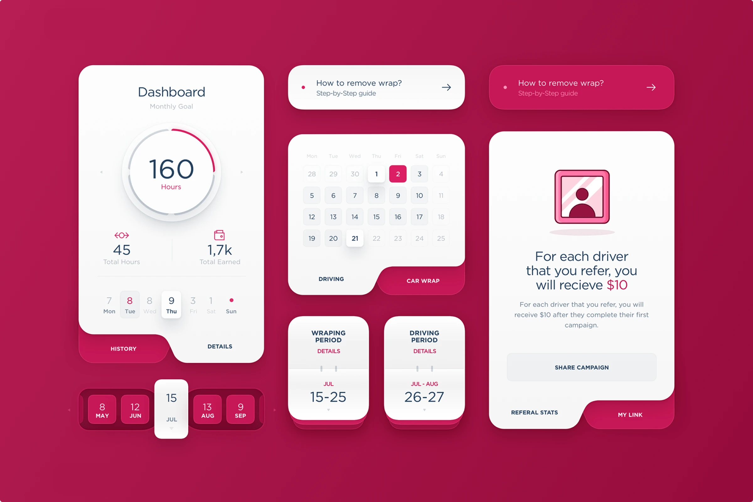
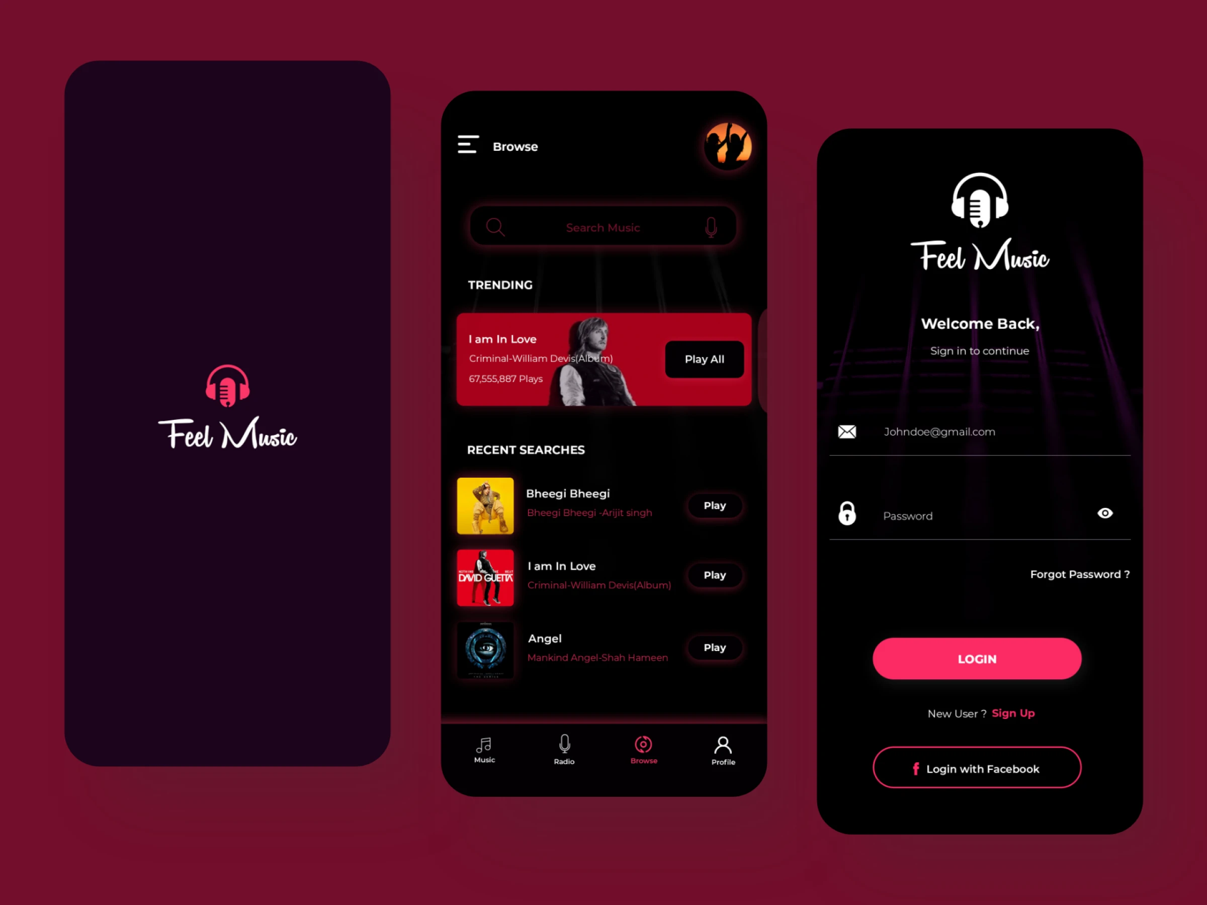
UI designs
Burgundy can be used for buttons, headers, and accents in UI design. Its luxurious feel makes it suitable for high-end products and services. Pair it with contrasting colors like white or light gray to ensure readability.
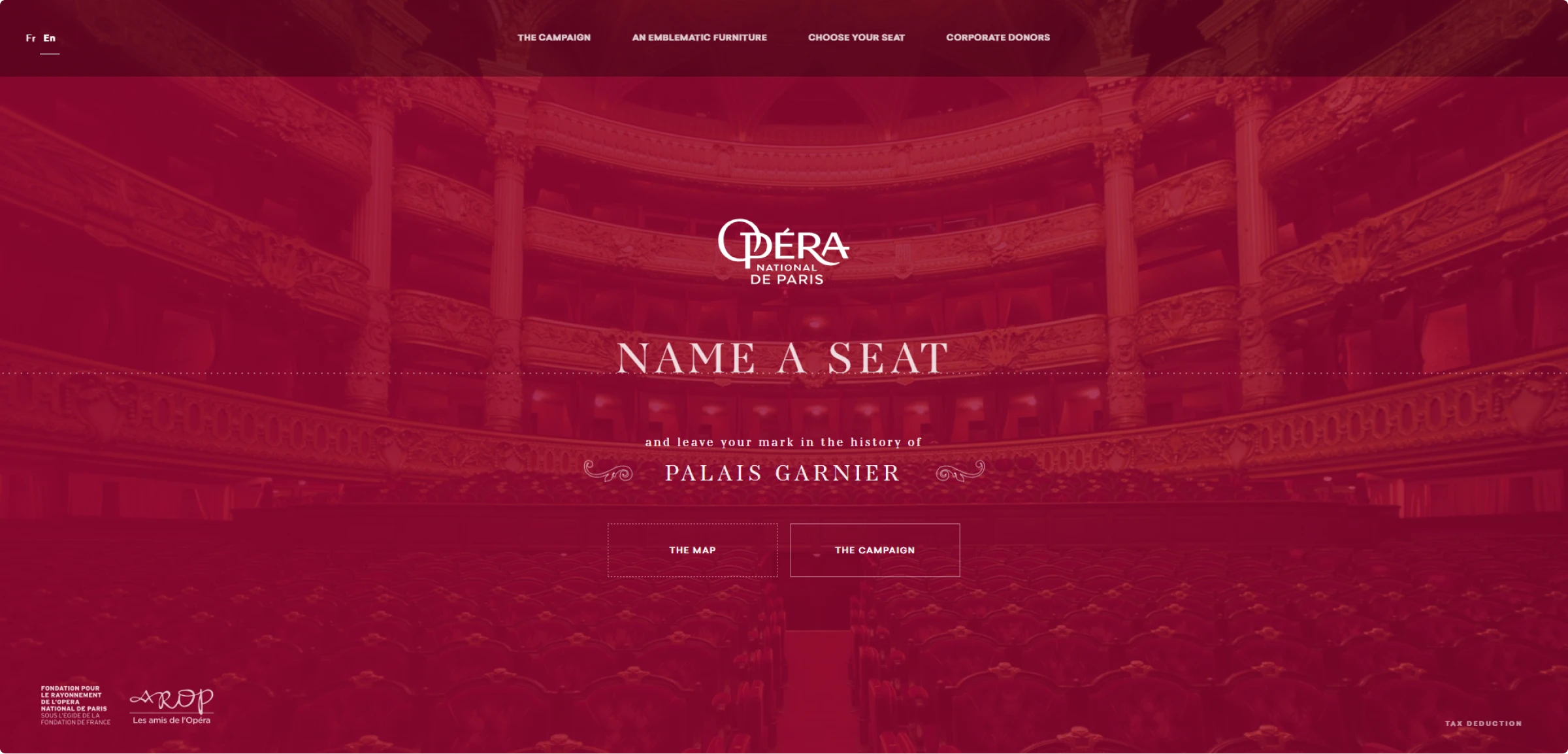
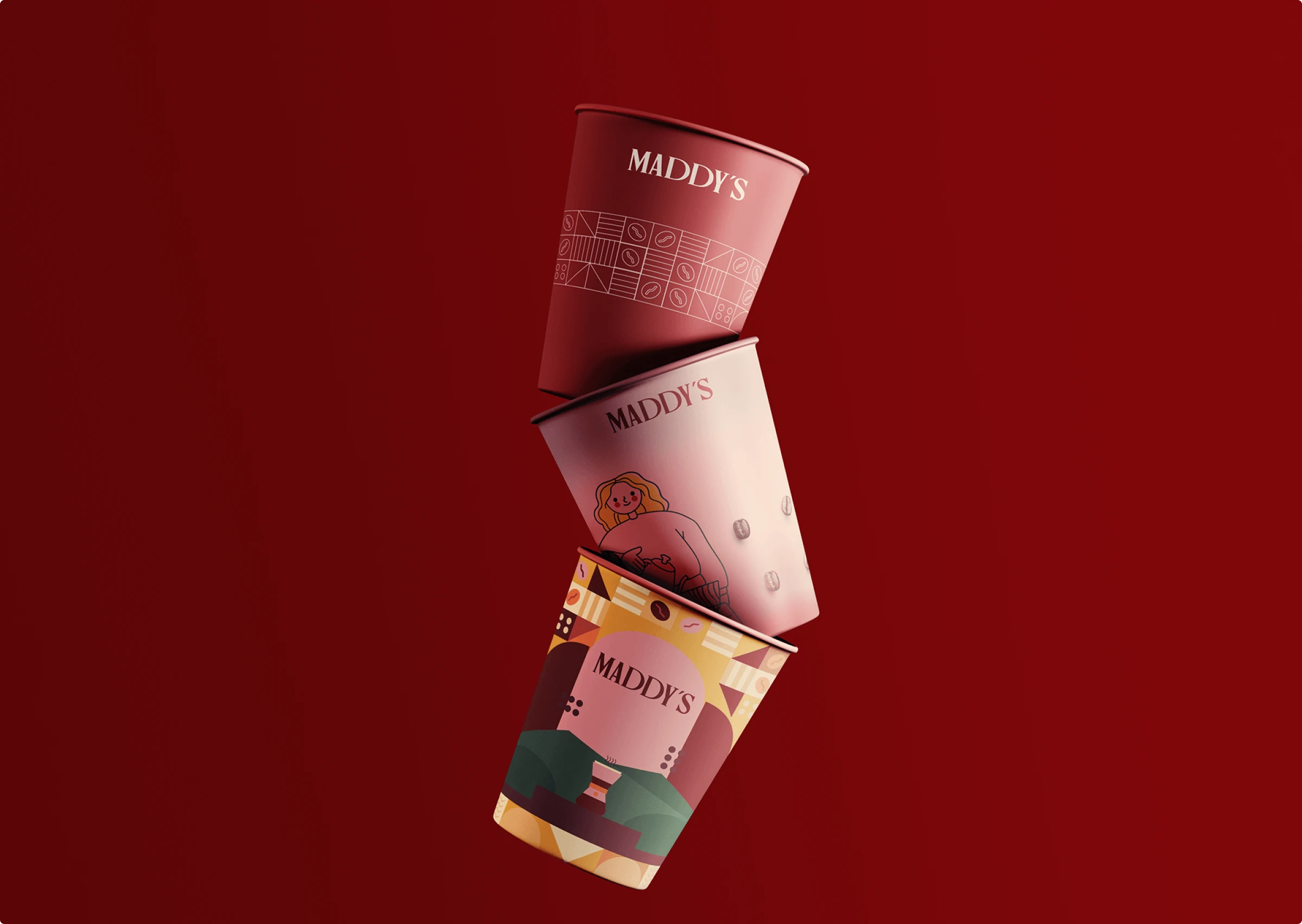
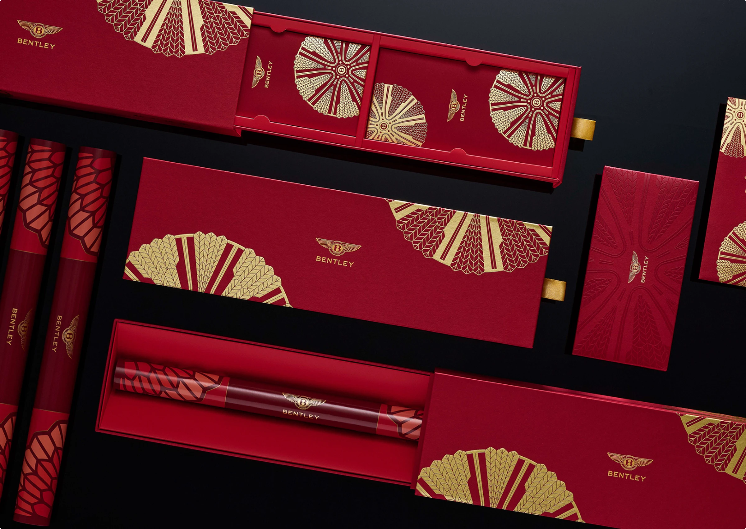
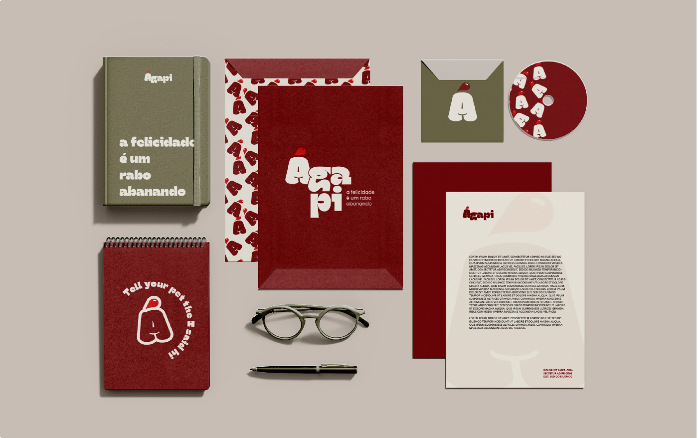
Branding
Burgundy is ideal for creating a strong and authoritative brand identity. It’s especially effective in fashion, cosmetics, and luxury goods. Use it in logos, packaging, and marketing materials to convey a sense of prestige and quality.
Tips for designing with burgundy
Burgundy is a fantastic color that adds depth and elegance to any design. Here are some friendly and concise tips to help you make the most of this rich hue:
- Pair with neutrals. Combine burgundy with whites, grays, or beiges to keep things balanced and chic.
- Highlight key elements. Use burgundy for buttons, headers, or icons to draw attention without shouting.
- Combine with metallics. Pair it with gold or silver for a touch of luxury and sparkle.
- Seasonal and textural play. Great for autumn/winter designs and fun to experiment with different textures.
Wrapping up
Burgundy is a versatile and rich hue that adds a touch of sophistication and elegance to any design project. From its historical and cultural significance to its emotional impact, burgundy offers a depth that few colors can match. Remember to balance it with neutrals, use it sparingly for key elements, and experiment with textures and metallics for a luxurious effect. Embrace burgundy, and watch your designs transform with timeless elegance.
About the author
Adeline Knight is a content writer at Icons8. She started as a professional photographer before falling for design. She enjoys experimenting with new tools and uncovering tips and tricks to simplify her life and boost her creativity.
Read also: