There are so many factors which make your website a success, but call-to-action buttons are web page superheroes. Why? They make people act like you want them to act. And that helps your conversion. Actually, CTAs don`t only show where to click. They are much more powerful. They help people navigate, fight their fears, create your image, share your values. And bring you money. If they are good.
A perfect CTA button. What is it made of? Generally, there are three components. Copy. Design. Context. And their complicated relationship. Ready to explore the most complete CTA guide? Then let`s get started.
Copy
CTA button is a button first of all. Sure. But it doesn’t mean making a green rectangle with rounded corners is enough. Your CTA consists of design and text. And people really read it. Plenty of testings show how much conversion rate depends on the copy. And it’s not only about putting the word ‘now’ in your button text (though it`s worth doing). As always in e-commerce, the devil is in the details.
When naming your CTA button always keep in mind:
- the text should really CALL to action;
- it should explain to your clients what exactly happens after clicking;
- and also — what won`t happen.
In other words, make them sure that clicking the button will serve their interests and won’t bring any harm. Yes, somebody still remembers that the Internet isn’t the safest place in the world. The main goal of the CTA copy is to make people click on and on and on without friction, frustration or panic.
Here are 10 simple tips for making your CTA copy irresistible. And effective at the same time!
1. ‘Do it’ rule
Well, it may seem obvious (and it really is), but your copy should make people act. So, use verbs and put them into the beginning. Ready to put another ‘Register’ or ‘Submit’ button? Sure, you may, but the researches show it`ll probably cut your conversion rate down. After years of dealing with CTAs people seem to get used to all these ‘submits’. This means you should think a bit more about your CTA copy in order for it to get straight to their hearts.

Hint. Dare sometimes to break the most important CTA rule. And don’t think of an elephant!
2. Make it simple and clear
Will clicking bring me to the payment gateway or just add the product to cart? Will it cost me anything or is it free? Is it the final action or just the start? The more clearly people understand the results of each action, the more they are likely to act.
3. Use the 1st person
Actually, it won’t fit in any case but this rule seems to be the recent trend. Some testings show you can increase conversion by choosing the 1st person possessive. Perhaps, psychologically it’s easier for us to get something which is already ‘ours’. At least, thus speak A/B tests!
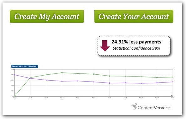
Hint. Look at your CTA copy. If it contains the word ‘your’, change it into ‘my’. Does it look friendlier? Or awkward? Anyway, test both versions. Maybe, there’s a loophole for higher conversion.
4. And don’t use formal language
E-commerce tends to make the Internet a great and very comfortable supermarket. And are you comfortable with formalities? Me, neither. Use ‘Get’ instead of ‘Order’ and ‘Join’ instead of ‘Subscribe’. Probably, it will improve your image and increase conversion!
5. ‘Do it right now’ rule
You don’t want your clients to think about each action for hours. Then make them hurry up! Create a sense of urgency by putting the word ‘now’ into your text.
6. If it’s free, let them know
And never forget to remind about it. Especially, in CTA copies.
7. Respect the limits
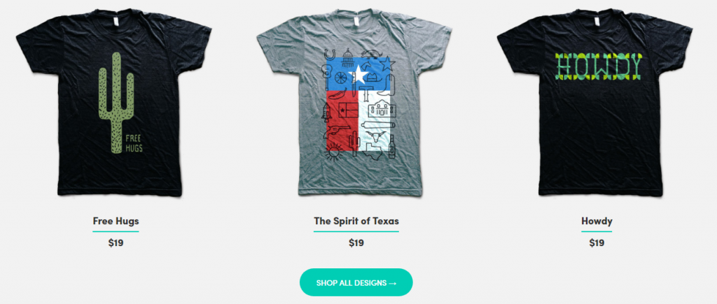
One-word buttons may look unfriendly in some cases, but CTAs longer than 5 words stop looking like buttons at all. Always try to find the balance not to look too covert and, on the other hand, wordy.
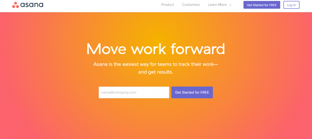
This copy got very close to the limit.
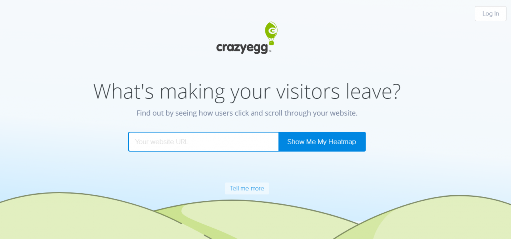
8. Put extra text close to the button
When you feel it`s worth stimulating users with some additional info, put it close to the main text. By the way, here is the fertile ground for incorporating your value proposition.
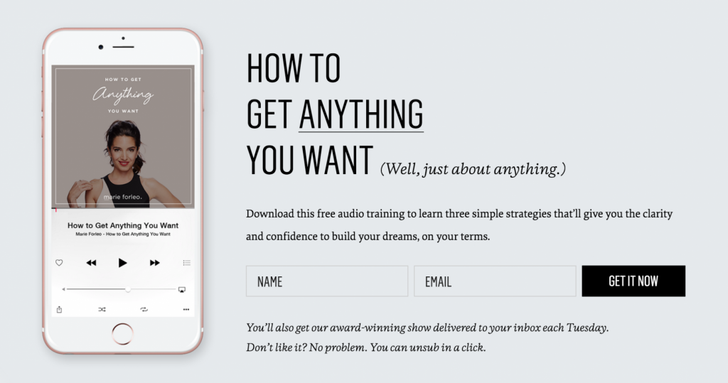
This is also a good example of how to fight users` fears. Remind them this choice isn`t that crucial. They can always make a step back and forget about it.
9. Put your value proposition. At least try to
You’ve spent much time trying to distinguish yourself from rivals. And of course, you succeeded. Your value proposition is something which makes your product special and meets the audience’s expectations. Right. And now try to pack at least its tiny part into the CTA text. Or just put it somewhere very close to it. Think what’s important for your clients. Free access? Fun? Simplicity? Community spirit? Respectability? An overall number of other users? Choose your specific proposition and make it work for your conversion.

10. Social proof
People trust you more when they know your service is tested by other people. Moreover, when they find out they are not using something which is popular, they become feeling uncomfortable. This is the Fear of missing out. If you already have plenty of users, don`t try to conceal it. For somebody, it will create the feeling of safety, for others (well, who knows?) — a sense of being part of a big family.
There are also some other ways to make your product more trustworthy. Attract experts and celebrities, this is as old as the hills.
Design
So, you’ve come up with an amazing CTA copy. It’s action-oriented, clear, personal and full of value. The next question is: how to pack it in a button? If you still doubt about your green-shadowed yellow brick button, look at these 7 simple design tips.
1. Colors matter
Perhaps, a yellow-brick button isn’t bad at all, especially if it’s not placed on a yellow background. There’s only one general rule for all the CTA buttons: they must stand out from the background and grab user’s attention. Well, it’s also true for the colors. It should make your CTA visible! But we can’t say green or yellow always work better than red ‘stop-color’ or blue which may seem too neutral. You should always look at how it combines with the overall color scheme of the webpage.

Hint #1. Don`t forget to use the good old color wheel to choose the complementary colors which will contrast the most. Or try this color calculator to get even more.
Hint #2. Everybody knows colors have an impact on our emotions. Want to learn more? Here’s a nice long read if you think it’s dramatically important.
2. And shape also
Probably, button shapes fashion is not as obvious as trends in human body shape, but some tendencies look quite evident. Buttons (as everything else) have become flat. It means pseudo 3D which made buttons look like buttons got a bit out-of-date. Maybe that’s why flat buttons tend to come with rounded corners. For some cases, it can even push the conversion rate up. This is not the panacea, but at least the idea for testing.
3. And size
That’s easy. Just make it visible enough to attract attention, but don’t go too far. Your customers might get scared. Seriously.
4. Right place
And that`s tricky.

Sorry. Not this one. The placement should be logical and the logic depends on the context. Here are the common tips.
-
- Follow the natural track of an eye. In Western culture, we read from left to right and from the top down, so if your CTA button is immersed in the text, it’s better to put it somewhere on the right and after the text explanation. But not in your website footer, please! Keep all this CTA content above the fold.
- Despite the fact all the users examine a webpage from the left upper corner, there’s no use to put the CTA there. The button should be placed after the body of the text in order for the user to understand what this button is for.
- And if there is no text? Great. Then you are free to put it to the left or, better, to the center of the page. That guarantees no one will miss it. But in that case, think twice about the copy!
Well, somebody might be fed up with this example. But I still like it.
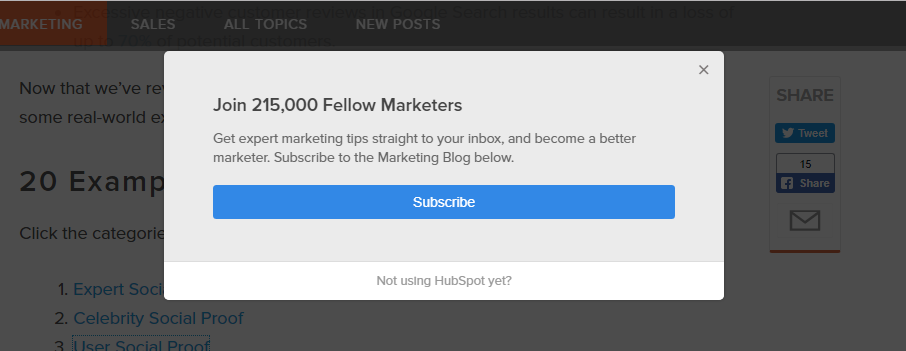
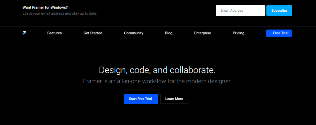
5. Make it win the competition!
If your CTA is not the only one on a page, make it look the most important. When you give choice to users, highlight the option which you want them to choose. How? By using the bright color, muting the other buttons and putting your winner button to the top of the visual hierarchy.
6. Give it more space
Don’t let your CTA get lost in the other content. Giving white space to the button will tell users there’s something important here.
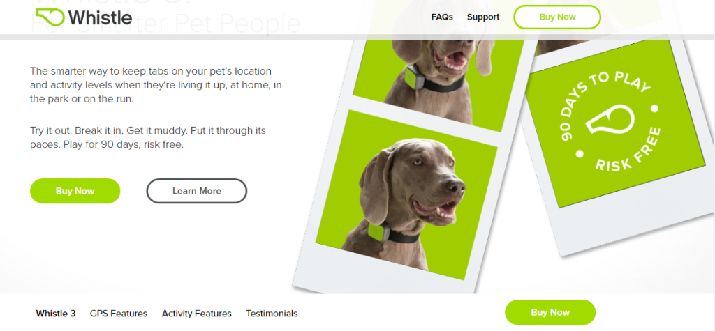
Shopify has made this button ghost but created a separate field to make it stand out.
7. Use icons and animation
Icons are not words. But they can speak volumes and become a significant detail for your CTA button. They tend to use them for additional motivation, putting together with words or just putting icons instead of standard buttons. Just try to keep them stylish in order for people to think your product is as cool as your button icons!
Context
It looks like we’re getting to the CTA perfect formula. But something is still missing. Do you know what? Right. The context. In fact, everything already mentioned was about context. No amazing buttons exist in a vacuum. This part of the article doesn’t contain any special tips. It’s just about common sense!
Actually, the best practices for CTA buttons go together with all the other content. I could even say: think about your whole website as a complex call-to-action (if it really is). It`s not just the color, the shape or the copy which make people proceed, but also your web page content and structure.
If you dream to get your audience warmed up when meeting the CTA, build a pleasant way to action. Put your value proposition into the first lines, make your website easy to navigate, meet the audience’s expectations or shock it with your brand new product.
Hint #1. Even if you are bursting with multiple design versions for your CTA, don’t put all of them into the same website. All buttons must look alike so that your customers wouldn`t feel confused.
Hint #2. If background pictures appeal to you, empower your CTA with the proper image. Just show happy people who have already used your service or simply use the image of a dog barking in the direction of your button.
The eye-tracking studies results can also help you there. Just look at this example. We all know faces attract attention. Especially baby faces!
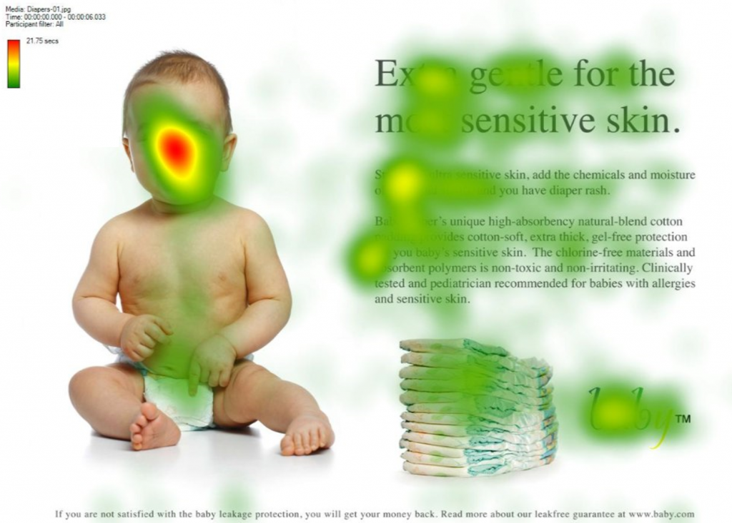
But this can play a bad joke on your conversion rate, distracting attention from your product. The way out?
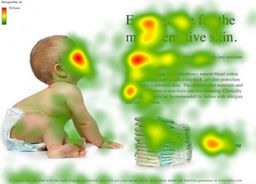
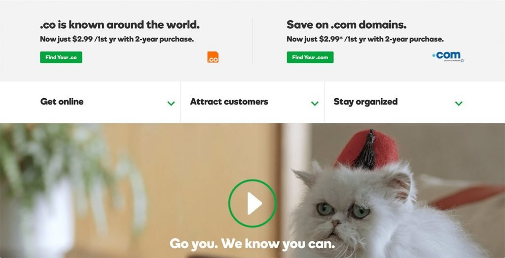
Do it the same as in the example with a dog. By the way, you can learn even more from the recent Google eye-tracking research. It’s not about buttons, but still shows some tendencies in users’ behavior.
Hint #3. In some businesses, cats work even better!
And the last (and the most important) tip. Even if you are sure you`ve created the most stunning button ever and get it in the right place, never forget to put it through the series of A/B tests! CTA is a small thing. But still, there’s much space for improvement.