On November 12, 2020, Apple released its newest operating system, Big Sur. The new system sparked many discussions and debates concerning the major user interface overhaul it delivered. But one of the most controversial and heated debates rose around Big Sur icons. Let’s find out why.
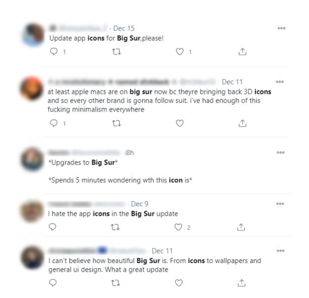
Seeing that there’s no common ground among Apple users, we reached out to professional icon designers to learn what they think about the newest Big Sur icons.
Are Big Sur icons a major design flop that needs to be forgotten as soon as possible, or are they part of a larger vision that Apple intends to follow in the next several years?
Let’s go through all the common opinions surrounding Big Sur icons, one by one.
“They All Look Terrible”
Technically speaking, not all of them look terrible, but some look definitely better than the others, which raises more questions about icons’ consistency. [more on that in the later section]
But we’ll get to the issue of consistency later.
To understand why Big Sur icons look the way they do, you need to realize two driving forces behind their creation: a skeuomorphism and IOSification.
The switch to skeuomorphism, a more detailed approach to designs with inspiration drawn from real-world objects, has been coming for some time as we’ve lived in a world of a minimalistic flat design for far too long.
In its current form, the new skeuomorphic movement is branded as neuomorphism, as it merges elements of flat design (clean, simplistic shapes) and skeuomorphism (shadows, lights, depth) without leaning too much on either side.
Source: Apple
Unfortunately, neuomorphism is a design gray zone, as the question of what stays flat and what becomes more realistic is always open to interpretation. You might see some Big Sur icons are more “realistic” than the others, hence why some feel underdeveloped.
Source: Apple
Another trend that inspired the latest icons collection is the IOSification, or Cupertino designers’ desire to bring all Apple devices to a common design standard.
Here’s a snippet from Apple’s Big Sur documentation:
“In macOS 11, the design language for app icons promotes consistency with all platforms while retaining the lifelike rendering style typical of macOS icons. App icons combine a rounded-rectangle shape, a front-facing perspective, and a consistent drop shadow to provide a unified visual experience.”
As Alexander, Icons8 senior icon designer, puts it, “Perhaps Cupertino designers decided to standardize all the icons to help users feel more comfortable within the Apple ecosystem. Hence why the Big Sur icons are placed within circled boxes or so-called squirkles.”
As Alexander notes, “The approach is common for iOS devices where users need larger icon zones to ease clicking and touching. At the moment, however, Big Sur doesn’t operate on any touch devices, so the argument doesn’t fly.”
It’s no surprise that some icons look better within a squircle, and others not so much.
Both skeuomorphism and IOSification tend to influence the newest icons in a major way; however, their impact is not uniform, and some icons do look better than the others.
At the same time, the question of consistency is a major point of concern.
“There’s no consistency — icons are all over in place.”
It’s hard to argue with this opinion as some icons really do look better than the others.
But that’s not just due to the vague skeuomorphic interpretation or squirkles. Some icons are detailed better than the others.
Here’s what Margarita, one of the most experienced Icons8 designers, says: “In general, new icons are OK, and there are some beautiful ones. But I have questions regarding consistency. Some new icons are super-detailed, like a gear icon with a billion teeth, while others are as simple as ABC.”

“Outdated flat elements and a bunch of new flares can exist even within the same icon,” she continues.
“It’s as if designers wanted to reinvent the whole thing but got lazy somewhere along the process,” Margarita sums up.
“Surely they left some elements in place to keep icons recognizable, but, strangely, a hyper-realistic gear exists within the same interface as a simple book with shadow,” Margarita shares.
“Meanwhile, the speech bubble has some depth. But not the book,” she adds.
“They did a great job at stirring the pot, though,” Margarita smiles, “People now have something to talk about. Icons publicity at its best.”
“These new icons look old.”
The “looking old” argument is strong, as skeuomorphism once dominated the design trends in the 2000s. No wonder it’s associated with something old and outdated.
But it’s not that simple.
“Fashion is cyclical. 3D is all the rage now, and every tiny thing with some volume now gets tons of love on Dribbble,” Margarita says, “I’m sure when flat gets back in a few years, people will have a field day with it.”
The reverse might actually be true, and skeuomorphism is actually a step forward rather than a stage in the cycle. As Apple dives confidently into the augmented reality field, the switch to more physical, 3D looking icons might signal the new era of 3D interfaces coming in strong. Big Sur might be just the beginning.
“Usability is a concern.”
Future-driven or not, Big Sur icons took a major hit in their usability characteristics.
“Due to the square-like borders, we lost the ability to differentiate icons at a glance,” Alexander notes, “We can’t always use color to do that. For example, Messages and FaceTime icons are already hard to discern from afar.”
But that’s just half the problem, as Alexander shares.
“To put an icon into a square, you really have to reduce the parts of icons that make the most sense. Take a look at camera and speech bubble icons once again,” he then adds,” Once again, we’re having a hard time understanding the purpose of icons. I hope it gets better as Apple goes forward!”
In addition to that, Margarita foresees more challenges for icon designers.
“Now, icon designers have to draw a myriad of icons for every case and platform, with every icon having a different degree of complexity. You never had this challenge with flat icons as they look great in both small and large sizes,” Margarita shares, “Gradient is also a point of concern as small details and gradients risk to become one blurred spot.”
Big Sur: Step Into Future or Past?
With all the controversy around Big Sur icons, you can’t deny that the change is, in a way, dramatic. It sets many trends into motion, and in time can potentially disrupt the user interface design field.
We see many strange decisions behind the design of the newest icon pack, but those might also serve as a signal of what might come next.
We might perceive Big Sur as the first step into this new territory of augmented reality, smart home technology, and merged gadgets infrastructure, all the niches we’ve seen Apple dialing down on in the past few years.
But time will show. For now, we’re left with sometimes strange, sometimes beautiful, and weirdly inconsistent icons.
About the author: Andrew is a usability specialist and content creator at Icons8
Learn how to customize app icons on your iPhone and get a free Aesthetic Icons App for easy and beautiful personalization. Discover What You Need In A Photography Lens When Taking Interior Photos