Your ultimate cheat sheet on gradients and how to use them to power up your designs.
In this article
- What is a gradient?
- Types of gradients
- How gradients can enhance your design
- How to use gradients
- Where to use gradients
Definition
Gradients are smooth, gradual transitions between colors. Those can be transitions between different hues of the same color or a blend of completely different shades.
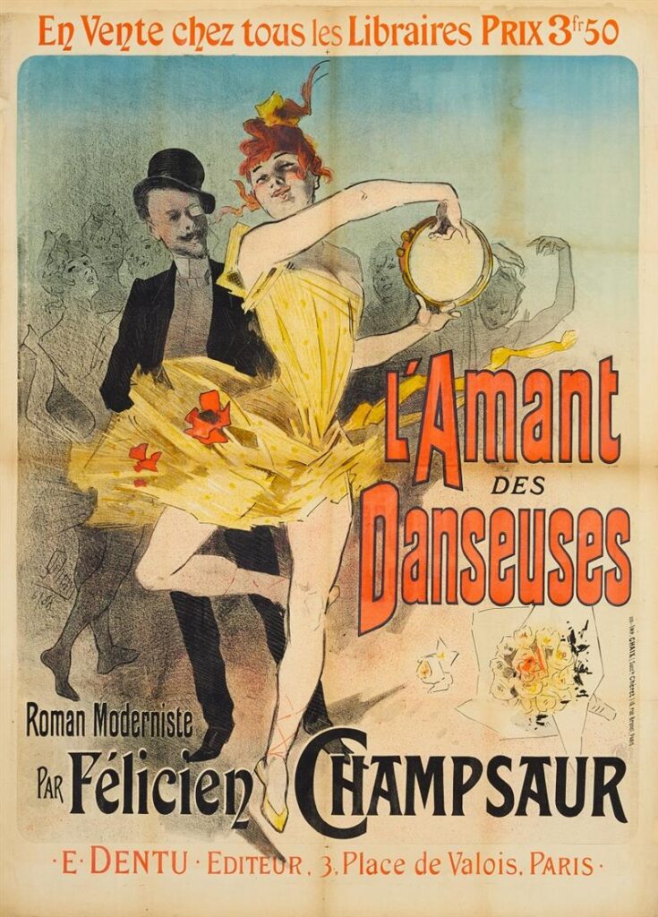
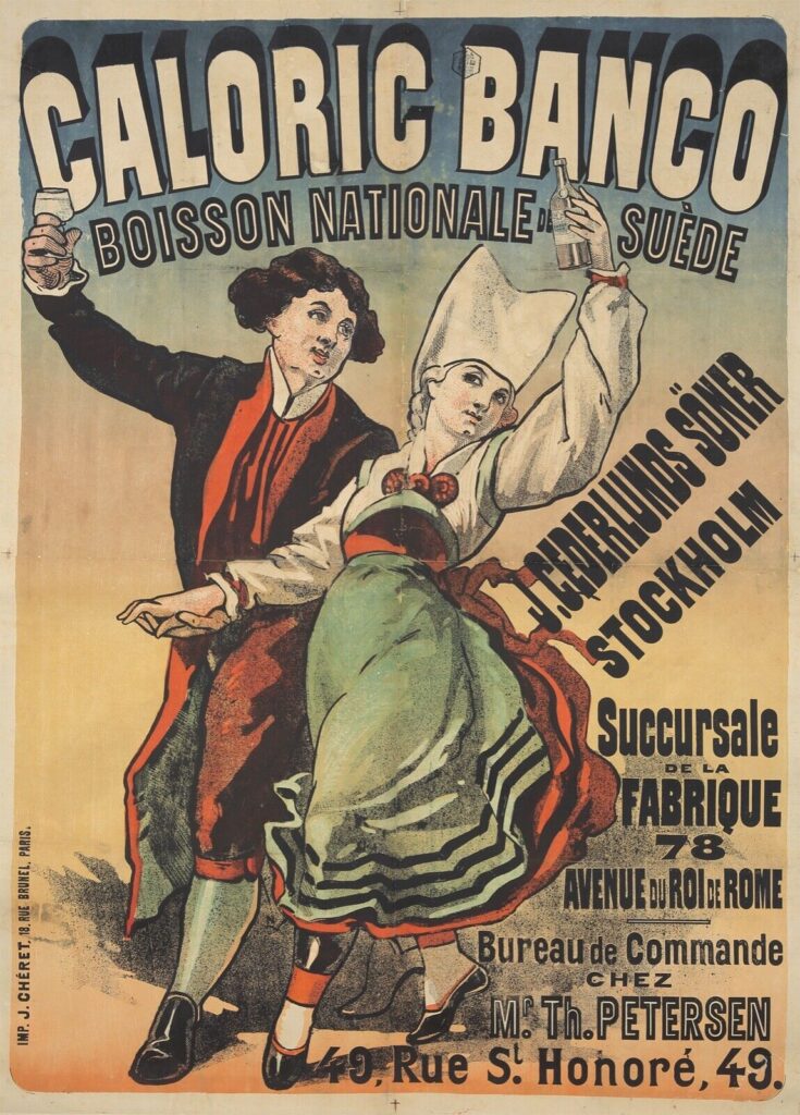
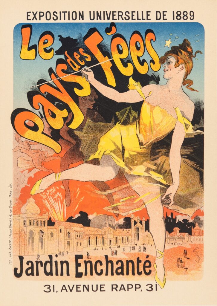
Technically, the history of gradients in graphic design dates back to the 1880s. Around that time, Jules Chéret introduced a brand-new printing method — three-stone lithography. It made printing with color possible and even allowed for subtle color blending. Some of Chéret’s posters feature smooth gradient backgrounds and soft shade transitions in finer details like clothes, hair, and lettering.
Since then, printmaking began to develop quickly, and went from lithography to screen printing to inkjet printing and all the way to laser and digital printing in just a century. Working with color was rapidly becoming less costly and technologically complicated. By the 1990s, graphic designers had graphic design apps like Illustrator and FreeHand as well as modern digital printing technology available. Thanks to the development of digital graphics editing tools, creating gradients became fast, accessible, and easy. Color grading software and graphics editing programs made it possible to create color shifts that follow various patterns in seconds, allowing artists to control their depth, intensity, spread, and other parameters in just a few clicks.
Unsurprisingly, these color shifts quickly became popular in graphic design of the 1990s-2000s. In late 2000s-early 2010s designers took a step back from gradients, as they were getting a bit too cheesy and overused. In late 2010s, however, gradients made a grand comeback and took over the graphic design industry with new variations of color grading gaining popularity.
Types
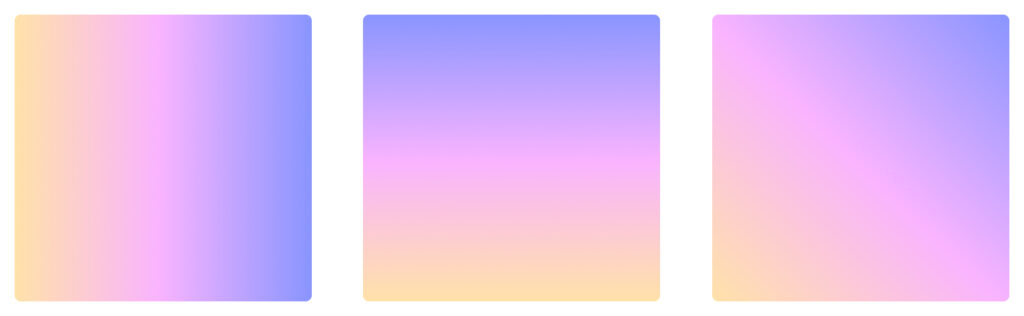
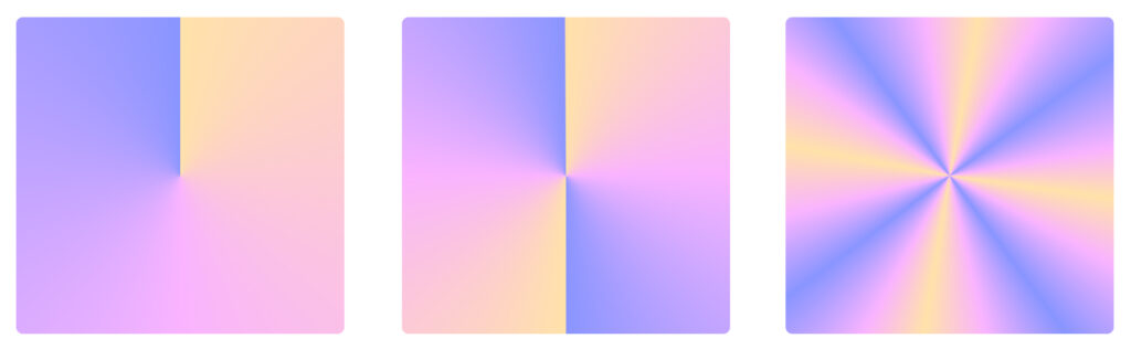
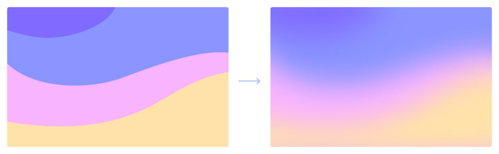
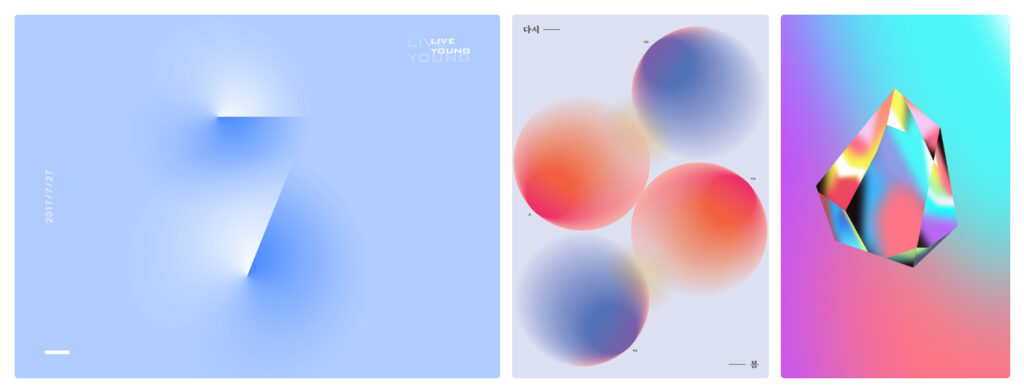
1. Linear gradient
Linear gradient is the most basic type of gradient that is the most effortless to work with. In a linear gradient, color progression follows a straight line that could go vertically, horizontally, or diagonally.
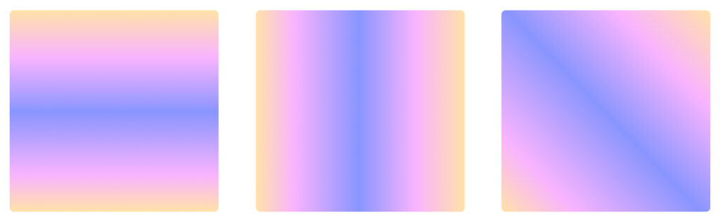
A subtype of a linear gradient — reflected gradient — with linear color progression at its base, it is a gradient where colors meet at a central point and diffuse into mirroring gradients from there
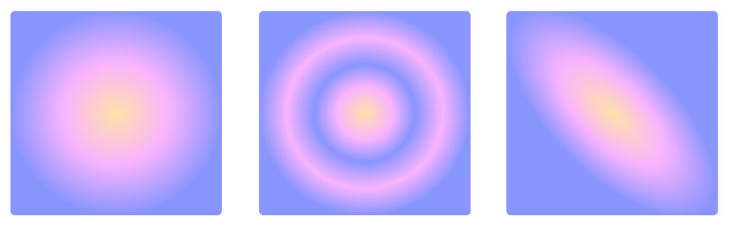
2. Radial gradient
In this gradient, the color transition goes in a circular or ellipsoid shape extending from the center. Radial gradients are perfect for highlighting particular design elements, since they create a halo effect around an object, bringing the viewers’ attention to it.
3. Angular gradient
Also known as a conic gradient, it creates a 3D effect thanks to its 180° color transition revolving around a central point. This makes it appear like you’re looking at a cone-shaped object from above, hence the name of the gradient.
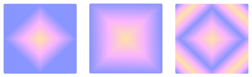
4. Diamond gradient
Similarly to the radial gradient, with this one, you have color spreading outwards from a central point. The only difference is that in this case, it follows the shape of a cross, creating a diamond-like figure instead of a circle.
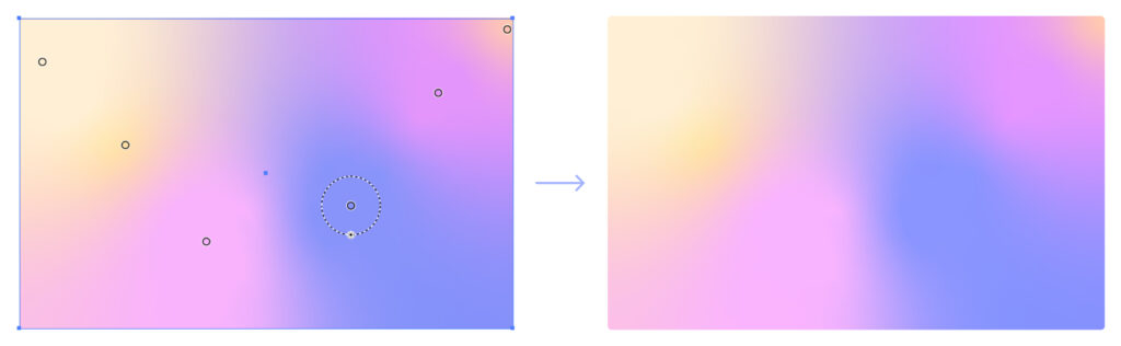
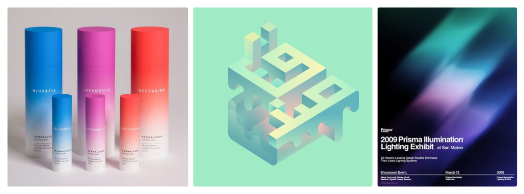
5. Mesh gradient
This is one of the most popular type of gradients you can create. Its only drawback is that you’ll need Adobe Illustrator to make one. You can make it by using the Mesh Tool that creates a mesh on top of your background. The core difference here is that it’s the anchor points within a gradient mesh that emit color. You can assign color to only a few of them or to each of the points making up a mesh. Using Bézier curve controls, you can distort the mesh and move it around until the anchor points create the desired pattern.
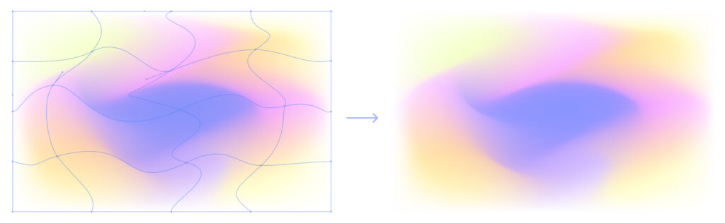
90% of the time, when you see gradients with clean lines in them, those are mesh gradients. Those clean curves appear when one colored anchor point gets close to another anchor point.
If you’re not ready for a $20/month commitment, you can make quick and simple mesh gradients using free online tools like Mesh-y or try to play around with Figma plugins like Mesh Gradient.
6. Shape blur gradient
These gradients are made using random free forms with a blur effect. Think of them as a lazy, less complex version of the mesh gradient. In a shape blur gradient, there can be as many forms as you’d like and they can all be the same or totally different. You can duplicate and overlay them for higher color intensity or place them further away from one another for a subtle color blend.
7. Freeform gradient
The freeform gradient is yet another gem you can find inside Adobe Illustrator. It’s a convenient way of creating a quick yet elaborate and visually pleasing gradient. Similarly to the mesh gradient, it has color assigned to several anchor points, except you can move them around freely, changing the gradient as you go. You can add as many points as you want, connect some of them to create paths of color, and adjust their spread.
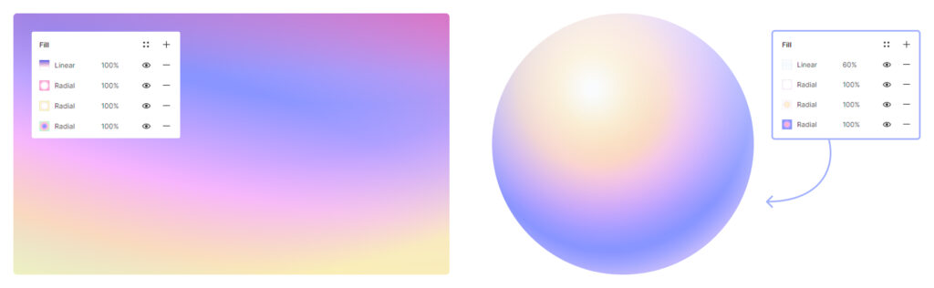
8. Multiple gradients
Multiple gradients are where all the fun’s at. It’s when you apply multiple basic gradients to a single shape to create a complex gradient pattern. It can be a combination of, say, several radial gradients and a linear gradient or a diamond gradient accompanied by multiple reflected gradients. By using multiple simple gradients within one shape, you can add more depth and make color transitions more intricate.
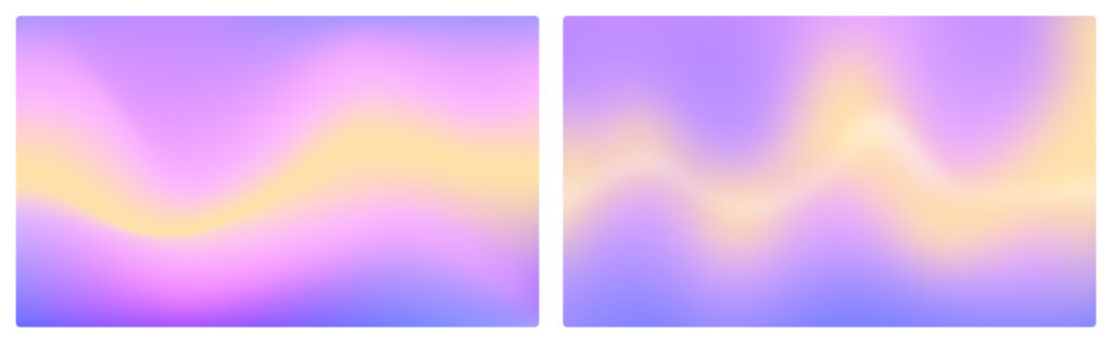
Wait, where’s the aurora gradient?
This gradient that has been on the rise lately can in fact be categorized as a subtype of the shape blur gradient, the mesh gradient, or the freeform gradient. You can create it using any of these options, depending on the desired outcome.
As the name suggests, the aurora gradient mimics the stunning aurora borealis phenomenon also known as polar lights. Because polar lights are never the same and don’t always look streaky, you can either create a soft, airbrushed aurora-like gradient using shape blur, or make a sharper one using a mesh. With a freeform gradient, you’d be able to do both.
How gradients can enhance your design
1. Make a color palette more fun and eye-catching without overdoing it
By using gradients, you can even turn a 3-shade neutral color palette into something refreshing. Gradual transitions between different hues make it look like the palette is richer than it really is. This gentle, non-overwhelming color play you can achieve with gradients almost always looks more alluring than a composition made up of monochrome shapes.
2. Draw the viewers’ attention to a specific element
Gradients can help you create a halo effect around an object, subtly highlighting it and shifting the viewers’ gaze towards it. Radial and diamond gradients are especially useful in this case, as they can act as a light, non-overpowering frame around an element.
3. Add volume/dimension
Even the most delicate color transitions can add depth to a design right away. With gradients, you can play with volume to the point where a 2D design looks like a 3D artwork. The trick is that color shifts in gradients imitate different types of lighting. Conic gradients mimic split lighting where the lighting source is perpendicular to the object. Radial and diamond gradients resemble backlighting. Linear gradients are similar to overhead lighting and bottom lighting.
4. They just look cool!
It’s undeniable that even a simple gradient makes any design look more sophisticated. There is something inexplicably mesmerizing about these mellow color shifts. Animated or static, shade transitions are an infallible design choice that works for nearly anything.
How to use gradients
One of the best things about gradients is their versatility. There are numerous ways you can use soft color blends in your designs. While slapping a gradient onto the background seems to be the most obvious option, it’s not the only one.
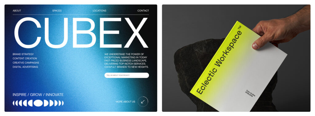
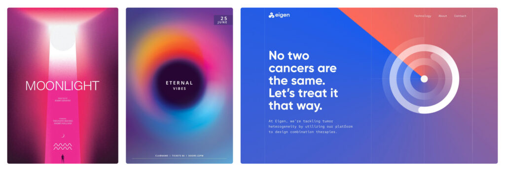
1. As a background
Gradient backgrounds are an all-time classic. There is no better way to make a background more visually appealing while keeping it free from unnecessary clutter. Gradient backgrounds are a foolproof choice all across graphic design, whether it’s a UI design project for a mobile app or a concert poster.
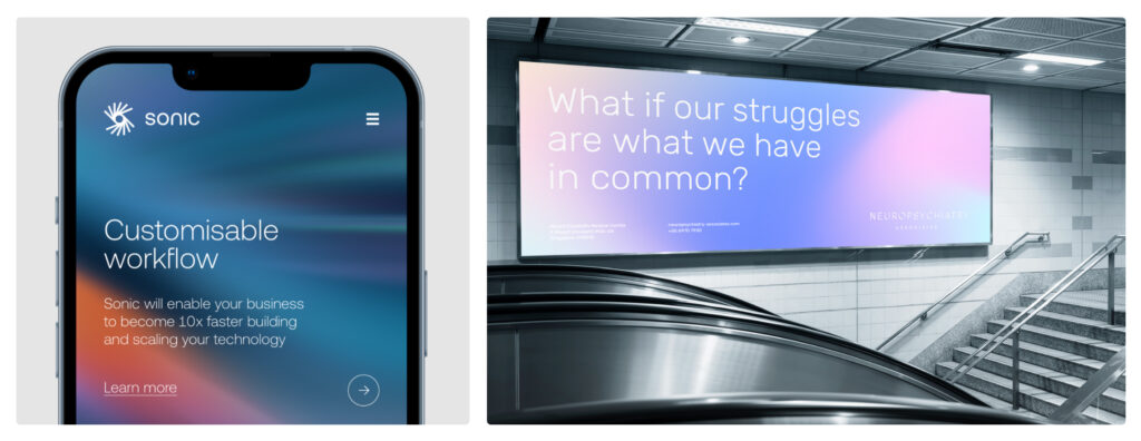
This is the easiest way to integrate a gradient into your design, since in most apps, all you have to do is switch the fill of your background to a gradient and select the colors you want.
2. As a shape fill
Whenever a shape looks too flat and boring with a monochromatic fill, gradients are there to save the day. By using a gradient fill, you can instantly add volume to your button and turn it into an attention grabber. This is especially helpful when designing CTA buttons that are supposed to catch a user’s eye and gently lead them to the desired action.
3. As a text fill
Don’t get this wrong, an entire 200-word paragraph filled in with a gradient is not a good idea. Gradients as text fills work wonders when you want to highlight one specific word or phrase. It can be a company logo, an important CTA button, a special offer announcement, etc.
4. As a filter over photos and images
Long gone are the days of the hyper-saturated, contrasty gradient filters. In case those left you traumatized, don’t worry, not every gradient filter has to look like Instagram’s ‘Rio de Janeiro’. You can turn virtually any gradient into a photo filter by tweaking overlay settings. Images with gradient filters make perfect backgrounds and accent visuals in UI design.
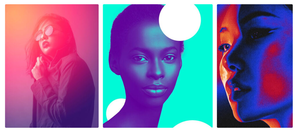
Another popular way of using gradients with pictures is creating gradient maps. With gradient maps, you essentially remap all color values in a picture so that they follow the color scheme of a chosen gradient. For instance, if you have a purple to orange gradient, once you apply the gradient map, the highlights in your image will be orange, and the shadows will turn purple.
5. As a graphic element or effect
Gradients don’t always have to be used as fills for other design components — they can be separate design elements. You can add gradients to mimic various lighting effects and create magical visual effects.
Where to use gradients
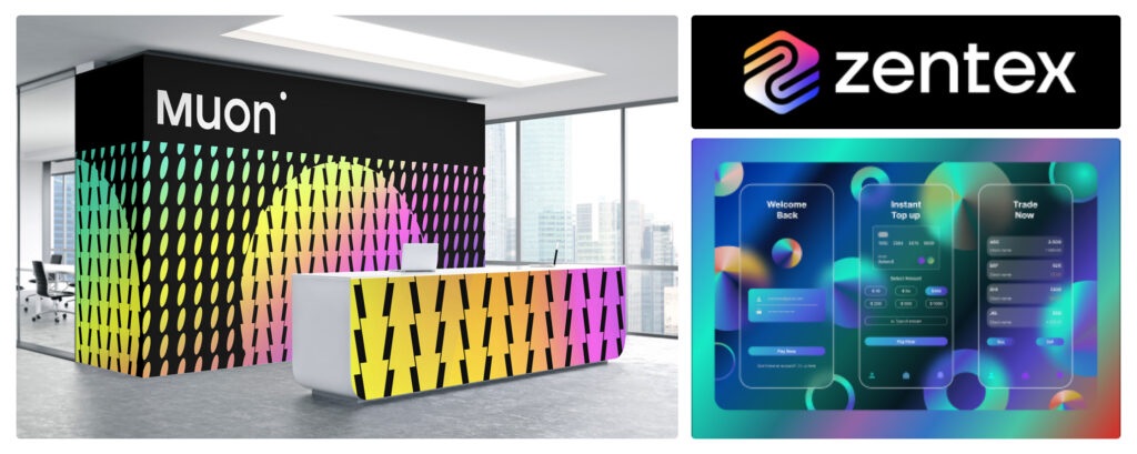
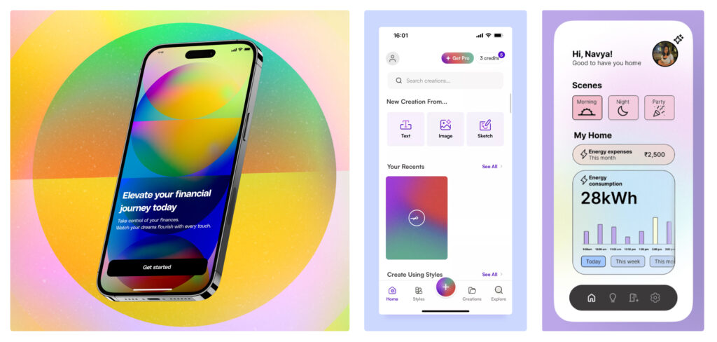
1. App design
Even a small gradient element can turn the interface of an app into eye candy. Many apps use gradient backgrounds and gradient-filled buttons in their UI. They help guide the user’s eye exactly where you want it to be and enhance the features you want them to pay attention to in the first place.
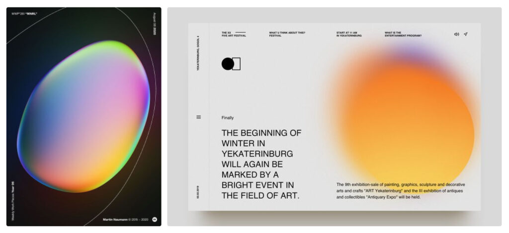
2. Web design
At this point, gradient backgrounds are a staple in web design. Whenever you need to keep your UI clean without it looking boring, gradients are irreplaceable. They instantly make the website look more lively and inviting. Plus, by placing gradients in and around the critical elements, you can subtly shift the user’s attention to where you need it most.
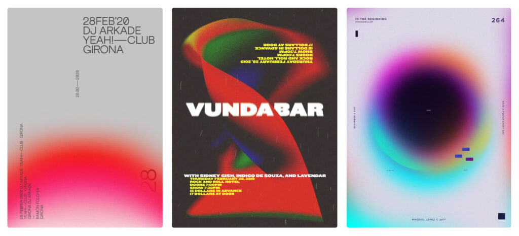
3. Poster design
When it comes to poster design, gradients are many artists’ go-to choice. By using a gradient background or shape, you can easily add depth to the composition while keeping it uncluttered. With minimalism in poster design still being very much in, gradients in posters are extremely common.
4. Social media
Social media posts often call for something extra catchy and visually appealing. Whether it’s a thumbnail for a video, an Instagram story template, a Facebook banner, or something else, you can see gradients all over social media. They are fast and easy to make, which is exactly what you need when crafting visuals for your socials.
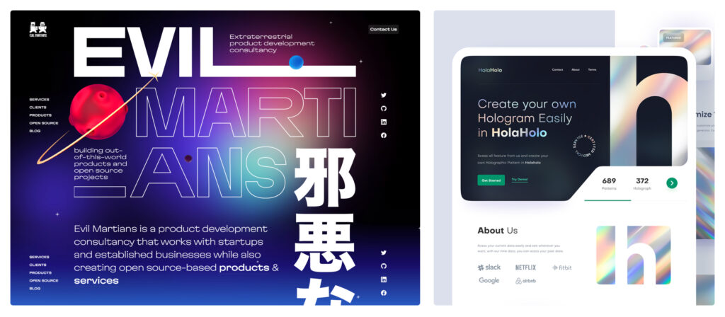
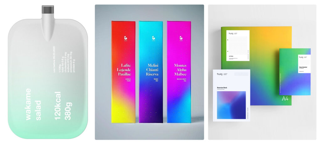
5. Brand identity and product packaging
Gradients are popular outside the digital world, too: product packaging often uses color shifts for a more exquisite, sleek look. Some brands go further than just using color grading for their packaging and make gradients a signature element of their identity. From logo to website design to brand merchandise, gradients can help create a clean, elevated brand image.
6. Logo design
One of the best ways to make a logo pop is to add a gradient to it. Some of the most iconic logos that the majority of users would recognize in an instant have a gradient in them. Microsoft Edge, Instagram, and Tinder are among the most famous examples of memorable gradient logos.