
Good user experience can make or break your mobile app. If the app is hard to navigate and the images aren’t clear, most people will delete the app and never use it again. In fact, about 25% of people use a mobile app only once. One way you can avoid this fate is by putting more thought and care into the photos you use in your app and how it impacts the overall user experience. In this post, we’re going to share six tips to consider when adding photo content to your mobile applications.
Choose Realistic Stock Photos
Stock photos are easy to access, and in some cases can be of high quality. However, you run the risk of your app looking generic, cheap, and even awkward, if you choose stock images that don’t match the look and feel of your app.
Stock photos that don’t match the story you need to tell will end up looking inauthentic and out of place. Not to mention, if it is a really popular image, there are probably dozens of other companies using it on their apps as well.
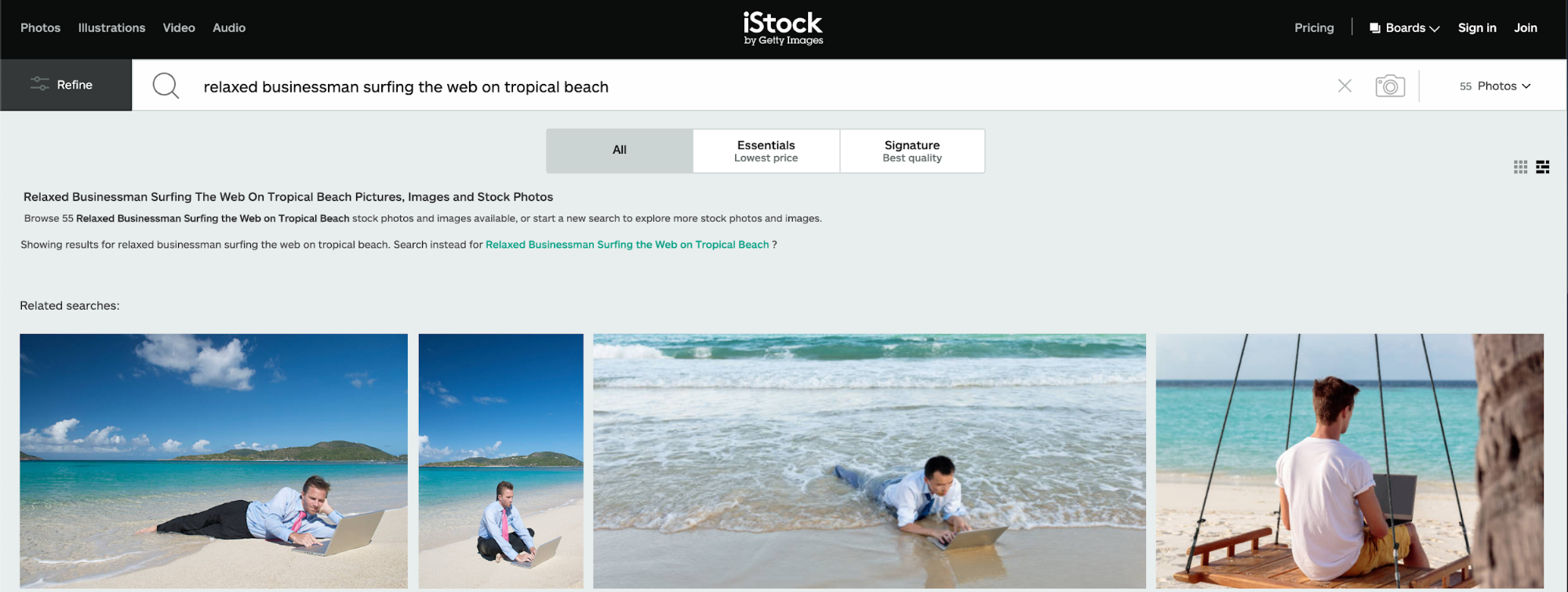
Here’s an example of a few generic stock photos in the “business” category. This photo is not only generic, but also unrealistic: laptops, sun glare, sand, and saltwater don’t mix. It will add nothing to your app unless you maybe sell waterproof electronics or offer electronics repair services.
Instead, you want to use images that tell a story in the right context. Make sure the picture has a purpose and fits in naturally with the rest of your mobile design.
Another long term solution to the stock photo problem might be to learn how to take photos by yourself. This will also add the necessary authenticity to your content and prevent any unforeseen copyright infringement problems. ‘How to become a photographer’ might be a question that has been asked by many rookie iPhone photographers, but wasn’t pursued properly as it is a long road and needs a certain amount of dedication. But the long term benefits are invaluable.
Declutter Your Images
Cut out the clutter and keep your interface simple and focused. This works for every aspect of your design, especially photos. Images with too much going on can turn mobile users away.
In addition, never add photos for the sake of filling space. Quality images are essential for a good mobile app, but too many pictures or too much clutter will defeat the purpose.
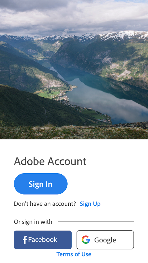
Here’s an example of an Adobe mobile app picture that takes a minimalist approach. The image is open and uncluttered. It sets the tone for the app by giving a sense of freedom and possibility right in the sign-up screen to encourage viewers to take the next step.
Don’t Be Afraid To Mix Mediums
You don’t have to stick to one medium when deciding on photo content. Illustrations and photography can coexist beautifully in the same app.
Photography is great for representing specific ideas or stories. Illustrations are better used for demonstrating metaphors or abstract concepts.
Mixing mediums not only lets you use the right type of image to convey your concept or story, but it also makes for more interesting visuals.
The Medium mobile app combines both photography and illustrations into one image that appears when you open the app. It effectively represents the brand’s purpose of being a hub for writers, thinkers, and storytellers to share their thoughts with the world.

Use a Singular Point of Focus
Images should include an iconic point of focus, as it directs the user’s attention and makes the message stand out. An image without a point of focus can appear cluttered and confusing.
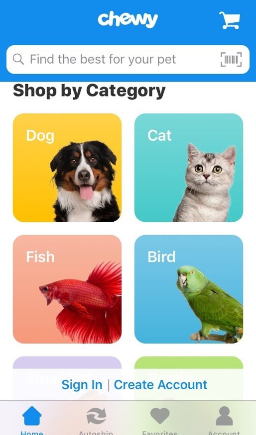
For example, here are category images for Chewy, a pet product mobile app. The images that represent the shopping categories have the animals featured as a clear point of focus. The face of the animal is also directed toward the category title.
The effectiveness of the photos above would have been lost if there were multiple animals in each picture or a busy background instead of a solid color.
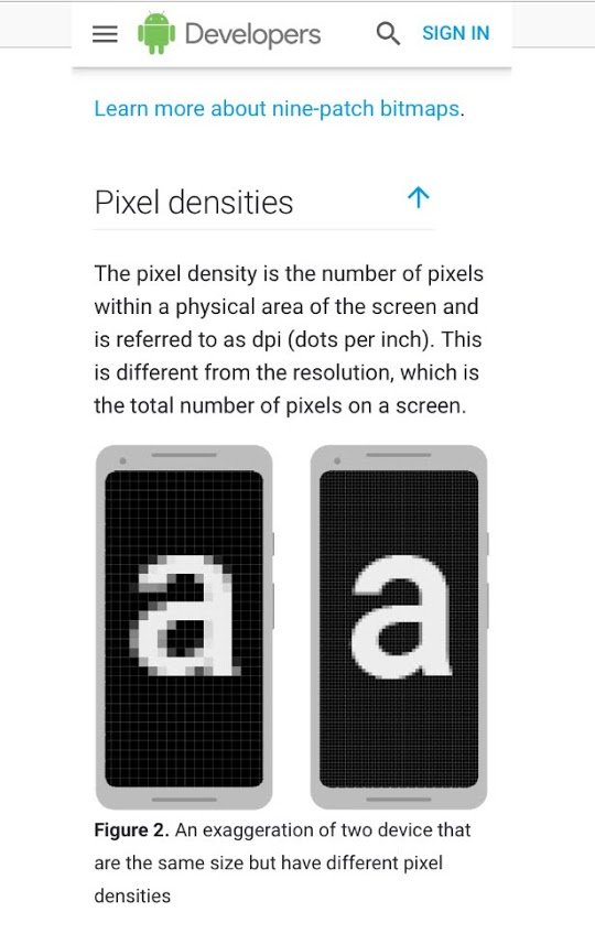
Size Images for High-Resolution
You should always provide high-resolution versions of all image assets to ensure your pictures look good on every device. Pixelated or distorted images will quickly turn mobile users away.
Pro Tip: Review Android and Apple’s developer tutorials for guidance on sizing images, pixel density, and providing alternative bitmaps. Following these guides will ensure your images show up in high resolution and as clear as possible.
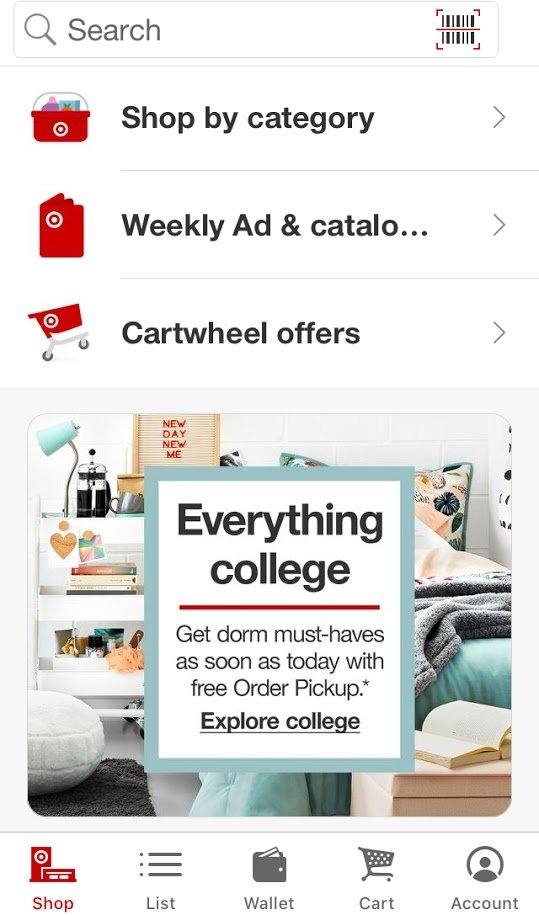
Keep Images Consistent Across the Website
If your mobile app is an extension of your website, make sure to use images that reflect the style of your website. This creates a cohesive experience no matter where the user is and instills automatic trust in the app.
For example, Target uses the same clean, visual elements and infamous red color on its mobile app as it does on its website and in all of its physical stores.
To sum up, the most important thing to keep in mind when adding images to your mobile app is the end user. Resist the urge to add photos where they aren’t needed and stick with pictures that clearly convey your message, tone, and style. This can go a long way in providing great mobile user experience.
About the author: this is the guest post by Sierra Taylor, a communications specialist, who is always interested in learning. Coffee and photography are big parts of her identity. You can reach out to her at sierrataylor@jotform.com
Title image from Ouch, the library of free vector illustrations
Read about the visual storytelling in modern photography, review the list of best free photo editing software, and learn about the advanced techniques of creating photo collages.