
If you’ve never heard of primary and secondary hooks or the AIDA principle, it’s time to learn some poster theory.
There is more to minimalist posters than lines and circles, and they have a much longer history than you might think. As seemingly easy to design as they are, a minimalist poster is quite the creative puzzle to solve. Want to know how and why we went from detailed hand-drawn illustrations to flat duo-chrome geometry and how to turn the latter into a piece of advertising art?
The origins of poster design
Though technically posters have existed for many centuries and originated in Ancient Egypt, the first printed posters as we know them only appeared in the late 1800s. French painter Jules Chéret introduced the 3-stone lithographic process that made printing faster and finally allowed for the use of more than one color.
1880s
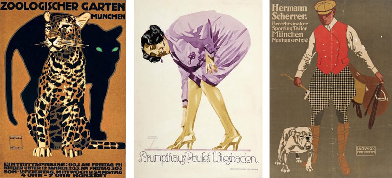
Thanks to Chéret, now known as the father of the modern poster, in the late 1880s poster became a dearly loved advertising tool. All those iconic hand-drawn vintage posters for theater plays and museum exhibitions you probably associate with the birth of posters are examples of Chéret-inspired the Belle Epoque lithographic prints.
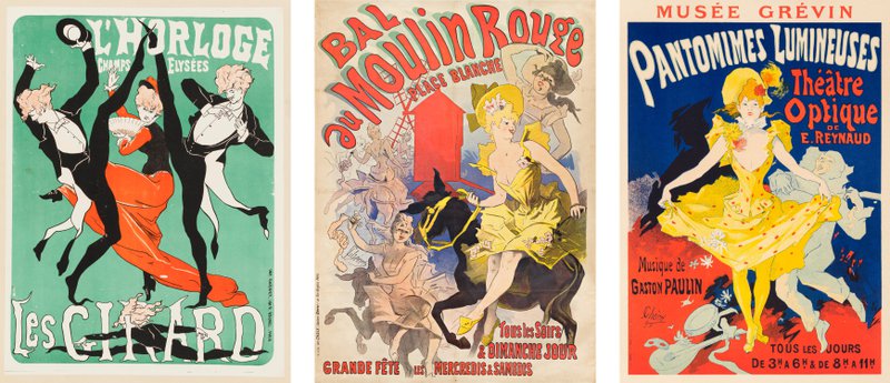
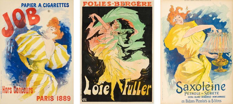
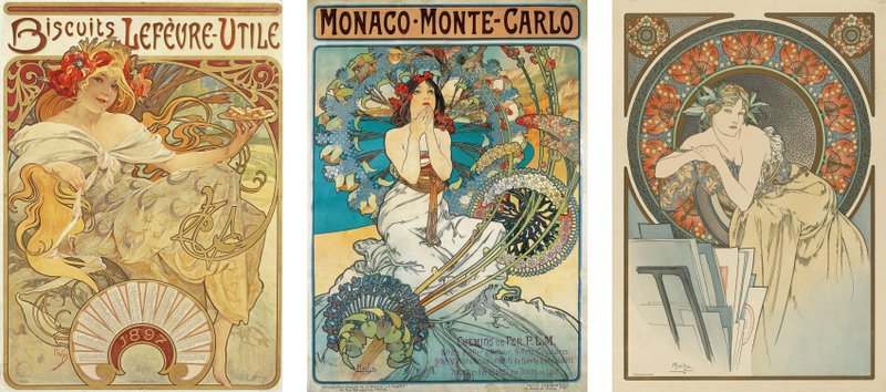
Once printing became more affordable and it was finally possible to add vibrant colors, the most intricate, detailed, yet delicate poster style in history emerged – the Art Nouveau.
Early 1900s
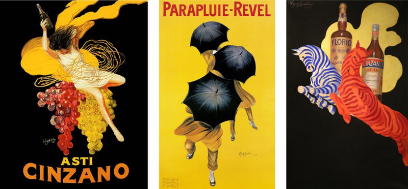
In the early 1900s, Art Nouveau began to lose its popularity and posters started to shift toward minimalism. Thanks to Leonetto Cappiello’s bold poster art that stepped away from detailed backgrounds, poster composition was completely redefined. From that point on, minimalism began to grow in popularity.
One of the most prominent styles that emerged in that era was the German Plakatstil. Those posters utilized negative space almost as much as modern posters do and used flatter shapes.
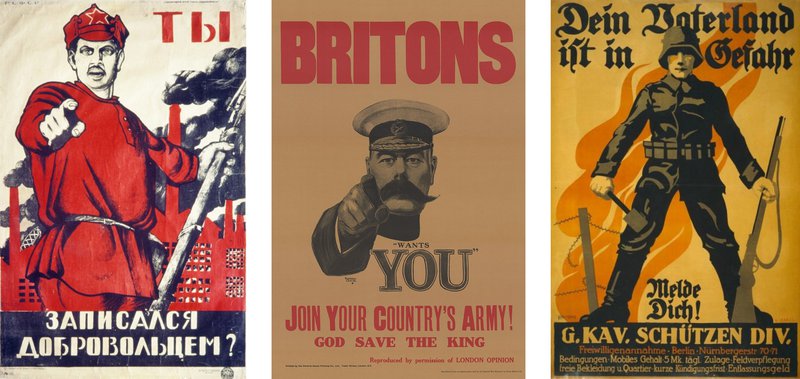
In the 1910s, with World War I, propaganda posters started to take over. They brought about bolder, more contrasty images and bigger, louder typefaces.
1920s–1930s
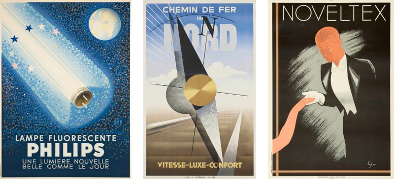
The polarizing post-war art movements – Cubism, Futurism, Expressionism, and Dadaism – eventually gave rise to Art Deco. A blend of clean geometry, ornate patterns, and stark color contrasts like shiny gold on black made its way into the poster design.
1950s
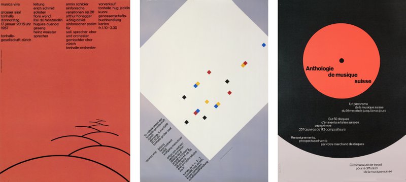
Swiss Style also known as the International Typographic Style heavily inspired by Soviet Constructivism and German Bauhaus dominated graphic design in the middle of the 20th century. Vivid hues, clean fonts, simple geometric shapes, and strong visual contrast were in.
1960s
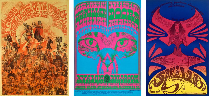
The era of some of the most colorful, heavily patterned, and artistically complex posters, the 1960s had two major themes in poster design. Futurism was all over poster design thanks to space exploration and the Space Race between the Soviet Union and the United States. But an even bigger trend was psychedelic hippie-inspired design with hypnotizing twirls, funky fonts, and dizzying color combinations.
1970s
Finally, in 1970s, when post-modernism established itself as the ruling art movement, poster design started to go back to the concise geometric look of the 1950s’ Swiss Style. Vibrant colors, thick curvy fonts, and complex patterns of the rebellious hippie 1960s were still there, but the posters were on their way toward a more minimal look.
1980s–1990s
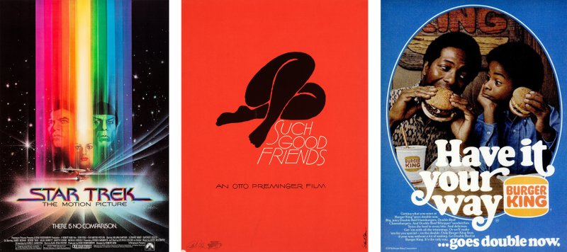
Thanks to the rapid development of computer graphics and printing technology in that era, experimenting with fonts, shapes, and colors became easier and less expensive. Plus, combining photography with computer imagery made it possible to create mind-blowing designs artists could never even dream of before. Posters of the 1980s–1990s experiment with the use of photography together with digital art, ranging from crazy maximalist designs to stylishly concise minimal ones.
2000s
Poster design in the 2000s is just as bizarre and over-the-top as the Y2K fashion in general. There is an abundance of vibrant colors, glow and glitch effects inspired by the hot new tech, futuristic elements, and much more. Even though the 2000s had plenty of minimal posters, maximalism had a bigger role in the graphic design of that era.
Graphic designers took full advantage of being able to finally play with some good-quality professional image editing software.
Modern posters
In the 2010s, graphic design made a U-turn back to Bauhaus-inspired geometric looks. Logos, album covers, product packaging, posters, interface design – everything is turning flat and minimal. Now mostly dictated by the need for optimization for digital media, minimalist designs are both practical and trendy. Many brands even give up their signature maximalist style to keep up with the minimalist craze.
Though the stylistic approach has changed quite a bit, the core purposes of a poster remain the same. A well-designed poster has to be seen from a distance and do a good job of advertising a product or communicating a message to the audience.
Let’s take a deeper dive into the fundamentals of minimalist poster design.
Core principles of minimalist poster design
1. AIDA
AIDA is one of the core principles of poster design in general, minimalist or not. The acronym stands for Attention, Interest, Desire, and Action. It means that first off, a poster has to grab the viewers’ attention, make them notice it from afar. Once they got their eyes on the poster, it needs to evoke interest to make them stay and look a little closer. If it’s an advertising poster, it has to get them curious about a brand’s product, service, or special event.
Once the interest is there, the next step is to induce desire. With an advertising poster, the goal is to get the viewer to see how the product can benefit them and, ideally, realize they need it. Lastly, the ultimate aim of a poster is to push the viewers to take action. A good poster never leaves the audience wondering what you expect them to do next. The action needs to be measurable and specific: “pre-order yours on www.mysite.com”.
2. Less is more
When it comes to designing posters, the general rule is to keep the composition clean and simple. A poster packed with unnecessary details will confuse viewers, making it unclear where they need to focus their attention. Overly intricate designs often mess with the clarity of the message a poster delivers. With a plain, straightforward composition, the eye follows the elements of a poster naturally, absorbing the key message first and looking further into details next.
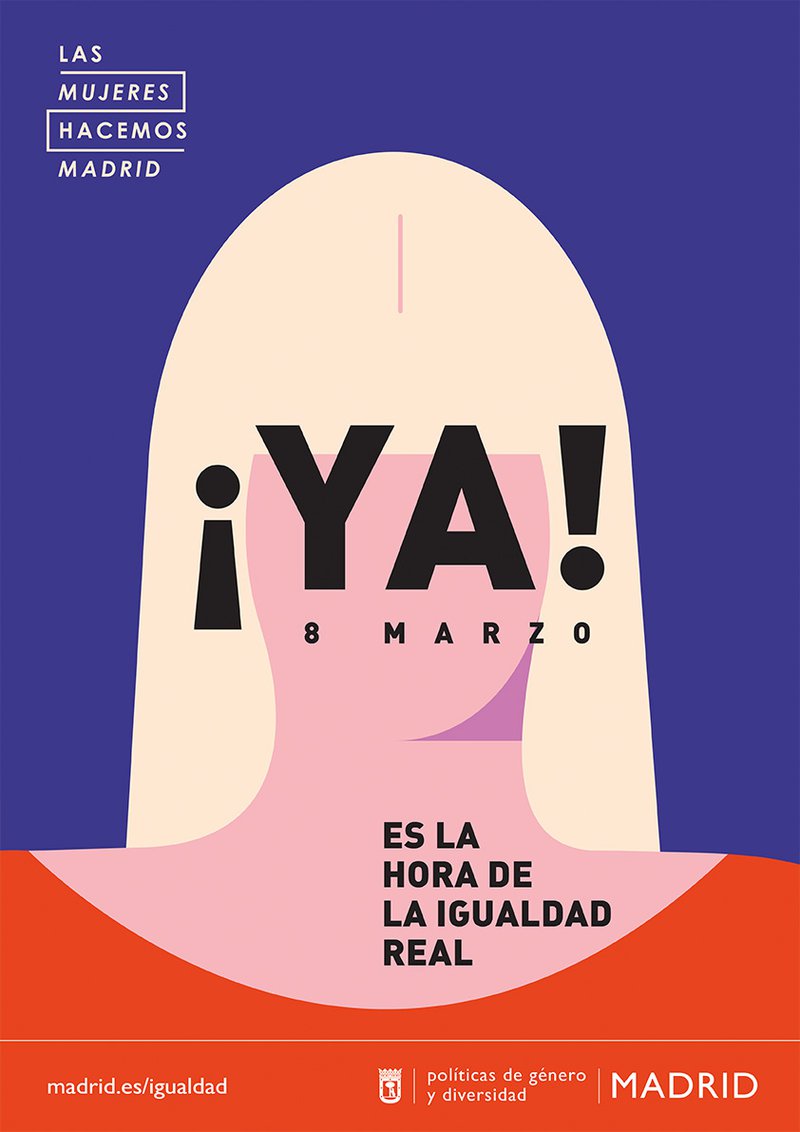
3. Make use of negative space
Every element in a poster needs room to breathe. Maximalist posters set aside again, the general rule of poster design constitutes leaving a significant amount of negative space between and around the elements. Negative space a.k.a. white space helps the viewers to focus their attention precisely where you want it to be without feeling tempted to look away.
Though frequently called white space, negative space can be of any color depending on the palette used in a poster.
4. Hierarchy & focus: main elements first
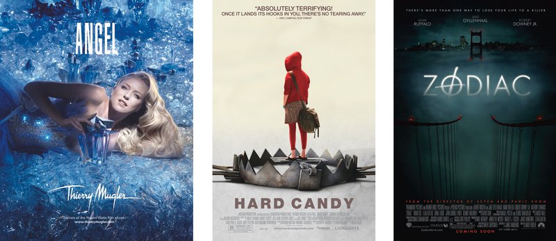
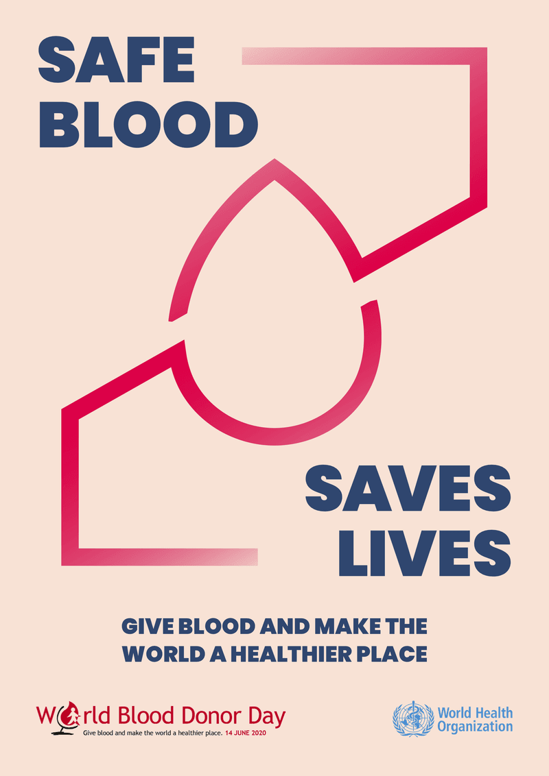
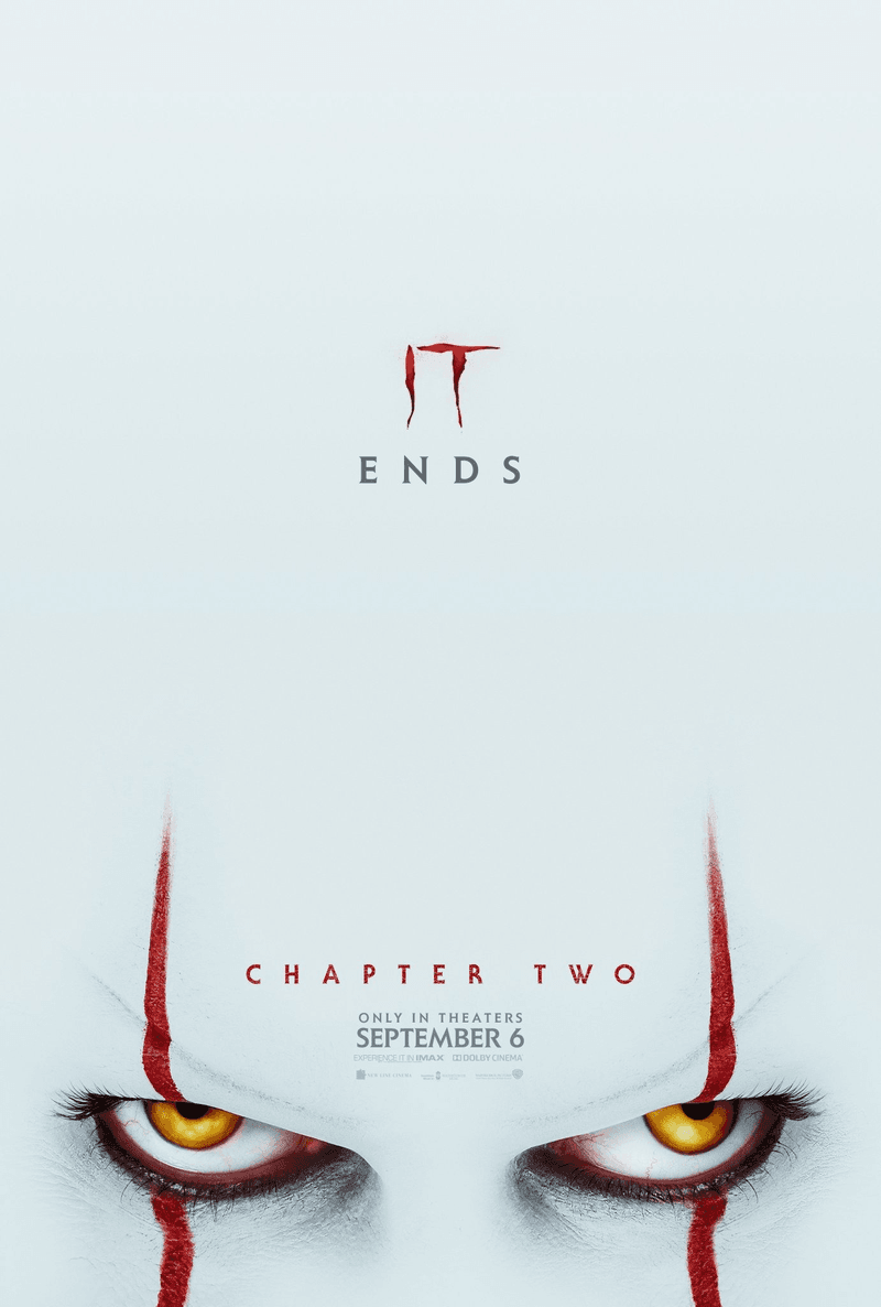
As designer Gareth David explains, the three core components of a poster include a primary hook, a secondary hook, and supportive elements. The primary hook is the center of attention that has to be powerful enough to lure the viewer in. Its two core tasks are to trigger viewers’ curiosity and anchor the entire composition. The primary hook is normally the biggest element that has the most contrast.
The secondary hook is a smaller element placed close to the primary hook to support the message and hint at what else there is to expect. Secondary hooks also help balance the composition by making the weighty primary hook appear less overbearing.
Finally, there are supportive elements that the viewers pay attention to after acknowledging the primary and secondary hooks. Supportive elements add further visual information to a composition, reinforcing the message and giving the viewer more details. Those often come in the form of text and might include anything from release date to website address.
There are different ways to achieve a clear sense of hierarchy in poster design. As Gareth David explains in his lectures on poster design, contrast is key when establishing relations between various elements of a composition. Through contrast in layers, scale, color, space, and direction, you can draw a distinction between primary, secondary, and supporting elements of your design.
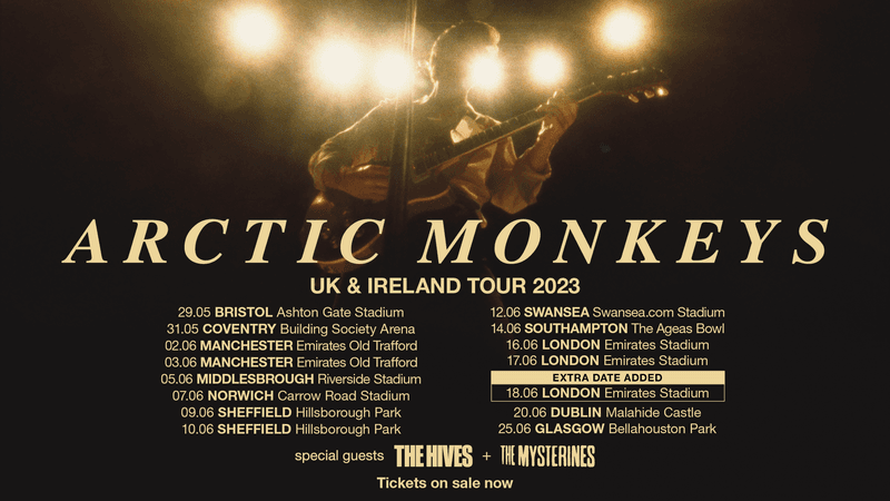
5. Minimalist typography
Sans serifs are taking over graphic design, even though nostalgic retro designs with elaborate fonts are trending right now. Visual clarity and readability of minimalist fonts that don’t have additional details like serifs and decorative twirls is ideal for minimalist posters.
For a little extra kick, designers like to use a combination of fonts in one poster. Contrasting typefaces are a smart yet subtle visual trick that helps retain the viewers’ attention. When something is written in a different font, it feels like a crucial new piece of information you don’t want to miss. When there’s too much text written in the same typeface, it might feel repetitive or even unimportant.
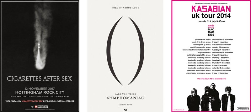
6. Colors: neutrals, monochrome & pastels
Color palette plays a crucial role in minimalist poster design. In a minimal design, the emphasis is on shapes and colors rather than fine details. The palette needs to be strong and visually appealing without being overwhelming. This is why most of the time, minimalist posters use monochromatic color schemes, pastel colors, and neutrals like gray and black.

Another color trick often used to create a harmonious color palette in minimalist posters is taking multiple neighboring hues.

7. Visual balance
Balance is key when it comes to graphic design. The easiest way to achieve a balanced look is to create a perfectly symmetrical poster. When one side mirrors the other and the text is perfectly centered, visual harmony comes naturally. Poster designers, however, rarely cheat like this and most of the time, they go for a more complex asymmetrical layout.
The secret behind balancing out an asymmetrical poster is finding heavier shapes and evening them out using other elements. Shape, size, color, and contrast are the fundamental characteristics determining the perceived visual weight of each element.
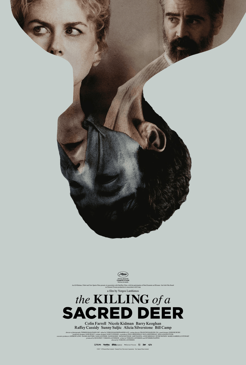
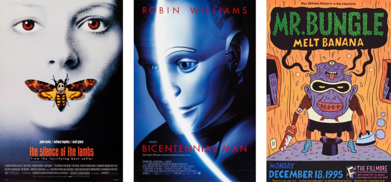
In this poster for The Killing of a Sacred Deer, the elaborate element at the top is balanced out by a thick pitch-black text at the bottom that uses a combination of serif and sans serif fonts. Visual complexity, size, and color of the text make it weighty enough to level the composition.
Advantages of minimalist poster design
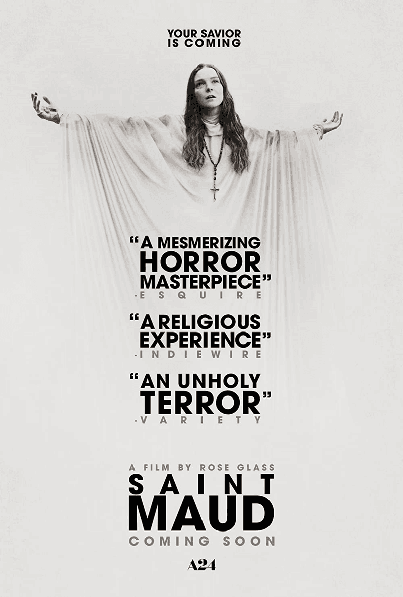
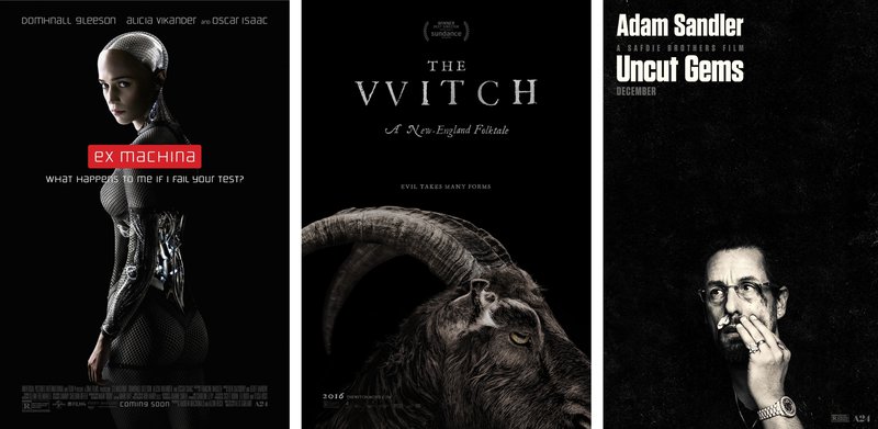
‘Well, it’s trendy’ is not the number one and the only perk of using a minimal approach in poster design. Minimalist posters can solve a wide variety of tasks, from creating an intriguing message for the viewer to reflecting the visual aesthetic of the brand. You might notice, for instance, that some of A24’s most prominent movies have minimalist posters.
Here are some more things that make minimal posters so loved among graphic designers:
1. Clarity of message
A poster where nothing distracts the viewer from the key elements makes the message loud, clear, and concise. Even if it uses metaphoric imagery, it’s usually directly related to the core idea.
2. Aesthetically pleasing and timeless
Digital design trends come and go at an insane speed that is nearly impossible to keep up with. One day a font is in, the next day it’s everywhere, the day after it’s out because it’s too mainstream. Sticking to minimalist geometric designs makes your poster truly timeless. Was it designed in the 1930s, at the peak of the Bauhaus era? Is it a retrofuturistic poster from the 1960s? You can make it look like a vintage poster or make it ultra edgy and futuristic and it will still be visually appealing years later.
Plus, minimal layouts tend to be more universally alluring unlike complex detailed posters that induce polarizing feelings.
3. Efficient and cost-effective
It’s not surprising that a poster that can be created entirely inside a graphic design app normally takes less time and money to create than a poster that requires a professional photoshoot. An abstract geometric minimalist poster leaves more room for experimentation and allows for quick iterations and touch-ups. You can change the entire look in literal seconds by modifying the color settings or adding gradients and textures.
4. Appeal across cultures and languages
Because most minimalist posters rely on visually striking symbolic imagery instead of massive lengthy blocks of texts, language barrier is not an issue. Universally recognizable shapes and figures make the message easy to understand regardless of the viewer’s first language. This makes minimalist posters an irreplaceable option for international campaigns, where cultural differences shouldn’t get in the way of communicating with the audience.
Challenges of minimalist poster design
As it is with any design style, minimalism is not everyone’s cup of tea. Though it might seem effortless for everyone, including those with limited art skills, minimal designs are hard to pull off. Every minimalist design needs to be perfectly calculated to make sure it tells the viewer just enough while being laconic. If you get carried away when simplifying your poster design, you might run into some serious problems:
1. Risk of oversimplification
When going for a minimal look, it’s important to avoid oversimplifying the design to the point where the main message is unclear. That said, a minimal poster might be ideal for representing one key idea. When the message a poster needs to convey is complex and has several sublayers, a minimal design will be misleading.
Imagine designing a minimal poster for an impossible puzzle of a movie like Mulholland Drive or a dynamic show with tons of plot twists like Rick and Morty. With a minimalist poster, the goal is to keep the core idea clear, and not just from a designer’s perspective but from a potential viewer’s point of view as well.
Cinematic value of the movie left aside, the poster for I Feel Pretty is an example of a minimalist design that might not work. What is the character’s story? Does she feel pretty listening to music in a pink and yellow outfit? Off-putting choice of font colors doesn’t make the message any clearer.
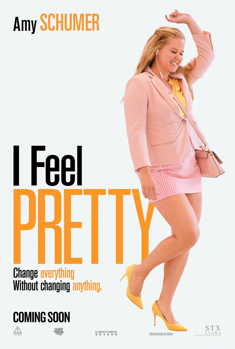
If you look at a minimalist poster and realize that it’s only clear if you know something more about what it represents, it’s not doing a great job. Unless, of course, your goal is to attract a niche audience.
2. Balancing simplicity and creativity
Keeping the right balance between simple and creative can be tricky when designing a minimalist poster. There is always a chance that your poster is going to end up looking unoriginal or bland. While brutally minimal might be good in some cases, there is no need to go for a perfectly sterile design. Adding a bit of texture, picking a little more ornate typeface, or using a bold contrasting color palette would instantly make a design more interesting to look at.
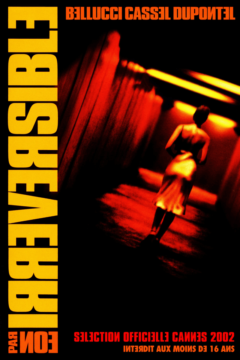
A combination of a painfully vibrant contrasty color palette and a baffling half-mirrored typeface make the poster unique while maintaining visual simplicity and clarity.
As little room for experimenting as a minimalist poster design seems to leave, there are numerous ways to make it one of a kind. To avoid repetitiveness and blandness when designing minimalist posters, it is essential for the artists to keep observing as many artworks from other creators as possible. Devouring high-quality visual content is the best way to get inspired and get those creative juices rushing right to the brain.
Creating your first poster
If you’ve never created a minimal poster before, we have an easy tutorial for you to get started. Check out our quick guide on making a simple poster in Lunacy with the Icons8 free graphic design assets.
You can also watch the full tutorial on creating a quick and easy poster design in Lunacy on YouTube.