Explore strategies for creating podcast cover artwork that reflects the podcast’s themes and tone with authenticity and artistic finesse.
In the realm of podcasting, visual identity is not merely an aesthetic consideration; it’s an integral part of storytelling.
As designers, the challenge lies in crafting cover artwork that doesn’t just capture attention with its visual allure and encapsulates the essence of the podcast’s themes and narratives. This harmonious blend of form and content elevates the listener’s experience from the very first glance.
Let’s explore some strategies that empower designers to visually articulate the unique soundscapes of podcasts, ensuring the cover artwork resonates with both authenticity and artistic finesse.
The fundamentals to get right
Before we dive into how to match the design of podcast cover artwork with its tone and the themes it explores, we first need to establish the fundamentals.
A common issue is that often designers (or podcasters themselves) don’t understand the difference between a logo and podcast cover artwork:
- Podcast logo: This distinctive visual represents a podcast and is adaptable for various branding needs. It might be featured on social media profiles and various marketing materials to promote a podcast. The podcast logo may — but doesn’t have to be — used as a part of its respective podcast cover artwork.
- Podcast cover artwork: This artwork acts as the podcast’s digital front cover, displayed within podcast directories and libraries. It’s often the first visual the audience encounters while browsing or searching for a podcast. It also displays on-screen while the podcast is playing. Think of this like a book cover or album art.
The second thing to keep in mind is the technical requirements. Here are the official Apple Podcasts guidelines for show cover artwork:
- Size: 3000 x 3000 pixels square
- File type: JPEG or PNG
- Resolution: 72 dpi
- Colorspace: RGB
These guidelines are the same for all other platforms, including Spotify, Google Podcasts, and other podcast directories.
Now that we’ve set the scene, let’s dive directly into the creative process you can use to design awesome cover artwork that instantly communicates what the podcast is all about.
The creative process
For designers, the creative process is both a challenge and a revelation. When designing eye-catching podcast cover art, there’s a lot to consider, so it pays to follow a simple creative process.
Conceptualization
This initial phase, though filled with exploration, demands structure to help you translate the auditory nuances of a podcast into preliminary visual sketches.
Perhaps the show host has provided you with a brief outlining the show’s key themes. If so, that’s a great starting point. But you’ll have to get your hands dirty to truly nail your design.
Start by listening to the podcast and try to pinpoint recurring motifs and underlying moods you can translate into tangible visual cues.
Here are some tips and examples on how to do this effectively:
- Identify key tones: Pay close attention to the tone and emotion conveyed in the podcast. Is it upbeat and energetic, or calm and soothing? Note down colors and shapes that embody these tones.
- Highlight recurring symbols: Note any recurring subjects or symbols that could translate into visual motifs. For instance, a show about maritime history might resonate with the imagery of anchors or ship wheels.
- Capture the energy: Consider the podcast’s rhythm — is it fast-paced with quick transitions, or has a slow, meandering pace? Use dynamic lines and contrast for the former or smooth, flowing forms for the latter.
- Reflect the mood: The overall mood of the podcast can guide the choice of color palette. A podcast on meditation might inspire a palette of cool blues and greens, suggesting tranquility.
- Note down relevant symbols: Oftentimes, abstract concepts are best conveyed through metaphor. If a podcast delves into complex, layered discussions, a visual of interwoven threads or a labyrinth could be the symbolism you’re looking for.
The choice of visual elements
Colors, typography, and imagery are the linchpins of compelling cover artwork. Each element must be chosen with an awareness of the podcast’s ambiance and narrative. For example, a melancholic podcast might veer towards muted tones, while an energetic one might bask in vibrant hues.
Choosing the right style and tone can be tricky, so here are a bunch more examples:
- Imagery: The images and graphics should reflect the podcast’s core essence. For a historical podcast, vintage photographs or illustrations might be used to transport listeners back in time. Conversely, a futuristic sci-fi podcast might employ sleek, digital graphics to evoke a sense of the unknown and the otherworldly. Many text to speech tools cater to podcasters so they often have in-built AI art generators for podcast covers. This is a really cost efficient option worth considering.
- Typography: You should always feature the show title in a large, clear font as one of the key elements of your design. The font and text style can set the mood before a word is read. A podcast discussing classic literature might opt for an elegant serif font reminiscent of old books and manuscripts. On the other hand, a podcast about tech startups might lean towards a modern, sans-serif typeface, symbolizing innovation and forward-thinking. (Note: Try limiting yourself to a maximum of two fonts on any cover artwork design. Here, you can read more about font pairing)
- Sharp vs. round elements: Choosing between sharp angles and round curves can subtly influence a viewer’s perception. A true-crime podcast might incorporate sharp, jagged edges to convey tension and danger. In contrast, a podcast about meditation and mindfulness might favor soft, rounded shapes, exuding calmness and serenity.
- Texture: The feel of the cover, whether smooth, gritty, or patterned, can add another layer of depth. A podcast about outdoor adventures might use a rugged, textured background reminiscent of rocky terrains and wild trails. Meanwhile, a podcast on luxury lifestyles might use subtle gradients to showcase a glossy, polished surface, mirroring the refined and lavish themes discussed within.
- Scale and proportion: The size and relationship of elements can be used to create a hierarchy. A podcast about giants in the business world might play with exaggerated scales, placing tiny icons next to towering figures; a podcast about the little joys in life might focus on minute details, highlighting the beauty in the mundane.
- Photography vs. illustrations vs. vector graphics: The selection of whether to use photography, illustrations, or vector graphics can greatly impact the tone and feel of the cover art. For a podcast on farming or agriculture, authentic photographs can vividly portray the reality of rural life. Abstract or creative themes might be better served by the whimsy of illustrations. Meanwhile, business or tech topics could benefit from vector graphics’ clean, professional look.
When made thoughtfully, each visual choice can lead to a cover artwork design that represents the podcast’s content and resonates deeply with its intended audience.
Here are some excellent podcast covert art examples for shows we produce (and help design the cover art) at Wavelength Creative.

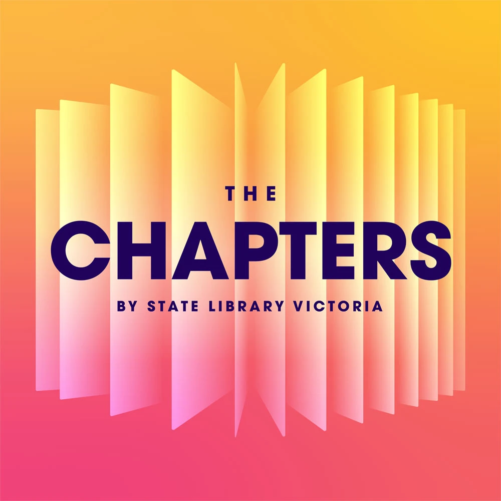


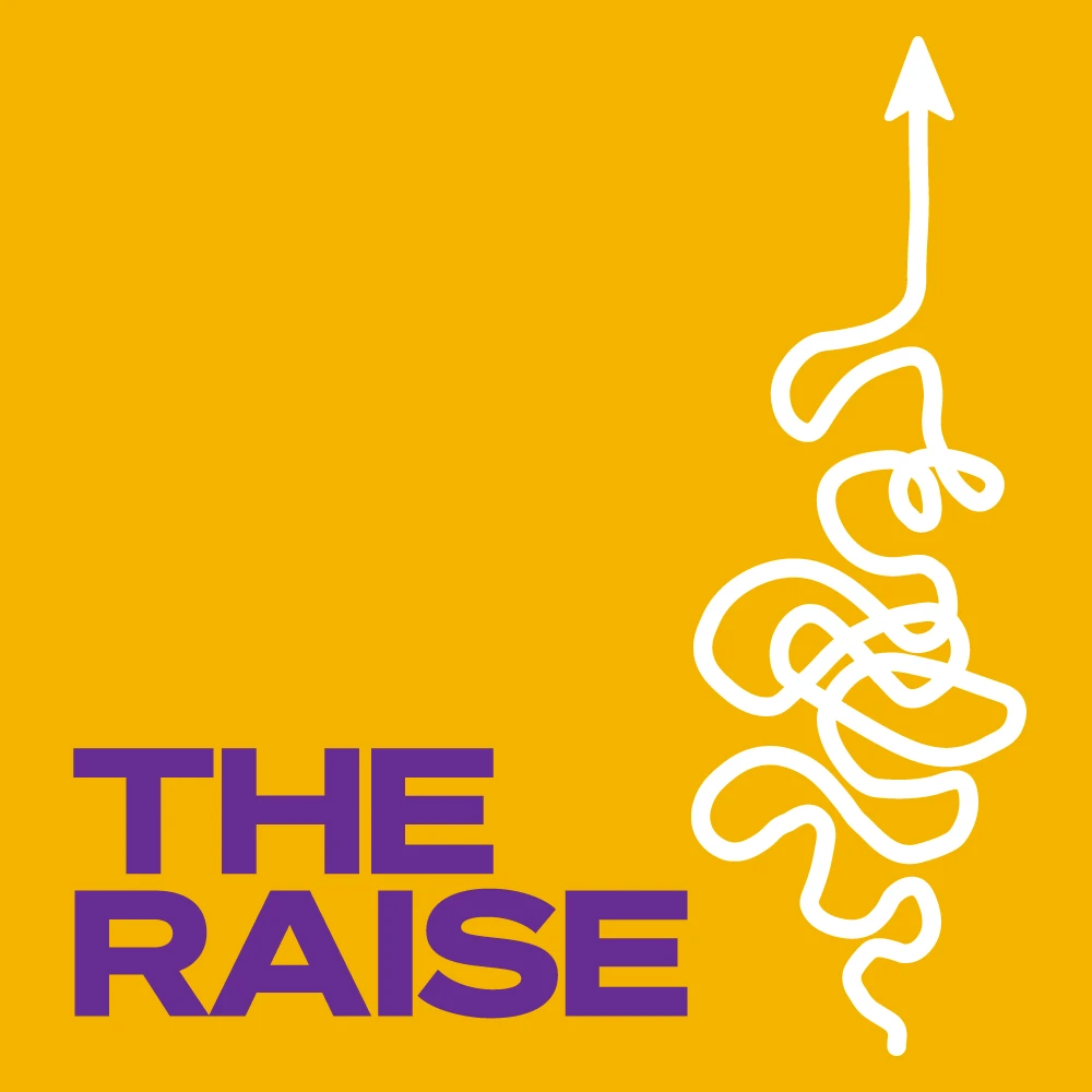
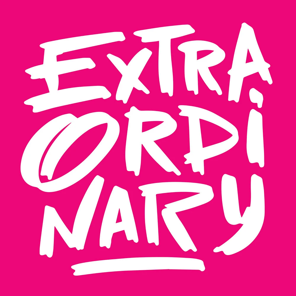
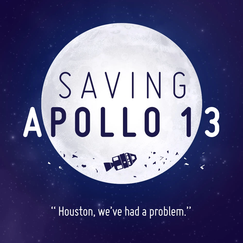
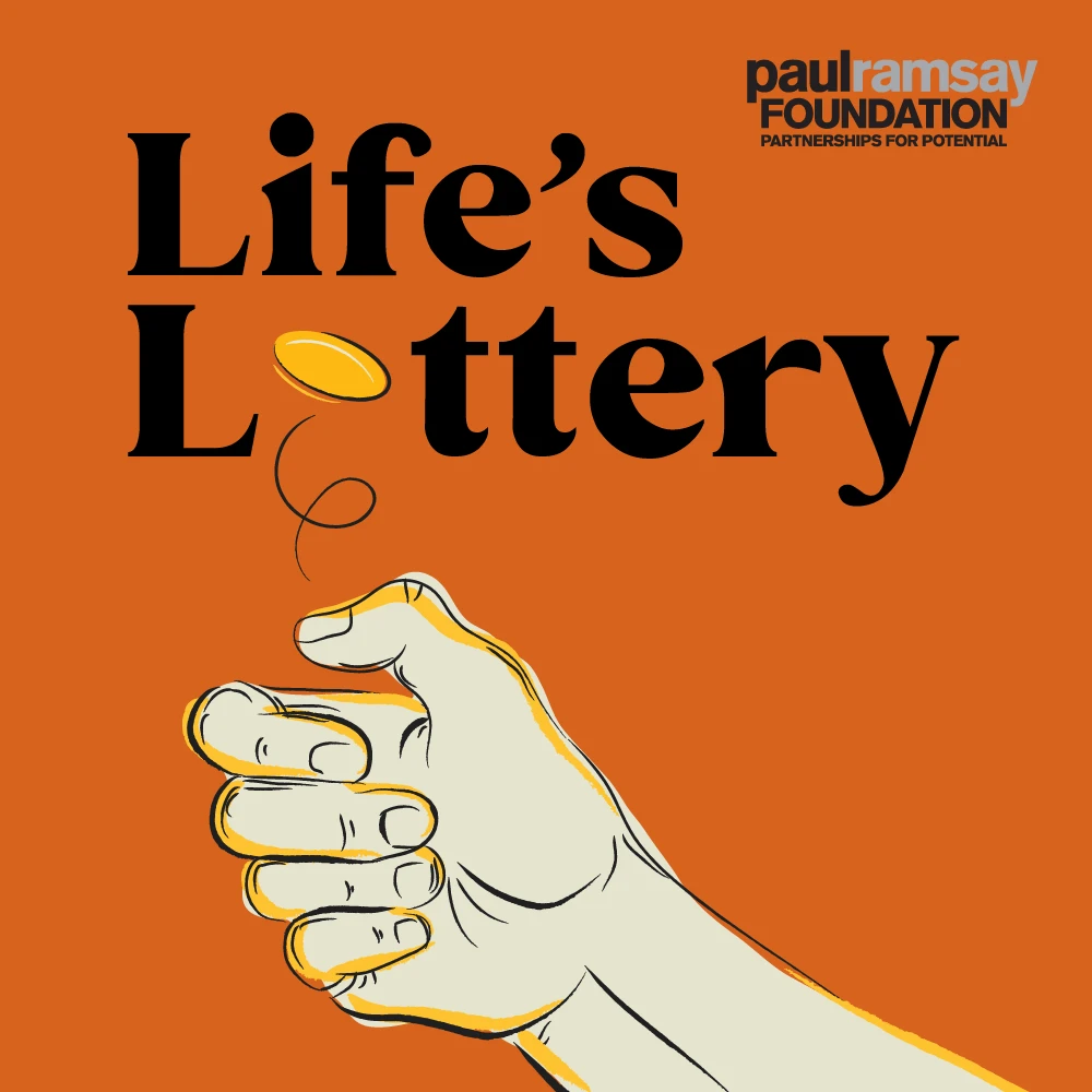

These are podcasts from various industries, ranging from complex technical explorations to real-life stories and simple shows focused on entertainment — and the variety in each design reflects their diversity.
Combining elements into a cohesive design
Crafting compelling cover artwork demands more than just selecting the right elements. It’s about weaving them into a cohesive artwork.
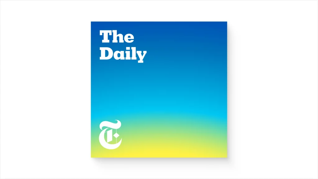
Let’s look at the popular podcast “The Daily” from The New York Times. Its cover artwork is a masterclass in the use of color, negative space, and typeface choice.
As you step into the visual symphony of podcast cover artwork design, remember that every icon, every font, and every color you select plays a critical role in your audience’s first impression.
Don’t just settle for good enough — strive for a design that’s as compelling as the content it represents. The design features a vibrant gradient that shifts from a sunny yellow to an open sky blue. This visual transition from dawn to daylight echoes the essence of the podcast’s title and its role as a daily news source. The gradient suggests the promise of a new day and creates an emotional connection with the audience, evoking the comfort and reliability of a daily routine.
The design’s simplicity, characterized by plenty of negative space and bold, clean typography, underscores the authoritative voice of The New York Times. The iconic “T” logo anchors the design, offering instant brand recognition amidst the sea of podcast covers.
The artwork’s minimalism ensures its adaptability across multiple platforms without losing impact, making it memorable and distinctive in a saturated market.
Just like “The Daily,” every element of your podcast cover artwork should be carefully chosen to represent the podcast’s content and create a cohesive and captivating visual that resonates with your audience.
To help you through the design process, we always use design resources to avoid creating everything from scratch. It’s much simpler (and way faster) to download existing icons/illustrations and adapt them to match your specific vision. Check out Icons8’s huge icons and vector illustrations repository to get started.
Design away
So there you have it! That’s everything you need to know to design eye-catching podcast cover artwork that reflects the core themes of your show and really stands out.
In the podcast world, the auditory and the visual are two sides of the same coin. When they align, the result is a symphony that captivates and engages audiences.
Design boldly, design smartly, and create a cover that will make the world listen.
About the author
Adam Jaffrey is a multi-award-winning podcast producer who has been podcasting since 2009 (before Serial launched!). With 14 years in the industry, he has extensive experience and specialist skills in podcast production, marketing, and growth. Adam is the Strategy Director at Wavelength Creative — Australia’s leading podcast production and growth agency — where he oversees all new show development for their diverse range of clients.