No one in their right mind would choose the same typeface for a children’s book and luxury watch. But sometimes the choice is not so obvious.
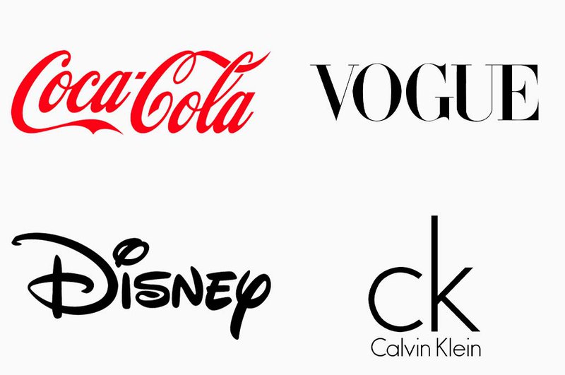
Matching fonts to designs is an important aspect of creating visually appealing and effective designs. With the right font, your projects will be able to stand out and win the hearts of your audience, and, who knows, even become the key identity element of the brand. Remember Coca-Cola, Vogue, Disney, Calvin Klein, CNN — there are tons of great examples here.
A poorly-chosen font, however, can send the wrong message and make your designs look cheap.
With an overwhelming surplus of fonts available on the internet, it’s easy to get lost — and that’s okay. There are a few simple yet important steps you can take on your way to cohesive and lucid designs, and we compiled them all below. Read on to find out what they are.
Understanding Font Families
Let’s start with the basics. A font family is a group of fonts that share similar design elements and characteristics. Even though it can include different versions of the same typeface — for instance, regular, bold, italic, etc. — their characters and glyphs will maintain a consistent style to match their family.
Here are the predominant groups:
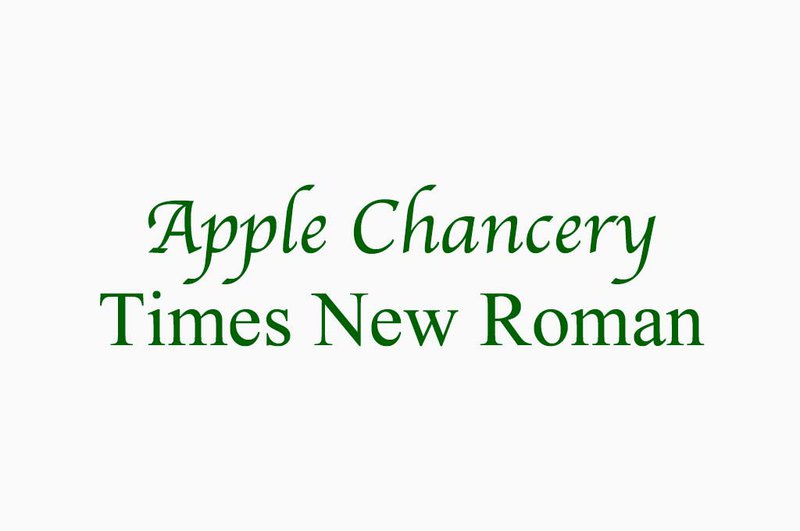
Serif fonts
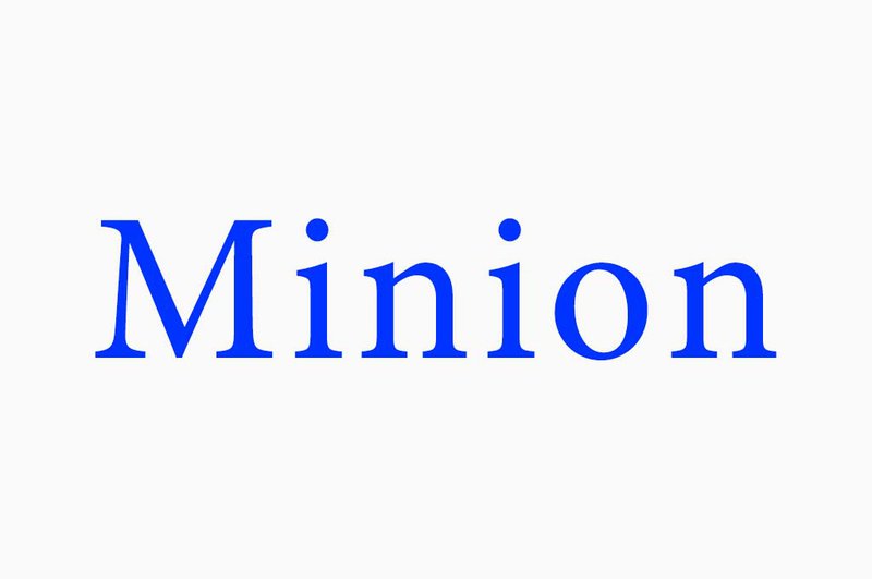
Serif fonts have small extensions at the end of the strokes that make up the letters. They’re commonly used in printed materials, such as books and newspapers because they’re easy to read in small sizes and in large paragraphs: the serifs in the letterforms help guide the reader’s eye along the line of text, making it easier to follow.
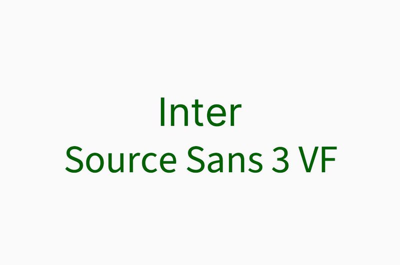
Sans-serif fonts
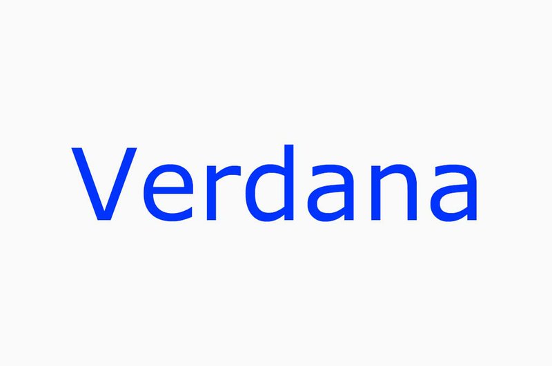
Coming from French, “sans” means “without”, so you already guessed it — these fonts are serifs-free and, in contrast to the previously mentioned family, don’t have any lines at the end of the letterforms. They have a clean and modern look, which makes them perfect for use in digital designs and on screens. Another reason to like them is that they work fine even in low-resolution formats.
Script fonts
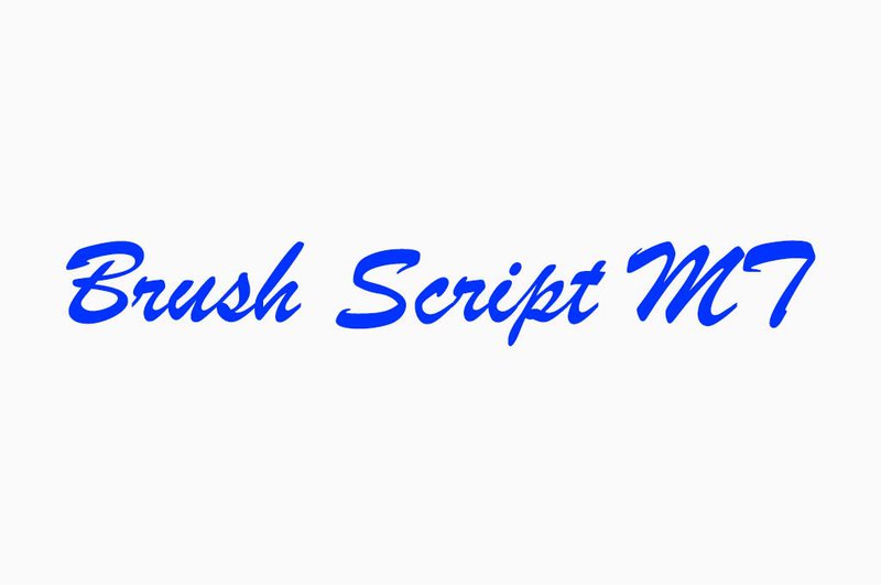
Script fonts are designed to mimic handwriting or calligraphy, giving the text a more personalized, elegant, and sophisticated look. They can be challenging to read in longer passages of text, so most of the time, they are used in short headlines or titles — on invitations, product packaging, logos, and certificates.
Display fonts

Display fonts, also known as decorative fonts, are designed to be used in larger sizes and to make a visual impact on the reader. They can be easily identified by their distinctive look and playful, quirky shapes. Often, display fonts may also sacrifice some legibility in favor of a strong visual identity. They do a great job at logos, posters, book covers, etc.
Monospace fonts
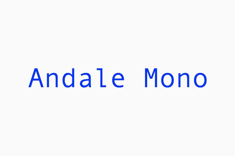
Monospace fonts, also known as fixed-width fonts, are fonts in which each character takes up the same amount of horizontal space, regardless of its width. This creates a consistent and uniform appearance that’s used in programming and utilitarian designs that prioritize functionality and legibility over visual flair.
Choosing the Right Font
Once you understand the concept of font families, you need to decide on some specifics for your project. And here’s what exactly:
- Your target audience. You always design with a specific audience in mind. Are they comic book fans, professional lawyers, or maybe kids? For a law firm’s website, you’d want something strict and concise like classic serifs, while a creative agency’s branding calls for eye-catching display typefaces.
- The mood. What do you want your audience to feel? Is your design supposed to be friendly and fun, or elegant and sophisticated? This choice stems directly from your target viewers but can vary greatly even within one group.
- The readability. After all, all texts are meant to be read — but to a different degree and in different amounts. Before choosing the font for your project, decide how readable you want it to be. The large blocks of text on editorials call for clean typography, while catchy logos need to fight for attention with almost illegible shapes.
- The contrast. The font and the background should have enough contrast to ensure readability. If your design is too busy by itself, you might want to consider minimalistic typefaces and, on the contrary, if the text is meant to be the center of attention, you don’t have to limit yourself in any way. Though, the end combination should always be harmonious and not distracting.
- The brand. Does the font comply with the brand’s DNA? Just like copywriting must always follow the chosen strategy for TOV, typography is responsible for how your message is perceived.
Pairing Fonts
You can settle on a single typeface, but no one can force you to stop just there. Pairing fonts can make your designs more dynamic, but it can also be a tricky task. Below, find some of our best tips.
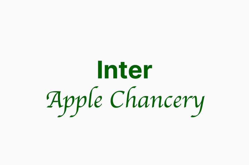
Opt for different font families
This can create contrast and visual hierarchy, as well as help the text stand out. For instance, you could pair sharp serifs with clean sans-serif silhouettes.
Choose fonts with similar x-heights and stroke widths
By choosing fonts with similar x-heights and stroke widths, the text will have a consistent appearance, resulting in a harmonious and balanced design. This will make it more professional and polished, while also keeping it accessible and legible for readers.
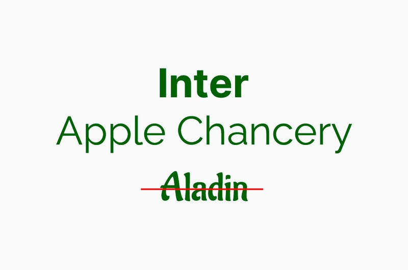
Maintain the contrast
Pairing fonts with contradictory styles can draw viewers’ attention to your designs. For example, you could combine a bold, display font with a thin, elegant script.
Limit the number of fonts
When pairing fonts, it’s important to limit their number to two or three: multiple fonts make for a cluttered design that’ll confuse the readers. Just like with ice cream toppings, if you put too many, they’ll all merge in one inedible blur.
Examples of Font Pairings
Here are some examples of font pairings that work well together:
Avenir (sans-serif) and Georgia (serif)
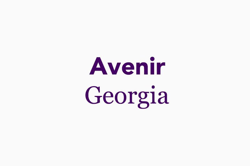
Avenir’s modern, geometric silhouette offsets Georgia’s classic, traditional typography. Plus, they’re both highly legible.
Lato (sans-serif) and Baskerville (serif)
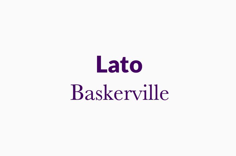
Lato and Baskerville both deliver a clean and elegant appearance. Lato’s rounded edges contrast nicely with Baskerville’s sharp edges.
Playfair Display (serif) and Lora (serif)
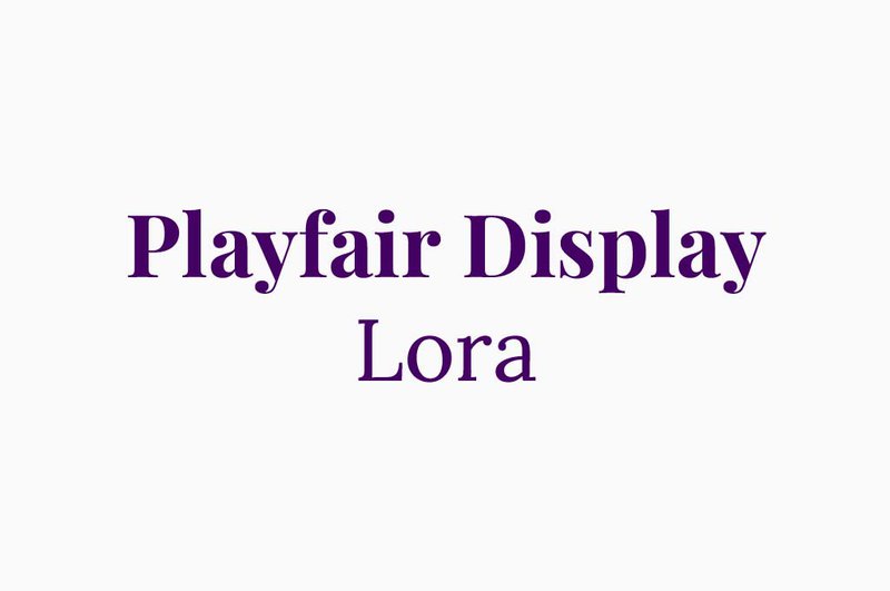
Playfair Display and Lora complement each other because of their shared vintage touch. Playfair Display in bold balances out Lora’s sleek build.
Open Sans (sans-serif) and Merriweather (serif)
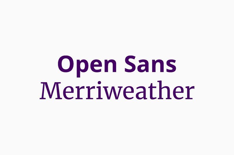
Open Sans and Merriweather are very similar, clean fonts that only differ in their serif and sans-serif strokes. Together, they’ll make for a harmonious text that’ll be easy to read.
These might seem too simple, but you always have to start somewhere. Now that you’ve figured out the logic, you can get your hands on more comprehensive combinations.
Tools for Finding Fonts
The search for the right typography could take hours — and even days, especially when can’t decide what you need. But don’t rush to scroll through random font libraries just yet. Below, find useful tools that’ll help you find font from image, making sure it’s nice and smooth.
Google Fonts
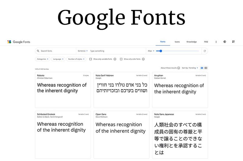
Google Fonts is a free library of over 900 font families that you can use in your designs. You can preview and download fonts directly from the website. All of them are open source!
Adobe Fonts
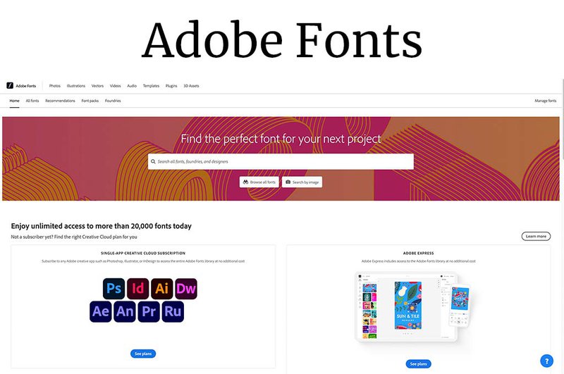
Adobe Fonts is a paid service that gives you access to thousands of high-quality fonts. Here, you will be able to find something exactly for your project as they offer an even wider selection of typefaces.
WhatTheFont
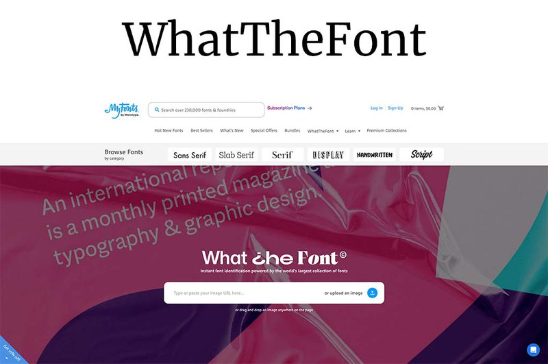
WhatTheFont is a service that’ll help you find any font used in the image — all you need is to upload it to the site. What’s great is that you can also browse through a library and find similar options! This can be really helpful for beginners who look for inspiration in the work of other designers.
Let’s sum up
The choice of typography can either make or break your designs, and you should never underestimate its importance. Before choosing a font for your next project, it is crucial to answer these questions:
- Who am I designing for?
- What emotional response am I expecting?
- Do I need the font to be highly readable?
- Does my design reflect the brand’s DNA?
Once you’re ready with the answers, decide what type of typography suits your project the most. It might be in need of bold and chunky display solutions or a personal touch of elegant scripts. The final step would be to determine whether you need more than one font. If you do, aim at balance and harmony, and remember to stop at two or three options.
And that’s all! Don’t be afraid to experiment and remember that, in contrast to how one common saying goes, the more you try, the easiest it gets!