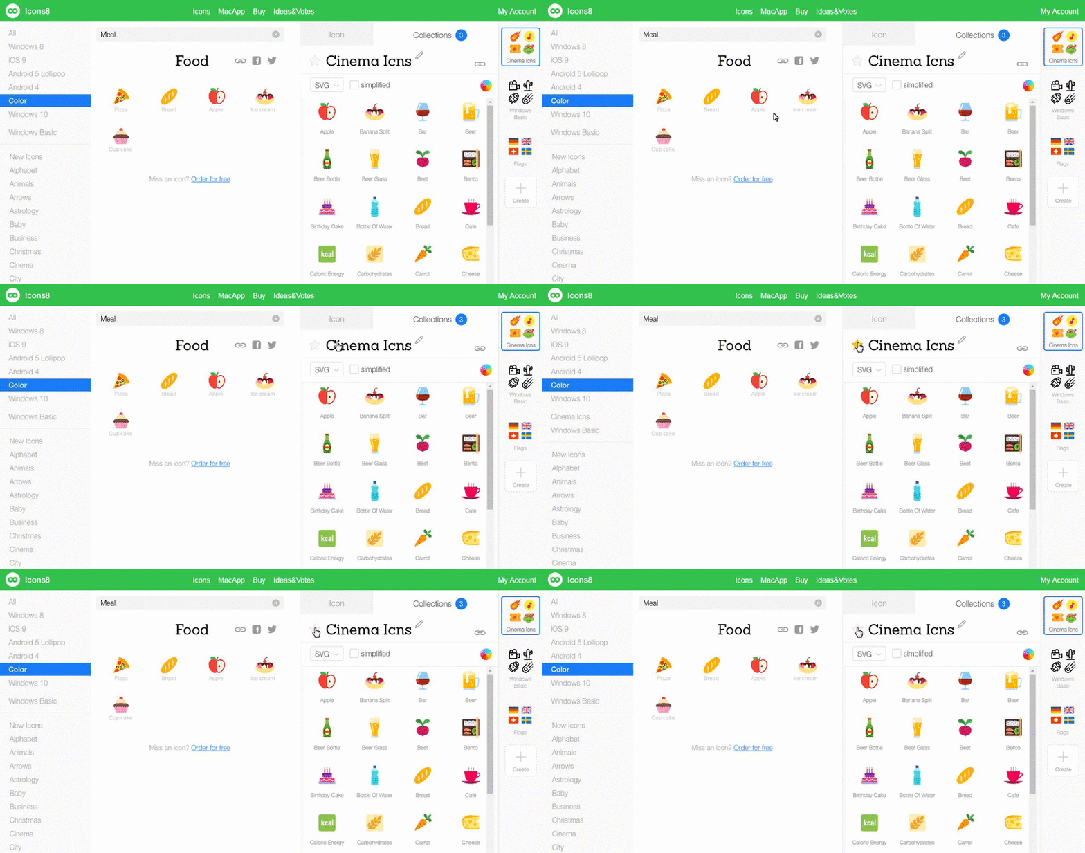
In our early prototypes, we had a button that implemented a very simple and useful function. However, nobody wanted to use it, even when I asked them to. Here’s the button:

The star. Its purpose is to bookmark a collection so you can add it to the left panel for frequent use. Of course, during usability studies, I can’t actually say, “Hey, press that star!” Instead, I had to come up with a relevant task and passively watch how people suffered (that’s a definition of usability studies here).

Seeing the first question go so poorly, I tried to improve the results by adding more specific questions. You can’t say the star is positioned badly. In fact, I can’t imagine a better place for it. Nor is it designed poorly. So what went wrong here? Well, I see three main issues:
1. Unnecessary prototype simplification
See the furthest panel to the right in the .gif above? Where are Cinema Icons, Windows Basic, and Flags collections? Two of the six attendees during the task identified this panel as the most convenient way for them to access collections.
I told them that this panel would be hidden when they entered the site and would be opened only after they had already accessed the collection. However, based on the sufficiency principle (which I explain in the Drag and Drop vs. Click article), they weren’t motivated to find another way of doing things.
Imagine it’s not there. It simply doesn’t work for us humans on a behavioral level. I didn’t hide the panel prototype because of the complex animation involved, and I had no time (~was too lazy) to do it.
Solution: do not simplify prototypes for features you want to check – the behavior model may change drastically.
2. Common design in an unexpected environment
Everybody saw the star from the beginning. Even from that moment, they had absolutely no interest. Why? Because they knew it was a bookmark star. We all know and use it every day in our browsers.
The problem is we know it too well – so well that we don’t even doubt what this star will do for us. However, there’s no webpage here that needs bookmarking. We, as users, are trying to achieve something completely different. So we ignore it. It’s like using the stairs every day at your home or job without ever really knowing how many of them there are (unless you read this article and then went and counted them).
Solution: Make the star more unusual. Slightly change the color or form. Grab the user’s attention, but don’t overdo it because the meaning may be completely lost. This is what’s called external consistency. Bookmarking is used in many services, and in most places, “a star” is the go-to icon.
3. Levels of expectation
Before they used this feature, it was non-existent to them. Their level of expectation is zero. Here’s a quick concept: we draw icons, and we share them with people. Here are the levels of expectation for different functions:
- High: search icons, download icons
- Medium: recolor icons, resize icons, generate fonts
- Low: group icons i.e., collections, icon effects (overlays, background, padding)
- Non-existent: request new icons for free (“I wouldn’t believe you”), bookmark collections (say what 0. o).
Well, after they had used bookmarking through my direct instruction, the participants in the usability study liked it very much. It’s convenient and useful. Collections are useful as a whole, and making them more accessible is a good thing.
Solution: Besides increasing the popularity of collections, which raises expectations of functions such as bookmarking, you may use hints. For a number of reasons we couldn’t use text hints like favorite and bookmark, that’s why I deliberately excluded them from the first question in this task. Nor could we use complex animations in our prototypes. However, if your interface allows this and the feature is worth it – do it.
It’s hard to imagine one little star button causing such a headache. Hopefully, you’ve got some ideas for tackling your own baffling button issues now.
Share your stories of button blindness with us in the comments
About the Author
Andrew Burmistrov is a usability specialist at Icons8. He started his career as a phone support specialist, telling jokes while customers rebooted their computers. Then, he moved to usability testing and occasional writing.
Try free tools for creators by the Icons8 team
Also, get the lists of free vector software and free photo editing software.