Icons are paramount to your UX prototype at any stage of its development, be it a pencil draft:
The draft was taken from the design without a designer article
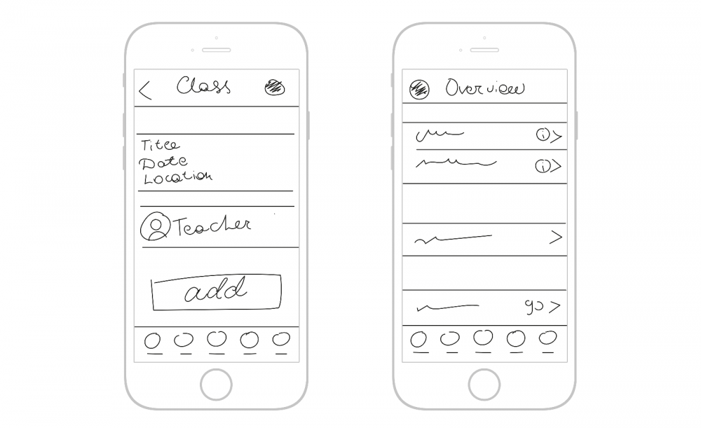
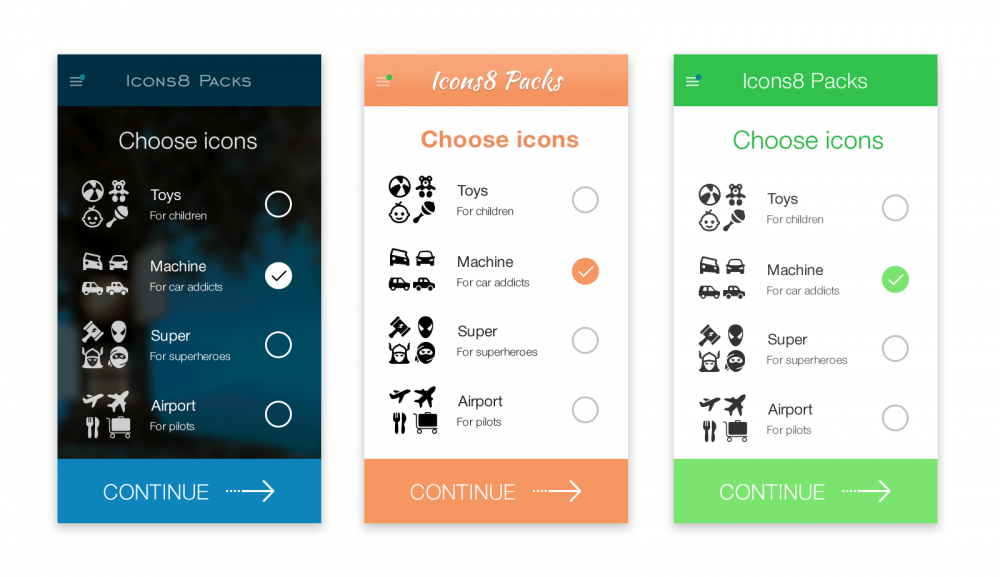
or a digital prototype:
How to make text in your app look pro
There should be a set of icons, dubbed something like “most used” or “most downloaded” icons. It should be a single icon pack, ready to be downloaded. But what are those “Must have icons for UX design” anyway?
There is no single answer to that, which is good. More ground to cover. Let’s start with obvious “Most downloaded icons”.
Most Downloaded Icons
Would you like to know the #1 icon with the most downloads? Try guessing… Save? Settings? Nope.
If you substitute “Delete” for “Close” you’ll understand why this icon is so popular. All men must die All apps must be closed. Let’s dwell on this list a bit. Does every prototype need a Facebook icon? Calendar? Nope. Clearly, most downloadable icons aren’t an indication of importance for UX design. Second try.
Most Contradictory Icons
These icons are used in almost every app, yet nobody knows exactly what they do there. Some designers believe that they should be implemented and tested in your prototypes ASAP. With all the ambivalence towards this approach, I think there is a grain of truth in it.
The winners of this “Most contradictory” category are…
Hamburger Icon
I have a feeling that there are more articles dedicated to this icon than to the Roman Empire. Or maybe even to the redesigned Instagram logo. See how up-to-date I am, talking about the Instagram redesign? Anyway, if you’re as up-to-date as me and have never seen a hamburger icon, here’s how it looks:

I honestly think that using this icon or not is not a question of usability, but of a trend. And I have no idea if this icon is trendy at the time you’re reading this article. But people are at least still using it in 2017.
Save Icon
That’s an interesting one. Do you remember what diskette looks like? Better yet, do you know what diskette is? We asked 200 of our customers to draw a diskette. Here’s what we got:
You have no idea how many ***cks I get when people draw anonymously.
It seems like the number of millennials is increasing every day. Who would have thought? You can support the tradition and use same old icon or experiment with something new, like . We live in a wonderful time when you still have a choice.
What is Love…? Icon
Do you love me? Or do you want to share something with me? You’re so difficult to understand. Especially when you’re using icons in our relationship. Instead of words.
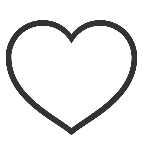
Is this a “Like” icon? Or “Share”? Maybe even “Bookmark”? No one knows. Which means it’s totally on you. Of course, you can use this icon. Just make sure that after people click it they get the appropriate feedback and can undo their action. I think it’s easier than struggling to make this icon understandable in the first place.
Let me cheat a bit and without adding a new section say that icon has exactly the same nature. You can read more about my own adventures with it in this One Button to Fool Them All article.
Untouchables
The last section of “Must Have Icons for UX Design” are untouchable icons. Customizing them for your app, or even inventing your own drastically affects user conversion, traffic, and karma.
Social Media Icons
It’s really hard to imagine a 2017 app without social media icons. Most of these icons , , are instantly recognizable, and it’s never a good decision to customize them, whether in color or shape.
Cart
What can I say – can you imagine our life without this icon? You can play with variations, e.g. arrow, but never experiment with the basic shape.
Wonderful Set
In the very beginning, I said there is no such set where all needed icons are gathered in one place. Well, I may have been a bit protective. We’ve tried gathering the most handy icons in our Very Basic category and made source files available for free.
Of course, you’ll be using many icons in your prototypes, many of which will execute far more complicated actions than “close” or “save”. Let me give you advice, if I may:
- Never customize icons for the sake of customization – it really does a bad job for the user
- for standard functions always try finding icons that are widely used in other apps – it’s never a bad decision and your customers will thank you for this