Unlock the power of visuals in your email campaigns! Discover key tips for crafting newsletter graphics that captivate and drive subscriptions.
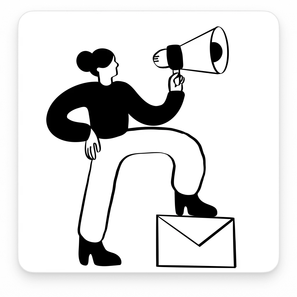
Let’s face it, in the clutter of inboxes, standout newsletter graphics are what grab attention. This isn’t just adding visuals; it’s about choosing the right ones that turn views into subscriptions.
We’re breaking down the graphics game—what works, what doesn’t, and why. No fluff, just straight insights from a designer’s lens. Ready to give your newsletters a visual edge? Let’s dive in.
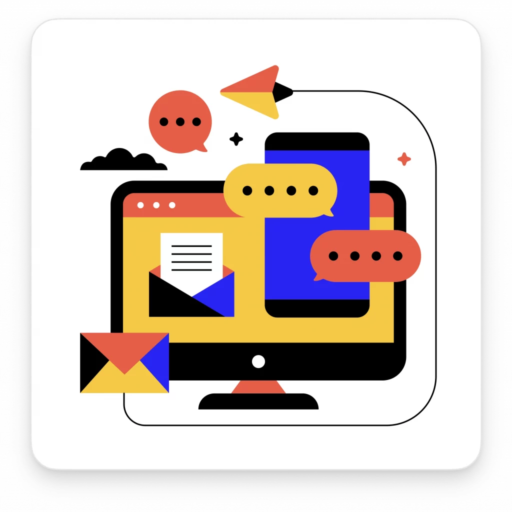
A gallery of graphics for newsletters
Dive into this curated gallery, where each category represents a distinct approach to newsletter design. Here’s what you’ll find:
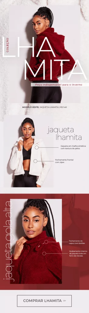
Minimalist design: Minimalist design in newsletters harnesses clean lines, limited color schemes, and ample whitespace, creating a sophisticated digital appearance. This approach, perfect for professional email communication, focuses on delivering the message with clarity and elegance, adhering to minimalist design principles.
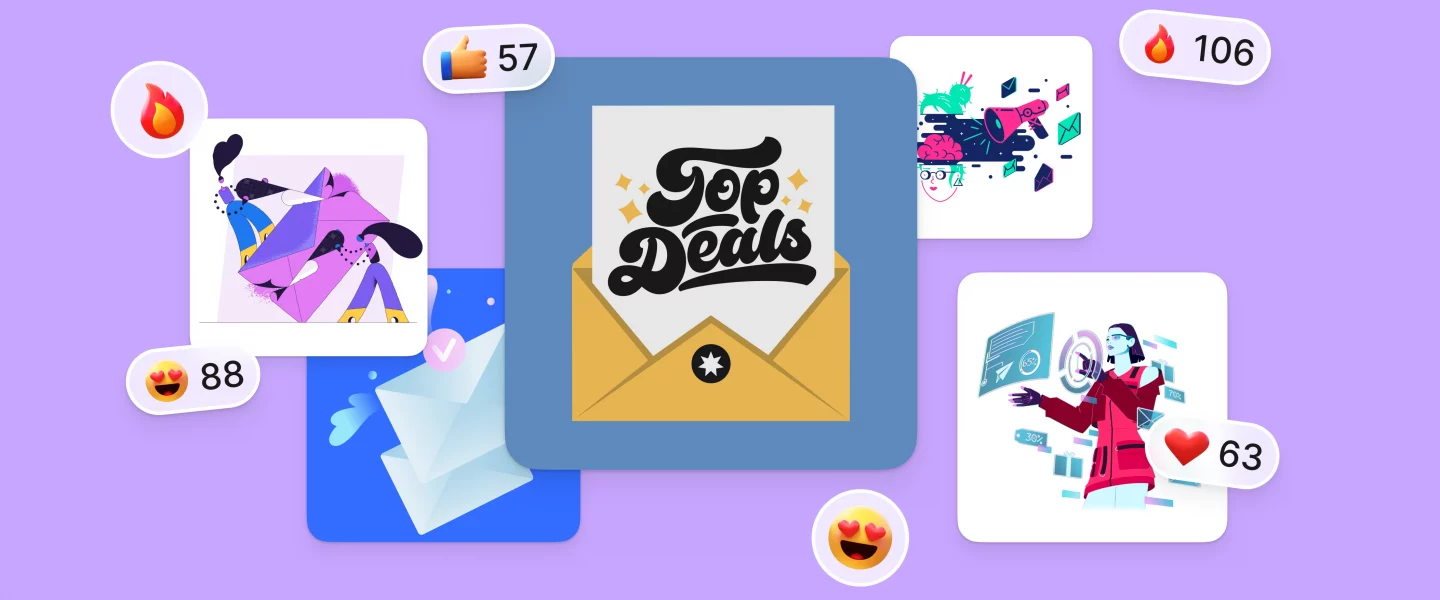
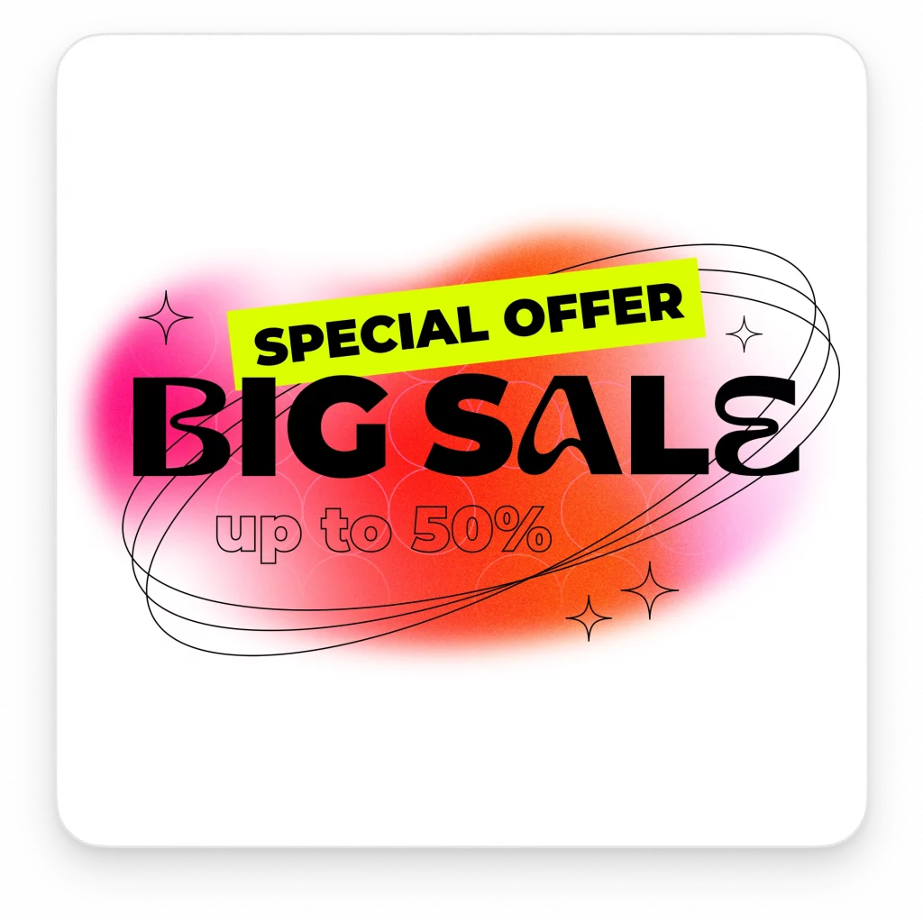
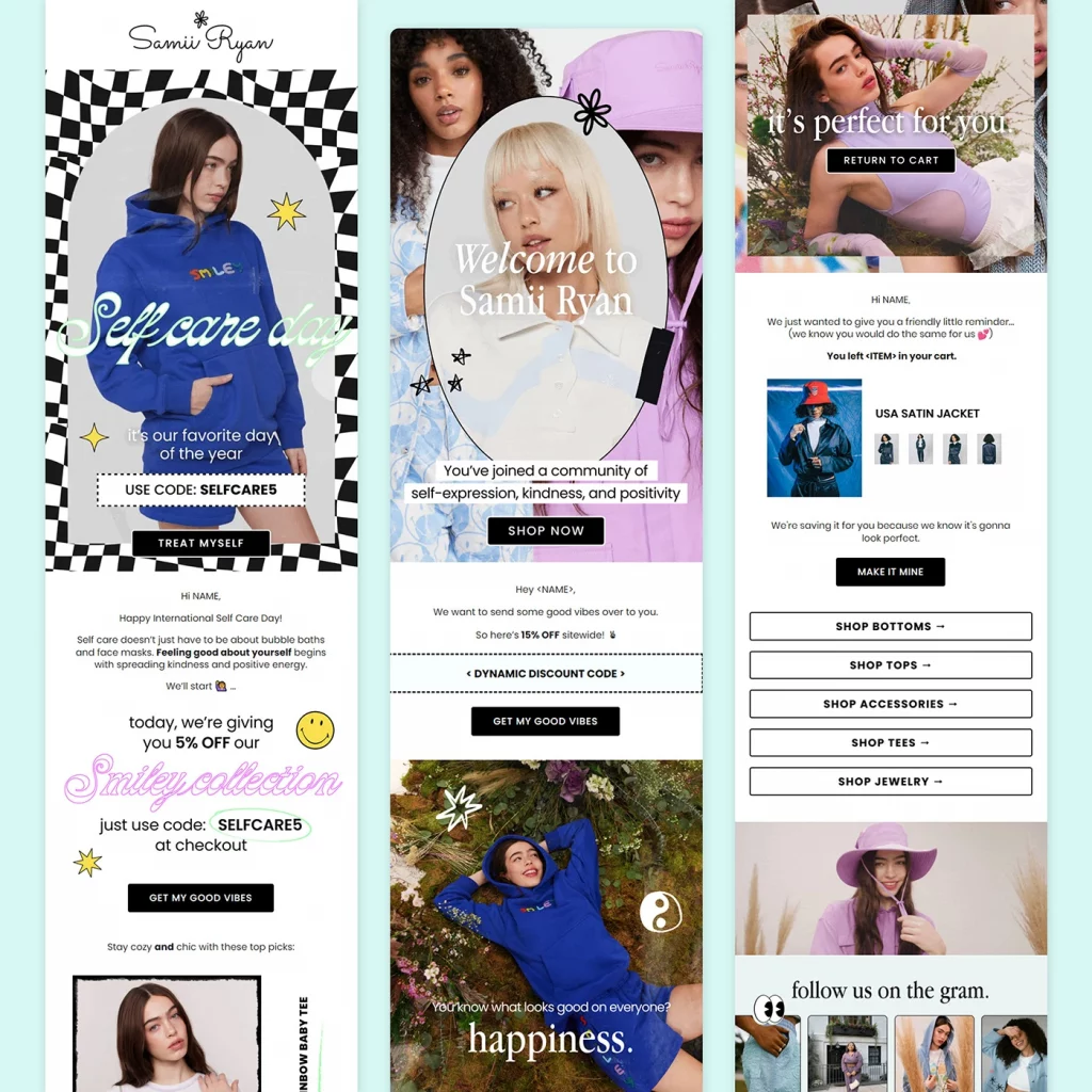
Bold colors: Bold and bright colors in email design instantly draw attention. This category showcases newsletters that use vibrant, energetic hues to make a memorable impact. Ideal for promotional emails or high-energy email marketing campaigns, bold colors are a powerful tool for standing out in a crowded inbox.

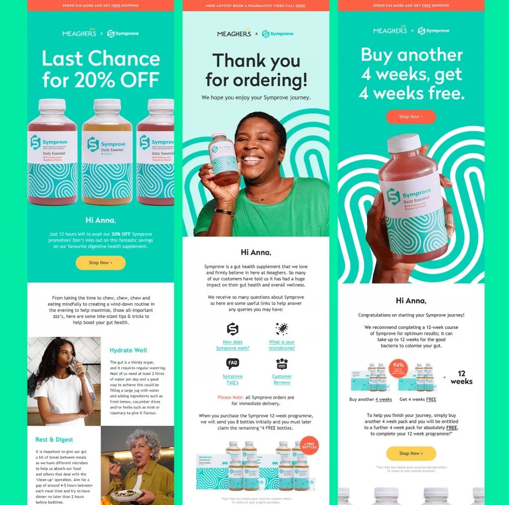
Pastel colors: Pastel colors offer a softer, more muted color scheme, delivering visually soothing and beautiful emails. Ideal for lifestyle or wellness brands, these designs create a warm, inviting atmosphere in email newsletters, effectively using complementary colors to enhance readability and engagement.

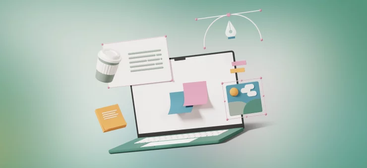
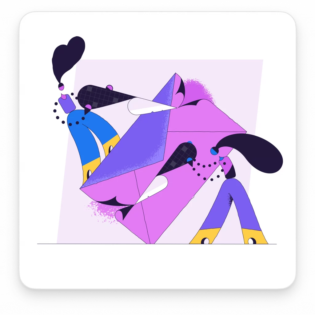
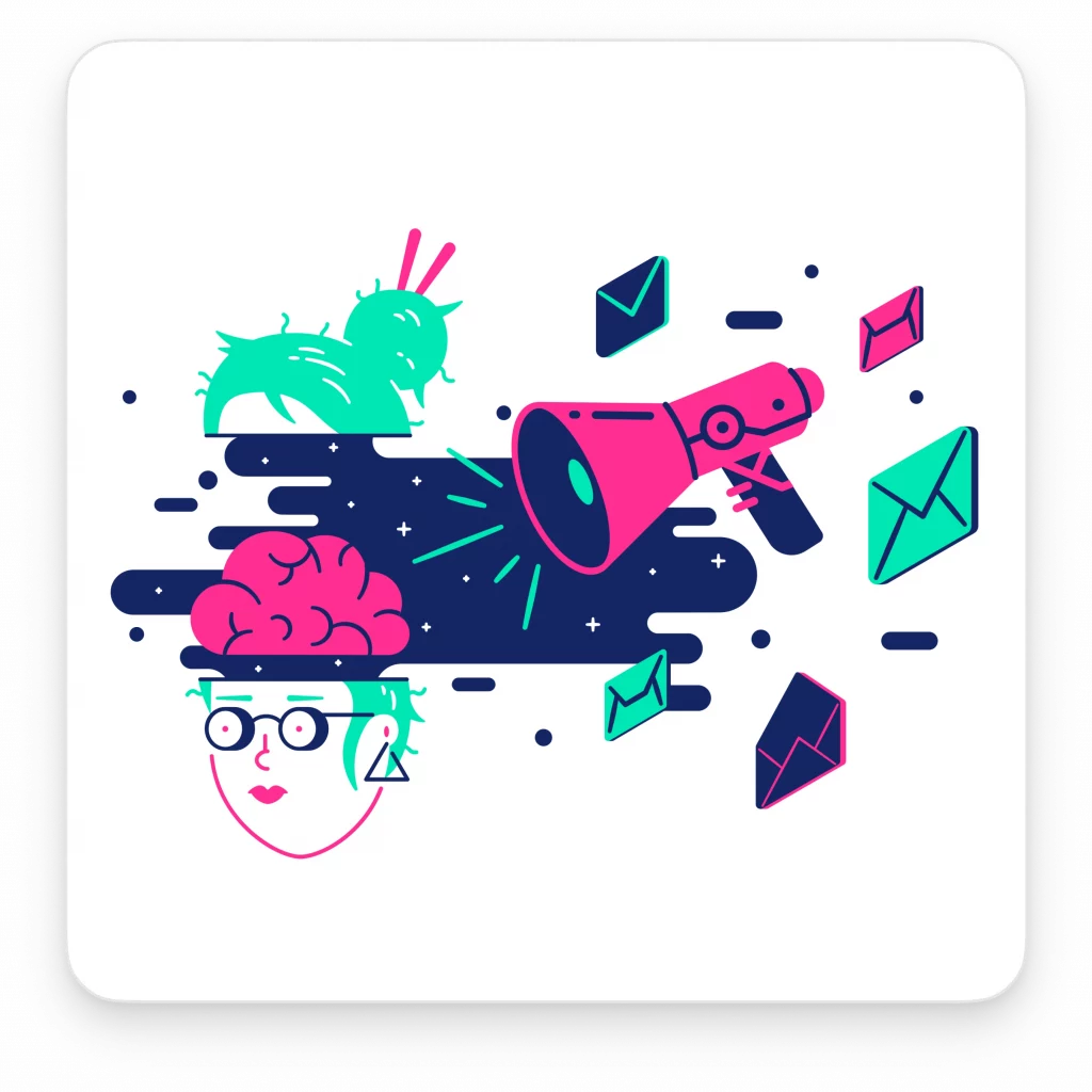
3D graphics: Incorporating 3D graphics in newsletters adds depth and a modern edge. This style can transform the entire newsletter into a visually engaging piece, breaking the monotony of traditional 2D layouts. It’s a way to captivate email recipients with a fresh, dynamic perspective.

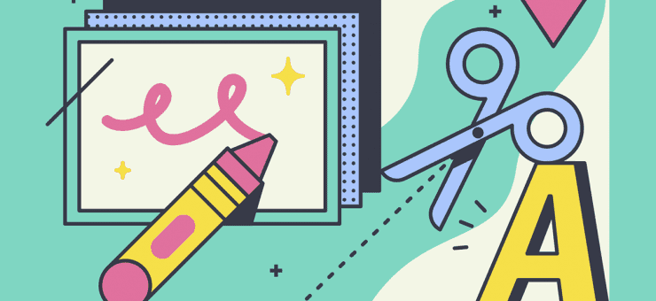
Lettering: Custom lettering brings a personal touch to email newsletters. This category demonstrates the use of unique typography, from hand-drawn styles to bespoke fonts, showcasing how creative lettering can become a central visual element, especially effective for brands with a focus on artistic or unique digital appearances.

Futuristic: Futuristic designs in newsletters often feature sleek, metallic colors and intricate design patterns. This style aligns with brands that want to convey innovation and a cutting-edge approach, appealing to email users interested in technology and forward-thinking concepts.

Funny: Humor can be a strategic element in email design. Newsletters with funny visuals or a witty copy can create a relaxed, engaging experience for the reader. This approach is excellent for brands aiming to establish a light-hearted, approachable identity, making their promotional newsletters or email campaigns more relatable.


Each category offers a different lens through which to view newsletter design, providing inspiration and ideas for your next email campaign. Whether you aim for a laugh, a futuristic feel, or a minimalist touch, there’s a style here that can elevate your newsletter to the next level.
Breaking down effective newsletter graphics
Understanding the anatomy of successful newsletter graphics helps create designs that look great and drive subscriptions. Here’s a breakdown:
Color scheme mastery:
Whether it’s using bold colors for impact, pastel tones for a soft touch, or complementary colors for harmony, mastering the color scheme is key. It sets the mood and tone of the entire newsletter, influencing how your message is perceived.
Strategic image placement:
Placement of high-quality images can make or break your design. It’s about balancing the email body with visual content that complements and enhances your message. Images should guide the reader’s eye and add to the storytelling.
Typography as a visual tool:
Typography in email newsletters goes beyond readability. It’s about using fonts to create hierarchy, emphasis, and personality. From bold lettering for headlines to subtle fonts for body text, typography should align with the overall design aesthetic.
Responsive design for all devices:
With a variety of devices and major email clients used to access newsletters, responsive design ensures your graphics look flawless across all platforms. This means adaptable layouts, scalable images, and flexible typography.
Interactive elements for engagement:
Incorporating interactive elements like hover effects, animated GIFs, or clickable buttons can significantly boost engagement. They transform a static newsletter into an interactive experience, making it more memorable and effective.
Consistency in branding:
Consistent use of design elements like logos, color schemes, and design patterns is crucial. It reinforces brand identity and builds trust among email recipients, turning your newsletter into a recognizable piece of content.
Balancing content and design:
The best newsletters strike a balance between informative content and engaging design. This involves considering the visual content as part of the overall message, ensuring that every graphic, color, and font choice adds value to the reader’s experience.
By focusing on these elements, designers can create newsletter graphics that are not only visually appealing but also optimized for engagement and conversion, ultimately leading to higher subscription rates.
Designing for different audiences
Tailoring your newsletter graphics to cater to different segments of your email list is crucial. Here’s how to approach this:
Promotional newsletters:
For audiences targeted with promotional campaigns, use bold colors and dynamic layouts to create excitement. High-energy graphics can effectively highlight offers and drive action.
Professional and corporate communications:
Opt for a clean design with a sophisticated color scheme, like muted colors or a minimalist design, for a professional audience. This approach resonates well with email users looking for straightforward, informative content.
Tech-savvy recipients:
For a tech-oriented audience, incorporate elements of futuristic or interactive design. Responsive design is non-negotiable here, as this audience is likely viewing on various devices and expects a high level of digital sophistication.
Lifestyle and wellness brands:
Utilize pastel colors and beautiful, high-quality images to create a calming and aesthetically pleasing experience. This approach is perfect for newsletters focused on lifestyle content, where visual appeal is crucial.
Youthful and creative audiences:
Engage younger or more creative recipients with bold and bright colors, funny visuals, or unique lettering. These elements can make your email stand out and speak directly to a more vibrant, energetic demographic.
Holiday newsletters:
Tailor your design to the holiday theme with appropriate color schemes and imagery. Whether it’s a bright, festive look or a cozy, muted palette, aligning your design with the holiday can boost engagement.
Segmentation and personalization:
Use your email marketing tool to segment your contact list and personalize newsletters. Custom images and tailored content can significantly increase the relevance and effectiveness of your newsletters for different audience segments.
By understanding and designing for the preferences and expectations of your specific audience, your newsletters can become a powerful tool in your email marketing strategy, leading to increased engagement and higher conversion rates.
Tips for creating impactful newsletter graphics
Crafting graphics that make your newsletter stand out requires a blend of creativity and strategy. Here are some tips to get it right:
- Focus on your goal:
- Start with a clear idea of what you want to achieve with your newsletter. Is it to inform, sell, or engage? Your goal should guide your graphic choices, from the color scheme to the type of visual content you use.
- Understand color psychology:
- Colors evoke emotions. Use bright colors to energize and draw attention, pastel tones for a soothing effect, and bold colors for a strong impact. Remember, the right color combination can significantly affect engagement and conversion rates.
- Quality over quantity:
- Use high-quality images and custom graphics. They should enhance your message, not distract from it. Ensure images are optimized for fast loading across all major email clients and devices.
- Be consistent with branding:
- Your newsletter should reflect your brand’s identity. Use consistent branding elements like logos, color palettes, and typography to build recognition and trust among your email recipients.
- Keep it responsive:
- Ensure your graphics look good on any device. Responsive design isn’t just about scaling down; it’s about creating an adaptable layout that offers a seamless experience for your email users, whether they’re on desktop or mobile.
- A/B test your designs:
- Experiment with different designs to see what resonates best with your audience. Use an email marketing tool to test variations in color, layout, and imagery, and use the insights to refine your approach.
- Use whitespace wisely:
- Don’t be afraid of whitespace. It helps to declutter the design and makes important elements like calls to action and key messages stand out.
- Balance text and imagery:
- Striking the right balance between text and visuals is key. Your graphics should complement the text, not overpower it, creating a harmonious and effective piece of content.
- Include сlear CTAs:
- Make your calls to action obvious and enticing. Use design elements like contrasting colors or action buttons to make them stand out, guiding your potential customer to take the desired action.
By following these tips, you can create newsletter graphics that are not only visually appealing but also strategically designed to engage and convert your audience, ultimately driving more subscriptions.
Wrapping up
Great newsletter graphics are more than just eye candy; they’re essential tools for boosting email engagement and subscription rates. By understanding your audience, mastering color schemes, and focusing on responsive, well-balanced designs, you can turn your newsletters into powerful vehicles for your marketing strategy.
Remember, each graphic element should serve a purpose: to attract, inform, or convert. Keep experimenting with different styles and layouts, and use your email marketing platform to track what resonates best with your audience.
Ultimately, the goal is to create newsletters that look impressive and resonate deeply with your readers, turning every email into an opportunity to grow your subscriber base and strengthen your brand’s digital presence.
Check out email design hacks that will boost your conversion rate.