Learn how to choose the right scale, stroke width, and level of detail to design universally compatible icons.
Drawing a visually pleasing icon is not enough. Making the icon scalable, responsive, and suitable for many devices is what’s important if you want someone to use your icons. It requires a lot of rational thinking and quite a bit of experience with icon design, and that is something we have. Tune in to find out how to craft pixel-perfect icons.
Watch this tutorial or follow the steps below.
We’ll be making our icons in Adobe Illustrator.
Start off by clicking Preferences → Guides & Grid and changing the Gridline every parameter to 1 px.
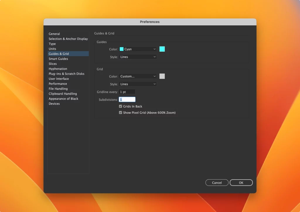
Also, open the View menu and click Snap to Grid & Show Grid. Now we are ready to create our impeccably clean icons.
Making pixel-perfect icons
There are 6 key factors that define whether your icon is pixel-perfect:
We are going to discuss these one by one and explain how to get each of the 6 parameters right.
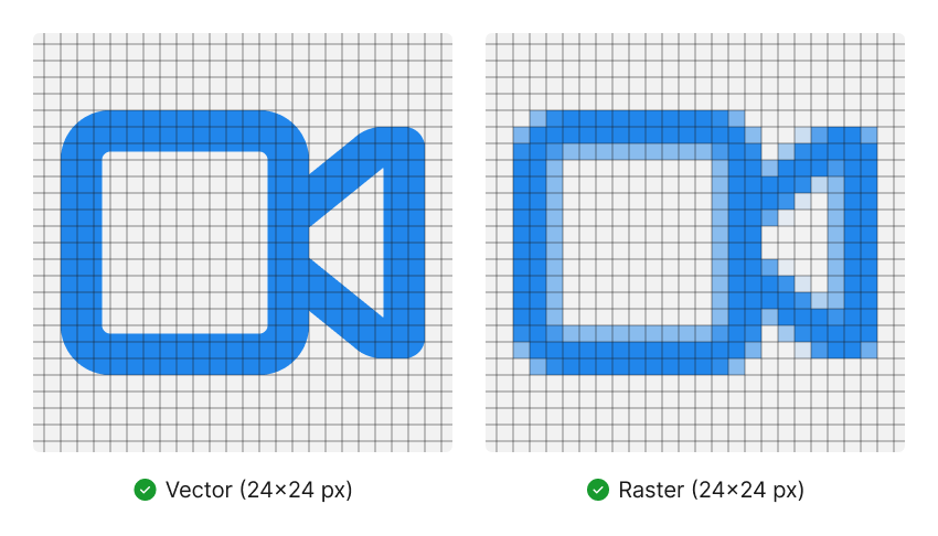
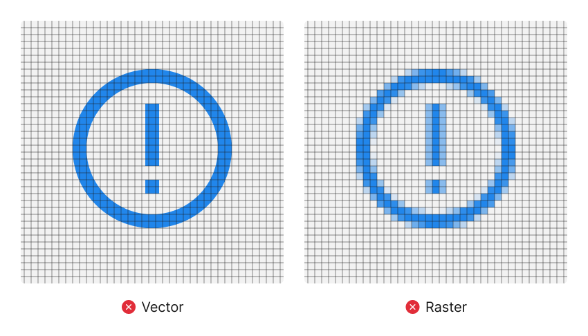
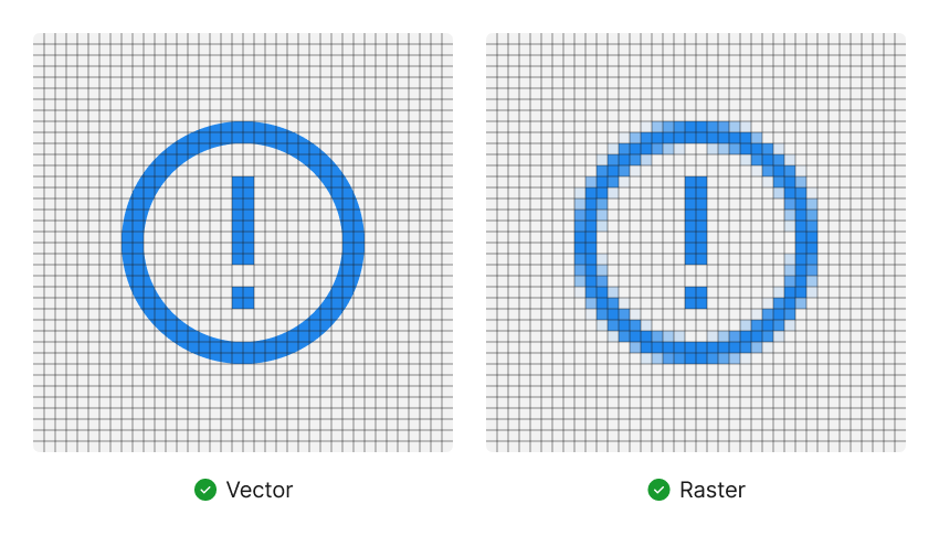
Stroke width
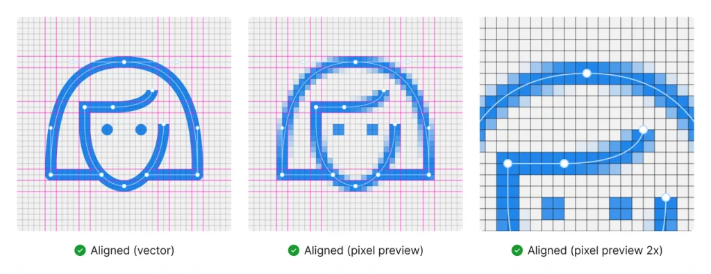
An outline icon can lose its sharpness if stroke width is not in line with the pixel grid.
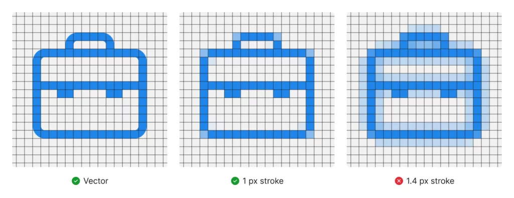
How to choose the stroke width? Always stick to even numbers (2 px, 4 px, 6 px, etc.) You can use odd numbers as well, as long as they’re aligned with the grid. As long as these are whole numbers, your lines should be fine.
However, if you absolutely need to use fractional numbers for your stroke width, you’ll need to take a few extra steps to clean up the edges. Once you rasterize an icon that uses fractional stroke width, you’ll see a few partially transparent pixels around the outline. Make sure you move all these fractional pixels inward so that this blurring stays on the inside, leaving the outer edges clean. This way, the semi-transparent blurry pixels won’t harm the readability of your icon.
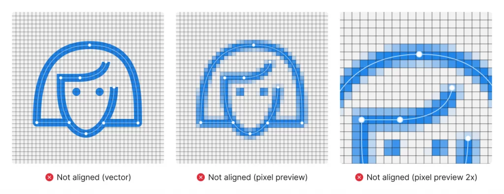
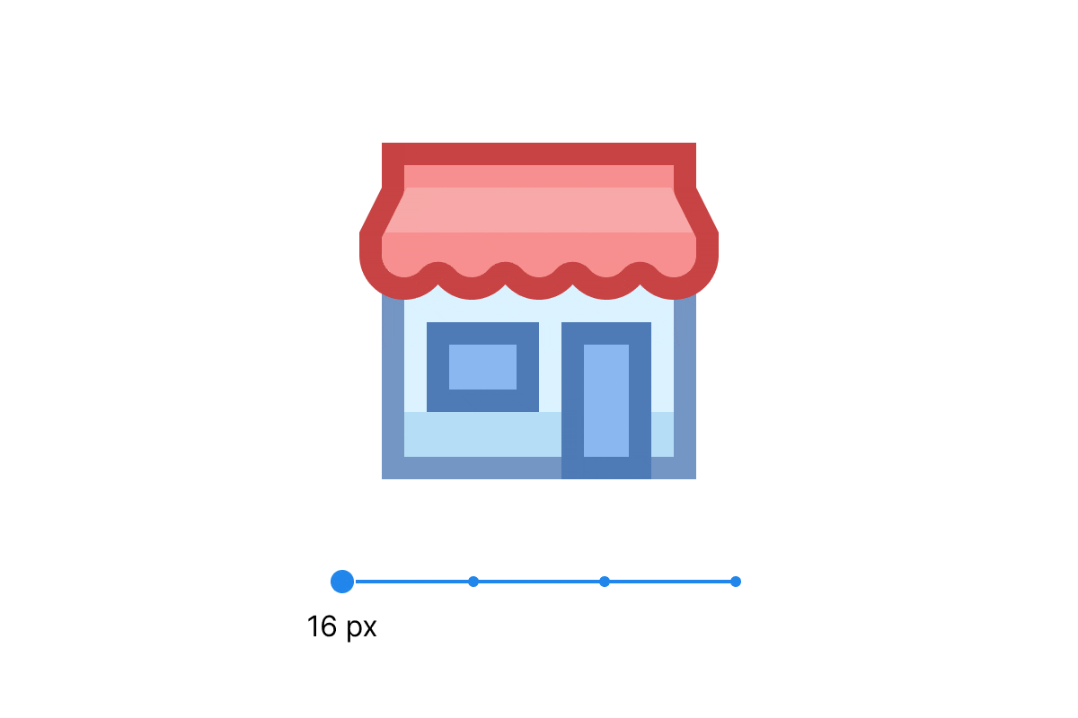
Inner elements
Inner elements of an icon may get distorted if they aren’t aligned with its size. For example, if the circle has an even radius — say, 20 px, the element inside it should have an even stroke thickness as well, e.g., 2 px.
Bézier curves
You can fine-tune vector paths to keep your edges clean.
Amount of details
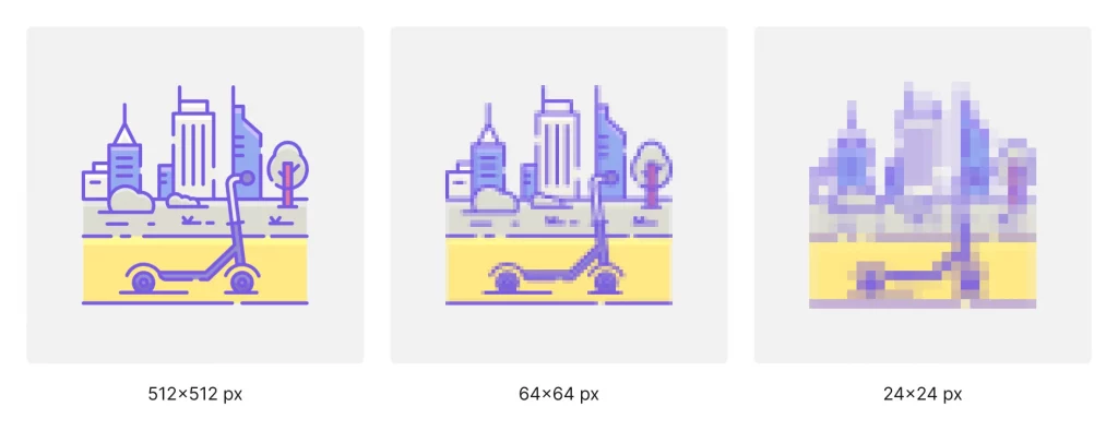
Keep in mind that an icon with a lot of small details may look like a blurry spot when the icon is resized. So it’s better to design icons with a specific size in mind.
In order to solve this problem for our Office style icons, we drew 4 versions of every icon so they could fit any screen. 16×16 px and 30×30 px are adapted for standard displays, while 40×40 px and 80×80 px are for retina.
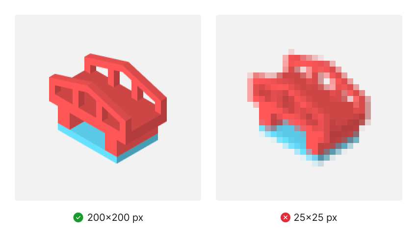
Perspective
Icons with an abundance of curved lines and angles tend to get more blurry. For small icons, avoid perspective altogether — flat styles are preferable.
Scaling
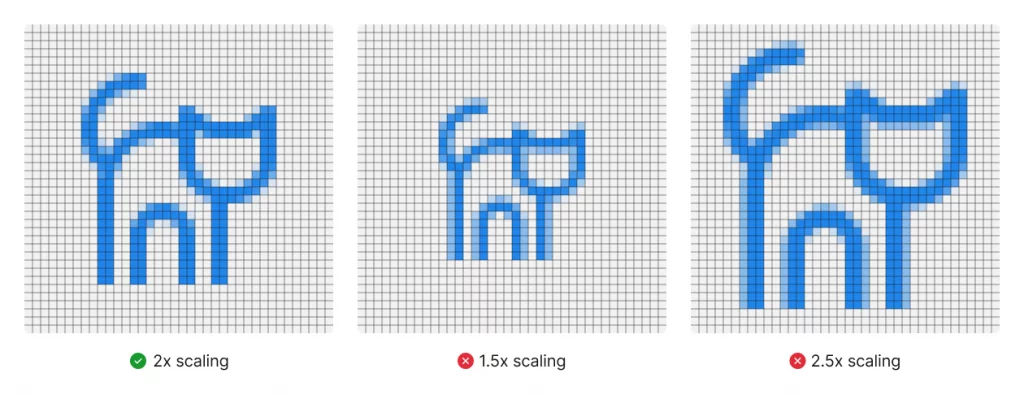
Beware of fractional numbers when designing icons. If you make several sizes for the same icon, each size might require tweaking after scaling. Fractional numbers in scaling might leave you with a lot of extra pixels to clean up.
Also, check out our checklist on icon design for graphic designers and read what is favicon and why it’s important