Here’s a step-by-step breakdown of the process of icon creation and a checklist for designing an icon set.
We have been designing icons every day for more than 15 years. It’s safe to say that no matter how design trends change, the key principles of icon design stay the same. In this article, we are going to go over the core must-knows of creating icons and give you some tips on designing a consistent set of icons.
The three main words you need to keep in mind at all times when creating icons are consistency, legibility, and clarity. A good icon should check all three boxes. As easy as this sounds, it can be difficult to nail all of them, especially when making a whole set of icons, and this challenge is even more pronounced in an era where AI icon generators are everywhere.
Here is how we do it at Icons8 and, hopefully, you can use our tips to optimize your own workflow.
Step-by-step process of icon design
Here’s a flow we found to be effective when it comes to icon design.
Define the parameters of your set
Consider where it will be used and what it should represent. Think of how it will be used, how big it should to be, and what icon categories it needs to include.
Think about your metaphors and symbols
Decide which icons are better off as metaphorical images and which work better as pictures of real-world objects. When thinking about your metaphorical icons, write down all the associations that come to mind so that you can capture the essence of that image in the best way possible. Look for definitions and synonyms, search for keywords related to that concept you need to encapsulate in an icon. Simplify the idea to the point where an abstract concept becomes a clear, easily readable image.
Need an example to help you navigate your search for the perfect metaphor? Read our article on how to design tiny icons to learn more.
Don’t try to reinvent the wheel
Collect all kinds of references that can be useful. Someone has probably already designed a solid set of icons related to that same theme. Those can be a massive source of inspiration and save you plenty of time you’d waste brainstorming on your own.
Pick an icon style
If we’re talking consistency, it is one of the first things you need to take into consideration. Think about the interface your icons will be used in. Does it allow for funkier, more creative shapes? Does it require simpler shapes and smaller icon sizes? The choice depends on both the general requirements for the type of interface you’re working with and the stylistic concept of a particular UI.
Sketch a few icons in your style of choice
Before you go all in and commit to the style and the images you chose, you need to get an idea of what they’re going to look like. Plus, a quick sketch will help you see whether your icons follow the principles of consistency, legibility, and clarity.
Vectorize the best sketches
Once you’re happy with the initial sketches, it’s time to put them to the test. Make full-blown vector versions of the best icons as if you were to finalize the whole set. If you’re happy with how they look, you’re on the right track.
Test the icons in the UI layout
To get an idea of just how good your future icon set is, you need to see it in an environment. Make a few demo UIs featuring your newly designed icons, create prototypes to see how they perform in an interface. If there are no second thoughts left at this point, it’s time to get to designing the rest of the set.
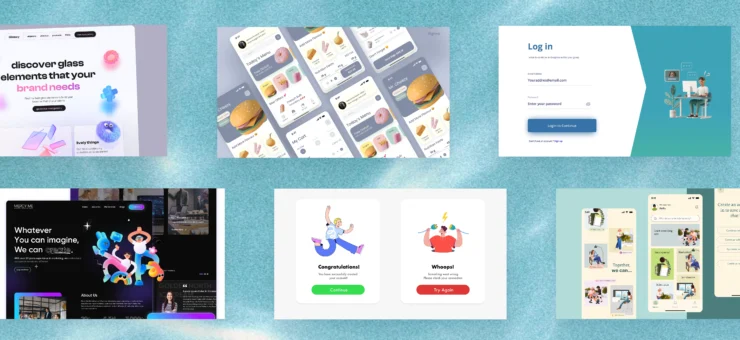
Here are some examples of icon sets we designed using this flow.
After having designed numerous icon sets over the years, we also came up with a designer’s checklist. It includes all the crucial characteristics of a high-quality icon set and helps you see where you have some brushing up left to do. It includes 8 main points to consider when creating your icon set.
Icon designer’s checklist
These points don’t come in any particular order, and they’re equally important. We also have an article with a more detailed overview of the main components of a perfect icon.
Pixel-perfect outlines
To avoid blurriness, you need to make sure the outlines in your icon fall within the pixel grid perfectly. Choose a stroke width that aligns with the grid. Avoid half pixels, as they are going to create a blurry halo around the main shape.
If you want to learn more about the art of creating pixel-perfect icons, read our article on how to achieve immaculate clarity no matter the icon size.
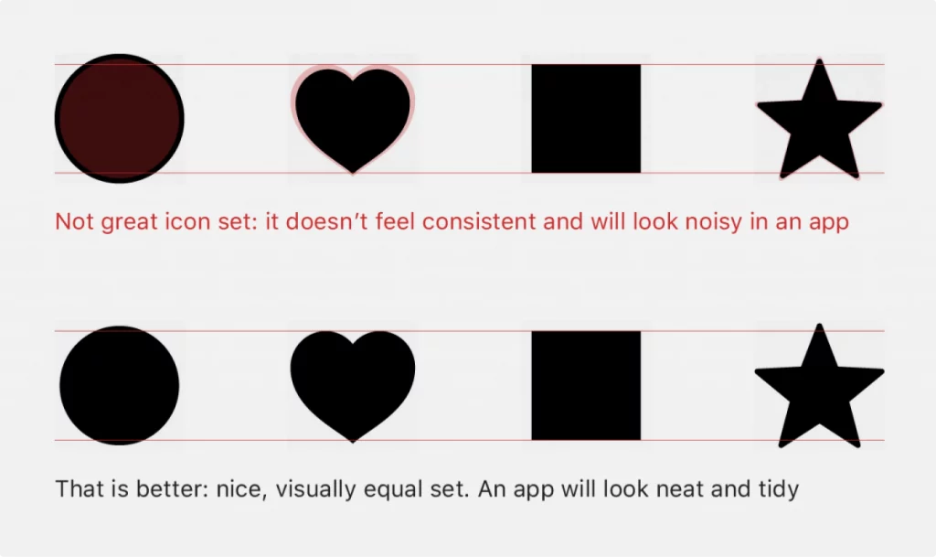
Visual weight
Use the squint hack to check whether all the icons in your set are the same size. Lean back a bit, squint, look at the icons, make the necessary adjustments, and look again. In order to maintain consistency in the visual weight of the icons within the same set, we use the “perfect circle” and the “perfect square”. These shapes are the easiest to get perfectly symmetrical, so we compare the rest of the icons to them to see which ones look too light or too bulky.
Clean geometry
Wherever possible, use clean, simple geometry to define your shapes. It makes your icons appear more balanced and neat overall. Plus, clean geometry is more readable than free-form asymmetrical shapes.
Clarity and simplicity
It’s vital to declutter your designs and only leave the essential details. The general rule of thumb is that if an element isn’t crucial for understanding the meaning of an icon, you should drop it. In an image this tiny, there is no space for extra embellishments. An unnecessary stroke can ruin the readability of the entire icon, so ditch as many redundant details as you can.
Space to breathe
Ensure all the elements in your icons have enough space to breathe. An icon shouldn’t feel like the elements within it have been shoved into a minuscule frame. There has to be enough white space between them so that the composition looks clean and harmonious.
Contrast
Make sure your icon works well on a plain white or black background (ideally both of them). If it partially blends into the background color, try going for shades that are more visible on white and black. Plus, don’t forget to check the contrast between the colors within your icon. Otherwise, it might turn into a colorful blob once sized down and added to a design.
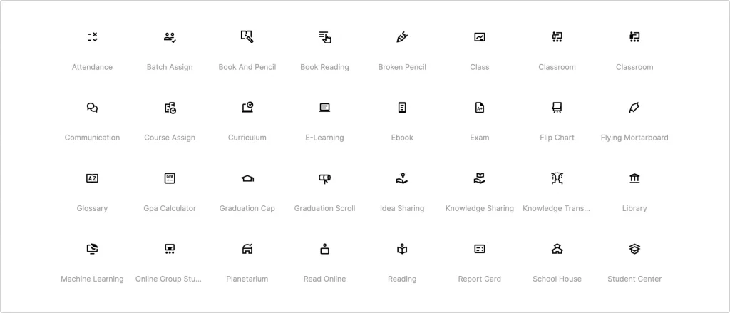
Visual consistency
Needless to say, all icons within the same icon set should have the same stroke width, corner radius, color palette, level of detail, etc. Make sure they all look like they belong in the same space and work well together.
Order in layers
This might seem like an unnecessary complication, but having your design file in order never hurts. This is especially important in case you are working on a commission. Imagine handing in a file with thousands of layers, all of which have random names like “0gh_p13x9iff.svg”.
Clean up as you go to make the design file easy to work with for yourself and others.
Useful Links
- Pixel Perfect Icons
- What is visual weight
- How to combine icons from different sets in your UI
- 3 simple tips to improve your app icon design
- Guide to a variety of interface icons
- How to design a top-quality icon
- 6 easy steps to better icon design
About the author: Anna Golde, graphic designer for Icons8
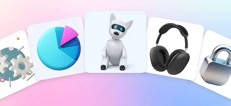
Check out Ouch!, our collection of free vector illustrations for UX
Read the article about how we redesigned the Icons8 web app and learn about the 6 dangerous temptations of icon design you’d better avoid.