Let’s explore how a well-designed 404 error page can turn a potential setback into a positive user experience, reinforcing your brand and keeping users engaged.
Encountering a ‘404 Not Found’ error page is a common online experience, often frustrating users. Yet, there’s a hidden opportunity here for creativity and engagement.
Table of contents
- Humor meets functionality
- The power of creative design
- A gallery of graphics for 404 pages
- Enhancing user engagement and navigation
- Tips on designing your own 404 page
- FAQs on designing 404 error pages
Humor meets functionality
While our earlier article showcased the use of humor in 404 pages, it’s important to balance wit with practicality. A good 404 page should guide users effectively and also bring a smile. Here’s how to strike that balance:
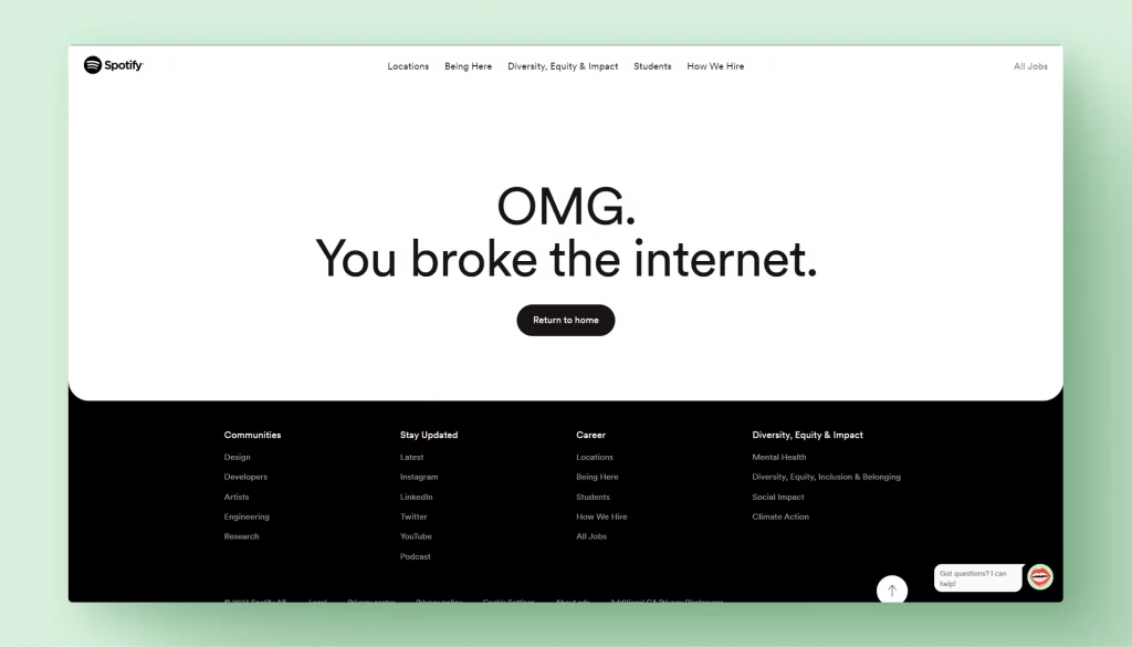
Clear communication: The primary role of a 404 page is to inform users that the requested page is unavailable. Clear messaging should be the priority, even when incorporating humor. Phrases like “Oops, looks like you’re off the map” or “This page must have taken a wrong turn” are light-hearted yet informative.
Navigational aids: After informing users of the error, the next step is helping them find their way. Include links to the homepage, popular sections, or a search bar. These elements should be easily identifiable and accessible, ensuring users aren’t lost.
Brand alignment: The tone of humor should align with your brand’s voice. A quirky startup might opt for a playful joke, while a more formal corporation might use subtle wit. Consistency in brand tone reassures users, even in error situations.
User engagement: Humorous 404 pages can be memorable, but they should encourage users to stay on your site. Interactive elements, like a mini-game or a humorous illustration, can engage users longer, decreasing their chance of leaving your site due to the error.
Design simplicity: The design should remain intuitive despite the temptation to go overboard with creativity. Avoid cluttering the page with too many elements. A clean, simple design with a touch of humor can be more effective than an overly complex page.
A well-crafted 404 page is more than a stopgap for missing content; it’s a unique touchpoint in the user journey. By merging humor with these practical design principles, you can create a 404 page that resonates with your brand and enhances the overall user experience.
The power of creative design
Beyond humor, the visual design of your 404 page plays a pivotal role in user engagement. Creative design elements capture attention and express your brand’s personality. Here’s how you can harness the power of design in your 404 pages:
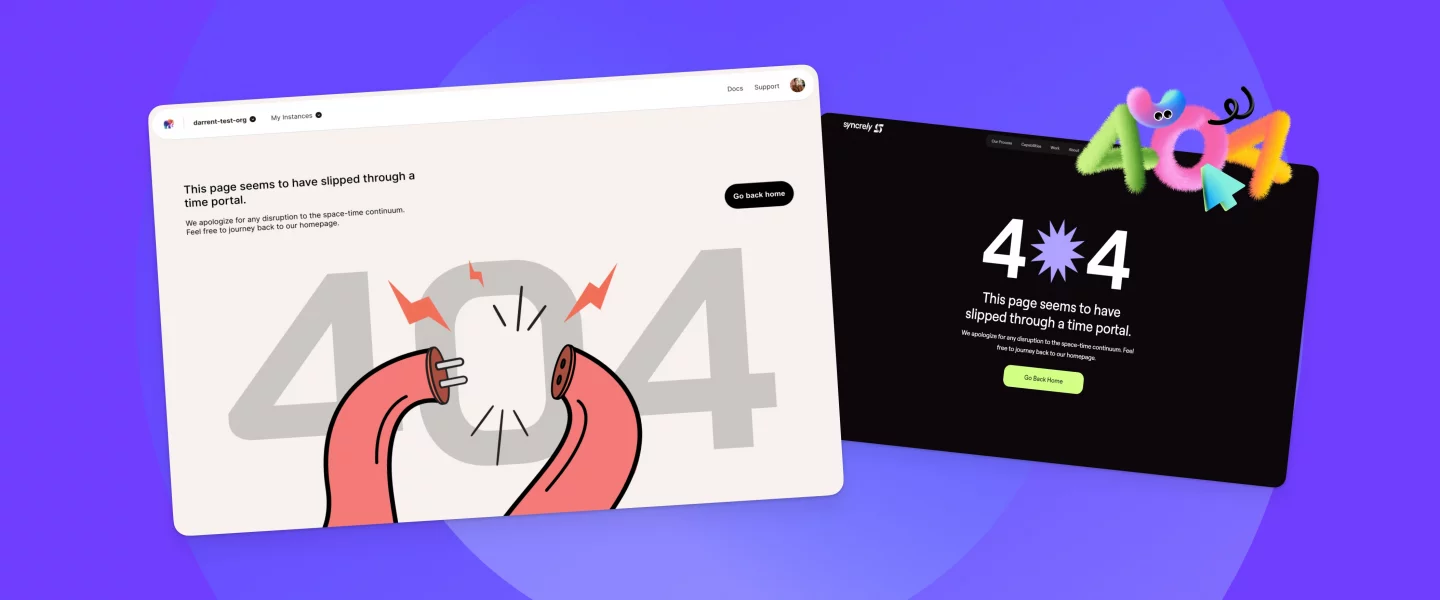
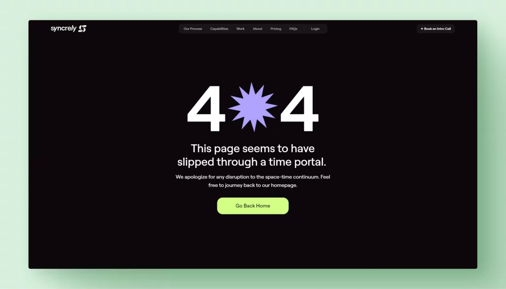
Use of custom graphics: Personalized graphics make your 404 page stand out. Whether it’s a whimsical illustration, a branded mascot, or an abstract design, custom graphics can turn an error page into a showcase of your brand’s creative flair.
Animation and interactivity: Incorporating animations or interactive elements can greatly enhance the user experience. An animated character that reacts to cursor movements or a simple interactive game related to the error theme can make the 404 page more engaging and memorable.
Color and typography: Choosing colors and fonts should reflect your brand identity. Consistency with your website’s overall design theme is key. Use colors that are easy on the eyes and typography that is readable yet distinctive.
Mobile responsiveness: With the increasing use of mobile devices, ensuring your 404 page is responsive and looks good on different screen sizes is crucial. A great design on a desktop should translate just as well on a mobile screen.
Minimalist approach: Sometimes, less is more. A minimalist design with a powerful message or iconography can be as effective as a detailed illustration. It’s all about creating an impact without overwhelming the user.
The goal is to create a 404 page that addresses the error and is a testament to your brand’s commitment to quality and detail. A creatively designed 404 page not only softens the blow of a missing page but also reinforces your brand’s identity in the minds of your users.
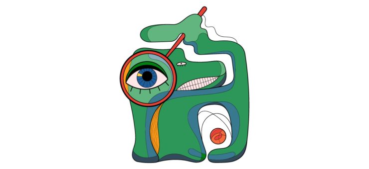
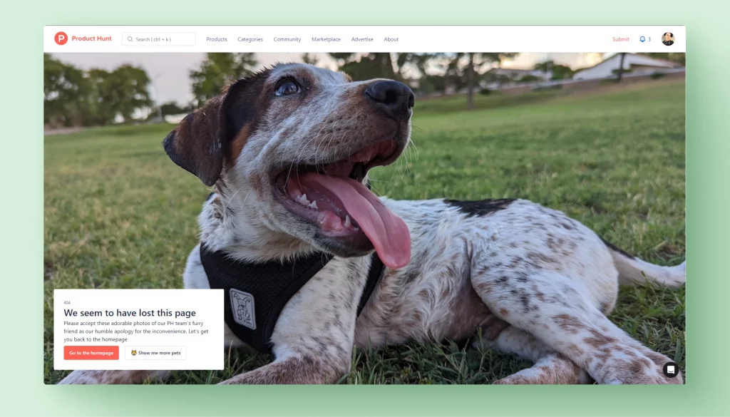
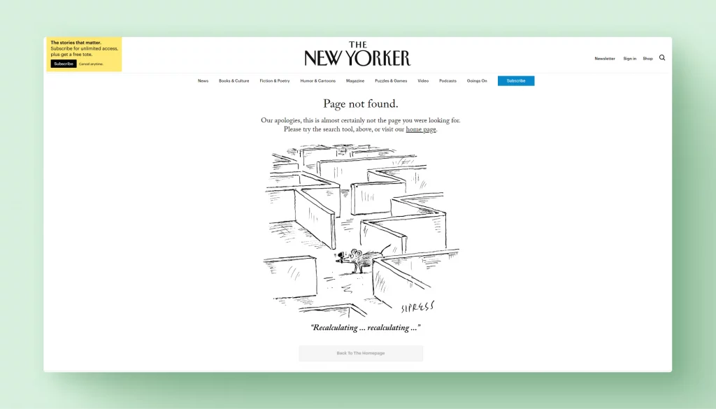
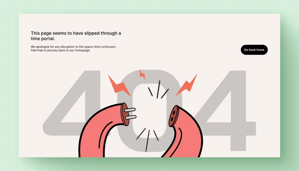
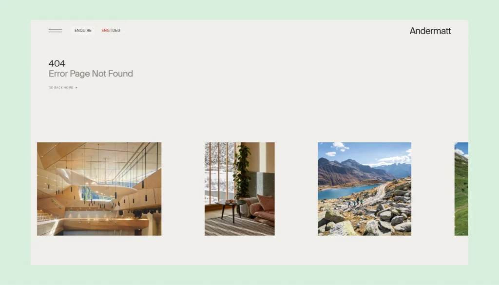
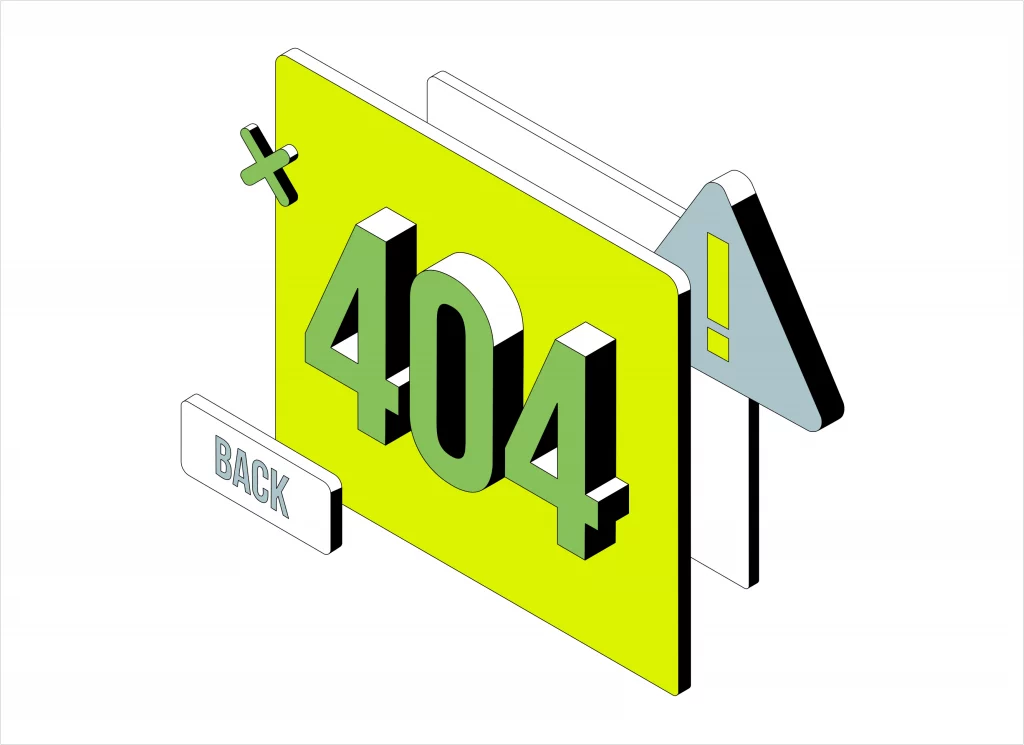
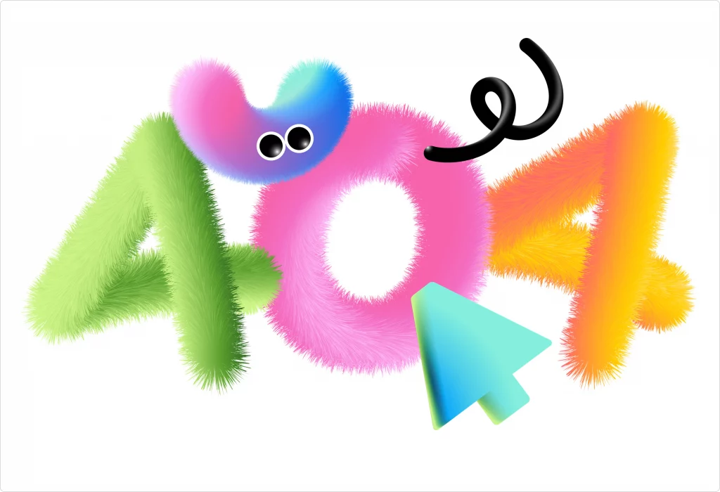
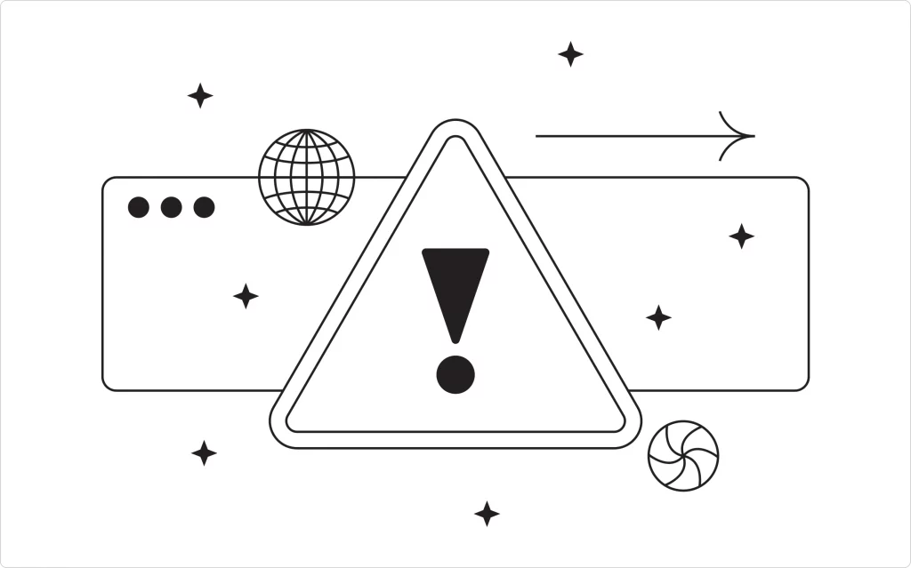
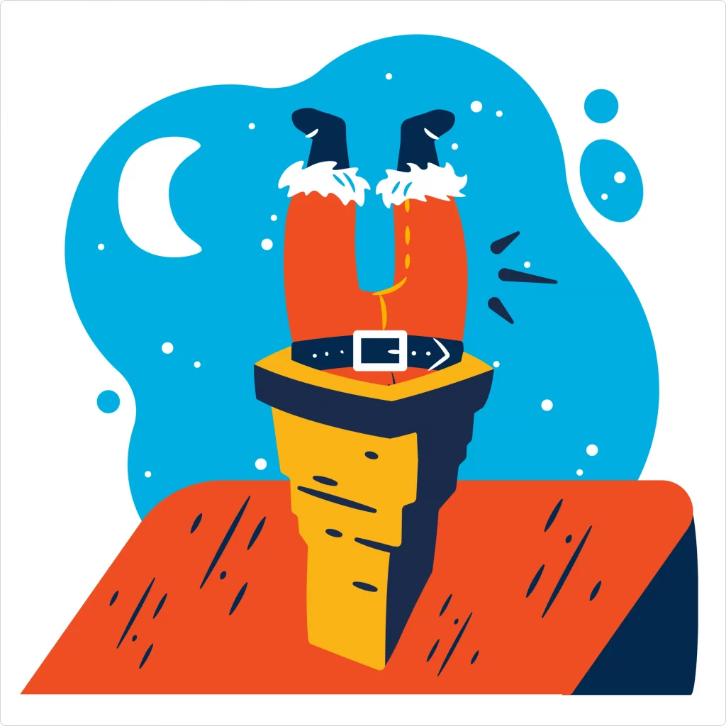
A gallery of graphics for 404 pages
Visuals speak louder than words, especially in web design. To spark your creativity, we’ve curated a selection of graphics and visual elements that could bring life to your 404 pages. Each example illustrates how thoughtful design can turn a simple error message into an engaging visual story.
Whimsical illustrations: Think of illustrations that reflect your brand’s personality – from playful cartoons to sophisticated artwork. These can add a touch of warmth and character to your 404 page.
Interactive animations: Showcase animations that respond to user actions. For instance, a character that looks around when the mouse moves or elements that animate on click. Interactive animations can keep users entertained and engaged.
Bold typography: Sometimes, a strong typographic approach can make a statement. Creative use of fonts and typography can convey the error message in a visually striking way.
Brand mascots: If your brand has a mascot, featuring it on your 404 page can reinforce brand recognition. Have the mascot in a unique setting or situation related to the error message.

Minimalist icons and graphics: For brands with a more understated style, minimalist icons or graphics can convey the message without overwhelming the user. Simple, clean lines and limited color palettes can be very effective.

GIFs and memes: Incorporating popular GIFs or memes can add a humorous angle to your 404 page. Ensure that any humorous content aligns with your brand voice and is appropriate for your audience.
Themed designs: Align your 404-page design with current events, seasons, or holidays for a timely and relevant touch. This shows users that your website is up-to-date and engaged with the wider world.

We encourage you to explore these ideas and consider how they can be adapted to fit your brand’s unique style and message. A well-designed 404 page is a necessity and an opportunity to showcase your brand’s creativity and attention to detail.
Enhancing user engagement and navigation
A well-designed 404 page does more than just look good; it actively engages users and helps them navigate to relevant content. Here’s how to optimize your 404 page for better user interaction and guidance:
- User-friendly navigation links: Include clear and prominent links to guide users to your homepage or other key site areas. Consider adding a search bar to help users find what they originally sought.
- Call-to-actions (CTAs): Strong CTAs can direct users to explore other parts of your site, such as your blog, product pages, or contact information. This can turn a potential exit point into an opportunity for deeper engagement.
- Personalized recommendations: Offering personalized content recommendations on your 404 page can pique user interest. For example, displaying popular articles or products based on the user’s browsing history can create a more engaging experience.
- Feedback options: Providing a way for users to report a broken link or a missing page can be beneficial. It helps you fix website issues and involves the user in improving the site experience.
- Keeping it updated: Regularly update your 404 page to reflect current trends, special promotions, or seasonal messages. This keeps the content fresh and relevant, showing users your site is actively managed.
- Testing and analytics: Use analytics to track the performance of your 404 page. Understanding how users interact with it can provide insights for further improvements. A/B testing different elements like CTAs or graphics can optimize user engagement.
By focusing on these aspects, your 404 page can effectively reduce user frustration and encourage them to continue their journey on your site. Remember, a 404 page isn’t just an endpoint; it can be a strategic tool for maintaining user interest and enhancing their overall experience with your brand.
Tips on designing your own 404 page
Creating a unique and effective 404 page requires a blend of creativity, brand awareness, and user-centric design. Here are steps and tips to guide you in designing a 404 page that resonates with your audience and enhances your brand:
- Start with your brand identity: Your 404 page should reflect your brand. Whether through tone, color, imagery, or typography, ensure that the page aligns with your overall brand identity.
- Craft a clear and concise message: The message should immediately inform users that the page they’re looking for can’t be found. Keep it simple and avoid technical jargon.
- Incorporate helpful navigation options: Provide clear links to your homepage, popular products, or resources. Consider including a search bar to help users find what they need without backtracking.
- Add creative elements: This is where you can get creative with illustrations, animations, or interactive features. Remember to keep these elements aligned with your brand and the overall design of your website.
- Ensure responsiveness: Test your 404 page on various devices to ensure it’s responsive and looks great on all screen sizes. A well-functioning page on mobile and desktop is crucial for a good user experience.
- Optimize loading time: Make sure your 404 page loads quickly. Heavy graphics or animations should be optimized so as not to slow down the user’s experience.
- Gather feedback and iterate: After launching your 404 page, gather user feedback and use analytics to understand its performance. Be open to continuously making changes based on this feedback to improve the user experience.
Designing a 404 page is an opportunity to showcase your brand’s creativity and commitment to a positive user experience. By following these steps, you can create a 404 page that addresses an error and leaves a lasting impression on your visitors.
The 404 error page, often overlooked, is a valuable piece of real estate in your digital landscape. It’s more than a stop-gap for a missing page; it’s an opportunity to reinforce your brand, engage with your audience, and even add a touch of delight to an otherwise frustrating moment. By creatively approaching its design, you can turn this error page into a memorable part of the user’s journey on your site.
We hope this exploration inspires you to rethink your 404 page. Remember, every element of your website, including the 404 page, is an opportunity to showcase your brand’s personality and commitment to a great user experience.
FAQs on designing 404 error pages
How do I create a 404 error page?
Creating a 404 error page involves a few key steps:
Design the page: Start with a design that aligns with your brand but stands out. It should include a clear message that the requested page couldn’t be found and possibly some creative graphics or animations.
Write the code: Use HTML and CSS to build the page. You might also include JavaScript for interactive elements.
Set up on your server: Configure your web server to display this custom 404 page whenever a user requests a page that doesn’t exist on your site.
What is 404 error layout HTML?
A 404 error layout HTML is the code structure used to create a custom 404 error page. It typically consists of HTML to structure the page and CSS for styling. The layout might include elements like a main message (e.g., “Page Not Found”), navigation links to guide users back to active pages, and additional creative elements like images or animations.
What is ‘404 page not found’ in UX design?
In UX design, a ‘404 page not found’ is a user interface element that informs visitors they’ve reached a dead end, typically because a webpage is no longer available or the URL is incorrect. A well-designed 404 page enhances user experience by minimizing frustration, offering helpful links to navigate back, and possibly entertaining the user with creative design elements.
What should a 404 error page say?
A 404 error page should clearly communicate that the requested page can’t be found. It should be concise and friendly, possibly with a touch of humor or brand personality. Essential elements include:
A straightforward message like “Oops, this page can’t be found.” Guidance on what to do next, such as links to the homepage or popular sections of your site. Optionally, a search bar to help users find what they’re looking for.
Feeling inspired to revamp your 404 page? Check out Icons8 for resources and ideas to help you create a 404 page that informs, engages, and delights. Dive into our gallery, experiment with our tools, and start transforming your 404 error page into a creative asset today!