Explore the depth of indigo color—a hue rich in history and versatility, perfect for adding sophistication and emotion to your designs.
Welcome to our color exploration journey designed for curious and creative minds. Here, we’re not just talking about any color. We’re diving deep into indigo, a shade that dances on the edge of blue and purple.
Indigo is more than just a color. It’s a story of history, culture, and creativity. If you’re a designer, or marketer, or just love colors, come explore the intricate beauty and depth of indigo with us. Let’s discover how this enigmatic hue can transform your designs and stir emotions in ways you might not expect.
What color is indigo?
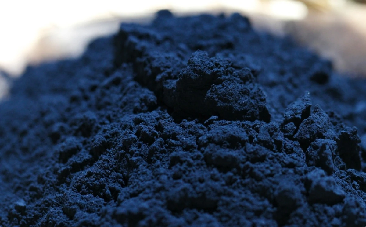
Indigo sits snugly between blue and purple in the color spectrum. It’s deeper than navy but less intense than royal blue, a perfect blend that keeps designers guessing. Originating from the natural Indigofera dye, this color has a rich history but doesn’t easily fit in a neat box.
So, is indigo blue or purple?
Indigo blurs the boundaries between blue and purple. Its identity shifts with its application, sometimes appearing more as a deep, thoughtful blue, and other times as a vibrant, mysterious purple.
This duality makes indigo a dynamic choice for designers looking to inject depth and sophistication into their work, from logos and websites to overall branding.
Let’s dive deeper into the meanings behind indigo, its digital specifics, and how to wield it in your designs for maximum impact.
The meaning of indigo
Indigo is more than just a color—it’s a symbol. It carries meanings of depth, intuition, and wisdom. In design, leveraging indigo can add layers of meaning to your work, suggesting sophistication, integrity, and a touch of mystique.
Culturally, indigo has been valued for centuries, not just for its beauty but for its rarity and the complexity of its dyeing process. This history imbues indigo with a sense of luxury and exclusivity.
In the context of branding and marketing, indigo can convey trust, reliability, and professionalism. It’s a color that can stand alone or complement others, providing a foundation that speaks to strength and depth without overwhelming.
Incorporating indigo into your designs goes beyond aesthetics. It’s a deliberate strategy. It can help create a space that encourages reflection and calmness, making it ideal for industries focused on health, technology, and education.
Indigo color code and hex
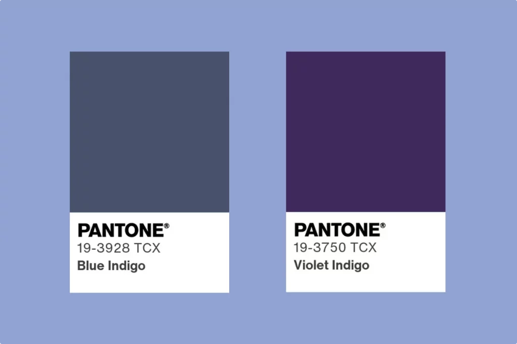
For indigo, the color can vary slightly, but a commonly accepted hex code is #4B0082. This code corresponds to a deep shade that sits between blue and purple, capturing the essence of indigo.
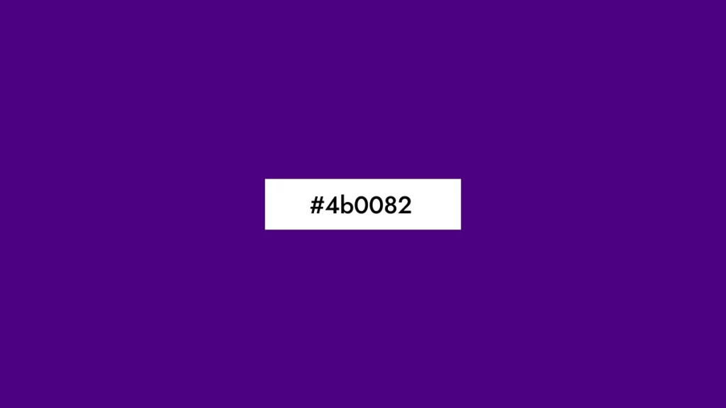
In RGB (Red, Green, Blue) format, indigo is represented as RGB(75, 0, 130), a mix that highlights its dominant blue-purple hue. For print designs, using CMYK (Cyan, Magenta, Yellow, Key/Black) values, indigo translates to approximately C=42, M=100, Y=0, K=49, reflecting its depth and intensity in physical media.
| Hex: #4b0082 |
| Rgb: 75, 0, 130 |
| Hsl: 275°, 100%, 25% |
| Rgba Color: 75, 0, 130, 1.00 |
| lab XyzColor: 6.931, 3.108, 21.354 |
| HsvaColor : 274.62, 100%, 50.98%, 1 |
| HsvColor : 275°, 100%, 51% |
| CIE L*a*b* : 20.47, 51.69, -53.32 |
These technical specifications go beyond mere numbers. They are essential for harnessing indigo’s full potential in your design projects. Whether you’re working on web design, branding, or digital art, using the exact color codes ensures that your vision of indigo comes through clearly and consistently.
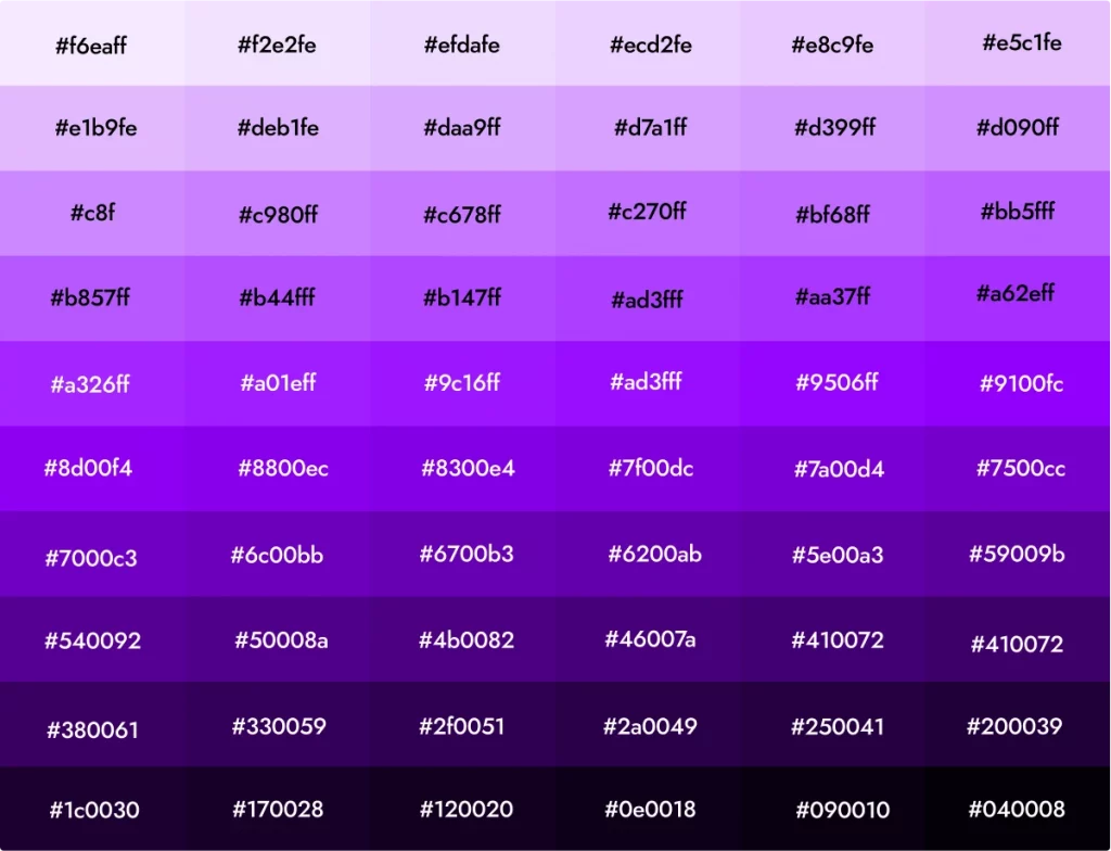
Remember, while #4B0082 is a starting point, the beauty of indigo lies in its range. Feel free to explore shades lighter or darker to find the perfect indigo for your project. Each variation can bring a different mood and style, from the more contemplative deep indigos to lighter, more playful shades.
Utilizing indigo in design
Indigo’s versatility makes it a standout choice for various design elements. Here’s how you can make the most of this captivating hue:
Icons and illustrations
Indigo can add depth and sophistication to icons and illustrations, making them pop against lighter backgrounds or stand out as part of a more complex color scheme. Its deep hue works well for technology, finance, and health themes, offering a sense of reliability and wisdom.


Icons8 offers a vast collection of icons that can seamlessly integrate indigo, making them pop against lighter backgrounds or become the centerpiece in complex color schemes. This deep, vibrant hue is perfect for themes related to technology, finance, and health, imbuing them with a sense of reliability and wisdom.
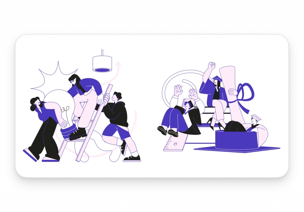
Discover the power of indigo in your designs with Icons8’s free indigo icon set. Each icon in this set harnesses indigo’s rich hue to stand out against lighter backgrounds or to complement complex color schemes. Beyond mere aesthetics, these icons are designed to convey reliability and wisdom, enhancing user experience with their visually striking appearance.
UI designs
In user interface design, indigo can create a sense of calm and focus, guiding users through their journey with subtle elegance. It’s particularly effective for highlighting interactive elements like buttons and links or for creating a dynamic background that doesn’t overpower text and other components.
Real-world applications
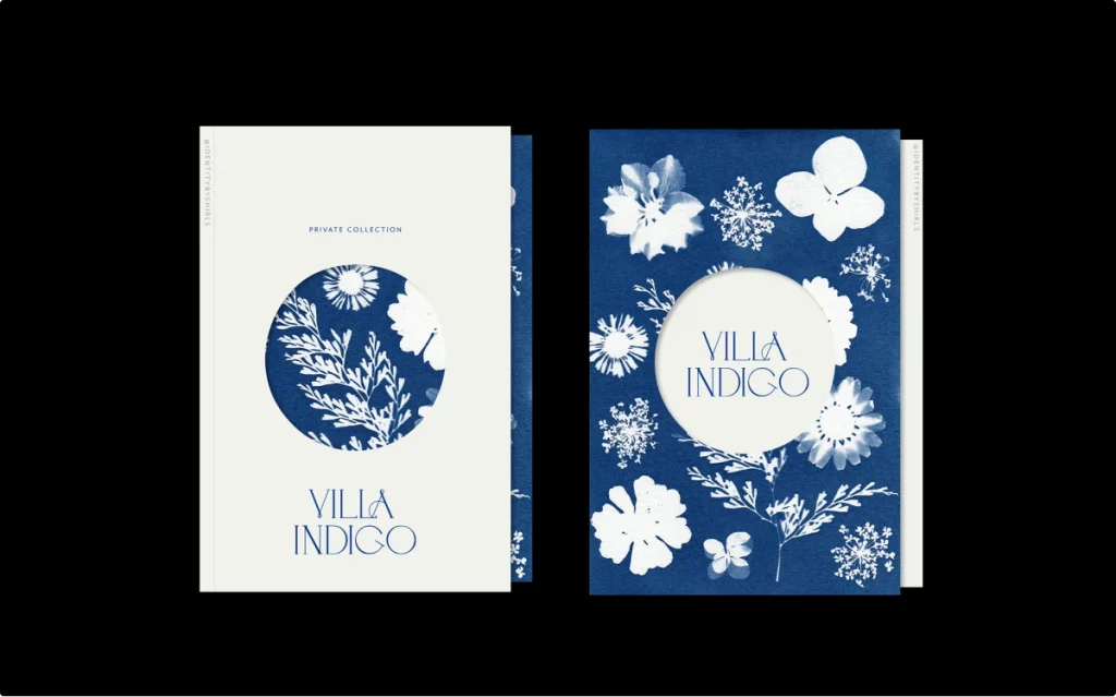
Beyond digital, indigo’s impact in branding and product design is profound. It can convey luxury, innovation, and depth, making it a favorite for branding elements, packaging, and even interior design. Indigo can set a brand apart, offering a distinctive identity that speaks of quality and thoughtfulness.
Combining indigo with other colors
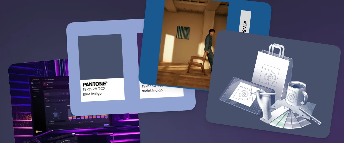
Indigo pairs beautifully with a range of colors. For a vibrant, energetic palette, combine it with warm yellows or oranges. For a more subdued, professional look, pair indigo with greys and whites. Indigo also works well with complementary colors like peach or coral, offering a palette that’s both inviting and visually striking.
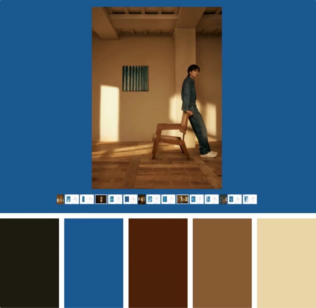
Indigo’s versatility shines in RM’s music album ‘Indigo‘. Pairing it with warm tones, the album’s design taps into a raw, earthy aesthetic. This combo creates a sense of authenticity and warmth, perfect for the album’s introspective vibe. It’s a masterclass in using color to complement the album’s themes and tone.
Tips for designing with indigo
- Contrast and balance: Use indigo as a focal point or as a background to balance lighter elements, ensuring content is readable and engaging.
- Mood setting: Leverage indigo’s psychological effects to set the mood of your design. Its depth can evoke seriousness or sophistication, depending on its application.
- Accessibility: Keep accessibility in mind, ensuring there’s enough contrast between indigo and other elements, especially in text-heavy designs.
Incorporating indigo into your design projects can transform them, adding a layer of depth and intrigue that resonates with viewers. Whether it’s a digital interface or a physical product, indigo’s rich hue offers endless possibilities to innovate and inspire.
Wrapping up
Indigo is more than a color. It’s a key to unlocking creativity and depth in design. Its rich history and psychological depth make it versatile for both digital and physical mediums. By embracing indigo, designers can create work that stands out and resonates. Let indigo inspire your next project to be not just visually appealing but meaningful.
Check out our color palette guide to dive into the basics of color theory