Digital designers are widely using the neon effect to engage users and convey the mood.
So, I’ve made this tutorial for you to show how to develop neon-glowing shapes and texts in Lunacy.
Watch this video or follow the step-by-step guide below.
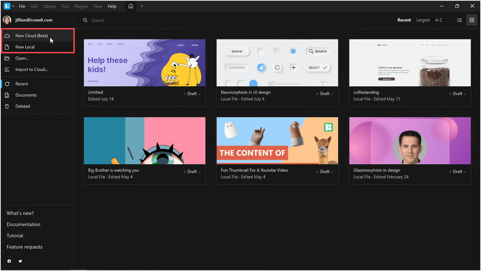
Launch Lunacy and create a new document.
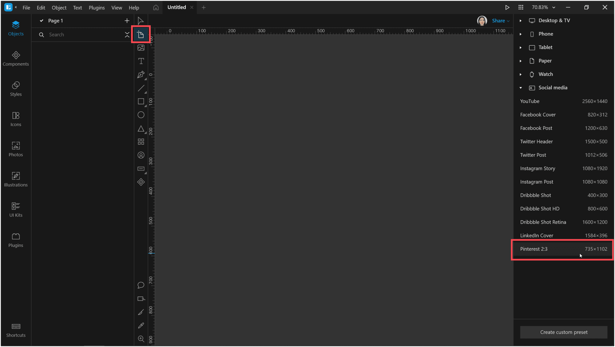
Create an artboard. I selected the Pinterest 2:3 option from the list of presets in the right panel.
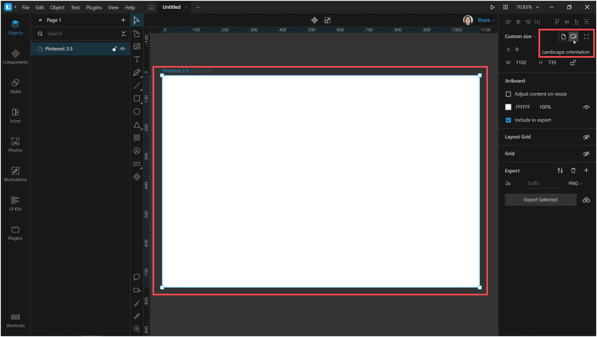
Adjust the zoom so that the artboard fits the canvas. Change the orientation of the artboard to Landscape.
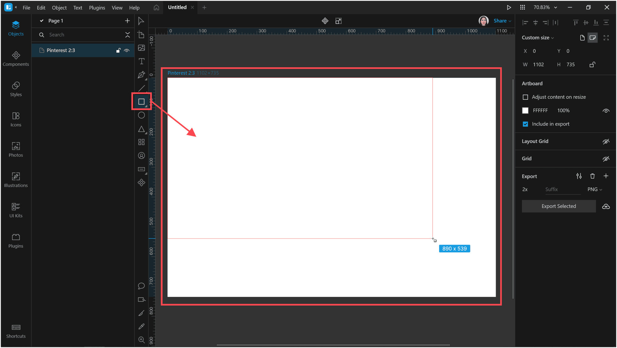
Now add a rectangle the size of the artboard.
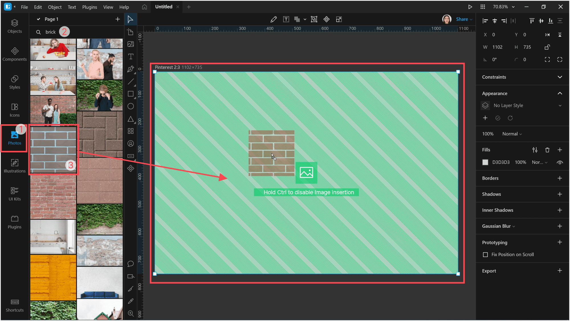
Open the Photos library and find a photo for the background. I used a brick wall. To find it, type brick in the search field above the gallery. Drag-and-drop the photo on the rectangle. It will be applied as an image fill.
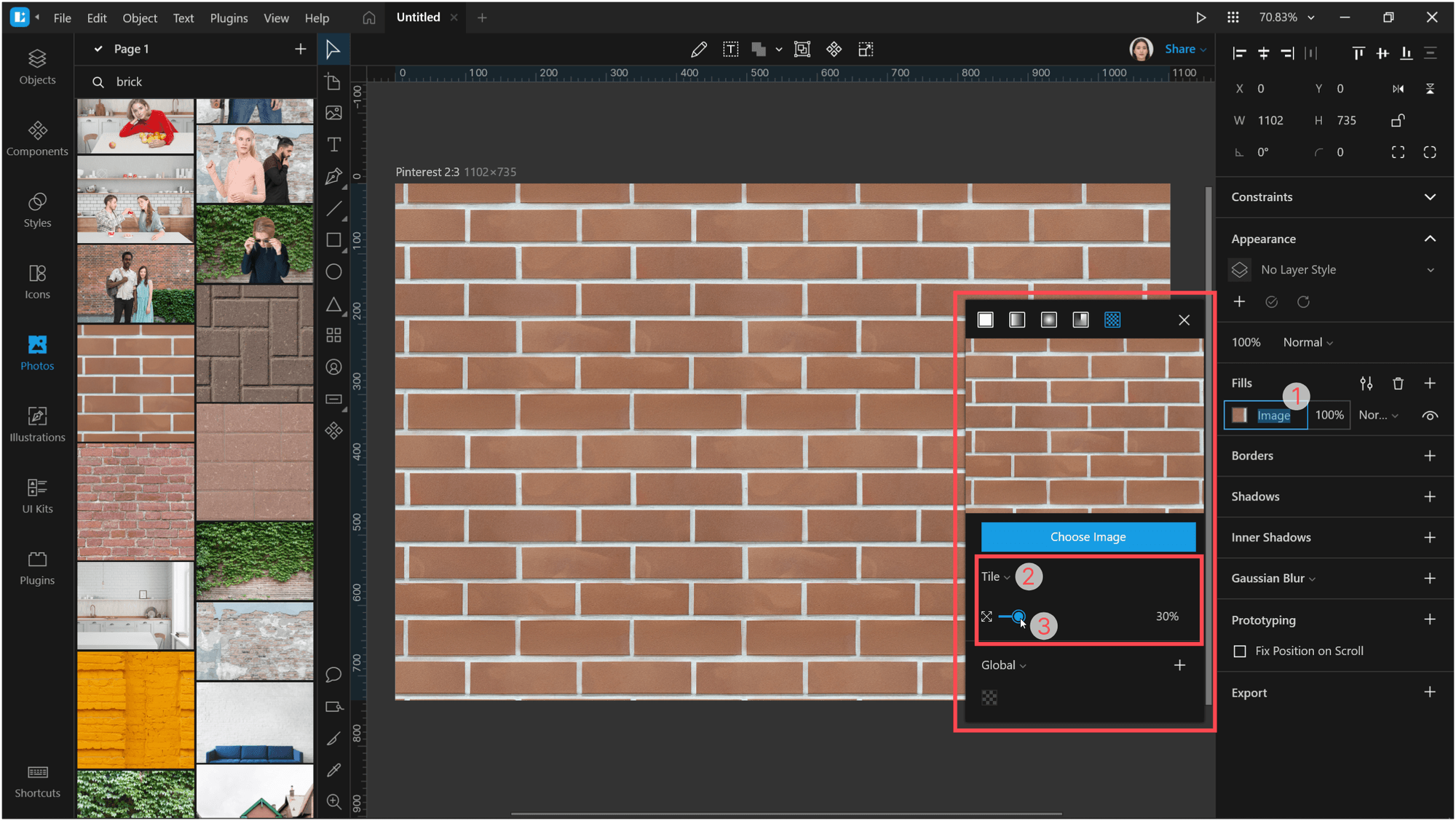
With the rectangle selected, open the Fill settings and change the fill type to Tile. Reduce the tile size to 30%.
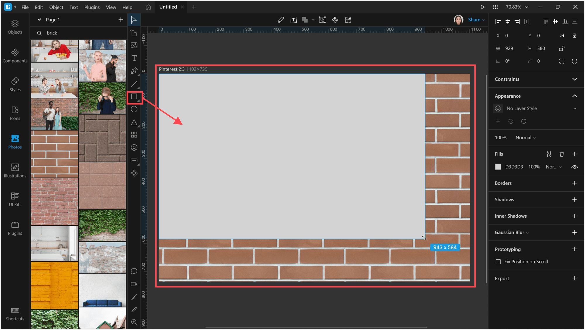
Add another rectangle above the brick wall. It should also be the size of the artboard.
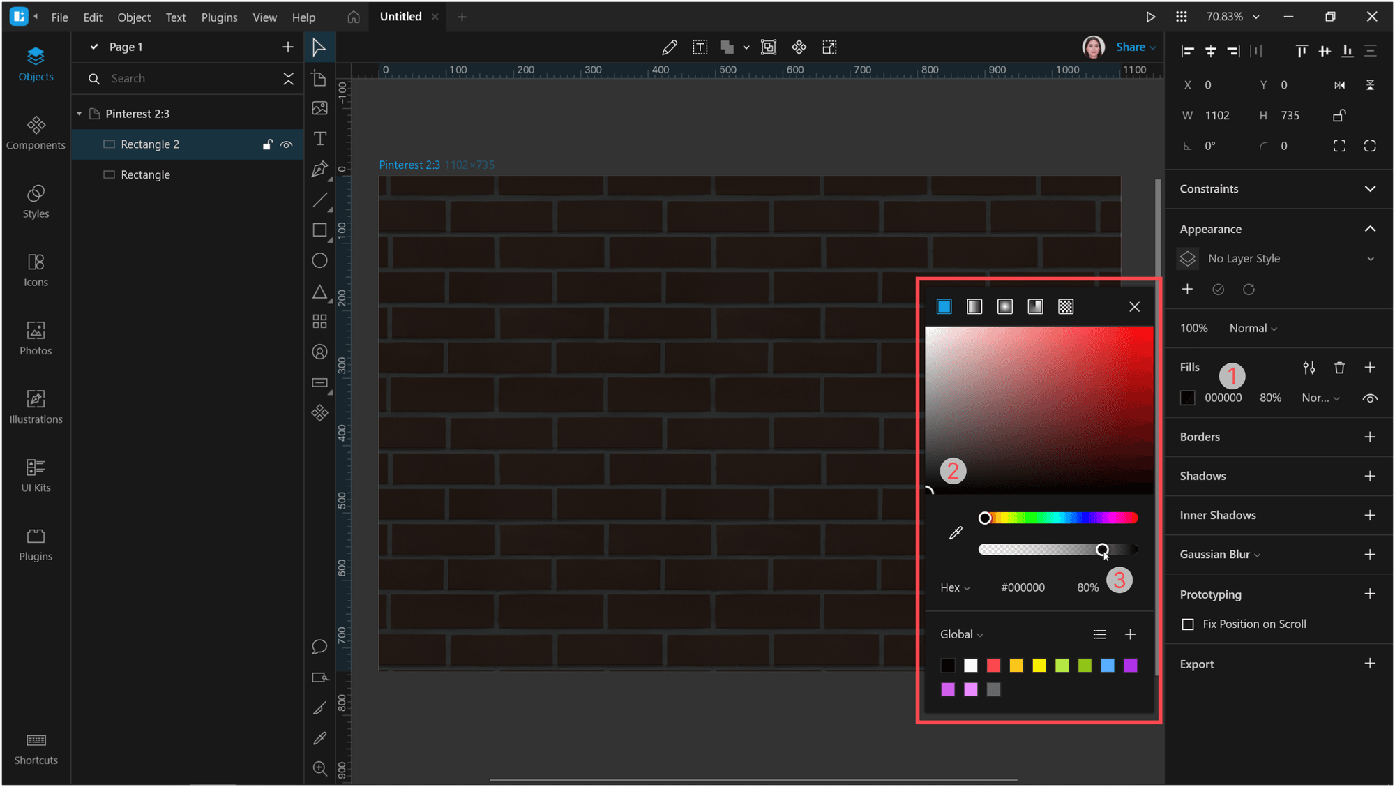
Change the Fill of the rectangle to #000000 and lower the Opacity to 80% so that we can see the wall through it.
Now, open the Icons tab and select the icon to which you will add the neon effect. I typed Controller in the search field and selected the Game controller icon.
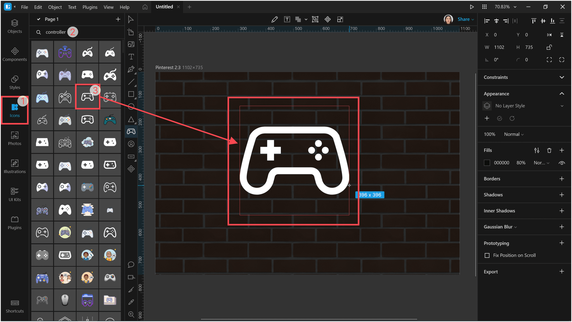
Adjust the size and position of the icon.
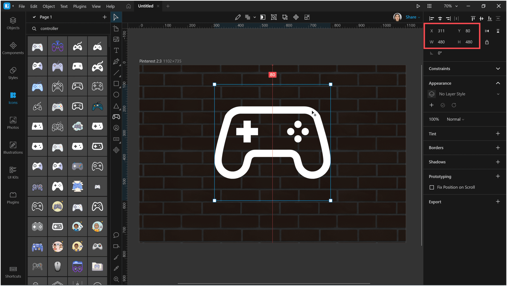
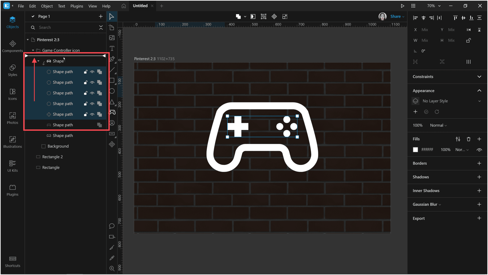
In the objects tree, expand the icon folder and pull all the objects out of the mask. This will make the editing of the icon elements easier.
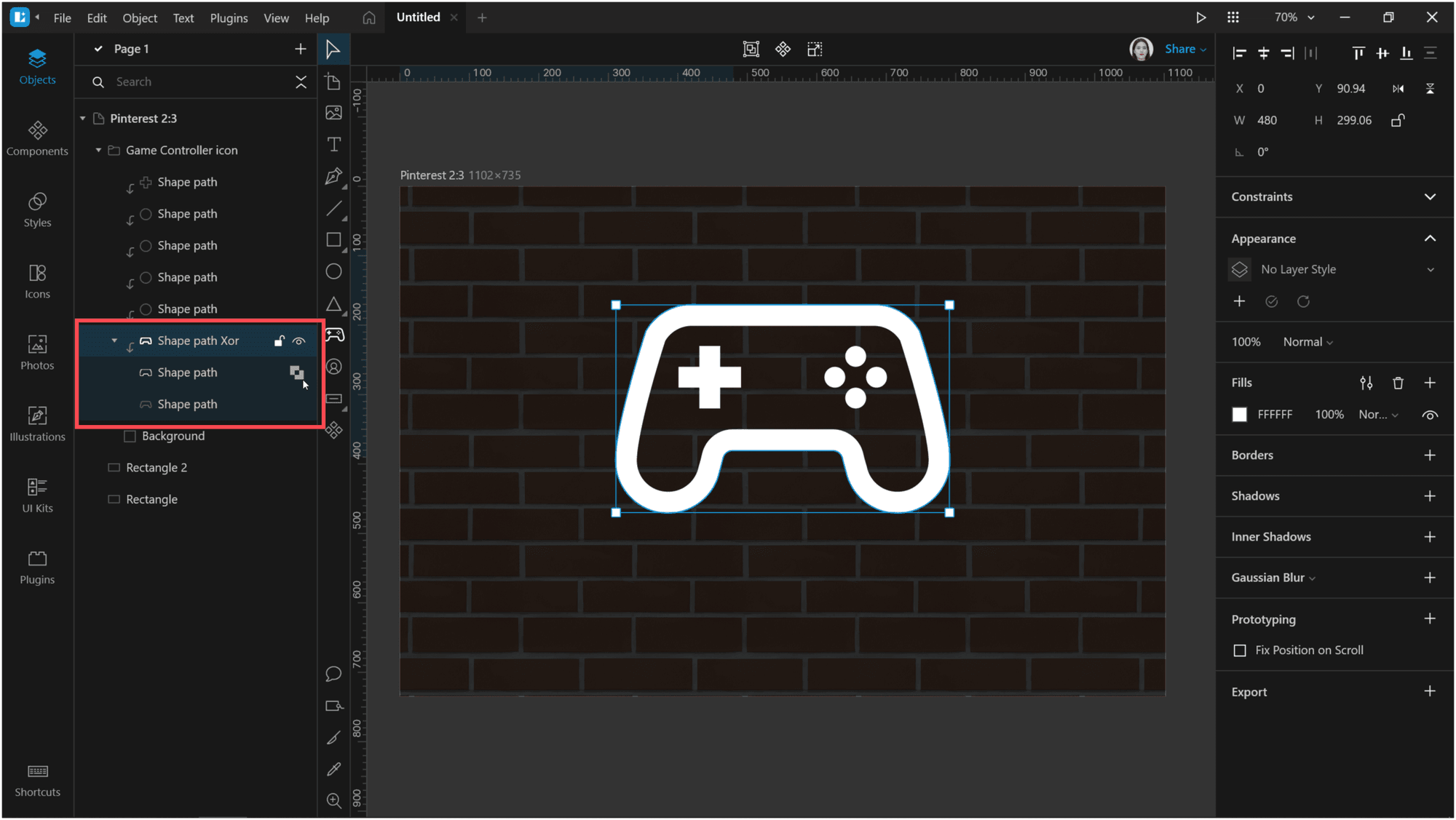
Select the two bottom objects and apply the Difference operation to them.
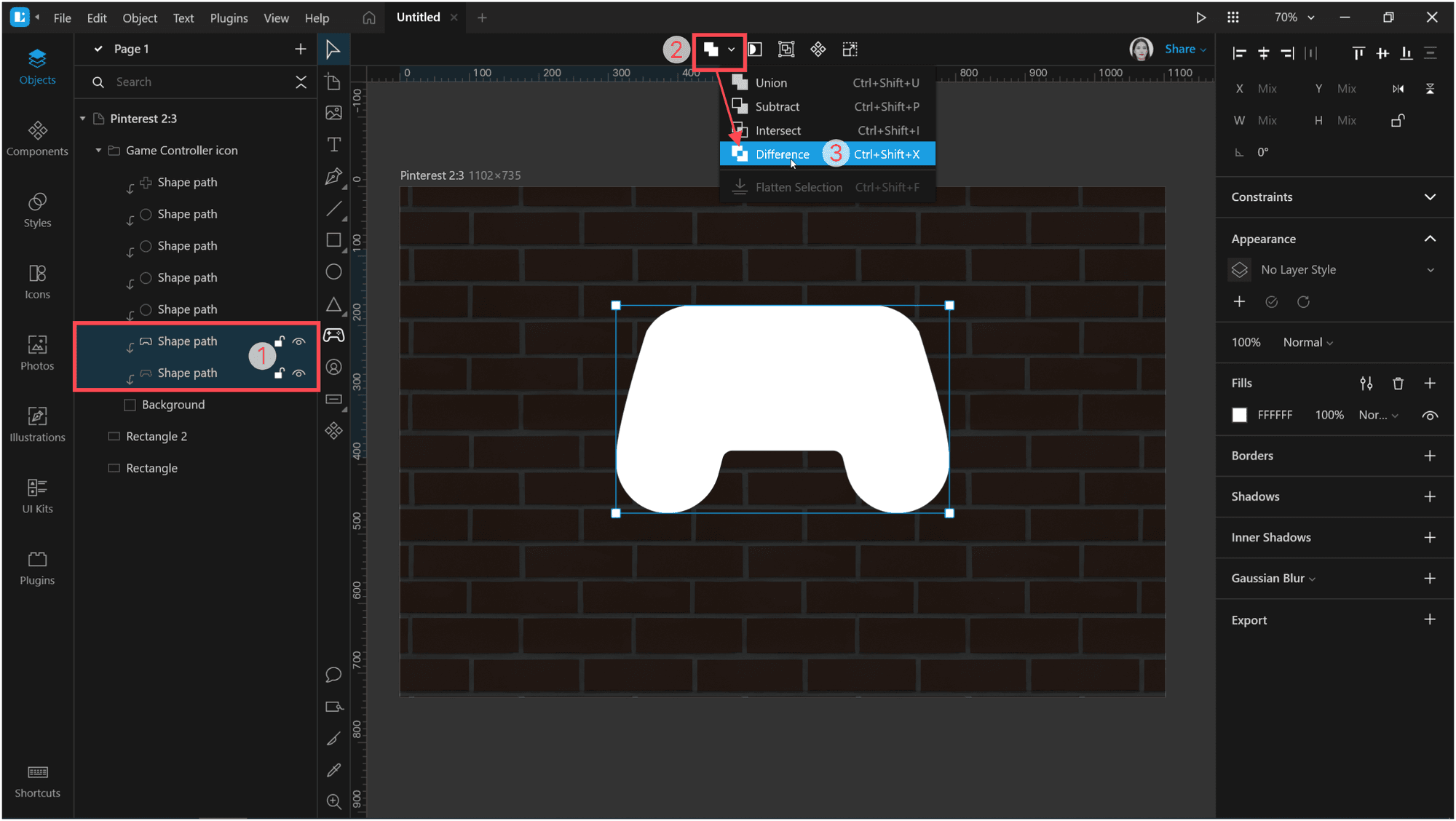
You should get the following result.
Now comes the bright part! Let’s add some glow to each icon element. For this, we’ll be using borders and shadows. And a few inner shadows.
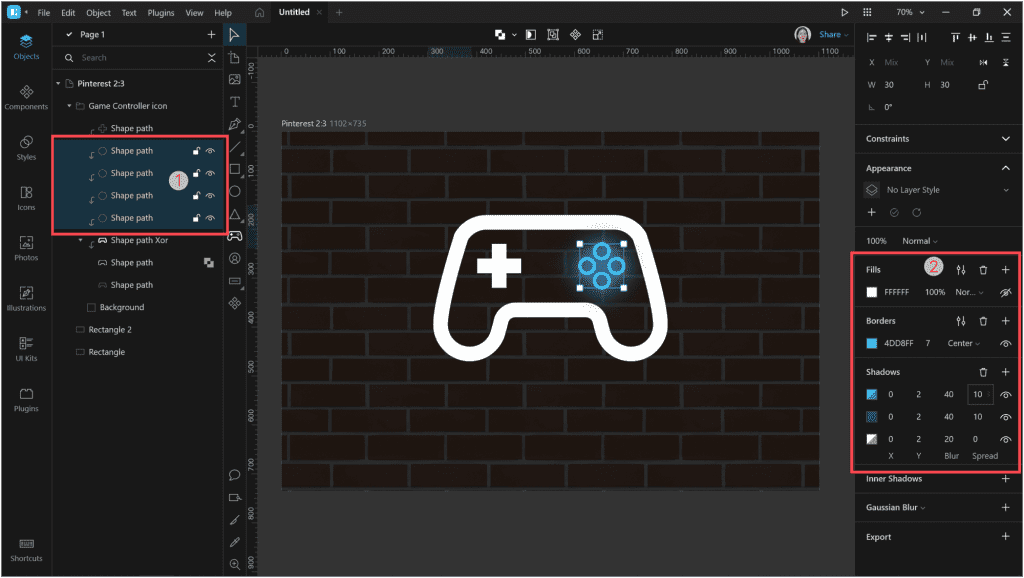
First of all, select the right group of controls of the game controller and adjust them. Remove the fill and add a border with the color #4DD8FF and thickness 7.
Then add some shadows with the following settings:
| Fill | Opacity | X | Y | Blur | Spread | |
| First shadow | #FFFFFF | 50% | 0 | 2 | 20 | 0 |
| Second shadow | #1C268F | 70% | 0 | 2 | 40 | 10 |
| Third shadow | #4DD8FF | 60% | 0 | 2 | 40 | 10 |
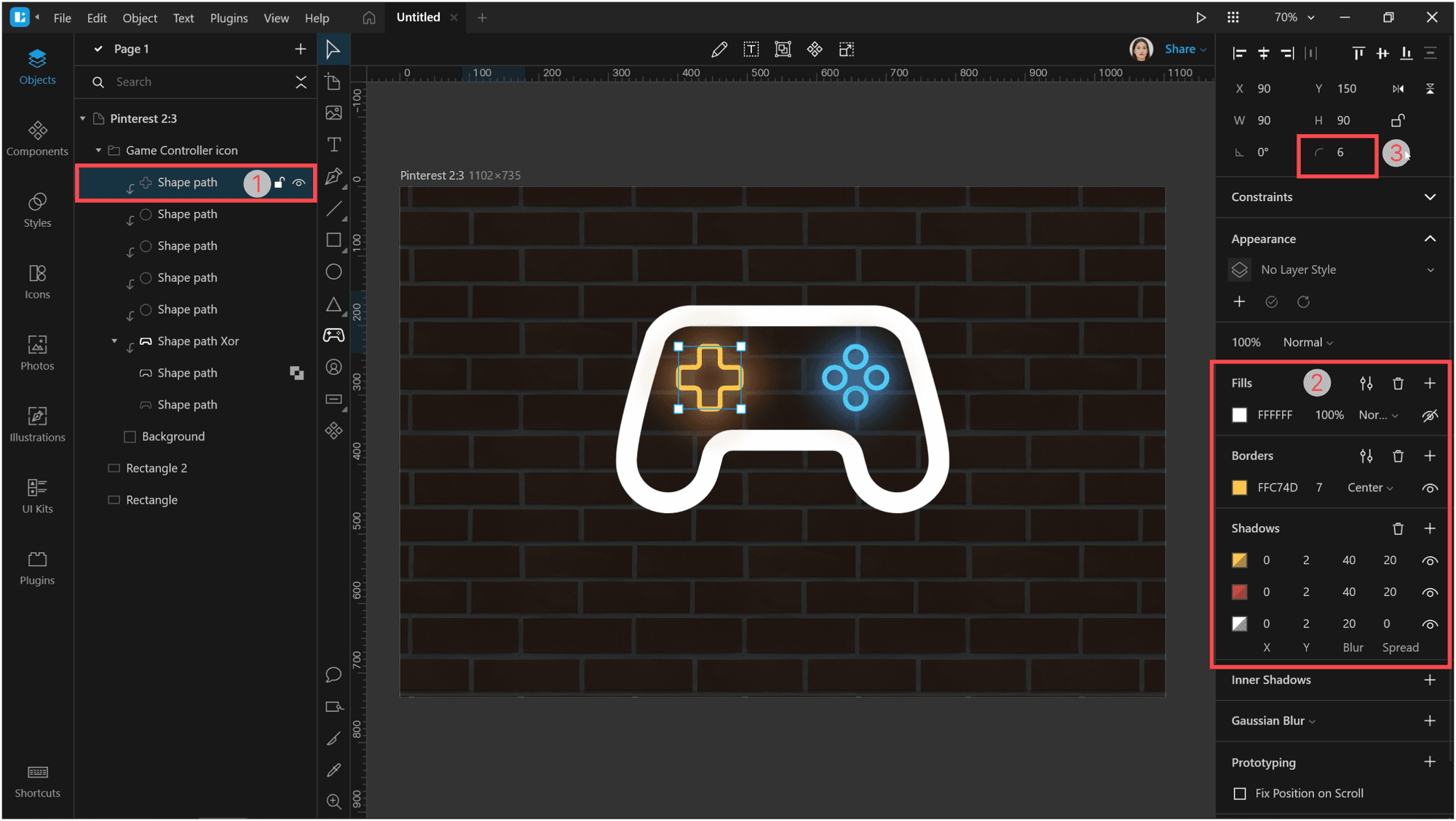
Now, select the left control, remove the fill, and add a border with the color #FFC74D and thickness 7.
Add shadows with the following settings:
| Fill | Opacity | X | Y | Blur | Spread | |
| First shadow | #FFFFFF | 50% | 0 | 2 | 20 | 0 |
| Second shadow | #CE5D24 | 70% | 0 | 2 | 40 | 10 |
| Third shadow | #FFC74D | 60% | 0 | 2 | 40 | 10 |
Then change the corner radius to 6.
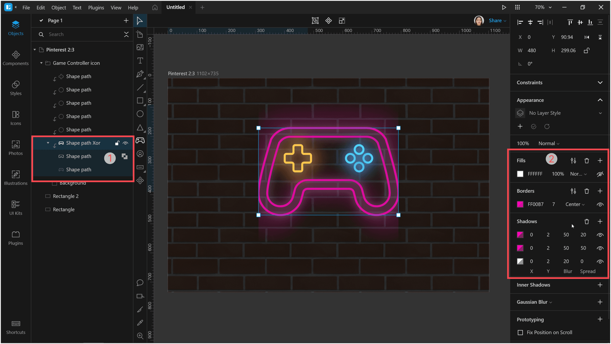
Select the shape that we’ve created using the Difference operation. Remove the fill and add a border with the color #FF00B7 and thickness 7.
The shadow settings will be as follows:
| Fill | Opacity | X | Y | Blur | Spread | |
| First shadow | #FFFFFF | 50% | 0 | 2 | 20 | 0 |
| Second shadow | #FF00B7 | 50% | 0 | 2 | 50 | 50 |
| Third shadow | #FF00B7 | 40% | 0 | 2 | 50 | 20 |
Now let’s remove the background that bounds our shadows.
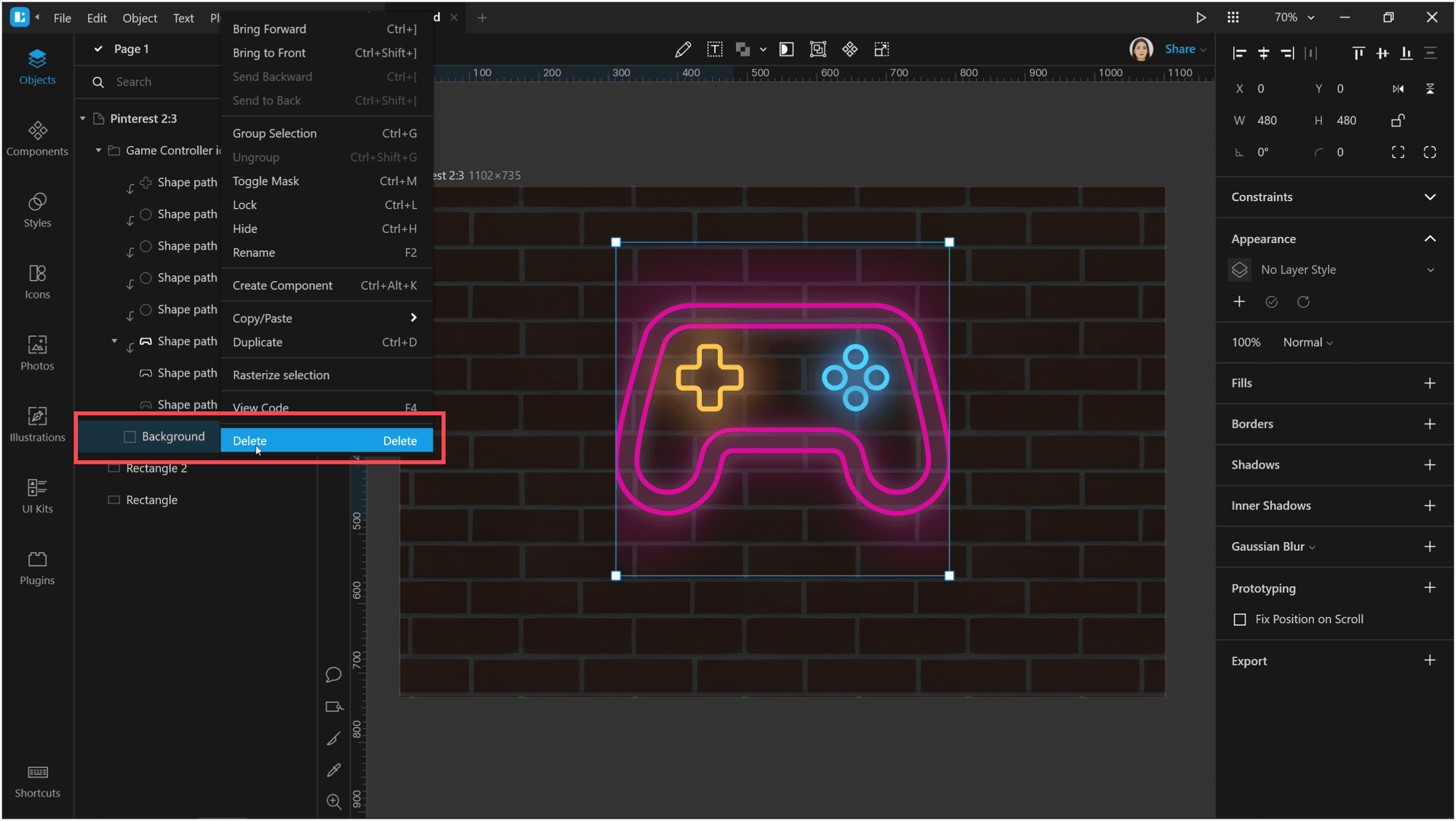
That’s much better.
Let’s rotate our controller a little. Select the entire icon group and turn it by, say, 15°.
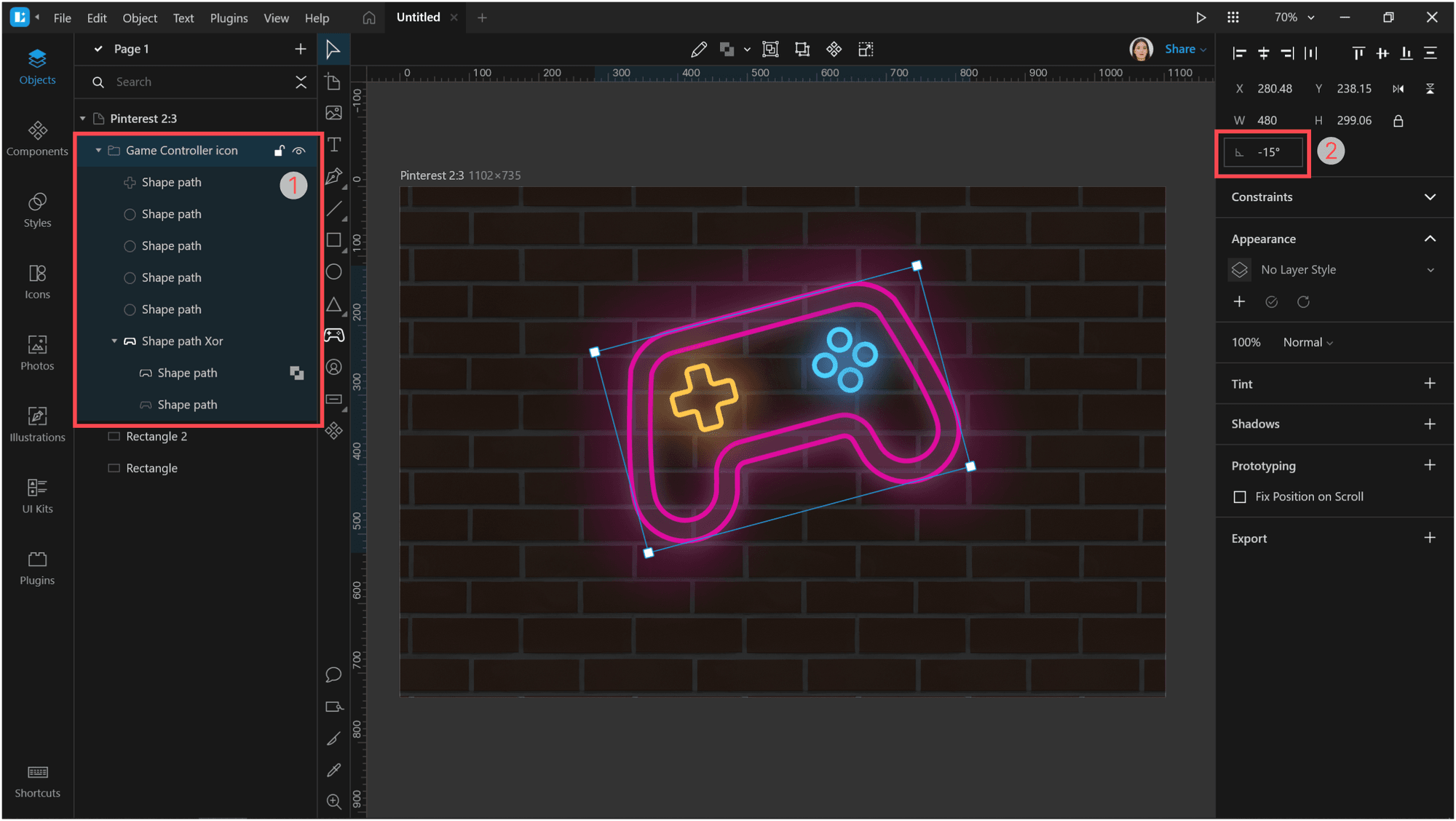
Now let’s add some text under the icon.
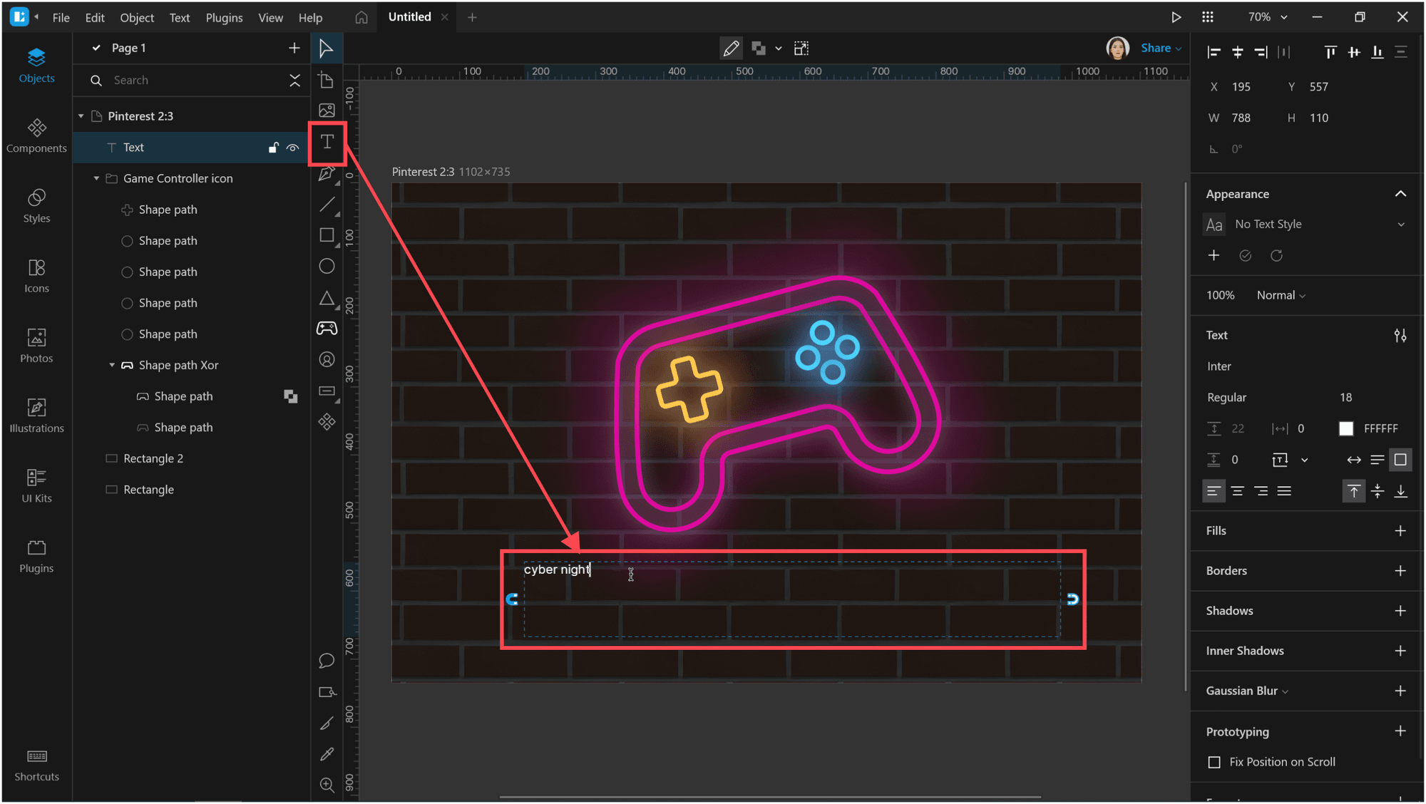
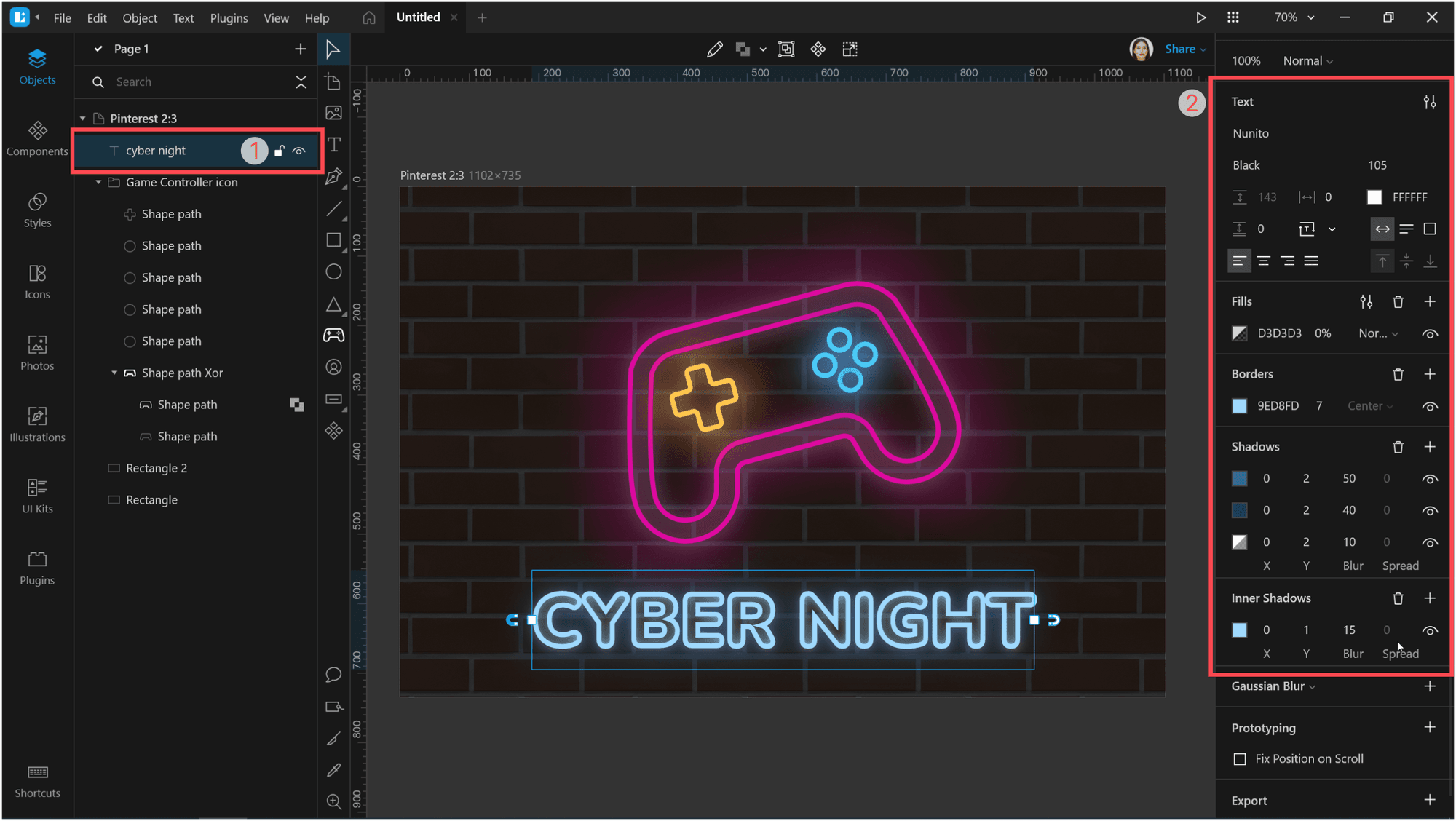
Adjust the text. I used the Nunito Black font with size 105.
After that, set the fill opacity to 0% and add a border with the color #9ED8FD and thickness 7.
Then add some shadows:
| Fill | Opacity | X | Y | Blur | Spread | |
| First shadow | #FFFFFF | 50% | 0 | 2 | 10 | 0 |
| Second shadow | #1D305A | 100% | 0 | 2 | 50 | 0 |
| Third shadow | #336C91 | 100% | 0 | 2 | 40 | 0 |
| Inner shadow | #9ED8FD | 100% | 0 | 2 | 15 | 0 |
Now we need to add a glow under our objects.
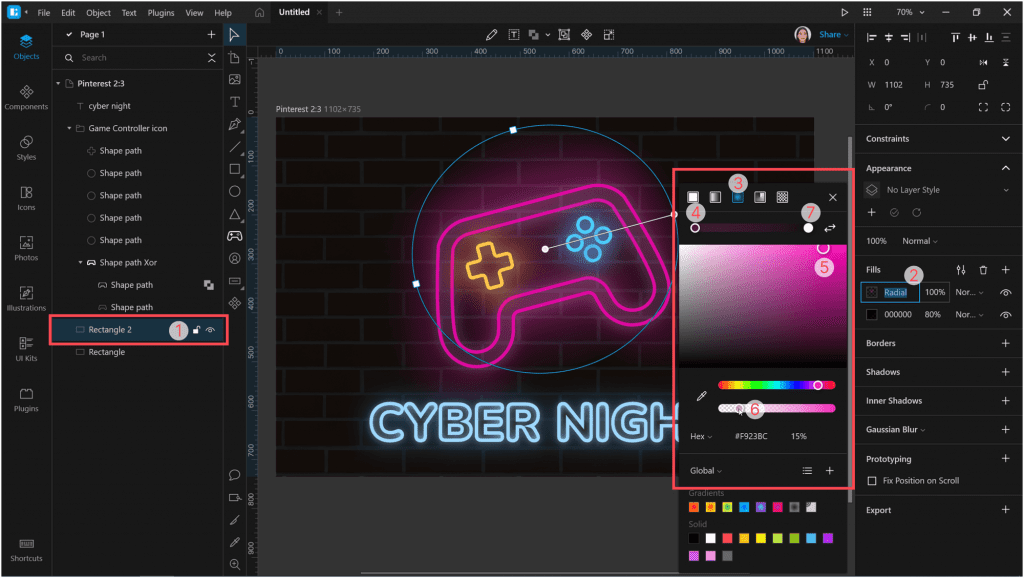
Select the semitransparent rectangle that we’ve put over the brick wall in the very beginning. Add a new fill layer to it and change its type to radial gradient.
Position and reduce the gradient size so that it only surrounds the game controller. Select the center color point and set the color to #F923BC with 15% opacity. For the border color point, use #000000 with 40% opacity.
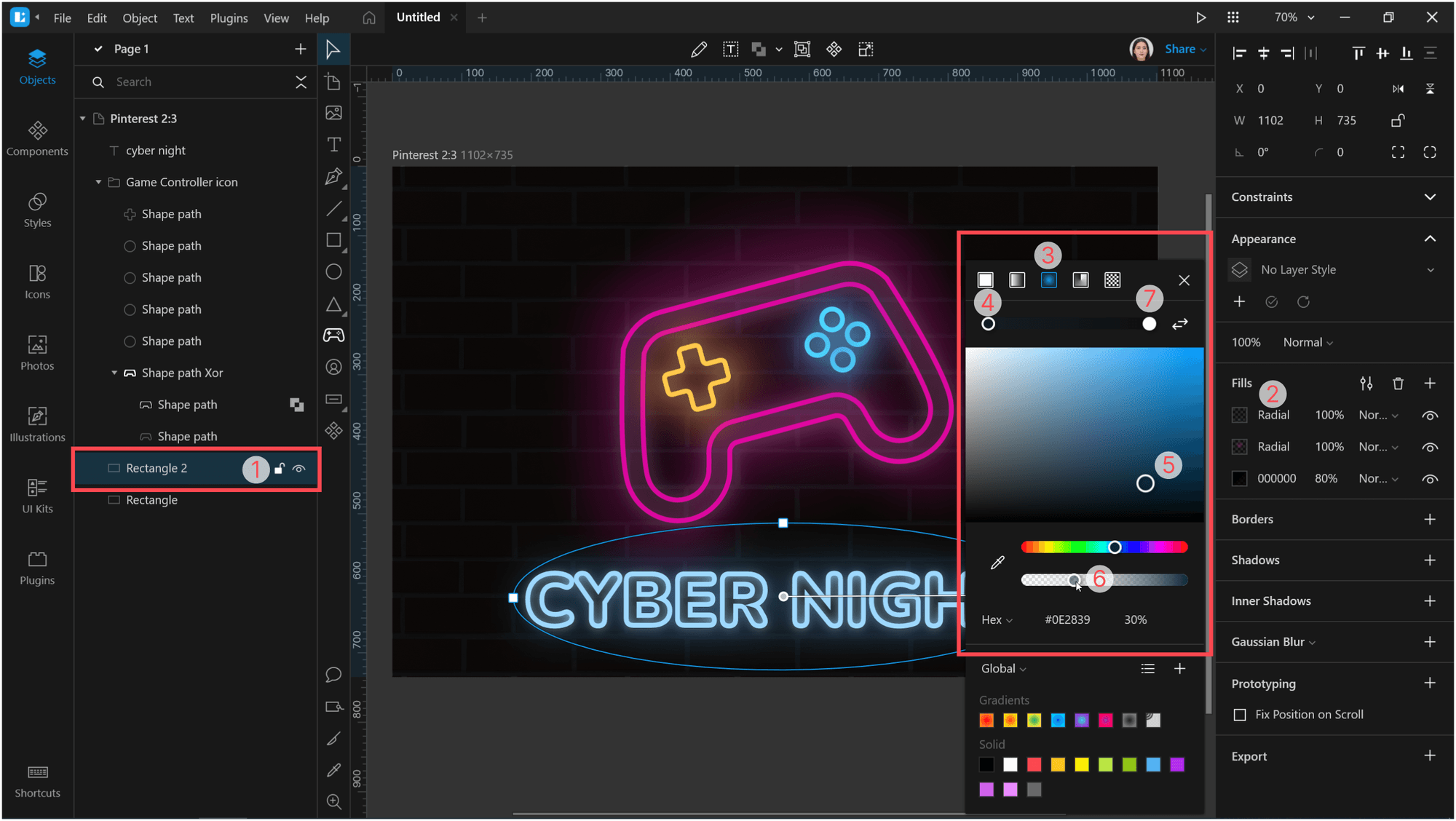
Similarly, create the third fill layer with a radial gradient so that it will appear around the text. For the central color point, I used color #0E2839 with 30% opacity. The border point I set to #000000 and 40% opacity.
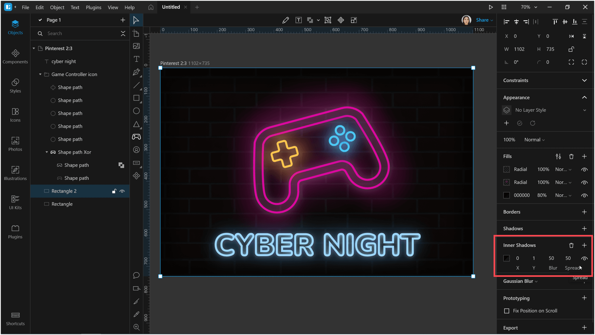
And the last step. With still the same rectangle selected, add an inner shadow with the color #000000 and a blur of 50. Then change the spread to darken the edges of the image. I set it to 50.
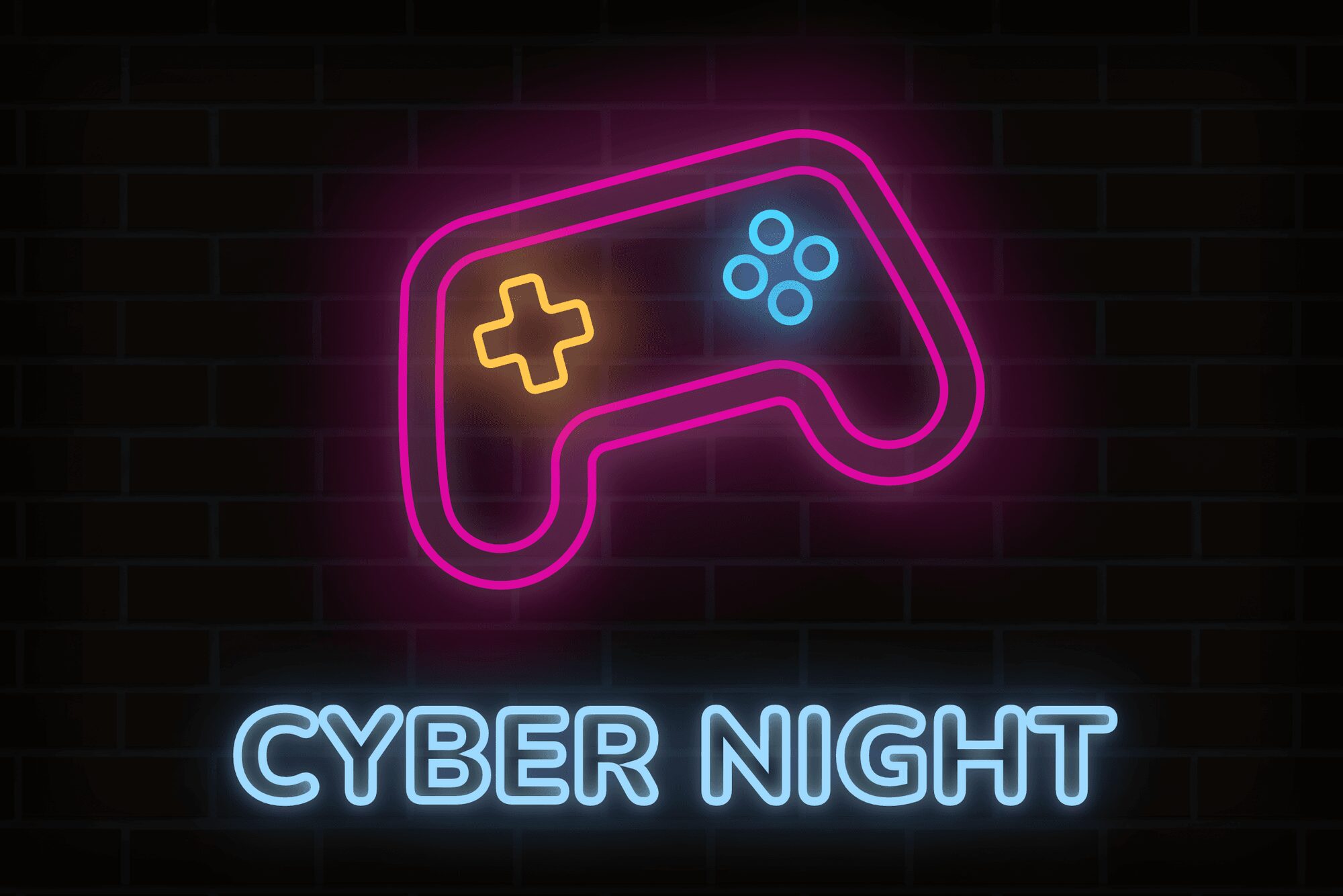
Don’t forget to adjust the alignment of objects. Then export the image and get the following result:
Create your art with the neon effect and share it with us on social media: Twitter, Facebook, and Instagram.
Check out the other Lunacy tutorials:
One more thing. We will soon roll out Lunacy for macOS and Linux! You can try the beta version and share your ideas with our community.
About the author
Julia G, a wonderful creature responsible for QA and SMM at the Lunacy team.