Let’s count an artist, a typographer, an editor, a usability specialist, a user, and a few more. When they look at a mobile app or web service, all they see is the same text. What’s important is how they see it.
To illustrate these views, we’ll use an imaginary app with some un-imaginary problems. Let’s call it “Icons8 Packs.”
An Artist’s View
Looking at the text as a graphical element forces us to see it differently. A good artist sees a lot but will focus on two main properties of text: color and position.
Color
The text has a color, even if, in most applications, it’s black or shades of grey.
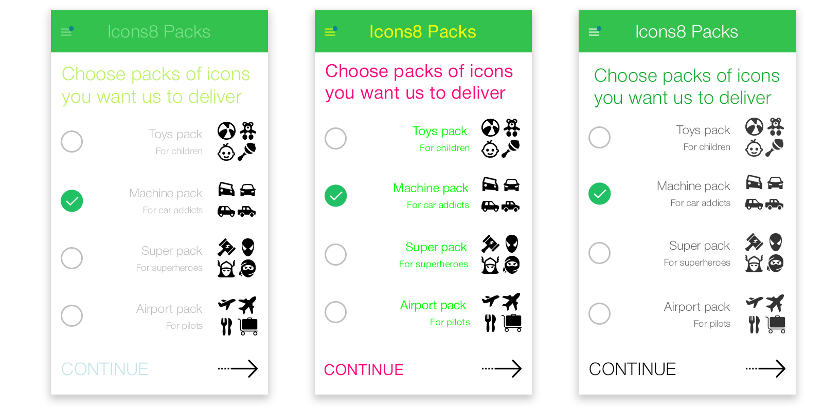
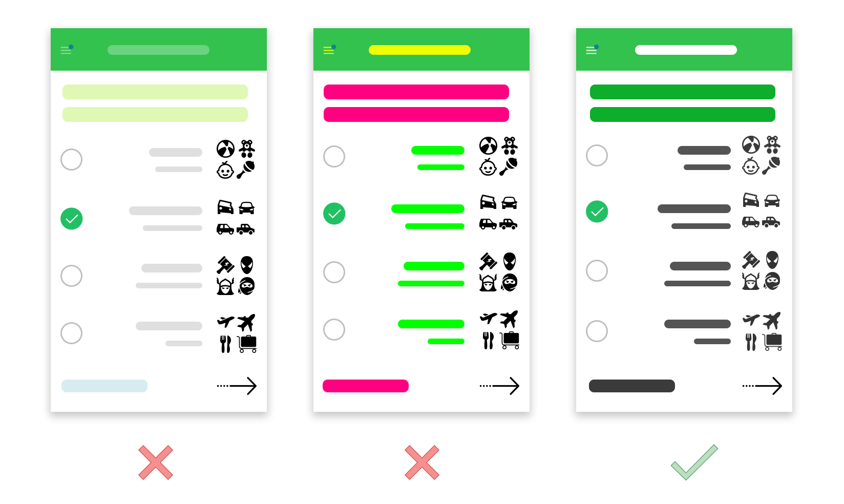
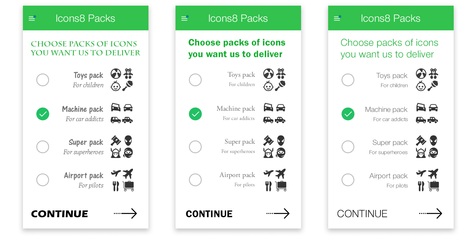
Left Low-contrast text looks organic with many color themes. However, if it’s overdone, text becomes like a background – unreadable, dull.
Middle On the other hand, people try to emphasize text by using all sorts of colors, making it look like impressionist art or a drug trip.
Right You are not forced to use only black and white. Notice that we were able to make our header green.
Position
Every app is a composition of graphical elements, one of which is text. If you place your text closer to another object, say, an icon or image, they become related. The reverse is also true. Properly positioned text enhances user’s experiences dramatically, so let’s focus on white spaces between different elements and the text alignment itself.
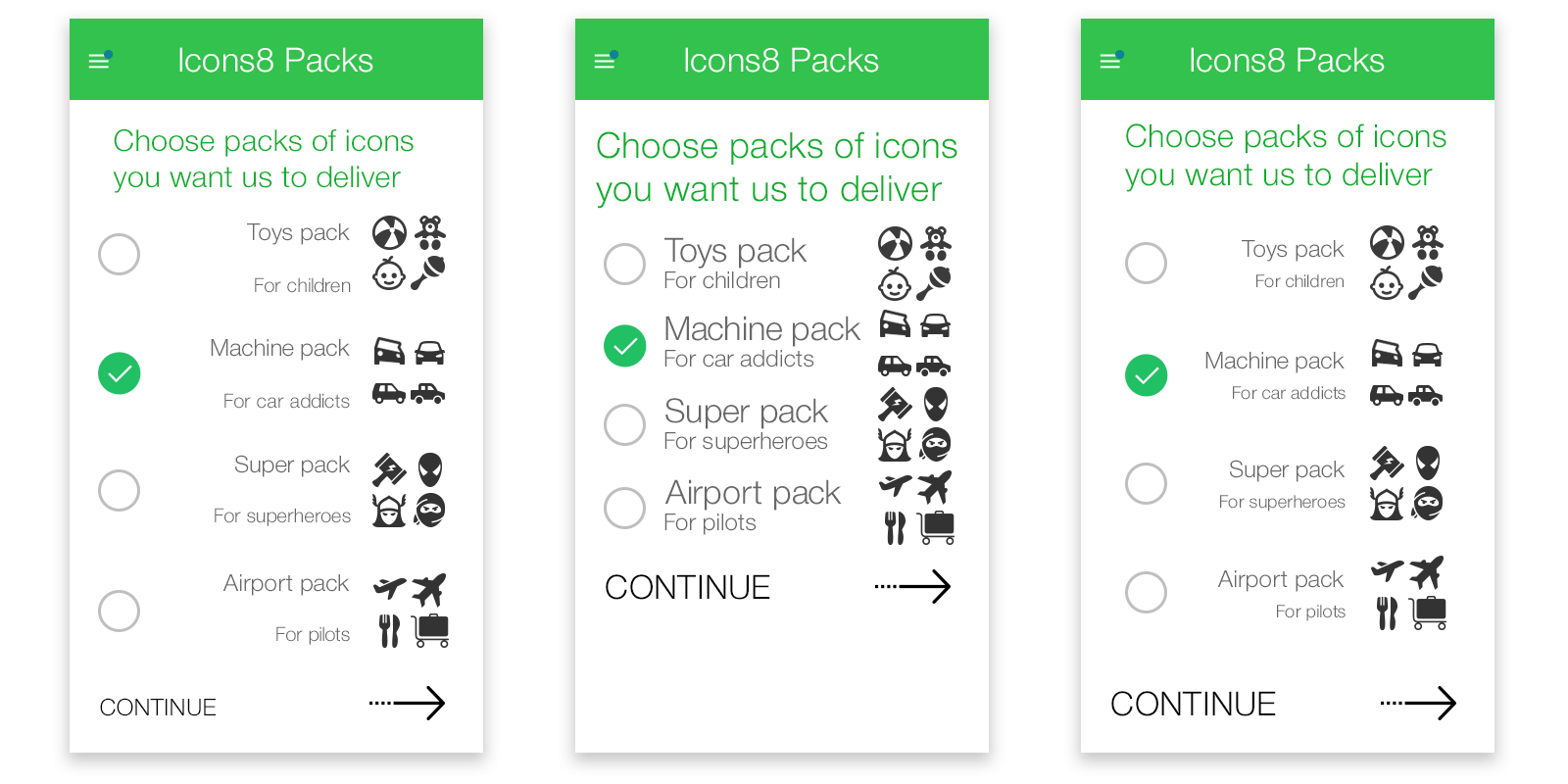
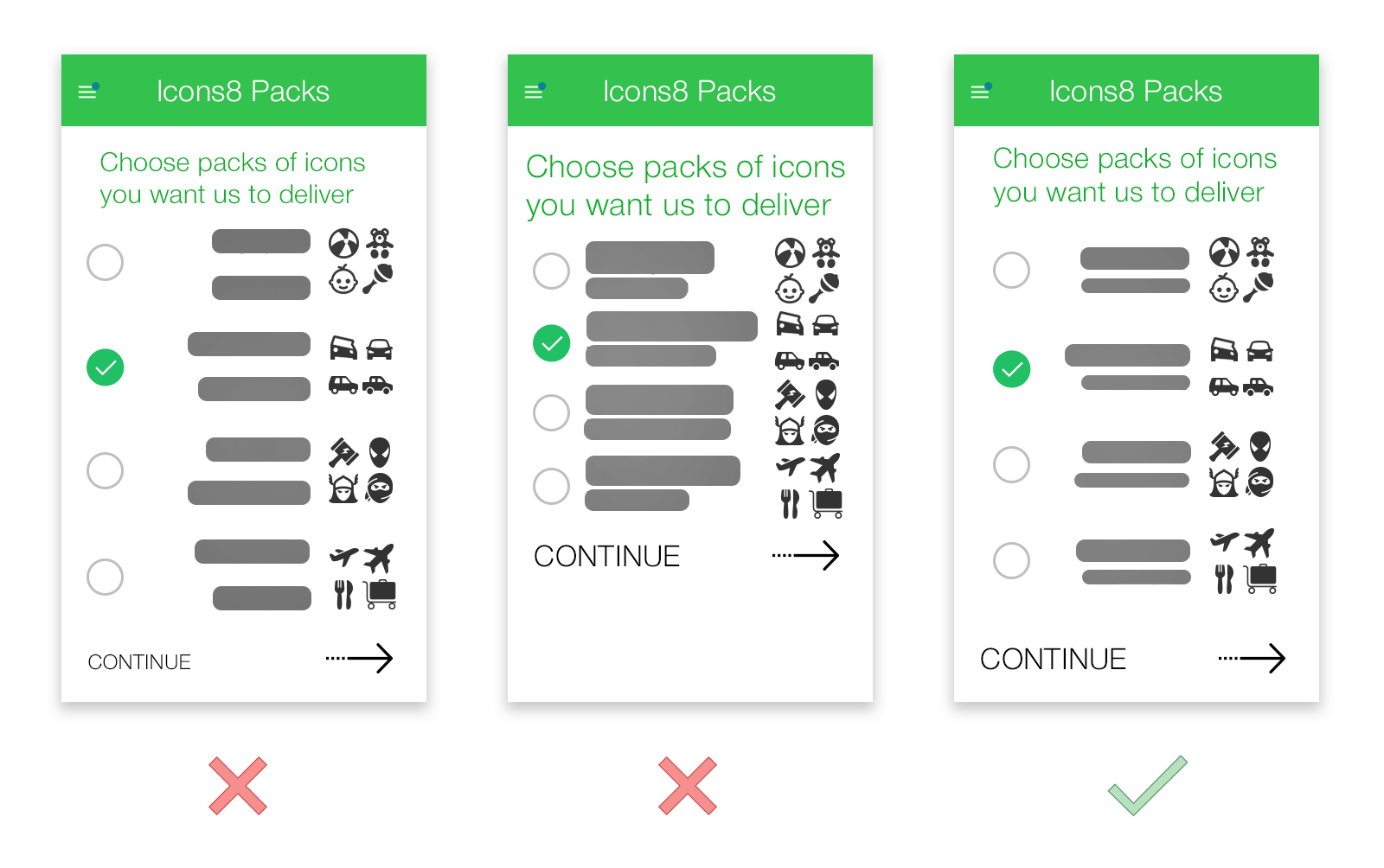
Left Toys pack and its description look separate because there’s too much space between them. Even more, the space between the Toys pack and “Choose icons…” is the same, which doesn’t allow these bits of text to be clearly separated.
Middle The problem here is that there is almost no space between packs’ names and their description. People may perceive these blocks as a single line and basically ignore them because reading them is quite inconvenient.
A Typographer’s view
The typoographer’s view intersects very much with the other views, but first, we’ll focus on the fonts and their relationships.
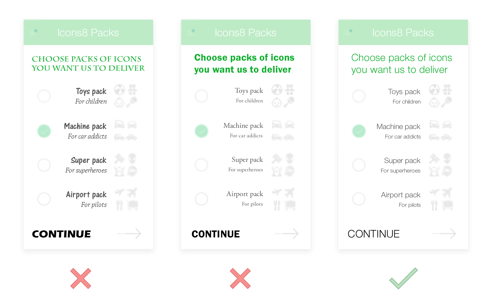
Left Too many different fonts are used. A good rule is to never use more than 3 font faces in your app. The fewer, the better. Or you can use one font face and it’s variations within a family. But even then, be careful.
Middle Only 2 different fonts are used, but they do not match at all. The results are pretty similar to the first example – chaos, poor readability.
A hint from Elwin de Witte, one of our readers: Don’t buy fonts. There are more than enough options for using third-party fonts or free fonts. Great examples are Google Fonts and Awwwards yearly “100 Greatest Free Fonts Collection for…” All fonts on Google Fonts are free to use and don’t require referral. You can even include the font-library in your web apps.
An Editor’s View
It’s not all about about obvious things like grammar and too many slang/techy words. The whole point is to make your text concise and easy. There are a few common problems below.
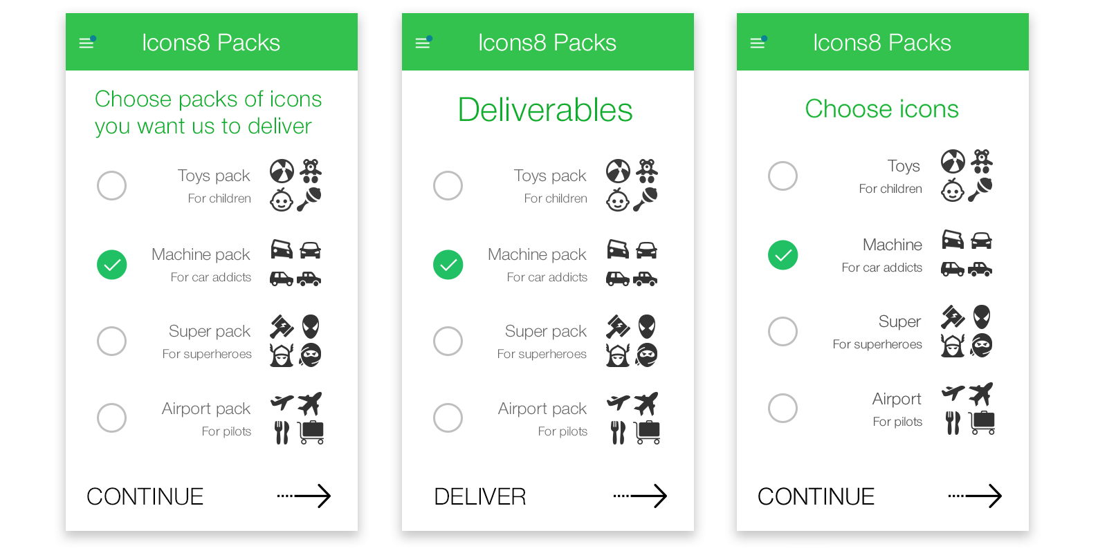
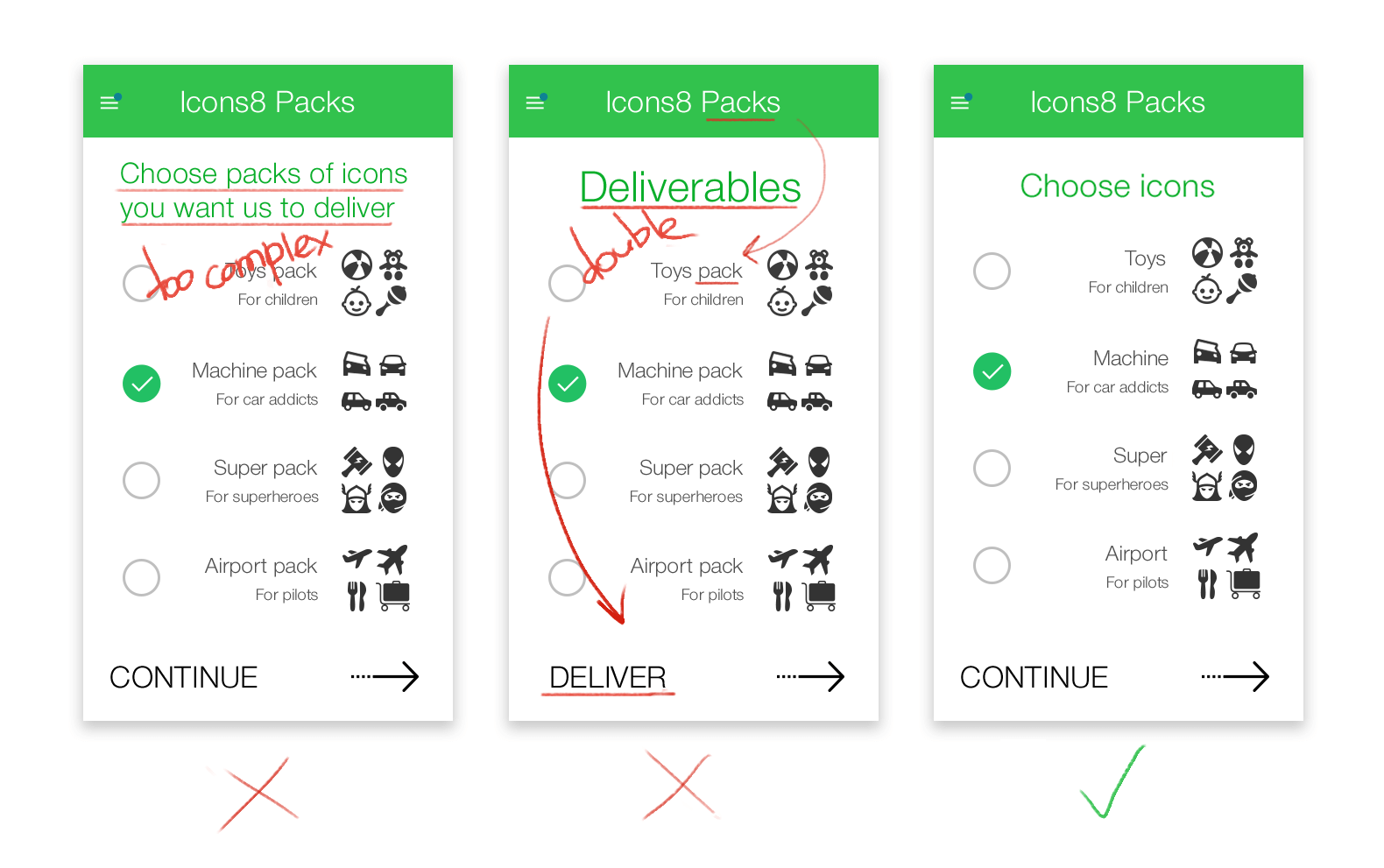
“The more I explain with text the better” is a terrible approach to interfaces. If you have a long text, try shrinking it by 30%. Then again, and again, until you start running out of letters to delete.
A Usability Specialist’s View
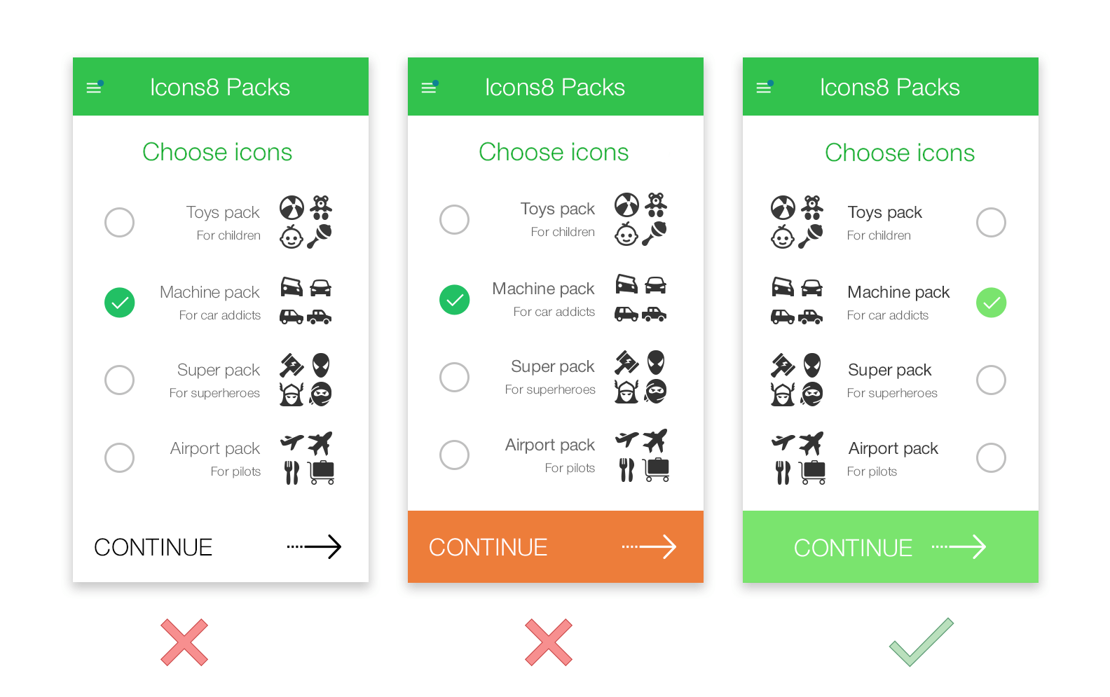
Everybody has an opinion on usability. It’s a great place to find enemies and allies. I’d suggest sticking to the basics. Context is everything. Something works in one case but completely fails to work somewhere else. Here, I’ve changed a few things.
1. People read from left to right, so I found it’s better to place the product and its name before the checkbox to the right – a meaningful action at the end of every line.
2. Buttons should differ from background color, but orange may be used for more important actions later on: “Buy”, “Attention,” etc., so we had to use another color that also fits our color theme well.
A User’s View
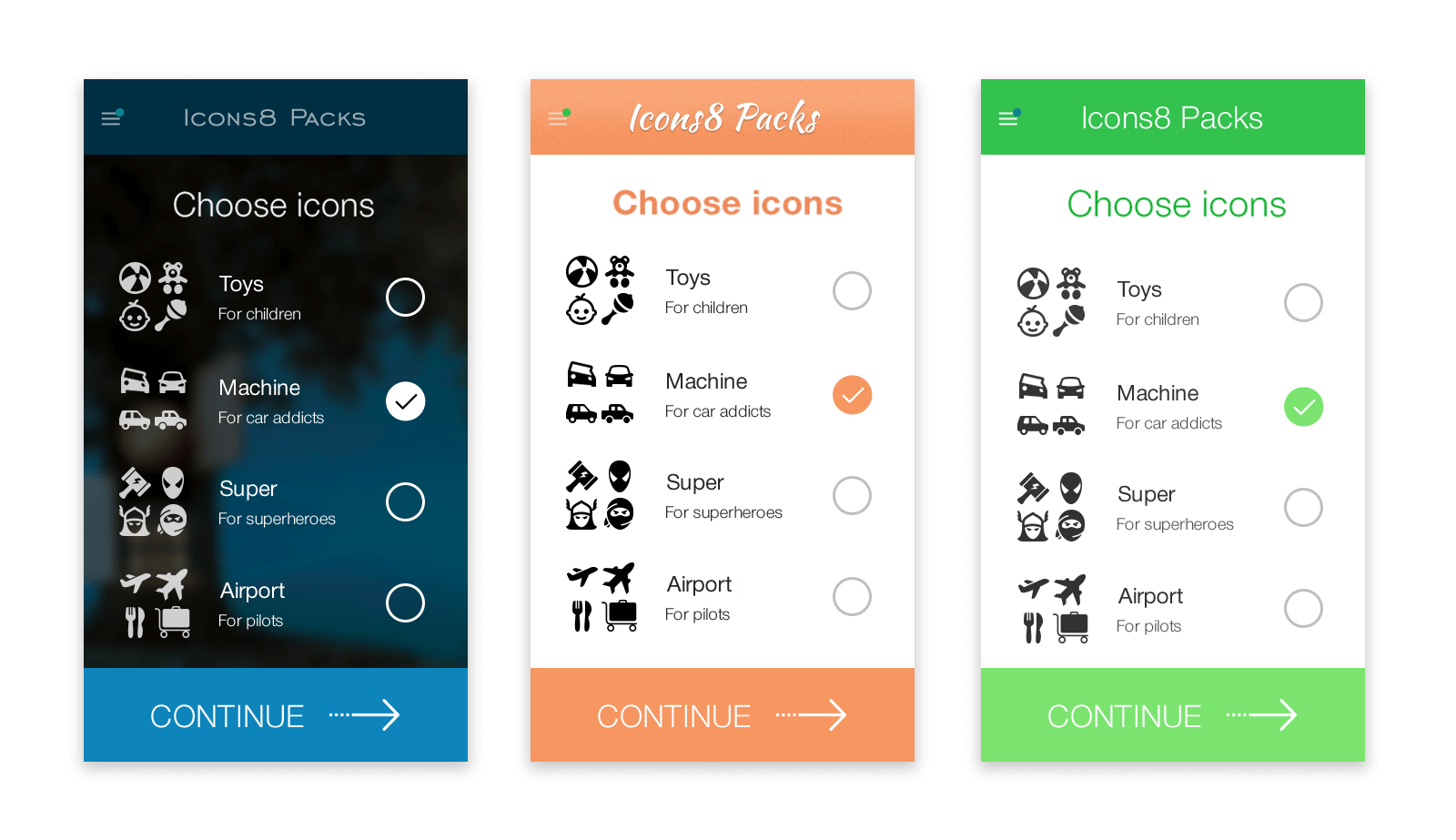
A user forms a relationship with your app, and text plays a very important role. Seeing text from a user’s point of view lets you see if all the elements of your app work together. Are you being playful or serious? Text is a continuation of your brand. However, don’t overuse fancy fonts everywhere, keep interface text clean and simple.
A Foreign User’s View
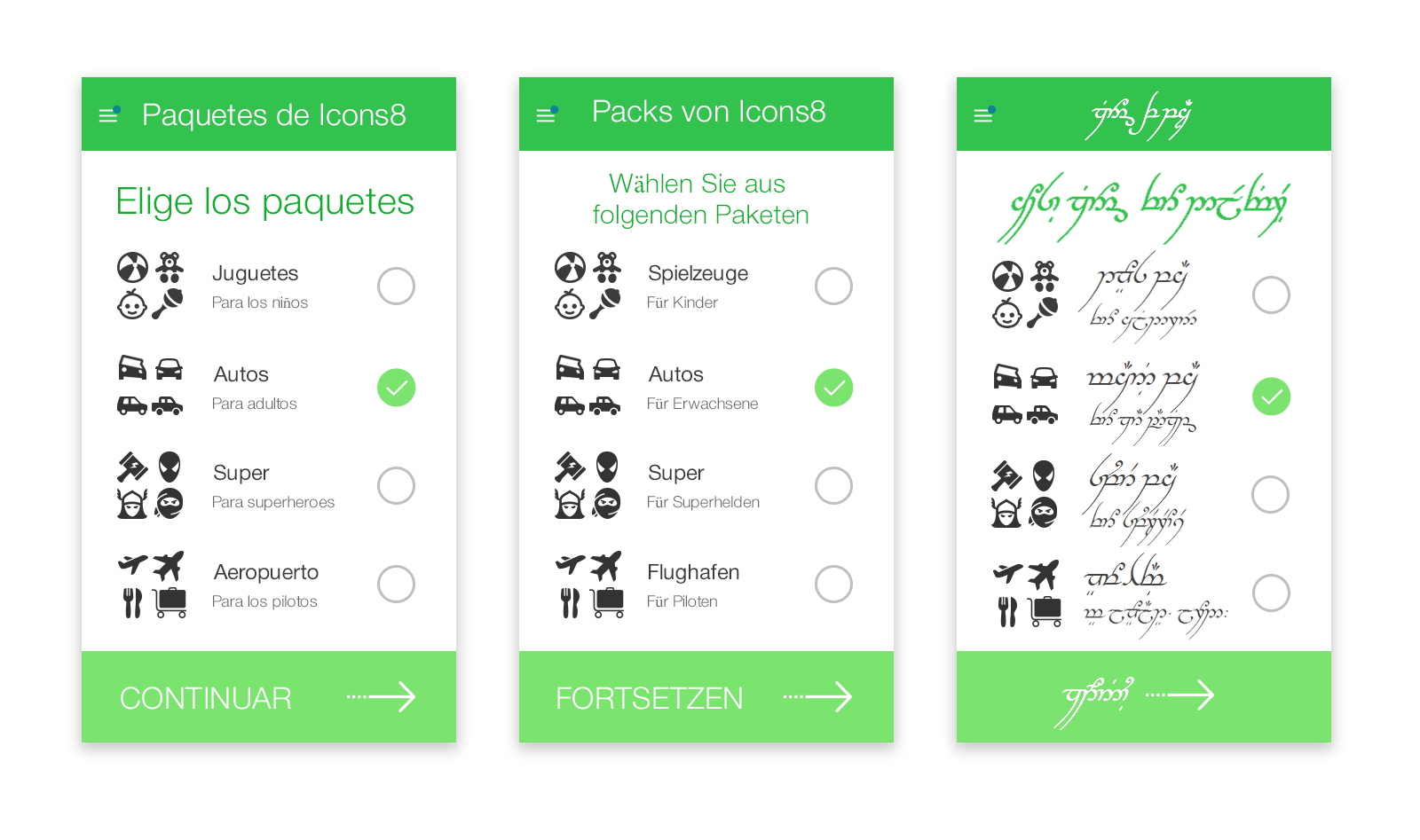
Sometimes, it’s useful to remember that some people may not be able to understand your text. Seeing your app like this helps you see some design problems and leads to better design solutions.
A Marketing Manager’s View
If you keep this perspective the last one rather than the first, you’ll be good.
Have any other views that may be helpful? See you in the comments section.
I hope tips from this article help you improve a few of your own designs. Here, you can read a story about one developer who had to design his app from scratch despite having no design experience at all.
And let’s not forget, that design is all about trends – current and past ones. Wouldn’t you like to know Why Are So Many Companies Changing to Flat Logo Design?
About the Author
Andrew Burmistrov is a usability specialist at Icons8. He started his career as a phone support specialist, telling jokes while customers rebooted their computers. Then, he moved to usability testing and occasional writing.
Try free tools for creators by the Icons8 team
Also, get the lists of free vector software and free photo editing software.