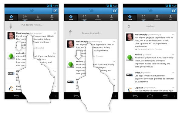
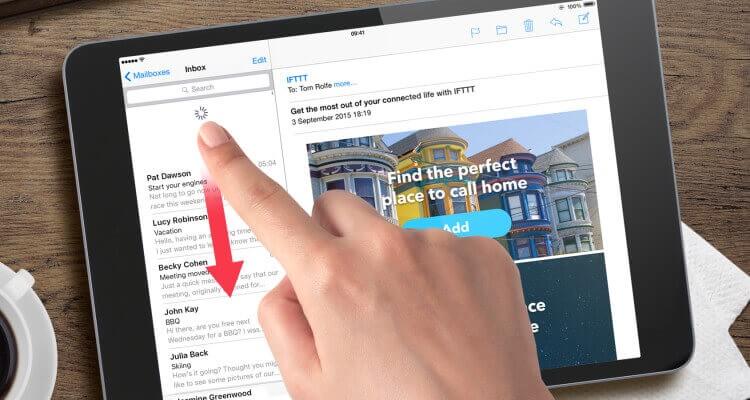
The pull-to-refresh (or swipe-to-refresh) pattern lets a user pull down a list of data using touch to retrieve more data. Loren Brichter first introduced the “Pull-to-refresh” gesture in the Tweetie app, and in no time, it became so popular that countless apps adopted this gesture.
Today, the “pull-to-refresh” feature is a natural part of many popular apps, including Twitter, Gmail, Tweetbot, and others.
In this article, we’ll overview the pattern, see when and why pull-to-refresh is implemented well, and talk about other refreshing options.
How It Works
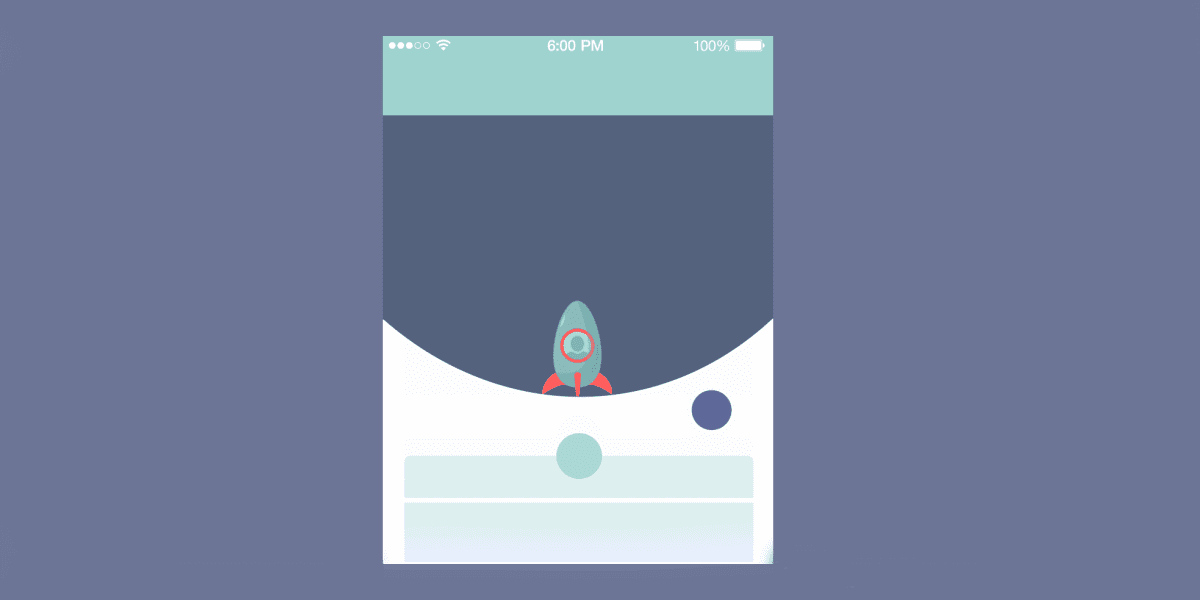
The refresh indicator appears only in conjunction with a refresh gesture or action. The animation below shows you the complete interaction model.
Swipe to refresh manually refreshes screen content with a user action or gesture. It’s quite obvious, but still, sometimes designers use refresh indicators to show automatically updated content. Since the automatic refreshing mechanism doesn’t require any actions from the user side, automatically update content shouldn’t display a refresh indicator.
When to Use Pull to Refresh
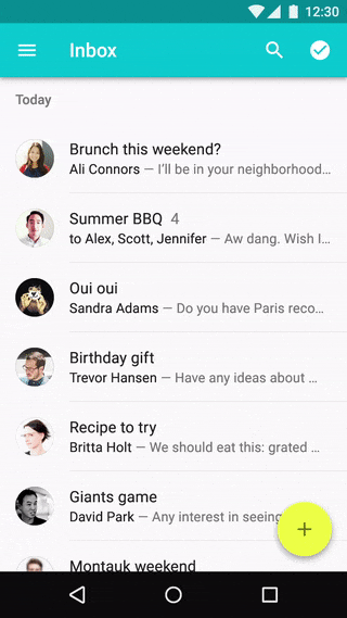
Swipe to refresh works well for lists, grid lists, and card collections that are sorted by recent content (a collection is strictly sorted by descending date). This collection usually represents a constantly updating stream of items, and you can’t use an automatically update content (e.g. sync) because as you scroll up to the top, it’s almost expected that you’ll automatically scroll up past the top since new items will be downloaded automatically all the time. So, instead of having the UI just automatically load more, the pull-to-refresh gesture is used to give the user a chance to “back out” of the refresh operation. Appropriate use cases for pull-to-refresh are:
- Content feeds (Twitter, RSS)
- Inbox messages (Email, SMS)
Twitter, for instance, has a list of tweets that is ordered with recent tweets on the top. User pull to see the most recent tweets. They reach the top of the list — the last tweets are added.
When You Shouldn’t Use Swipe to Refresh
Swipe to refresh should not be used in the following situations:
- Homescreen widgets. Because home screen widgets should update content automatically.
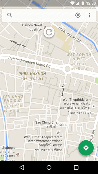
- Maps. Because maps have no primary direction or content origin from which users can presume the swipe-to-refresh gesture will originate.
- Non-ordered list. If the user isn’t looking at an ordered list view in the first place, there is no expectation that pulling down will refresh, and the gesture is, therefore, neither discoverable nor intuitive for the user.
- Low “update rate” content. Suppose the application does not contain content that typically needs to be refreshed frequently. In that case, the gesture is less necessary because there is little chance the list/grid/card collection will need to be updated while the user is looking at it. An example is a weather widget.
- List items are sorted in chronological order. For a vertical scrolling view that sorts items in chronological order (oldest first), you should use a refresh button because pulling down to append items at the bottom of a list would be awkward.
- Special content types. Cases such as livestock data/charts, server/background process monitoring, or auction reporting when the thing to be refreshed becomes stale within the space of a minute or less.
How to Design Refresh Indicator Transitions
Transitions should act as intermediaries between the different states of the UI, helping users to understand what is going on when the screen changes. As the refresh indicator translates and/or scales into view, it should remain visible until the refresh activity completes and any new content is visible or the user navigates away from the refresh content.
Any user activities with the content on the view during this update (such as scrolling) shouldn’t move the refresh indicator off-screen:
Design Tips
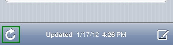
Pull-to-refresh vs. “Refresh” Button
A lot of developers consider using ‘pull-to-refresh’ as a way to save space on screen. And it obviously saves space as nothing is visible on screen at all. But like with any other gesture-based action, you have to know it’s there. Thus, it’s not as intuitive as a simple but clear “Refresh” button. Most of the time a refresh button would have been way easier to implement from a developer perspective and to use from a user point of view (since it’s always visible and available).
Refresh Time
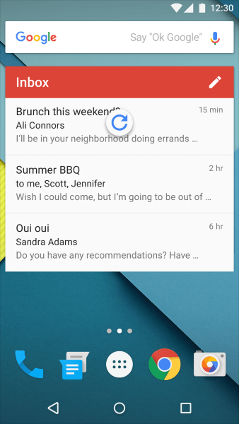
A user’s wait time begins the moment when they swap the screen (initiates an action). Immediately, the system should give some visual feedback to communicate that it has received the request. A big part of UX is informing a user about what’s happening and reassuring him or her that the app is working properly. The user’s confidence that the refresh happened is directly related to its technical representation. That’s why your refresh indicator should continue to spin until the data is available. This engages the user and prevents confusion.
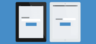
Thumb-Reach Issue on iPad
The action of pulling when visualizing a list is natural on a mobile device, but it looks odd on the iPad in landscape mode. You need either to stretch your thumb or put the device on a flat surface to operate comfortably with the UI.
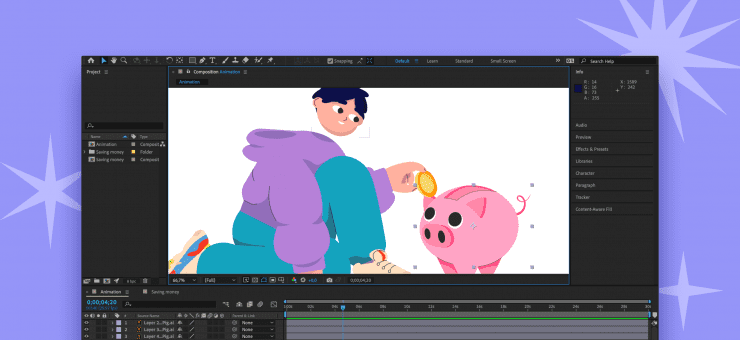
Functional Animation
Pull-to-refresh is a great place for creativity. As was said before, transitions should act as intermediaries between the different states of the UI. Animation for pull-to-refresh can help the user follow the motion of an element on the screen and understand exactly how the two UI states are related.
Conclusion
Used correctly, pull-to-refresh facilitates content update interaction, with feedback, notifications, and sometimes even a little entertainment.
Main image credit by Tubik
About the author
Nick Babich is a software developer and author of a blog dedicated to usability