


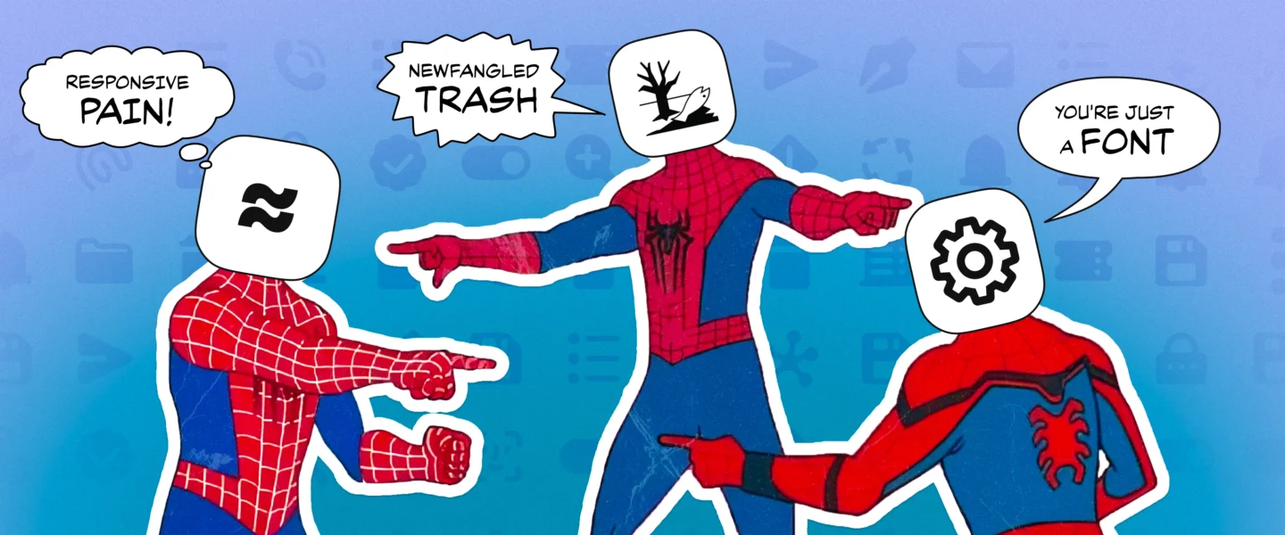
Deep dive into the tiny images in graphic design with all the nerdy details you need to sound like a pro.
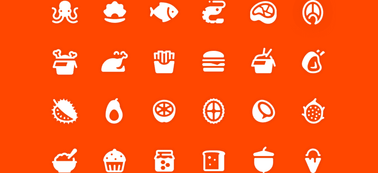
Icons may be tiny, but their impact is huge—they guide users, save space, and convey meaning at a glance. Evolving from ancient pictograms to essential UI elements, they have shaped the way we navigate digital and physical spaces. Whether you’re designing them, using them, or just want to impress your colleagues, this guide has you covered.
What you’ll find?
- Choose your fighter: icons, pictograms, glyphs
- From clean to chaotic: the different types of icons
- Icon anatomy: how to sound like you know what you’re talking about
- How to use icons right: essential tips for designers
- The wild history of icons: from Xerox to Windows 11 and Big Sur
Choose your fighter: icons, pictograms, glyphs
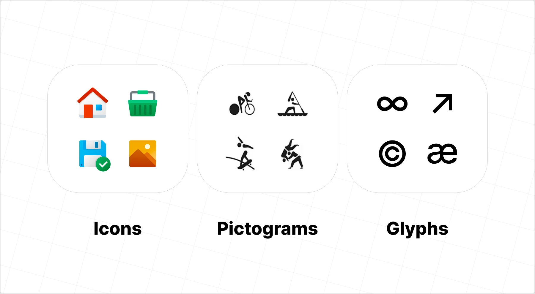
Before we jump into icons, let’s clear up a common mix-up: icons, pictograms, and glyphs aren’t the same thing. While they all use metaphors to convey meaning (like a gear for “Settings,” a speech bubble for “Chat,” or a paper plane for “Send”), each serves a distinct purpose:
- Icons: detailed interface elements that can be minimalist or richly styled—sometimes flat, sometimes colorful, depending on the design system
- Pictograms: universal communication symbols, stripped down for instant recognition, typically monochrome and simple
- Glyphs: systematic typographic marks that make up letters, numbers, and symbols in a typeface, designed for consistency and legibility
| Icons | Pictograms | Glyphs | |
|---|---|---|---|
| Complexity | most complex: decorative, contextual, UI-focused | simplified: universal, single-concept, signage | most basic: minimal, systematic, typography-based |
| Examples | detailed email app icon, colorful settings gear | airport bathroom sign, road symbols | ←, ©, letterforms |
| Typical usage | apps, interfaces, digital environments | public spaces, wayfinding, international communication | fonts, basic symbols, typography |
| Historical origin | 1980s GUI computing | Ancient cave paintings | Early writing systems (hieroglyphs) |
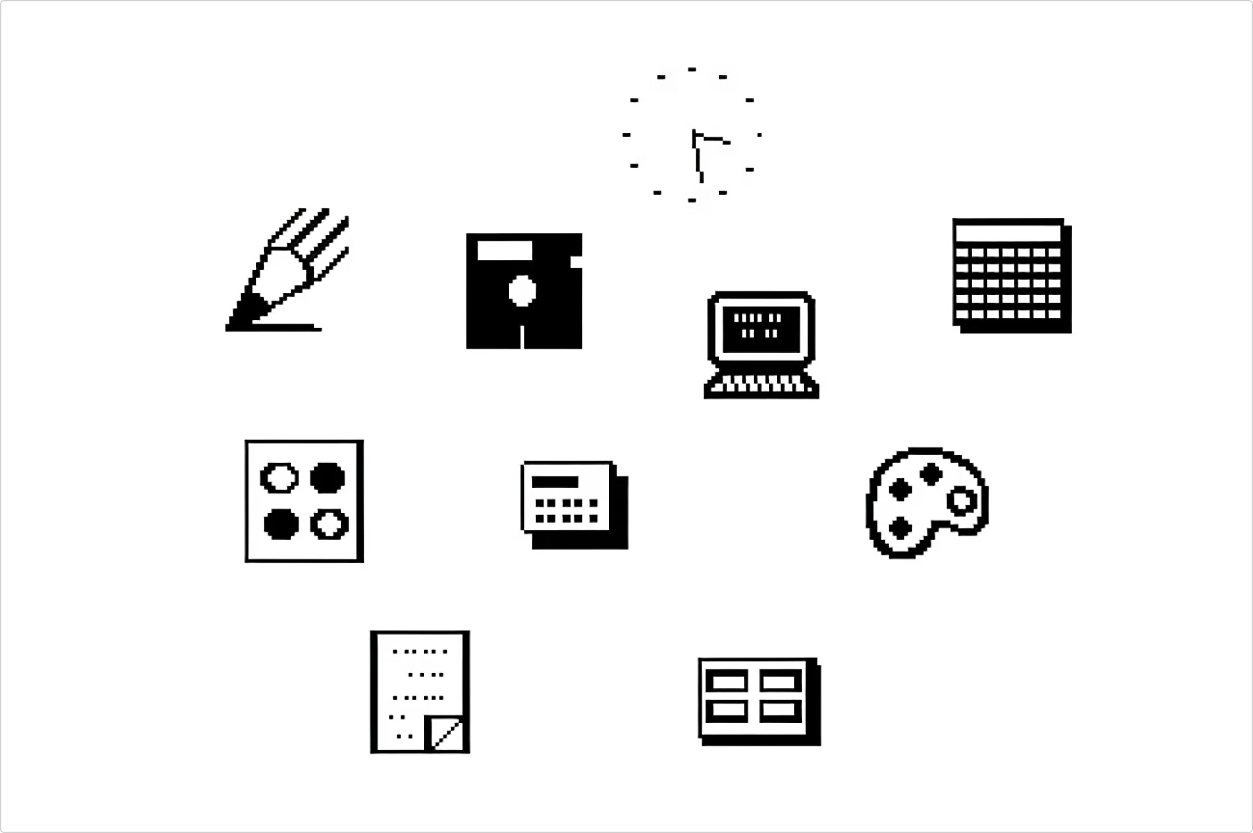
Icons
The term “Icon” took off when Microsoft mainstreamed graphical interfaces in the 1980s. Icons are visual shortcuts for apps, files, or actions—think of the floppy disk for ‘Save’ or the scissors for ‘Cut.’
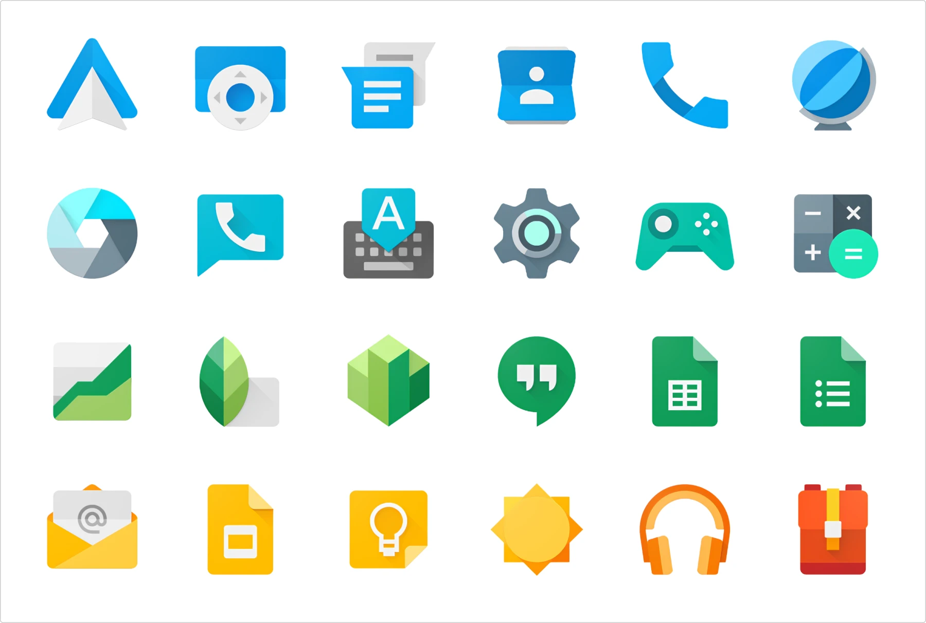
Modern icons come in various styles: filled, outlined, monochrome, duotone, gradient, or colored. While they need to be functional, they don’t have to be pure symbols—decorative elements are welcome. Icons often come in packs or sets to maintain visual consistency across interfaces.
‘Icons’ is actually a catch-all term that also covers pictograms and glyphs. Beware: speaking about icons could make people think it’s something Christian-related. My grandma was super excited when I told her that we create icons. She thought I was designing religious icons until I explained what we really do.
Pictograms

Technically, “pictogram” is the correct term for what we call icons, too. Nerdy designers still love calling them pictograms to sound precise, but they’re “icons” in UI design.
Pictograms (or pictographs) are stripped-down images that represent an idea, word, or action—no extra detail, just pure function. They follow strict international standards (like ISO and AIGA) and must be easily recognizable from a distance. The earliest writing systems were pictographic (cave paintings count!), and today, we still rely on them for universal communication: restroom signs, road symbols, and airport wayfinding.
Pictograms are simpler than icons, less detailed, typically monochrome, or duotone.
Glyphs
Before digital typography, glyphs were hieroglyphs—the earliest form of written symbols. Ancient Egyptians carved them into stone, using visual marks to communicate ideas, names, and sounds. Over time, these pictorial symbols evolved into alphabets, scripts, and the structured glyphs we use in typography today.
In modern design, a glyph is any single, distinct mark used within a type system. Glyphs include letters, numbers, punctuation marks, and special characters (such as arrows or currency symbols). Modern examples include Unicode symbols and even emoji, though traditional glyphs are much simpler.
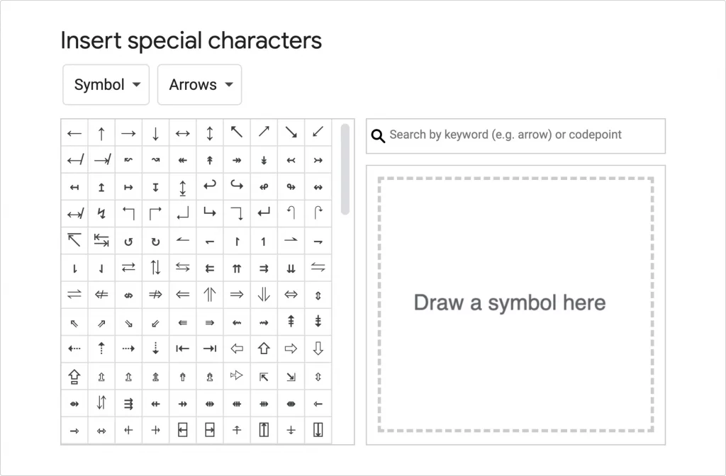
Glyphs are very simple and monochrome, designed to work at very small sizes. They must be in vector format to keep clarity at any scale and integrate seamlessly into written communication. Whether the letter “A” in Helvetica or a left-pointing arrow in a font set, a glyph is a precise, structured visual.
Check out this article on glyphs to explore their history, design principles, and role in modern digital interfaces.
Different types of icons: from clean to chaotic
Let’s dig deeper into icons. Why do some icons look like real objects, some rely on learned associations, and some are just… vibes? Let’s break it down—because knowing the difference won’t just make you a better designer, it’ll also give you something to casually drop in meetings to impress senior designers (or at least confuse them enough to nod along).
The three broad categories
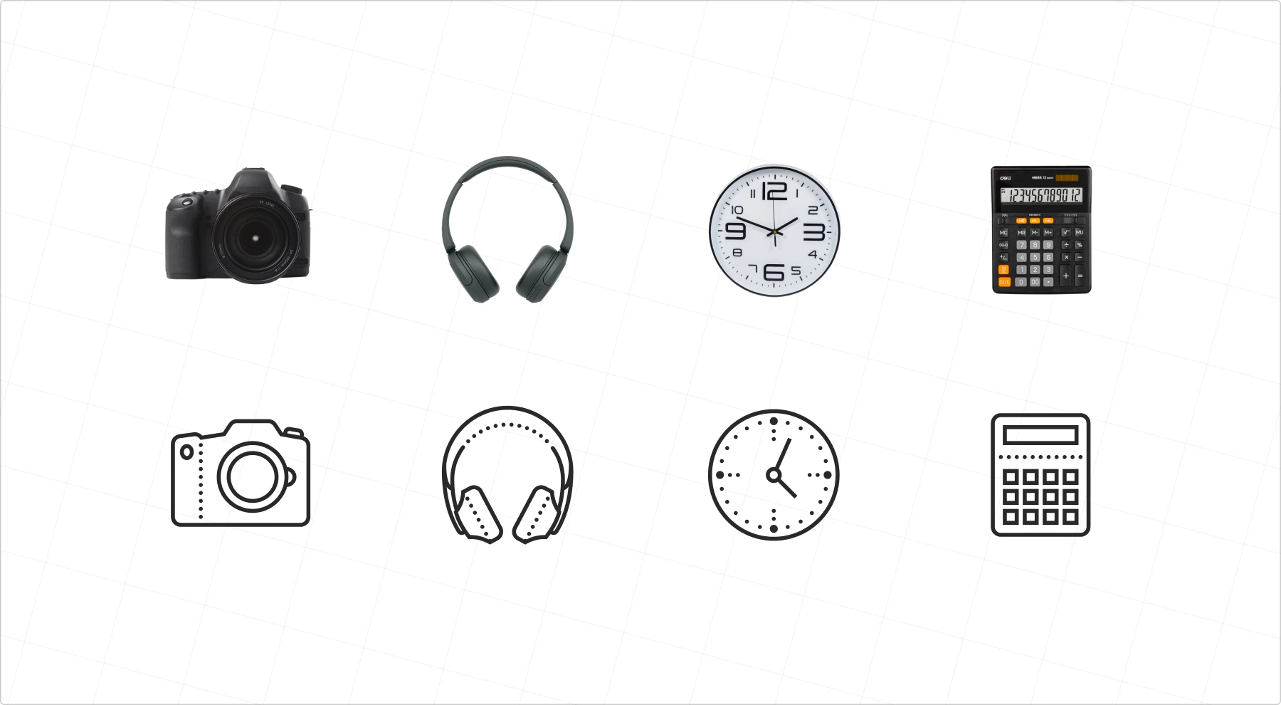
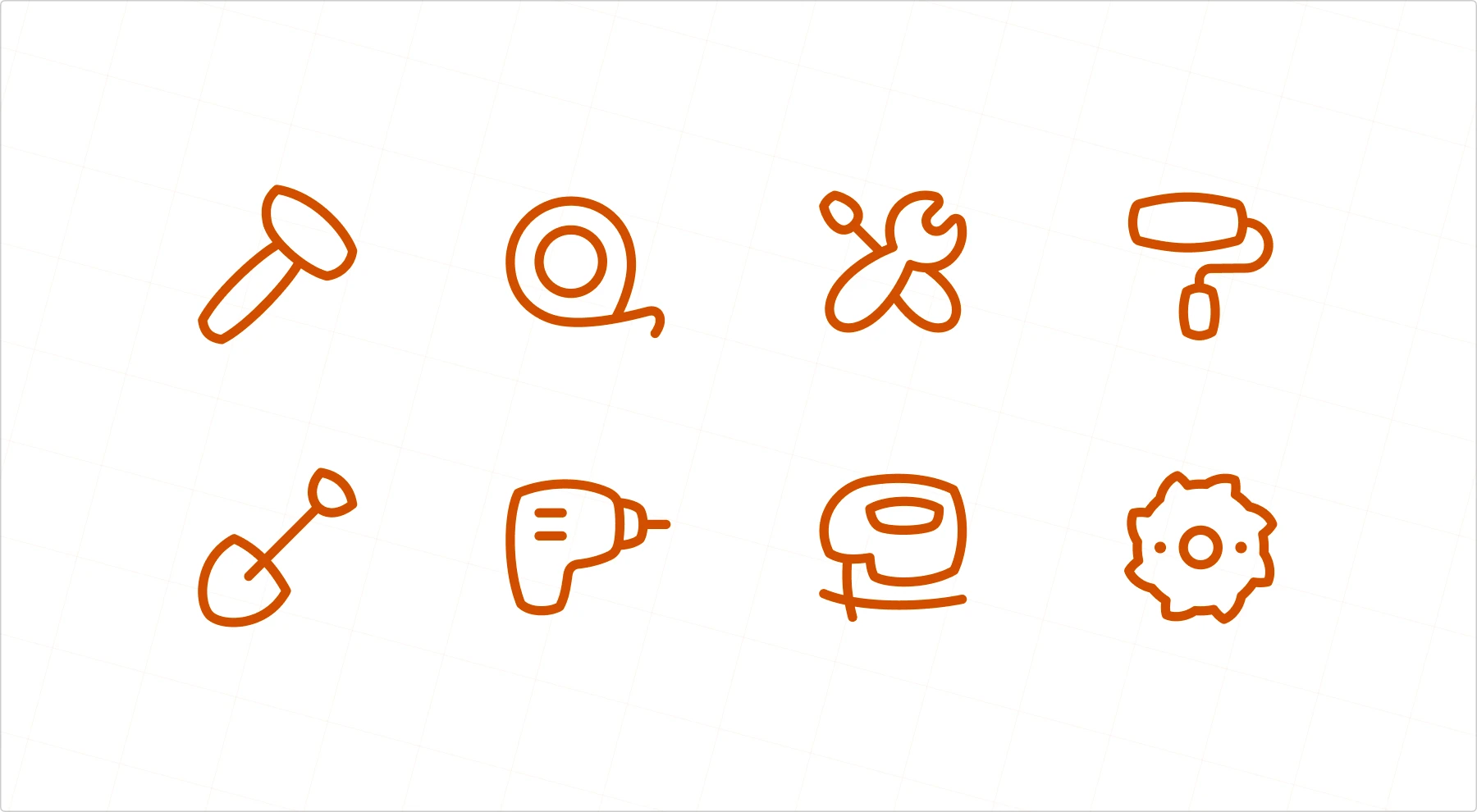
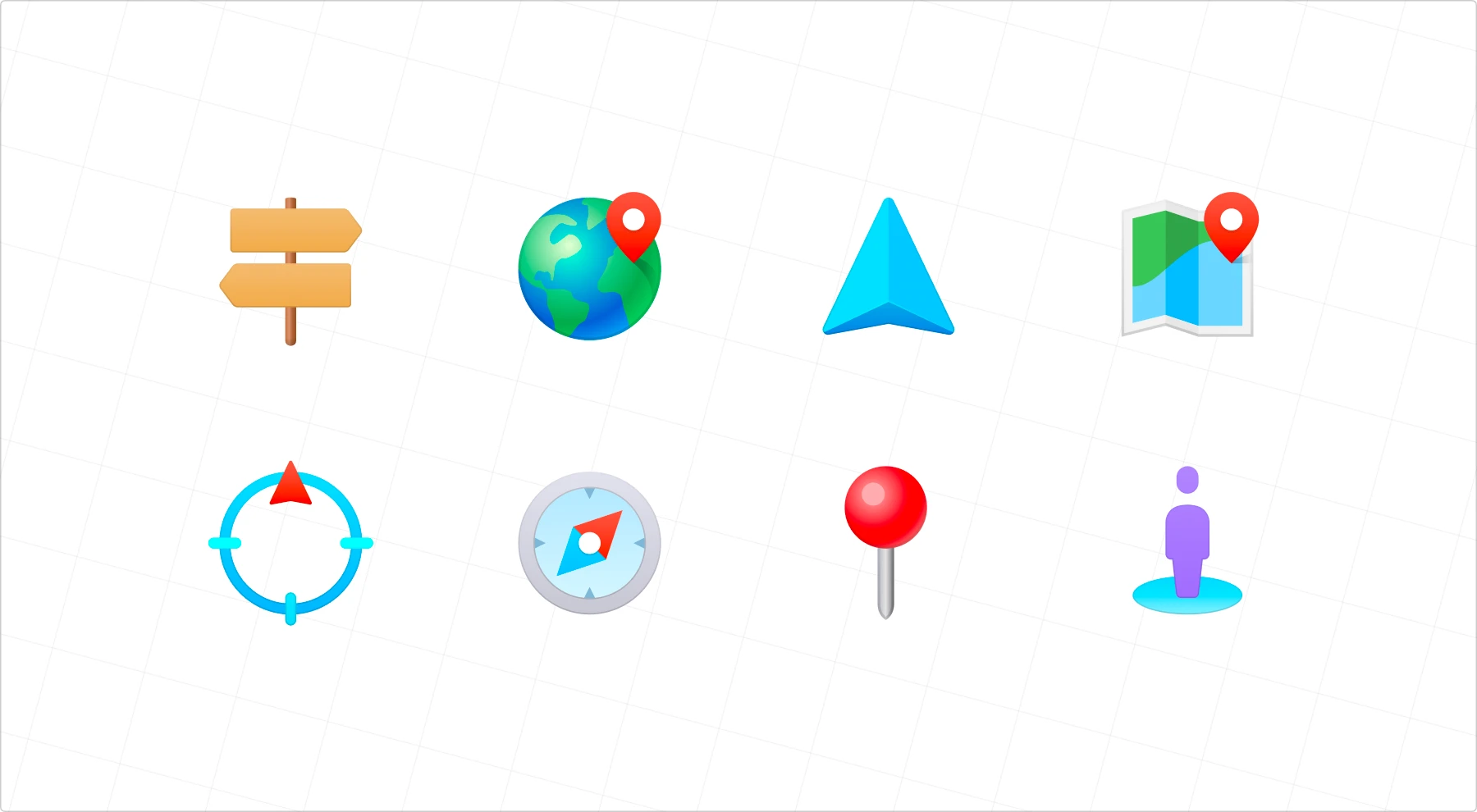
Resemblance icons
These are the most intuitive. They look like the real-world thing they represent: a shopping cart for a store, a camera for photos, or a phone for calls. The closer they resemble the object, the faster users understand them.
Pro tip: Resemblance icons are your safest bet for universal understanding. Simple objects like cameras, clocks, and printers work well because they look similar worldwide. But beware: even “universal” objects can vary—an American-style mailbox icon might be unrecognizable in countries with different postal systems.
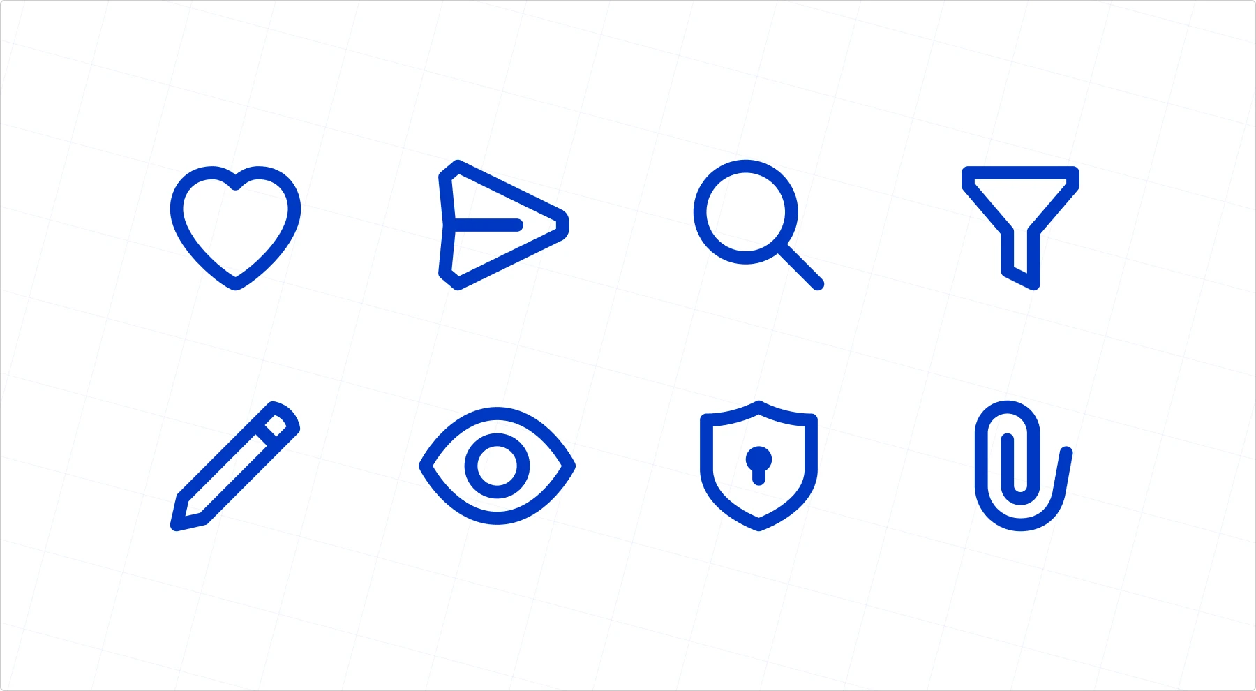
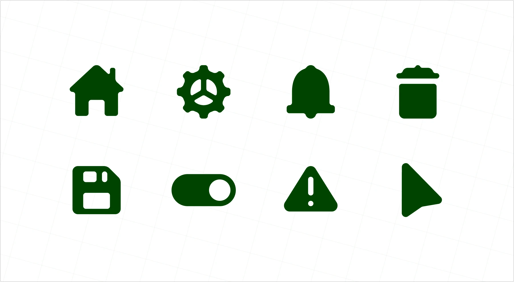
Reference icons
These icons don’t directly depict the action but rely on familiar associations. A heart for “Like” (because we love things), a paper plane for “Send” (old-school letters, anyone?), or a magnifying glass for “Search” (because detectives, I guess?). They work because we recognize their meaning from context.
Pro tip: Again, be careful with cultural references. What’s obvious in one country might be meaningless or even offensive in another. For example,
- Checkmark ✓ means “correct” in Western cultures but might be seen as “incorrect” in some East Asian countries, where circles ⭕ are used to mark correct answers.
- “Thumbs up” gesture is friendly in Western cultures but can be offensive in Middle Eastern countries
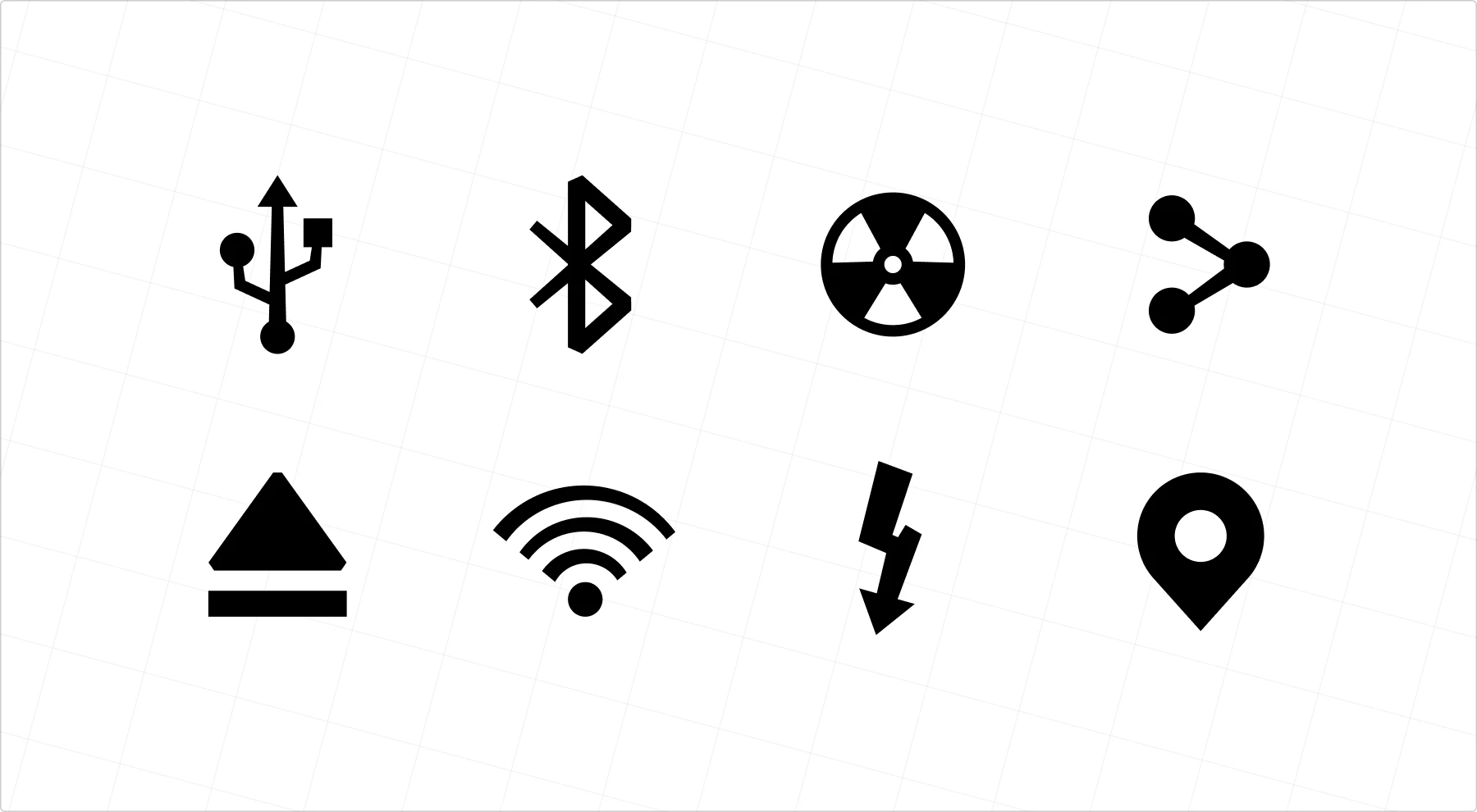
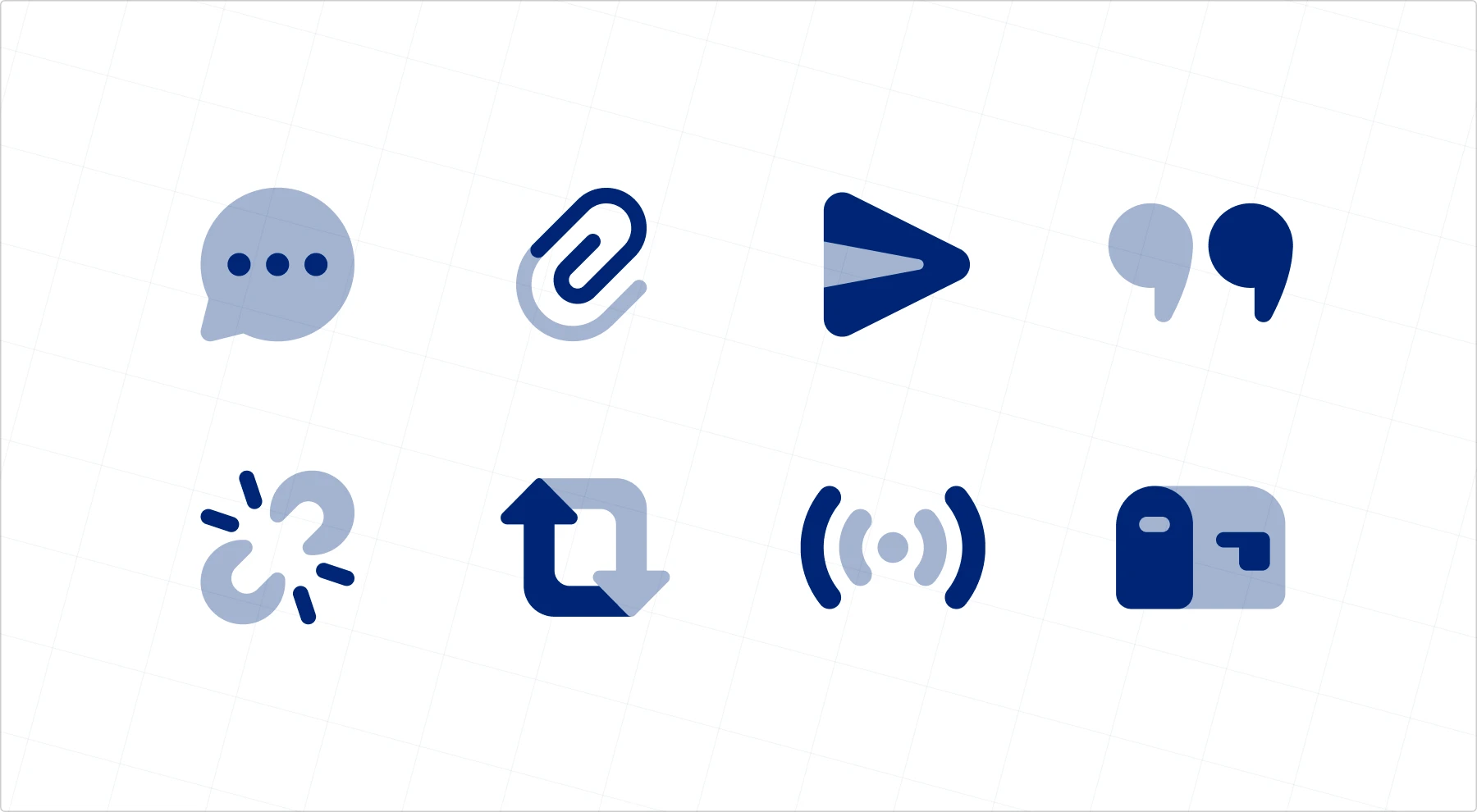
Arbitrary icons
There’s no natural connection between these icons and their meaning—you just have to learn them. The hamburger menu (☰), the share symbol (⤴), or even the command key (⌘) are examples. At first, they meant nothing, but they became second nature through repeated exposure.
Pro tip: When you’re about to introduce a new arbitrary icon, consider adding labels or tooltips until users become familiar with it. Even the mighty hamburger menu needed some explanation when it first appeared!
But here’s the kicker. Many icons are actually hybrids of these categories. Take the floppy disk “Save” icon—it started as a resemblance icon (looking like an actual floppy disk), became a reference icon (associating with saving), and is now practically arbitrary for younger users who’ve never seen an actual floppy disk. Talk about an identity crisis!
Accessibility note: icons need to work for everyone. Test them at small sizes, add text labels (visible or hidden), and don’t forget alt text and aria-labels.
Curious how these symbols went from obscure to iconic? Check out how legendary icons were born to see the stories behind the most recognizable UI symbols.
UI icon styles: how they look
Icons are about visual language. The same icon can be minimalist or detailed, flat or dimensional, playful or serious. It all depends on the design system, brand identity, and aesthetic choices. Rule of thumb: whatever style you choose, stick to it and you’ll look like a real pro. Now, let’s check the most common styles.
Outlined icons
Thin, minimal, and adaptable. These work well in modern UI because they blend seamlessly into different themes and don’t overpower other elements. Used everywhere—from iOS tab bars to Google’s Material Icons.
Best for: navigation menus, secondary actions, and interfaces where subtlety is key.
Filled icons
The solid version of outlined icons. They add more visual weight, making them easier to spot at a glance. That’s why they’re often used for primary actions in mobile UIs.
Best for: primary actions, small sizes where clarity is crucial.
Duotone icons
A step up from monochrome icons, duotone icons use two shades to create contrast and depth. They add subtle hierarchy without going full color. Google’s Material Symbols support this style.
Best for: feature highlights, selected states, and branded interfaces.
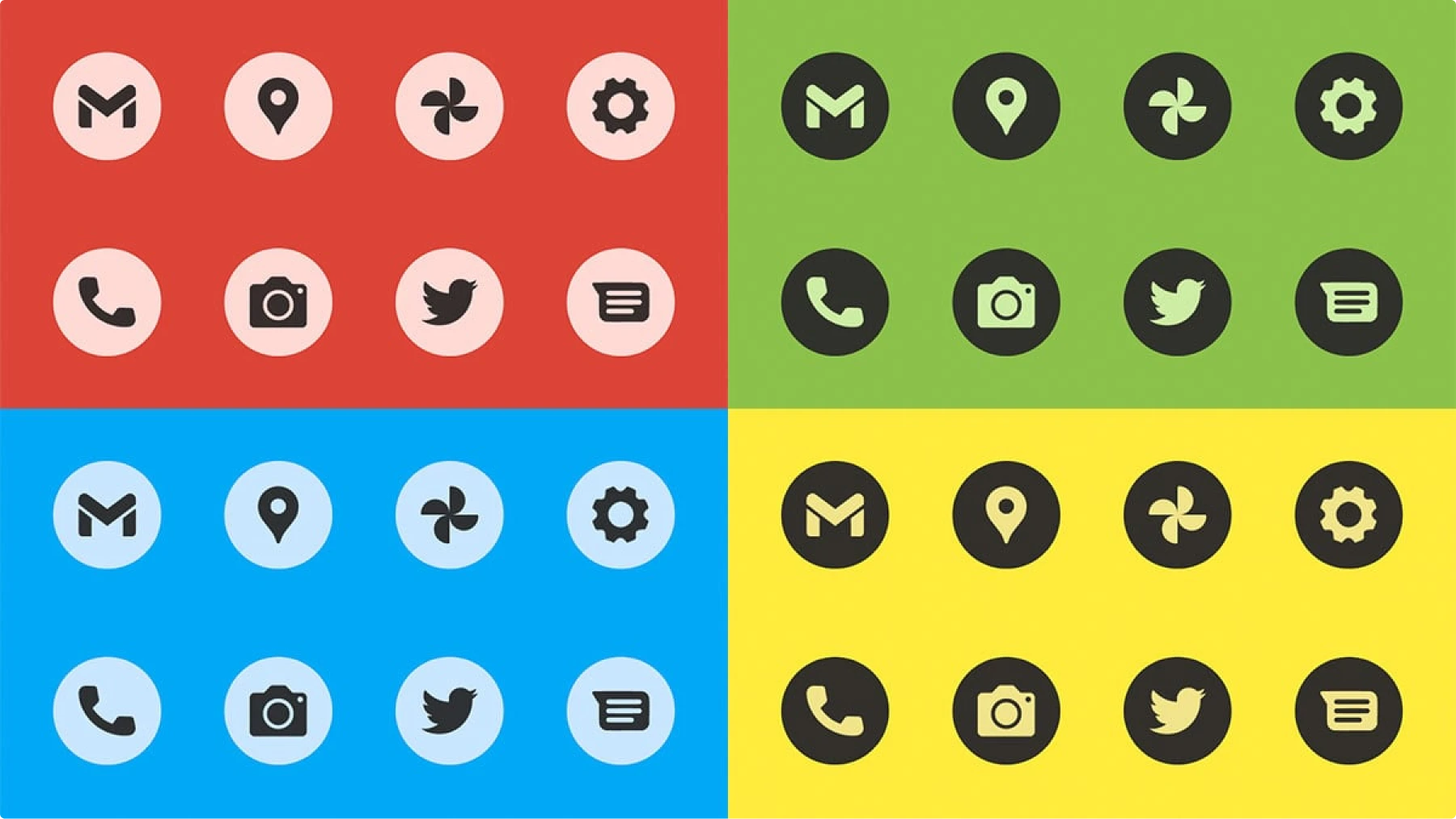
Colored icons
Bright, bold, and attention-grabbing. These work best in branding (like Google’s app icons) or decorative elements but can be tricky in UI design if overused. Too many colors = visual chaos.
Best for: branding elements, app icons, and key features that need emphasis.
Pro tip: Always check your colored icons in grayscale and with colorblind simulation tools (like Stark or Color Oracle). If they don’t look clear and recognizable without color, change color or add extra elements to help color-challenged people understand them.
Flat & semi-flat icons
Flat icons keep things ultra-simple—no gradients, no depth, just clean vector shapes. Semi-flat icons bring back a little dimension with soft shadows or layered elements. This style has dominated UI design since the fall of skeuomorphism.
Best for: modern, clean interfaces that prioritize clarity.
Skeuomorphic icons
Once the king of UI design, skeuomorphic icons mimic real-world objects in extreme detail. Think Apple’s early iOS icons: textured notebooks, glossy buttons, and wooden bookshelves. It’s mostly dead now, but it still shows up in branding and high-end design.
Best for: apps where realism adds value, gaming interfaces.
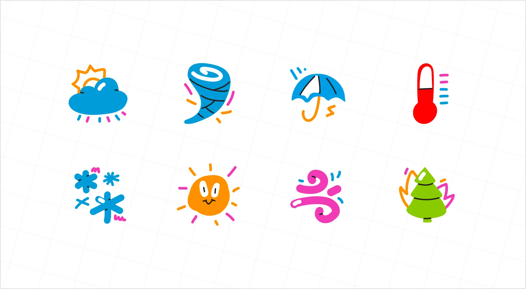
Decorative icons
These don’t necessarily serve a strict function; sometimes, they just make things look good. You’ll see them in illustrations, infographics, and playful UI elements. They add personality but shouldn’t replace functional icons.
Best for: Visual storytelling, brand moments, empty states.
Emojis
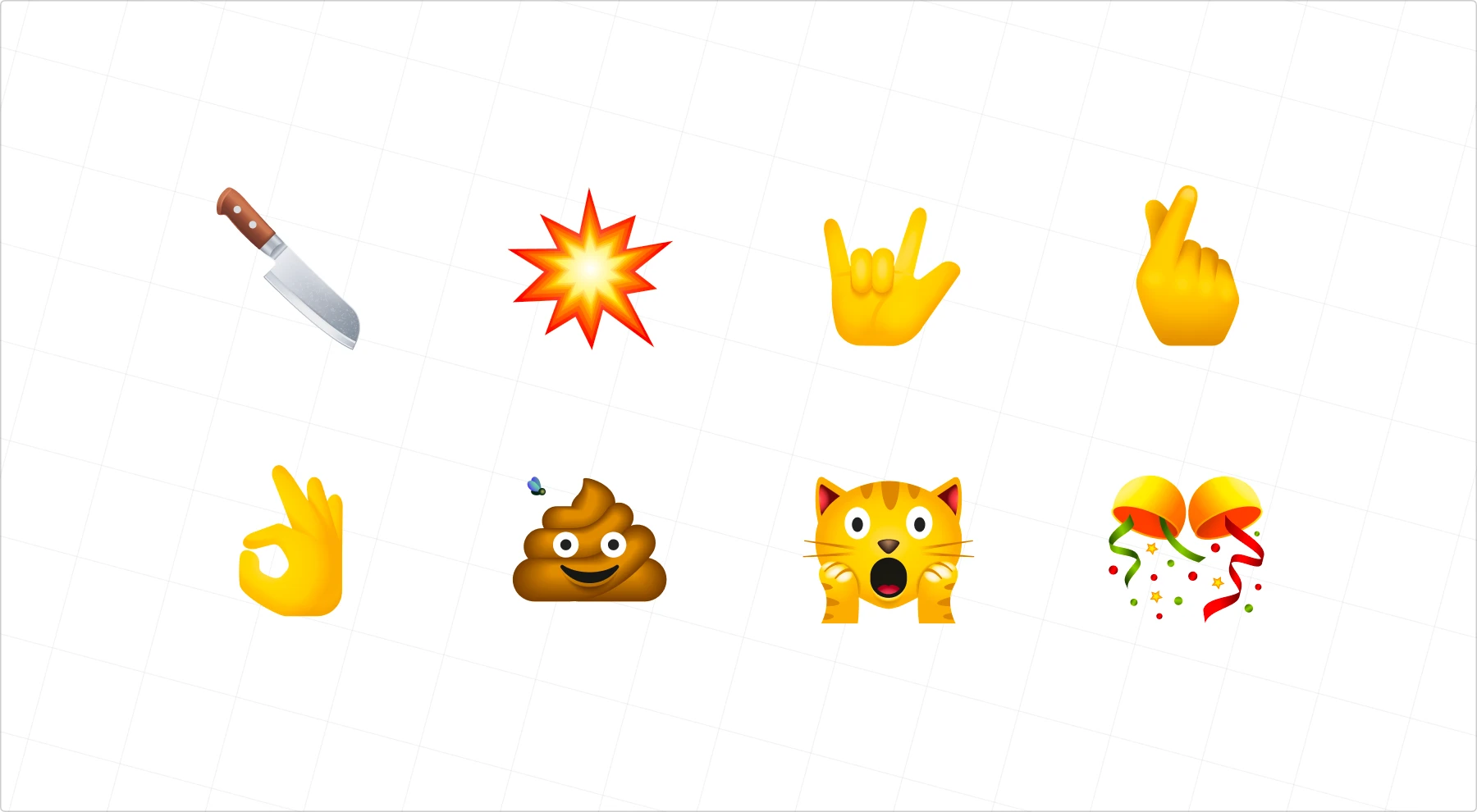
Yes, emojis are technically icons. They’re pictographic symbols communicating emotions, objects, and actions faster than words. Plus, they’ve become a universal language—good luck finding a message thread without one.
Best for: Casual interactions and social features.
Caution:
- Not all platforms render emojis the same way. What looks perfect on iOS might look weird on Windows.
- Apple’s emoji designs are copyrighted and should not be used outside iOS and macOS products. Instead, use platform-independent emoji designs.
3D icons
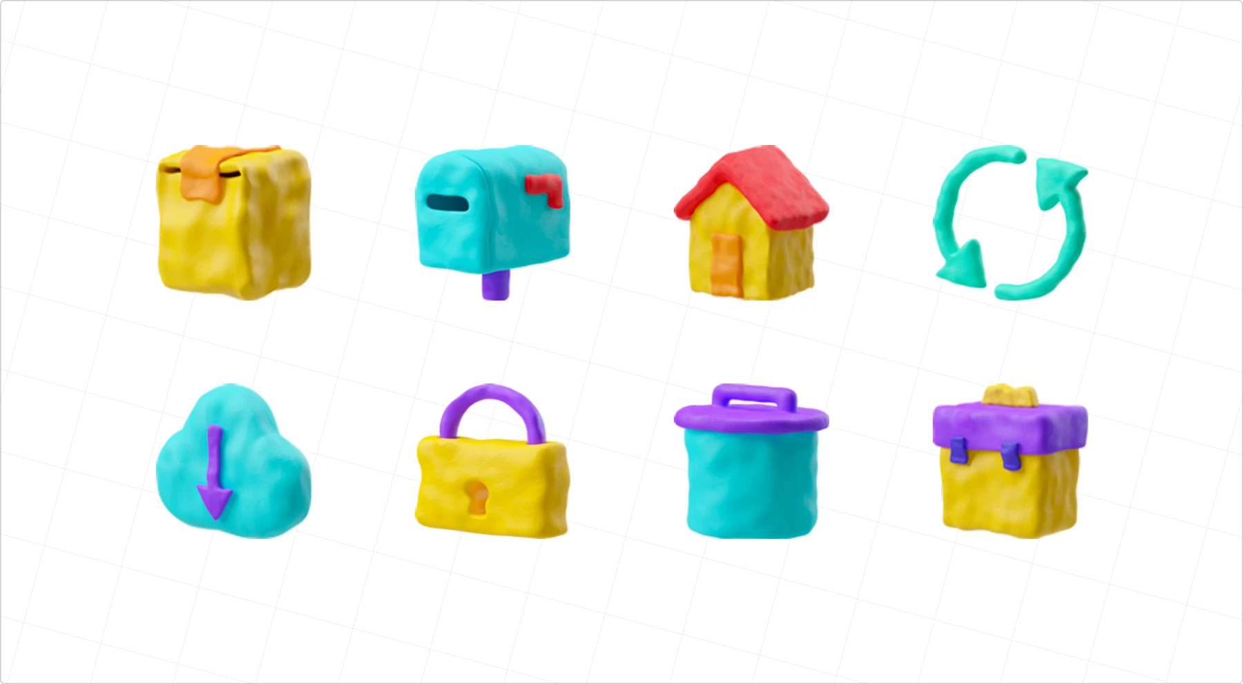
The new kid on the block, riding the skeuomorphism revival wave. These detailed, dimensional icons add extra depth and personality. Think Apple’s Big Sur system icons or Figma’s recent 3D style—modern, playful, but still functional.
Best for: OS-level interfaces, distinctive branding, and standout moments in your UI.
Pro tip: Use them sparingly like a powerful spice, they’re best as an accent rather than the main dish:
• They need more space to be legible and work best at larger sizes (32px minimum)
• Can slow down loading times; consider offering a simpler fallback style for smaller screens
Icon anatomy: from noob to pro, no bloody massacre or autopsy
Ever heard designers throw around terms like “padding” and “live areas” when discussing icons? Here’s your cheat sheet to the structural elements that make icons work. Whether you’re reviewing designs or trying to explain why that icon looks “off,” knowing these basics will make you sound like you’ve been doing this for years.
The building blocks are simple:
- Grid: keeps everything aligned
- Keylines: provides the foundation
- Container and padding: give icons room to breathe
- Stroke: determines how bold or subtle the icon appears
Designing an icon isn’t just about drawing a small picture—it’s about structure, balance, and consistency. Every element makes an icon look crisp, readable, and visually aligned across a set. Let’s break down each one so you can casually drop these terms when you need to.
Grid
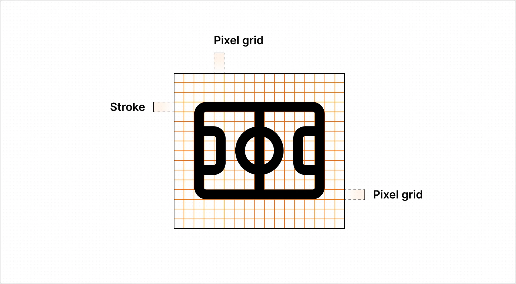
An icon grid ensures visual consistency by defining dimensions, stroke width, and alignment. Working within a set grid—typically an 8px or 24px square—creates structure and prevents icons from feeling uneven. A grid also helps maintain scalability, ensuring icons remain clear at different sizes.
Tip: Stick to a pixel-based grid to avoid fractional pixels, which can cause blurry icons on lower-resolution screens.
Keylines (Keyshapes)
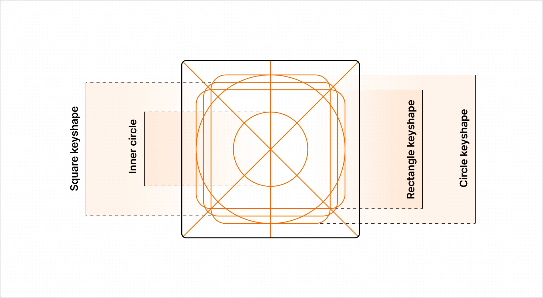
Keylines (also called keyshapes) are the geometric guides—circles, squares, rectangles—that help maintain proportion and symmetry. Most well-designed icons start with these simple shapes, ensuring visual balance before refining details.
Keylines also keep icons feeling cohesive in a set, preventing one icon from looking too bulky or too thin compared to others.
Tip: Material Design icons use a 2px keyline system to maintain consistent padding and alignment. Consider setting similar spacing rules for your own icon sets.
Container, live area, and padding
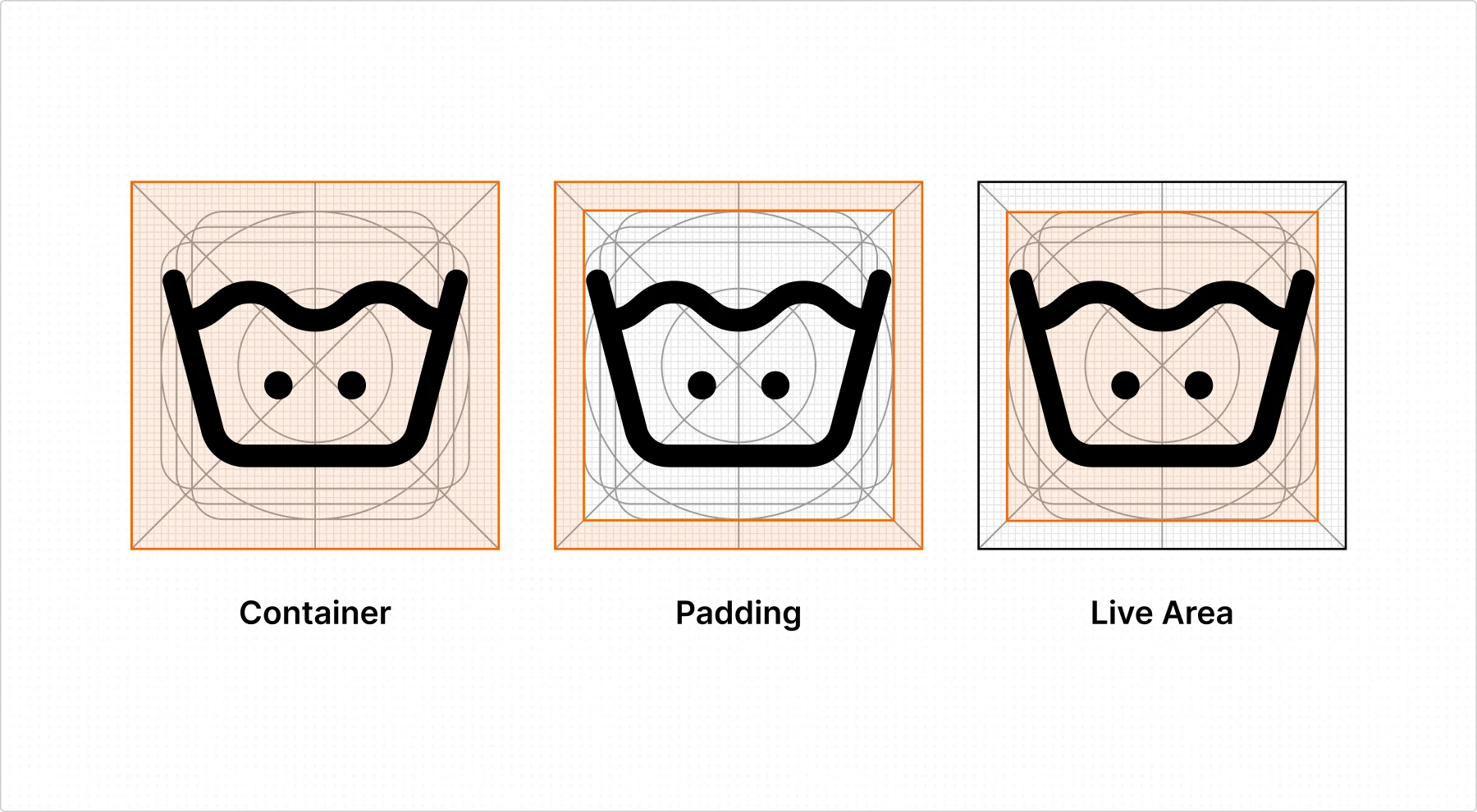
The container is the invisible (or sometimes visible) boundary—usually a square, circle, or rounded rectangle—that defines the icon’s outer limits. It helps with alignment and keeps icons consistent across buttons, menus, and navigation bars. Some icons may need larger or smaller containers to balance their visual weight.
The live area holds the visible parts of the icon, making sure nothing spills over. It keeps icons aligned and visually balanced, even when their shapes differ. More detailed icons may need a larger live area for breathing room.
Padding is the space between the live area and the container’s edge. It stops icons from feeling cramped and maintains clarity, especially in tight layouts. Padding often varies depending on an icon’s complexity and weight.
Tip: Standard UI icon padding follows set ratios. For example, Google’s Material Icons often use 4px padding within a 24px grid, ensuring balanced spacing.
Stroke
Stroke width determines an icon’s visual weight and readability. A consistent stroke keeps icons uniform within a set, preventing some from looking too bold or too thin.
Best practices for stroke widths:
- Whole pixels (e.g., 2px, 4px) avoid blurring at smaller sizes.
- Aligned to the grid ensures sharp edges and even spacing.
- Scalable strokes adjust thickness proportionally when resizing icons.
For vector-based icons, using Bézier curves for smooth, natural lines makes a big difference in quality.
Mastering these structural elements ensures they remain clear, balanced, and functional across different interfaces. If you want more, check out our complete icon design guide for a deeper dive into refining icons—working with Bézier curves, perfecting stroke weights, and balancing details.
How to use icons right: essential tips for designers
Icons can make or break your UI. When done right, they improve usability. When done wrong, they create confusion. Here’s how to use them right.
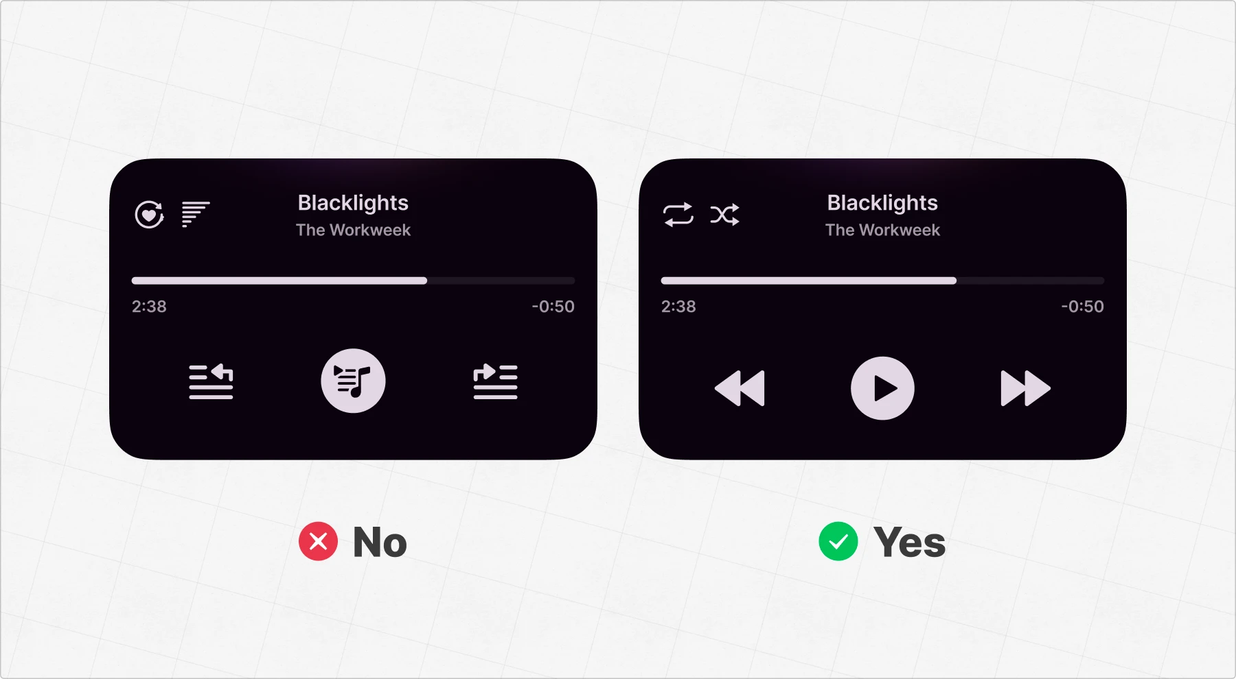
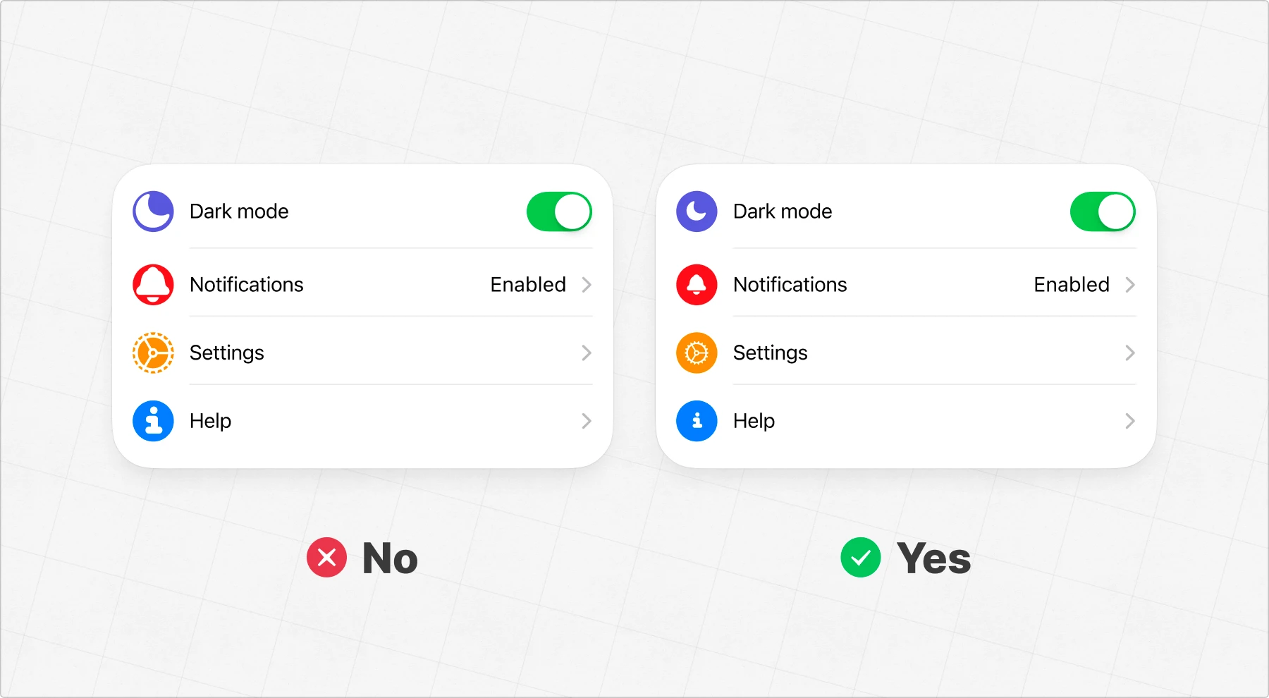
Stick to common metaphors
Users shouldn’t have to guess what an icon means. If an icon requires an explanation, it’s probably the wrong choice.
In the example above, the icons on the left are confusing. It’s not obvious what tapping them will do. On the right, simple and familiar metaphors—play, skip, shuffle—make it instantly clear how to interact with the interface.
Color plays a big role here. Red is universally associated with errors, warnings, or stopping. Using colors that align with user expectations reinforces meaning and makes icons instantly more understandable.
Choose the right level of detail
An icon should be clear at a glance, even at smaller sizes. Too much detail can clutter the design, while too little might make it unrecognizable. Simplify complex objects and focus on the core shape to keep icons instantly readable.
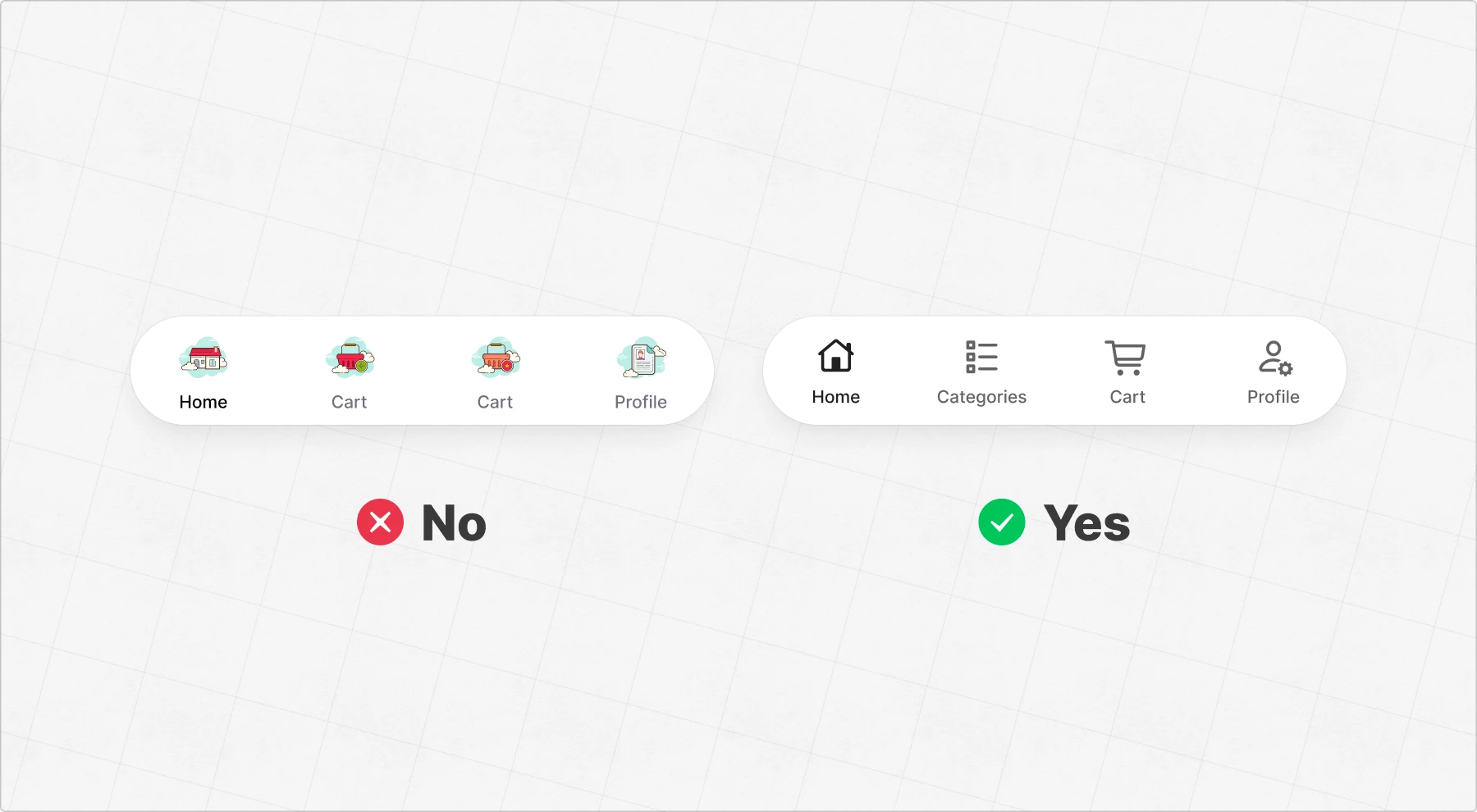
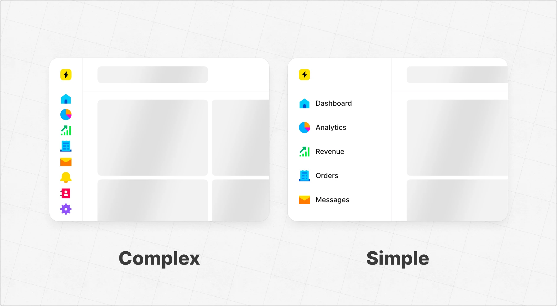
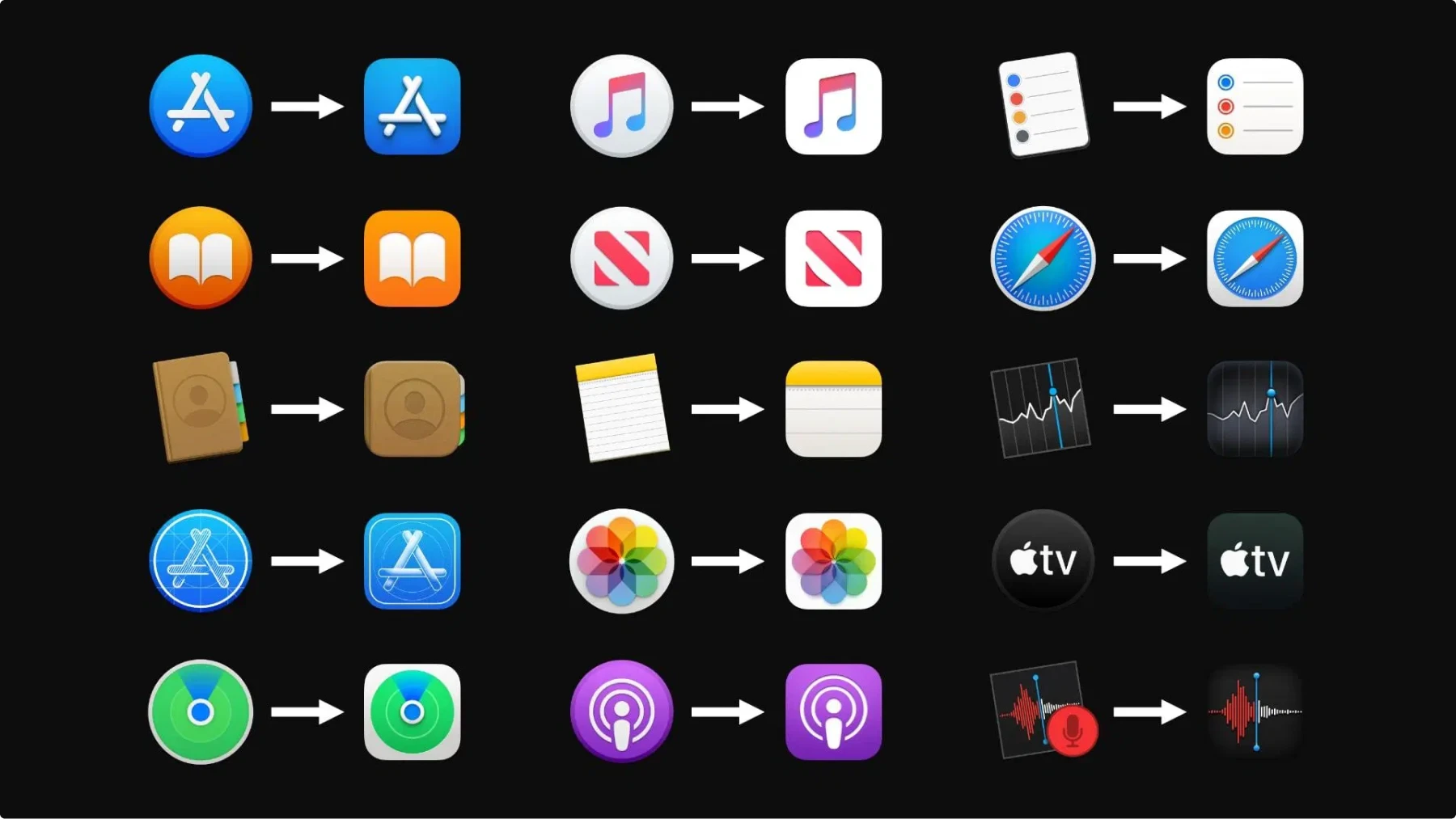
Use consistent icon packs
Mixing different styles—outlined, filled, duotone—in one UI looks messy and unpolished. Pick an icon set and stick with it, whether it’s Material Icons, Apple SF Symbols, or any other Icons8 pack 😏
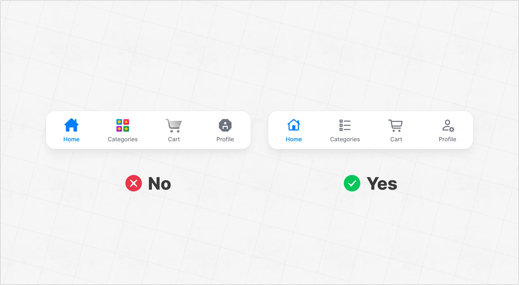
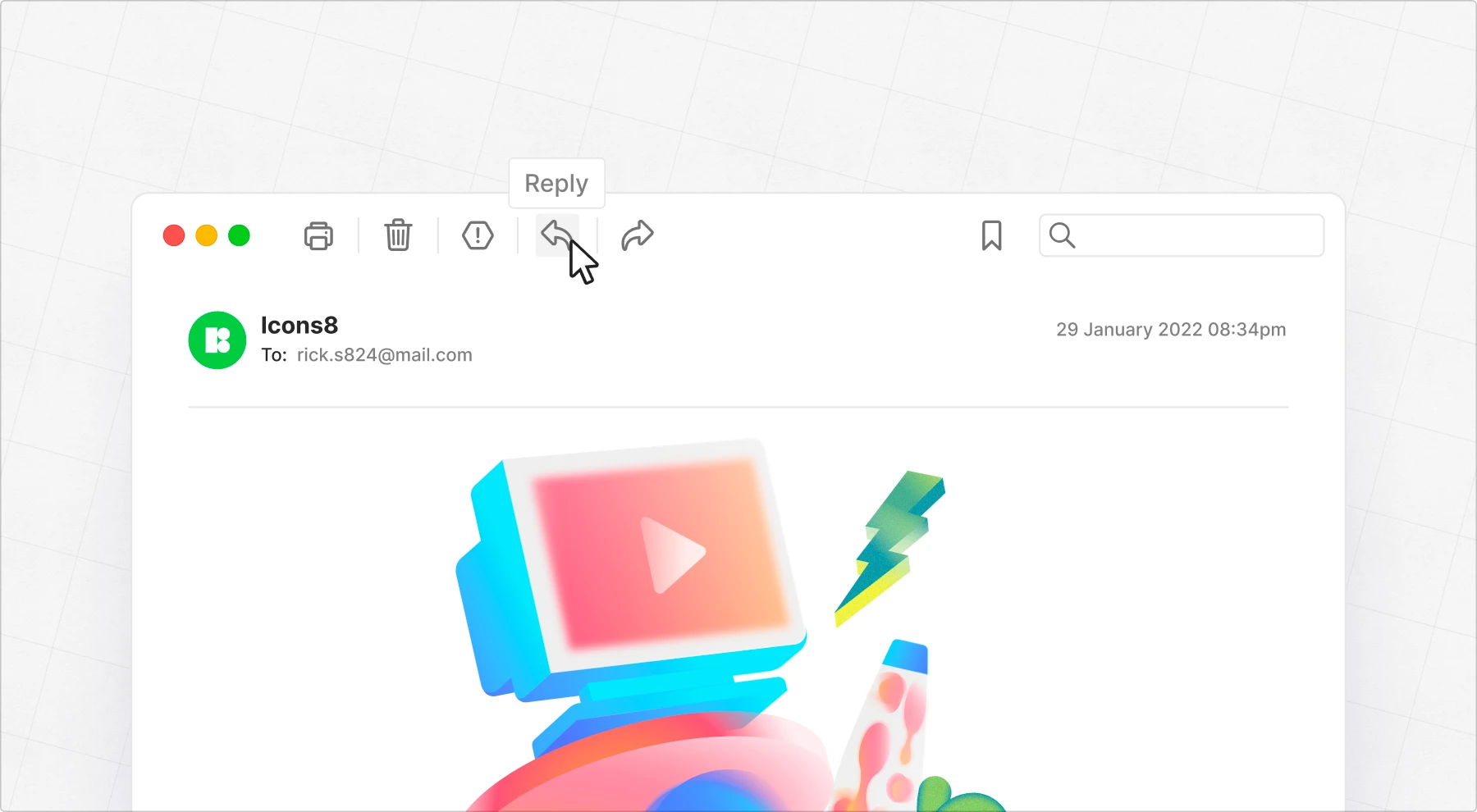
Size icons correctly
Different platforms have different size requirements, and getting them wrong can lead to blurry or misaligned icons. Mobile, desktop, and wearable OS guidelines all have specific rules for icon dimensions, spacing, and scaling.
To make things easier, we’ve gathered all major OS icon size guidelines in one place. Check out our guide and bookmark it—it’ll save you time (and headaches) when designing for multiple platforms.
Balance visual weight

Icons should feel equal in size, even if their shapes differ. A thin key shouldn’t look smaller than a bold house. Adjust paddings, or scale to create a balanced set that looks cohesive.
Keep spacing in mind
Spacing between icons isn’t just about aesthetics—it depends on how busy the interface is. In simple, minimal UIs, you can afford to give icons more breathing room. But in feature-packed software (hello, Photoshop), space is at a premium. That’s why spacing there is often tighter—it’s about making room for functionality, not just looking good.
The key is balance: leave enough space so icons don’t feel cramped, but stay mindful of the context. More features usually mean less space.
Show text labels on hover
Not every icon is self-explanatory. If there’s any chance of confusion, pair it with a label. Users shouldn’t have to guess what an icon means—clarity always beats minimalism.
Remember icon states
Icons help communicate interactive states. A plus for adding something, a checkmark for confirmation, and a loader for processing. Paired with color changes or animations, they make UI actions clearer.
The wild history of icons: from Xerox to Windows 11 and Big Sur
Icons weren’t always the sleek, minimalist symbols we use today. In the early days of computing, they were pixelated, highly detailed, and sometimes downright clunky. Over the decades, design trends pushed them from skeuomorphic realism to flat minimalism, only to settle somewhere in between.
Here’s how digital icons have transformed—one redesign at a time.
1970s: The birth of GUI icons
The Xerox Alto (1973) was the first computer with a graphical user interface, though it was never mass-produced. It introduced the concept of on-screen icons, laying the groundwork for future personal computers.
Building on this, the Xerox Star (1981) brought GUI icons to consumers. These early designs were simple, skeuomorphic outlines—folders looked like paper folders, and documents resembled sheets of paper—making digital interfaces feel more familiar.
Early 1980s: Skeuomorphism takes shape
The Apple Lisa (1983) and Macintosh (1984) built on Xerox’s ideas, introducing icons that looked like real-world objects. A clipboard for Copy/Paste, a trash can for deleted files—these visuals made digital actions feel familiar. Apple’s approach cemented skeuomorphism as a core GUI design principle, shaping interface design for years to come.

Mid-1980s: Icons get bolder
With Windows 1.0 (1985), icons moved beyond simple outlines, using bold black fills and early 3D shading techniques. Icons became more tangible, making interfaces feel interactive.
Early 1990s: Color brings realism
Macintosh System 7 (1991) embraced color, creating more detailed and realistic icons than ever before. Shades, gradients, and fine details became possible as screen technology improved.
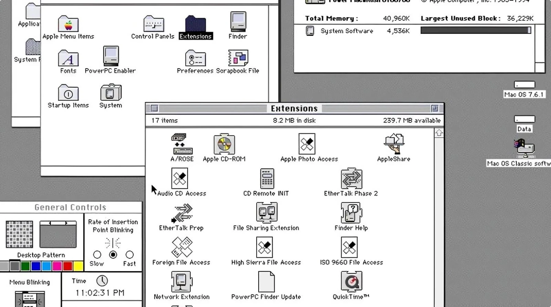
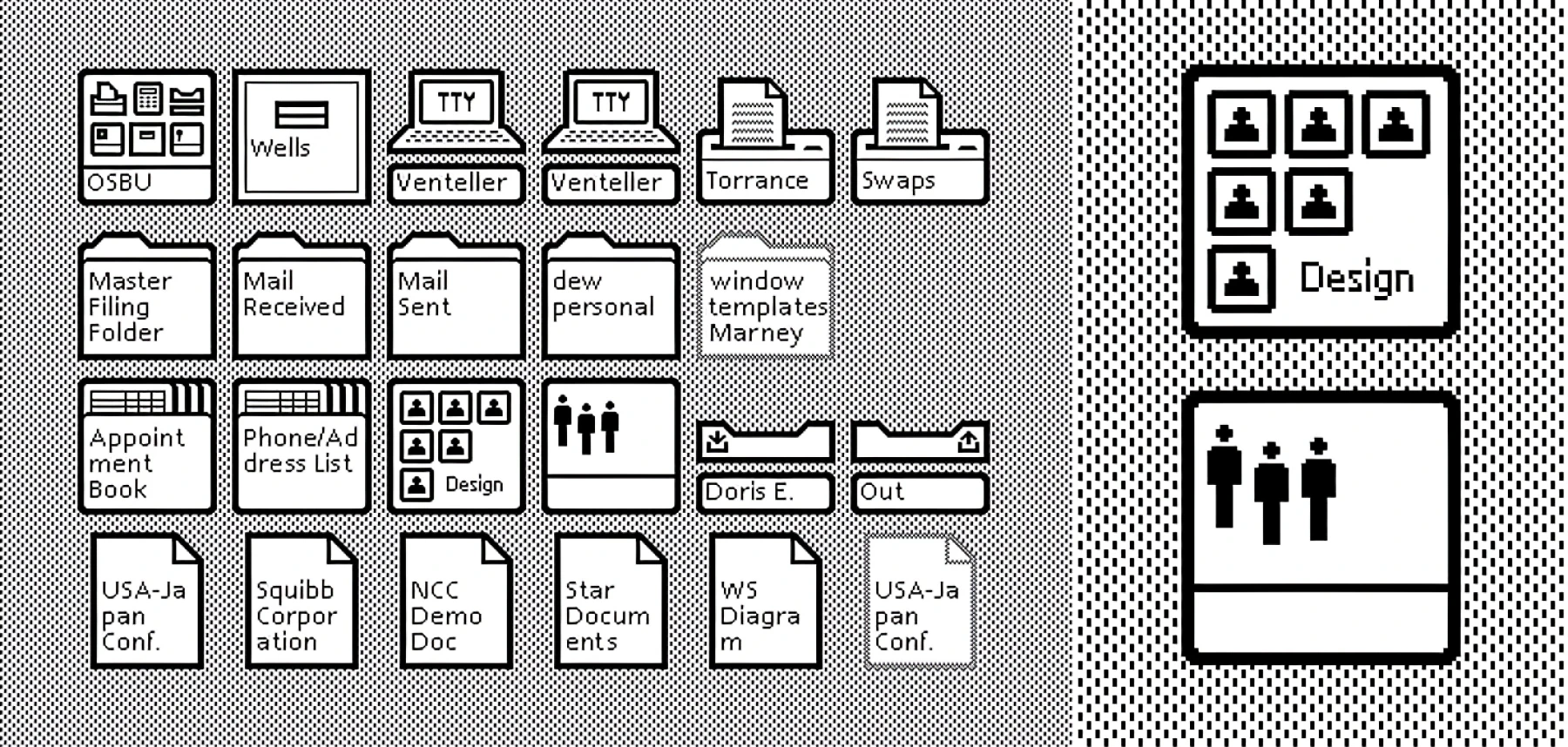
Mid-1990s: The rise of pixel art
Windows 95 (1995) introduced isometric pixel art icons, giving the UI a distinct, blocky 3D look. Limited by low screen resolutions, designers used clever shading and perspective tricks to add depth. This style became an instant classic—so much so that it’s still a nostalgic favorite today.
2000s: Maximalist 3D takes over
The early 2000s pushed icons into hyper-detailed, glossy realism. Designers embraced gradients, reflections, textures, and lighting effects, making icons look almost tangible.
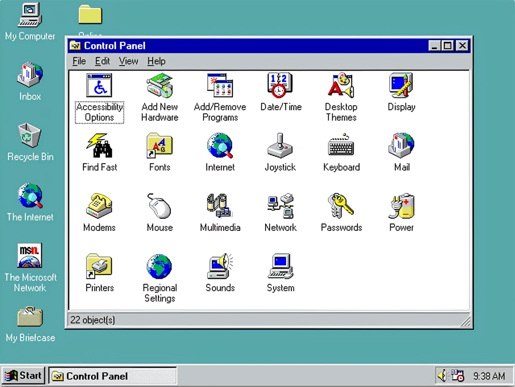
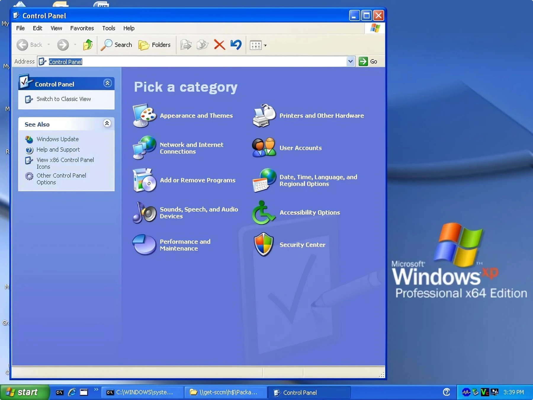
Windows XP (2001) introduced shiny, plastic-like icons with beveled edges and soft shadows.
Mac OS X (2001) took it even further with intricate, photorealistic icons—folders looked like embossed leather, and the Trash icon had visible crumpled paper inside.
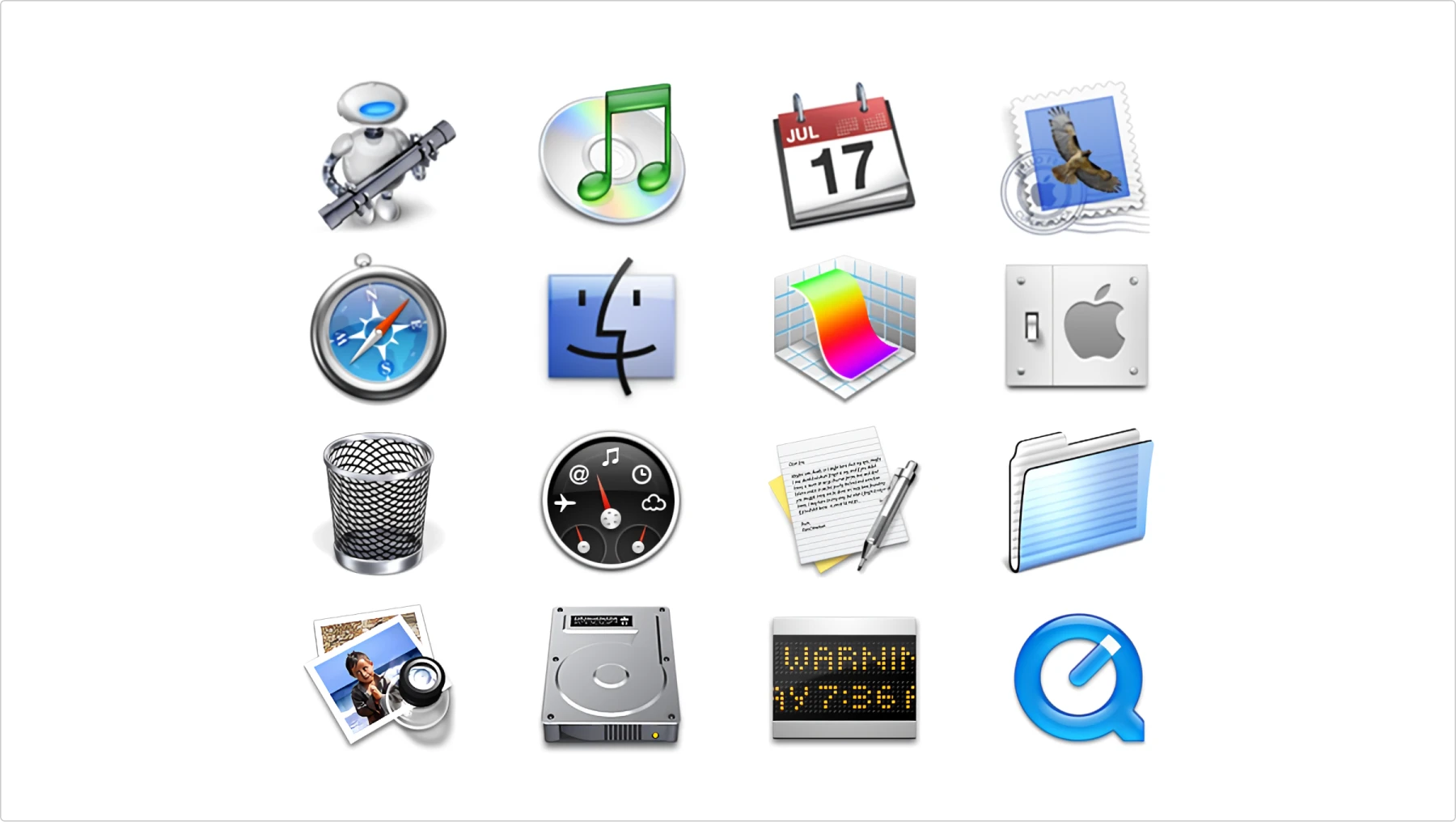
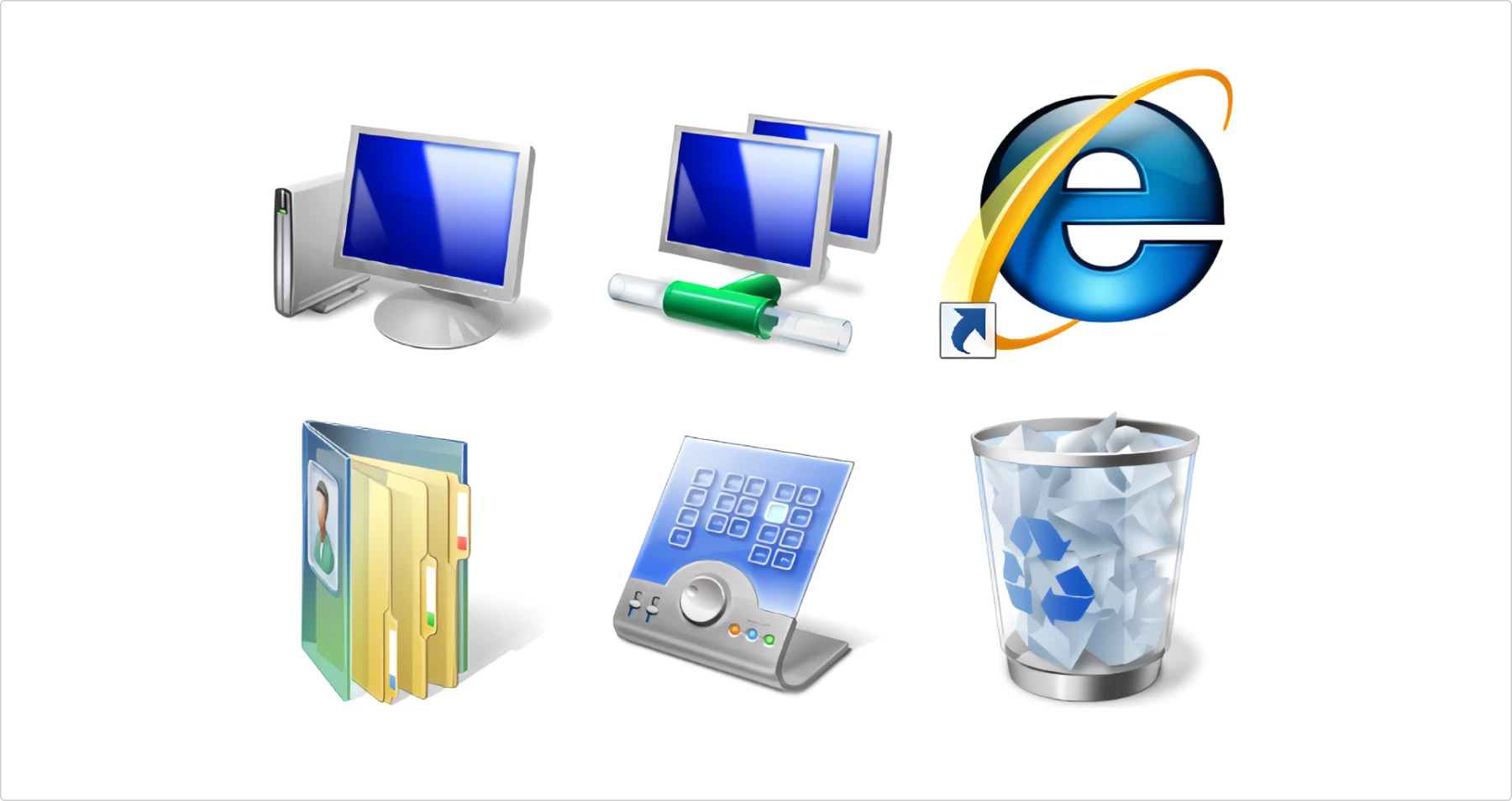
Windows Vista (2006) refined the trend, adding glass-like transparency and depth, aligning with its Aero UI.
This era was all about making icons look rich and polished—sometimes at the cost of clarity.
2010s: The flat design revolution
After years of over-the-top 3D effects, flat design took over. Shadows, textures, and glossy highlights were stripped away in favor of clean lines, bold colors, and simple shapes.
Windows 8 (2012) fully embraced flat icons, removing all gradients and depth for a sharp, minimalist look.
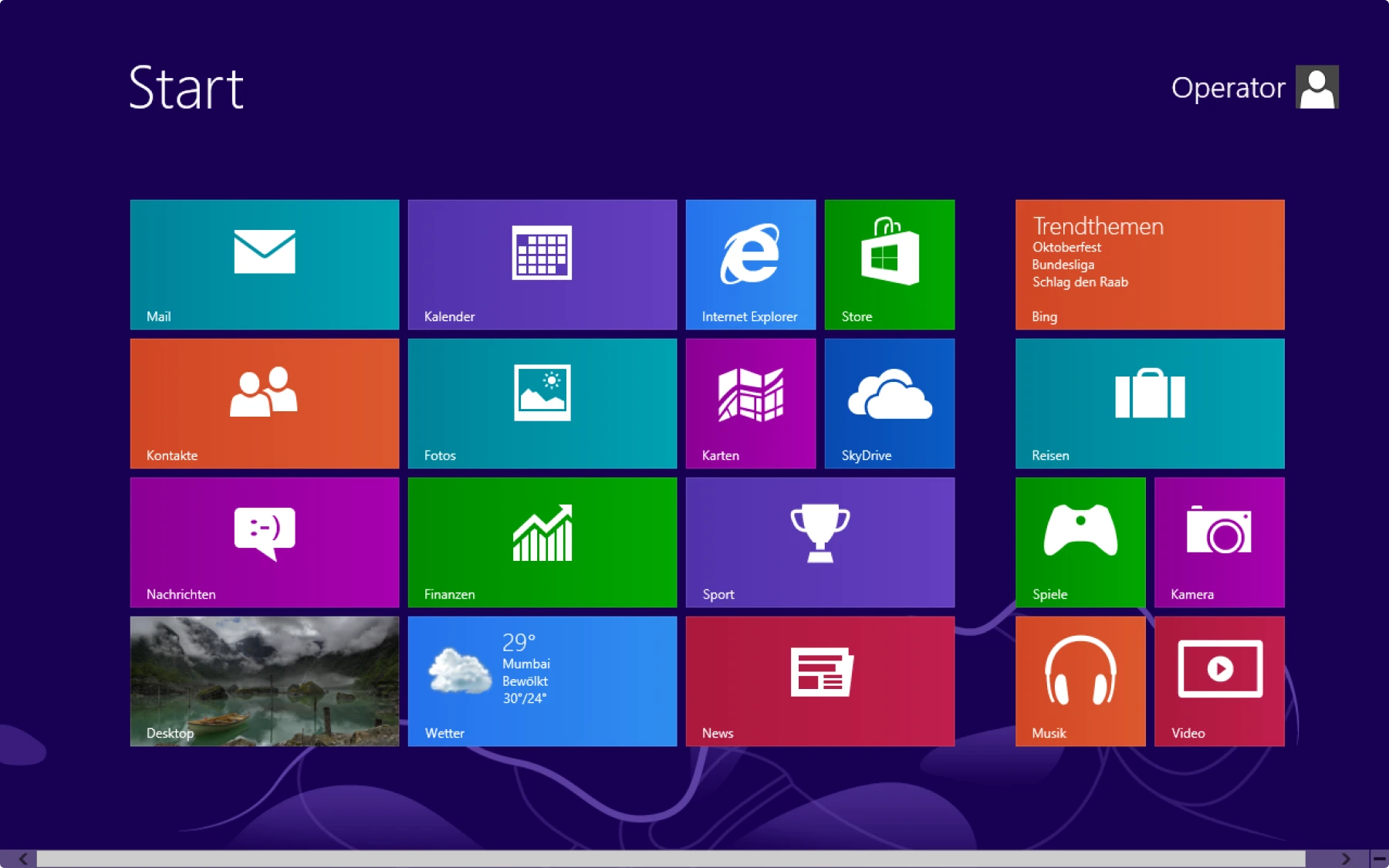
iOS 7 (2013) followed, ditching Apple’s skeuomorphic icons in favor of thin lines and bright, uniform colors.
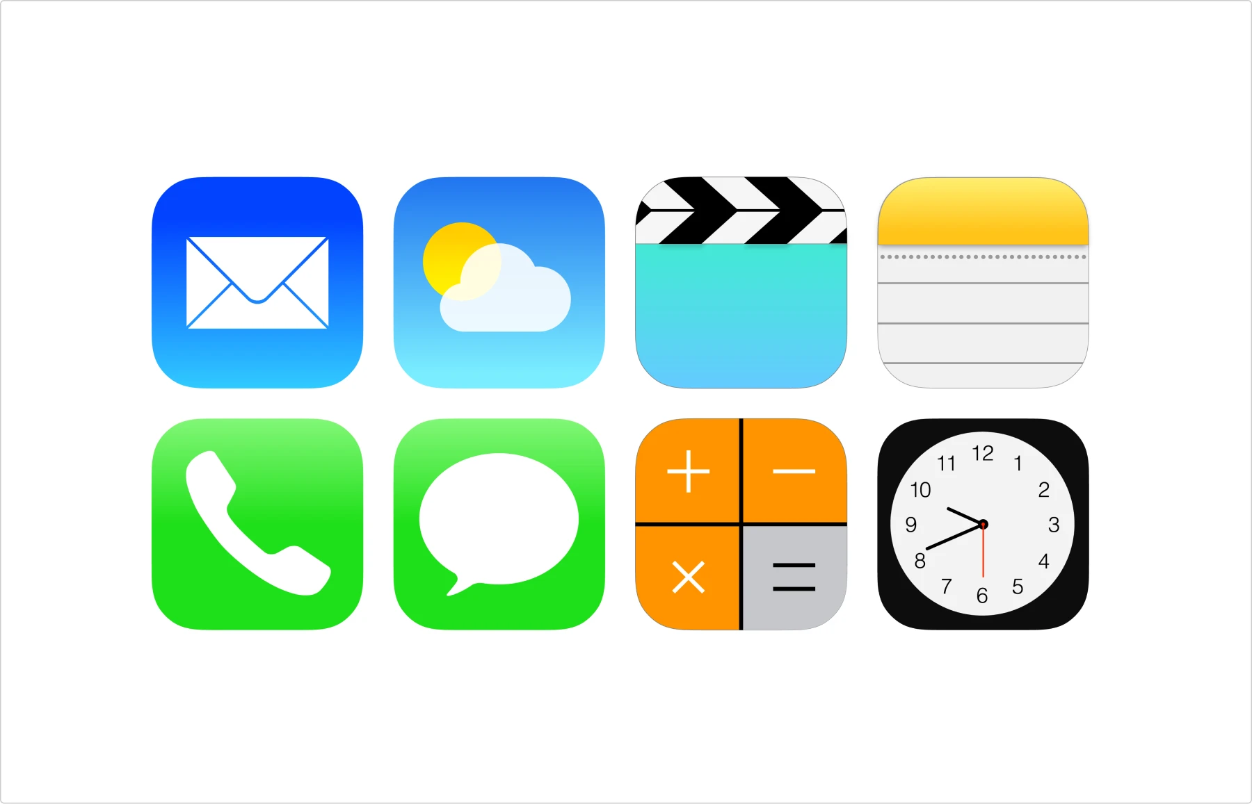
Google’s Material Design (2014) refined flat design with subtle layering and soft shadows, creating a more structured, tactile look.
Flat design made interfaces feel modern and efficient—but for some, it was a little too simple.
2020s: The balance between flat and dimensional
After a decade of ultra-minimalism, designers started bringing depth and texture back—carefully. The harsh, oversimplified flat icons of the 2010s evolved into a softer, more refined look that blended clean design with subtle dimensionality.
macOS Big Sur (2020) reintroduced gradients, shadows, and rounded edges, giving icons a more physical feel without going full skeuomorphic.
Windows 11 (2021) followed suit, with fluid shapes and gentle shading, making icons feel less harsh than their Windows 8 predecessors.
Google’s Material You (2021) introduced adaptive icons that change color based on user preferences, adding a dynamic, personalized touch.
This era marks a shift toward “semi-flat” design—icons that are simple but not lifeless, polished but not overcomplicated.
Wrapping up. Time to show off your icon knowledge
Congrats! You made it to the end! Now, you can confidently explain the difference between a glyph and a pictogram, tell ’em which icon pack will fit best, or debate whether emojis count as icons (spoiler: they do). But remember the golden rules:
- Keep it simple: The best icons are the ones users don’t have to think about
- Stay consistent: Pick a style and stick to it
- Mind the cultural difference: Know when a thumbs-up may bring you down
- Think accessibility: If it doesn’t work for everyone, it doesn’t work
Icons might be the smallest elements in our interfaces, but master them, and you’ll stand tall.
Want to dive deeper? Check out our other articles on:

