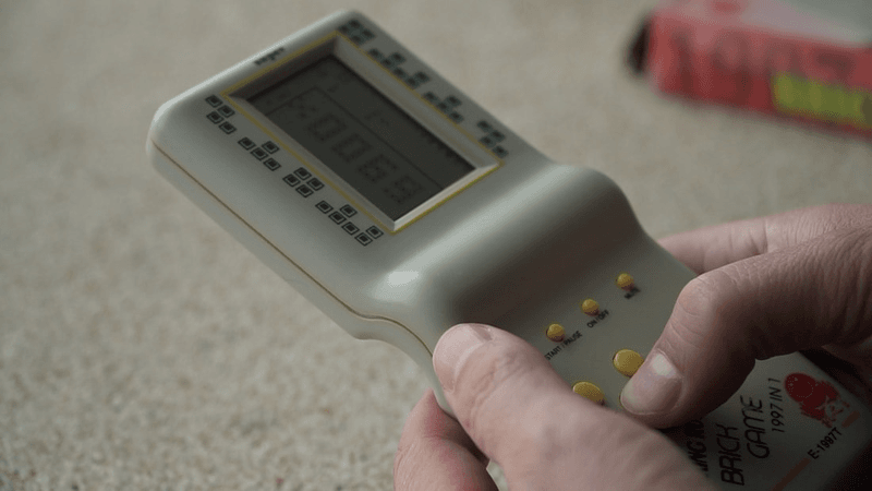
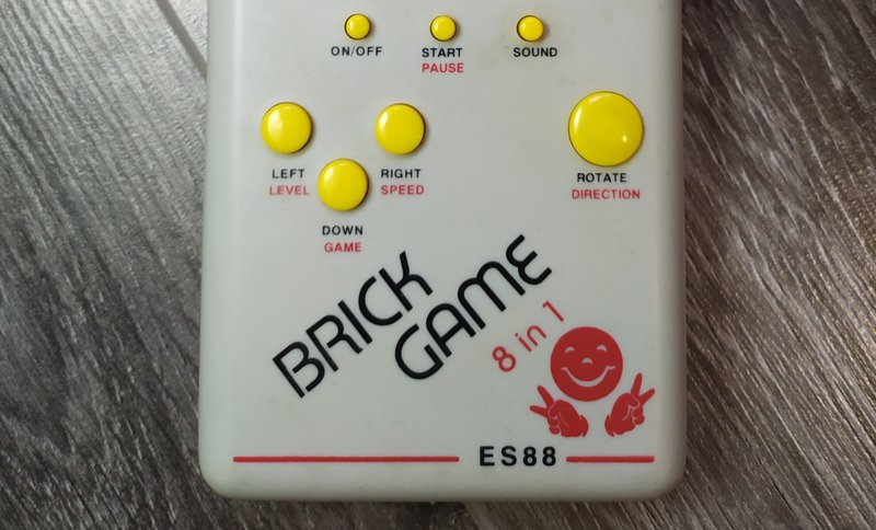
This iconic console had both kids and adults in a chokehold back in the 1990s. Want to see how we recreated the Tetris design using Lunacy?
You can watch the video tutorial or keep reading for a step-by-step breakdown.
While Tetris itself was invented by the Soviet software engineer Alexey Pajitnov, the famous Brick Game pocket console was created in China. The sleek 18 × 7 × 2 cm design is a perfect one to replicate and play around with in Lunacy.

Making the console shell
First, we create a 1140 × 2565 px frame with a 40° corner radius to imitate the shape of the console. We then select the Rectangle tool to fill in the shape and change its color to #D6D2CB. To add to the realistic look, we set the fill type to Radial gradient.
After that, we add soft inner shadows to mimic depth and make the design look more three-dimensional.
We switch back to the Rectangle tool and add a shape for the curved divider between the screen and the buttons. Like with the first rectangle, we change the corner radius to 40°. In the Fills settings, we choose Linear gradient at a 20% opacity and add a Gaussian blur effect set to 40.
Next, we copy that same rectangle and tweak the gradient settings just a little to get that extra volume. Also, each rectangle excluding the one in the middle has its blending mode set to Multiply (100% opacity for the upper rectangle and 75% for the one below).
…and again! See where we’re going with this? With three separate rectangles with gradients and blurs applied to them, we mimic the curvature below the console screen.
Working on the screen
Once we’ve finalized the fills and gradients, we can group these three elements for convenience. After that, we add a new frame over our design and start working on the screen of the console.
The screen is a 626 × 800 frame filled with a rectangle with a linear gradient (#929160).
To make the screen appear less flat and lifeless, we need to add a frame. Above the screen, we place a thinner rectangle (#B4B4B4) and align it horizontally. We repeat the process around each side of the console screen until we get a nice clean outline.
To add even more depth, we set the color of the lower and the right edges of the screen to #D6D6D6.
Using the Rectangle tool again, we create two squares – one in the upper right and the other in the lower left corner. We double tap the square to activate the pen tool and drag the upper left corner towards the center to turn the shape into a triangle. After doing the same in the opposite corner, we adjust the colors of the triangles using the eyedropper tool.
We then place another 441 × 782 px rectangle, except this time, we want it outlined rather than filled in with color. With border thickness set to 4, we can now reposition the shape and move on to the little design elements around the screen.
Creating the tetrominoes
To create the little dark blue-gray tetris pieces called tetrominoes, we select the Rectangle tool and make a 22 × 22 px square shape, its fill set to #343E44.
The next step is to create a bigger 34 × 34 px square around it and leave it unfilled. We set its border thickness to 3, align the shape, and group the two squares.
To make it reusable, we click Create Component at the top of the canvas or just press Ctrl + Alt + K.
After that, we can duplicate it as many times as we want and build several different tetrominoes in a matter of seconds.
Once the shapes are ready, we group them and place them around the screen. Then we align them for a cleaner look.
Once we are happy with the spacing and positioning, we can start filling in the console screen with these same Tetris shapes. To do that, we copy one of the strings of tetrominoes and click Ungroup so that we can have a set of individual pieces again.
The fun part begins: drag and drop your shapes anywhere you want to imitate the actual game.
Next, we select the Text tool and write TETRIS in all caps using that same dark blue-gray color as the one we chose for our tetrominoes (#343E44), using a 48 pt Semi Bold Inter font.
Time for more rectangles. We create an 800 × 950 px rectangle, delete its fill, and add a 12 px border to it. We set the border fill to Linear gradient (#FFE865) and add an inner shadow effect for a realistic 3D appearance.
Using the Pen tool, we remove the section that goes over the TETRIS text, and voilà – there’s your perfect frame.
After that, it’s time to get creative with the in-game texts on the right. To imitate the original pixelated look, we pick the VT323 font, using 38 pt for the main text elements and 58 pt for the rest of the elements.
To replicate the cool fade effect you see around the shape that is coming next, we simply create a 4 × 4 square made up of tetrominoes, select the squares we don’t need for our shape, and bring their opacity from 100% to 20%.
Adding the control buttons
Time to move on to the lower part and create the buttons. To make the four main control buttons, we select the Oval tool and add a 110 × 110 px circle. With a Radial gradient fill (#FBE151) applied to it, the button looks almost perfect. To help it pop even more, we add 3 px borders with a Linear gradient (#808080) and an inner shadow effect.
For some extra definition, we add a 75 × 75 px circle on top of our button and only leave the outline visible. We then change the color to white, adding a Linear gradient to make sure the bottom half disappears entirely, and blend it with Gaussian blur.
You can play around with border thickness and gradient settings to adjust the glossiness of the button.
For the rest of the buttons, you just copy and paste the first one and add two perpendicular lines in the middle.
Now onto adding texts. Here, we use a standard 22 pt Semi Bold Inter font with a fill that matches our tetrominoes (#343E44).
We do the same for the three tiny buttons, except the size is reduced to 45 × 45 px and the highlights are barely noticeable.
For the big Rotate button, we copy one of the four control buttons and set its size to 200 × 200 px. Text formatting stays exactly the same, so it’s as easy as Ctrl+C, Ctrl+V with some adjustments.
Alternatively, you can use Ctrl+Alt+C, Ctrl+Alt+V to copy layer styles, fills, borders, and effects from one layer and apply them to another.
Final touches
To make the signature Brick Game logo, we use Montserrat Alternates, which is actually pretty close to the original console font. We set it to Medium, reduce letter spacing to -6, and increase the font size to 130.
For more precise text positioning, we use two separate text fields for “BRICK” and “GAME”.
Using the Inter font in Semi Bold at 55 pt, we type in “9999 in 1” – a claim that left millions of naive players disappointed back in the day. Those 9999 games were actually just repetitive variations of Tetris, Arkanoid, Snake, Tanks, and Racing.
To finalize the design, we open the Icons library from the left panel and search for a smiley face and a peace sign icon. We drag and drop those onto the canvas, adjust the size and rotation, and set their fill to #F23030.

There’s one last detail left to add: the line with console model name at the bottom. We use the very same shapes, colors, and fonts as the ones we picked when creating the yellow frame above the screen that has TETRIS written in the middle.
We create a line and apply the style of the rectangle to it from the context menu (via Copy/Paste as > Copy/Paste style). Or simply select the yellow rectangle, press Ctrl+Alt+C, then select the line and press Ctrl+Alt+V. For the text, we use Inter at 48 pt (#343E44). Finally, we select the line, press Enter, and use the Pen tool to separate it into two lines that frame the text. All done!
And there you have it, a nice and crisp Brick Game Tetris console art that looks like it took you several hours to create in Blender. Except with Lunacy, hours turn into minutes, and dozens of complex actions turn into a couple of mouse clicks.
Check out other Lunacy tutorials: