Discover how a smarter boarding pass design could drastically reduce airport hassles, speeding up boarding and saving precious time.
Every second, planes take off worldwide. We pay a lot of attention to costs, destinations, boarding, and many other things, but there’s one thing we don’t care about, and it applies to your boarding pass. Specifically, what kind of usability should it have?
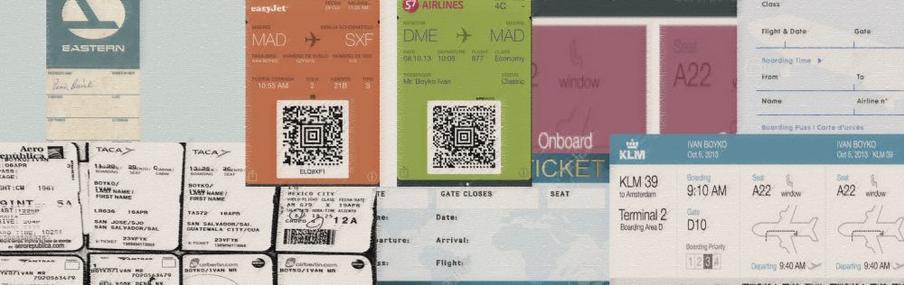
Airlines have 90 years of boarding pass design under their belts, but they’ve still managed to flub it.
Evolution
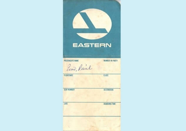
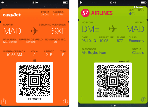
Primarily designed to be filled in by hand…
…they’ve remained virtually unchanged with thermal printers: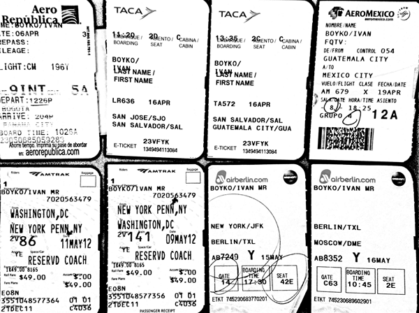
…and successfully migrated to Passbook:
So what’s wrong with them?
- Ungrouped fields. The time of departure and gate closing time are on two opposite corners.
- Tiny text. Good luck to old people checking it with bad lighting, not to mention while they’re on the go.
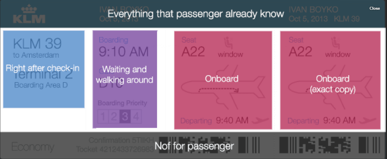
- Wrong visual priorities. The most prominent elements are the airport codes. If you know anything about your flight without needing to look at your boarding pass, it’s your origin and destination. You’d probably like to know everything else: gate, seat, etc.
Current boarding passes have hideous usability. There is no grouping of data in them, as well as a lack of visual dominants, grids, space, and good typography. Their readability is poor, like crumpled punch cards.
Instead, we should appeal to:
- Quantitative usability research. How long it takes (in seconds) to find the necessary information on the ticket?
- Percentage of mistakes. The ratio of latecomers to boarded passengers.
- Downtime caused by long pick-ups.
Our solution
Our version of a boarding pass: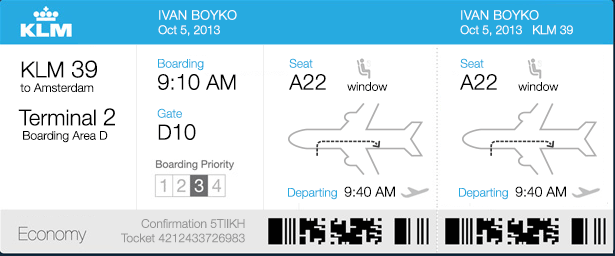
The idea is:
- All the right information
- At the right time
- Without any of the noise
Credits
We were highly influenced by Adam Glynn-Finnegan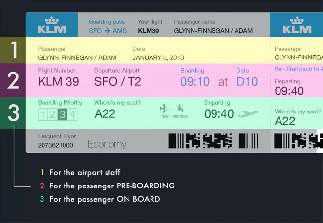
Please let me share the history of incremental changes of Gelnn’s design that lead to a complete redesign.
Improvement 1. Grouping
We’ve stripped the color lines and here’s what we’ve got: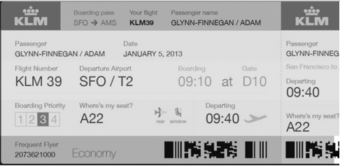
It didn’t look grouped at all; not in the way it’s meant to. Rather, we saw two groups: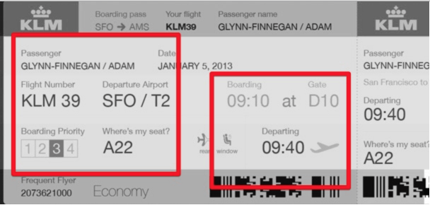
It looks a little bit like this:
“No Safety or No Smoking?” Funny #Design Fail ? #uxfail #crappydesign #humor pic.twitter.com/H80NRKRDyi
— Icons8 (@icons_8) June 6, 2016
So we started moving blocks before figuring out grouping horizontally is virtually impossible.
- On the one hand, you have to put the blocks close to each other
- On the other, they have variable lengths: names, cities, even dates can have very different lengths
We ended up with the grouping shown below: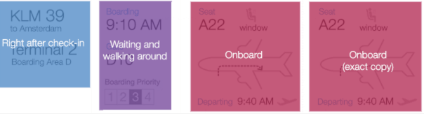
Improvement 2. Icons
Icons are something we’ve been doing since 2002. We thought we could contribute here.
We didn’t like the “rear” icon: it’s not clear which half of the aircraft is highlighted. Also, we thought we could use more precision: in wide-body aircrafts, flight attendants have to direct each of the 400 passengers to one of the aisles.
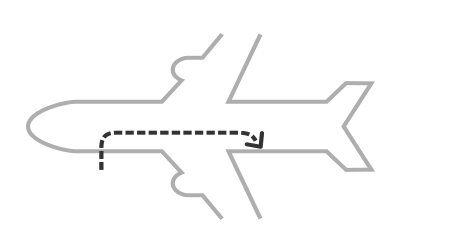
We ended up with an arrow. We love arrows; we think they communicate something savage in us; something we’re designed for. The mental model of getting to the seat is the same as the mental model of attacking a mammoth.
Cleaning up
We’ve moved everything unnecessary for the passenger to the header and footer: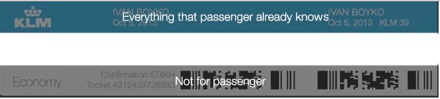
Effect
With a redesign like this we could expect:
- Fewer passengers missing their flights
- Fewer flight delays due to missing passengers
- Fewer delays for removing baggage of missing passengers
- Less load on airport information desks
- Faster boarding: people know where to look for their seat numbers
What else?
Flight attendants don’t need to point to an aisle 400 times per flight. They would save their vocal cords if they didn’t need to repeat “This way, please, to the back” or “Adelante, por favor.”
Some statistics: there are 500 million passengers per year in the United States alone. Saving just 10 seconds per passenger we save 159 years in the USA, every year. That’s two full human lives.
Two human lives per year!
About the Author
Ivan Boyko is the founder of Icons8. He got his first job after drawing a banner with CTR of 43%. After years of creating icons, he specializes in rapid prototyping and backlog grooming.