There is no problem in finding icons. Thousands of designers draw icons daily, and hundreds of websites offer them, often for free. The variety is huge. With that variety, however, comes a problem.
A typical app needs 10 to 20 icons. Some icons are used everywhere, like “settings” and “edit”, while others are unique to every project. If you start browsing websites for icons and downloading the ones you like, your interface would quickly turn into an exotic meal. Not the tasty and pleasantly surprising kind. The “I would never eat in this country again” kind.
You may love each one of these icons separately, but together they just “don’t fit”.
So how do you combine icons from different designers & icons sets so that they look consistent and pleasant on your website, app or any UI that uses icons?
Color
The first and most prominent thing you see with icons is their color. And the easiest way to combine icons from different sets is to get them all in one color.
Though it’s easier to use monochrome (one color), icons made in a consistent color palette work as well:
If you really like the icons you’ve found, but they are all in different colors, you can edit the icons yourself, or ask a fellow designer to help you. Keep in mind, that most creative commons licenses allow small edits such as color and size change. Some services (not mentioning any names) even have built-in recoloring. Who would have thought…
Recoloring icons at some-unnamed service
Style
The battle between flat design and skeuomorphism has gone on for an eternity.
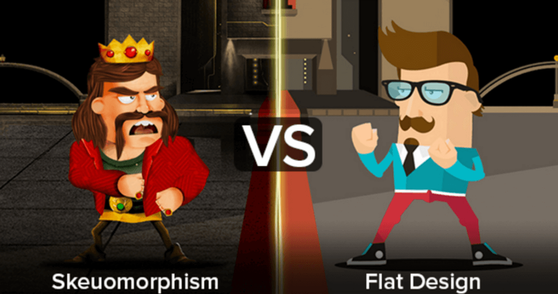
The image credit goes to Jixee.
Currently, flat design is winning. But I have no idea how long this will be the case, just as I have no idea what people will be wearing in 5 or 10 years. Fashion, they call it.
I’ve never understood the fashion industry. Those people are so clothes minded.
All I know is that you have to pick a side. You either go full flat-design or full skeuomorphism.
Look at this set. Color palette is consistent. Yet…
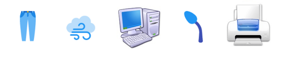
Combining flat and skeuo icons leads to many things: messy interface, wrong accents and, sometimes, total disregard of buttons as “buttons”.
Of course, within flat and skeuo styles there are many “sub-styles”. For example, in flat style most famous are Apple Human Guidelines for iOS and Google’s Material Design. They are well documented to the point where even line should be of certain width:
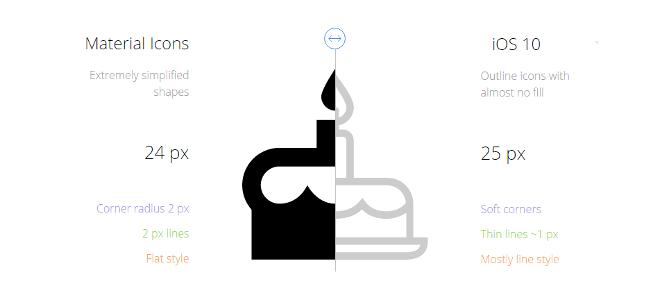
Combining icons that were made specifically for a target operating system is the surest way for UI to be consistent. These guidelines are widely popular and many designers follow them in their work.
So being consistent with color and style is paramount, yet there are still a few subtle, albeit important, details. An experienced designer will spot such flaws instantly, and the user will feel the classic, “I can’t tell exactly what it is, but something here bothers me”.
Perspective
Take a look at these 5 icons. They all are made in skeuomorph style and I adjusted color a bit, so they would look more consistent. And yet, they seem like icons for 5 different apps. (and they are, actually).
All five objects from icons can be incorporated into one picture.
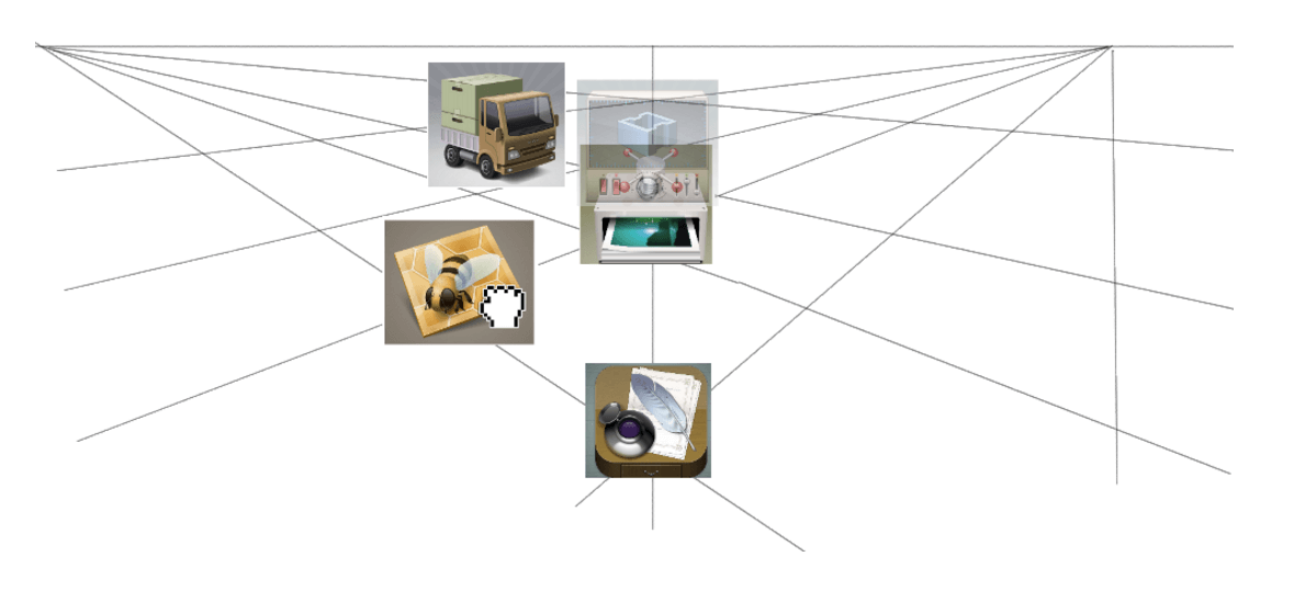
However, between them, scattered around in several places, there won’t be any consistency. And in a world of icons, consistency is everything.
Icons should look as if they are a part of a one panel, interface. Don’t forget that first icons were used in “offline” interfaces, and our perception of them in the “digital” world is hugely affected by this fact.
I want to press them. Do you?
Shadows
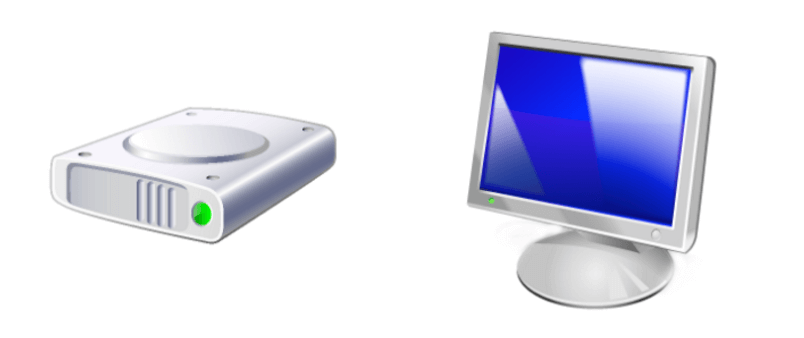
Another sign of consistency is the light. Or shadow, for that matter. Take a look at these two icons:

It seems like the sun is only shining for one of the icons. A direction of light is also important so that icons would fit together. Either the sun is the same for all, or there is no sun for anyone. *Dramatic pause… *
Note: though shadows are often used in skeuomorphic style, sometimes they are incorporated into flat design as well. But the principle stays – same shadows for every icon in a group.
Visual Weight
Visual weight is how big, dense, and heavy an icon is perceived. The theory is explained in-depth here. In short, icons should look nearly identical in size.
Take a look at these two icons.
Now squint your eyes so that you see only big washed out shapes:

See the big difference between the size of these two forms? That’s a big NO-NO. This example is pretty extreme, so let’s look at this comparison between two other similar sets:
In terms of visual weight, the upper set is clearly out of balance. And all you needed is to squint your eyes.
Details
The devil is in the details, they say. Well, “details” is a broad topic, so I’ll try to be very specific.
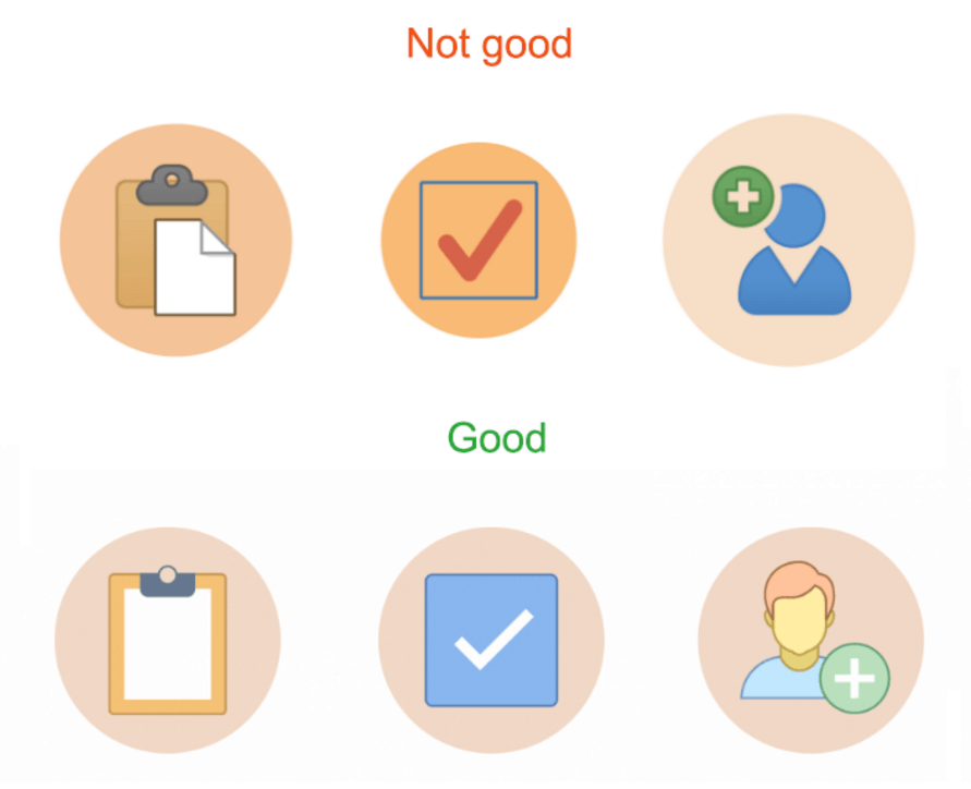
Repeated Elements
Sometimes designers incorporate some element or trait into their designs, so their set would look unique.
Take a look at the pixelated element in the right corner of every icon – any subsequent icon should have it as well. Another example of a repeatable element would be user icons:

So here’s a thing – any repeatable element of style should be… well, repeated.
Amount of Details
Another case: consistency may also be disturbed by different amounts of details in icons. Simply put, all icons should be either simple, or complex. Mixed combinations act quite unpredictably. Users won’t know what’s a button and what’s an image. Bad UX.
Final Thoughts
As I’ve repeatedly pointed out, the only thing you have to strive for while combining icons from multiple packs is consistency. Consistency. Consistency. Consistency. An experienced designer decides whether icons fit together or not almost intuitively, and the list of possible attributes (shadows, styles, lines) can be endless. However, in this article, I tried to pinpoint the most important, and often ignored ones, so we all could become better at “gathering” our interfaces.
Hope you enjoyed the article. If you have something to add – I welcome your feedback in the comments.
About the author
Andrew started at Icons8 as a usability specialist, conducting interviews and usability surveys. He desperately wanted to share his findings with our professional community and started writing insightful and funny (sometimes both) stories for our blog.
Try free tools for creators by the Icons8 team
Also, get the lists of free vector software and free photo editing software.