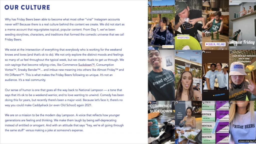
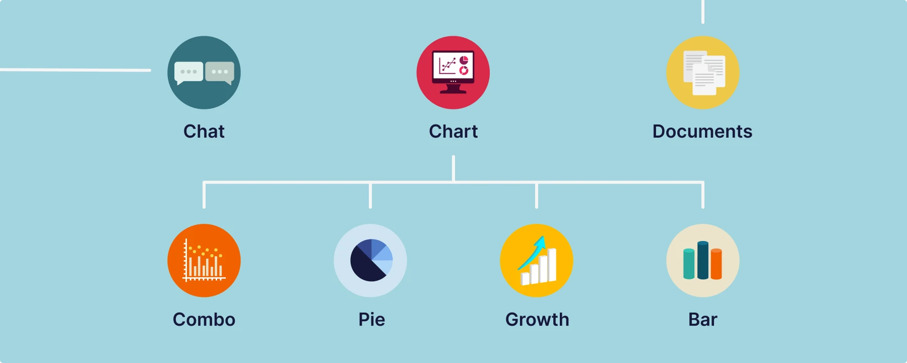
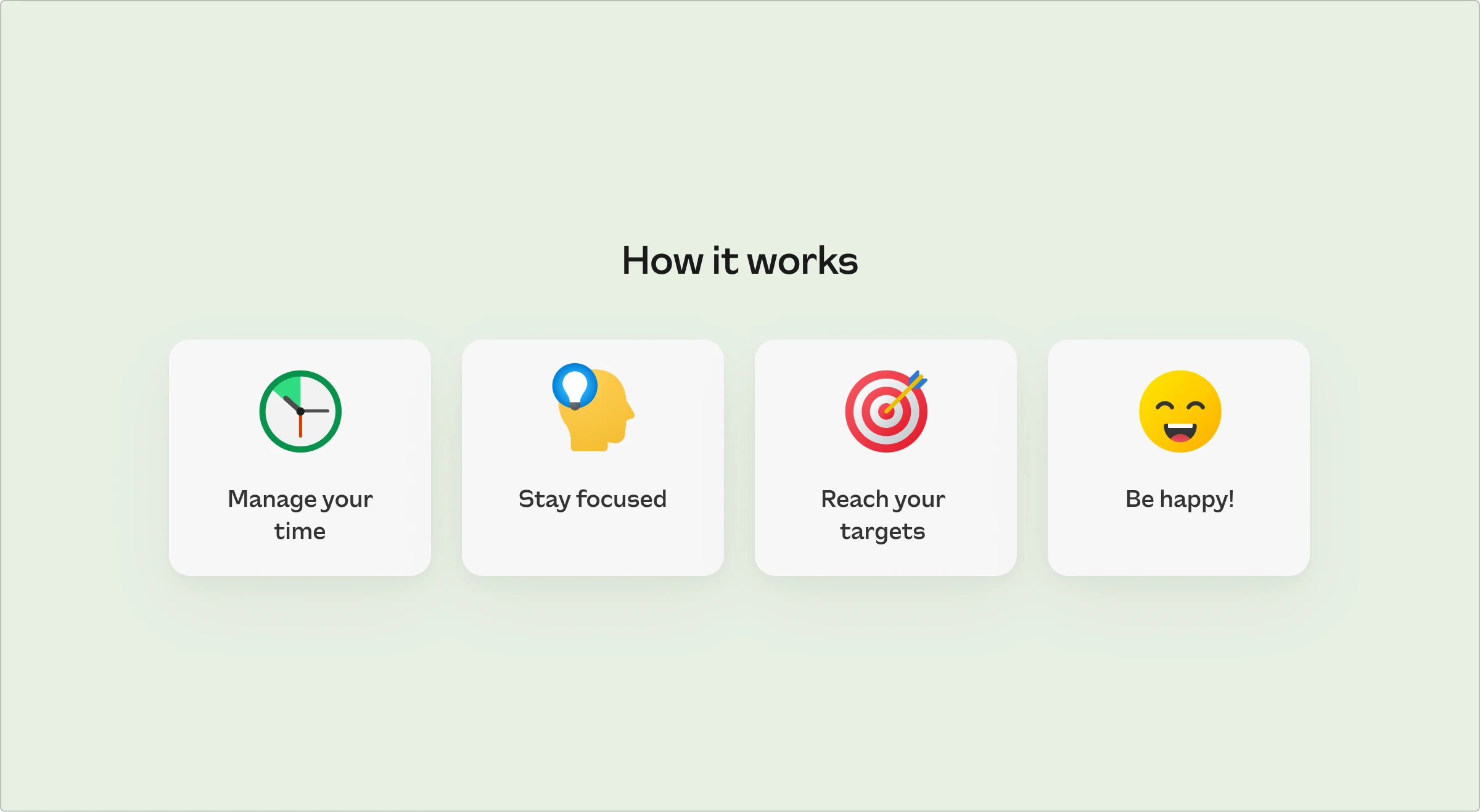
Learn how to craft a winning pitch deck with essential elements and design tips. Discover the power of visual consistency using Icons8’s high-quality graphics.
A well-designed pitch deck can be a game-changer for startups, capturing investor interest and securing significant funding. Successful pitch decks, like those of GTX and SQUIRE, have attracted millions in investment by effectively conveying their value propositions.
The role of a pitch deck designer is crucial in crafting these high-impact presentations, combining compelling storytelling with visual appeal to create an irresistible pitch. In this article, we’ll delve into what makes a pitch deck successful and share expert tips on designing your winning deck.
Contents
What is a pitch deck?
A pitch deck is a brief presentation used by startups and businesses to give potential investors an overview of their company. It typically includes essential information about the business plan, product or service, market opportunities, financial projections, and the team.
The primary purpose of a pitch deck is to attract investors by succinctly presenting the company’s value proposition and growth potential. Unlike other presentations, a pitch deck is designed to convince investors to fund the business, making it a critical tool for securing investment.
Key elements of a successful pitch deck
A successful pitch deck consists of several essential slides, each serving a unique purpose. Let’s break down these elements using real-world pitch deck examples from successful companies like GTX, Aphea, Bio, RoadRunner, Folx, Kyra, Convelio, MuckRack, and Pluang.
Title slide
The title slide should immediately convey the company’s name, logo, and a brief tagline or mission statement. Keep it simple and visually appealing. Use high-quality images or mockups to illustrate your product or service.

Pluang’s title slide is simple yet effective, showcasing their app interface and the tagline “The leading investing super app for Southeast Asia.” This immediately communicates what the company does and its primary market.
Problem statement
Clearly define the problem your company aims to solve. Use data and real-world examples to make the problem relatable and urgent.
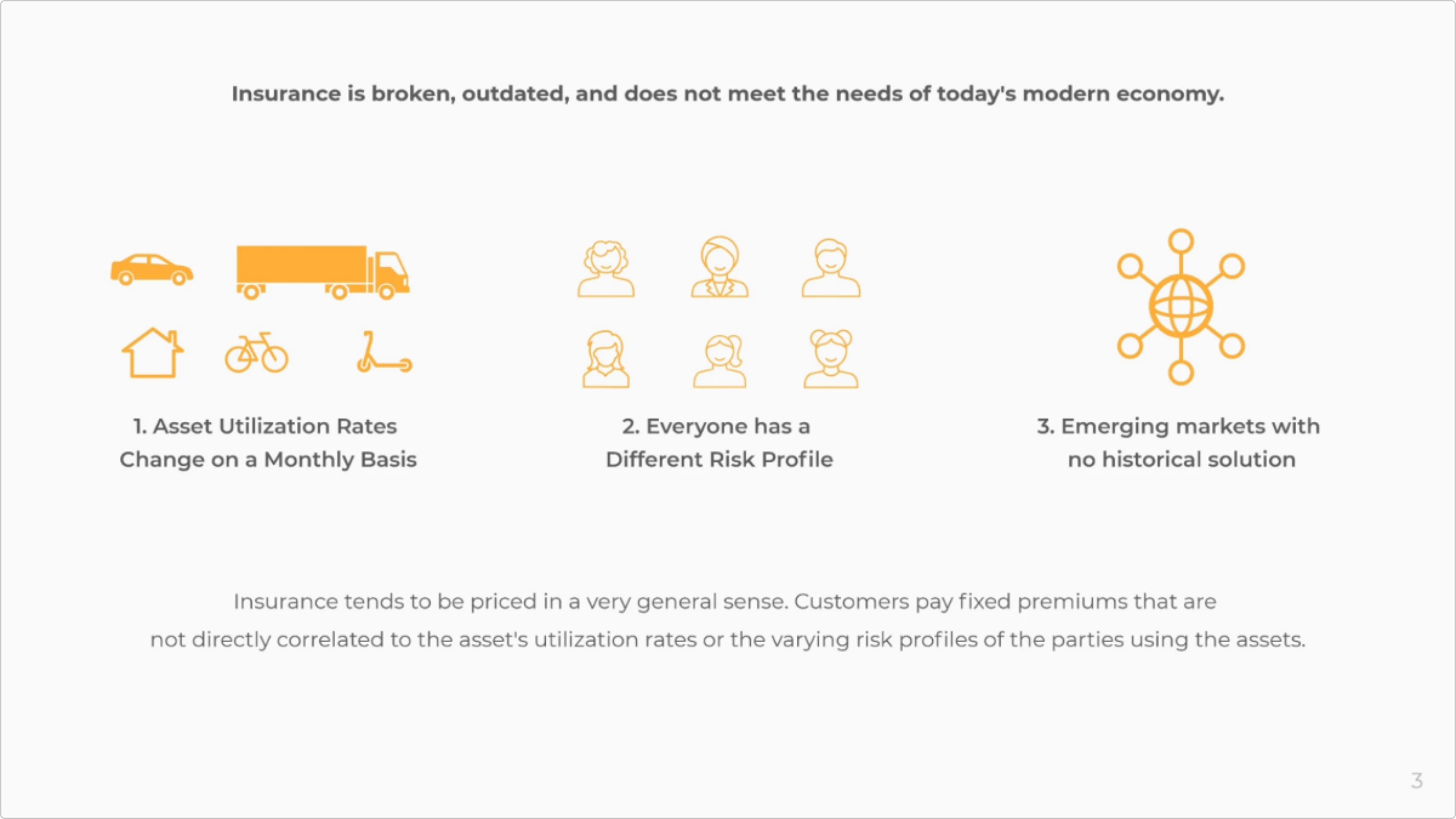
Lula highlights the outdated, generalized pricing in insurance, underscoring the need for personalized and episodic insurance solutions.
Solution
Present your solution and how it effectively addresses the problem. Use visuals and comparisons to show the benefits of your solution over current alternatives.
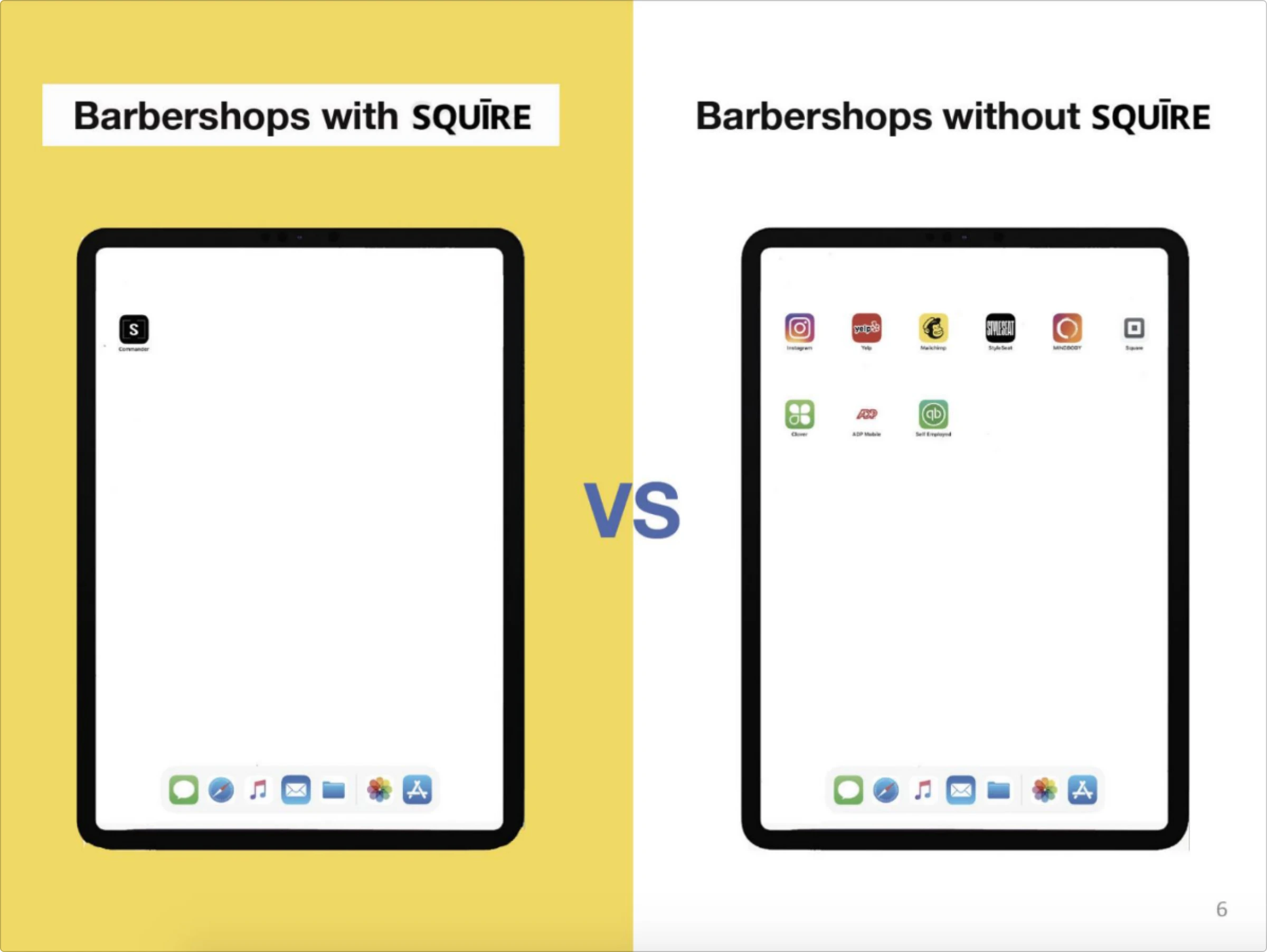
SQUIRE effectively demonstrates the value of its solution by comparing barbershops using their platform to those that don’t. The slide shows a clear visual difference: barbershops with SQUIRE have a single, streamlined app, while those without it rely on multiple apps, leading to clutter and inefficiency. This comparison highlights how SQUIRE simplifies operations by integrating essential tools into one app, making it easier for barbershops to manage their business effectively.
Market size
Showcase the potential market for your product or service. Use credible sources and data visualizations to back your claims.

Lula’s pitch deck effectively showcases the vast potential in the US insurance market. By emphasizing fragmentation and the underserved commercial sector, Lula underscores the significant opportunity for innovation and growth. This sets a compelling stage for Lula’s targeted approach to transforming the insurance landscape to meet modern needs.
Business model
Explain how your company plans to make money. Break down your revenue streams and include pricing models if applicable.
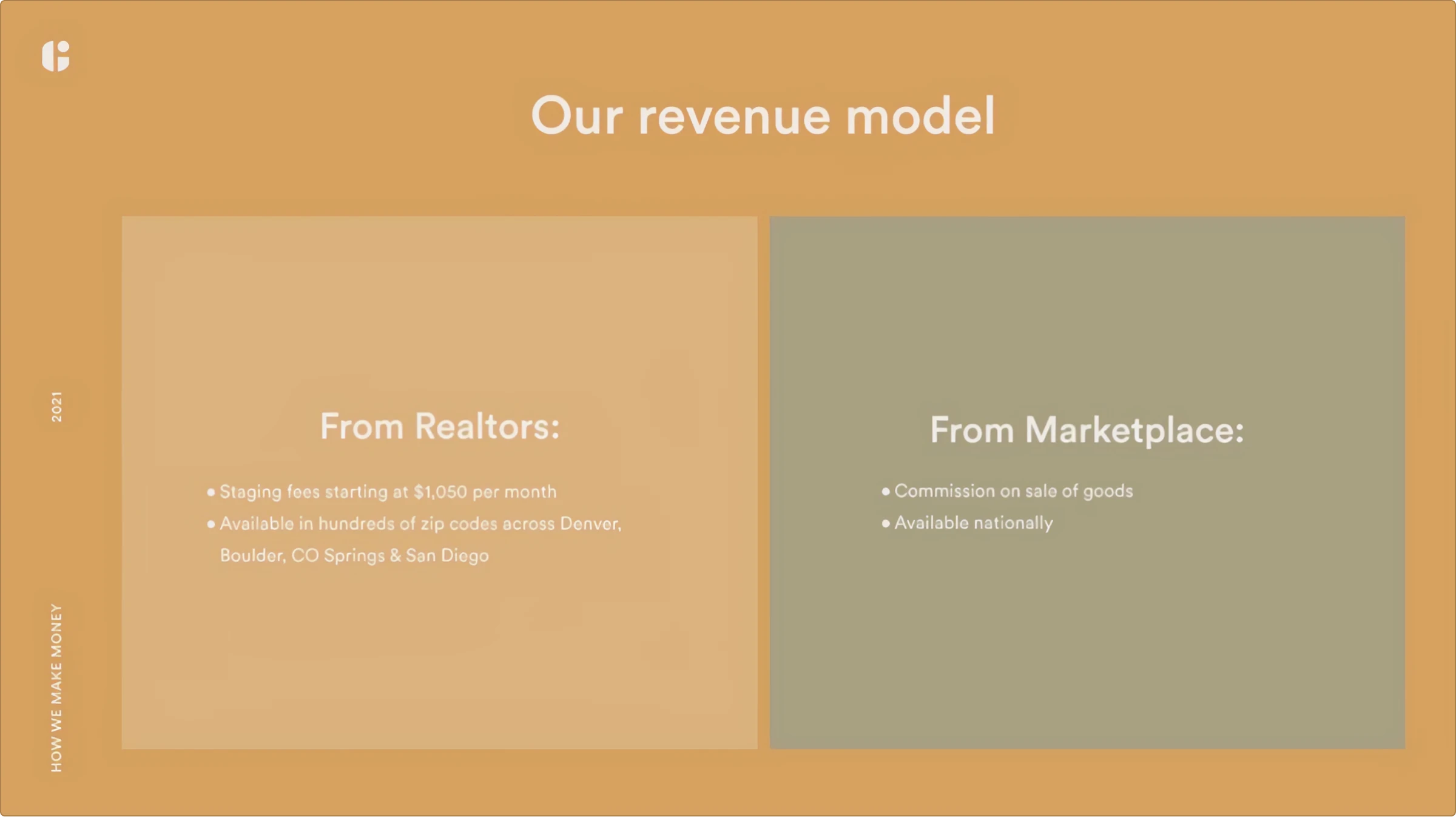
Guest House breaks down its business model by showcasing its various revenue streams, including partnerships. This provides a clear picture of how it plans to generate revenue.
Competitive analysis
Identify your competitors and highlight what sets you apart. Use a competitive matrix to compare features and benefits visually.
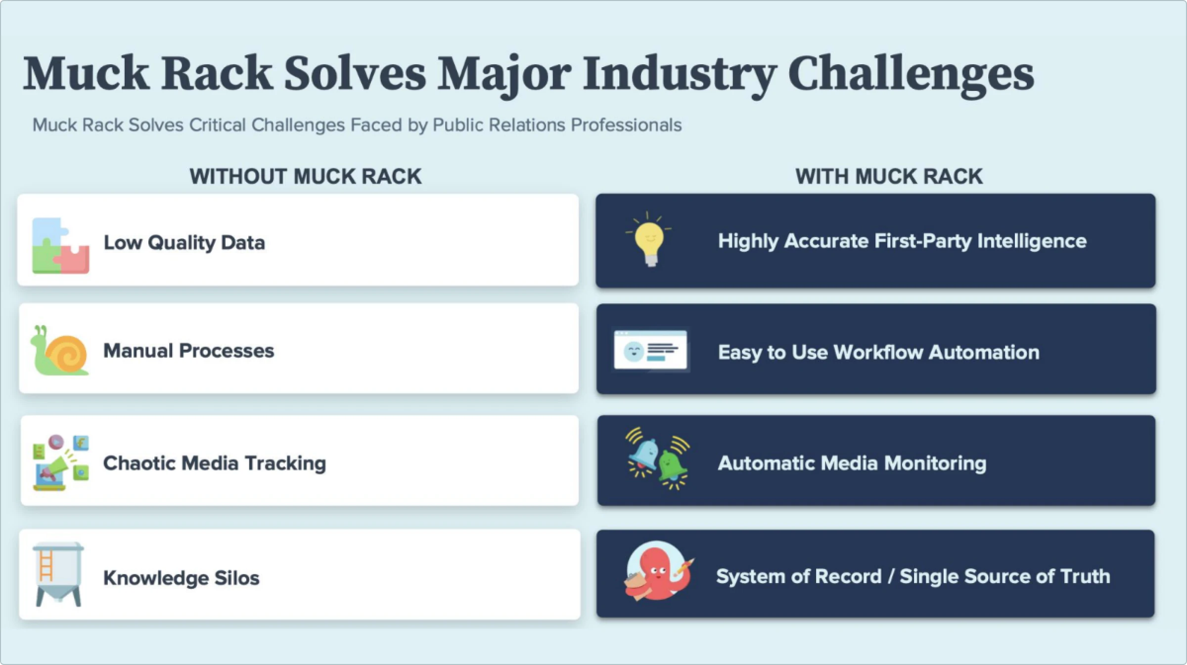
MuckRack compares its PR management platform with traditional PR methods, demonstrating its superior features, such as real-time media monitoring and automated workflows, which give it a competitive edge.
Financial projections
Present your company’s financial forecasts. Include key metrics such as revenue growth, profit margins, and market share.
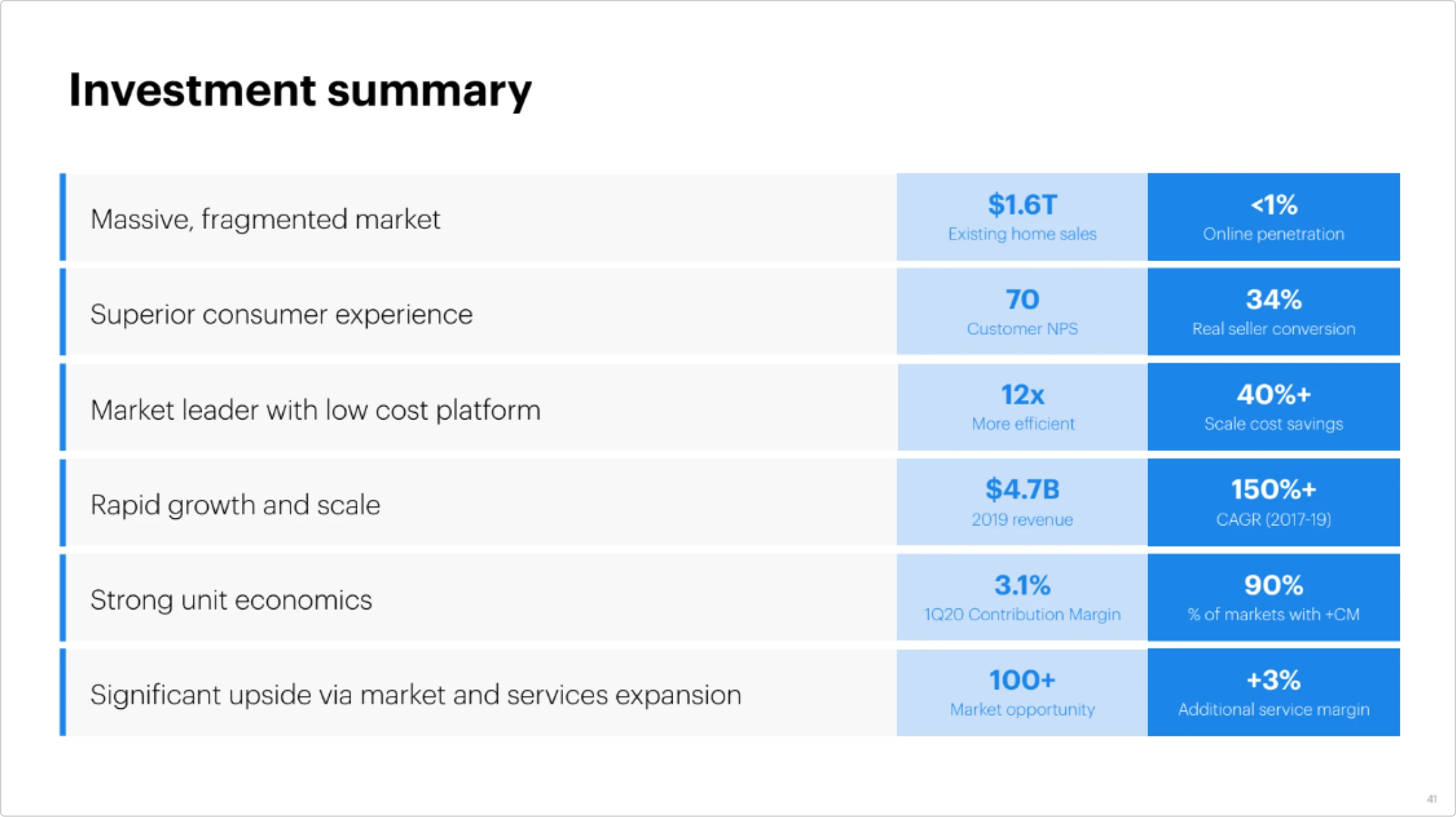
Opendoor’s investment summary effectively highlights its strong financial health and growth potential. They emphasize rapid growth, operational efficiency, and significant cost savings. The summary points to a solid track record of revenue growth, strong unit economics, and a high percentage of profitable markets. This demonstrates their ability to scale and maintain profitability, making a compelling case for investors.
Team
Introduce the key members of your team and their relevant experience. Focus on expertise and past successes that are directly relevant to your business.

Opendoor introduces its team by highlighting its key members’ extensive experience and expertise. This builds confidence in their ability to execute their business plan.
These pitch deck elements and examples demonstrate how well-crafted presentations can effectively communicate a company’s value proposition and attract significant investment.
Pitch deck design principles
Creating an impactful pitch deck involves compelling content and effective visual design. Here are some best practices for achieving a professional and engaging look:
Consistency in color schemes and fonts
Use a consistent color scheme and font style throughout your deck. This uniformity helps create a cohesive and professional appearance. Choose colors and fonts that align with your brand’s visual style.
Importance of whitespace
Use whitespace effectively to avoid clutter and improve readability. Whitespace can make your content stand out and help guide the viewer’s focus to key points.
High-quality images and icons
Utilize high-quality images and icons to make your slides visually appealing. Icons8 offers a great selection of professional icons and illustrations that can enhance the look of your deck. High-quality visuals can make a significant difference in how your presentation is perceived.
Common design mistakes to avoid
- Overloading slides with information. Avoid cramming too much information onto a single slide. Keep your slides concise and to the point.
- Inconsistent design elements. Ensure all design elements are consistent, including font sizes, colors, and image styles.
- Poor quality images. Always use high-resolution images to maintain a professional appearance.
- Lack of visual hierarchy. Use headings, subheadings, and bullet points to create a clear visual hierarchy and make your content easier to follow.
Perfect graphics for the pitch deck
Visual consistency is key to creating a professional and polished pitch deck. Here’s how to achieve it:
Using consistent icons
Ensure that all icons follow a uniform style. This creates a cohesive look and reinforces your brand identity. Consistent visuals maintain a professional appearance and make your pitch deck more visually appealing. Matching icons can elevate your design, making your message clearer and more engaging.
Utilize Ouch! illustrations for uniform visuals
Ouch! by Icons8 offers a wide range of high-quality illustrations that can be used to maintain visual consistency. These illustrations are designed in a cohesive style, making integrating them into your deck easy. You can find them here.
Leverage the Illustration Generator by Icons8
The Illustration Generator by Icons8 allows you to create custom illustrations that match your specific needs while keeping a consistent style. This tool is particularly useful for tailoring visuals to fit the unique elements of your pitch.
Let’s create a pitch deck for PetPulse—an app for automizing your pet’s check-ups. We used the 3D Business style from Ouch! as the main graphic for this project. Here’s the title image for this pitch deck:

Storytelling is the best way to explain how PetPulse works. Consistency is key here.
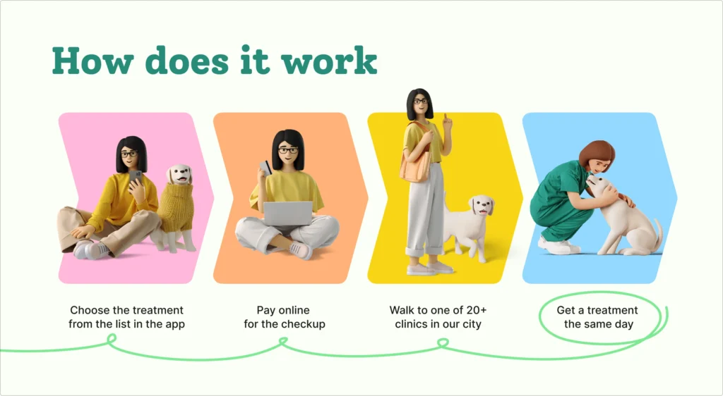
However, we faced an issue with the closing slide. In our vision, there should be a dog in the carrier looking happy. It’s quite a unique request, and we couldn’t find anything that would fit.
Here comes Illustration Generator.
The prompt for the first try was “white-colored dog in the brown-colored carrier” in the 3D Business style and 1:1 ratio.
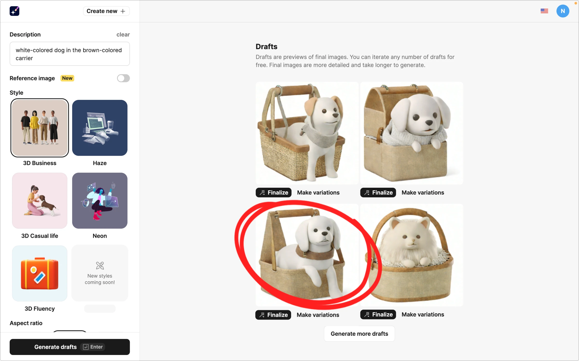
The third puppy looks adorable, but we don’t quite like the collar. The “Make variations” feature comes in handy in our case.
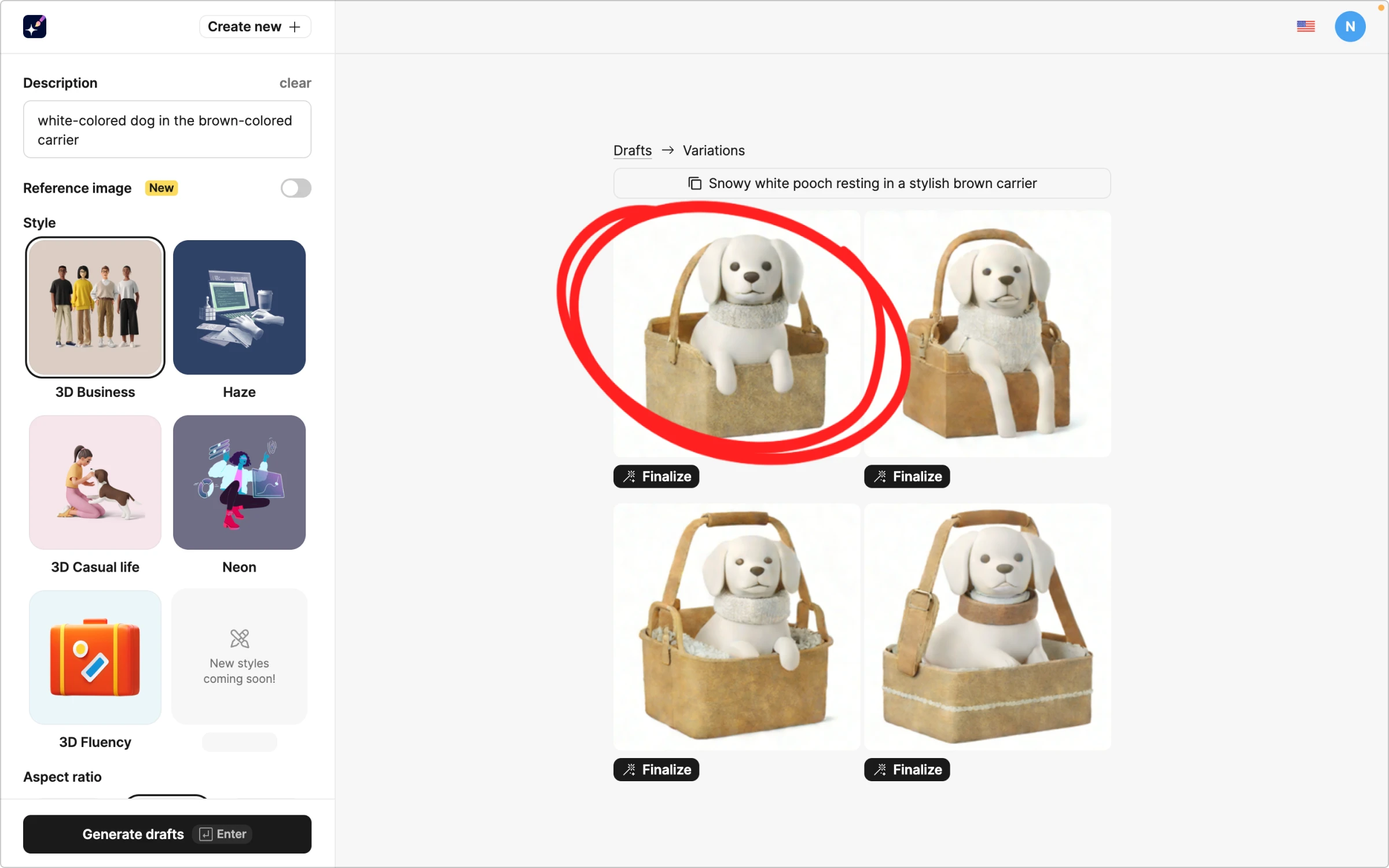
The first one is perfect! So, we hit “Finalize,” added a transparent background, and copied it to our design.
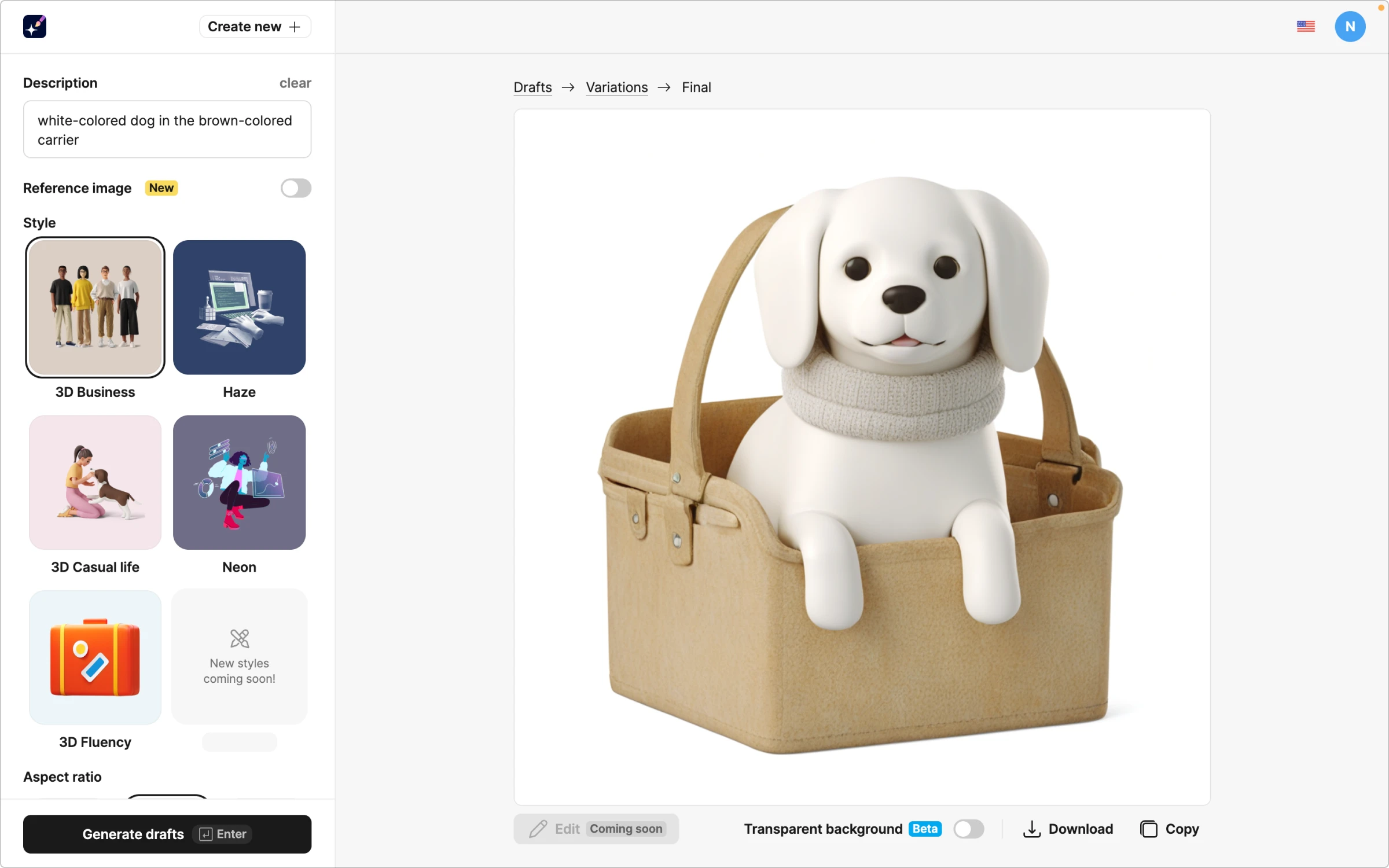
The ideal closing slide for our pitch deck is to make investors open their wallets.

Wrapping up
Creating a successful pitch deck requires balancing compelling content and sleek design. Focus on clear storytelling, highlighting your value proposition, market potential, and business model. Visual consistency is key — use high-quality icons and illustrations from Icons8 to maintain a cohesive look. These tips will create a pitch deck that captivates investors and sets your startup up for success. Happy pitching!
About the author
Adeline Knight is a content writer at Icons8. She started as a professional photographer before falling for design. She enjoys experimenting with new tools and uncovering tips and tricks to simplify her life and boost her creativity.
