Any marketer knows just how important email marketing is to growing a business and boosting sales. In fact, for every $1 you spend, email can return $38.
Table of content
- Use a simple newsletter design
- Make your call-to-action button stand out
- Use different email designs for each segment
- Use high-quality and eye-catching images and colors
- Add videos to your newsletters
- Add GIFs to your newsletters
- Use mobile-responsive email templates
- Experiment with different fonts
- Key takeaways on email design hacks to boost conversion rates
However, most businesses focus on sending emails to customers and staying on schedule, with little thought to the visual design.
While the email content communicates the necessary information, the design elements catch the recipient’s attention and entice them to continue reading once they open your newsletter.
For that reason, we’ll discuss some design life hacks on how to increase the conversion of a letter. Let’s dive in!
Use a simple newsletter design
Your newsletter template design is a crucial element to consider when you want to increase your conversion rates.
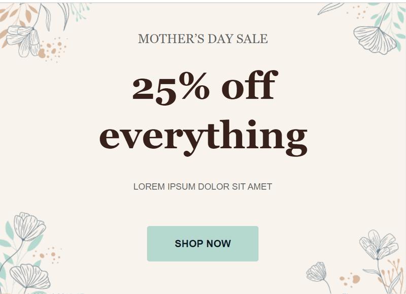
A simple yet eye-catching design can help you retain and attract more customers. In other words, the fewer the details, the more likely it is to maintain your customer’s attention. So, ensure your email designs are easy for recipients to understand your message in one go.
Here’s an example:
Make your call-to-action button stand out
Your call to action (CTA) is the lifeblood of your email campaigns. They should stand out and create urgency.
The CTA will vary depending on your audience and services and products. In essence, each CTA should directly ask your visitors to take action on the service or product they like.
Here’s an example of a great CTA button that stands out:
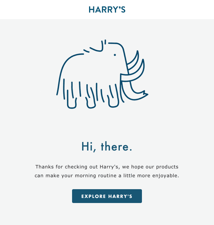
How’s this for a focused and simple email? The CTA is surrounded by plenty of white space and stands out from the rest of the content.
The next example shows how you shouldn’t craft your CTAs:
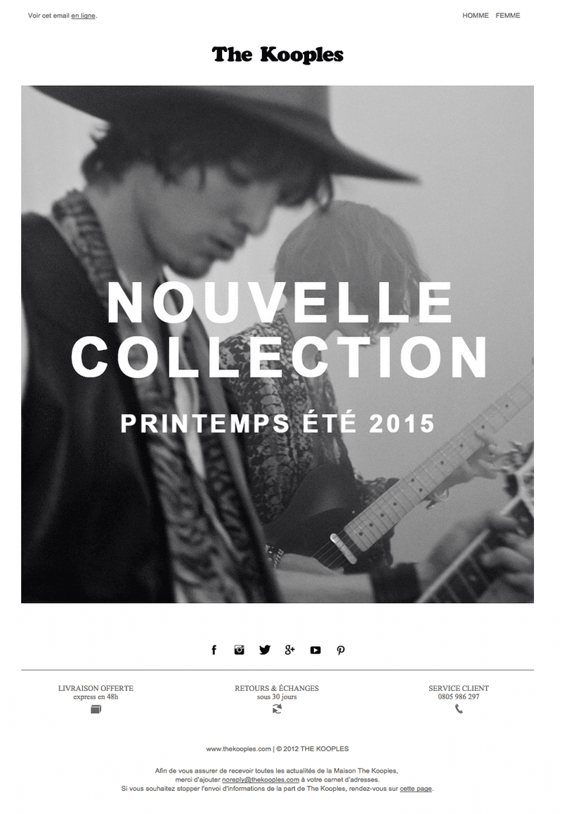
Where’s the CTA?
Exactly. There’s basically no CTA in this email, so we’re assuming you just click on the image, which may be easy for recipients to overlook.
So, put as much effort into creating an excellent CTA as you would the rest of your email.
Here are some ways to make your call-to-action button stand out:
- Use different colors to highlight the CTA and make it easy for readers to recognize and understand it.
- Use action-oriented, second-person verbs to encourage subscribers to click.
- Optimize the CTA for mobile browsing.
- Personalize your CTAs for different audiences. For example, if you’re selling men’s and women’s shoes, you can use “Shop Men” as the CTA for the men’s audience and “Shop Women” for the women’s audience.
Use different email designs for each segment
Modern email marketing tools let you segment your audience based on specific criteria. As a result, you can send relevant messages to each segment and use different designs to engage them further.
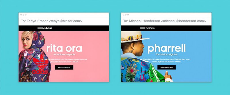
For example, if you sell men’s and women’s jackets, you can segment them into men and women. You can then send newsletters to each segment with different designs but identical messages, taking into account the characteristics of each audience. That’ll help you stand out and increase the engagement and dwell time of the newsletter.
Here’s an example:
Use high-quality and eye-catching images and colors
Images have a higher chance of capturing attention than text. And the right images communicate the right message and make people take the desired action.
The goal of using images in newsletters is to elicit an emotional response. So, you must find or create the appropriate image to support your message.
Here’s an example:
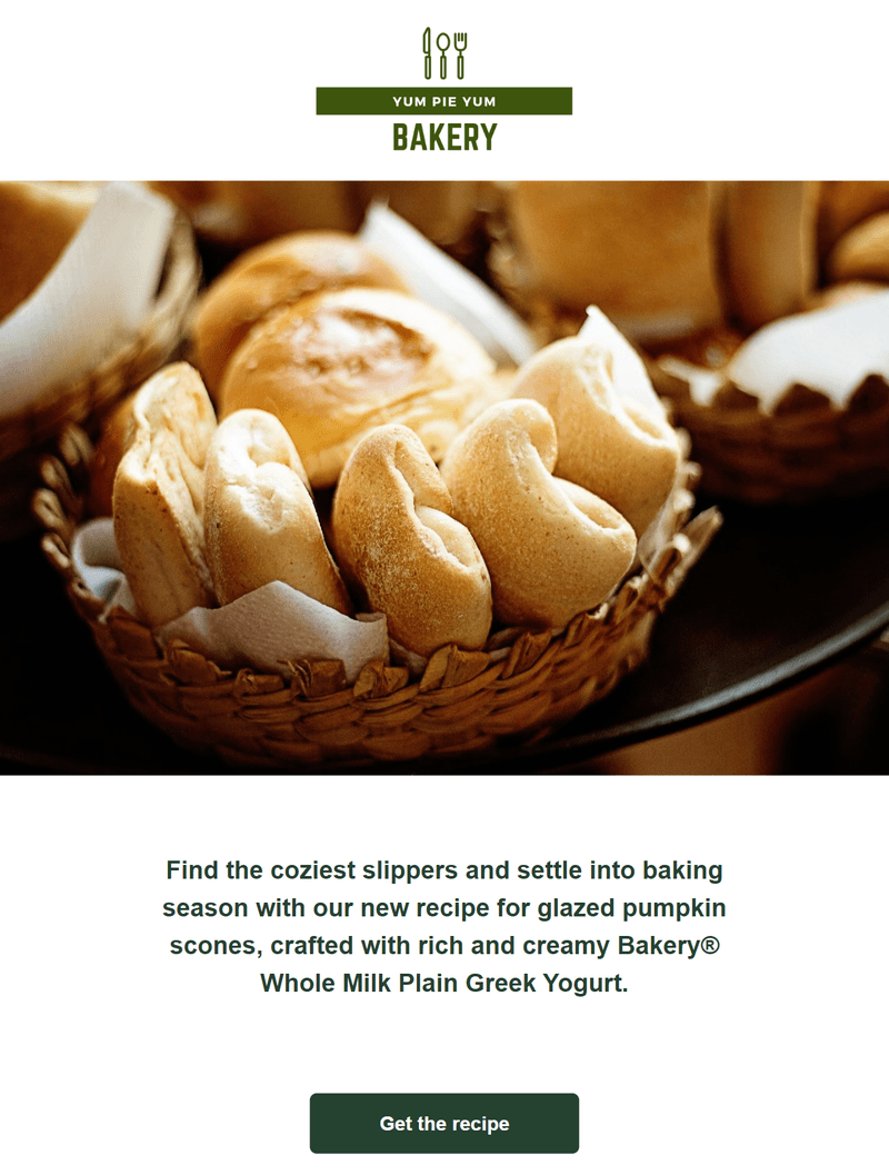
Here are some ways to create eye-catching email graphics:
- Use high-quality images (at least 800px wide) to ensure your email looks good on desktop and mobile devices.
- Use a simple color palette that fits your brand and reflects your message.
- Experiment with email design and graphics to create messages that look great on any device.
- Format your images correctly, so readers can see them. Stick to JPEG and PNG for the best results.
Add videos to your newsletters
Adding videos to your newsletters can increase your open and engagement rates and boost your sales and ROI. That’s why 86% of brands use video as a marketing tool.
In fact, videos are so effective that 92% of marketers consider video an essential component of their marketing strategy.
With that in mind, here are more benefits of using videos in your newsletters:
- Branded videos help you show your audience what your brand is about rather than just telling them. As a result, it builds credibility and creates customer trust.
- Videos can boost your email click-through rates by 65% and open rates by 19%. As a result, it can increase the response rate of email types such as engagement and welcome emails.
- Videos boost conversion rates by enabling subscribers to better understand your products and services.
- You can use videos to explain complex topics to subscribers simply and boost their engagement and retention.
Here’s an example from a brand that uses a sales video in their newsletter to send a holiday greeting to their recipients:
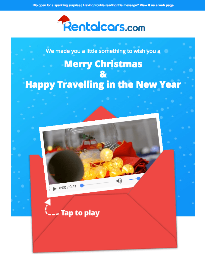
Adding a video to your newsletter using email automation software is one of the simplest ways to do so. You’ll just sign in to your account, design your email, and then add a video block to your newsletter.

Add GIFs to your newsletters
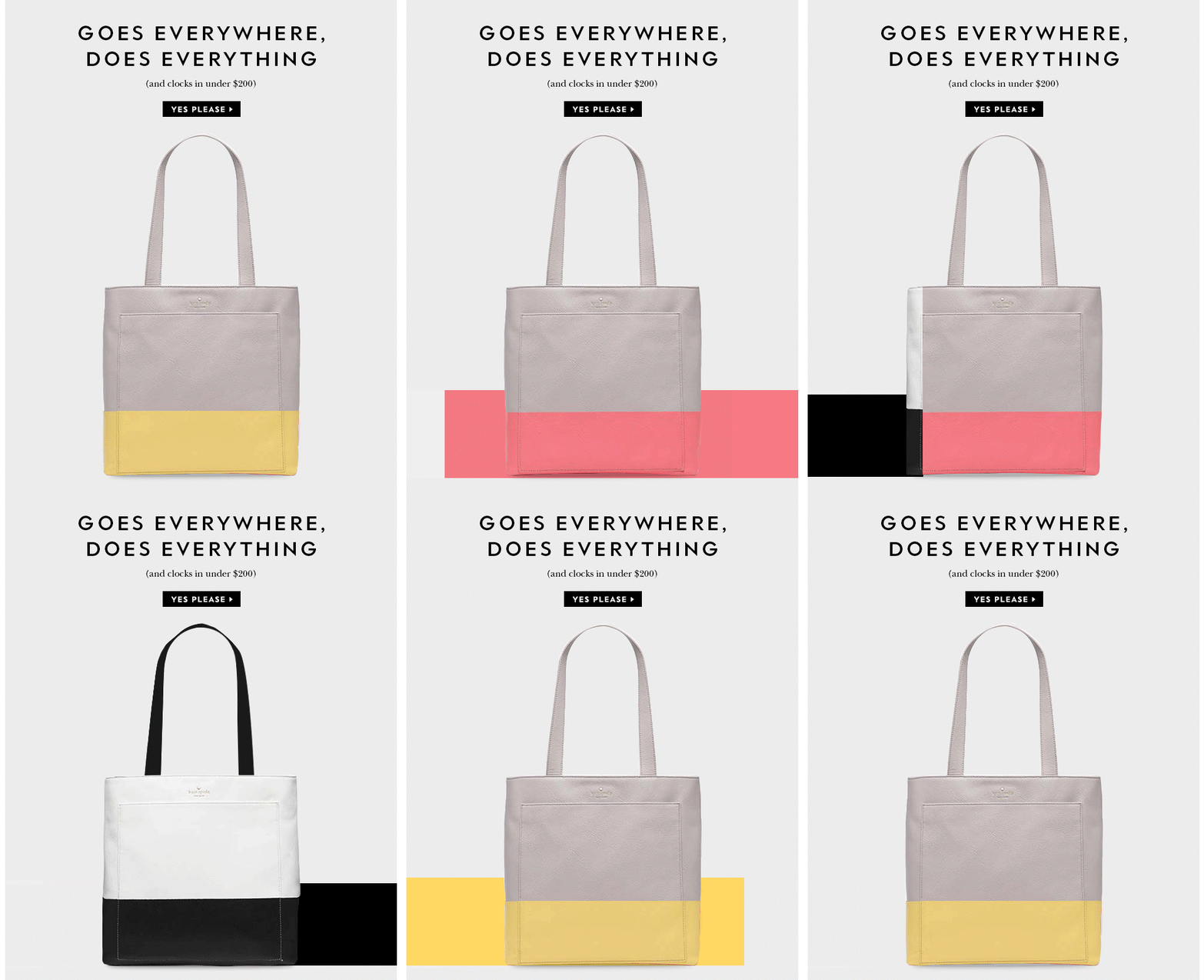
GIFs are typically noiseless animations you make from still images. While a static image can be an excellent option for your emails, GIFs make your newsletters so engaging that your subscribers can’t look away.
So, whether you plan to inform, entertain, educate, or instill a sense of curiosity, GIFs can boost your conversion rates by:
- Grabbing your subscriber’s attention and increasing their dwell time on the newsletter.
- Showcasing your product’s collection excitingly.
- Teasing an upcoming contest or event to instill the fear of missing out (FOMO).
Here’s an example:
Use mobile-responsive email templates
A responsive email template will adapt to any screen size automatically. Your newsletter will look great and be easy to read regardless of whether the recipient opens it using a computer, smartphone, or tablet.
Here’s an example:
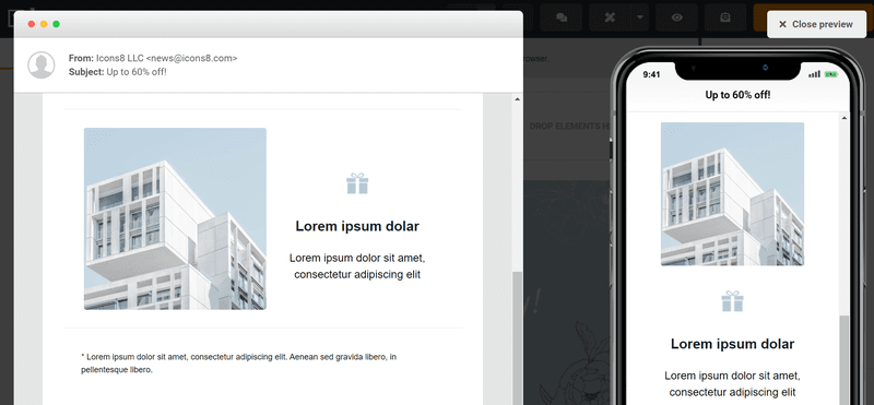
Almost half (43%) of your recipients open your emails using mobile devices. So imagine how many subscribers you’ll lose if your emails aren’t compatible with their mobile devices.
The good news is that most email marketing apps have libraries of responsive email templates you can use to design your newsletters quickly.
Experiment with different fonts
Fonts are a crucial part of your visual identity, so typically, you should use web fonts that resonate with your brand.
Web fonts also allow you to showcase your brand without relying on images for your text. Remember, locking essential copy in images limits user accessibility since screen readers can’t read texts on images. And having an important message in your images hurts the user experience if the person has turned off images by default.
So, experiment with different web fonts to emphasize your message and attract subscribers. You can combine bold and thin fonts. For example, you can use a bold font for the title and a thinner one for the body text.
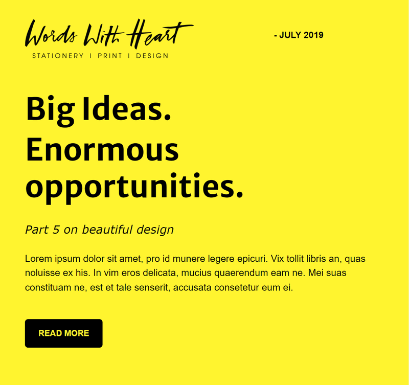
In the example below, we’ve used Merriweather Sans, Verdana, and Arial fonts for the headline, sub-heading, and body, respectively.
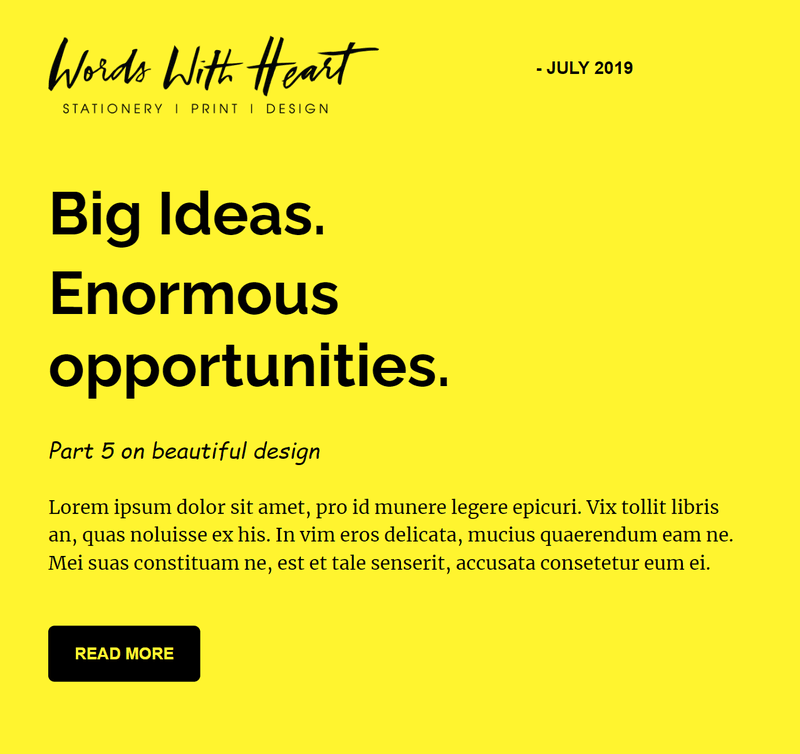
In the next example, we’ve used Raleway, Cursive, and Merriweather fonts:
That said, always have a web-safe font as a fallback option since they’re the default fonts you can find across most devices and systems. Examples include Arial, Times New Roman, and Verdana.
That way, if their email app doesn’t support the font you’re using, they’ll be able to see your fallback font.
Key takeaways on email design hacks to boost conversion rates
There you have it. Eight email design hacks to help you boost your conversion rates.
Use the design hacks above to help you get into your recipients’ inboxes and increase your conversion rates. Also, an email marketing tool will help you create stunning newsletters quickly while sticking to the email design hacks above.
About author
Skirmantas Venckus is a writer by day and reader by night. He hates talking about himself in the third person. He is also the growth hacker at Sender.net – the email marketing provider that is focused on user-friendliness, affordability, and utility.