Learn how to use the hottest logo design techniques wisely from these finance brands.
The success of businesses, especially those in the financial sector, depends on their expertise and the quality of their services. As a financial company, you must create a strong visual representation of these key characteristics in your branding. The first step is to make a powerful and memorable logo.
Adobe Express recently listed the latest logo design trends that can help you get some ideas. In this article, we will focus on the financial sector only because each business field has its own peculiarities.
Don’t forget the key foolproof logo design principle: keep it simple and incorporate modern design elements wisely. To give you some inspiration, here is a selection of some of the best finance logo designs that illustrate how to make a logo look professional and unique at the same time. So let’s get started.
Mastercard
Designed in 2016, Mastercard’s new logo is a simplified version of its old logo, which had two intertwining circles. The move towards simplification and lowercase lettering aligns with the trend of minimalism in graphic design, which reflects the shift to electronic payment methods and technology-oriented approaches. The trend towards minimalism in modern logo design stems from the need for a simplified brand image that can be translated to all types of media and platforms.
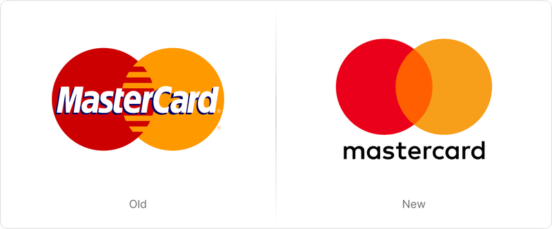
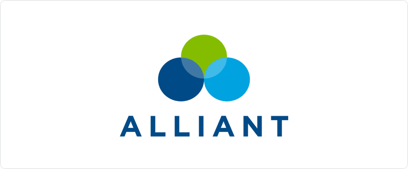
It is also worth keeping in mind that colorful circles will never go out of style. Alliant Credit Union is also a finance company that has a similar logo design.
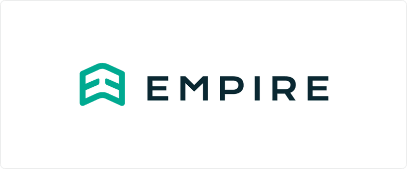
Empire (Financial Specialists)
This logo was designed by the Nektar Design agency. A quick glance at the logo suggests business excellence, growth, and sustained success.
The company’s logo symbol represents its dedication to progress. You might also notice that the arrow is composed of mirrored “E” letters, which highlight the name of the company. The Empire brand name is written beside this exquisite shape in a stylish yet straightforward sans serif font to convey the company’s future-oriented nature.
The use of an arrow to signify growth and progress is consistent with the trend of incorporating dynamic symbols that represent progress. The mirrored letters within the arrow add an element of uniqueness.
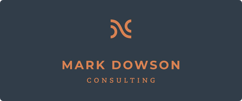
Mark Dowson Consulting
Mark Dowson Consulting provides top-notch business advice to companies to help them scale their business and increase their revenue and sales.
Therefore, their business revolves around fostering strong partnerships, which is beautifully reflected in their logo, which also includes the owner’s name to increase credibility. The logo icon of the finance company appears, at first glimpse, to be a fragment of an icon depicting a percentage.
Undoubtedly, that already provides the customer with a good understanding of the nature and services of the company. If you look closely enough, it is a simplified vector icon showing a partnership between two individuals shaking hands.
The abstract icon representing a partnership mirrors the trend of using abstract symbols to convey a brand’s image clearly yet gracefully. Abstraction in logo design is not a new trend, but when paired with elegant fonts like a combination of a serif and a sans-serif, it can signify professionalism with a touch of modernity.
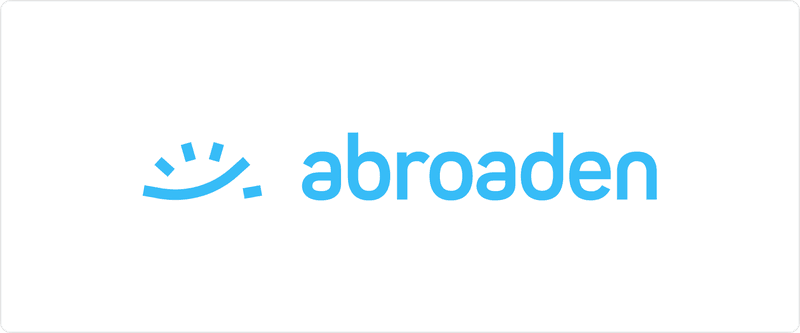
Abroaden
Living abroad can present several challenges when it comes to managing one’s finances. Abroaden is an online platform designed for individuals who wish to increase their income streams while living abroad.
Brands like this cater to a certain demographic of young expats or those coming from another country to work. Designer Giuliano Rusciano‘s logo design perfectly illustrates the brand’s message.
Simple shapes and lines can form a complete image and effectively communicate a brand’s message in a simple way. By moving the long curved line past small lines, the investor signifies their growth and expansion into a more prosperous future and breaking barriers on their way to international investment.
Following the trend of minimalism and visual clarity, the brand has incorporated bright, youthful colors that convey positivity and approachability. The Abroaden logo exemplifies the brand’s mission, thus establishing it as one of the top finance companies and translating its core business values into an inspiring visual identity.
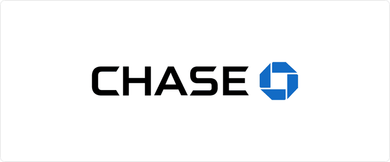
Chase Bank
Chase Bank uses a blue geometric pattern that the bank explains as a “single unit made up of separate parts” moving forward. The solid blue geometric shape (octagon) is iconic and easily recognizable, which is the goal of every brand.
The Chase Bank logo is still relevant in a world that is becoming increasingly digital due to its appearance on many business assets and merchandise. Chase incorporated the octagonal shape to establish itself as a stable, iconic, and professional brand.
Read more about some other famous brands that have recently added geometric shapes in their logo design as a part of the rebranding process here.
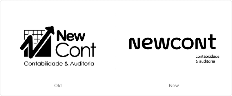
NewCont
NewCont has been in the accounting industry for over two decades. It needed a visual identity refresh to appeal to a new generation of consumers. The company partnered with Ave Design in order to undergo a comprehensive visual redesign.
In our opinion, the best part of this project is the logo design, which is both exciting and youthful yet simple and straightforward at the same time. This combo makes the ideal brand identity design for a modern company.
NewCont has updated its logo from a combination of symbols and text to a crisp, clear, and easily recognizable wordmark.
The designers employed a combination of lowercase and uppercase letters to maintain a youthful look and make it look more modern. The emphasis on simplicity and readability in the logo reflects the minimalist trend.
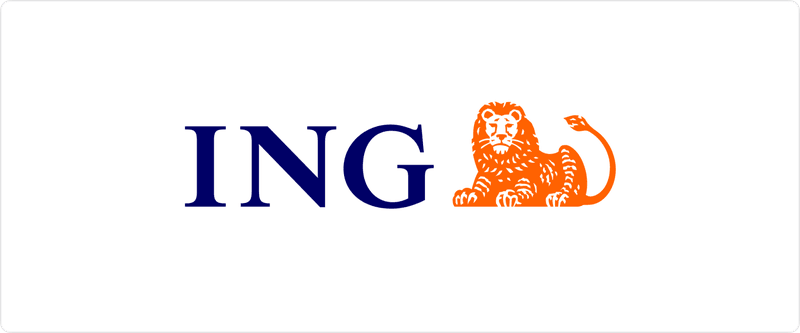
ING
ING is a leading institution of global finance of Dutch descent. The ING brand is promoted through its emblem, which shows a lion icon, a national animal, to convey a sense of financial stability. The emblem is orange since it is the color of the Netherlands. Incorporating the national symbols in the logo reflects the trend of infusing cultural elements into designs. These are effective, memorable, and relatable, especially for customers who have an association with the company’s home country.
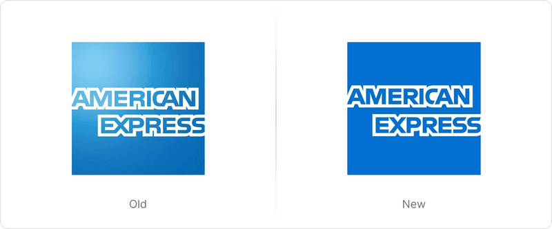
American Express
This is another famous logo that represents a lot more than what is apparent from the initial impression. With its smooth curves on the C and S, the typeface is both powerful and dynamic.
The emphasis on smooth curves and powerful typography aligns with the trend of using thick yet elegant fonts, which in this case are Benton Sans and Guardian. The shift to a solid, clean background signifies a move towards simplicity and modernity.
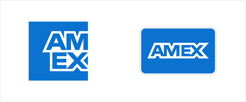
In addition, a favicon/icons version was also included in the rebranding for use on social media platforms (e.g. Twitter). Using only the letters ‘Am’ and ‘Ex’, this design reflects the well-known brand image of the company and their short nickname — AmEx.
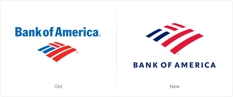
Bank of America
Here is another corporate logo that has been updated recently and yet another example demonstrating the effectiveness of simple geometric shapes in a flat design. Prior to this change, the lines that comprised the bank logo were close to each other, with less space between the shapes.
With its new design, the old flag still stands out, but in a modern manner that will also appeal to audiences of a younger age group and newer demographics.
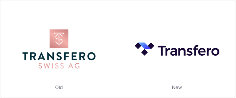
Transfero
Transfero is a fintech company that allows users to buy and sell cryptocurrency. The group is based in Switzerland and has developed the first stablecoin that is linked to a national currency in Latin America: the BRZ Token. A pristine, shatterproof logo was required to reflect this change in positioning.
A company that once had a traditional look decided to adopt a bold, more modern, and technologically advanced approach.
The new icon features three distinct symbols: a diamond silhouette symbolizing the long-term value and quality of the brand, an investment graph neatly concealed in the icon, and a square symbolizing the brand’s technical characteristics. Learn more on how to master technical branding here.
The use of distinct symbols like squares, rhombuses, and triangles within the logo icon reflects the trend of layering in logo design. The designer has cleverly made use of gradients and geometric shapes to create this modern brand identity.
Conclusion
With finance branding constantly evolving, staying up-to-date with logo design trends is tricky yet absolutely crucial. The above finance logos demonstrate a smart use of trends that offer a blend of modern simplicity and adaptable dynamism. These help finance brands to connect deeply with their audience. Some employ the use of geometric shapes, while others adopt the minimalist approach to stay abreast with the demands of modern-day media and consumers. By embracing these trends, finance brands can navigate the intersection of innovation and tradition, creating logos that are both impactful and timeless in an ever-changing industry.
Whether you are planning to use a combination of lowercase and uppercase letters, minimalism, abstract shapes, geometry, cultural symbols, or simple yet elegant sans serif fonts, take your brand identity into account first. A logo is the face of your business above everything else, and no design microtrend is worth losing your identity for the sake of being modern.