TL;DR. Because Apple set a fashion trend.
Disclosure. As a UX designer, I’ll focus slightly more on user interfaces and tech design than the rest of graphic design.
Before iOS 7
The world before iOS 7 was pseudo-3D. It was fun.
- First, our displays had 256 colors, then 64 thousand, then 16 million
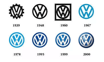
As strange as it seems, Volkswagen changed from a flat to a pseudo-3D design. I remember making a website for a Volkswagen dealer at the end of the 90s, then I got the new brand book from Volkswagen and it struck me how beautiful the gradient logo looked.
- We had UI conventions: actionable elements with pseudo-3D, such as push buttons, drop-downs, and even inputs.
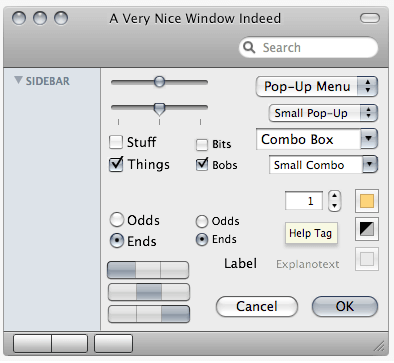
Please note all the ways actionable controls can look 3D, such as the inner shadow on input controls and even a slight glass border around color boxes.
- We had some of the most beautiful isomorphic icons ever created; there was a fashion of drawing objects squarish in the shape of iOS icons.
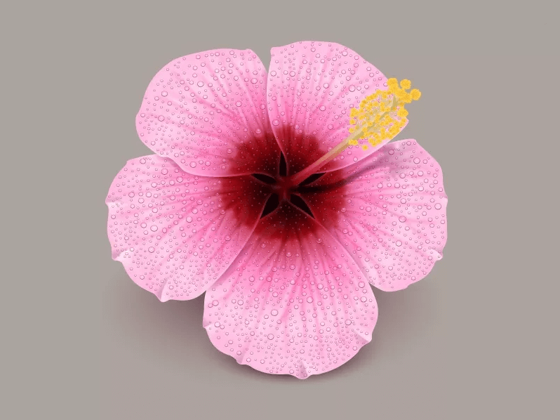
My teammate Alexander created it in the late 2000s. Look what kind of flowers he was drawing just a few years ago.
After iOS 7
It all ended overnight on September 18, 2013, with an iOS update. The App Store updated the apps. The world became flat.
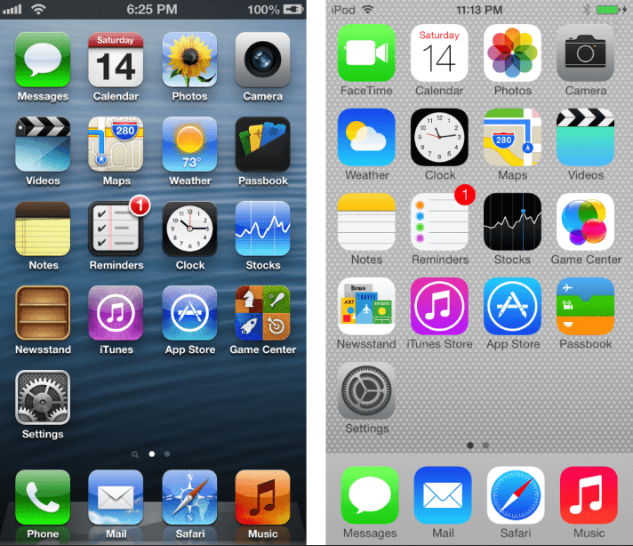
Glossy textured UI that seemed beautiful only the day before became obsolete. Apps that didn’t manage an interface update died.
It wasn’t great for UX. It caused a lot of confusion.
- What is clickable?
- What is not?
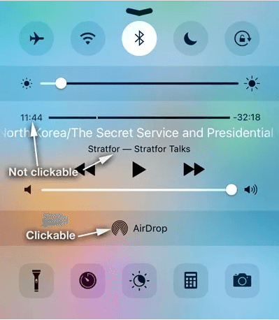
By doing this, Apple erased years of users’ lives who had tapped the screen in all the wrong places.
Icons
Icons became flat, too.
- Icons got rid of the details and became simpler. They became more recognizable.
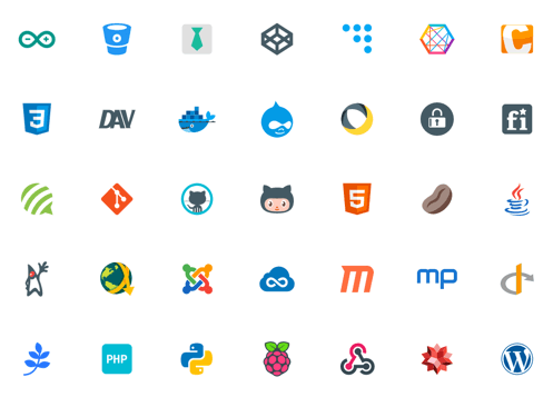
People ask us to draw logos in the format of icons. Sometimes we have to do some work, but mostly the original logos are fine. We just make sure they’re as pixel-perfect as possible, then we call it a day.
- By drawing simpler app icons, icon designers saved years of their lives. Therefore, Apple saved years of icon designers’ lives.
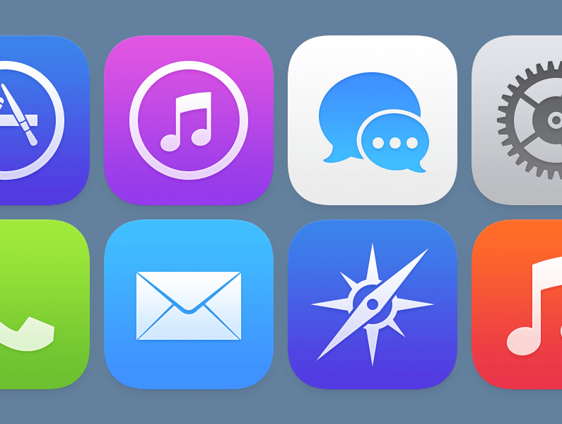
Louie Mantia reworked the icons for the native iOS apps. I bet it took him less time than merely fixing the isomorphic versions a year before.
What else?
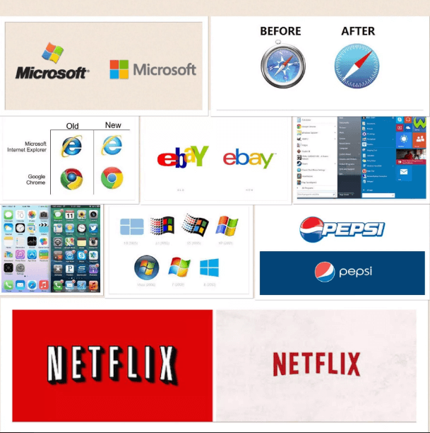
There were other factors besides Apple. Some people resisted the trend, while some supported it. We’ve seen examples of the former at the beginning of the article. Let’s look at some examples of the latter.
Uses in various media
The process of simplifying graphics is partially due to the variety of available media: TV, computer screens, ORACAL vinyls, LED lights, and even tattoos:

Screen use
Simplification for screen use — logos should be recognizable as a 16×16 px favicon on a low-res display.
Stylized logos optimized for 32×32. However, most of them look OK in 16×16.
Just simplification
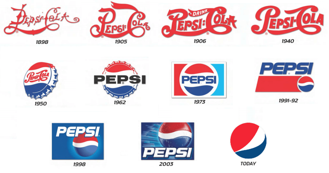
There was some simplification of logos throughout the entire 20th century, long before screens, social networks, and mainstream tattoo culture.
Windows Metro
Microsoft promoted flat design for a while. I remember exactly when we started Icons8 as a collection of icons for Windows 8 (Icons8 means icons + Windows 8). Certainly, it had some influence.
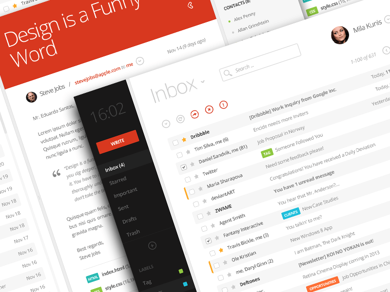
Certainly, it had some influence, but was Microsoft a trendsetter? I don’t think so. As a desktop operating system, mobile platform, tablet platform, and visual style, it was a failure. 10 years later, I think more people hate it than like it.
Shift toward vectors
In the world of high-density displays, you either:
- Keep 2-3 versions for various pixel densities
- Or use vectors
Although vectors can drop shadows and show a few different simple effects, this set of effects is super limited. Photoshop 3 had more. I wish we move toward something like this:

Thanks for the hint, btw!
…and then September 18, 2013 happened. The day when the world turned flat overnight.
About the Author
Ivan Boyko is the founder of Icons8. He got his first job after drawing a banner with a CTR of 43%. After years of creating icons, he specializes in rapid prototyping and backlog grooming.