There are many ways to define a glyph. Let’s take a look at what glyph icons are in typography and graphic design.
Glyph is a term that has a broad definition. In typography, a glyph is any figure that represents any character in any given font. Basically, whatever you type using a keyboard or scribble on paper when writing a text is a glyph. For instance, the letter A with a goofy swirl on the side from the Curlz font is a glyph. And so is the double-serif 4 digit of the Bodoni font. And the wonky question mark of the infamous Comic Sans is a glyph, too.

Another definition of glyphs which still lies within the area of typography involves special characters. All the extra characters you wouldn’t find on the regular keyboard are called glyphs. These involve mathematical symbols, musical symbols, arrows, and other signs. Plus, this category includes small minimalist black-and-white icons like stars, flowers, hearts, etc. These are what we call glyph icons: they are simple, tiny images you can use along with regular text symbols.
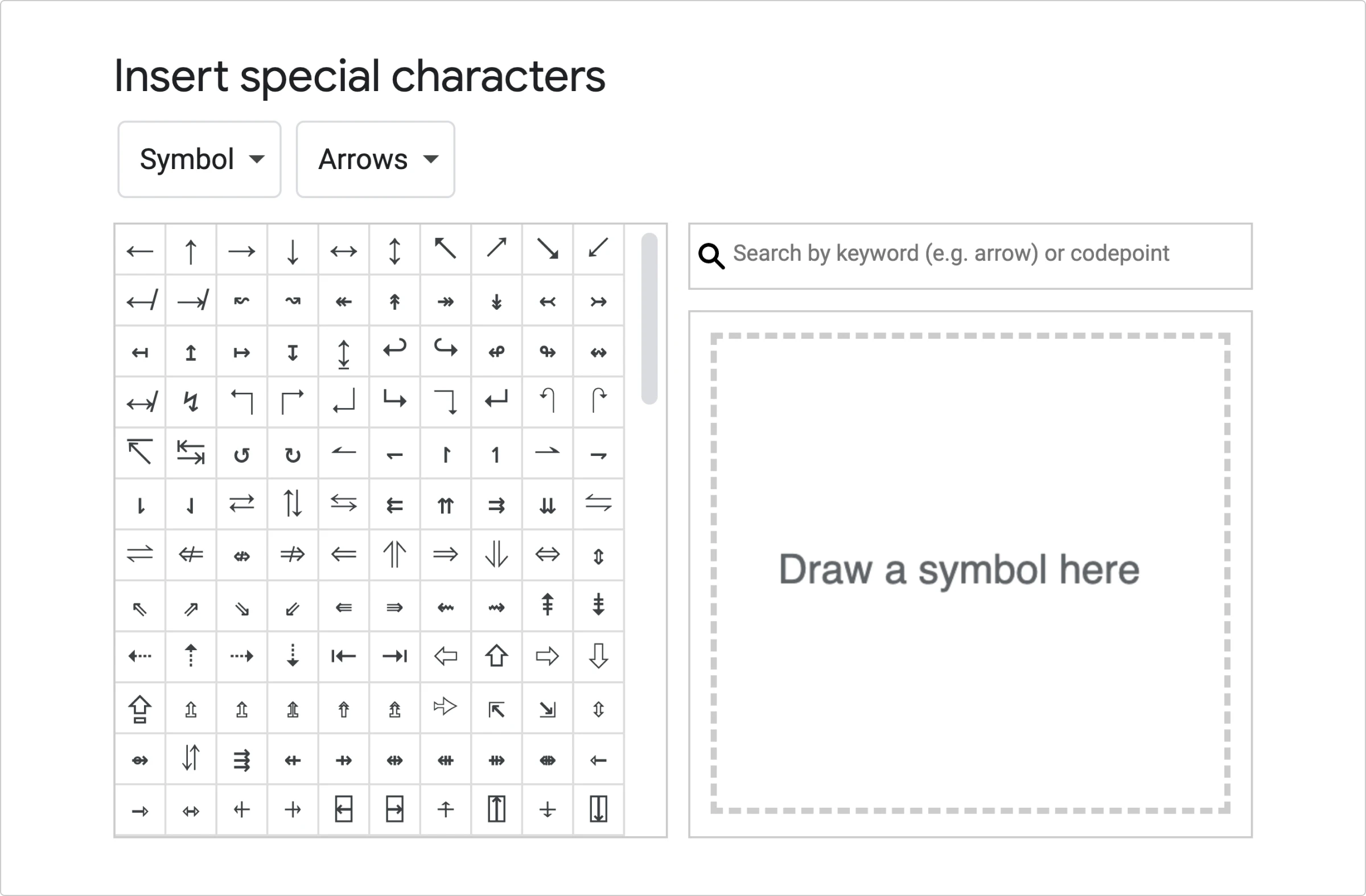
Now, glyph icons are not just the icons you can find on a regular list of special characters inside a text editor. In graphic design, this term refers to a family of icon styles that mimic these minimalist glyph images. Aside from that, it is also used to describe all sorts of icons you can use as fonts.
Sounds confusing? Let’s take a closer look at both interpretations.
Glyphs as an icon style
There are several key characteristics that set glyph icons apart. A glyph icon is
- monochromatic, usually black
- minimalistic, uncluttered
- flat, without gradients or shading effects
Plus, since glyph icons are monochromatic and flat, they make use of negative space to create volume and depth.
Most utilitarian UI icons you can see on your laptop or in a mobile app fall into this category. Glyph icons are perfect for UI/UX design as they are readable, non-overwhelming, and easy to integrate into any space. Their goal is not to embellish, but to help navigate, which is why they don’t look as fancy as some other styles. This is why, unlike many decorative colorful icon styles, glyph icons look good both in large and in small resolution. A well-designed glyph icon stays recognizable even as an 8×8-pixel image.
Glyph icons make perfectly clean SVGs that are easy to customize. You can recolor or animate them as a whole or element by element. Depending on the complexity of your UI design, you can add SVG icons as <img> elements or inline them. In the Icons8 library, for instance, each icon is available as an SVG image, SVG inline, <img> element, or background element.
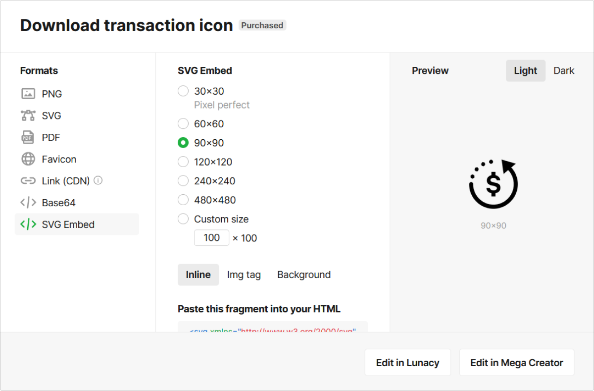
The main advantage of inline SVGs is that it requires fewer HTTP requests to load. The main benefit of using SVGs as separate image elements is that they get cached by the browser. If your UI is not too graphics-heavy, inline SVGs would load way faster. But in case you have numerous icons all over a single page, it might be better to insert them as <img>.
Because glyph icons are clean and minimal, many developers prefer to save and use them as icon fonts instead of images.
Glyphs as icon fonts
One might suggest that a plain monochromatic SVG glyph icon is already convenient enough. It has a small file size and it’s easy to implement in a design. However, sometimes turning these icons into icon fonts is an even handier solution. By saving vector icons as fonts, you can make them into typographic glyphs, just like the ones we described in the beginning. This way, you can use icons as text symbols rather than image files. While icon fonts have plenty of advantages, they still come with a few limitations.
Pros of using icon fonts
- Compatibility. Technically, these icons are text symbols, so even older devices and browsers can read them correctly with no issues. This means you don’t need to worry about the users’ viewing experience and ensure an equally smooth experience for all of them. Only very few older browsers don’t support the @font-face CSS rule that helps display icon fonts.
- Small file size. Font files are typically small, which helps reduce loading times. Plus, because these icons are stored in the same font file, the browser accesses and cashes them all once. This also helps accelerate page loading. With image files, the browser needs to send multiple separate HTTP requests.
- Easy to edit. You can change their size, color, and positioning by tweaking a few properties. Plus, you can edit the whole set in a matter of seconds by changing the CSS rule for the entire font. The most convenient way to work with icon fonts with CSS is by defining them as pseudo-elements.
- Easy to integrate. You simply need to include the font file in your project, and the browser will request it when loading the page. This is more convenient than working with dozens or even hundreds of different image files.
Cons of using icon fonts
- Accessibility. Unlike images that have titles and alternative text descriptions, glyphs from icon fonts don’t carry descriptive data like this by default. Because of this, screen readers often have a hard time identifying and reading them correctly. To avoid this, you need to add ARIA descriptions to your code so that search engines and screen readers have no trouble decoding the glyphs.
- Low customizability. You can’t make multicolored icon fonts — the only options you have are monochrome or gradient fill. Creating duotone icons is possible, but to do that, you’ll need to layer two glyphs that make up one icon. On top of that, you can’t create complex animations with icon fonts.
- Quality issues. Browsers use text antialiasing, so icon fonts may be shown in poor quality. Text antialiasing by itself is not a bad thing: it adds a subtle blur to smooth out the corners of the letters. Thanks to this, you don’t see letters with blocky, staircase-like edges. However, when applied to icon fonts, especially at smaller font sizes, it can make them barely readable.
Where to get glyph icons?
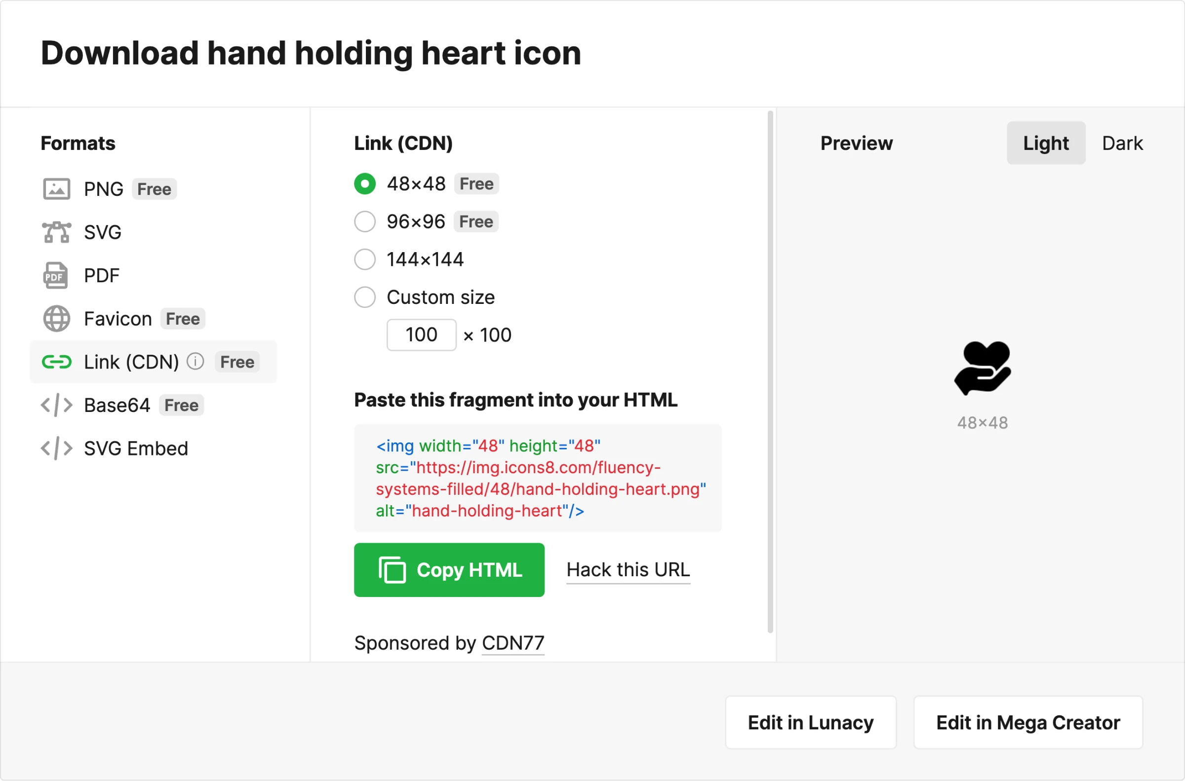
The easiest solution would be to use an icon library like Icons8. There you can download glyph icons as SVG images or get them as HTML links to insert directly into your code.
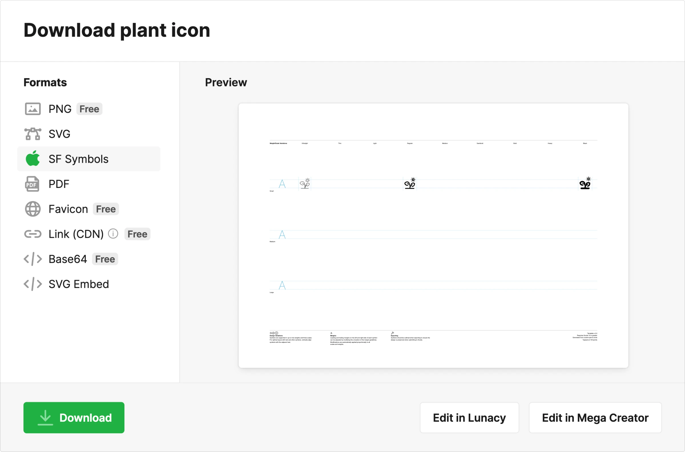
On top of that, there is a collection of icons available as SF Symbols, which is perfect for Apple-oriented designs.
One more option would be to hand-pick your own icon kit and save it as a font file. Once you’ve gathered all the necessary images, you can download your collections as font packs right away.
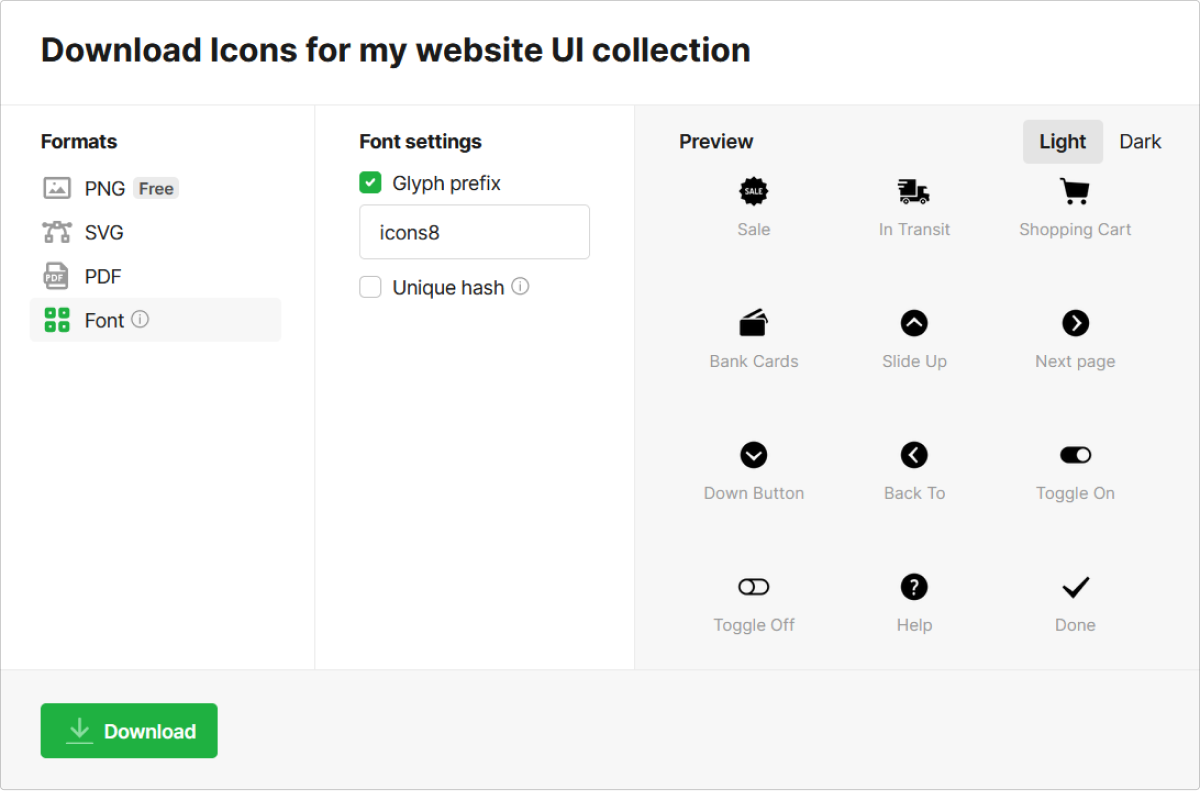
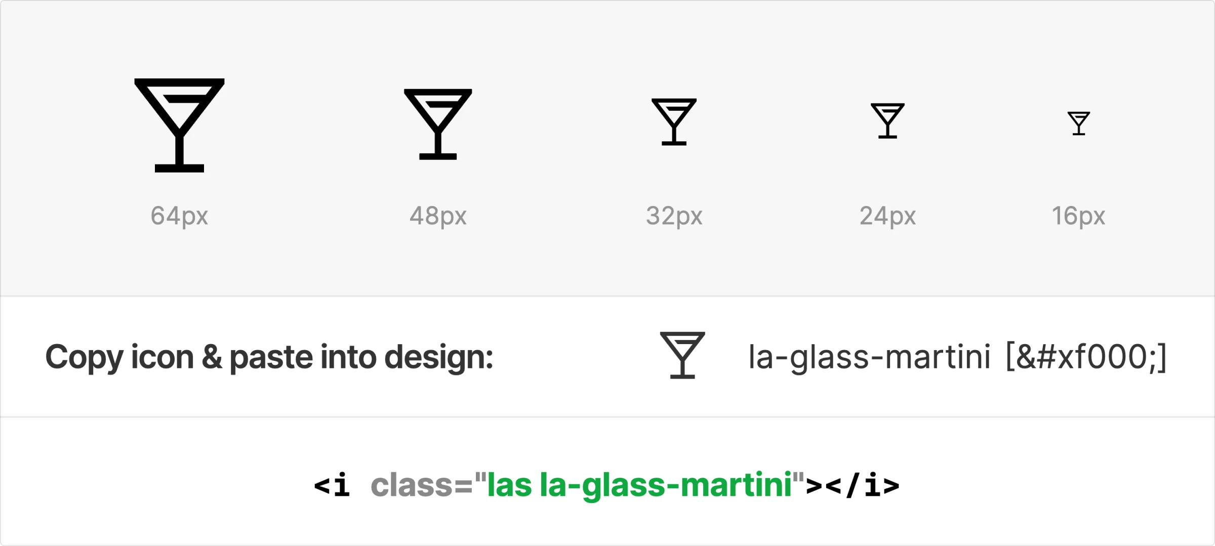
Finally, Icons8 has a pre-made icon font where you can find any icon you might ever need and get the CSS code to add it to your design in seconds. Line Awesome is a free icon font with hundreds of consistent, high-quality icons that are ready to use.
In case you decide to hand-pick your icon set using other icon libraries, you might have to save your icons as SVGs first and then convert them into WOFF, OTF, EOT, or other text format. You can do it using free online converters like Convertio, CloudConvert, and others.