Discover the power of icons in landing pages. Enhance the visual appeal of your web page design to captivate potential customers.
In the era of scanning and skimming through content, it’s vital to catch the eye of your potential customer. Even if you have a great product or service and top-notch UI copy, without proper presentation, it risks being passed by.
The team behind the innovative website builder, Tilda, continually researches the best practices of web page design. In this article, we are going to share ways of using icons in landing page design to make your offer stand out.
You can then create yours for free with a landing page builder.
Now let’s take a look at how you can use icons on landing pages to make them more visually appealing.
Add visual cues
Structured information is easier to read and memorize, which is why lists and tables are go-to elements in webpage design. Web designers use lists and tables to highlight product features, summarize pricing options, and more.
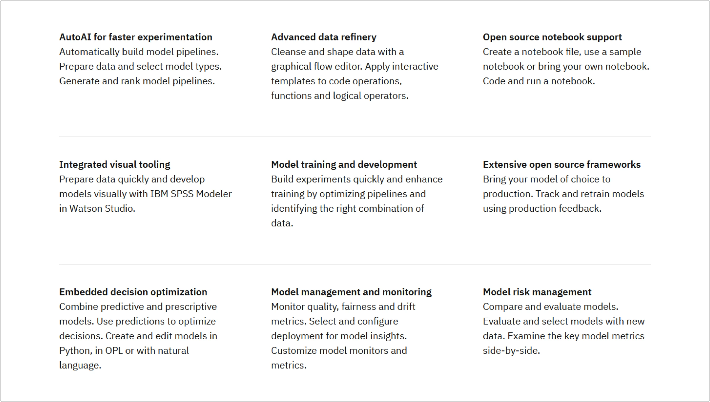
However, without visual anchors, many users are likely to look through this list briefly. They might omit it as something non-essential since it has no visual data supporting the information.
However, earlier on that same page the company has an overview of Watson Studio’s benefits where each of them is accompanied by an icon. This looks clearer, less intimidating, and more engaging than paragraphs of plain text.
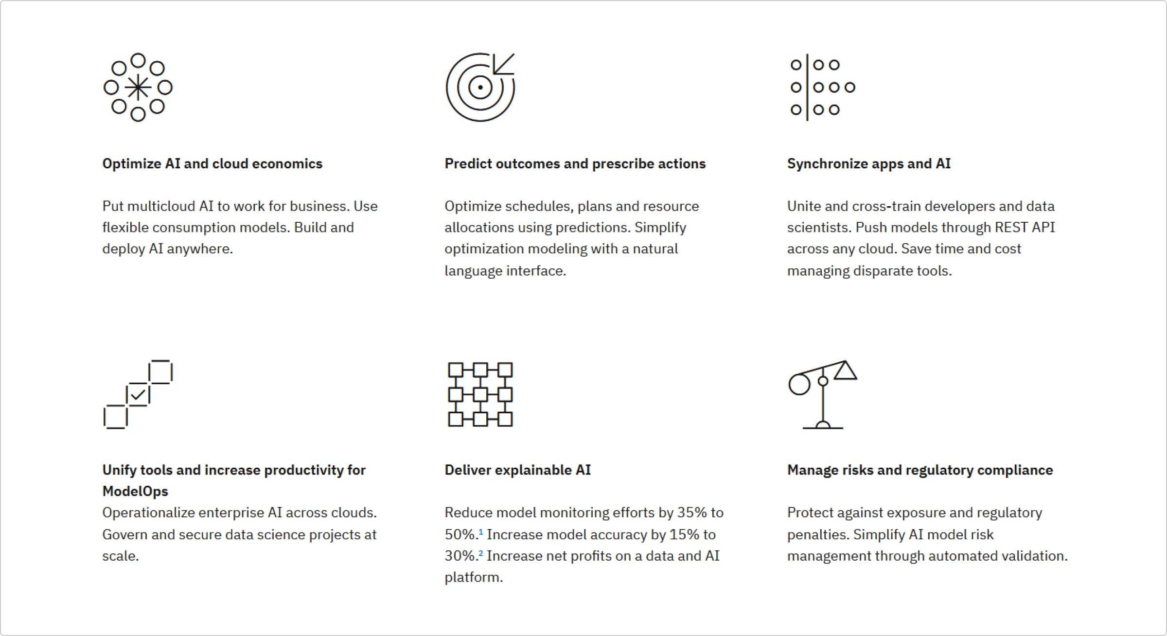
Let’s further compare the 2 ways of presenting the information, and you will see which one is more memorable and friendly. Here is an example of the same information about a tour with and without icons.

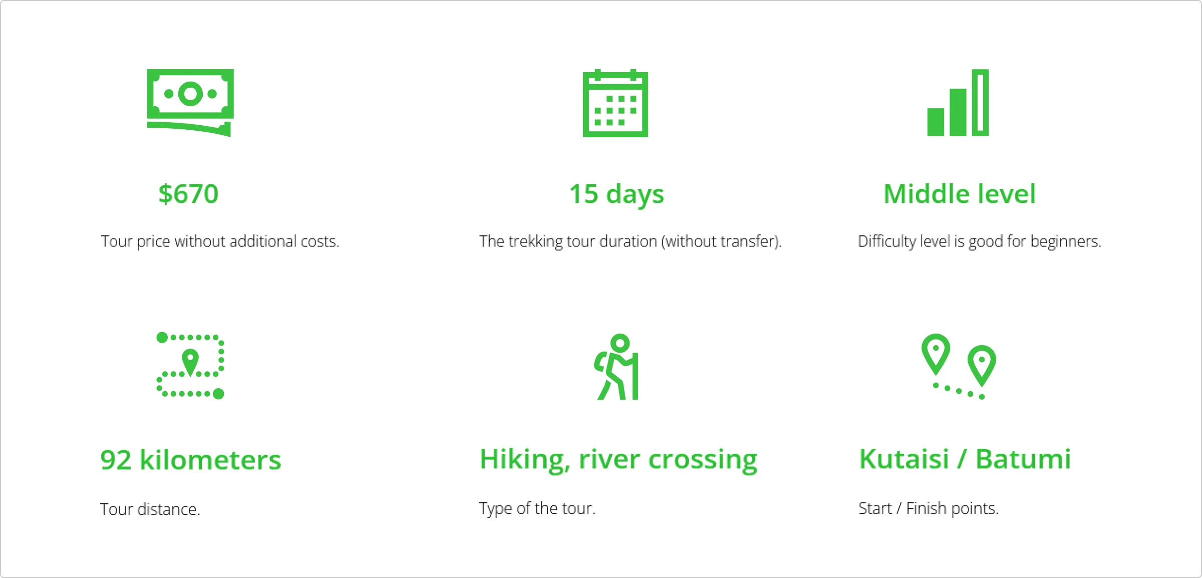
As you can see, icons make the page look more appealing and guide the user’s eye, making it easier to find the necessary information. This is why major companies like Apple make use of icons in their webpage design.

Create a sense of order
Web design software will allow you a number of preset options for creating lists and boxes. One of the simplest ways to make a list look tidy and ordered is to use a checkmark. Checkmark icons act as subtle dividers, making each point stand out and turning an otherwise lengthy text into a more easily readable one.
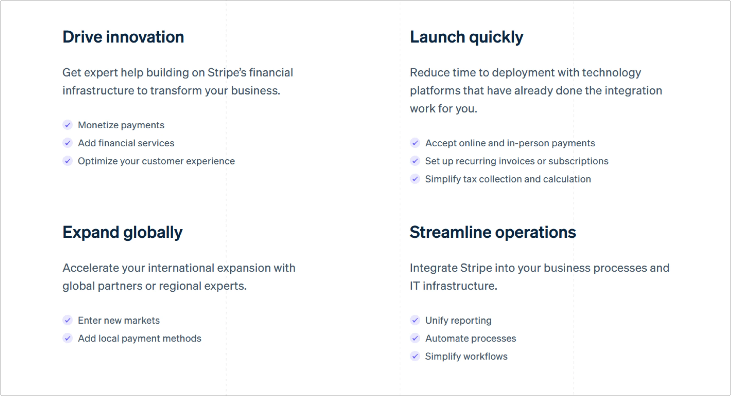
Similarly, you can use icons with numbers to organize your lists. They are more eye-catching than a simple ordered list with numbers that have the same size and formatting as the rest of the text. Even an uncomplicated padding like a colored circle can make digits more fun and vibrant.
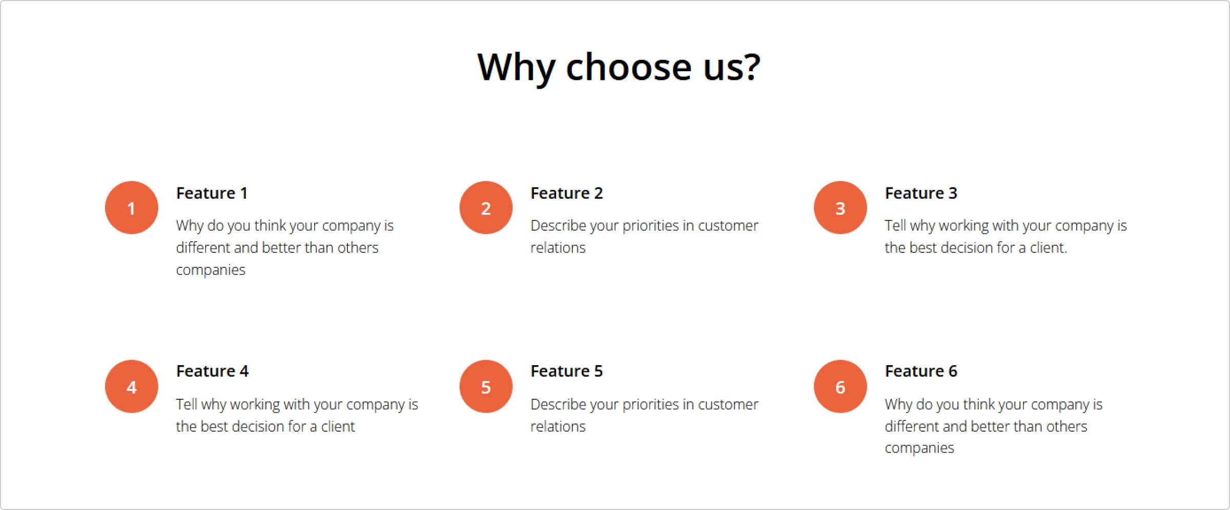
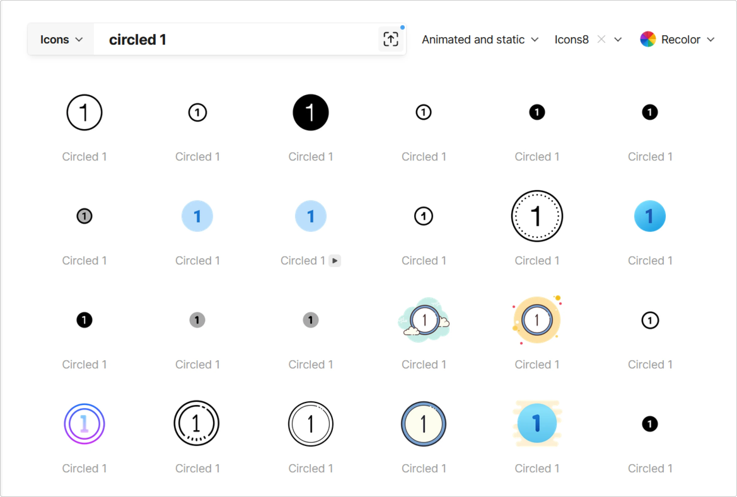
To get number icons like these, you can search for “number 1” or “circled 1” on Icons8.
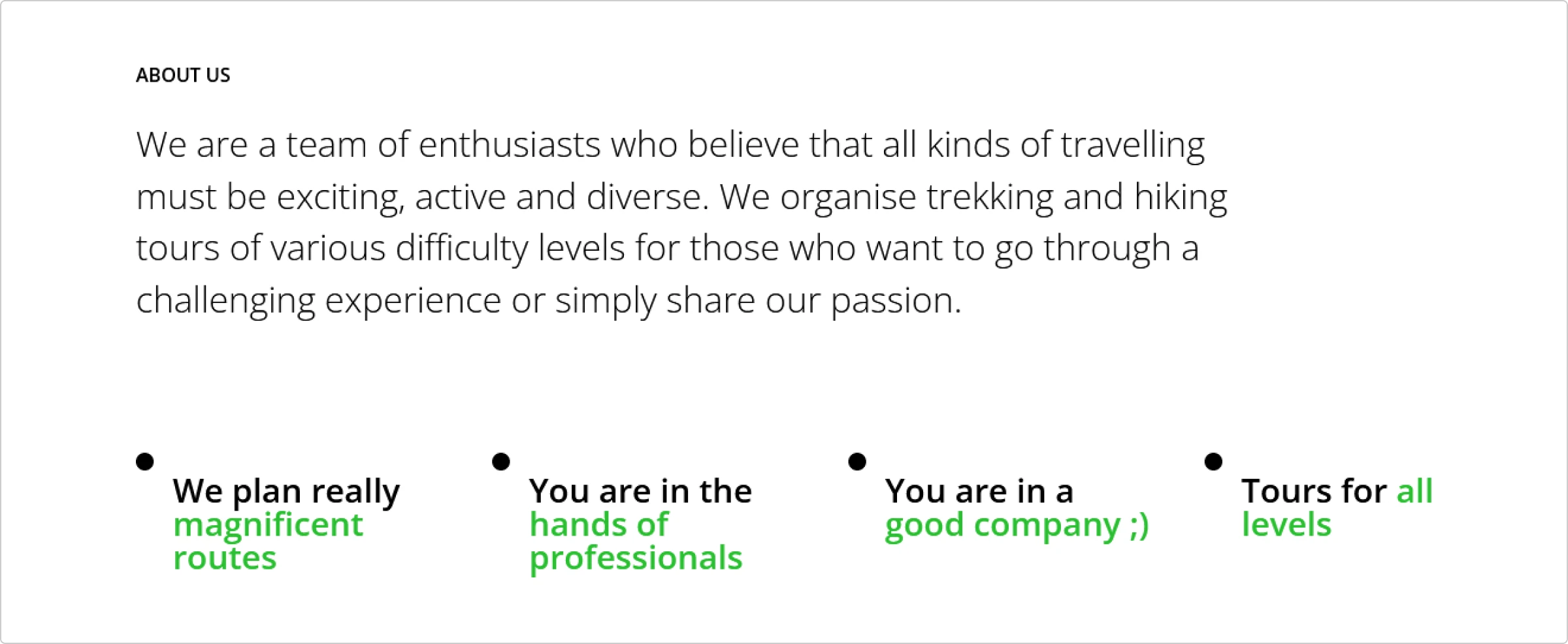
You can also use simple circle, arrow, square, and other icons to make a slightly more fun bulleted list. Consider placing the items horizontally rather than vertically to make it pop.
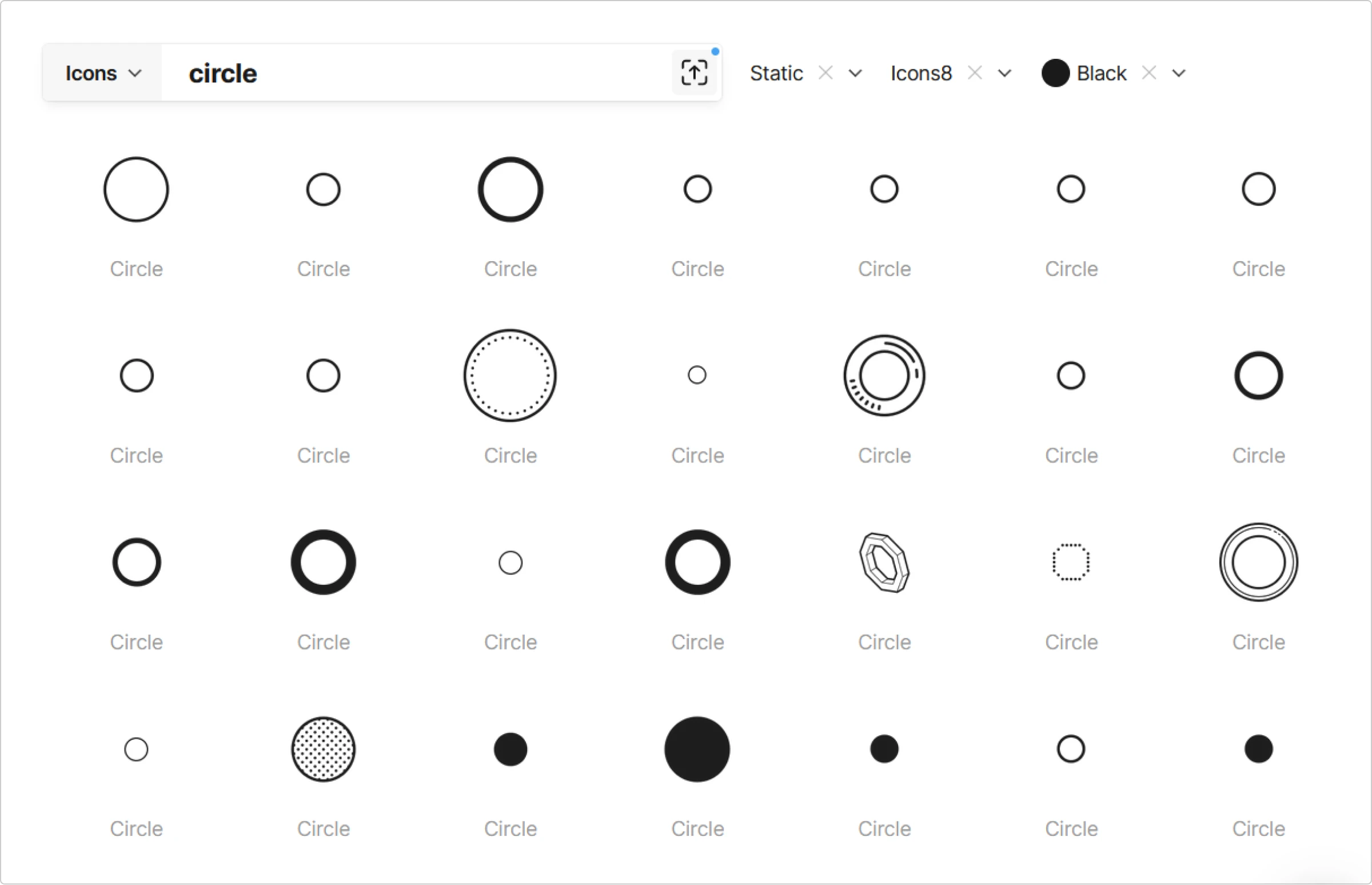
If you don’t want to spend extra time creating circles, squares, and arrows in any graphics editor, just search for “circle” on Icons8 and recolor it in one click.
Add an emotional touch
By using powerful visual metaphors, you can add an emotional touch to your message. When chosen wisely, icons can liven up any text and make it resonate with the user’s feelings. Plus, it helps them better understand your message.
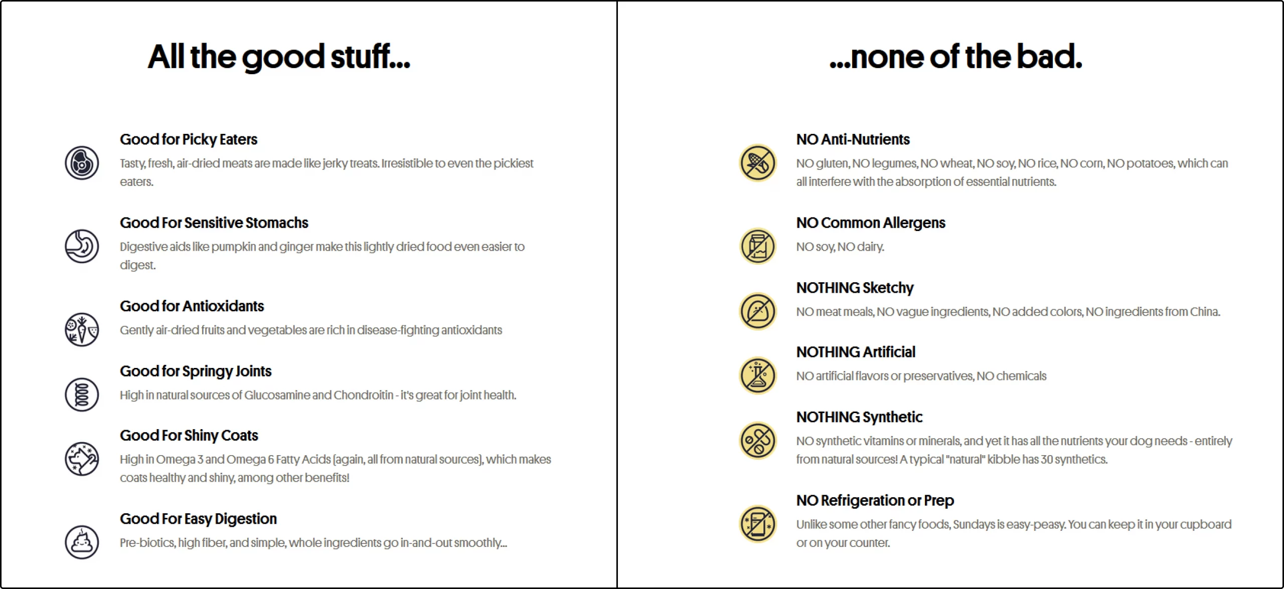
In this example from Sundays for Dogs, icons highlight the benefits of air-dried dog food compared to regular kibble. For dog owners, the points mentioned in the table already are a highly important topic that evokes an emotional response. By using little smiley faces in some of the icons, Sundays further engages potential buyers emotionally.
Divide the sections within a page
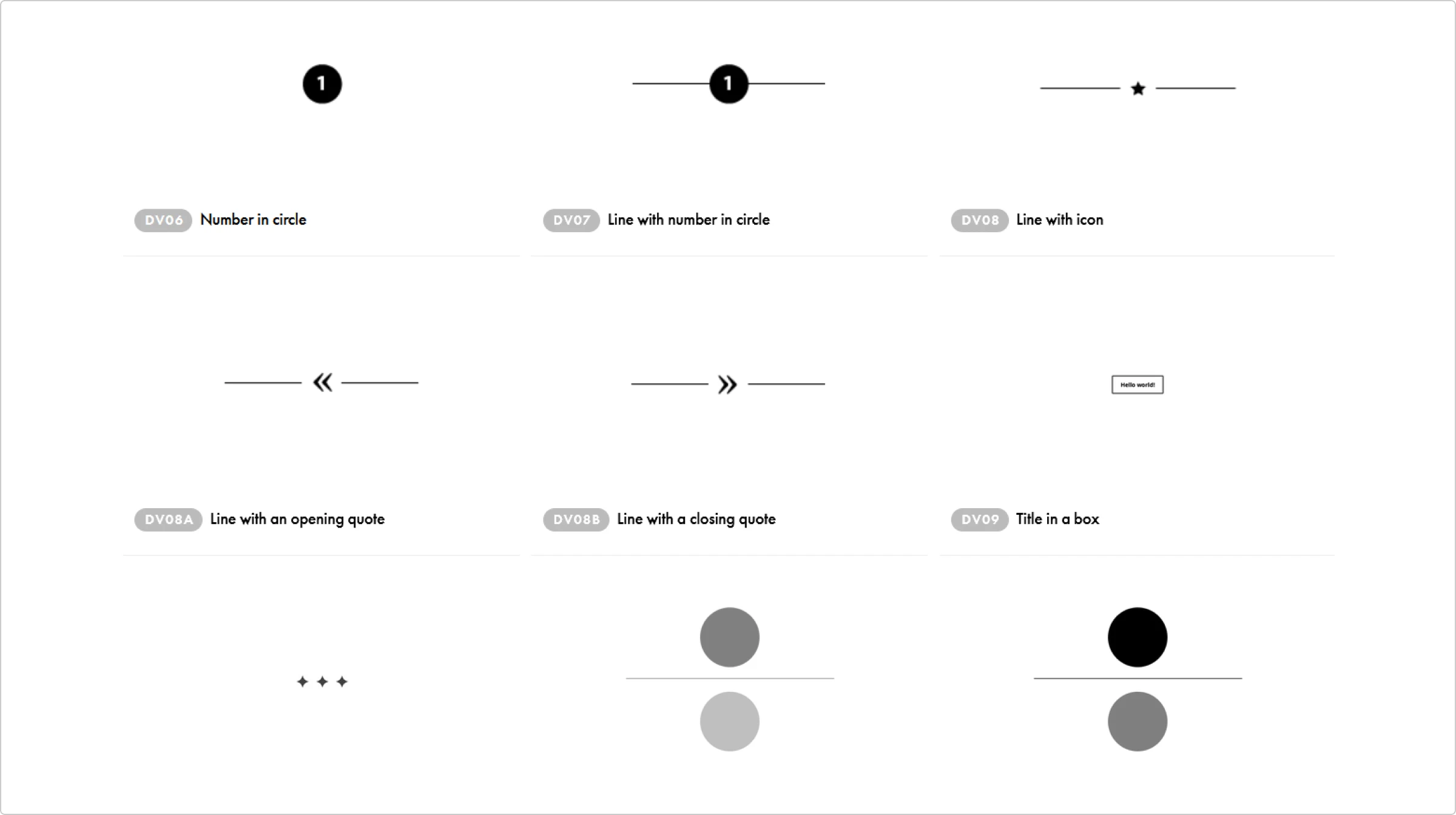
Icons are perfect visual dividers that can separate different sections of a webpage. Instead of using something bland and unoriginal like horizontal lines or dots, you can add icons. They can make a huge difference, especially if your page has quite a bit of text. With icons as your dividers, you can turn a lifeless page that’s hard to look at into something fun and engaging.
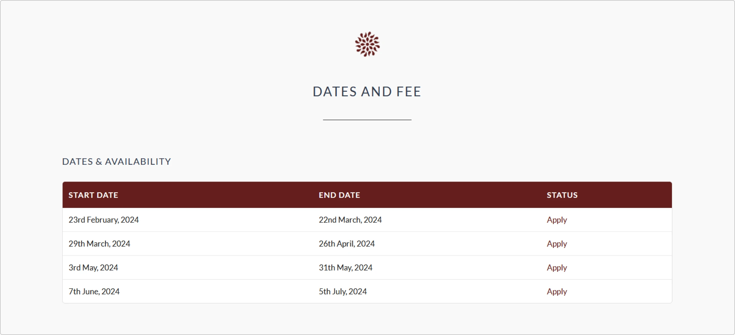
In case full-blown icons are not quite your vibe and you need a more subtle divider, Tilda has plenty of them. Tilda’s website builder has a library of foolproof footers, buttons, and other elements that work with any design.
Elevate hero images and blog post covers
When you take content marketing seriously, sometimes an article is a high-traffic landing page. This means that it needs to have an impeccable cover and hero image. Because minimal flat designs with bold colors are still in, icons will be a perfect addition to blog graphics.
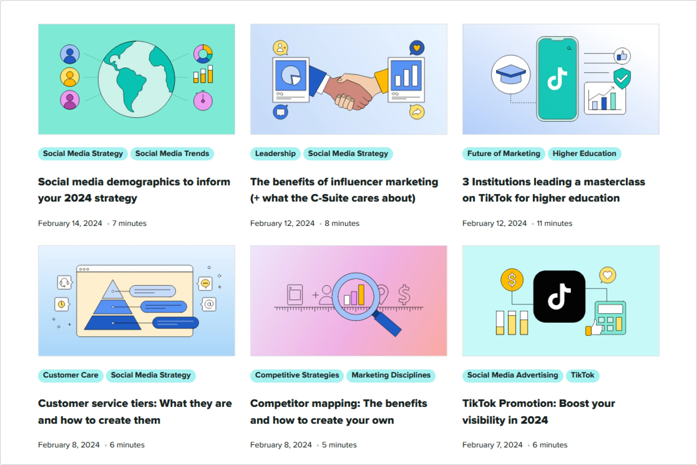
When used for blog graphics, icons can give the readers a better idea of what to expect from an article. It’s way faster to scan an image with your eyes than to read the title of a blog post. The same applies to hero images at the beginning of an article: they are essentially a quick preview of what’s in the text. If you make good use of icons in article cover and hero image design, it can level up your SEO game and conversions.
Create meaningful clickable buttons
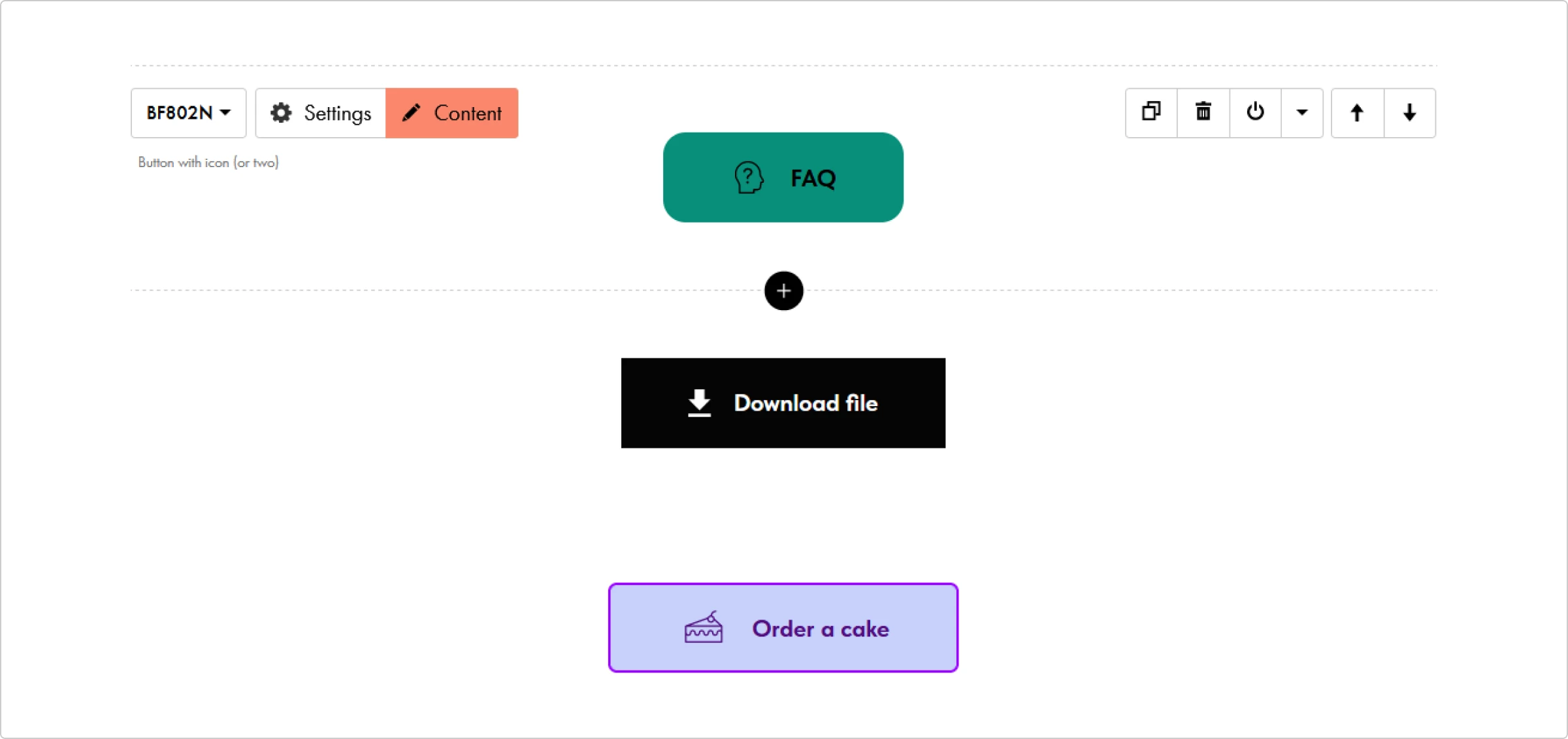
Buttons are a crucial part of any CTA block on landing pages. Many marketers prefer clean, big CTA buttons that have no extra elements. However, chances are you have more than one button on a landing page, meaning they need to look different to avoid confusion. By adding icons to them, you make each button different and hint at what happens after clicking them.
With Tilda, you can quickly customize pre-made buttons by adding icons from Tilda’s library or uploading your own. Even a tiny glyph icon can make a big difference and turn a lifeless CTA button into eye candy. Want to know more about glyph icons and why they are irreplaceable in web design? Read this article about glyph icons on the Icons8 blog.
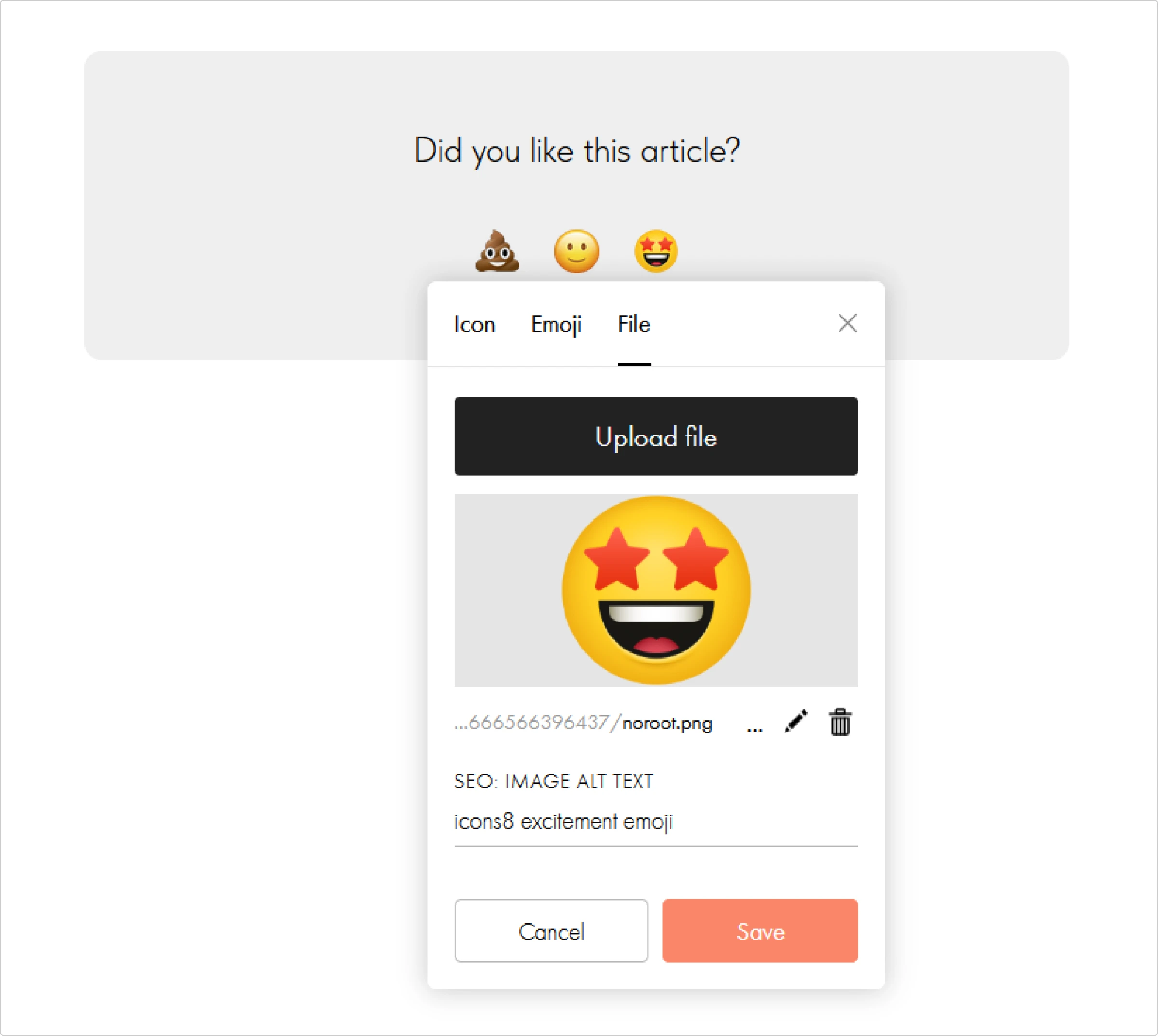
Icons are also great as reaction buttons. Whenever you want to receive quick feedback from your users, reaction icons are an impeccable button choice. Clicking on a heart, thumbs up, thumbs down, or a meh-face emoji is intuitive and convenient.

On Tilda, you can create a poll/survey block with quick icon reactions. It comes with three options, but you can add more and change the icons by uploading a new image or selecting an icon or emoji from Tilda’s collection.
Take landing page icons to the next level
To make icons on your landing pages work, you need to personalize them a little. Slapping a ready-made icon onto the canvas might be an easy solution, but it’s better if you spend a little extra time tweaking your icons.
Rule number one is that each icon you use on a landing page should feel like it belongs there. It shouldn’t look awkward or out of place — it needs to be in tune with the rest of your design. Here is what you can do to make it look right.
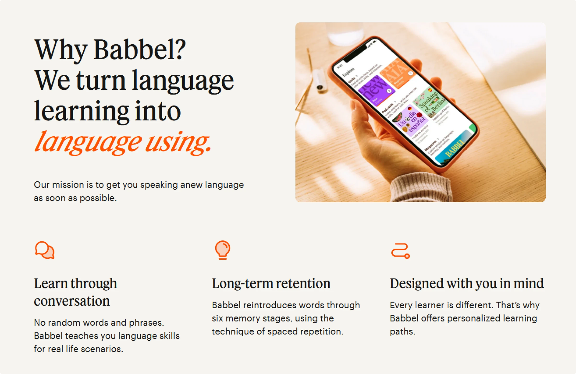
Apply signature brand colors to your icons
While minimalist black or white glyph icons are a timeless, universally compatible option, using the colors of your brand on landing pages is much better. A simple detail like this can really bring everything together and reinforce brand vision. By using signature colors, you can make your UI look more put together and sleek.
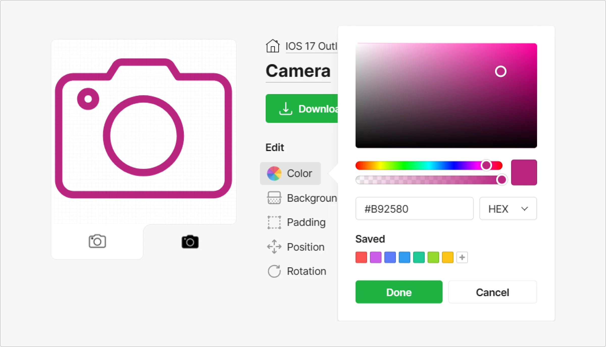
When you find just the right icon in the Icons8 library, you can instantly recolor it for free. Just select the hue you need in the color picker and click Done.
Add some weight to the icons with a background shape
Sometimes, an icon looks more well-rounded with a background shape. It adds to the visual weight of an icon, making the image more noticeable. Thanks to this, you can bring the users’ attention to where you need it most. Plus, this is a perfect way to fill in any excess space on the webpage, especially if there are not too many elements on it.
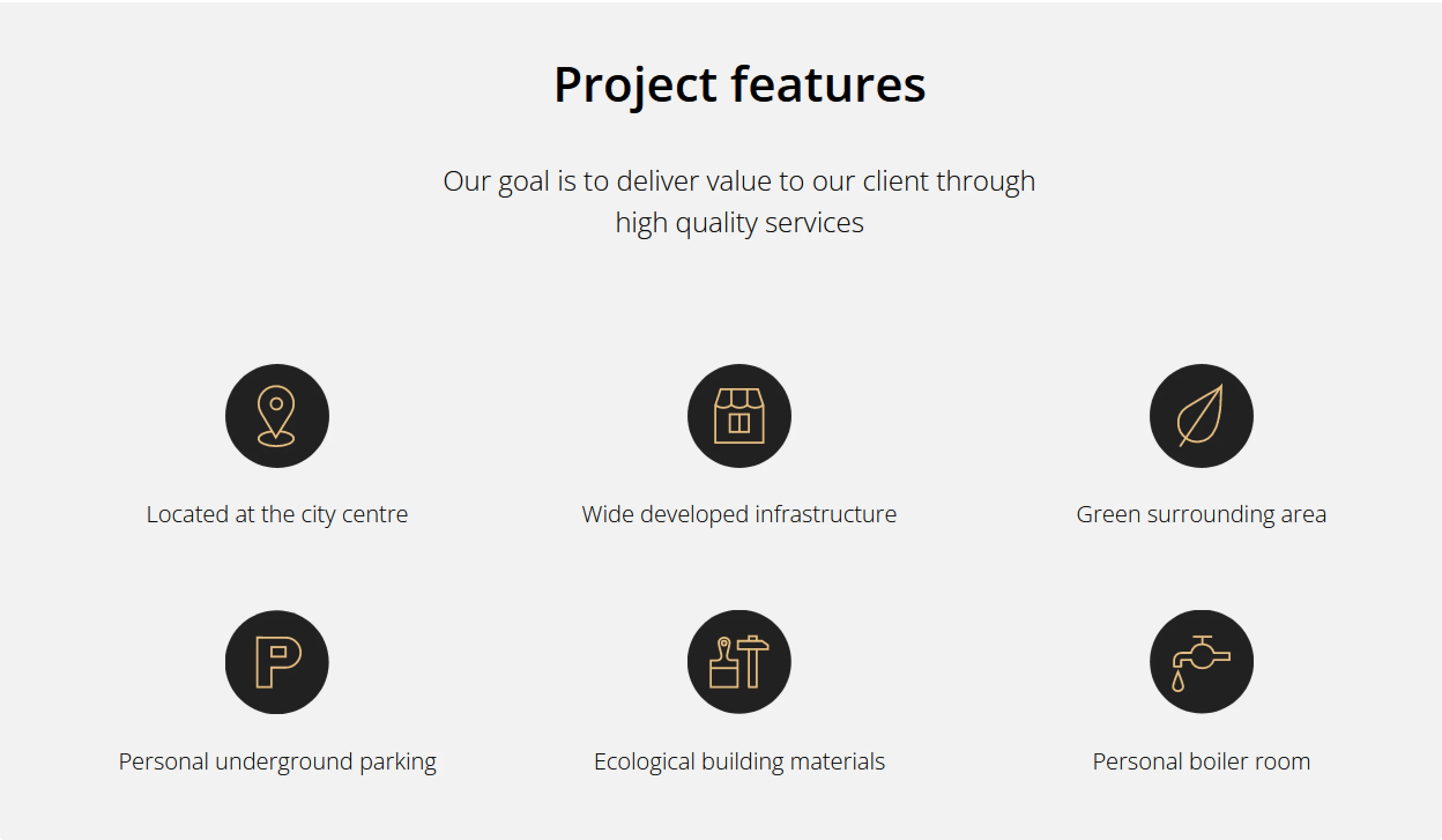
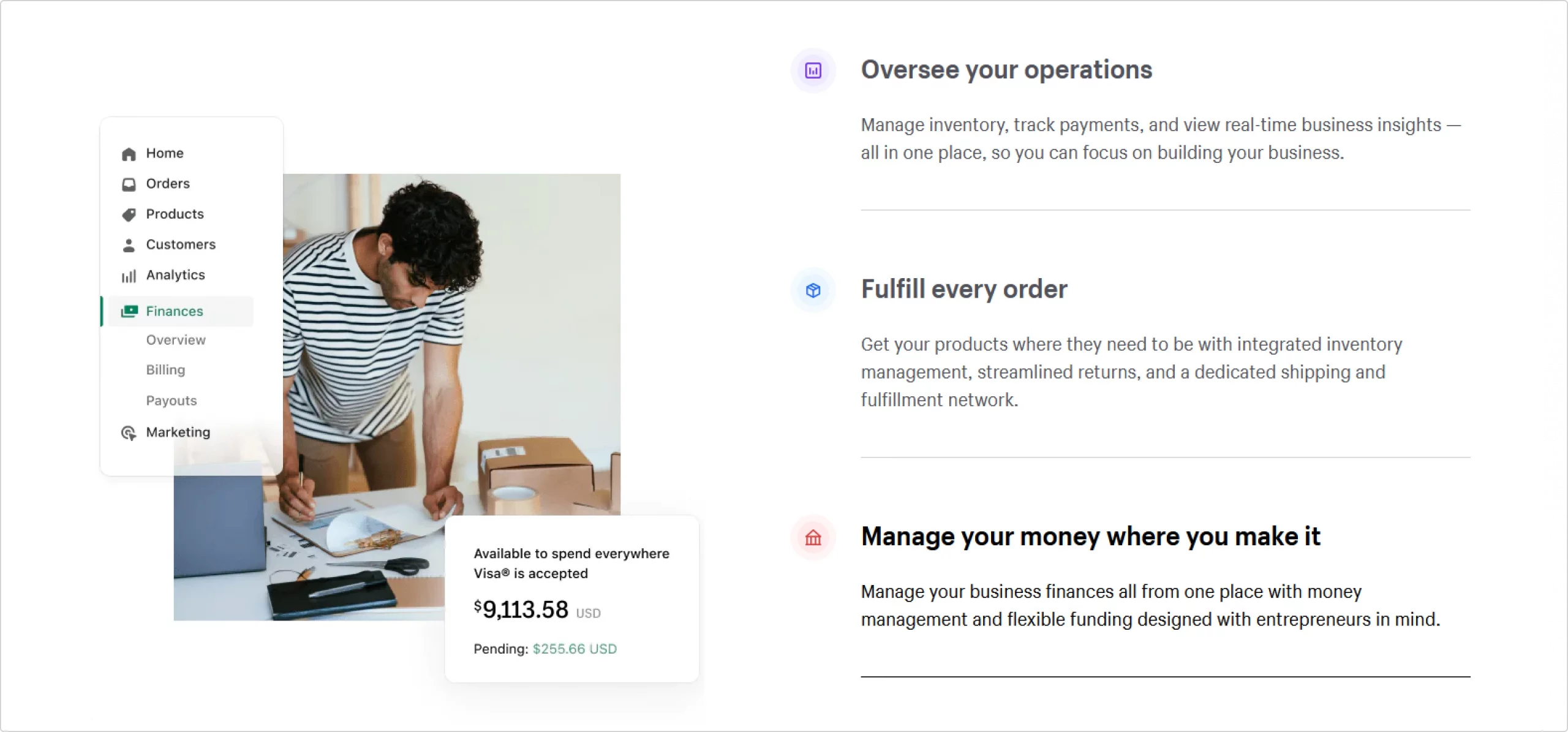
Because background shapes make icons more prominent, they work amazing when you need to highlight something important. Product features, exclusive offers, benefits, and other crucial points are a few examples of areas where you might want to consider using icons with background shapes.
You can add a square, a circle, or an icon-shaped stroke right in the Icons8 web application. Depending on the look you are going for, you might need to adjust padding, positioning, and rotation as well. You can do all that with any icon from the Icons8 library.
Conclusion
Creating landing pages that work does not always requite huge efforts if you have a clear idea of what you need and a couple of solid tools:
- an abundant icon library like Icons8 where you can find packs of consistent icons and customize them on the go
- an intuitive webpage builder like Tilda Publishing where you have all the blocks needed for high-quality webpage design
Check out other website templates from Tilda for inspiration and get creative with your own website. Don’t forget to gather a pack of top-notch icons from Icons8 for your UI.
About the author: this is a guest post by Vlad Korobov from the Tilda Publishing team, the creators of the easy-to-use and elegant website builder.
Check the useful tips on choosing effective images for landing pages and read why favicon is vital for website usability.