Your digital business page is not so different from a real-life storefront. Consumers have a knack for picking up on dubious first impressions. And if your brand design sends out too many questionable signals, then getting users to stick around is going to prove problematic.
If you look at your design from the perspective of clear communication, then that in itself can provide answers to many trust-related dilemmas.
- Are you being thorough but succinct in explaining your product?
- How are you reassuring people that your product is authentic?
- Can you verify your claims so as not to oversell your product?
- Are you building a brand or trying to be a clever salesman?
UX design is always about the user and the way that your design makes a user feel. Trust builds loyalty, and loyalty fosters a strong brand presence.
Fortunately, creating trustworthy and pleasant designs for websites isn’t as difficult of a task.
In this post, you will find plenty of tips and time-tested strategies to ensure that your UX design is making users feel like they can trust your brand.
What Does This Product Do?
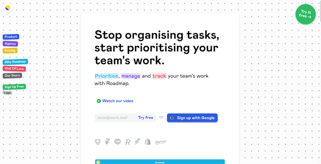
I’m the customer, and you are the seller. Please explain to me, what does your product do? Because unless it’s made clear immediately, there’s no reason for me to stick around and try to figure it out by myself.
Indeed, pitching value straight away is the way to go. As shown in the picture above, Roadmap is using a bold intro statement combined with a subheading that highlights the core product features.
At this point, I know that this product provides a solution to a certain problem. Should I want to learn more, I can also watch the introductory video.
And if everything looks good, I’m going to continue shopping.
Consistency Feels Familiar
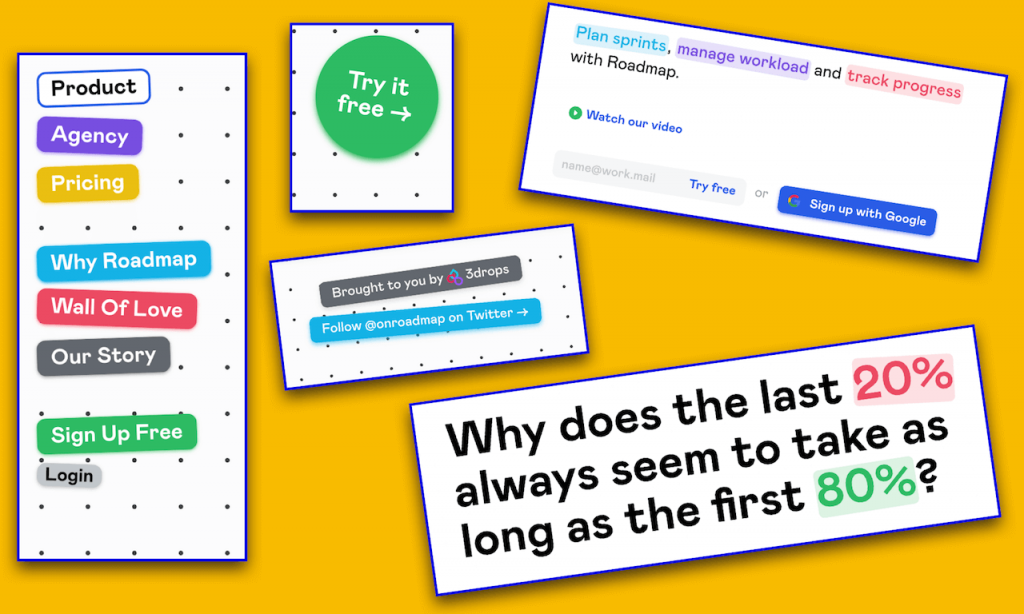
There are a few things more infuriating than inconsistent design. Whereas predictability is easy to work with. As a result, you want your entire design style to be based on the premise of consistency.
For this example, we are still looking at Roadmap’s design. I guess you could say that we’re being consistent!
The colors, menu, in particular, fonts and font highlights are all working together in the same style for all pages. The background remains the same, so does the container size. At no point does it feel like I am being told one thing on one page, and something else on another.
This is called consistency, and it’s all about familiarity.
When you introduce familiarity-based UX patterns in your entire design process, that’s when your business pages start to emanate a strong brand presence.
What are some tips on conquering design consistency?
- Decide on your brand voice. Are you upper-corporate or more inclined to serve small businesses? Set a tone and stick to it.
- One color scheme to rule them all. Choose your color hues wisely. Try to understand how color improves your design. Read up on some color psychology if you want to get a better idea.
- Create a style guideline. This is your bread and butter. Don’t stray away from your UX patterns when building new pages.
How have you conquered consistent patterns in your page designs? Let us know in the comments!
Privacy Is a Thing
Does your website track user behavior?
Are you trying to create personalized browsing experiences?
If the answer is yes, make it clear. Be upfront about tracking people’s data and why you are doing it.
The key is to be transparent. If you want to earn trust and build loyalty, then explaining what you do and why you do it, is without question, the first step.
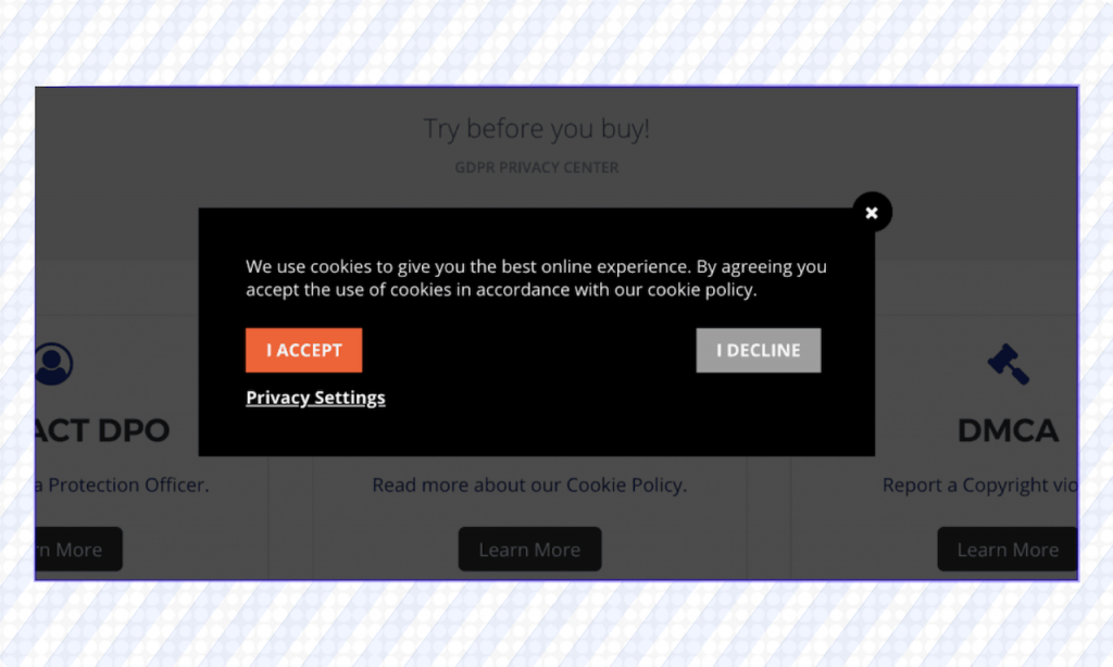
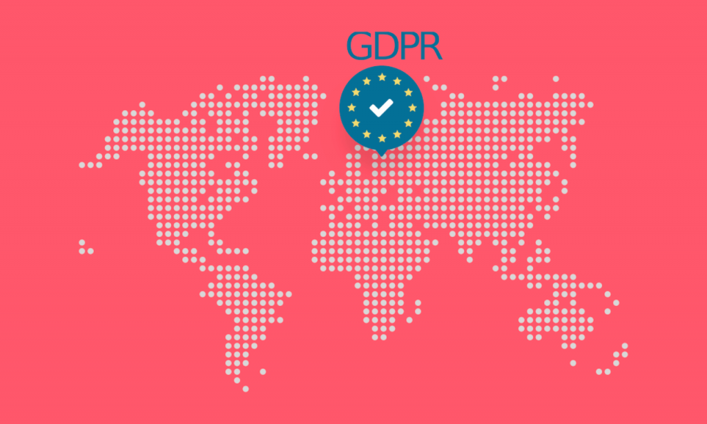
Alas, there’s also the new European law, known as GDPR. Fundamentally, this law is about user data protection. This includes things like cookie tracking, data, and risk management.
If you want to learn the ins and outs of what GDPR means for the modern web, I highly recommend reading an article on Smashing Mag written by Heather Burns. It’s an in-depth and thorough read on this new law and includes numerous checklists you ought to take into consideration when working on a new design project.
Numbers and Existing Clients
Building trust isn’t a one-way street. You can always find new ways to reassure consumers that they are in good hands when using your product.
Some of the most prominent examples of this are to use numerical data, reviews, and showcasing your actual clients. E.g. Adding brand logos from your existing clients can work very much like word of mouth promotion.
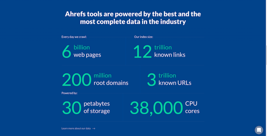
Ahrefs is a well-known marketing suite for SEO specialists. Their database of search and marketing data is ridiculously large. But, you wouldn’t know this unless you become a customer first.
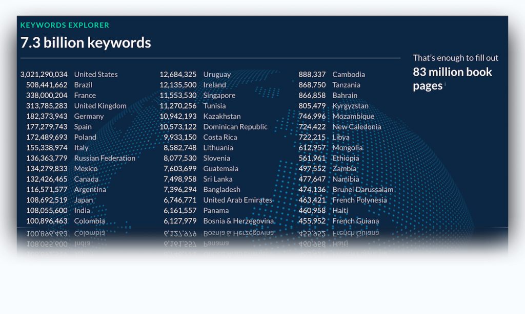
See your data as an opportunity to promote trust signals. Having a database of 7.3B keywords is impressive. Let your customers know!
Even if it’s only a small feat that you have accomplished, tailor it together with your story. Little bits of honesty and sincerity are going to help build a positive brand image.
A word of advice: Don’t risk your brand’s reputation by pretending to be who you are not. It’s better to list a single brand logo with an actual client, than ten logos without you having any connection to those brands. The same applies to numbers. Be willing to admit that you “only” have 1,000 customers. It’s real, and it shows that you’re helping to solve real problems.
Set the Seal on Security
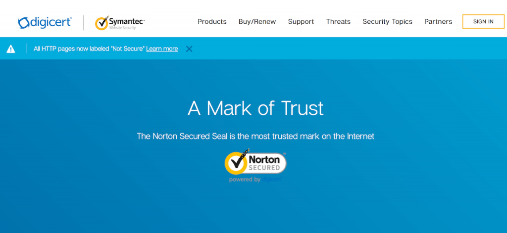
Are you processing payments directly from your site? Are you using a third-party gateway like Stripe or PayPal? Whichever it is, you ought to make it clear whenever a user is going through the checkout process.
Another alternative is to use ‘trust seals’, which can be bought from certified providers. A trust seal is a commonly used mark across many different e-commerce platforms and helps to strengthen the perception of trust that new clients might experience.
There is a substantial number of case studies behind secure seal providers like Norton and McAfee. As many as 50% of online shoppers take into consideration the display of trust-marks across checkout pages.
Take yourself as an example.
Would you blindly follow through to give your payment details to an unknown brand? After all, it’s only another website somewhere on the internet. Expect new clients to have this mindset about your brand, too.
Who Are the People Behind the Brand?
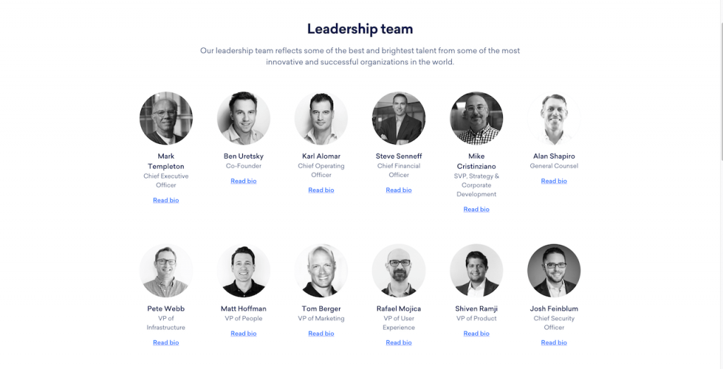
I love to read success stories, but I also enjoy reading about the people who make certain products. Who knows, you might share similarities and that could lead somewhere by itself.
But, it’s not just about opportunity. The idea that users can see and read about the people behind a product fosters a sense of community.
Your team members can submit their personal bio’s, provide social media links, and real-life photos. The goal is to help new users feel like they can establish a real connection with your team.
Also, it’s understandable if your product consists only of one or two people. This isn’t as uncommon as people think. Many great products have started out as a solopreneur project (Icons8 among them), only later to grow immeasurably.
Don’t be afraid to tell your story.
Talk about the problem you are solving, how it came about, and what you are doing to try and solve it. This creates a real and authentic connection. And there’s nothing more valuable than that if you wish to build trust and establish loyalty.
Practices & Case Studies
Another way to learn, apart from putting things in practice, is to see how other brands are tackling similar design-related matters.
While it’s not viable to list every case study made in the recent year, it’s more than fair to talk about a select few that match the practices we have discussed in this article.
Optimizing Landing Pages for Comprehension
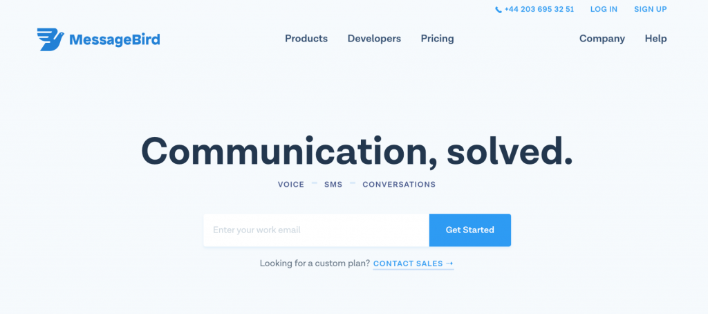
The first point we discussed was about pitching value, and more specifically, explaining what your product does. To better illustrate how this works, here’s a recap from a case study done by Hugo Jenkins.
The study in question was done on the subject of, “How to optimize SaaS landing pages for rapid comprehension”, and the product in question used for this study was MessageBird.
As the image above shows, the default intro headline for this landing page is terrible. There’s no clear direction for what kind of communications are being solved, or what solved even means in this context.
In this situation, it doesn’t even matter if you’re a SaaS company or not, what matters is that users can quickly decipher what your product is about.
How was the optimization achieved?
For this specific study, Hugo used the 5-second design test feature provided by UsabilityHub. It’s the quickest way to get people from all around the world to give their gut impression on what they see on a web page.
Here are some of the comments for the first iteration, which is the default headline shown in our first screenshot:
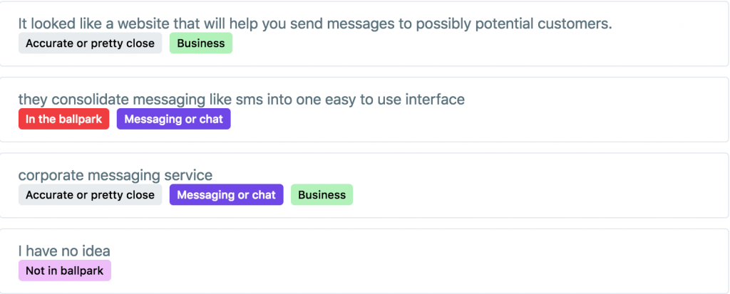
While the responses indicate a clear understanding of the relation between a messaging service, it’s still not fully clear — to the user — as to what kind of messaging service this product is about.
After the initial test, Hugo went over numerous reiterations, finally landing on this one:
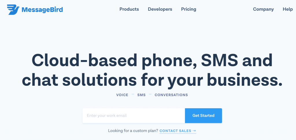
The overall result for this iteration was a whopping 82% for ‘in the ballpark’ or ‘pretty close’ (these labels were created by Hugo himself for the purpose of collecting relevant data).
All in all, this falls in line perfectly with what we discussed on the first point in this post. Use the header section of your landing pages to give a concise answer to the question of, “What does this product do?”.
MailChimp Creating a New Brand Identity
MailChimp isn’t your typical brand to hit the shelves of design news. But this year it’s different. MailChimp will remember 2018 as the year when it completely revamped its digital brand identity through an entirely new design structure.
We didn’t want our brand to feel disjointed, so we created a more unified and recognizable system by weaving the new brand identity throughout all facets of MailChimp, from our customers’ accounts to our website, and from our marketing to our support channels. (Gene Lee)
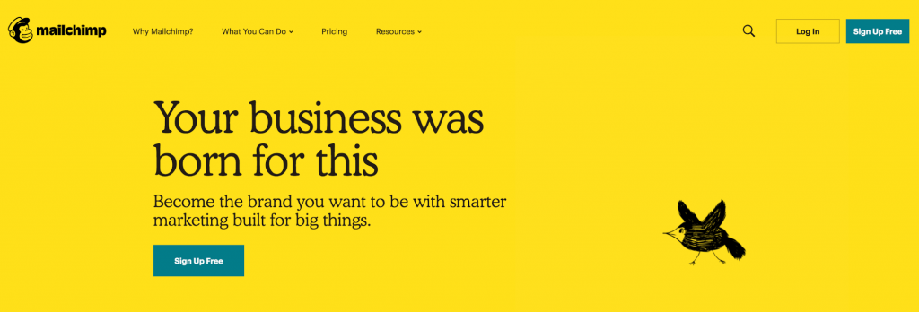
The new design, which affects all public MailChimp pages, is also highly documented inside the MailChimp Design chronicle.
If we dig deep inside all the changes that MailChimp brought forth, it’s clear as day that there are strong similarities between what we have discussed on the subject of UX design and user trust.
We touched upon design consistency, and how familiarity helps to draw a much clearer path towards customer acquisition. Hindsight, this is a massive part of MailChimp’s new design foundation.
Here’s a rundown on some of their new design principles:
- Creativity & structure. When you have multiple creatives working on one complete design, things are bound to get a little chaotic. To solve this, MailChimp has built a framework of core components. Using a framework lets you retain brand identity on all pages, while also giving designers more freedom in creative expression.
- Consistent style. Typography, logo, and color schemes are kept thoroughly grounded and organized. As a result, each page feels familiar and welcoming.
- Visual communication. MailChimp is attempting to embrace a more emotional user connection by implementing illustrations, animations, and unique photography. It works!
If you browse the new homepage, you’ll quickly grasp the idea behind this new identity. Page flow feels effortless, with a lot of clear spaces and distinct typography to guide you through.
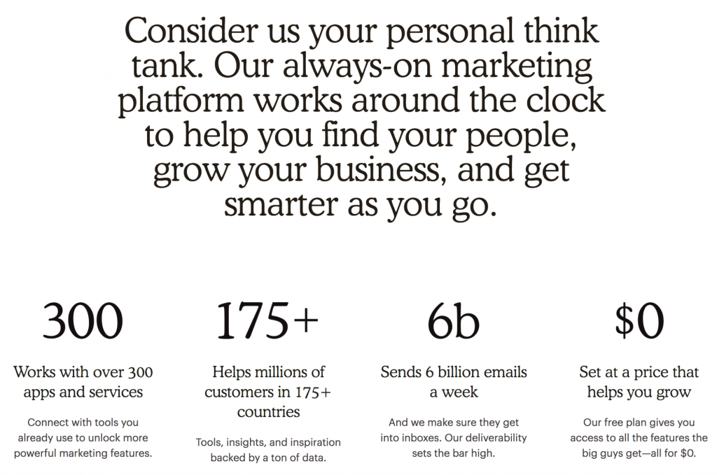
But it’s not just the amazing effort put towards design consistency.
MailChimp manages to embrace the elements that make users feel like they can trust a brand: pictured above.
Also, their security guarantee is an actual thoughtful write-up on how the company protects your data. After reading such a thorough exposition, I can’t help but appreciate the distance that MailChimp is going to protect my data from unauthorized access.
What are your thoughts on MailChimp’s new brand identity? Does it feel like their design structure accomplishes the task of instilling trust and curiosity?
Over to you
Little things make a big difference. Actually, it’s probably testing that makes the biggest difference.
Are you being thoughtful with your UX design in the aspect of trust?
Share your story in comments, let us learn what has worked for you and what proved to be inefficient.
About the author: Alex Ivanovs is a digital marketing specialist with a knack for writing, UX design, and all-things success. Visit his website Stack Diary.
Title image from Ouch, the collection of free vector illustrations
Learn how to use icons on landing pages, check best practices for website footer design and review the tips on choosing effective images for landing pages