Building a website is all about your users. You need to be aware of your audience and you build your brand identity around them. There are thousands of ways to approach and enhance your website user experience. One of the strategies we are often presented with is using humor and cuteness added to your website style.
What is implied with humor and cuteness? Is it all about making jokes and being sarcastic? Well, it’s a bit more than that. If you choose to go down the humor road, you’re giving your brand a specific voice, and you need to be consistent in using it. Humor helps you make a great first impression on your users. It also leads to people developing certain kinds of emotions for your brand and that makes it closer to your users.
Here’s what you need to know if you want to use humor and cuteness to improve your website user experience.
Make a Mascot
Having a mascot represent your brand is a strategy that’s been around since the 1950s- that is, the beginning of advertising.
From Mr. Clean by Procter & Gamble and Quicky by Nesquik to Michelin Man by Michelin, we have enjoyed watching mascots speak on the behalf of the brand and make us smile or laugh every time their face is on the screen.
As you can see, world-famous brands use mascots to inject a bit of humor in their brand identity. They use it as their primary brand voice and nurture it throughout their entire global marketing campaign.
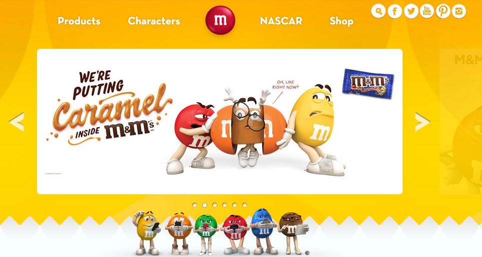
For example, take a look at M&M’s.
M&M’s mascots have been around since 1995, and they haven’t stopped making us laugh. The little M&M’s will greet you on their website using witty jokes, sarcastic comments, and powerful punch lines.
Along with the website’s colorful design, little M&M’s paint a picture for the website visitors and make the user experience unforgettable.
 Source: mms.com
“Creating a funny mascot to greet your website users will make them feel more comfortable, relaxed and even amused. In addition, it will make the whole experience memorable, and that’s exactly what you want”- says Mariah Daley, a psychologist and writer at ResumesCentre.
The Bait
Humor can be used as a bait to make to users stick around for just a bit longer or to have them perform the desired action.
You can achieve this by having something funny, mysterious or witty jumping in front of your users the moment they enter your website.
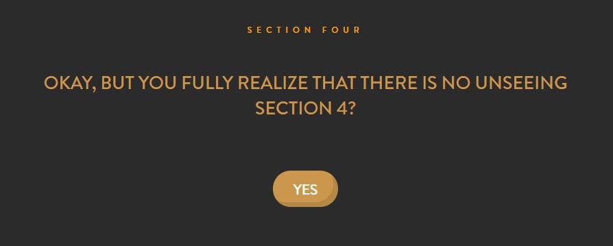
A great example is Cultivated Wit, a website about connecting comedy and technology. Obviously, it needs to be super funny. Once you enter it, you’ll be presented with the first 3 sections and asked if you want to enter section 4. Once you confirm, the humor kicks in:

This makes you smirk a bit, and, naturally, you click YES.
 Source: Cultivated Wit
Now you simply have to keep on going and see what else do they have.
Later on, they go on asking you what your super-power is and how come you gave them your name so easily. It’s an overall fun and interesting process, and it definitely makes you want to be a part of their party.
Amanda Sparks, a marketing specialist and a writer at EssaySupply says that humor can be used as a bait even on websites whose message is serious: “Sometimes the contrast between the humorous surface and serious core can do the job for a website. It’s all about using humor smartly.”
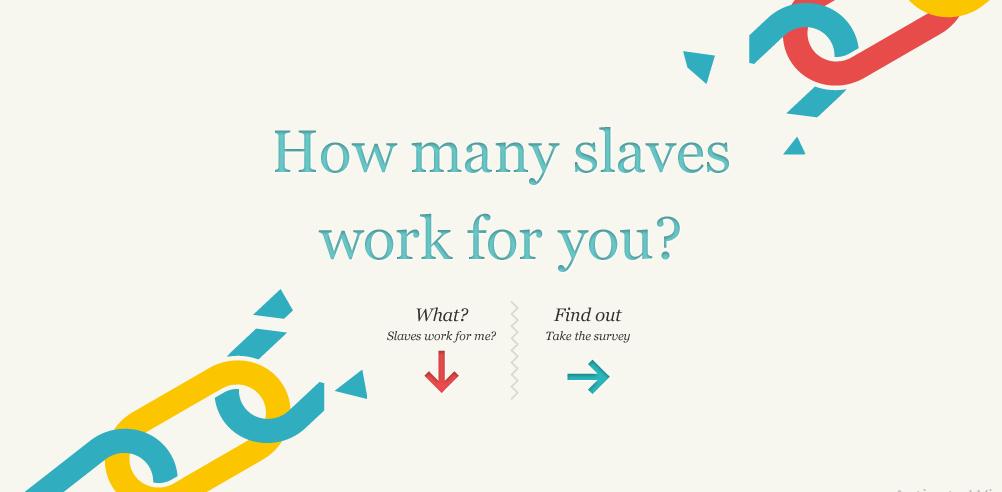
Another great example of humor used to deliver an important message is made by Slavery Footprint. This website deals with fighting against child labor and slavery in supply chains. However, take a look at the opening line on their website:
 Source: Slavery Footprint
This kind of a formulation makes most of the users decide to take the survey, which consequentially leads to them finding out more about the website’s mission and how to join it.
About Us Page
Humor is proved to have beneficial effects on both mood and memory. That means that funny information is easier to remember than a non-funny one. A humorous website is more memorable.
If you want to retain your users and draw more attention to your website, you can make the About Us page hilarious and entertaining. You can opt for representing your team members in a humorous way and draw your brand and your business closer to the users.
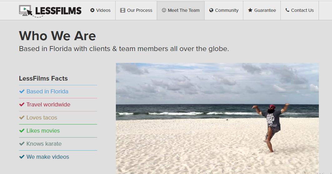
Here’s how it’s done by Less Films.
 Source: Less Films
They have a super-funny opening video on their About us page, telling the story of their business and making you laugh. In addition, they have funny pictures of all team members along with witty facts about their business. The whole thing is pure enjoyment for the users who appreciate a good joke and quality humor.
How can you do it?
You might be reading through all this thinking, that’s all fun and games but how can I do it? I’m not a comedian!
The truth is, you don’t have to be a comedian in order to use humor for your website. You do, however, need to be smart and tactical.
Look at the things you absolutely need to have in mind:
Planning
Every step you make needs to be planned ahead. In other words, you need to set clear goals.
Make sure to formulate your website’s goals and what you want to achieve with humor and cuteness. That’ll help you make the best of it.
Your audience
Who are you writing for? Web designers, dancers, pet shop owners? What kind of humor do they find funny?
“If you’re able to identify your audience and analyze the data you have on them, you’ll be able to create humorous lines especially for their taste” suggests Randall Morris, a web developer at Citatior.
Information
Remember why you’re here- to convey a message and deliver specific information to your audience. That means your jokes aren’t just supposed to make people laugh. They need to be highly informative and useful at the same time.
Well-written
Don’t overthink the writing process. Brainstorm the best ideas, and see what comes up to surface as the best one. Then polish it until it’s what you wanted. Make sure to test it with friends and family prior to publishing.
You can look for help in formulating your jokes from copywriters on FlashEssay or OnlineWritersRating.
Conclusion
Great user experience is what sets you apart from other websites dealing with the same services or products. You need to be memorable and unique so as to have people come back to you. Humor and cuteness can help you achieve this. The only thing you need to worry about is the bigger picture.
If you find your brand being in accordance with a humorous website – go for it. Structure your website and enrich it with cute mascots, entertaining design, and attractive baits. Give your users an unforgettable experience and make sure they have a smile on their face every time they visit your website.
About the author: this is the guest post by Leona Henryson, a UX designer and writer.
Title image by Diana Stoyanova
Check Ouch, the collection of free vector illustrations for UX
Read the tips how to use icons on landing pages, review popular UI design trends and best practices on using illustration in UI design