Windows 10
Microsoft introduced a new style with the icon font for the Windows 10 Preview.
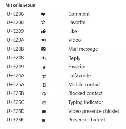
It’s called Segoe UI Symbol and contains around 1,000 glyphs.
Microsoft didn’t publish the specifications yet. Based on experience, there is a chance they will never publish them at all; there are still no specifications for Windows 8. It often result into style inconsistency and breaking the visual weight of the icons, but that is another story.
However, we can say the following, based on how the icons look:
We’ve created a tool to compare Windows 10 with Windows 8, iOS 9, and Android side-by-side.
Other than that, these glyph icons are similar to many others. Designers who are used to drawing icons for Windows 8, iOS, and Android will have little trouble designing line icons for Windows 10.
From our experience, the more icons you create, the better they will get — no limit! We’ve been creating icons daily since 2005, and we still have room for improvement. So, we believe that our Windows 10 icon pack is way better than our Windows 8 icon pack, which is three years old. Windows 10 is the best icon pack we have at the moment.
Also, get the lists of free vector software and free photo editing software.
Monochromatic color = one hue, many values. Learn what it is, why it works, examples,…
A blunt look at why “three clicks” isn’t a usability law, what actually drives task…
Your cover may hook them, but the contents page keeps them. Learn how to design…
Because your feed shouldn't look like it was generated by the same three people. (more…)
From bold typography to organic abstracts, explore creative poster layouts with pro tips to adapt…
Everyone's out here saying "don't use Garamond" like it's 2015. Spoiler alert: it's not.
This website uses cookies.