Ready to turn your app into a spatial experience with visionOS? Check out Apple’s official guidelines.
At WWDC23, Apple rolled out a gadget that totally redefines tech and how we interact with it – the Apple Vision Pro. It’s a spatial computer that blends digital stuff with the real world. This bad boy lets users control a 3D interface using just their eyes, hands, or voice. Pretty cool, right?
But wait, there’s more. The Vision Pro runs on visionOS, which is the world’s first-ever spatial operating system. It’s all about making digital content feel like it’s literally part of your surroundings.
Seems like Apple is changing the tech game yet again.
Let’s start with the basics.
Key concepts of spatial design
As visionOS is a completely new operating system, you’ll have to re-design your apps to fit Apple’s guidelines. Here are the key principles you need to know about spatial design:
Familiar. This is all about how users engage with your app. It includes window design, window size and flexibility, the points system, and the immersion spectrum. The goal here is to make sure that your app feels intuitive and easy to use.
Human-centered. In spatial apps, it’s essential to consider what a user sees and how they move. Content placement should account for different heights and positions in space.
Dimensional. It’s all about space and depth to enhance the user experience. It involves utilizing your user’s surroundings, playing with the sense of depth and the perception of scale for a smoother blend with reality. The aim is to make your app feel like a natural part of the user’s space.
Immersive. Create a deeply engaging and memorable experience for the user. This includes leveraging immersion, animating scenes, guiding focus, and emphasizing key moments. The goal here is to make your app more than just a tool – it should be an experience.
Authentic. Focus on ensuring that the user feels comfortable and in control while using your app. Smooth transitions, keeping users comfortable, clear entrance and exit, and doing more with less. The aim here is to make sure the app experience is pleasant and not overwhelming.
Spatial UI: foundations
Icons
Let’s start with the first thing the user sees – the app icon. According to Apple’s “Design for spatial user interfaces“, these are the requirements for the icons for visionOS:
Use multiple layers: You should use up to three layers to create a truly three-dimensional effect. This should include a background layer and up to two foreground layers on top.
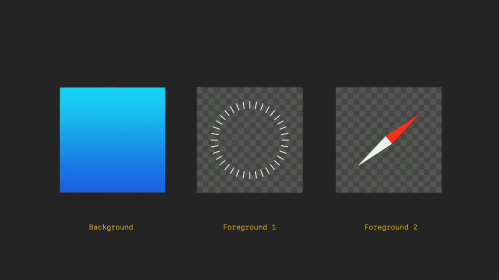
Image size: Make sure each layer is a 1024×1024 px square image. The foreground layers should have a transparent background.
Edge-to-edge design: The background layer should be designed as an edge-to-edge square image. All layers will then get cropped by a circular mask.
Centered graphics: You need to keep your graphics centered. If they are too close to the edge, they may appear off-center when expanded.
Avoid semi-transparent pixels: Layers with reduced opacity will blend with the shadow cast behind them.
Avoid using glass layer: A glass layer is applied automatically by the system, adding depth, specular highlights, and shadows.
As much as we love our 3D icon collections, flat designs would be a safer option. Luckily, we got tons of those for you to choose from! Check out our Color icon sets.
Get inspired with our spatial-like 3D fluency icon set.
Materials
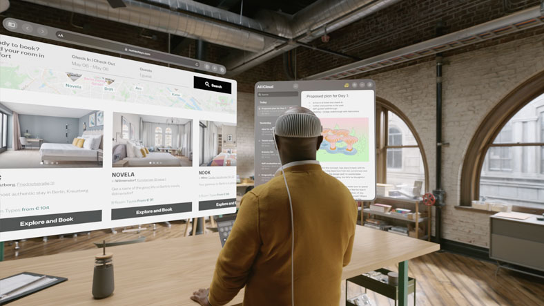
Spatial interfaces offer an immersive 3D environment that users can interact with, blurring the line between digital and physical realities. Here are some things that Apple’s team recommends you take into account:
Lighting conditions: Your app needs to adapt to various lighting conditions. It should be easy to place in space around you, easy to use at any distance, and easy to view under any lighting conditions.
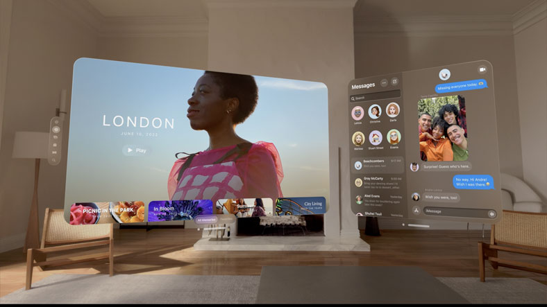
Glass material: Defined by Apple as a new visual language, the glass material is there to make your app feel like part of a user’s physical world. Specular highlights and shadows reinforce its scale and position in space.
Avoid solid colors: Too many opaque windows can make the interface feel heavy and constricting.
Dynamic response to light: The glass material responds dynamically to lighting, adjusting the contrast and color balance to feel part of your space.
Use darker and lighter materials: Use darker materials to separate sections of your app, and lighter materials to highlight interactive elements. Be careful about stacking lighter materials on top of each other, as it impacts legibility and reduces contrast.
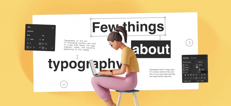
Typography, color, vibrancy
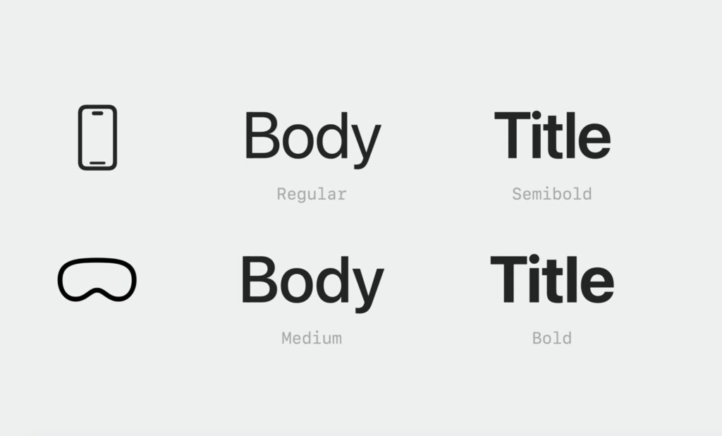
Typography adaptation: Font styles use semantic names that work on all platforms and are tuned using a point-based unit system for legibility at any distance. Some font weights have been modified to improve contrast and readability. For example, the body text style uses medium weight instead of regular, and titles use bold instead of semibold. The tracking has been slightly increased to enhance legibility.
Hierarchy indication: Use vibrancy to indicate hierarchy for text, symbols, and fills. There are three modes: primary, secondary, and tertiary. The primary mode is used for standard text, while the secondary is used for description text, footnotes, and subtitles.
Vibrancy: Vibrancy brightens foreground content displayed on top of material by pulling light and color forward from what’s behind it. Vibrancy updates in real-time to ensure text is always legible, given that the background can be constantly changing.
Color usage: White text or symbols are preferred for clarity. If color is needed, it should be used in the background layer or the entire button. When possible, use system colors instead of custom colors, as they are calibrated for legibility and dynamically adapt to maintain hue and contrast on the glass.
Wrapping up
Imagine being immersed in an intricate blend of digital and physical realities, a seamless fusion that delivers a unique user experience. It’s almost like stepping into the world of a sci-fi film, only this time, it’s way more interactive and exciting. This is the essence of optimizing apps for Apple Vision Pro through spatial UI design – a reality that takes user engagement to a whole new dimension.