Review the bunch of handy design tips and examples to help you choose the best logo fonts for your brand.
Your logo plays a central role in defining your brand. Beyond just capturing what your company does, it also captures your company’s personality. But how do you create a logo that ticks both these boxes while also resonating with customers, working across mediums, and standing out from competitors? Well, you start by looking at your logo’s elements.
Your main logo elements are symbols, colors, and fonts. These come together to create your logo’s design and build your brand identity. While all of these elements are important, there’s one the element that does most of the talking: fonts.
As important as fonts are for logos, they can be a bit intimidating. When designers start talking “kerning” and “tracking,” it’s easy to feel overwhelmed. But finding the right logo fonts doesn’t need to be difficult. To help you choose the best logo fonts for your brand, we’ve pulled together some font basics to get you started. With a few lessons in logo and font design, you’ll be able to find fonts that fit your brand to the letter.
Fonts 101
As you begin your search for the perfect logo font, it helps to familiarize yourself with the language of letters. Here are a few of the terms you’ll need to talk fonts:
Typeface
Typefaces are groups of fonts that all share key font features. Families of fonts that all have the same “look” fall into one typeface—like Times or Arial.
Font
If typefaces are the family, fonts are the individual members within that family. While they might look similar, features like weight, size, slant, and italicization set individual fonts apart from their typeface siblings. Within the Arial typeface, you’ll find specific fonts like Arial Extra Bold Italic and Arial Light.
Typography
Unlike fonts and typefaces, typography is less about letters themselves and more about how they’re used. This graphic design process involves arranging type in a way that’s both beautiful and legible. Typography works with typefaces, fonts, visual hierarchy, spacing, and other design elements to enhance everything from webpages to posters.
For logos, how you use your font is just as important as the font itself. Without proper typography, even the most beautiful font won’t work. To make sure you’re giving your logo font the best shot, research the basics of typography as you start designing.
Whether you are creating a logo on your own with an online logo maker or getting it done by a professional designer selecting a right font is important specially when you are opting for having a typography logo.

Source: Careerfoundry
Choosing a Logo Font That Fits Your Industry
To narrow down your search for the perfect logo font, let’s start by breaking down a few typefaces you might consider. Finding a font that fits your brand begins with finding a typeface that fits your industry.
While you don’t need to stick with industry-specific typefaces, it helps to know which typefaces are associated with which industries. That way, you can work with any assumptions customers might have—rather than against.
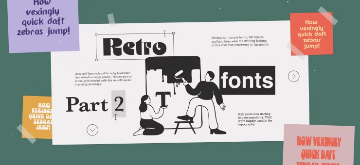
Serif Fonts
The feature that defines Serif fonts is the small extensions at the end of letter strokes—known as serifs. Seen as established and refined, these fonts are popular in publishing, finance, insurance, and law. They’re a good choice for brands looking to convey a sense of stability and maturity in their logo, as most customers associate them with serious industries.
The Financial Times logo uses a Serif font
The Financial Times logo on the front page of the papers. Source: Financial Times
Slab Fonts
A subsection of Serif fonts, Slab fonts have serifs that are much thicker and more uniform than most members of the Serif typeface. They have a heavier, squared-off look, which makes them a popular logo font for durable, reliable companies. If your brand operates in an industry like automobiles, outdoor equipment, or electronics, Slab fonts might fit your logo.
Sony’s logo uses a Slab Serif font
The Sony logo on a pair of headphones. Source: Sony
Sans Serif Fonts
If Serif fonts are defined by having serifs, Sans Serif fonts are defined by not having serifs. This clean, sleek family of fonts has become increasingly popular across industries over the past few years. A longtime favorite of minimalism-obsessed tech companies, Sans Serif fonts have also become popular in fashion and media lately.
Calvin Klein’s logo leverages a Sans Serif font
Calvin Klein’s Sans Serif logo font on a tote bag. You can see the brand’s old Serif font used in the large ‘K,’ an homage to their former logo. Source: Calvin Klein
Modern Fonts
A subsection of Sans Serif fonts, these more experimental fonts take the sleekness of typical Sans Serifs a step further. Think gaps between letter strokes or some strokes omitted entirely. Again, these logo fonts are popular with the tech industry, but you’ll also find them in music and movie logos.
Ritual’s Modern font omits a stroke on its ‘A’
Ritual’s Modern logo font in action on a mobile pickup interface. Source: BlogTO
Script Fonts
With their handwritten look, Script fonts lend a personalized look to logos. These elegant fonts are favored by luxury and boutique brands alike. They’re typically associated with restaurants, clothing brands, and many of the finer things in life. If your industry is on the higher end, these fonts might be the right choice.
Cartier’s signature Script logo font
Cartier’s logo appears twice on this wedding band from the brand. Source: Cartier
Once you have an idea of which typeface fits your brand’s industry, it’s time to delve into the details of your logo fonts.
Details Make the Font
Once you’ve found a typeface that makes sense for your industry, it’s time to let your brand’s personality shine through. This is where you can really set your brand apart from your competitors and show who you are. All it takes is a little fine-tuning of your font’s qualities. If you’re considering a font pair for your logo, try contrasting these qualities between your two fonts.
Geometry and Rounding
Font geometry exists on a sliding scale, with blocky, highly structured fonts at one end and softer, more human-looking fonts at the other end. Blockier fonts create a more mechanical feel, while humanist fonts create a more approachable feel.
As you consider geometry, you should also look into rounding. Fonts with crisp, sharp corners have a more professional feel, while those with rounded corners are friendlier and more approachable.
For your logo fonts, you’ll likely land somewhere in the middle of the two extreme ends of geometry and rounding. By leaning more to one side than the other, you can communicate nuances about your brand’s personality.
Weight
Weight refers to the thickness of the strokes within your font. Thinner fonts create a delicate feel, which can be good for brands trying to convey sensitivity.
On the other end of the spectrum, heavier fonts create a bolder impression. The sense of stability and strength a heavier weight font creates can sometimes come off a bit brash. So you’ll have to consider the context of your brand before you go all-in on a heavier font.
Spacing and Openness
Spacing and openness are two sides of the same coin. Spacing refers to the room between letters; openness is the room inside of letters. For both, the roomier your fonts, the more calm and airy your logo. But if you add too much space, your name can become disjointed or difficult to read. This is where learning kerning comes in handy.
If you remove room from your logo fonts, you can create a cozier, warmer look. But if you go too far, that coziness can turn to claustrophobia. As with all of these logo font details, you’ll need to find a balance that fits your brand.
Contrast and Dynamism
The last logo font characteristics to consider are contrast and dynamism. Contrast is the variation in the width of the strokes of your fonts. Low contrast fonts have the same width throughout, while high contrast fonts vary thickness throughout their strokes.
Dynamism refers to the overall level of variation within a font. Some fonts are static, without much variation from letter to letter. Dynamic fonts break away from the grid format, with letters that vary greatly.
For both contrast and dynamism, the more movement in your logo fonts, the spontaneous your brand seems. On the other hand, by sticking to lower movement fonts, you create a more subdued and reliable impression.
Finalizing Your Logo Fonts
Now that you know the basics of font design, you’re ready to start choosing your logo fonts. As you set out on your search for the perfect font, remember to start with a typeface that makes sense for your industry before looking for font features that speak to your personality. With the right font, your logo will speak volumes about your brand at a glance.
About the author: Dawson Whitfield is the founder and CEO of Looka, an AI-powered logo maker that provides entrepreneurs with a quick and affordable way to create a beautiful brand.
Don’t miss the review of actual logo design trends, get insights into the psychology of logo design, learn what’s a brand book, and check more examples and design tips on typographic logos.