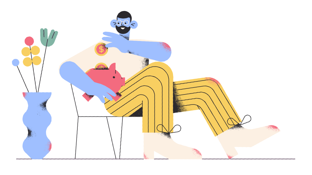
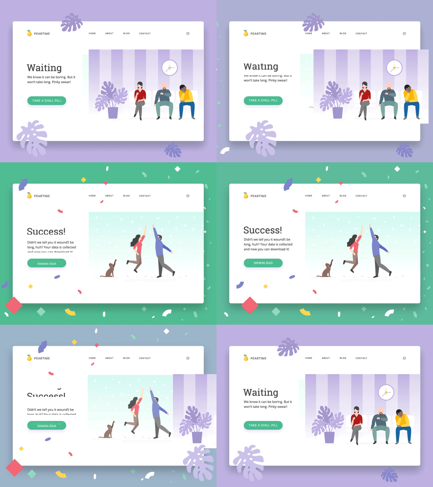
Сontent consumers are sometimes capricious children. If you look at the situation from the position of marketers, the worst option in the case is to keep giving “rational arguments” by means of the dry text. An adequate way to attract the attention of a target audience is to offer something different. But how to do that? For the web and mobile, use interface illustrations.
Visual Content Is Perceived Better
The power of images is great, so the full potential of visual content should be directed at enhancing the impact of your key message. Each of us is surrounded by a sum of the textual content with no time for its consumption. Fortunately, visual information is processed independently from the verbal information.
Correctly selected images clearly emphasize short and thriving slogans, having a more significant impact on the target audience. Here are some of the services that may be useful for you to adjust illustrations to the content:
- Visual.ly is the service specialized in creating visual content for modern marketers;
- Handmadewritings provides professional services featuring any content type, including the illustrative one as well;
- The Hideout is an agency of content makers with a wide range of specializations;
- The overview of Illustration History, across cultures and artistic genres.
Use the Full Potential of Images
We live in an amazing time: everyone can get new knowledge through the Internet quickly and for free. There are a lot of publicly available tools and resources with free access on the network. Images play the big role in this process. Still, don’t confuse pictures with illustrations – these terms are a bit different.
Pictures are a design or representation made by various visual means; basically, are just shapes with pixels. A photo, a collage, a painting, a screenshot – these are all pictures. Even a rectangle with some white noise is a picture.
An illustration is an element supporting the piece of writing (story, article, book, etc). It reveals the author’s thought by referring to sensory perception. The illustration can be made by means of a picture but also something different such as a table, a chart, and even a text example. The main thing is that it should disclose and clarify the idea.
Here is an example of an image made by the Icons8 designers for the Ouch illustration collection:
Now it’s just a basic picture linked to a particular theme – traveling, but in this presentation, it performs a very wide range of associations. Seeing it, people can see in it the checking of baggage, any airline company, acts of a terrorist nature, or anything else. To make this picture an illustration, it should get connected to the text and reveal the specific idea. For example, this is the same interface illustration featured in the web interface associated with traveling:
This illustration works because looking at it, a website visitor understands the content of your verbal message better. The image helps to reveal the idea by referring to sensory experience.
Here’s one more case how original interface illustrations by Icons8 enhance the error message on the screen, this time in a mobile app.
How to Attract User’s Attention with Illustrations
In the contemporary user interfaces, illustrations are beneficial together the text and other content elements. Illustrations can improve the usability of your content. Here are the key approaches how, using the illustrations, to attract the attention of the readers to your content and to improve their interactive experience.
Bright colors
The pretentious and enigmatic black and white images look great in art galleries, soft tones look great in the bedroom, but that’s often not what people expect to see online. Sometimes, you need color-rebels: red, green, yellow, or blue, and also their crazy combinations. Such colors favorably stand out in the daily routine.
When users search for the material for several hours, every minute they scan the screen faster and faster until strong visual prompts grab their attention. In this case, the user will read the title and, if they like it, they will open the article to read it.
 Illustration by Icons8 used as a title image for the article sharing the list of free graphic design software
Contrast
The brightness is not enough. You must, somehow, stand out: it is necessary that you are visible in the sea of content. A large bright object with a contrasting background may help.
Let the eyes relax
The disorder not only creates a bad impression but literally breaks the user’s attention. The sight is spreading out. Put an illustration on a suitable background, which will not distract the perception. Of course, you do not have to edit everything and stamp the white background everywhere. You only need to organize the content layout so that eye could naturally follow it.
 Set of interface illustrations by Icons8 used in the web interface.
Intrigue
You can also show the reader something abstract or some element that, at first glance, does not coincide with the topic. After reading, the reader would be surprised at what’s going on here and look at things differently. The best way to intrigue a person is to show something familiar but present it differently.
Avoid using text inside images
Unless, of course, this is not an infographic. Many bloggers like to add the title or theme of their post into an image. But the text often confuses the perception of the main message that the picture carries. Text images work fine when a picture contains a quote or some aphorism (something that makes sense in itself). Text that does not explain anything by itself will not work.
Metaphors
In many industries and for many topics, there is no accurate or attractive image transferring the message directly. You can not convey the essence or intrigue someone with a picture to the text about SEO. What is often used for such articles? Fragments of code, huge letters, and all that stuff.
The best alternative is a metaphor. The main thing is to come up with a fresh idea so that you could avoid turning good content into a cliche. For example, an article about link building could be perfectly decorated with not an apparent image of chain links, but with a photo or illustration featuring a chain of people holding hands.
![]() The Icons8 interface illustration presenting a metaphoric look on logging out
The Icons8 interface illustration presenting a metaphoric look on logging out
Conclusion
Visual information is processed hundreds of times faster than text by the human brain. Lead your customers and visitors with visual content. An exceptionally selected image can add new tints to the content of your message. Considering the interface illustrations, avoid obvious approaches and use more subtle ones. Try advanced methods – what if the entire page consists of images? And don’t neglect other illustrative mediums, such as tables, charts, and even texts.
About the author: this is the guest post by Donna Moores, a professional marketer with expertise in marketing, HR and freelance writing.
Title image by Olga
Read our article showing how to amplify user interface with illustrations, learn how to use images to improve mobile UX and check the handy tips on choosing effective images for landing pages.
Check Ouch, the collection of free vector illustrations for UX
Have an interesting article to share with our readers? Let’s get it published.