Dribbble is a great place for inspiration. And it is also the platform where creatives meet their clients.
So the way you present your work there matters like nowhere else. If you’re just starting your journey as a designer and want to make your first steps on Dribbble, then this tutorial is for you.
I will show you how to design a Dribbble-worthy shot using Lunacy, a 100% free design app that has everything you need for the task. We will create a couple of views for a mobile app concept with fancy graphics without even leaving Lunacy.
You can watch this video or follow the step-by-step guide below.
Let’s start with the background of our shot.
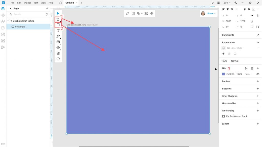
Launch Lunacy and create a new document. Create an artboard (A). I selected the Dribbble Shot Retina option from the list of presets in the right panel. Adjust the zoom so that the artboard fits the canvas.
Add a rectangle (R) the size of the artboard. Change the Fill of the rectangle to #CEC2FF.
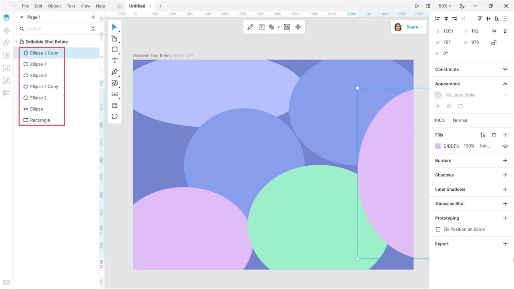
Add some ellipses (O) and adjust their colors. I used the following: #9B85F3, #F385EE, #B3FFA4, and #AEF4FF.
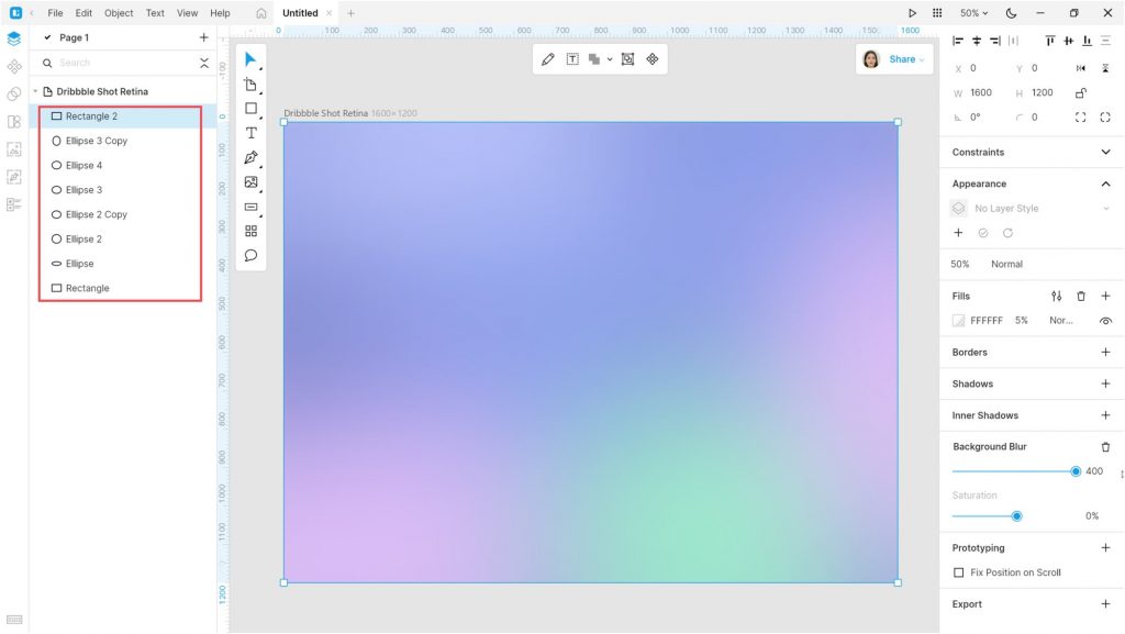
Add another rectangle over the ellipses:
- Color: #FFFFFF
- Opacity: 5%
- Background blur: 400 or more
The background is ready. Group (Ctrl+G / ⌘ G) all the objects on the artboard and then lock the group to prevent it from accidental editing.
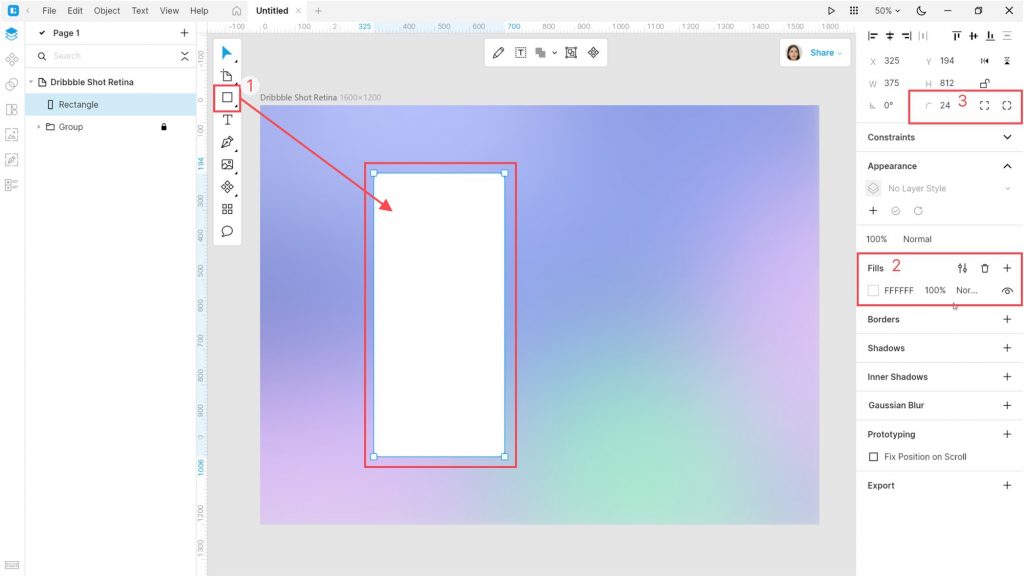
Now create another rectangle:
- Size: 375*812 px
- Color: #FFFFFF
- Corner radius: 24 px
This will be a view of a mobile app.
Open the UI Kits tab and select the Apple iOS UI Kit. Add the following top bar components:
- Bars/Navigation Bar/iPhone – Compact/Light/Default
- Bars/Status Bar/iPhone/Light
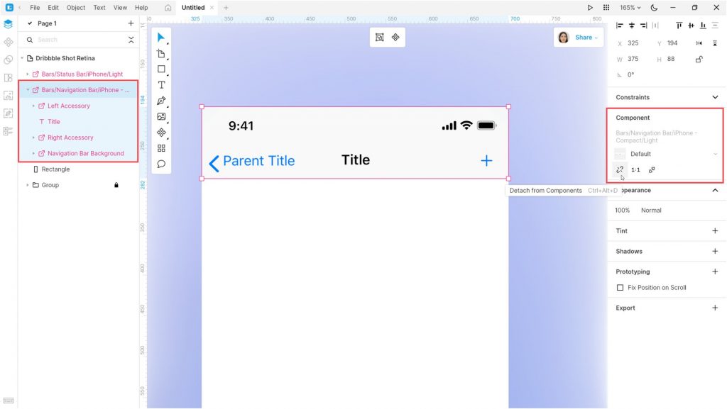
Select the Bars/Navigation Bar/iPhone – Compact/Light/Default component and detach it from components.
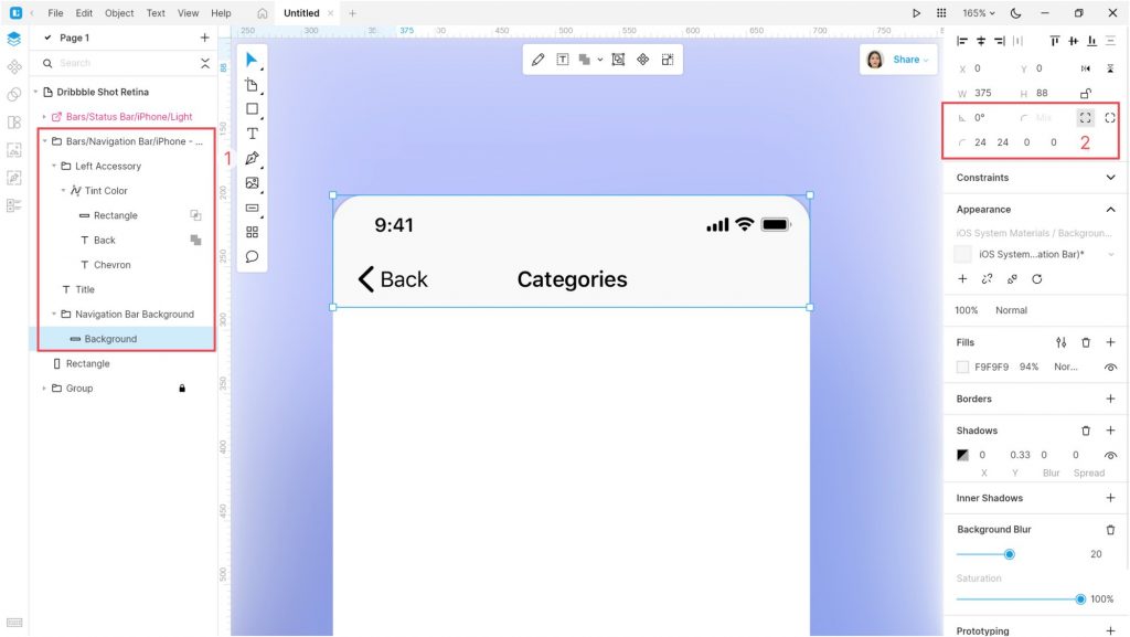
Adjust the object: remove the unnecessary elements, edit the text, color, and alignment of objects. I removed the plus button, changed the texts to Back and Categories, and set the texts’ color to #000000. Also, I set the radius of the upper corners to 24 px.
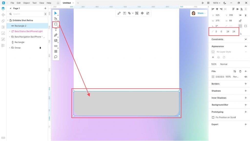
Now let’s switch to the bottom of the app view and add a new rectangle of 375*84 px in size. Set the radius of the lower corners to 24 px.
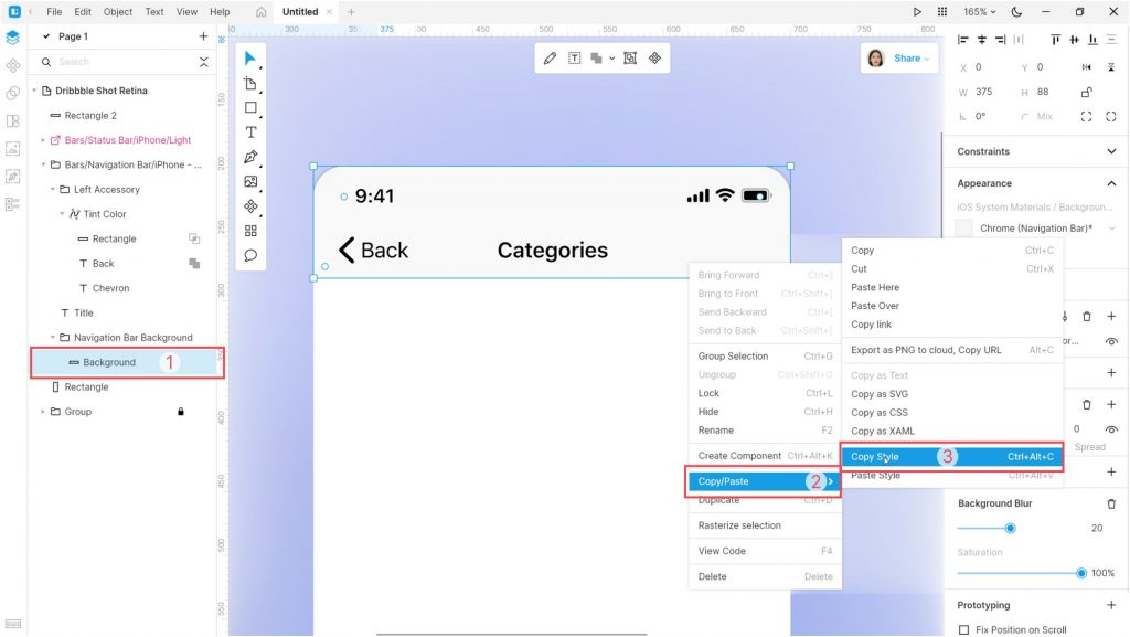
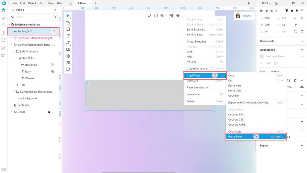
Copy the style of the navigation bar background (Ctrl+Alt+C / ⌘ ⌥ C or using the context menu).
And paste this style to the new rectangle (Ctrl+Alt+V / ⌘ ⌥ V or using the context menu). That’s a very useful feature. No need to set up object properties in the right panel.
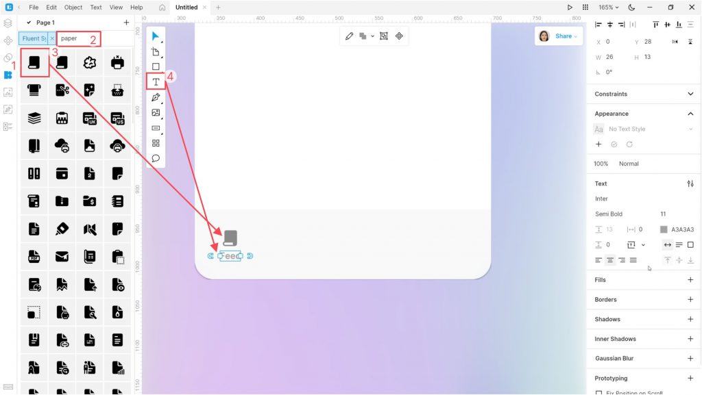
Open the Icons tab and select an icon. I used the Paper icon in the Fluent Systems Filled style. Then, add a text block (T) below the icon.
Set the Tint of the icon to #898989. The text settings are as follows: Inter Semi Bold, size 11 px, color #1A1A1A, and opacity 40%. Then, select the text and the icon and align them horizontally.
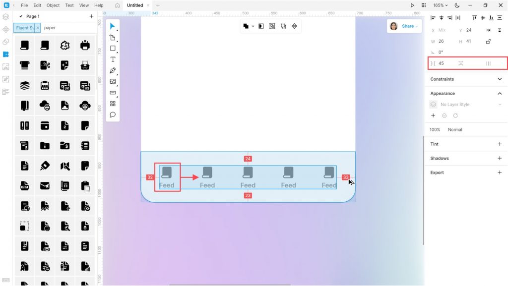
Group the icon and text and create four duplicates (Ctrl+D / ⌘ D).
Select all the icon-and-text groups and align them. Try the Tidy up button and the Smart Distribute feature.
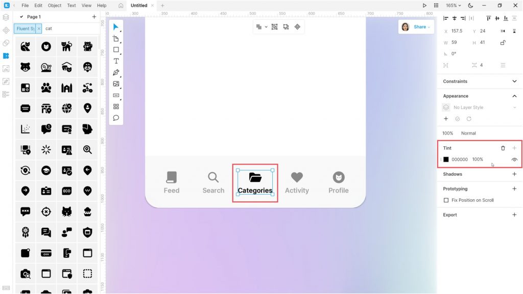
Change the icons and texts of the duplicates. Then change the color of the group in the center to #000000.
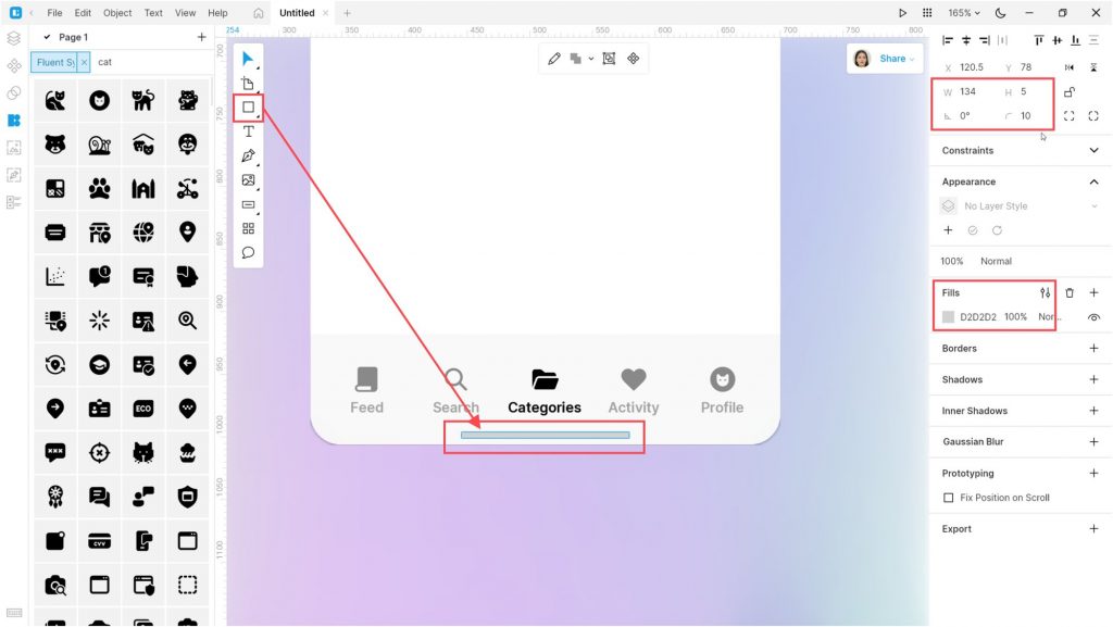
Add a small rectangle below the bar. This will be the Home indicator. Set its size to 135*5 px, corner radius to 10, and color to #D2D2D2. You can use the eyedropper (I) to pick up the color of existing objects.
Now let’s add some beauty.
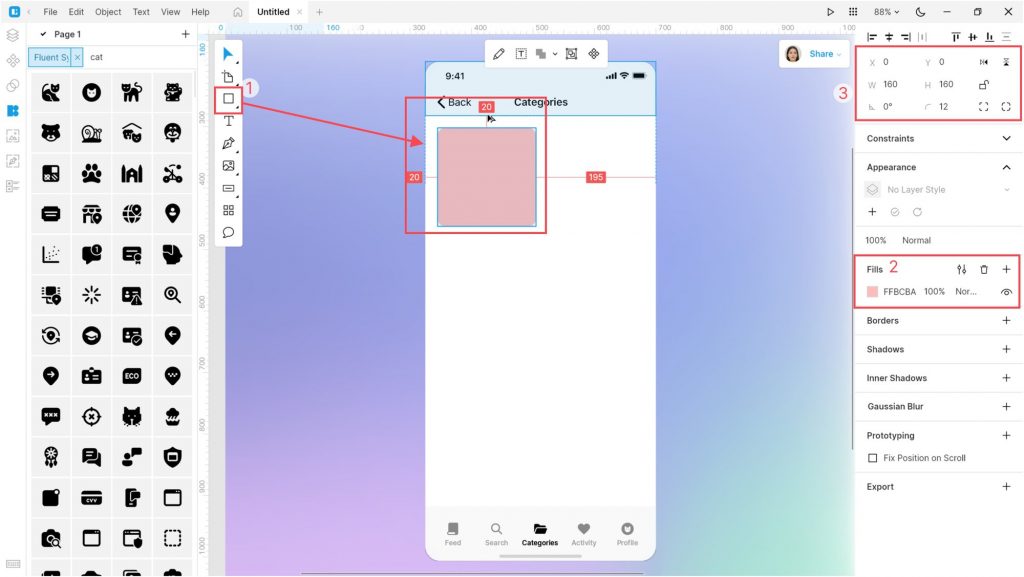
Go back to the top of the app view and add a 160*160 px rectangle. Set its color to #FFBCBA, and the corner radius to 12.
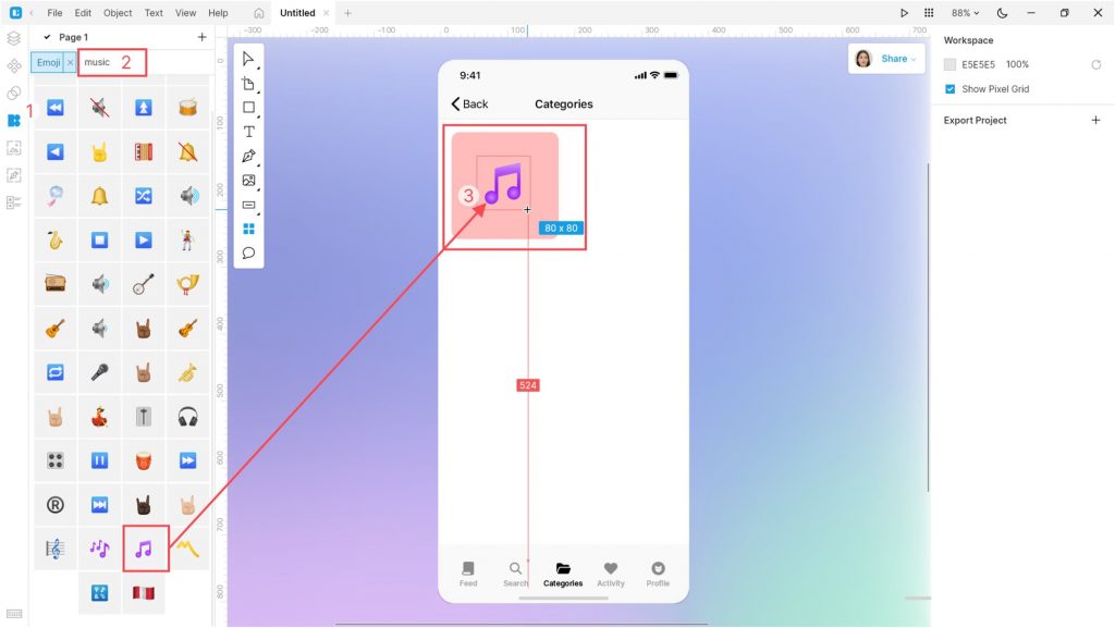
In the Icons tab, select the Emoji style. Find an icon, for example, Musical note. Place the icon over the rectangle. Align the icon to the center of the rectangle.
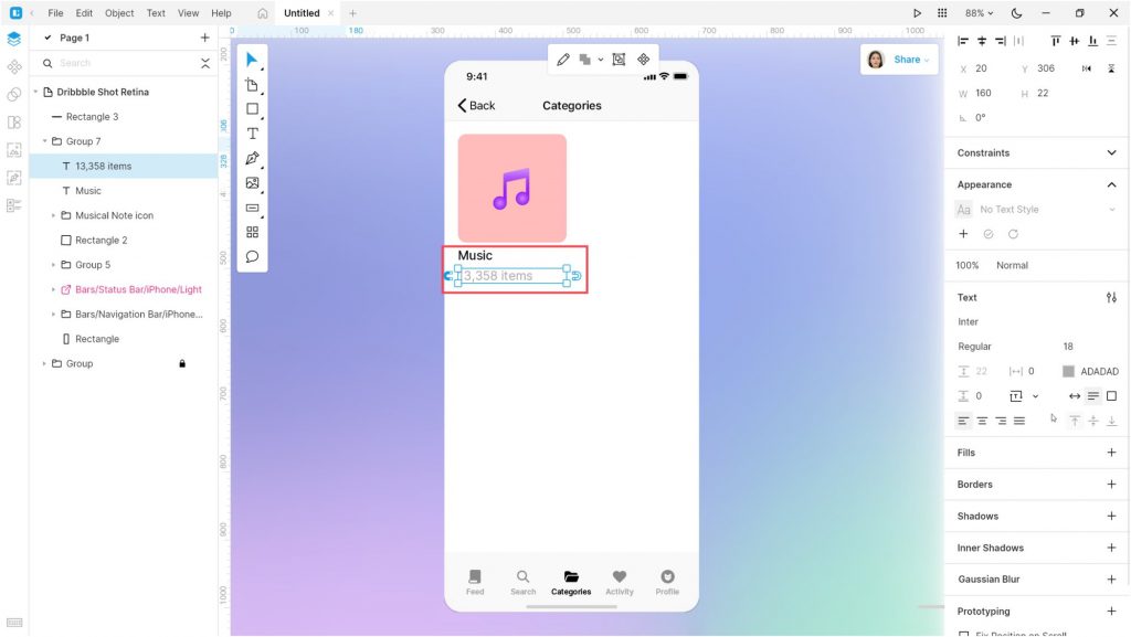
Then add two text blocks below the rectangle:
| Text | Font | Weight | Size | Color | |
| Top text | Music | Inter | Medium | 18 | #000000 |
| Bottom text | 13,453 items | Inter | Regular | 18 | #ADADAD |
Select the rectangle, icons, and texts, and group them.
Now duplicate this group 5 times and make some changes:
| Color | Icon | Text 1 | Text 2 | |
| Duplicate 1 | #91E3BC | Popcorn | Cinema | 124 items |
| Duplicate 2 | #FFE477 | School | Courses | 455 items |
| Duplicate 3 | #AEBFFE | Book | Books | 2,874 items |
| Duplicate 4 | #E9BAFC | Mask | – | – |
| Duplicate 5 | #F7BAD5 | Stadium | – | – |
You should get a result like this:
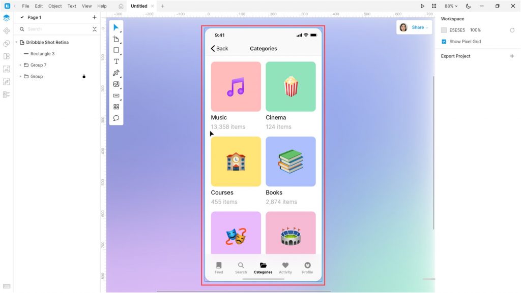
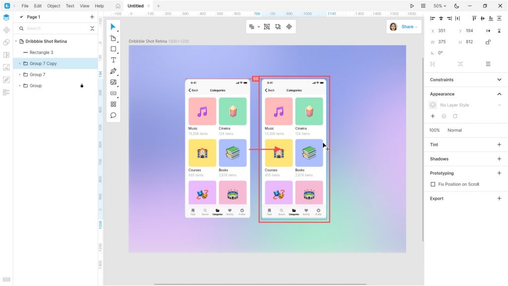
Select all the objects making up the app view and create a duplicate.
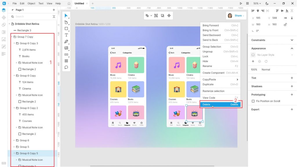
In the duplicate, select the cards and the bottom bar, and delete them. Also, delete the Categories text on the top bar.
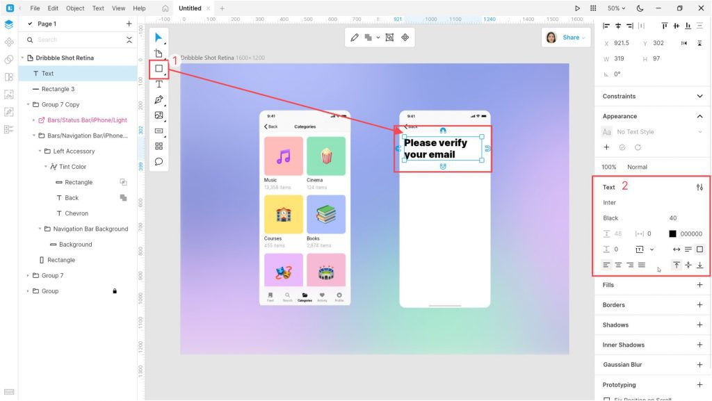
Select the Text tool and create a large text block as shown below. I used the following text settings: Inter Black, size 40 px, and color #000000.
Now create a text field with a placeholder text and a button.
For the text field create a 335*44 px rectangle. Set its color to #F7F7F7 and corner radius to 8. For the text, use the following settings: Inter Medium, 18 px, color #000000, opacity 40%, align left.
For the second button, create a rectangle with size 335*44 px and corner radius 8. Delete the fill and add a border with color #1A1A1A and thickness 2. Add a text to the center of the rectangle: Inter Medium, size 20 px, color #000000.
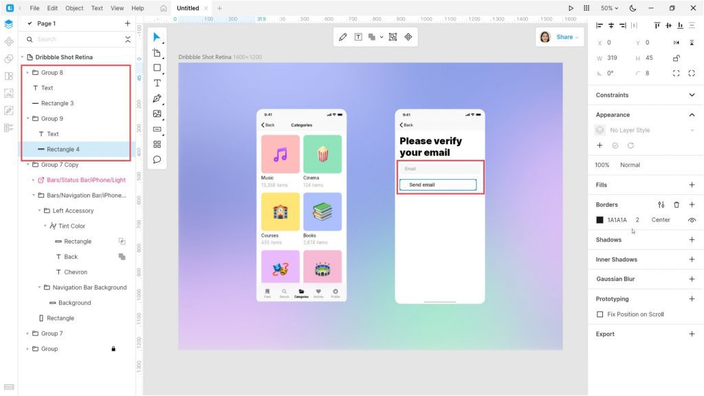
Select both groups. Set the horizontal space between them to 200. Align the groups to the center of the artboard.
And the last step. Open the Illustration tab and add some illustrations. I used the images in the Casual life 3D style.
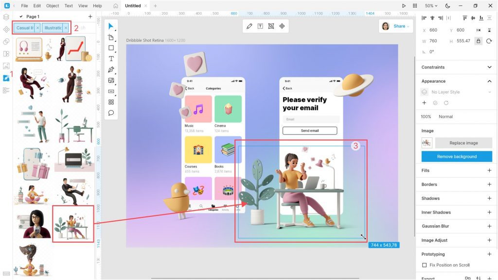
That’s it. Our design is ready.
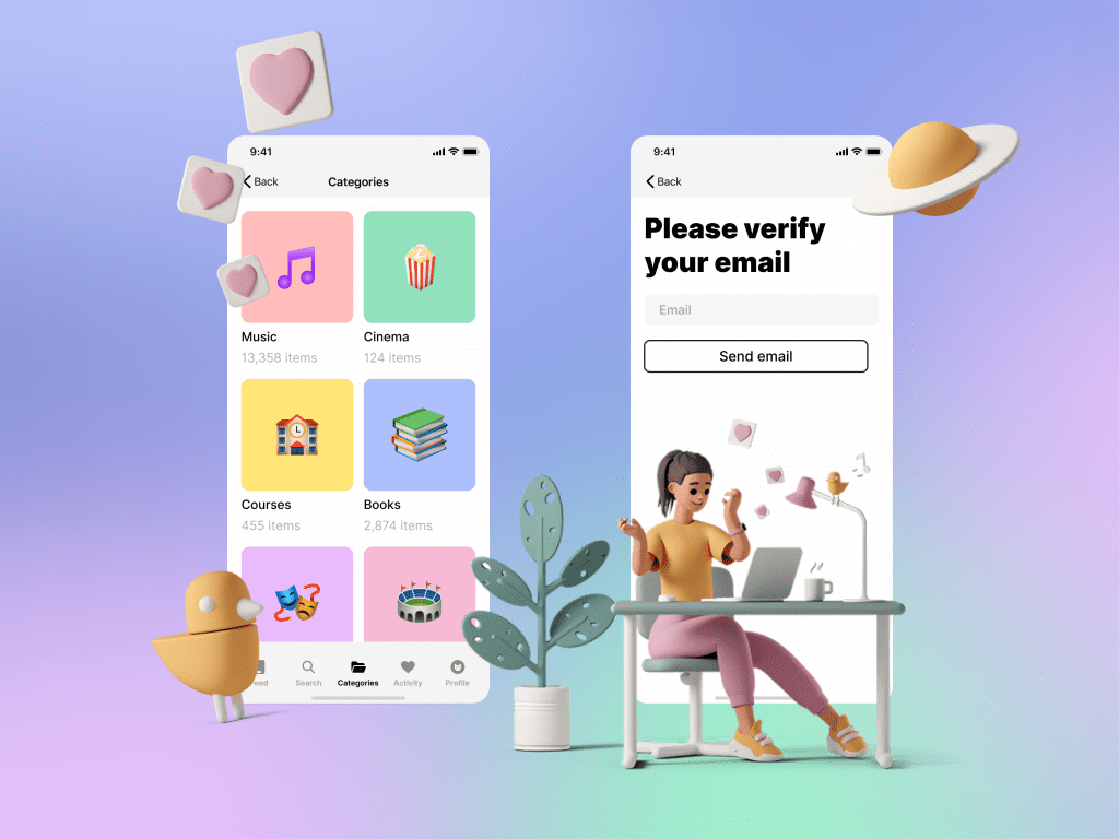
Create your designs in Lunacy and share them with us on social media: Twitter, Facebook, and Discord.
Check out the other Lunacy tutorials:
Don’t forget to tell your fellow designers and developers that starting from version 8 Lunacy runs not only on Windows but also on macOS and Linux. Send them this link https://icons8.com/lunacy and help us spread the word about Lunacy.
About the author
Julia G, a wonderful creature responsible for QA and SMM at the Lunacy team.